Qt Quick - Menu使用总结
- 一、概述
- 二、上下文菜单
- 三、弹出式菜单
- 四、子菜单和Action
- 五、美化
一、概述
Menu其实就是Qt Quick里面的菜单控件,一般来说。
Menu有两种主要用例:
- 上下文菜单;例如,右键单击后显示的菜单
- 弹出菜单;例如,单击按钮后显示的菜单
在有鼠标光标可用的桌面平台上,子菜单是默认级联的。非级联菜单一次显示一个菜单,并且位于父菜单的中央。
通常,菜单项被静态声明为菜单的子菜单项,但menu也提供了动态添加、插入、移动和删除菜单项的API。
可以使用itemAt()或contentChildren访问菜单项。
虽然MenuItems最常与Menu一起使用,但它可以包含任何类型的 Item,其实就是用 MenuItem去封装一下菜单项的意思。
二、上下文菜单
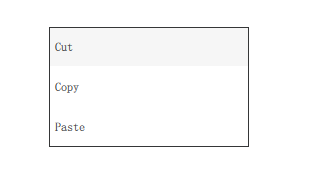
如果用作上下文菜单,推荐的打开菜单的方式是调用popup()。除非明确指定位置,否则在有鼠标光标可用的桌面平台上,菜单将定位在鼠标光标上,否则将位于其父项目的中心。
  MouseArea {
      anchors.fill: parent
      acceptedButtons: Qt.LeftButton | Qt.RightButton
      onClicked: {
          if (mouse.button === Qt.RightButton)
              contextMenu.popup()
      }
      onPressAndHold: {
          if (mouse.source === Qt.MouseEventNotSynthesized)
              contextMenu.popup()
      }

      Menu {
          id: contextMenu
          MenuItem { text: "Cut" }
          MenuItem { text: "Copy" }
          MenuItem { text: "Paste" }
      }
  }
三、弹出式菜单
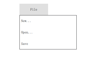
在作为弹出式菜单使用时,最简单的方法是通过各自的属性指定所需的x和y坐标,然后调用open()来打开菜单。
  Button {
      id: fileButton
      text: "File"
      onClicked: menu.open()

      Menu {
          id: menu
          y: fileButton.height

          MenuItem {
              text: "New..."
          }
          MenuItem {
              text: "Open..."
          }
          MenuItem {
              text: "Save"
          }
      }
  }
四、子菜单和Action

因为QtQuick.control 2.3 (Qt 5.10),也可以在Menu中创建子菜单并声明动作Action:,就比如在Qt里面的 QMenu的子项就是 QAction;
  Menu {
      Action { text: "Cut" }
      Action { text: "Copy" }
      Action { text: "Paste" }

      MenuSeparator { }

      Menu {
          title: "Find/Replace"
          Action { text: "Find Next" }
          Action { text: "Find Previous" }
          Action { text: "Replace" }
      }
  }
五、美化
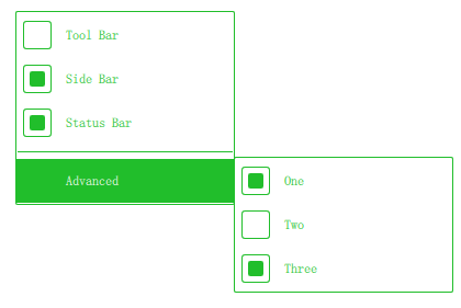
  import QtQuick 2.12
  import QtQuick.Controls 2.12

  Menu {
      id: menu

      Action { text: qsTr("Tool Bar"); checkable: true }
      Action { text: qsTr("Side Bar"); checkable: true; checked: true }
      Action { text: qsTr("Status Bar"); checkable: true; checked: true }

      MenuSeparator {
          contentItem: Rectangle {
              implicitWidth: 200
              implicitHeight: 1
              color: "#21be2b"
          }
      }

      Menu {
          title: qsTr("Advanced")
          // ...
      }

      topPadding: 2
      bottomPadding: 2

      delegate: MenuItem {
          id: menuItem
          implicitWidth: 200
          implicitHeight: 40

          arrow: Canvas {
              x: parent.width - width
              implicitWidth: 40
              implicitHeight: 40
              visible: menuItem.subMenu
              onPaint: {
                  var ctx = getContext("2d")
                  ctx.fillStyle = menuItem.highlighted ? "#ffffff" : "#21be2b"
                  ctx.moveTo(15, 15)
                  ctx.lineTo(width - 15, height / 2)
                  ctx.lineTo(15, height - 15)
                  ctx.closePath()
                  ctx.fill()
              }
          }

          indicator: Item {
              implicitWidth: 40
              implicitHeight: 40
              Rectangle {
                  width: 26
                  height: 26
                  anchors.centerIn: parent
                  visible: menuItem.checkable
                  border.color: "#21be2b"
                  radius: 3
                  Rectangle {
                      width: 14
                      height: 14
                      anchors.centerIn: parent
                      visible: menuItem.checked
                      color: "#21be2b"
                      radius: 2
                  }
              }
          }

          contentItem: Text {
              leftPadding: menuItem.indicator.width
              rightPadding: menuItem.arrow.width
              text: menuItem.text
              font: menuItem.font
              opacity: enabled ? 1.0 : 0.3
              color: menuItem.highlighted ? "#ffffff" : "#21be2b"
              horizontalAlignment: Text.AlignLeft
              verticalAlignment: Text.AlignVCenter
              elide: Text.ElideRight
          }

          background: Rectangle {
              implicitWidth: 200
              implicitHeight: 40
              opacity: enabled ? 1 : 0.3
              color: menuItem.highlighted ? "#21be2b" : "transparent"
          }
      }

      background: Rectangle {
          implicitWidth: 200
          implicitHeight: 40
          color: "#ffffff"
          border.color: "#21be2b"
          radius: 2
      }
  }