All Tableau authors are essentially storytellers. Analyzing data is more than just puzzle- solving; it is a search for a story that will make a difference. Topics can range from Airbnb爱彼迎(美国短租平台) to the Zika virus[ˈziːkə ˈvaɪrəs]寨卡病毒, and may be pleasantly diverting[daɪˈvɜːrtɪŋ]转移注意力 or life-changing, but they all serve a common need: to tell a story. This chapter is dedicated to helping you stock your toolkit of knowledge with ideas and methods for using Tableau to make presentations that engage, delight, and make a difference.
This chapter will explore the following presentation-centric topics:
- • Getting the best images out of Tableau
- • From Tableau to PowerPoint
- • Embedding Tableau in PowerPoint
- • Animating Tableau
- • Story points and dashboards for presentations
- • Presentation resources
Getting the best images out of Tableau
In this section, we will review options for exporting an image from Tableau into other applications and discuss the pros and cons of each method. We'll begin by surveying various screenshot applications and then we will consider methods that are available directly in Tableau.
- • Snipping Tool
 is installed by default with Windows and, although a very simple tool with few bells and whistles, is easy to use and effective.
 - • Greenshot is an open-source screen capture tool with many features similar to SnagIt. Visit https://getgreenshot.org/ to download the application and learn more.
- • Microsoft Office OneNote includes a screen capture feature. If you have OneNote installed with Windows 7 or earlier, simply press Windows + S to activate the screen capture. If you are on Windows 8 or 10, press Windows + N and then the S key for activation.
- • Grab is a screen capture utility natively available on macOS. Grab is located in the Utilities folder under Applications. You can also access it via the following shortcuts: Shift + Command + 3 for a screenshot, Shift + Command + 4 for a partial screenshot, and Shift + Command + 5 for a timer screenshot.
Now that we have covered the tools and methods for image capturing, let us have a look into the native capabilities that ship with Tableau.
Tableau's native export capabilities
One of the shortcomings of screen capture tools is that they are limited to raster images光栅图像. Raster images are often sufficient for documentation or a PowerPoint presentation, but are subject to pixilation实体动画 if enlarged. Vector images, on the other hand, do not pixelate[ˈpɪksəleɪt]像素化,视频滤镜效果 when enlarged and may therefore provide sharper image quality更清晰的图像质量. Natively, Tableau includes both raster and vector export options. These options are discussed in the following section.
Tableau can export images in three formats, accessible via Worksheet | Export | Image:
- • JPEG is a raster image format that is good for high resolution images such as photographs, but does not work very well for low color images, such as those typically deployed in Tableau. Export an image from Tableau in JPEG format and then zoom in close. Note that the white space (especially white space surrounding text) includes stray[streɪ]离散的,杂散的,流浪的 pixels of various colors. These are known as artifacts假象,伪影 or noise. Although these pixels are not visible unless zoomed in, the overall impact on an exported image is that it can look blurry[ˈblɜːri]模糊不清的. Thus, there is rarely, if ever, a reason to export to JPEG from Tableau.

- Like JPEG images, PNG images are raster. The advantage of the PNG format is that it works well with both high color images such as photographs and low color images like those typically used in Tableau. Export an image from Tableau in PNG format and zoom in to observe that, although pixilation occurs, the white space comprises only white. Unlike JPEG images, no artifacts or noise appear. PNG should be considered the format of choice when using a raster image.
- BMP is a raster image format that looks quite nice but is uncompressed and can thus result in large image files. Today, the BMP format is considered antiquated/ˈæntɪkweɪtɪd/过时的 and should typically be avoided.
I suggest you try all three of them. Luckily, Tableau also provides us with a native feature to export to a PDF as a vector image, as well as exporting to PowerPoint directly. In the next section, we will take a look at the PowerPoint export feature and some variations to it.
From Tableau to PowerPoint
PowerPoint is ubiquitous[juːˈbɪkwɪtəs]普遍存在的,无所不在的. Some may argue that other presentation tools such as Prezi are superior, but for many organizations (probably the vast majority) PowerPoint remains the software of choice.
Prezi is a tool that can be accessed via the web. Typically, you won't see classical slides but an interactive, moving presentation. Templates are available online and they offer free as well as paid tiers. You can check it out here: https://prezi.com/.
As such, it's important to integrate Tableau and PowerPoint efficiently and effectively. Starting from Tableau Desktop version 2019.1, it is possible to export your dashboard directly to PowerPoint. You will find the option under File | Export As PowerPoint: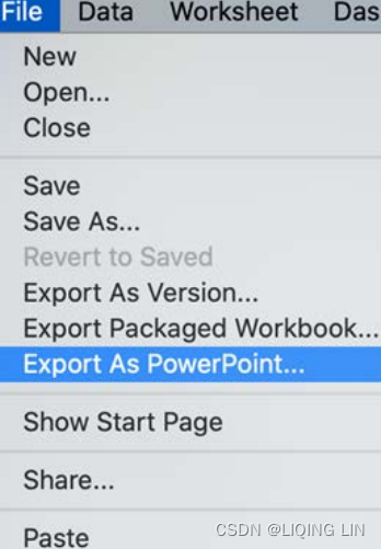 ==>
==>
After making this selection, you will be asked whether you want to export the current view or a selection of sheets from the workbook.
Try both options to see how the native Tableau export functionality appears in PowerPoint. If you want to put in a little extra effort, there are options to create a PowerPoint implementation of Tableau via a different route. These alternatives might present added value for you. The following exercises explore the various techniques for doing so.
Creating a template
For this first PowerPoint-centric exercise, you will create a template that will be utilized in future exercises. It will include common PowerPoint elements such as a header and a footer. The size of the template will be 1200 x 900, which adheres to the 4:3 aspect ratio typically used for PowerPoint presentations. Of course, other sizes may be targeted, but the aspect ratio should always be kept in mind. Let us look at the following steps:
- 1. Navigate to https://public.tableau.com/profile/marleen.meier to locate and download the workbook associated with this chapter.
- 2. Create a new worksheet titled Header and select the Superstore dataset.
- 4. Place Sales on the Color shelf in the Marks card.
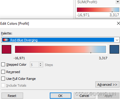
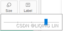
- 5. Click on Color in the Marks card, click Edit Colors..., and then select the gray color palette and set Opacity to 50%:

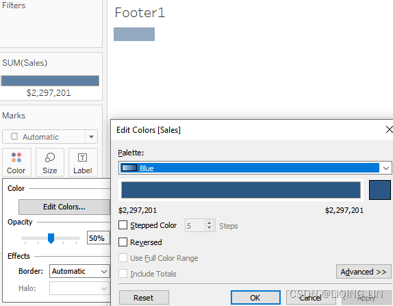
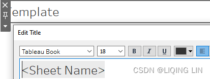
- 6. Duplicate the Header worksheet and name the duplicate Footer1.
- 7. Click on Color in the Marks card, click Edit Colors..., and then select the blue color palette:
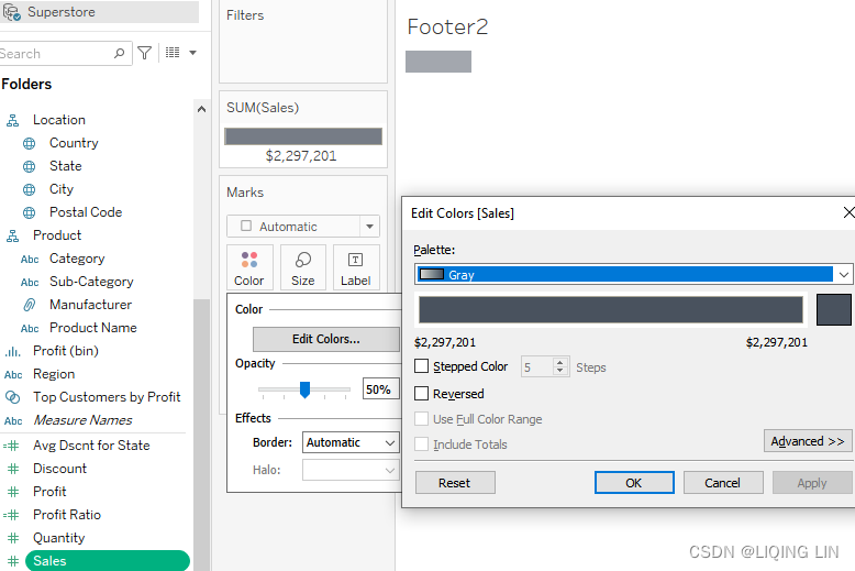
- 8. Duplicate the Footer1 worksheet and name the duplicate Footer2.
- 9. Click on Color in the Marks card, click Edit Colors..., and then select the gray color palette and set Opacity to 50%.
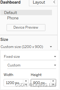
- 10. Create a new dashboard called Template.
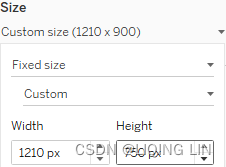
- 11. Within the Dashboard pane, set the size to 1200 x 900:
- 12. Display the dashboard title via Dashboard | Show Title.
- 13. Double-click on the title. In the resulting dialog box, left-justify the text if needed.
- 14. In the Dashboard pane, make sure that Tiled is selected. This way, you make sure that the single worksheets stay in place and don't overlap one another:

- 15. From the Dashboard pane, drag Blank from the Objects panel and place it on the left-hand side of the dashboard. Be careful to place it so that it stretches from the top to the bottom of the dashboard, as shown in the following screenshot:

- 16. Repeat the previous step for the bottom, the right-hand side, and the middle of the dashboard. When creating the bottom margin, be sure to position the object so that it stretches from the far right to the far left of the dashboard. Your final layout should contain four containers and a left-aligned title at the top, like so:
 ==>
==>
- 17. Size the blank objects to create appropriate margins. This can be accomplished by dragging the inner edge of each Blank object (that is, the edges facing the center) as far to the right or left or bottom as possible:
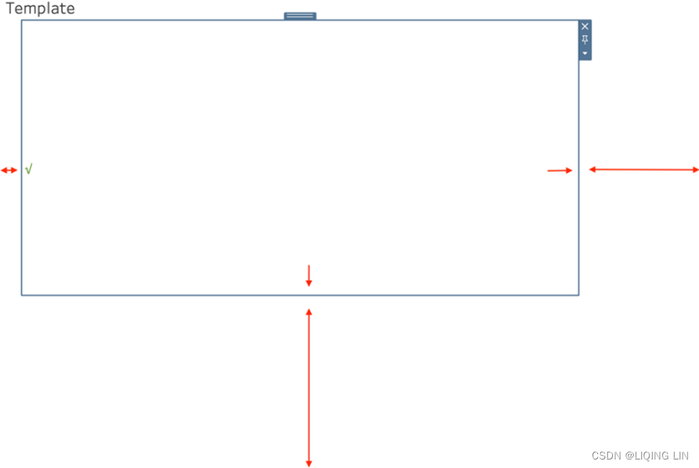 Figure 10.9: Increasing size
 - 18. Change the bottom margin one more time by approximately doubling the height by selecting the container and dragging the bottom line downward, as indicated by the arrows in Figure 10.9.
- 19. In the Objects portion of the Dashboard pane, click Floating.
- 20. Drag the Header, Footer1, and Footer2 assets onto the dashboard. It does not matter where you place them; we will align the worksheets shortly. If a Sales legend appears, delete it (remove from dashboard).
- 21. Right-click on the title of each asset and select Hide title.
- 22. In the Layout pane, enter the following values for each worksheet:
 vs
vs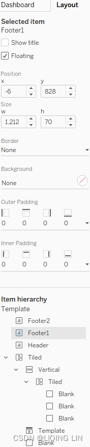 vs
vs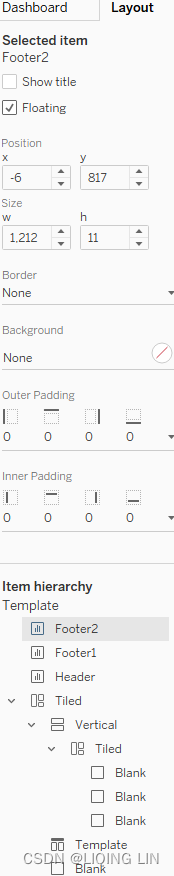
- 23. Set each worksheet to Entire View by clicking in the toolbar on the Fit drop-down menu next to the word Standard and selecting Entire view:
- 24. The results should be a line for the header just under the title stretching across 80% of the dashboard and two bars at the bottom stretching across the entire dashboard:

- 25. Click on the blank container located underneath the Template title.
- 26. If you have not already done so, download the assets associated with this chapter. A link is provided in the workbook.
- 27. Drag an Image object from the Objects portion of the Dashboard pane onto the dashboard. When prompted, select the tableau-logo.png image supplied with this chapter:
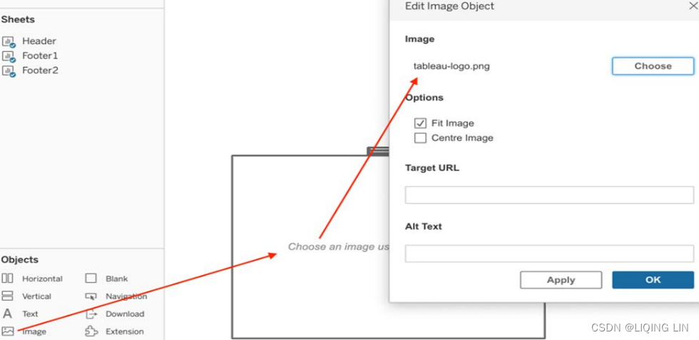
- 28. Select the option Centre Image and then click OK.
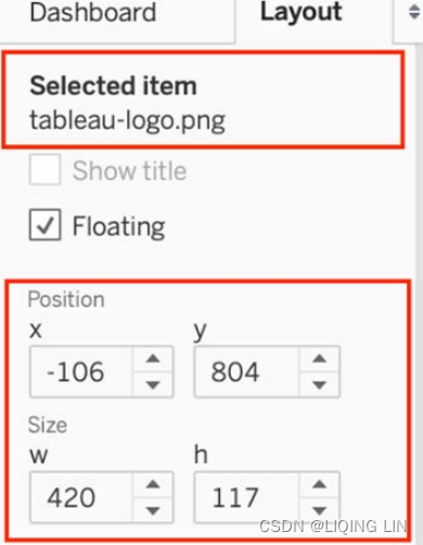
- 29. Position the image via the Layout pane as follows:
- Your PowerPoint template is now ready to use:

For every screenshot you will take now, you will always have the same design surrounding it. By doing so, your presentations will look more professional and your audience will soon recognize your work by its design. A template such as this can also help you follow company design guidelines. As an extra tip, make sure that you use matching colors for headers, footers, and your graphs!
Next, we will go through some examples in order for you to see the template in use.
the worksheets Loss Leaders States
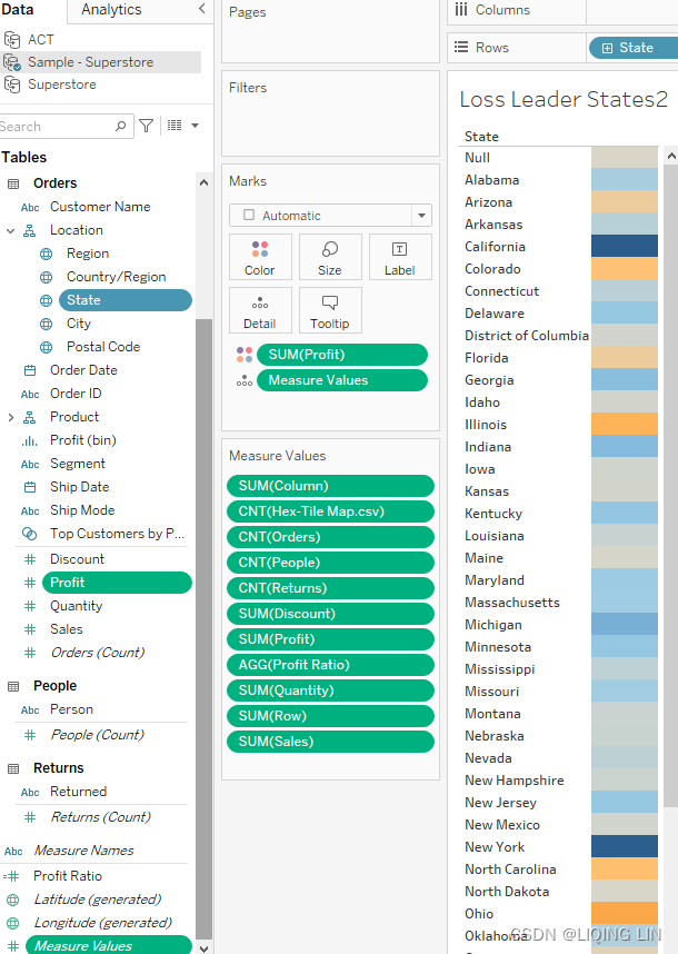

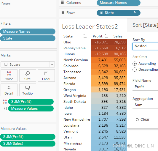

the worksheets HexMap
calculated field :


 ==>unshow header
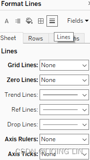

Creating a dashboard for print
This exercise will utilize the Template created previously to make a dashboard. Basic instructions are provided, but specifics are left to individual preference:
- 1. Right-click on the tab entitled Template created in the previous exercise, Creating a template, and select Duplicate.
- 2. Rename the duplicate dashboard to Superstore Loss Leaders.
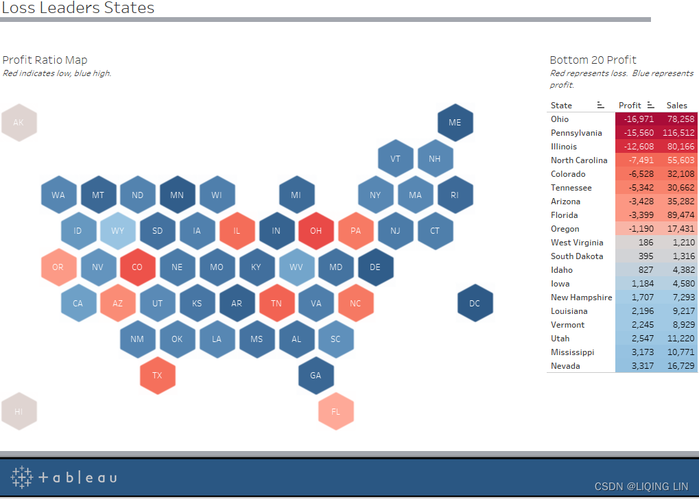
- 3. Populate the Superstore Loss Leaders dashboard with the worksheets HexMap and Loss Leaders States. Arrange as desired. An example layout is given as follows:

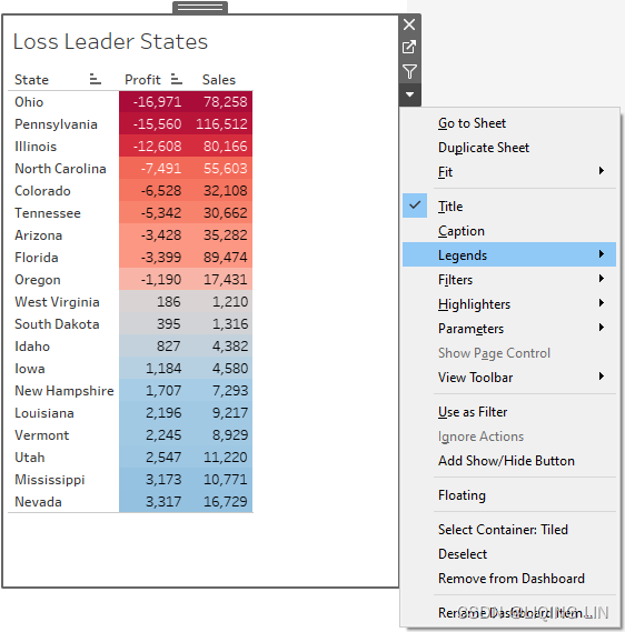


 Figure 10.16: Dashboard and template
The dashboard on top of the template looks really great, doesn't it? It immediately looks more professional and presentation-worthy. But are you asking yourself why did I choose to work with that specific layout? Well, let me elaborate: If you want to show a Tableau dashboard in a printed version or you have to export the dashboard to PowerPoint, it is important to remember that all interactivity will be lost. One of the highlights and biggest selling points of Tableau—interactivity—doesn't work on a 2D print. But obviously you don't want to recreate graphs that already exist in some form on your Tableau Server, and you don't have to. Just make sure that your audience understands the viz without being able to click on a field or hover over to show more info:
- • Tip 1: The dashboard in Figure 10.17 has been adjusted to the colors of the template to make it appear as if the two belong together.
- • Tip 2: A hexagon map (hexmap)六边形地图 has been used instead of the default map that comes with Tableau. The reason is that smaller states on the east coast disappear when printed in the actual ratio and Alaska and Hawaii are so far away that they usually don't fit on the map either. A hexmap gives the same space to each state and hence, even if printed, the user can see what's going on in Alaska, as well as in Rhode Island.
- • Tip 3: The colors indicate that the profit ratio is especially bad in Ohio and Colorado, but your audience might want to know more. That's when the table comes into play. The profit ratio is profit divided by sales and the table shows both numbers so that the audience can get a better picture of the current situation and you can avoid them asking.
- • Tip 4: In order to avoid a printed scroll down bar, I selected the bottom 20 states only. If the topic is loss leaders亏损领导者, it is not very likely that you will need to show all the states that do really well.
I hope this example gave you some ideas on how to prepare your dashboard for a print! If a print happens more frequently, I would advise you to add a page to your interactive dashboard on Tableau Server such that you always have it ready to go if asked for. If you are interested in replicating the hexmap, go ahead and check the following article: https://www.tableau.com/about/blog/2017/1/viz-whiz-hex-tile-maps-64713. 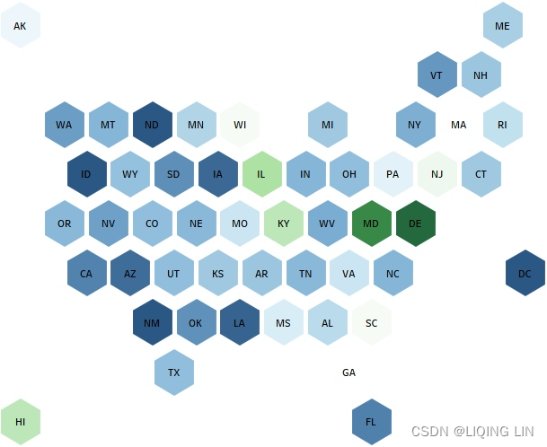
Next, we will look at another example, this time an automation for a weekly PowerPoint presentation.
Semi-automating a PowerPoint presentation
The previous exercises (Creating a template and Creating a dashboard for print) demonstrated two methods for generating a template for PowerPoint presentation and gave you some tips on how to adjust your dashboard for printing and/or PowerPoint presentations. Usually, however, your Tableau dashboard isn't static, and the data will change for the next time when you need it. You can, of course, export a new PowerPoint file with the updated data, but you might have other slides as well that you don't want to lose. The following steps will help you a bit with a semi-automated way of updating your PowerPoint presentation:
1. Open the dashboard created previously entitled Superstore Loss Leaders.
2. Click on Dashboard | Export Image…: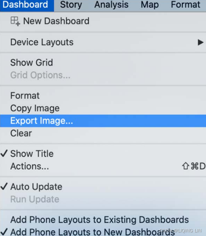
3. Click Save and, in the resulting dialog box, choose to save the image as SuperstoreLossLeaders.png .
4. Open the PowerPoint presentation. Open a slide.
5. Select the Insert ribbon and choose Pictures | Picture from File: 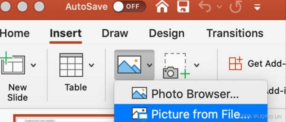 OR
OR Figure 10.18: Inserting a picture into PowerPoint
6. Navigate to the PNG image(SuperstoreLossLeaders.png) you just exported.
7. In the Insert dialog box, choose the drop-down selector next to Insert and select Insert and Link for Windows, or select Options | Link to File | Insert for Mac. Note that this step is important because it will allow pictures to be swapped out easily, as will be demonstrated: 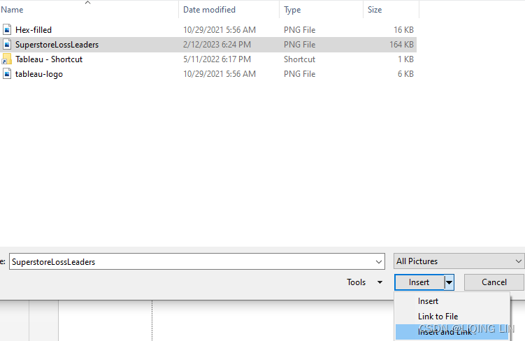
OR Figure 10.19: Link to File
8. Save the PowerPoint presentation as AutoUpdate.pptx .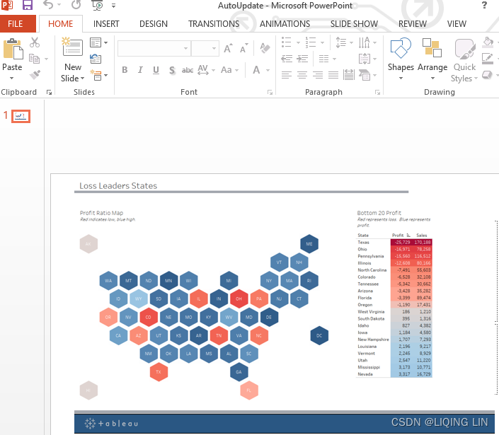
9. Close PowerPoint. In Tableau, modify the dashboard; for example, remove a state from the table.
10. Overwrite the previously exported SuperstoreLossLeaders.png image via Dashboard | Export Image ….
11. Open AutoUpdate.pptx and note that the new image of the dashboard displays.  vs original
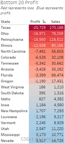
Something I come across frequently when I teach in Tableau classes is that I encounter people who are responsible for providing PowerPoint presentations on a weekly or monthly basis. These presentations include charts and graphs that are updated, but the overall layout remains unchanged. The technique covered in the preceding exercise can make that process much quicker. Although Tableau Desktop only allows the author to update one image at a time, Tableau Server can be configured to export multiple images simultaneously, thereby making the process even more efficient. Exporting images from Tableau Server is discussed in Chapter 14, Interacting with Tableau Server/Online.
Wouldn't it be even nicer if we could present our web browser, Tableau Server, directly on a slide, including all the interactivity?(直接在幻灯片上展示我们的 Web 浏览器 Tableau Server,包括所有交互功能) The next section will cover this while sharing some thoughts on doing so.
Embedding Tableau in PowerPoint(office 22016及之后的版本不适用)
It is possible to embed Tableau directly in a PowerPoint presentation or, to be more accurate, it's possible to embed a web browser through which an instance of Tableau Server may be accessed. There are various methods for accomplishing this, including the Web Viewer app, a third-party add-in called LiveWeb, and VBA code.
The Web Viewer app is available at https://appsource.microsoft.com/en-us/product/office/WA104295828?tab=Overview . Although it works well for Tableau Public, the default Tableau Server settings disallow access via Web View. LiveWeb (available at http://skp.mvps.org/liveweb.htm http://skp.mvps.org/liveweb.htm ) works well, but requires an additional installation. You have to download the installation from the URL provided and start PowerPoint. You will then be able to add another add-in to your PowerPoint ribbon, which, in return, allows you to add a Tableau Server URL that will be displayed directly in Tableau. Detailed instructions can be found on the website too.
The third method mentioned previously, using VBA, is perhaps the most workable method and will be discussed next. The following steps utilize PowerPoint 2016. Other versions of PowerPoint may require a slightly different approach, but any differences should be relatively easy to figure out. Also, the exercise assumes that the Developer toolbar is activated. If the Developer toolbar is not activated for your instance of PowerPoint, instructions to enable it can be found here: https://support.microsoft.com/en-us/office/show-the-developer-tab-e1192344-5e56-4d45-931b-e5fd9bea2d45 .
The following exercise currently only works on Windows due to the fact that PowerPoint for Mac does not provide a developer add-in.
office 2021 最新版详细安装教程,附激活方法_c+猿辅导的博客-CSDN博客_office2021激活
https://download-market.ru/
【Office】Microsoft Office下载地址合集(微软官方原版离线安装下载)_Cappuccino-jay的博客-CSDN博客_office官网下载地址
Perform the following steps:
- 1. Open PowerPoint. If it's not already enabled, enable the Developer tab in the Excel ribbon by selecting File | Options | Customize Ribbon and then, under Main Tabs, add Developer.
- 2. Create a new single blank slide.
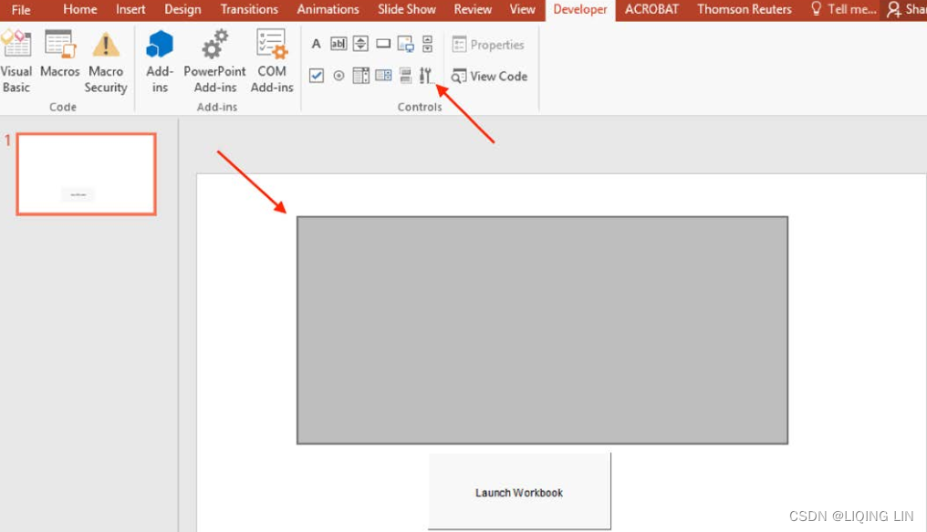
- 3. Select the Developer tab in the ribbon and click on the Command Button icon located in the Controls group:

 Figure 10.20: Command button
 - 4. In the lower-left hand portion of the slide, create a command button by clicking and dragging:
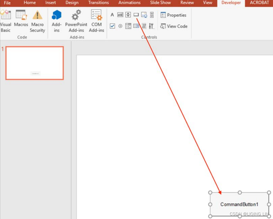
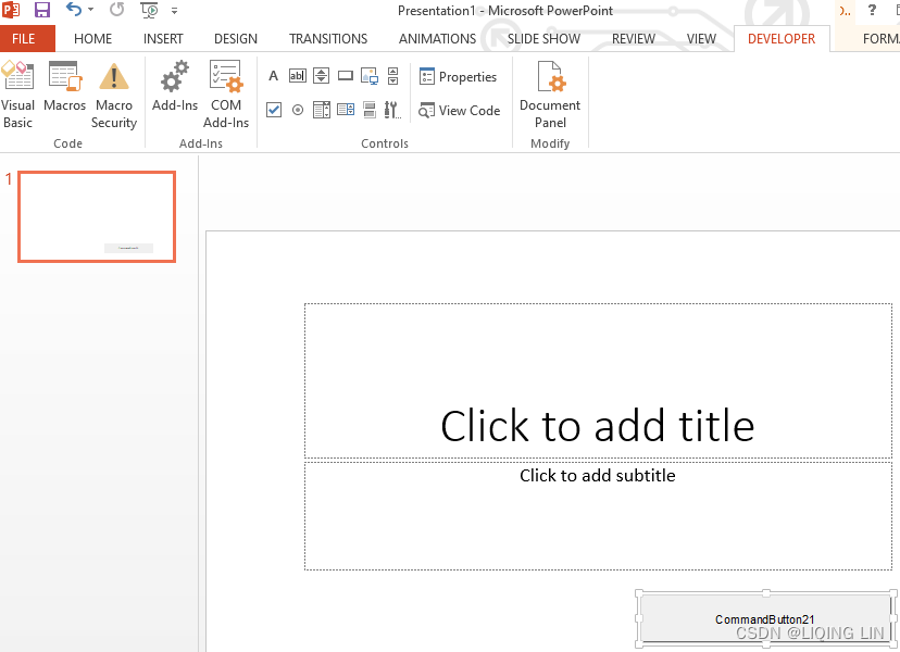 Figure 10.21: Creating a command button
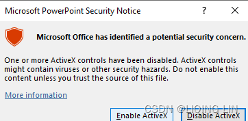
- 5. Right-click on the command button just created and select Property Sheet.

- 6. Within Property Sheet, locate Caption and set the text to Launch Workbook:
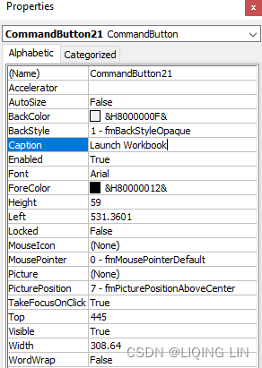
Figure 10.22: Properties
The command button should now be labeled Launch Workbook.
- 7. Within the Controls group in the Developer ribbon, select More Controls.
- 8. Within the resulting dialog box, choose Microsoft Web Browser and then click OK:

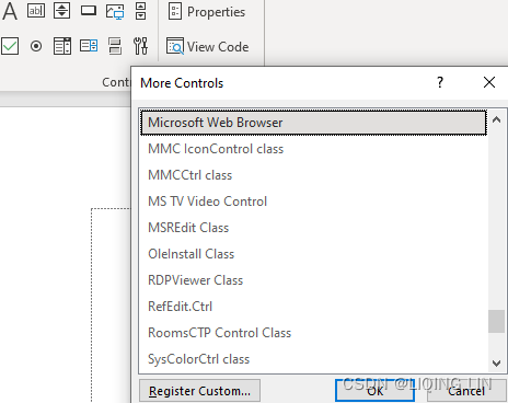 Figure 10.23: More Controls
 - 9. If this process works and you do not get an error message at this point, skip to Step 16. However, if a warning dialog box displays stating that The ActiveX control cannot be inserted,
 continue reading the next few steps.
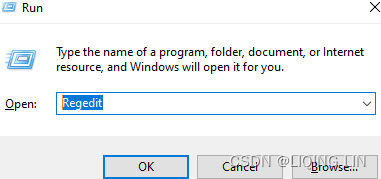
Note that the following steps provide instructions regarding the adjustment of registry settings. Adjusting registry settings can be a tricky business and can cause problems on your machine if done incorrectly. Proceed at your own risk! - 10. Save the file and close PowerPoint.
- 11. Press the Windows button + R to open the Run dialog box. Within the Run dialog box, type Regedit.
- 12. In the Registry Editor, locate the following class ID: 8856F961-340A-11D0-A96B-00C04FD705A2 . This class ID will be located differently based on the different installation methods for Office. The following three locations are likely candidates:
- HKEY_LOCAL_MACHINE\SOFTWARE\Microsoft\Office\15.0\Common\COMCompatibility\
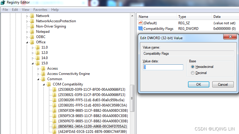
- For the Click-to-Run installation即点即用安装 of Office 2013, locate the following registry subkey:
HKEY_LOCAL_MACHINE\SOFTWARE\Microsoft\Office\15.0\Click ToRun\REGISTRY\MACHINE\Software\Wow6432Node\Microsoft\Office\15.0\Common\COM Compatibility\ - For the MSI installation of Office 2013, locate the following registry subkey:
HKEY_LOCAL_MACHINE\SOFTWARE\Wow6432Node\Microsoft\Office\15.0\Common\COM Compatibility
- HKEY_LOCAL_MACHINE\SOFTWARE\Microsoft\Office\15.0\Common\COMCompatibility\
- 13. Click on the class ID and note the type REG_DWORD in the right-hand panel. Right-click on REG_DWORD and then select Modify.

- 14. Change the textbox labeled Value data to 0 and then click OK:
- 15. Start PowerPoint and open the file saved previously. Now you should be able to add the Microsoft Web Browser control as instructed in Step 8.
- 16. Draw a marquee选取框 over most of the slide, allowing only enough room for the Launch Workbook command button created previously:
- 17. Right-click on the Launch Workbook command button and then select View Code.
- 18. Within the Visual Basic for Applications (VBA) console that appears, delete any existing code and enter the following code:
https://public.tableau.com/app/profile/david.baldwin/viz/Oregon_Starter/Sheet1
https://public.tableau.com/profile/david.baldwin#!/vizhome/1_Starter/SampleWorksheet
Private Sub CommandButton21_Click()
'Begin Comment: The above line of code gives instructions regarding what action to take when clicking on the command button. End Comment.

WebBrowser1.Navigate ("https://public.tableau.com/profile/vizpainter#!/vizhome/TheChangingShapeofHistory/FromColoniestoUS")

'Begin Comment: WebBrowser1 is the name of the Microsoft WebBrowser control that the command button controls. End Comment.
'Begin Comment: The URL can be replaced with a URL of your choosing. End Comment.
'Begin Comment: '"Navigate" is the Property/Method that accepts the URL. End Comment.
End Sub
Note that the preceding VBA code includes comments. The statements Begin Comment and End Comment are included for clarity, but are not required. For this example, I used a link to a very well-designed Tableau Public dashboard by Joshua N. Milligan, a Tableau Zen Master.
- 19. Close the VBA console.
20. Press F5 and click the Launch Workbook command button. An instance of a Tableau workbook should now display in PowerPoint:
web view https://www.youtube.com/watch?v=3hTr4VYGLJA
Web Browser Control in Microsoft Powerpoint 2010 VBA:
https://www.youtube.com/watch?v=aMdznKc4lZQ
https://public.tableau.com/app/profile/vizpainter/viz/TheChangingShapeofHistory/FromColoniestoUS
https://www.guru99.com/excel-vba-selenium.html
Assign a macro to a Form or a Control button - Microsoft Support
Robert Mundigl explores various techniques for embedding Tableau in PowerPoint similar to the preceding example on his blog, clearlyandsimply.com . Perform a search on the blog for PowerPoint to explore these methods. Robert's creative ideas include a technique for accessing multiple workbooks on a single PowerPoint slide and a technique for embedding the Tableau Desktop authoring environment in PowerPoint for on-the-fly authoring without leaving the presentation interface.
In this section, you have learned how you can embed a web browser in a PowerPoint presentation. Next, we will discuss ways to bring animation to Tableau that can support your data storytelling.
Animating Tableau
Including animation in a presentation can be very effective for engaging an audience. Hans Rosling accomplishes this admirably with his popular YouTube video 200 Countries, 200 Years, 4 Minutes ( https://www.youtube.com/watch?v=jbkSRLYSojo&feature=youtu.be ). In this video, Rosling uses data visualization to track wealth and life expectancy over time. His combination of data visualization with insightful commentary and a passion for his message makes Rosling's video a must-see for anyone interested in making appealing presentations using data.
Animations are easy to implement and are available via Tableau Reader as well as Tableau Server (since the 2020.1 release). At the time of writing, I have only encountered one drawback; worksheets with animation that are uploaded to Tableau Server will provide a single-speed level, whereas Tableau Desktop will show three![]() . But as you can see, nothing too pressing.
. But as you can see, nothing too pressing.
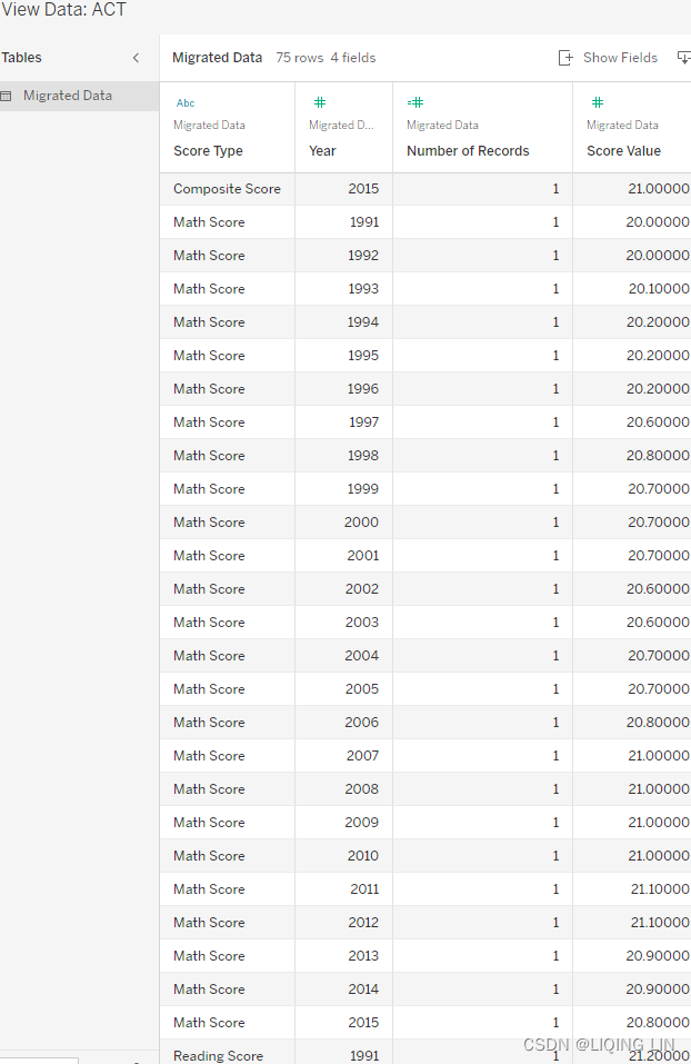
The following exercise tracks ACT testing scores from 1991 to 2015. Complete the exercise to learn how to create an animation in Tableau and also discover whether standardized testing results in the United States have improved over time.
Perform the following steps:
- 1. Open the workbook associated with this chapter and navigate to the worksheet entitled ACT scores.
- 2. Select the ACT data source.
- 4. Place Year on the Columns shelf, Score Value on the Rows shelf, and Score Type on Color in the Marks card.
- 5. Right-click on Score Value axis and select Edit Axis... In the resulting dialog box, deselect Include zero.
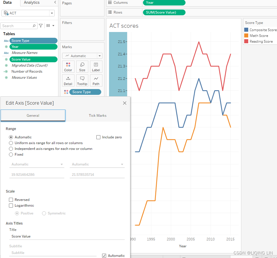
- 6. Place Year on the Pages shelf. Your view should look like the following:
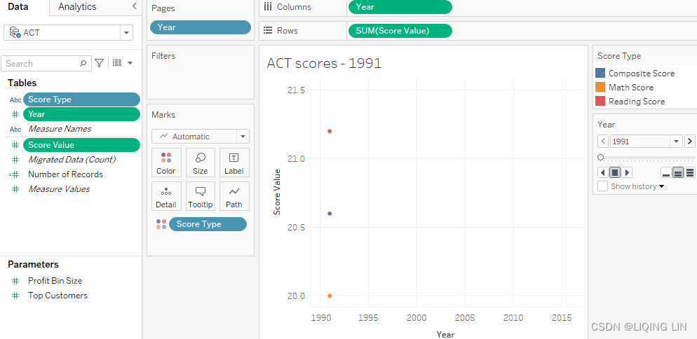
- 7. In the Current Page panel that appears on the worksheet, check Show history. Click on the arrow to open the dropdown and align all parameters as shown in the following screenshot:
 Figure 10.28: Aligning parameters
 - 8. In the Marks card, click on the drop-down menu to change the view type from Automatic to Circle.

- 9. Click on the Show history drop-down menu again and note that both the shows options and the Trails options are now available. Under Show, select Both.
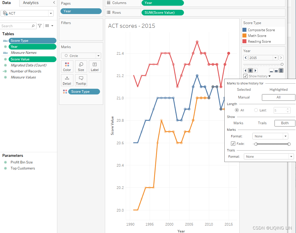
- 10. Click on the Format drop-down menu under Trails and then select the dashed line option:

Sometimes, the question "How can I create a dashed line in Tableau?" arises. One method is demonstrated in the preceding steps. By setting the view type to Circle and adjusting the Show history options, a dashed line was created. If a dashed line without animation is required, simply hide the page panel.
To briefly extend the theme of creating dashed lines in Tableau, to discover how to create multiple lines with varying dash types, check out https://boraberan.wordpress.com/2015/11/22/quick-tip-creating-your-own-dashed-line-styles-in-tableau/Workbook: Dashed Lines, where Bora Beran has pioneered a method using calculated fields to insert null values to achieve differing line effects. - 11. Now, click on the play button and see how Tableau walks through each year, one at a time: screenToGif software
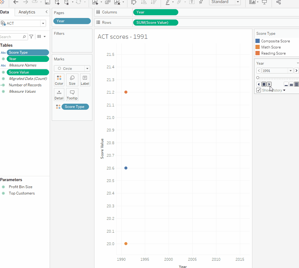 Figure 10.30: Animation
Even though this functionality is not a good use case for thorough analytics, it does help when visualizing change over time, for example, while giving a presentation or for any other kind of storytelling. I most recently used it to show how product clusters changed over time, with the conclusion that clusters should not remain static. I then continued to search for early identification of such change in clusters in order to adjust pricing and marketing accordingly.
To conclude, animations are possible in Tableau using a functionality called pages. I hope you will find many use cases for this feature. Next, we will use the animation features in a different way, by showing you how to export multiple images with it.
Using an animation to export many images
There are at least two reasons why it may be necessary to export many images from a timeline. First, it may be analytically advantageous to see separate images for each time snapshot; for example, a separate image for each day in a month. Second, it may be necessary to create an animation outside of Tableau, perhaps in PowerPoint.
The next two exercises (Using an animation to export many images and Using an animation in Tableau to create an animation in PowerPoint), cover both scenarios:
1. Open the workbook associated with this chapter and navigate to the worksheet entitled ACT scores: 
2. Select File | Page Setup....  At the bottom of the resulting dialog box, under Pages Shelf, select Show all pages:
  Figure 10.32: Show all pages
3. Window user select File | Print to PDF. Mac users should select File | Print.
4. In the resulting dialog box, set Range to Active Sheet. Also set the orientation to Landscape. 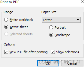
5. Click OK and save the PDF as Animation.pdf to a location of your choice. 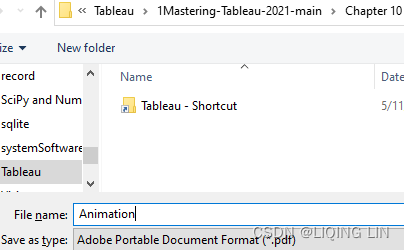
![]()
6. Navigate to https://www.pdftoppt.com/ . Upload Animation.pdf and convert it to PowerPoint. An email will be sent a few minutes after conversion.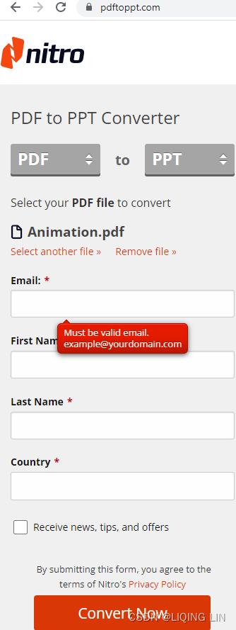
7. Download the file via the link provided in the email and open it in PowerPoint.https://dserv.nitroplatform.com/api/storage/My11VzFhRFRackh6bmZBMFRjL1ZINk03V1F1WWJ1UUFmVlhLdHJ5Q2ZObm04Q3NEdVRJYjczYkxRQ0RodFpnUDQ2Nm5keVVzZjdmc2Z1K3RaM3lVWkZjMVh6bjJRQjJhekE0em5tTEFMZ2JUdko2bVMyaUc3QUxBWDUzTkZSaVJBTHQvTTV0ZHVXWlNvMXRWaGVRNXExeGN1c2I1ek44VVk9?filename=Animation.pptx&attachment=true
8. Within PowerPoint, select File | Save As. (Enable Editing) Within the Save As type drop-down menu, select *.png: 
9. When prompted, choose to export All Slides: Figure 10.34: All Slides
10. Save the PowerPoint presentation. Note that when PowerPoint finishes saving, a dialog box will display stating that each slide in the presentation has been saved as a separate file: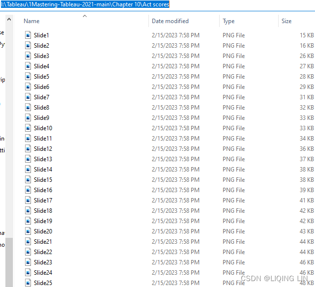 Figure 10.35: All slides saved
11. Open and inspect the saved PNG files as desired: Figure 10.36: Last slide as .png
By following all the preceding steps, you should have been able to save multiple images at once. This is hopefully a time saver for you, and even though it might not happen too often, it will benefit you knowing about this option.
Using an animation in Tableau to create an animation in PowerPoint
This exercise will show you how to create an animation from the mass of images we saved in the preceding exercise. Hence, we will use the files created previously to animate in PowerPoint:
- 1. Access the PowerPoint presentation downloaded from https://www.pdftoppt.com/ in the previous exercise.
https://dserv.nitroplatform.com/api/storage/My11VzFhRFRackh6bmZBMFRjL1ZINk03V1F1WWJ1UUFmVlhLdHJ5Q2ZObm04Q3NEdVRJYjczYkxRQ0RodFpnUDQ2Nm5keVVzZjdmc2Z1K3RaM3lVWkZjMVh6bjJRQjJhekE0em5tTEFMZ2JUdko2bVMyaUc3QUxBWDUzTkZSaVJBTHQvTTV0ZHVXWlNvMXRWaGVRNXExeGN1c2I1ek44VVk9?filename=Animation.pptx&attachment=true
- 2. In the View ribbon, select Slide Sorter under the Presentation Views group.

- 3. Select All slides in the PowerPoint presentation except for the last one.
click the 1st slide then press Shift key and click the 24th slide - 4. On the Transition ribbon under Timing group, set to advance the slide after 0.1 seconds:
 Figure 10.37: Advancing the slide
 - 5. Press F5 to see the animation.

Isn't this cool? You can see a similar simulation to what you would see in Tableau using Pages!![]() To further improve the animation in PowerPoint, consider the following additional steps:
To further improve the animation in PowerPoint, consider the following additional steps:
- • Upload the initial PDF to https://pdfresizer.com/crop and crop the size as desired.
- • If the animation is too slow in PowerPoint, it is likely that all the text and drawing elements are maintained. For example, the background grid is made up of individual lines. Rendering all text and drawing elements is resource-intensive. Consider creating a separate PowerPoint presentation using the PNG images created in the Using an animation to export many images exercise. This will lead to a quicker, smoother running animation.
I hope that this section has given you some ideas on how you can improve and impress with PowerPoint. Using these newly acquired techniques, you might not even need Prezi after all. However, this chapter wouldn't be complete without mentioning story points, a feature that will bring you a long way if you don't want PowerPoint at all.
Story points and dashboards for presentations
Story points are Tableau's answer to PowerPoint. As such, both share fundamental similarities. A PowerPoint presentation provides a linear approach to communication. So do story points in Tableau. A PowerPoint presentation provides slides, each of which is a blank canvas that provides a user with infinite possibilities to communicate ideas. A story in Tableau provides story points for the same purpose.
Although there are fundamental similarities, it is important to understand that Tableau story points and PowerPoint presentations often do not fulfill the same role. Each has advantages over the other, and so a list of pros and cons should be considered.
We can view the pros and cons of PowerPoint and Tableau story points in the following table:
| PowerPoint | Tableau story points | ||
| Pros | Cons | Pros | Cons |
| Can be quick and easy to create | Difficult to automate based on changes to underlying data 难以根据基础数据的变化实现自动化 | Automatically updates as underlying data changes 随着基础数据的变化自动更新 | Can be more difficult to create 可能更难创建 |
| Easily fits different resolutions | Difficult to create a presentation that allows for departure from linear thought 很难创建一个允许偏离线性思维的演示文稿 | Easily allows nonlinear exploration in the middle of a presentation 轻松允许在演示过程中进行非线性探索 | Requires forethought regarding resolution size 需要预先考虑分辨率大小 |
So how do you decide between using PowerPoint and Tableau when making presentations? Perhaps the following list will help:
| When to Use PowerPoint | When to Use Tableau story points |
| A presentation where the audience has little opportunity for immediate feedback 观众几乎没有机会获得即时反馈的演示 | A presentation where immediate feedback is likely and exploratory questions may be asked 可能会立即得到反馈并可能会提出探索性问题的演示文稿 |
| A one-time presentation comprising clearly delineated points 包含明确划定的要点的一次性演示 | A reusable presentation with updates mostly based on changes to underlying data 可重用的演示文稿,其更新主要基于对基础数据的更改 |
| A presentation where the monitor resolution size may not be known in advance 可能无法事先知道显示器分辨率大小的演示文稿 | A presentation where the monitor resolution size is known or assumed 显示器分辨率大小已知或假定的演示文稿 |
The basics of creating and using story points are straightforward, nor, at the time of writing, is there much beyond the basics. Since I focus on more advanced Tableau ideas and concepts, those basics will not be considered here. If you need to quickly understand story point basics, I recommend reading through the following pages: https://help.tableau.com/current/pro/desktop/en-us/stories.htm
I like story points and I like to use them especially when my audience has its own version of Tableau open in front of them and can follow along with their own actions. It is a great way to give people a deeper understanding because it allows you to show more complexity than a static screenshot. If you are looking to improve your presentation skills in general, continue reading the next section.
Presentation resources
Using story points effectively in Tableau is perhaps more of an artistic consideration than a technical one. Although this book attempts to consistently consider best practices for data visualization and to encourage attractive and user-friendly worksheets and dashboards, a discussion of effective presentation techniques is beyond its scope.
If you would like to improve your ability to create effective presentations, consider the following resources:
- Presentation Zen: Garr Reynolds is a bestselling author and a repeat speaker at Tableau conferences. His books and website ( https://www.presentationzen.com/ ) provide provocative ideas for effective presentations.
- Tableau Public: Learning by example is invaluable. Fine examples of story points can be found on Tableau. To learn from one of the most engaging, navigate to https://help.tableau.com/current/pro/desktop/en-us/story_example.htm
- Blogs: One of the more interesting posts discussing Tableau story points in combination with good presentation methodology can be found on Matt Frances' blog, wannabedatarockstar.blogspot.com . The post is entitled Five Tips for Better Tableau Story Points.
Even though these presentation skills are beyond the scope of this chapter, I hope that the preceding resources have given you food for thought.
Summary
We began this chapter by exploring various screen capture tools as well as Tableau's native export capabilities. Next, we turned our consideration to PowerPoint, where we explored various methods for creating PowerPoint presentations from Tableau workbooks, and even explored how to embed a live instance of Tableau in PowerPoint. Next, we considered Tableau animation. Lastly, we explored how to use story points and dashboards for presentations. In mtb11_Dashboard(collapse, hide filters)_DATETRUNC_Donut_各种chart_Custom Shapes Size_action_layout_LIQING LIN的博客-CSDN博客, Visualization Best Practices and Dashboard Design, we will turn our attention to dashboarding, where we will push beyond the normal boundaries of the typical dashboard, but not lose focus of the practical applications.