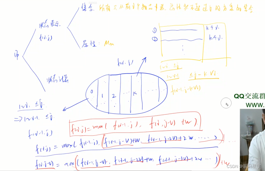
这话在我心里已经复习了几千遍。我深恨发明不来一个新鲜飘忽的说法,只有我可以说只有你可以听,我说过,我听过,这说法就飞了,过去、现在和未来没有第二个男人好对第二个女人这样说。
——《围城》

目录
一、前言
二、往期作品回顾
三、作品介绍
四、本期代码介绍
五、效果显示
六、编码实现
index.html
style.css
script.js
七、获取源码
公众号获取源码
获取源码?私信?关注?点赞?收藏?
一、前言
在我们的 html 学习过程中,会用到并见识到各种各样的实例,以及各种插件,并且有些 web 网页中的小插件又非常的吸引眼球,提升 web 网页的层次,显得非常好看并且非常使用。在本系列中,我将持续为大家更新有趣且使用的 html 实例,放在 web 网页中,凸显效果。
特点一:都是符合学校或者学生考试期末作业的水平,都是最基础的简单的 html 样例,提升web网页整理效果,都是 div+css 框架原创代码写的,内容包括 js / css,也包含 视频+音乐+flash 等元素的插入…
特点二:内容包括多种丰富类型,例如: 倒计时,404页面,Blog顶置卡片设计 (css+js),To-Do-List设计 (css+js),火柴盒动画 (css),日历便签设计 (css+js),搜索框设计 (css+js),卡片式图片展示 (css+js),咖啡选择 (css+js)……
可满足多种需求,欢迎大家下载!

二、往期作品回顾
有趣的HTML实例(一) 倒计时_Enovo_飞鱼的博客-CSDN博客
有趣的HTML实例(二) 404页面_Enovo_飞鱼的博客-CSDN博客
有趣的HTML实例(三) 加载页面动画_Enovo_飞鱼的博客-CSDN博客
有趣的HTML实例(四) 旋转菜单_Enovo_飞鱼的博客-CSDN博客
有趣的HTML实例(五) 加载页面动画Ⅱ(css)_Enovo_飞鱼的博客-CSDN博客
有趣的HTML实例(六) 卡片翻转时钟_Enovo_飞鱼的博客-CSDN博客
有趣的HTML实例(七) 注册登录界面Ⅱ(css+js)_Enovo_飞鱼的博客-CSDN博客
有趣的HTML实例(八) 一个很有趣的动态背景(css+js)_Enovo_飞鱼的博客-CSDN博客
有趣的HTML实例(九) 文本变形动画(css+js)_Enovo_飞鱼的博客-CSDN博客
有趣的HTML实例(十) 悬停时有旋转效果的图标_Enovo_飞鱼的博客-CSDN博客
有趣的HTML实例(十一) 烟花特效(css+js)_Enovo_飞鱼的博客-CSDN博客
三、作品介绍
1.作品简介 :HTML响应式布局网站源码!兼容 pc 以及移动端,内涵 js 交互,ui 交互。直接点击即可查看效果!
2.作品编辑:个人主页网页设计题材,代码为 html+css 布局制作,作品下载后可使用任意HTML编辑软件(例如:DW、HBuilder、Vscode 、Sublime 所有编辑器均可使用)。
3.作品技术:使用DIV+CSS制作了网页背景图、鼠标经过及选中导航变色效果、下划线等。
四、本期代码介绍
一款简单的 HTML+ CSS+JS 早安、晚安动画(css+js) 实例
1、HTML
2、CSS
3、JS
4、舒适的画面感
5、早晚安特效
6、点击改变早晚安效果
可通用多种不同情景,放置在web网页上,作为小插件使用,也可作为美化页面的效果
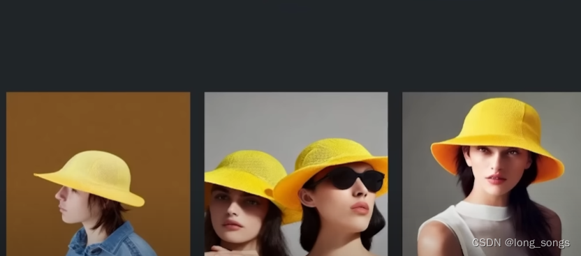
五、效果显示


可使用在多种情景下,提升层次轮廓效果、美化界面、自定义文字修改——>
根据需求修改
六、编码实现
显示完整代码
注意路径(⊙o⊙)?
o(* ̄▽ ̄*)ブ
index.html
<!DOCTYPE html>
<html lang="en" >
<head>
  <meta charset="UTF-8">
  <title>早安、晚安动画</title>
  <link rel="stylesheet" href="https://cdnjs.cloudflare.com/ajax/libs/meyer-reset/2.0/reset.min.css">
<link rel="stylesheet" href="./style.css">

</head>
<body>
<div class="container-wrapper">
  <h1>Good Morning, Goodnight</h1>
  <p id="subtitle">Click on the sun or moon for animation</p>
  <div class="container">
    <div class="circle-container">
      <!-- 天空部分 -->
      <div class="sky">
        <div class="sky-night">
          <div class="stars">
            <div class="shooting-star"></div>
            <div class="star-group-1"></div>
            <div class="star-group-2"></div>
            <div class="star-group-3"></div>
            <div class="star-group-4"></div>
          </div>
        </div>

        <!-- 云彩 -->
        <div class="cloud cloud-1"></div>
        <div class="cloud cloud-2"></div>
        <div class="cloud cloud-3"></div>
        <div class="cloud cloud-4"></div>
        <div class="cloud cloud-5"></div>
        <div class="cloud cloud-6"></div>
        <div class="bird bird-1"></div>
        <div class="bird bird-2"></div>
        <div class="bird bird-3"></div>
      </div>

      <!-- 山川 -->
      <div class="mountains">
        <div class="mountain-back">
          <div class="mountain-back-1"></div>
          <div class="mountain-back-2"></div>
        </div>
        <div class="mountain-middle">
          <div class="mountain-middle-1"></div>
          <div class="mountain-middle-2"></div>
        </div>
        <div class="mountain-top">
          <div class="mountain-top-1"></div>
        </div>
      </div>

      <!-- 太阳 -->
      <div class="sun-container">
        <div class="sun"></div>
      </div>

      <!-- 海洋 -->
      <div class="ocean">
        <div class="boat"></div>
        <div class="ocean-night">
          <div class="moon"></div>

          <!-- 山川 -->
          <div class="mountains mountains-bottom">
            <div class="mountain-back">
              <div class="mountain-back-1"></div>
              <div class="mountain-back-2"></div>
            </div>
            <div class="mountain-middle">
              <div class="mountain-middle-1"></div>
              <div class="mountain-middle-2"></div>
            </div>
            <div class="mountain-top">
              <div class="mountain-top-1"></div>
            </div>
          </div>
        </div>
      </div>
    </div>
  </div>
</div>
<!-- partial -->
  <script src='https://cdnjs.cloudflare.com/ajax/libs/jquery/3.4.1/jquery.min.js'></script>
  <script src="https://cdnjs.cloudflare.com/ajax/libs/prefixfree/1.0.7/prefixfree.min.js"></script><script src="./script.js"></script>
</body>
</html>
style.css
@import url("https://fonts.googleapis.com/css?family=Sanchez");

* {
  padding: 0;
  margin: 0;
  -webkit-box-sizing: border-box;
  box-sizing: border-box;
}

*:before,
*:after {
  content: "";
  position: absolute;
}

html {
  font-family: "Sanchez", serif;
}

.container-wrapper {
  width: 100%;
  height: 100%;
  display: -webkit-box;
  display: -ms-flexbox;
  display: flex;
  -webkit-box-pack: center;
  -ms-flex-pack: center;
  justify-content: center;
  -webkit-box-align: center;
  -ms-flex-align: center;
  align-items: center;
  -webkit-box-orient: vertical;
  -webkit-box-direction: normal;
  -ms-flex-direction: column;
  flex-direction: column;
}

html {
  -webkit-transition: background-color 3s ease;
  -o-transition: background-color 3s ease;
  transition: background-color 3s ease;
  -webkit-transition-delay: 2s;
  -o-transition-delay: 2s;
  transition-delay: 2s;
  background-color: #fff7f4;
}

.container {
  width: 450px;
  height: 450px;
  position: relative;
}

.container-night {
  background-color: #e4ecff;
}

.circle-container {
  width: 450px;
  height: 450px;
  -webkit-clip-path: circle(50% at 50% 50%);
  clip-path: circle(50% at 50% 50%);
  position: absolute;
  overflow: hidden;
  z-index: 100;
}

.sky {
  position: absolute;
  width: 100%;
  height: 55%;
  top: 0;
  background: -webkit-gradient(
    linear,
    left top,
    left bottom,
    from(#feb8b0),
    to(#fef9db)
  );
  background: -webkit-linear-gradient(#feb8b0, #fef9db);
  background: -o-linear-gradient(#feb8b0, #fef9db);
  background: linear-gradient(#feb8b0, #fef9db);
  z-index: 1;
  overflow: hidden;
}

.sky-night {
  position: absolute;
  width: 100%;
  height: 100%;
  background: -webkit-gradient(
    linear,
    left top,
    left bottom,
    from(#4c3f6d),
    color-stop(#6c62bb),
    to(#93b1ed)
  );
  background: -webkit-linear-gradient(#4c3f6d, #6c62bb, #93b1ed);
  background: -o-linear-gradient(#4c3f6d, #6c62bb, #93b1ed);
  background: linear-gradient(#4c3f6d, #6c62bb, #93b1ed);
  opacity: 0;
  -webkit-transition: opacity 3s;
  -o-transition: opacity 3s;
  transition: opacity 3s;
  -webkit-transition-delay: 2s;
  -o-transition-delay: 2s;
  transition-delay: 2s;
}

.sky-night-fade {
  opacity: 1;
}

@-webkit-keyframes sky-night {
  0% {
    background: -webkit-gradient(
      linear,
      left top,
      left bottom,
      from(#feb8b0),
      to(#fef9db)
    );
    background: -webkit-linear-gradient(#feb8b0, #fef9db);
    background: linear-gradient(#feb8b0, #fef9db);
  }
  100% {
    background: -webkit-gradient(
      linear,
      left top,
      left bottom,
      from(#4c3f6d),
      to(#96b5ee)
    );
    background: -webkit-linear-gradient(#4c3f6d, #96b5ee);
    background: linear-gradient(#4c3f6d, #96b5ee);
  }
}

@keyframes sky-night {
  0% {
    background: -webkit-gradient(
      linear,
      left top,
      left bottom,
      from(#feb8b0),
      to(#fef9db)
    );
    background: -webkit-linear-gradient(#feb8b0, #fef9db);
    background: -o-linear-gradient(#feb8b0, #fef9db);
    background: linear-gradient(#feb8b0, #fef9db);
  }
  100% {
    background: -webkit-gradient(
      linear,
      left top,
      left bottom,
      from(#4c3f6d),
      to(#96b5ee)
    );
    background: -webkit-linear-gradient(#4c3f6d, #96b5ee);
    background: -o-linear-gradient(#4c3f6d, #96b5ee);
    background: linear-gradient(#4c3f6d, #96b5ee);
  }
}

.sun-container {
  z-index: 10;
  position: absolute;
  left: 0;
  right: 0;
  margin: auto;
  top: 0;
  bottom: 0;
  width: 290px;
  height: 290px;
  /*    background-color: rgba(255, 0, 255, 0.2);*/
  -webkit-transform-origin: center center;
  -ms-transform-origin: center center;
  transform-origin: center center;
  -webkit-transition: all 5s ease-in-out;
  -o-transition: all 5s ease-in-out;
  transition: all 5s ease-in-out;
}

.sun {
  position: absolute;
  width: 90px;
  height: 90px;
  border-radius: 50%;
  background: -webkit-gradient(
    linear,
    left top,
    left bottom,
    from(#fefefe),
    to(#fffbe8)
  );
  background: -webkit-linear-gradient(#fefefe, #fffbe8);
  background: -o-linear-gradient(#fefefe, #fffbe8);
  background: linear-gradient(#fefefe, #fffbe8);
  cursor: pointer;
  z-index: 10;
}

.boat {
  position: absolute;
  width: 50px;
  height: 0px;
  border-top: 7px solid #bb7074;
  border-left: 10px solid transparent;
  border-right: 10px solid transparent;
  left: 280px;
  /*    right: -50px;*/
  top: -5px;
  -webkit-transform-origin: center bottom;
  -ms-transform-origin: center bottom;
  transform-origin: center bottom;
  -webkit-animation: boat 5s infinite;
  animation: boat 5s infinite;
  -webkit-animation-delay: 0.25s;
  animation-delay: 0.25s;
  -webkit-transition: all 4s ease-in-out;
  -o-transition: all 4s ease-in-out;
  transition: all 4s ease-in-out;
}

.boat-sail {
  margin-left: -350px;
}

.boat,
.boat:before,
.boat:after {
  position: absolute;
  z-index: 200;
}

@-webkit-keyframes boat {
  0% {
    -webkit-transform: rotate(1deg)translate(2px, 0px);
    transform: rotate(1deg)translate(2px, 0px);
  }
  25% {
    -webkit-transform: rotate(-1deg) translate(-2px, -2px);
    transform: rotate(-1deg) translate(-2px, -2px);
  }
  50% {
    -webkit-transform: rotate(1deg) translate(1px, 0px);
    transform: rotate(1deg) translate(1px, 0px);
  }
  75% {
    -webkit-transform: rotate(-1deg) translate(-1px, -2px);
    transform: rotate(-1deg) translate(-1px, -2px);
  }
  100% {
    -webkit-transform: rotate(1deg) translate(2px, 0px);
    transform: rotate(1deg) translate(2px, 0px);
  }
}

@keyframes boat {
  0% {
    -webkit-transform: rotate(1deg)translate(2px, 0px);
    transform: rotate(1deg)translate(2px, 0px);
  }
  25% {
    -webkit-transform: rotate(-1deg) translate(-2px, -2px);
    transform: rotate(-1deg) translate(-2px, -2px);
  }
  50% {
    -webkit-transform: rotate(1deg) translate(1px, 0px);
    transform: rotate(1deg) translate(1px, 0px);
  }
  75% {
    -webkit-transform: rotate(-1deg) translate(-1px, -2px);
    transform: rotate(-1deg) translate(-1px, -2px);
  }
  100% {
    -webkit-transform: rotate(1deg) translate(2px, 0px);
    transform: rotate(1deg) translate(2px, 0px);
  }
}

.boat:before,
.boat:after {
  width: 0;
  height: 0;
  border: 0 solid transparent;
}

.boat:before {
  bottom: 8px;
  right: -6px;
  border-right-width: 15px;
  border-left-width: 0px;
  border-bottom: 30px solid #bb7074;
}

.boat:after {
  bottom: 8px;
  right: 11px;
  border-right-width: 0px;
  border-left-width: 20px;
  border-bottom: 48px solid #bb7074;
}

.ocean {
  position: absolute;
  width: 100%;
  height: 45%;
  bottom: 0;
  background: #ceefe8;
  z-index: 200;
  -webkit-animation: ocean-top 3s infinite;
  animation: ocean-top 3s infinite;
  opacity: 1;
  -webkit-transition: all 3s ease;
  -o-transition: all 3s ease;
  transition: all 3s ease;
  -webkit-transition-delay: 2s;
  -o-transition-delay: 2s;
  transition-delay: 2s;
  -webkit-transform-origin: top;
  -ms-transform-origin: top;
  transform-origin: top;
}

.animation-stop {
  -webkit-animation: ocean-top 3s forwards;
  animation: ocean-top 3s forwards;
  height: 42%;
}

.ocean-night {
  position: relative;
  width: 100%;
  height: 100%;
  background: -webkit-gradient(
    linear,
    left top,
    left bottom,
    from(#8da6e6),
    to(#788cc9)
  );
  background: -webkit-linear-gradient(#8da6e6, #788cc9);
  background: -o-linear-gradient(#8da6e6, #788cc9);
  background: linear-gradient(#8da6e6, #788cc9);
  opacity: 0;
  -webkit-transition: opacity 3s;
  -o-transition: opacity 3s;
  transition: opacity 3s;
  -webkit-transition-delay: 2s;
  -o-transition-delay: 2s;
  transition-delay: 2s;
  z-index: 500;
}

.ocean-night-fade {
  opacity: 1;
}

.moon {
  position: absolute;
  width: 90px;
  height: 90px;
  border-radius: 50%;
  background: -webkit-gradient(
    linear,
    left top,
    left bottom,
    from(#fefefe),
    to(#fffbe8)
  );
  background: -webkit-linear-gradient(#fefefe, #fffbe8);
  background: -o-linear-gradient(#fefefe, #fffbe8);
  background: linear-gradient(#fefefe, #fffbe8);
  opacity: 0;
  left: 80px;
  margin-top: 90px;
  -webkit-transition: opacity 1s ease;
  -o-transition: opacity 1s ease;
  transition: opacity 1s ease;
}

.moon-fade {
  opacity: 0.3;
  -webkit-transition-delay: 4s;
  -o-transition-delay: 4s;
  transition-delay: 4s;
}

.ocean:before,
.ocean:after {
  width: 100%;
  bottom: 0;
  position: absolute;
  z-index: 200;
}

.ocean:before {
  height: 75%;
  background: #baeced;
  -webkit-animation: ocean-middle 3s infinite;
  animation: ocean-middle 3s infinite;
}

.ocean:after {
  height: 50%;
  background: #ace6f1;
  -webkit-animation: ocean-bottom 2s infinite;
  animation: ocean-bottom 2s infinite;
}

@-webkit-keyframes ocean-top {
  0% {
    -webkit-transform: rotate(0deg);
    transform: rotate(0deg);
  }
  25% {
    -webkit-transform: rotate(-1deg);
    transform: rotate(-1deg);
  }
  50% {
    -webkit-transform: rotate(0deg);
    transform: rotate(0deg);
  }
  75% {
    -webkit-transform: rotate(1deg);
    transform: rotate(1deg);
  }
  100% {
    -webkit-transform: rotate(0deg);
    transform: rotate(0deg);
  }
}

@keyframes ocean-top {
  0% {
    -webkit-transform: rotate(0deg);
    transform: rotate(0deg);
  }
  25% {
    -webkit-transform: rotate(-1deg);
    transform: rotate(-1deg);
  }
  50% {
    -webkit-transform: rotate(0deg);
    transform: rotate(0deg);
  }
  75% {
    -webkit-transform: rotate(1deg);
    transform: rotate(1deg);
  }
  100% {
    -webkit-transform: rotate(0deg);
    transform: rotate(0deg);
  }
}

@-webkit-keyframes ocean-middle {
  0% {
    height: 75%;
  }
  50% {
    height: 77%;
    -webkit-transform: rotate(2deg);
    transform: rotate(2deg);
  }
  100% {
    height: 75%;
  }
}

@keyframes ocean-middle {
  0% {
    height: 75%;
  }
  50% {
    height: 77%;
    -webkit-transform: rotate(2deg);
    transform: rotate(2deg);
  }
  100% {
    height: 75%;
  }
}

@-webkit-keyframes ocean-bottom {
  0% {
    height: 50%;
  }
  50% {
    height: 52%;
    -webkit-transform: rotate(-2deg);
    transform: rotate(-2deg);
  }
  100% {
    height: 50%;
  }
}

@keyframes ocean-bottom {
  0% {
    height: 50%;
  }
  50% {
    height: 52%;
    -webkit-transform: rotate(-2deg);
    transform: rotate(-2deg);
  }
  100% {
    height: 50%;
  }
}

.bird:before,
.bird:after {
  border: 2px solid #bb7074;
  border-bottom: 0;
  width: 18px;
  height: 8px;
  z-index: 200;
}

.bird {
  position: absolute;
  -webkit-animation: bird 1s infinite;
  animation: bird 1s infinite;
  z-index: 200;
  -webkit-transition: all 2s ease-in-out;
  -o-transition: all 2s ease-in-out;
  transition: all 2s ease-in-out;
}

.birds-fly {
  margin-left: 150px;
  margin-top: -100px;
}

.bird:after {
  border-top-left-radius: 18px;
  border-top-right-radius: 18px;
  border-right: 0;
  -webkit-animation: wing-right 1s infinite;
  animation: wing-right 1s infinite;
  -webkit-transform-origin: bottom left;
  -ms-transform-origin: bottom left;
  transform-origin: bottom left;
}

.bird:before {
  left: -19px;
  border-top-right-radius: 18px;
  border-top-left-radius: 18px;
  border-left: 0;
  -webkit-animation: wing-left 1s infinite;
  animation: wing-left 1s infinite;
  -webkit-transform-origin: bottom right;
  -ms-transform-origin: bottom right;
  transform-origin: bottom right;
}

.bird-1 {
  left: 240px;
  top: 140px;
  -webkit-transform: scale(0.9)rotate(10deg);
  -ms-transform: scale(0.9)rotate(10deg);
  transform: scale(0.9)rotate(10deg);
  -webkit-animation-delay: 0.4s;
  animation-delay: 0.4s;
}

.bird-2 {
  left: 280px;
  top: 120px;
  -webkit-transform: scale(0.8)rotate(-5deg);
  -ms-transform: scale(0.8)rotate(-5deg);
  transform: scale(0.8)rotate(-5deg);
  -webkit-animation-delay: 0.2s;
  animation-delay: 0.2s;
}

.bird-3 {
  left: 250px;
  top: 100px;
  -webkit-transform: scale(1)rotate(8deg);
  -ms-transform: scale(1)rotate(8deg);
  transform: scale(1)rotate(8deg);
}

@-webkit-keyframes bird {
  0% {
    -webkit-transform: translate(0px, 0px);
    transform: translate(0px, 0px);
  }
  50% {
    -webkit-transform: translate(2px, -3px);
    transform: translate(2px, -3px);
  }
  100% {
    -webkit-transform: translate(0px, 0px);
    transform: translate(0px, 0px);
  }
}

@keyframes bird {
  0% {
    -webkit-transform: translate(0px, 0px);
    transform: translate(0px, 0px);
  }
  50% {
    -webkit-transform: translate(2px, -3px);
    transform: translate(2px, -3px);
  }
  100% {
    -webkit-transform: translate(0px, 0px);
    transform: translate(0px, 0px);
  }
}

@-webkit-keyframes wing-right {
  0% {
    -webkit-transform: rotate(0deg);
    transform: rotate(0deg);
  }
  50% {
    -webkit-transform: rotate(10deg);
    transform: rotate(10deg);
  }
  100% {
    -webkit-transform: rotate(0deg);
    transform: rotate(0deg);
  }
}

@keyframes wing-right {
  0% {
    -webkit-transform: rotate(0deg);
    transform: rotate(0deg);
  }
  50% {
    -webkit-transform: rotate(10deg);
    transform: rotate(10deg);
  }
  100% {
    -webkit-transform: rotate(0deg);
    transform: rotate(0deg);
  }
}

@-webkit-keyframes wing-left {
  0% {
    -webkit-transform: rotate(0deg);
    transform: rotate(0deg);
  }
  50% {
    -webkit-transform: rotate(-10deg);
    transform: rotate(-10deg);
  }
  100% {
    -webkit-transform: rotate(0deg);
    transform: rotate(0deg);
  }
}

@keyframes wing-left {
  0% {
    -webkit-transform: rotate(0deg);
    transform: rotate(0deg);
  }
  50% {
    -webkit-transform: rotate(-10deg);
    transform: rotate(-10deg);
  }
  100% {
    -webkit-transform: rotate(0deg);
    transform: rotate(0deg);
  }
}

.mountains {
  position: absolute;
  width: 100%;
  /*        background-color: #ccc;*/
  height: 20%;
  bottom: 35%;
  /*        overflow: hidden;*/
}

.mountains-bottom {
  opacity: 0.5;
  -webkit-transform-origin: center;
  -ms-transform-origin: center;
  transform-origin: center;
  -webkit-transform: scaleY(-1);
  -ms-transform: scaleY(-1);
  transform: scaleY(-1);
  top: 0;
  position: fixed;
  overflow: hidden;
  height: 31.5%;
}

.mountains div,
.mountains div:after,
.mountains div:before {
  border-radius: 50%;
  position: absolute;
  z-index: 200;
}

.mountains * {
  -webkit-transition: background 3s ease;
  -o-transition: background 3s ease;
  transition: background 3s ease;
  -webkit-transition-delay: 2s;
  -o-transition-delay: 2s;
  transition-delay: 2s;
}

.mountain-top,
.mountain-top * {
  background: #fffcdd;
}

.mountain-top {
  width: 200px;
  height: 90px;
  top: 18px;
  right: 0;
  margin-right: -50px;
}

.mountain-top-1 {
  position: absolute;
  width: 250px;
  height: 80px;
  top: 15px;
  right: 0;
  margin-right: 150px;
}

.mountain-top-night {
  background: #614da2;
}

.mountain-middle,
.mountain-middle * {
  background: #fee1cb;
}

.mountain-middle {
  width: 180px;
  height: 120px;
  top: 12px;
  margin-left: 180px;
}

.mountain-middle-1 {
  width: 200px;
  height: 100px;
  top: 3px;
  margin-left: -110px;
}

.mountain-middle-2 {
  width: 220px;
  height: 150px;
  margin-left: -250px;
}

.mountain-middle-night {
  background: #6154a4;
}

.mountain-back,
.mountain-back * {
  background: #fec6b9;
}

.mountain-back {
  width: 180px;
  height: 120px;
  top: 0px;
}

.mountain-back-1 {
  width: 200px;
  height: 100px;
  top: 3px;
  margin-left: 80px;
}

.mountain-back-2 {
  width: 150px;
  height: 80px;
  margin-left: 250px;
}

.mountain-back-night {
  background: #7980c8;
}

.cloud,
.cloud:after,
.cloud:before {
  background: #fff;
  position: absolute;
  z-index: 500;
}

.cloud {
  width: 65px;
  height: 12px;
  border-radius: 20px;
  -webkit-animation: cloud 4s infinite;
  animation: cloud 4s infinite;
}

@-webkit-keyframes cloud {
  0% {
    -webkit-transform: translate(0px, 0px);
    transform: translate(0px, 0px);
  }
  25% {
    -webkit-transform: translate(2px, 2px);
    transform: translate(2px, 2px);
  }
  50% {
    -webkit-transform: translate(0px, 0px);
    transform: translate(0px, 0px);
  }
  75% {
    -webkit-transform: translate(-1px, -1px);
    transform: translate(-1px, -1px);
  }
  100% {
    -webkit-transform: translate(0px, 0px);
    transform: translate(0px, 0px);
  }
}

@keyframes cloud {
  0% {
    -webkit-transform: translate(0px, 0px);
    transform: translate(0px, 0px);
  }
  25% {
    -webkit-transform: translate(2px, 2px);
    transform: translate(2px, 2px);
  }
  50% {
    -webkit-transform: translate(0px, 0px);
    transform: translate(0px, 0px);
  }
  75% {
    -webkit-transform: translate(-1px, -1px);
    transform: translate(-1px, -1px);
  }
  100% {
    -webkit-transform: translate(0px, 0px);
    transform: translate(0px, 0px);
  }
}

.cloud:after {
  border-radius: 50%;
  height: 30px;
  left: 27px;
  top: -18px;
  width: 30px;
}

.cloud:before {
  border-radius: 50%;
  height: 20px;
  left: 12px;
  top: -11px;
  width: 20px;
}

.cloud-1 {
  left: 310px;
  top: 50px;
}

.cloud-2 {
  left: 280px;
  top: 150px;
  -webkit-animation-delay: 0.2s;
  animation-delay: 0.2s;
}

.cloud-3 {
  left: 410px;
  top: 190px;
  -webkit-animation-delay: 0.4s;
  animation-delay: 0.4s;
}

.cloud-4 {
  left: 160px;
  top: 120px;
  -webkit-animation-delay: 0.6s;
  animation-delay: 0.6s;
}

.cloud-5 {
  left: 60px;
  top: 170px;
  -webkit-animation-delay: 0.8s;
  animation-delay: 0.8s;
}

.cloud-6 {
  left: 0px;
  top: 100px;
  -webkit-animation-delay: 1s;
  animation-delay: 1s;
}

.stars *,
.stars *:before,
.stars *:after {
  border-radius: 50%;
  background-color: #fff;
  position: absolute;
}

.stars {
  opacity: 0;
  -webkit-transition: opacity 2s ease;
  -o-transition: opacity 2s ease;
  transition: opacity 2s ease;
}

.stars-fade {
  opacity: 1;
  -webkit-transition-delay: 4s;
  -o-transition-delay: 4s;
  transition-delay: 4s;
}

.star-group-1 {
  width: 5px;
  height: 5px;
  left: 225px;
  top: 120px;
  animation: twinkle 2s infinite linear;
}

.star-group-1:before {
  width: 4px;
  height: 4px;
  left: 50px;
  top: 18px;
  opacity: 0.8;
}

.star-group-1:after {
  width: 3px;
  height: 3px;
  left: -35px;
  top: 35px;
  opacity: 1;
}

.star-group-2 {
  width: 5px;
  height: 5px;
  left: 25px;
  top: 175px;
  animation: twinkle 1s infinite linear;
}

.star-group-2:before {
  width: 4px;
  height: 4px;
  left: 40px;
  top: 14px;
  opacity: 0.8;
}

.star-group-2:after {
  width: 3px;
  height: 3px;
  left: 30px;
  top: -40px;
  opacity: 1;
}

.star-group-3 {
  width: 5px;
  height: 5px;
  left: 125px;
  top: 50px;
  animation: twinkle 0.8s infinite linear;
}

.star-group-3:before {
  width: 4px;
  height: 4px;
  left: 50px;
  top: 20px;
  opacity: 0.8;
}

.star-group-3:after {
  width: 3px;
  height: 3px;
  left: 90px;
  top: -20px;
  opacity: 1;
}

.star-group-4 {
  width: 5px;
  height: 5px;
  left: 300px;
  top: 100px;
  animation: twinkle 1.2s infinite linear;
}

.star-group-4:before {
  width: 3px;
  height: 3px;
  left: 80px;
  top: 60px;
  opacity: 0.8;
}

.star-group-4:after {
  width: 3px;
  height: 3px;
  left: 50px;
  top: -20px;
  opacity: 1;
}

@-webkit-keyframes twinkle {
  0% {
      opacity: 1;
  }
  25% {
      opacity: 0.3;
  }
  50% {
      opacity: 0.8;
  }
  75% {
      opacity: 0.5;
  }
  100% {
      opacity: 0.8;
  }
}

@keyframes twinkle {
  0% {
      opacity: 1;
  }
  25% {
      opacity: 0.3;
  }
  50% {
      opacity: 0.8;
  }
  75% {
      opacity: 0.5;
  }
  100% {
      opacity: 0.8;
  }
}

.shooting-star {
  position: absolute;
  background: -webkit-gradient(
    linear,
    left top,
    right top,
    from(rgba(255, 255, 255, 1)),
    to(rgba(255, 255, 255, 0))
  );
  background: -webkit-linear-gradient(
    left,
    rgba(255, 255, 255, 1) 0%,
    rgba(255, 255, 255, 0) 100%
  );
  background: -o-linear-gradient(
    left,
    rgba(255, 255, 255, 1) 0%,
    rgba(255, 255, 255, 0) 100%
  );
  background: linear-gradient(
    to right,
    rgba(255, 255, 255, 1) 0%,
    rgba(255, 255, 255, 0) 100%
  );
  width: 35px;
  height: 3px;
  left: 310px;
  top: 10px;
  -webkit-transform-origin: left;
  -ms-transform-origin: left;
  transform-origin: left;
  -webkit-transform: rotate(-40deg);
  -ms-transform: rotate(-40deg);
  transform: rotate(-40deg);
}

.shooting {
  -webkit-animation: shooting-star 2s 2 ease-in-out;
  animation: shooting-star 2s 2 ease-in-out;
  -webkit-animation-delay: 5s;
  animation-delay: 5s;
}

@-webkit-keyframes shooting-star {
  100% {
    -webkit-transform: rotate(-40deg)translateX(-450px);
    transform: rotate(-40deg)translateX(-450px);
  }
}

@keyframes shooting-star {
  100% {
    -webkit-transform: rotate(-40deg)translateX(-450px);
    transform: rotate(-40deg)translateX(-450px);
  }
}

p a:link,
p a:active,
p a:visited {
  color: inherit;
  text-decoration: none;
  border-bottom: 1px dotted;
  border-bottom-color: inherit;
  opacity: 0.6;
}

h1,
p {
  color: #bb7074;
  -webkit-transition: color 3s;
  -o-transition: color 3s;
  transition: color 3s;
  -webkit-transition-delay: 2s;
  -o-transition-delay: 2s;
  transition-delay: 2s;
  text-align: center;
}

h1 {
  margin: 60px 0 10px 0;
  font-size: 30px;
  position: relative;
}


p {
  font-size: 16px;
  line-height: 16px;
  margin: 40px;
  position: relative;
  opacity:0.6;
}


p#subtitle {
  margin-top: 10px;
}

.text-color {
  color: #7980c8;
}
script.js
$(function () {
    $('.sun').click(function (e) {
        e.stopPropagation();
        $("html").toggleClass('container-night');
        $(".sky-night").toggleClass('sky-night-fade');
        $("p, h1").toggleClass('text-color');
        $(".ocean-night").toggleClass('ocean-night-fade');
        $(".moon").toggleClass('moon-fade');
        $(".ocean").toggleClass('animation-stop');
        $(".bird").toggleClass('birds-fly');
        $(".boat").toggleClass('boat-sail');
        $(".mountain-top, .mountain-top >*").toggleClass('mountain-top-night');
        $(".mountain-middle, .mountain-middle >*").toggleClass('mountain-middle-night');
        $(".mountain-back, .mountain-back >*").toggleClass('mountain-back-night');
        $(".cloud").delay(2500).fadeToggle(2500);
        $(".stars").toggleClass('stars-fade');
        $(".shooting-star").toggleClass('shooting');

        var angle = ($('.sun-container').data('angle') + 360) || 360;
        $('.sun-container').css({
            'transform': 'rotate(' + angle + 'deg)'
        });
        $('.sun-container').data('angle', angle);

    });
});
七、获取源码
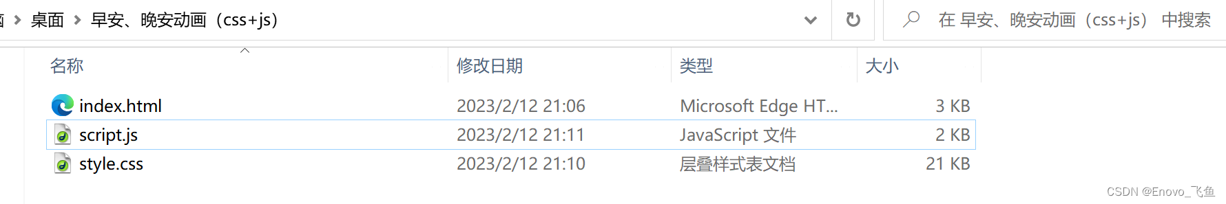
老规矩,先给朋友们看一下完整文件夹,
正确的文件如下图 ,复制源码的朋友们请注意了!!!
公众号获取源码
第一步,通过微信公众号下载源码压缩包,解压并打开文件夹,即为上图样式(复制源码请注意路径及文件名)
第二步,点击 html 文件 打开即可查看
2023年第二十二期,希望得到大家的喜欢🙇
也是新的系列,将会持续更新,🙇
希望大家有好的意见或者建议,欢迎私信
以上就是本篇文章的全部内容了
~ 关注我,点赞博文~ 每天带你涨知识!
1.看到这里了就 [点赞+好评+收藏] 三连 支持下吧,你的「点赞,好评,收藏」是我创作的动力。
2.关注我 ~ 每天带你学习 :各种前端插件、3D炫酷效果、图片展示、文字效果、以及整站模板 、HTML模板 、C++、数据结构、Python程序设计、Java程序设计、爬虫等! 「在这里有好多 开发者,一起探讨 前端 开发 知识,互相学习」!
3.以上内容技术相关问题可以相互学习,可 关 注 ↓公 Z 号 获取更多源码 !
获取源码?私信?关注?点赞?收藏?
👍+✏️+⭐️+🙇
有需要源码的小伙伴可以 关注下方微信公众号 " Enovo开发工厂 ",回复 关键词 " a-goodm "