ArkUI组件(续)
QRCode组件

用于显示单个二维码的组件。
说明
- 该组件从API Version 7开始支持。后续版本如有新增内容,则采用上角标单独标记该内容的起始版本。
- 二维码组件的像素点数量与内容有关,当组件尺寸过小时,可能出现无法展示内容的情况,此时需要适当调整组件尺寸。
子组件
无
接口
QRCode(value: string)
卡片能力: 从API version 9开始,该接口支持在ArkTS卡片中使用。
元服务API: 从API version 11开始,该接口支持在元服务中使用。
QRCode(value: string)参数:
| 参数名 | 参数类型 | 必填 | 参数描述 |
| value | string | 是 | 二维码内容字符串。最大支持256个字符,若超出,则截取前256个字符。 说明: 该字符串内容确保有效,不支持null、undefined以及空内容。 |
属性
除支持通用属性外,还支持以下属性:
color
color(value: ResourceColor)
设置二维码颜色。
卡片能力: 从API version 9开始,该接口支持在ArkTS卡片中使用。
元服务API: 从API version 11开始,该接口支持在元服务中使用。
系统能力: SystemCapability.ArkUI.ArkUI.Full
参数:
| 参数名 | 类型 | 必填 | 说明 |
| value | ResourceColor | 是 | 二维码颜色。默认值:'#ff182431' |
backgroundColor
backgroundColor(value: ResourceColor)
设置二维码背景颜色。
卡片能力: 从API version 9开始,该接口支持在ArkTS卡片中使用。
元服务API: 从API version 11开始,该接口支持在元服务中使用。
系统能力: SystemCapability.ArkUI.ArkUI.Full
参数:
| 参数名 | 类型 | 必填 | 说明 |
| value | ResourceColor | 是 | 二维码背景颜色。 默认值:Color.White 从API version 11开始,默认值改为'#ffffffff'。 |
contentOpacity11+
contentOpacity(value: number | Resource)
设置二维码内容颜色的不透明度。不透明度最小值为0,最大值为1。
元服务API: 从API version 12开始,该接口支持在元服务中使用。
系统能力: SystemCapability.ArkUI.ArkUI.Full
参数:
| 参数名 | 类型 | 必填 | 说明 |
| value | number | Resource | 是 | 二维码内容颜色的不透明度。 默认值:1 |
事件
通用事件支持点击事件、触摸事件、挂载卸载事件。
示例
// xxx.ets
@Entry
  @Component
  struct QRCodeExample {
    private value: string = 'hello world'
    build() {
      Column({ space: 5 }) {
        Text('normal').fontSize(9).width('90%').fontColor(0xCCCCCC).fontSize(30)
        QRCode(this.value).width(140).height(140)


        // 设置二维码颜色
        Text('color').fontSize(9).width('90%').fontColor(0xCCCCCC).fontSize(30)
        QRCode(this.value).color(0xF7CE00).width(140).height(140)


        // 设置二维码背景色
        Text('backgroundColor').fontSize(9).width('90%').fontColor(0xCCCCCC).fontSize(30)
        QRCode(this.value).width(140).height(140).backgroundColor(Color.Orange)


        // 设置二维码不透明度
        Text('contentOpacity').fontSize(9).width('90%').fontColor(0xCCCCCC).fontSize(30)
        QRCode(this.value).width(140).height(140).color(Color.Black).contentOpacity(0.1)
      }.width('100%').margin({ top: 5 })
    }
  }
Rating组件

评分组件,提供在给定范围内选择评分的组件。
说明
- 该组件从API Version 7开始支持。后续版本如有新增内容,则采用上角标单独标记该内容的起始版本。
子组件
无
接口
Rating(options?: { rating: number, indicator?: boolean })
卡片能力: 从API version 9开始,该接口支持在ArkTS卡片中使用。
元服务API: 从API version 11开始,该接口支持在元服务中使用。
参数:
| 参数名 | 参数类型 | 必填 | 参数描述 |
| rating | number | 是 | 设置并接收评分值。 默认值:0 取值范围: [0, stars] 小于0取0,大于stars取最大值stars。 从API version 10开始,该参数支持$$双向绑定变量。 |
| indicator | boolean | 否 | 设置评分组件作为指示器使用,不可改变评分。 默认值:false, 可进行评分 说明: indicator=true时,默认组件高度height=12.0vp,组件width=height * stars。 indicator=false时,默认组件高度height=28.0vp,组件width=height * stars。 |
属性
stars
stars(value: number)
设置评分总数。设置为小于等于0的值时,按默认值显示。
卡片能力: 从API version 9开始,该接口支持在ArkTS卡片中使用。
元服务API: 从API version 11开始,该接口支持在元服务中使用。
系统能力: SystemCapability.ArkUI.ArkUI.Full
参数:
| 参数名 | 类型 | 必填 | 说明 |
| value | number | 是 | 设置评分总数。 默认值:5 |
stepSize
stepSize(value: number)
设置操作评级的步长。设置为小于0.1的值时,按默认值显示。
卡片能力: 从API version 9开始,该接口支持在ArkTS卡片中使用。
元服务API: 从API version 11开始,该接口支持在元服务中使用。
系统能力: SystemCapability.ArkUI.ArkUI.Full
参数:
| 参数名 | 类型 | 必填 | 说明 |
| value | number | 是 | 操作评级的步长。 默认值:0.5 取值范围:[0.1, stars] |
starStyle
starStyle(value: { backgroundUri: string, foregroundUri: string, secondaryUri?: string })
设置评分的样式。该属性所支持的图片类型能力参考Image组件。
支持加载本地图片和网络图片,暂不支持PixelMap类型和Resource资源。
默认图片加载方式为异步,暂不支持同步加载。
卡片能力: 从API version 9开始,该接口支持在ArkTS卡片中使用。
元服务API: 从API version 11开始,该接口支持在元服务中使用。
系统能力: SystemCapability.ArkUI.ArkUI.Full
参数:
| 参数名 | 类型 | 必填 | 说明 |
| value | { backgroundUri: string, foregroundUri: string, secondaryUri?: string } | 是 | backgroundUri:未选中的星级的图片链接,可由用户自定义或使用系统默认图片。 foregroundUri:选中的星级的图片路径,可由用户自定义或使用系统默认图片。 secondaryUri:部分选中的星级的图片路径,可由用户自定义或使用系统默认图片。 说明: backgroundUri或者foregroundUri或者secondaryUri设置的图片路径错误时,图片不显示。 backgroundUri或者foregroundUri设置为undefined或者空字符串时,rating会选择加载系统默认星型图源。 secondaryUri不设置或者设置的值为undefined或者空字符串时,优先设置为backgroundUri,效果上等同于只设置了foregroundUri、backgroundUri。 |
说明
- rating宽高为[width, height]时,单个图片的绘制区域为[width / stars, height]。
- 为了指定绘制区域为方形,建议自定义宽高时采取[height * stars, height], width = height * stars的方式。
contentModifier12+
contentModifier(modifier: ContentModifier<RatingConfiguration>)
定制Rating内容区的方法。
元服务API: 从API version 12开始,该接口支持在元服务中使用。
系统能力: SystemCapability.ArkUI.ArkUI.Full
参数:
| 参数名 | 类型 | 必填 | 说明 |
| modifier | ContentModifier<RatingConfiguration> | 是 | 在Rating组件上,定制内容区的方法。 modifier: 内容修改器,开发者需要自定义class实现ContentModifier接口。 |
事件
onChange
onChange(callback:(value: number) => void)
操作评分条的评星发生改变时触发该回调。
卡片能力: 从API version 9开始,该接口支持在ArkTS卡片中使用。
元服务API: 从API version 11开始,该接口支持在元服务中使用。
系统能力: SystemCapability.ArkUI.ArkUI.Full
参数:
| 参数名 | 类型 | 必填 | 说明 |
| value | number | 是 | 评分条的评分。 |
键盘走焦规格
| 按键 | 功能描述 |
| Tab | 组件间切换焦点。 |
| 左右方向键 | 评分预览增加/减少(步长为step),不改变实际分值。 |
| Home | 移动到第一个星星, 不改变实际分值。 |
| End | 移动到最后一个星星, 不改变实际分值。 |
| Space/Enter | 根据当前评分提交评分结果。 |
RatingConfiguration12+对象说明
开发者需要自定义class实现ContentModifier接口。
元服务API: 从API version 12开始,该接口支持在元服务中使用。
| 参数名 | 类型 | 默认值 | 说明 |
| rating | number | 0 | 评分条当前评分数。 |
| indicator | boolean | false | 评分条是否作为一个指示器。 |
| stars | number | 5 | 评分条的星级总数。 |
| stepSize | number | 0.5 | 评分条的评分步长。 |
| triggerChange | Callback<number> | - | 触发评分数量变化。 |
示例
示例1
// xxx.ets
@Entry
@Component
struct RatingExample {
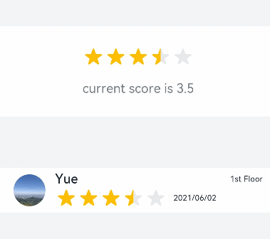
@State rating: number = 3.5
build() {
Column() {
Column() {
Rating({ rating: this.rating, indicator: false })
.stars(5)
.stepSize(0.5)
.margin({ top: 24 })
.onChange((value: number) => {
this.rating = value
})
Text('current score is ' + this.rating)
.fontSize(16)
.fontColor('rgba(24,36,49,0.60)')
.margin({ top: 16 })
}.width(360).height(113).backgroundColor('#FFFFFF').margin({ top: 68 })
Row() {
Image('common/testImage.jpg')
.width(40)
.height(40)
.borderRadius(20)
.margin({ left: 24 })
Column() {
Text('Yue')
.fontSize(16)
.fontColor('#182431')
.fontWeight(500)
Row() {
Rating({ rating: 3.5, indicator: false }).margin({ top: 1, right: 8 })
Text('2021/06/02')
.fontSize(10)
.fontColor('#182431')
}
}.margin({ left: 12 }).alignItems(HorizontalAlign.Start)
Text('1st Floor')
.fontSize(10)
.fontColor('#182431')
.position({ x: 295, y: 8 })
}.width(360).height(56).backgroundColor('#FFFFFF').margin({ top: 64 })
}.width('100%').height('100%').backgroundColor('#F1F3F5')
}
}
示例2
// xxx.ets
@Entry
  @Component
  struct RatingExample {
    @State rating: number = 3.5


    build() {
      Column() {
        Rating({ rating: this.rating, indicator: false })
          .stars(5)
          .stepSize(0.5)
          .starStyle({
            backgroundUri: '/common/imag1.png', // common目录与pages同级
            foregroundUri: '/common/imag2.png',
            secondaryUri: '/common/imag3.png'
          })
          .margin({ top: 24 })
          .onChange((value: number) => {
            this.rating = value
          })
        Text('current score is ' + this.rating)
          .fontSize(16)
          .fontColor('rgba(24,36,49,0.60)')
          .margin({ top: 16 })
      }.width('100%').height('100%').backgroundColor('#F1F3F5')
    }
  }
示例3
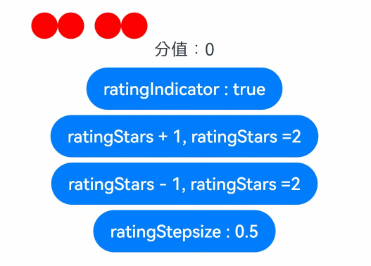
该示例实现了自定义评分条的功能,每个圆圈表示0.5分。ratingIndicator为true时表示评分条作为一个指示器不可改变评分;
为false时可以进行评分。ratingStars可改变评分总数。ratingStepsize可改变评分步长。
// xxx.ets
class MyRatingStyle implements ContentModifier<RatingConfiguration> {
  name: string = ""
  style: number = 0
  constructor(value1: string, value2: number) {
    this.name = value1
    this.style = value2
  }
  applyContent() : WrappedBuilder<[RatingConfiguration]> {
    return wrapBuilder(buildRating)
  }
}


@Builder function buildRating(config: RatingConfiguration) {
  Column() {
    Row() {
      Circle({ width: 25, height: 25 })
        .fill(config.rating >= 0.4 ? Color.Black : Color.Red)
        .onClick((event: ClickEvent) => {
          if (!config.indicator) {
            if (config.stepSize = 0.5) {
              config.triggerChange(0.5);
              return
            }
            if (config.stepSize = 1) {
              config.triggerChange(1);
              return
            }
          }
        }).visibility(config.stars >= 1 ? Visibility.Visible : Visibility.Hidden)
      Circle({ width: 25, height: 25 })
        .fill(config.rating >= 0.9 ? Color.Black : Color.Red)
        .onClick((event: ClickEvent) => {
          if (!config.indicator) {
            config.triggerChange(1);
          }
        }).visibility(config.stars >= 1 ? Visibility.Visible : Visibility.Hidden)
      Circle({ width: 25, height: 25 })
        .fill(config.rating >= 1.4 ? Color.Black : Color.Red)
        .onClick((event: ClickEvent) => {
          if (!config.indicator) {
            if (config.stepSize = 0.5) {
              config.triggerChange(1.5);
              return
            }
            if (config.stepSize = 1) {
              config.triggerChange(2);
              return
            }
          }
        }).visibility(config.stars >= 2 ? Visibility.Visible : Visibility.Hidden).margin({left:10})
      Circle({ width: 25, height: 25 })
        .fill(config.rating >= 1.9 ? Color.Black : Color.Red)
        .onClick((event: ClickEvent) => {
          if (!config.indicator) {
            config.triggerChange(2);
          }
        }).visibility(config.stars >= 2 ? Visibility.Visible : Visibility.Hidden)
      Circle({ width: 25, height: 25 })
        .fill(config.rating >= 2.4 ? Color.Black : Color.Red)
        .onClick((event: ClickEvent) => {
          if (!config.indicator) {
            if (config.stepSize = 0.5) {
              config.triggerChange(2.5);
              return
            }
            if (config.stepSize = 1) {
              config.triggerChange(3);
              return
            }
          }
        }).visibility(config.stars >= 3 ? Visibility.Visible : Visibility.Hidden).margin({left:10})
      Circle({ width: 25, height: 25 })
        .fill(config.rating >= 2.9 ? Color.Black : Color.Red)
        .onClick((event: ClickEvent) => {
          if (!config.indicator) {
            config.triggerChange(3);
          }
        }).visibility(config.stars >= 3 ? Visibility.Visible : Visibility.Hidden)
      Circle({ width: 25, height: 25 })
        .fill(config.rating >= 3.4 ? Color.Black : Color.Red)
        .onClick((event: ClickEvent) => {
          if (!config.indicator) {
            if (config.stepSize = 0.5) {
              config.triggerChange(3.5);
              return
            }
            if (config.stepSize = 1) {
              config.triggerChange(4);
              return
            }
          }
        }).visibility(config.stars >= 4 ? Visibility.Visible : Visibility.Hidden).margin({left:10})
      Circle({ width: 25, height: 25 })
        .fill(config.rating >= 3.9 ? Color.Black : Color.Red)
        .onClick((event: ClickEvent) => {
          if (!config.indicator) {
            config.triggerChange(4);
          }
        }).visibility(config.stars >= 4 ? Visibility.Visible : Visibility.Hidden)
      Circle({ width: 25, height: 25 })
        .fill(config.rating >= 4.4 ? Color.Black : Color.Red)
        .onClick((event: ClickEvent) => {
          if (!config.indicator) {
            if (config.stepSize = 0.5) {
              config.triggerChange(4.5);
              return
            }
            if (config.stepSize = 1) {
              config.triggerChange(5);
              return
            }
          }
        }).visibility(config.stars >= 5 ? Visibility.Visible : Visibility.Hidden).margin({left:10})
      Circle({ width: 25, height: 25 })
        .fill(config.rating >= 4.9 ? Color.Black : Color.Red)
        .onClick((event: ClickEvent) => {
          if (!config.indicator) {
            config.triggerChange(5);
          }
        }).visibility(config.stars >= 5 ? Visibility.Visible : Visibility.Hidden)
    }
    Text("分值:" + config.rating)
  }
}


@Entry
@Component
struct ratingExample {
  @State rating: number = 0;
  @State ratingIndicator: boolean = true;
  @State ratingStars: number = 0;
  @State ratingStepsize: number = 0.5;
  @State ratingEnabled: boolean = true;
  build() {
    Row() {
      Column() {
        Rating({
          rating: 0,
          indicator: this.ratingIndicator
        })
          .stepSize(this.ratingStepsize)
          .stars(this.ratingStars)
          .backgroundColor(Color.Transparent)
          .width('100%')
          .height(50)
          .onChange((value: number) => {
            console.info('Rating change is'+ value);
            this.rating = value
          })
          .contentModifier(new MyRatingStyle("hello", 3))
        Button(this.ratingIndicator ? "ratingIndicator : true" : "ratingIndicator : false")
          .onClick((event) => {
            if (this.ratingIndicator) {
              this.ratingIndicator = false
            } else {
              this.ratingIndicator = true
            }
          }).margin({top : 5})


        Button(this.ratingStars < 5 ? "ratingStars + 1, ratingStars =" + this.ratingStars : "ratingStars最大值为5")
          .onClick((event) => {
            if (this.ratingStars < 5) {
              this.ratingStars += 1
            }
          }).margin({top : 5})


        Button(this.ratingStars > 0 ? "ratingStars - 1, ratingStars =" + this.ratingStars : "ratingStars小于等于0时默认等于5")
          .onClick((event) => {
            if (this.ratingStars > 0) {
              this.ratingStars -= 1
            }
          }).margin({top : 5})


        Button(this.ratingStepsize == 0.5 ? "ratingStepsize : 0.5" : "ratingStepsize : 1")
          .onClick((event) => {
            if (this.ratingStepsize == 0.5) {
              this.ratingStepsize = 1
            } else {
              this.ratingStepsize = 0.5
            }
          }).margin({top : 5})
      }
      .width('100%')
      .height('100%')
      .justifyContent(FlexAlign.Center)
    }
    .height('100%')
  }
}
showToast

创建并显示文本提示框
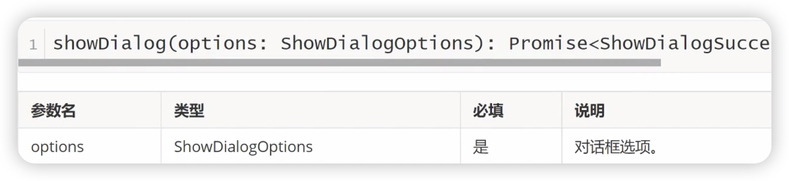
showToast(options: showToastOptions): void
文本提示框的选项:


import { promptAction } from '@kit.ArkUI';

@Entry
@Component
struct  Index {
  build() {
    Column() {
      Button('showToast')
        .fontSize(24)
        .padding(5)
        .onClick(() => {
          promptAction.showToast({
            message: '消息提示',
            duration: 1500,
            bottom: 200,
            alignment: Alignment.Center // Bottom
          })
        })
    }
    .width('100%')
  }
}
showDialog

创建并显示对话框,对话框响应后异步返回结果
对话框的选项:


import { promptAction } from '@kit.ArkUI';

@Entry
@Component
struct  Index {
  build() {
    Column() {
      Button('showDialog')
        .fontSize(24)
        .padding(5)
        .onClick(() => {
          promptAction.showDialog({
            title: '提示',
            message: '你确定要删除吗?',
            buttons: [
              {
                text: '取消',color: '#666'
              },
              {
                text: '确定',color: '#000'
              }
            ],
            alignment: DialogAlignment.Center,
            offset: {dx: 0, dy: 100},
            maskRect: {x: 0, y: 0, width: '100%', height: '100%'},
            isModal: true,
            backgroundColor: Color.White, // Brown
          }).then((data) => {
            console.info('click button', data.index)
          }).catch((error: Error) => {
            console.info('Error', error)
          })
        })
    }
    .width('100%')
  }
}
showActionMenu

创建并显示操作菜单,响应结果异步返回

操作菜单的选项:


import { promptAction } from '@kit.ArkUI';

@Entry
@Component
struct  Index {
  build() {
    Column() {
      Button('showDialog')
        .fontSize(24)
        .padding(5)
        .onClick(() => {
          promptAction.showActionMenu({
            title: '点菜',
            // 注意,buttons里的item项最多只能容纳6个
            buttons: [
              {
                text: '番茄炒鸡蛋',
                color: '#000'
              },
              {
                text: '番茄炒火腿',
                color: '#0002bf'
              },
            ],
            isModal: true,
          }, (err,data) => {
            console.log('当前点击了:' + data.index)
          })
        })
    }
    .width('100%')
  }
}
WaterFlow组件

瀑布流容器,由行和列分割的单元格所组成,通过容器自身的排列规则,将不同大小的项目自上而下,如瀑布流般紧密布局
瀑布流容器,由“行”和“列”分割的单元格所组成,通过容器自身的排列规则,将不同大小的“项目”自上而下,如瀑布般紧密布局。
说明
- 该组件从API Version 9 开始支持。后续版本如有新增内容,则采用上角标单独标记该内容的起始版本。
子组件
仅支持FlowItem子组件,支持渲染控制类型(if/else、ForEach、LazyForEach和Repeat)。
说明
- WaterFlow子组件的visibility属性设置为None时不显示,但该子组件周围的columnsGap、rowsGap、margin仍会生效。
接口
WaterFlow(options?: WaterFlowOptions)
元服务API: 从API version 11开始,该接口支持在元服务中使用。
系统能力: SystemCapability.ArkUI.ArkUI.Full
参数:
| 参数名 | 参数类型 | 必填 | 参数描述 |
| options | WaterFlowOptions | 否 | 瀑布流组件参数。 |
WaterFlowOptions对象说明
| 参数名 | 参数类型 | 必填 | 参数描述 |
| footer | CustomBuilder | 否 | 设置WaterFlow尾部组件。 元服务API: 从API version 11开始,该接口支持在元服务中使用。 |
| scroller | Scroller | 否 | 可滚动组件的控制器,与可滚动组件绑定。 说明: 不允许和其他滚动类组件,如:List、Grid、Scroll等绑定同一个滚动控制对象。 元服务API: 从API version 11开始,该接口支持在元服务中使用。 |
| sections12+ | WaterFlowSections | 否 | 设置FlowItem分组,实现同一个瀑布流组件内部各分组使用不同列数混合布局。 说明: 1. 使用分组混合布局时会忽略columnsTemplate和rowsTemplate属性。 2. 使用分组混合布局时不支持单独设置footer,可以使用最后一个分组作为尾部组件。 元服务API: 从API version 12开始,该接口支持在元服务中使用。 |
| layoutMode12+ | WaterFlowLayoutMode | 否 | 设置WaterFlow的布局模式,根据使用场景选择更切合的模式。 说明: 默认值:ALWAYS_TOP_DOWN。 元服务API: 从API version 12开始,该接口支持在元服务中使用。 |
WaterFlowSections12+
瀑布流分组信息。
constructor
constructor()
创建一个瀑布流分组。
元服务API: 从API version 12开始,该接口支持在元服务中使用。
系统能力: SystemCapability.ArkUI.ArkUI.Full
splice12+
splice(start: number, deleteCount?: number, sections?: Array<SectionOptions>): boolean
移除或者替换已存在的分组和/或添加新分组。
元服务API: 从API version 12开始,该接口支持在元服务中使用。
系统能力: SystemCapability.ArkUI.ArkUI.Full
参数:
| 名称 | 类型 | 必填 | 描述 |
| start | number | 是 | 从0开始计算的索引,会转换为整数,表示要开始改变分组的位置。 说明: 1. 如果索引是负数,则从末尾开始计算,使用start + WaterFlowSections.length()。 2. 如果 start < -WaterFlowSections.length(),则使用0。 3. 如果 start >= WaterFlowSections.length(),则在最后添加新分组。 |
| deleteCount | number | 否 | 表示要从start开始删除的分组数量。 说明: 1. 如果省略了deleteCount,或者其值大于或等于由start指定的位置到WaterFlowSections末尾的分组数量,那么从start到WaterFlowSections末尾的所有分组将被删除。 2. 如果deleteCount是0或者负数,则不会删除任何分组。 |
| sections | Array<SectionOptions > | 否 | 表示要从start开始加入的分组。如果不指定,splice()将只从瀑布流中删除分组。 |
返回值:
| 类型 | 说明 |
| boolean | 分组是否修改成功,要加入的分组中有任意分组的itemsCount不是正整数时返回false。 |
push12+
push(section: SectionOptions): boolean
将指定分组添加到瀑布流末尾。
元服务API: 从API version 12开始,该接口支持在元服务中使用。
系统能力: SystemCapability.ArkUI.ArkUI.Full
参数:
| 名称 | 类型 | 必填 | 描述 |
| section | SectionOptions | 是 | 添加到瀑布流末尾的分组。 |
返回值:
| 类型 | 说明 |
| boolean | 分组是否添加成功,新分组的itemsCount不是正整数时返回false。 |
update12+
update(sectionIndex: number, section: SectionOptions): boolean
修改指定索引分组的配置信息。
元服务API: 从API version 12开始,该接口支持在元服务中使用。
系统能力: SystemCapability.ArkUI.ArkUI.Full
参数:
| 名称 | 类型 | 必填 | 描述 |
| sectionIndex | number | 是 | 从0开始计算的索引,会转换为整数,表示要修改的分组的位置。 说明: 1. 如果索引是负数,则从末尾开始计算,使用sectionIndex + WaterFlowSections.length()。 2. 如果sectionIndex < -WaterFlowSections.length(),则使用0。 3. 如果sectionIndex >= WaterFlowSections.length(),则在最后添加新分组。 |
| section | SectionOptions | 是 | 新的分组信息。 |
返回值:
| 类型 | 说明 |
| boolean | 分组是否更新成功,新分组的itemsCount不是正整数时返回false。 |
values12+
values(): Array<SectionOptions>
获取瀑布流中所有分组配置信息。
元服务API: 从API version 12开始,该接口支持在元服务中使用。
系统能力: SystemCapability.ArkUI.ArkUI.Full
返回值:
| 类型 | 说明 |
| Array<SectionOptions > | 瀑布流中所有分组配置信息。 |
length12+
length(): number
获取瀑布流中分组数量。
元服务API: 从API version 12开始,该接口支持在元服务中使用。
系统能力: SystemCapability.ArkUI.ArkUI.Full
返回值:
| 类型 | 说明 |
| number | 瀑布流中分组数量。 |
SectionOptions12+
FlowItem分组配置信息。
元服务API: 从API version 12开始,该接口支持在元服务中使用。
系统能力: SystemCapability.ArkUI.ArkUI.Full
参数:
| 名称 | 类型 | 必填 | 描述 |
| itemsCount | number | 是 | 分组中FlowItem数量,必须是正整数。 |
| crossCount | number | 否 | 纵向布局时为列数,横向布局时为行数,默认值:1。 |
| columnsGap | Dimension | 否 | 该分组的列间距,不设置时使用瀑布流的columnsGap,设置非法值时使用0vp。 |
| rowsGap | Dimension | 否 | 该分组的行间距,不设置时使用瀑布流的rowsGap,设置非法值时使用0vp。 |
| margin | Margin | Dimension | 否 | 该分组的外边距参数为Length类型时,四个方向外边距同时生效。 默认值:0 单位:vp margin设置百分比时,上下左右外边距均以瀑布流的width作为基础值。 |
| onGetItemMainSizeByIndex | GetItemMainSizeByIndex | 否 | 瀑布流组件布局过程中获取指定index的FlowItem的主轴大小,纵向瀑布流时为高度,横向瀑布流时为宽度,单位vp。 说明: 1. 同时使用onGetItemMainSizeByIndex和FlowItem的宽高属性时,主轴大小以onGetItemMainSizeByIndex返回结果为准。 2. 使用onGetItemMainSizeByIndex可以提高瀑布流跳转到指定位置或index时的效率,避免混用设置onGetItemMainSizeByIndex和未设置的分组,会导致布局异常。 3. onGetItemMainSizeByIndex返回负数时FlowItem高度为0。 |
GetItemMainSizeByIndex12+
type GetItemMainSizeByIndex = (index: number) => number
根据index获取指定Item的主轴大小。
元服务API: 从API version 12开始,该接口支持在元服务中使用。
系统能力: SystemCapability.ArkUI.ArkUI.Full
参数:
| 名称 | 类型 | 必填 | 描述 |
| index | number | 是 | FlowItem在WaterFlow中的索引。 |
返回值:
| 类型 | 说明 |
| number | 指定index的FlowItem的主轴大小,纵向瀑布流时为高度,横向瀑布流时为宽度,单位vp。 |
WaterFlowLayoutMode12+枚举说明
元服务API: 从API version 12开始,该接口支持在元服务中使用。
系统能力: SystemCapability.ArkUI.ArkUI.Full
| 名称 | 枚举值 | 描述 |
| ALWAYS_TOP_DOWN | 0 | 默认的从上到下的布局模式。视窗内的FlowItem依赖视窗上方所有FlowItem的布局信息。因此跳转或切换列数时,需要计算出上方所有的FlowItem的布局信息。 |
| SLIDING_WINDOW | 1 | 移动窗口式的布局模式。只考虑视窗内的布局信息,对视窗上方的FlowItem没有依赖关系,因此向后跳转或切换列数时只需要布局视窗内的FlowItem。有频繁切换列数的场景的应用建议使用该模式。 说明: 1. 无动画跳转到较远的位置时,会以目标位置为基准,向前或向后布局FlowItem。这之后如果滑回跳转前的位置,内容的布局效果可能和之前不一致。 这个效果会导致跳转后回滑到顶部时,顶部节点可能不对齐。所以该布局模式下会在滑动到每个分组的顶部后自动调整布局,保证顶部对齐。 2. 该模式不支持使用滚动条,就算设置了滚动条也无法显示。 3. 不支持scroller的scrollTo接口。 4. 如果在同一帧内调用跳转(如无动画的scrollToIndex、scrollEdge)和输入偏移量(如滑动手势或滚动动画),两者都会生效。 |
属性
除支持通用属性和滚动组件通用属性外,还支持以下属性:
columnsTemplate
columnsTemplate(value: string)
设置当前瀑布流组件布局列的数量,不设置时默认1列。
例如, '1fr 1fr 2fr' 是将父组件分3列,将父组件允许的宽分为4等份,第一列占1份,第二列占1份,第三列占2份。
可使用columnsTemplate('repeat(auto-fill,track-size)')根据给定的列宽track-size自动计算列数,其中repeat、auto-fill为关键字,track-size为可设置的宽度,支持的单位包括px、vp、%或有效数字,默认单位为vp,使用方法参见示例2。
元服务API: 从API version 11开始,该接口支持在元服务中使用。
系统能力: SystemCapability.ArkUI.ArkUI.Full
参数:
| 参数名 | 类型 | 必填 | 说明 |
| value | string | 是 | 当前瀑布流组件布局列的数量。 默认值:'1fr' |
rowsTemplate
rowsTemplate(value: string)
设置当前瀑布流组件布局行的数量,不设置时默认1行。
例如, '1fr 1fr 2fr'是将父组件分三行,将父组件允许的高分为4等份,第一行占1份,第二行占一份,第三行占2份。
可使用rowsTemplate('repeat(auto-fill,track-size)')根据给定的行高track-size自动计算行数,其中repeat、auto-fill为关键字,track-size为可设置的高度,支持的单位包括px、vp、%或有效数字,默认单位为vp。
元服务API: 从API version 11开始,该接口支持在元服务中使用。
系统能力: SystemCapability.ArkUI.ArkUI.Full
参数:
| 参数名 | 类型 | 必填 | 说明 |
| value | string | 是 | 当前瀑布流组件布局行的数量。 默认值:'1fr' |
itemConstraintSize
itemConstraintSize(value: ConstraintSizeOptions)
设置约束尺寸,子组件布局时,进行尺寸范围限制。
元服务API: 从API version 11开始,该接口支持在元服务中使用。
系统能力: SystemCapability.ArkUI.ArkUI.Full
参数:
| 参数名 | 类型 | 必填 | 说明 |
| value | ConstraintSizeOptions | 是 | 约束尺寸。设置小于0的值,参数不生效。 说明: 1.同时设置itemConstraintSize和FlowItem的constraintSize属性时,minWidth/minHeight会取其中的最大值,maxWidth/maxHeight会取其中的最小值,调整后的值作为FlowItem的constraintSize处理。2.只设置itemConstraintSize时,相当于对WaterFlow所有子组件设置了相同的constraintSize。3.itemConstraintSize通过以上两种方式转换成FlowItem的constraintSize后的生效规则与通用属性constraintSize相同。 |
columnsGap
columnsGap(value: Length)
设置列与列的间距。
元服务API: 从API version 11开始,该接口支持在元服务中使用。
系统能力: SystemCapability.ArkUI.ArkUI.Full
参数:
| 参数名 | 类型 | 必填 | 说明 |
| value | Length | 是 | 列与列的间距。 默认值:0 |
rowsGap
rowsGap(value: Length)
设置行与行的间距。
元服务API: 从API version 11开始,该接口支持在元服务中使用。
系统能力: SystemCapability.ArkUI.ArkUI.Full
参数:
| 参数名 | 类型 | 必填 | 说明 |
| value | Length | 是 | 行与行的间距。 默认值:0 |
layoutDirection
layoutDirection(value: FlexDirection)
设置布局的主轴方向。
元服务API: 从API version 11开始,该接口支持在元服务中使用。
系统能力: SystemCapability.ArkUI.ArkUI.Full
参数:
| 参数名 | 类型 | 必填 | 说明 |
| value | FlexDirection | 是 | 布局的主轴方向。 默认值:FlexDirection.Column |
layoutDirection优先级高于rowsTemplate和columnsTemplate。根据layoutDirection设置情况,分为以下三种设置模式:
- layoutDirection设置纵向布局(FlexDirection.Column 或 FlexDirection.ColumnReverse)
此时columnsTemplate有效(如果未设置,取默认值)。例如columnsTemplate设置为"1fr 1fr"、rowsTemplate设置为"1fr 1fr 1fr"时,瀑布流组件纵向布局,辅轴均分成横向2列。
- layoutDirection设置横向布局(FlexDirection.Row 或 FlexDirection.RowReverse)
此时rowsTemplate有效(如果未设置,取默认值)。例如columnsTemplate设置为"1fr 1fr"、rowsTemplate设置为"1fr 1fr 1fr"时,瀑布流组件横向布局,辅轴均分成纵向3列。
- layoutDirection未设置布局方向
布局方向为layoutDirection的默认值:FlexDirection.Column,此时columnsTemplate有效。例如columnsTemplate设置为"1fr 1fr"、rowsTemplate设置为"1fr 1fr 1fr"时,瀑布流组件纵向布局,辅轴均分成横向2列。
enableScrollInteraction10+
enableScrollInteraction(value: boolean)
设置是否支持滚动手势,当设置为false时,无法通过手指或者鼠标滚动,但不影响控制器的滚动接口。
元服务API: 从API version 11开始,该接口支持在元服务中使用。
系统能力: SystemCapability.ArkUI.ArkUI.Full
参数:
| 参数名 | 类型 | 必填 | 说明 |
| value | boolean | 是 | 是否支持滚动手势。 默认值:true |
nestedScroll10+
nestedScroll(value: NestedScrollOptions)
设置向前向后两个方向上的嵌套滚动模式,实现与父组件的滚动联动。
元服务API: 从API version 11开始,该接口支持在元服务中使用。
系统能力: SystemCapability.ArkUI.ArkUI.Full
参数:
| 参数名 | 类型 | 必填 | 说明 |
| value | NestedScrollOptions | 是 | 嵌套滚动选项。 |
friction10+
friction(value: number | Resource)
设置摩擦系数,手动划动滚动区域时生效,只对惯性滚动过程有影响,对惯性滚动过程中的链式效果有间接影响。设置为小于等于0的值时,按默认值处理。
元服务API: 从API version 11开始,该接口支持在元服务中使用。
系统能力: SystemCapability.ArkUI.ArkUI.Full
参数:
| 参数名 | 类型 | 必填 | 说明 |
| value | number | Resource | 是 | 摩擦系数。 默认值:非可穿戴设备为0.6,可穿戴设备为0.9。 从API version 11开始,非可穿戴设备默认值为0.7。 从API version 12开始,非可穿戴设备默认值为0.75。 |
cachedCount11+
cachedCount(value: number)
设置预加载的FlowItem的数量,只在LazyForEach中生效。设置该属性后会缓存cachedCount个FlowItem。LazyForEach超出显示和缓存范围的FlowItem会被释放。设置为小于0的值时,按默认值显示。
元服务API: 从API version 12开始,该接口支持在元服务中使用。
系统能力: SystemCapability.ArkUI.ArkUI.Full
参数:
| 参数名 | 类型 | 必填 | 说明 |
| value | number | 是 | 预加载的FlowItem的数量。 默认值:1 |
事件
除支持通用事件和滚动组件通用事件外,还支持以下事件:
onReachStart
onReachStart(event: () => void)
瀑布流组件到达起始位置时触发。
元服务API: 从API version 11开始,该接口支持在元服务中使用。
系统能力: SystemCapability.ArkUI.ArkUI.Full
onReachEnd
onReachEnd(event: () => void)
瀑布流组件到底末尾位置时触发。
元服务API: 从API version 11开始,该接口支持在元服务中使用。
系统能力: SystemCapability.ArkUI.ArkUI.Full
onScrollFrameBegin10+
onScrollFrameBegin(event: (offset: number, state: ScrollState) => { offsetRemain: number; })
瀑布流开始滑动时触发,事件参数传入即将发生的滑动量,事件处理函数中可根据应用场景计算实际需要的滑动量并作为事件处理函数的返回值返回,瀑布流将按照返回值的实际滑动量进行滑动。
触发该事件的条件:手指拖动WaterFlow、WaterFlow惯性划动时每帧开始时触发;WaterFlow超出边缘回弹、使用滚动控制器和拖动滚动条的滚动不会触发。
元服务API: 从API version 11开始,该接口支持在元服务中使用。
系统能力: SystemCapability.ArkUI.ArkUI.Full
参数:
| 参数名 | 类型 | 必填 | 说明 |
| offset | number | 是 | 即将发生的滑动量,单位vp。 |
| state | ScrollState | 是 | 当前滑动状态。 |
返回值:
| 类型 | 说明 |
| { offsetRemain: number } | 实际滑动量,单位vp。 |
onScrollIndex11+
onScrollIndex(event: (first: number, last: number) => void)
当前瀑布流显示的起始位置/终止位置的子组件发生变化时触发。瀑布流初始化时会触发一次。
瀑布流显示区域上第一个子组件/最后一个组件的索引值有变化就会触发。
元服务API: 从API version 11开始,该接口支持在元服务中使用。
系统能力: SystemCapability.ArkUI.ArkUI.Full
参数:
| 参数名 | 类型 | 必填 | 说明 |
| first | number | 是 | 当前显示的瀑布流起始位置的索引值。 |
| last | number | 是 | 当前显示的瀑布流终止位置的索引值。 |
示例
示例1
WaterFlow的基本使用。
// WaterFlowDataSource.ets


// 实现IDataSource接口的对象,用于瀑布流组件加载数据
export class WaterFlowDataSource implements IDataSource {
  private dataArray: number[] = []
  private listeners: DataChangeListener[] = []


  constructor() {
    for (let i = 0; i < 100; i++) {
      this.dataArray.push(i)
    }
  }


  // 获取索引对应的数据
  public getData(index: number): number {
    return this.dataArray[index]
  }


  // 通知控制器数据重新加载
  notifyDataReload(): void {
    this.listeners.forEach(listener => {
      listener.onDataReloaded()
    })
  }


  // 通知控制器数据增加
  notifyDataAdd(index: number): void {
    this.listeners.forEach(listener => {
      listener.onDataAdd(index)
    })
  }


  // 通知控制器数据变化
  notifyDataChange(index: number): void {
    this.listeners.forEach(listener => {
      listener.onDataChange(index)
    })
  }


  // 通知控制器数据删除
  notifyDataDelete(index: number): void {
    this.listeners.forEach(listener => {
      listener.onDataDelete(index)
    })
  }


  // 通知控制器数据位置变化
  notifyDataMove(from: number, to: number): void {
    this.listeners.forEach(listener => {
      listener.onDataMove(from, to)
    })
  }


  //通知控制器数据批量修改
  notifyDatasetChange(operations: DataOperation[]): void {
    this.listeners.forEach(listener => {
      listener.onDatasetChange(operations);
    })
  }


  // 获取数据总数
  public totalCount(): number {
    return this.dataArray.length
  }


  // 注册改变数据的控制器
  registerDataChangeListener(listener: DataChangeListener): void {
    if (this.listeners.indexOf(listener) < 0) {
      this.listeners.push(listener)
    }
  }


  // 注销改变数据的控制器
  unregisterDataChangeListener(listener: DataChangeListener): void {
    const pos = this.listeners.indexOf(listener)
    if (pos >= 0) {
      this.listeners.splice(pos, 1)
    }
  }


  // 增加数据
  public add1stItem(): void {
    this.dataArray.splice(0, 0, this.dataArray.length)
    this.notifyDataAdd(0)
  }


  // 在数据尾部增加一个元素
  public addLastItem(): void {
    this.dataArray.splice(this.dataArray.length, 0, this.dataArray.length)
    this.notifyDataAdd(this.dataArray.length - 1)
  }


  // 在指定索引位置增加一个元素
  public addItem(index: number): void {
    this.dataArray.splice(index, 0, this.dataArray.length)
    this.notifyDataAdd(index)
  }


  // 删除第一个元素
  public delete1stItem(): void {
    this.dataArray.splice(0, 1)
    this.notifyDataDelete(0)
  }


  // 删除第二个元素
  public delete2ndItem(): void {
    this.dataArray.splice(1, 1)
    this.notifyDataDelete(1)
  }


  // 删除最后一个元素
  public deleteLastItem(): void {
    this.dataArray.splice(-1, 1)
    this.notifyDataDelete(this.dataArray.length)
  }


  // 在指定索引位置删除一个元素
  public deleteItem(index: number): void {
    this.dataArray.splice(index, 1)
    this.notifyDataDelete(index)
  }


  // 重新加载数据
  public reload(): void {
    this.dataArray.splice(1, 1)
    this.dataArray.splice(3, 2)
    this.notifyDataReload()
  }
}
// Index.ets
import { WaterFlowDataSource } from './WaterFlowDataSource'
@Entry
@Component
struct WaterFlowDemo {
@State minSize: number = 80
@State maxSize: number = 180
@State fontSize: number = 24
@State colors: number[] = [0xFFC0CB, 0xDA70D6, 0x6B8E23, 0x6A5ACD, 0x00FFFF, 0x00FF7F]
scroller: Scroller = new Scroller()
dataSource: WaterFlowDataSource = new WaterFlowDataSource()
private itemWidthArray: number[] = []
private itemHeightArray: number[] = []
// 计算FlowItem宽/高
getSize() {
let ret = Math.floor(Math.random() * this.maxSize)
return (ret > this.minSize ? ret : this.minSize)
}
// 设置FlowItem的宽/高数组
setItemSizeArray() {
for (let i = 0; i < 100; i++) {
this.itemWidthArray.push(this.getSize())
this.itemHeightArray.push(this.getSize())
}
}
aboutToAppear() {
this.setItemSizeArray()
}
@Builder
itemFoot() {
Column() {
Text(`Footer`)
.fontSize(10)
.backgroundColor(Color.Red)
.width(50)
.height(50)
.align(Alignment.Center)
.margin({ top: 2 })
}
}
build() {
Column({ space: 2 }) {
WaterFlow() {
LazyForEach(this.dataSource, (item: number) => {
FlowItem() {
Column() {
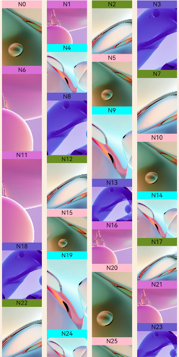
Text("N" + item).fontSize(12).height('16')
// 存在对应的jpg文件才会显示图片
Image('res/waterFlowTest(' + item % 5 + ').jpg')
.objectFit(ImageFit.Fill)
.width('100%')
.layoutWeight(1)
}
}
.onAppear(() => {
// 即将触底时提前增加数据
if (item + 20 == this.dataSource.totalCount()) {
for (let i = 0; i < 100; i++) {
this.dataSource.addLastItem()
}
}
})
.width('100%')
.height(this.itemHeightArray[item % 100])
.backgroundColor(this.colors[item % 5])
}, (item: string) => item)
}
.columnsTemplate("1fr 1fr")
.columnsGap(10)
.rowsGap(5)
.backgroundColor(0xFAEEE0)
.width('100%')
.height('100%')
.onReachStart(() => {
console.info('waterFlow reach start')
})
.onScrollStart(() => {
console.info('waterFlow scroll start')
})
.onScrollStop(() => {
console.info('waterFlow scroll stop')
})
.onScrollFrameBegin((offset: number, state: ScrollState) => {
console.info('waterFlow scrollFrameBegin offset: ' + offset + ' state: ' + state.toString())
return { offsetRemain: offset }
})
}
}
}
示例2
auto-fill的使用。
//index.ets
import { WaterFlowDataSource } from './WaterFlowDataSource'


@Entry
  @Component
  struct WaterFlowDemo {
    @State minSize: number = 80
    @State maxSize: number = 180
    @State colors: number[] = [0xFFC0CB, 0xDA70D6, 0x6B8E23, 0x6A5ACD, 0x00FFFF, 0x00FF7F]
    dataSource: WaterFlowDataSource = new WaterFlowDataSource()
    private itemWidthArray: number[] = []
    private itemHeightArray: number[] = []


    // 计算FlowItem宽/高
    getSize() {
      let ret = Math.floor(Math.random() * this.maxSize)
      return (ret > this.minSize ? ret : this.minSize)
    }


    // 设置FlowItem宽/高数组
    setItemSizeArray() {
      for (let i = 0; i < 100; i++) {
        this.itemWidthArray.push(this.getSize())
        this.itemHeightArray.push(this.getSize())
      }
    }


    aboutToAppear() {
      this.setItemSizeArray()
    }


    build() {
      Column({ space: 2 }) {
        WaterFlow() {
          LazyForEach(this.dataSource, (item: number) => {
            FlowItem() {
              Column() {
                Text("N" + item).fontSize(12).height('16')
                Image('res/waterFlowTest(' + item % 5 + ').jpg')
              }
            }
            .width('100%')
                      .height(this.itemHeightArray[item % 100])
                      .backgroundColor(this.colors[item % 5])
                      }, (item: string) => item)
        }
        .columnsTemplate('repeat(auto-fill,80)')
          .columnsGap(10)
          .rowsGap(5)
          .padding({left:5})
          .backgroundColor(0xFAEEE0)
          .width('100%')
          .height('100%')
      }
    }
  }
示例3
WaterFlowSections的使用。
// Index.ets
import { WaterFlowDataSource } from './WaterFlowDataSource'


@Reusable
  @Component
  struct ReusableFlowItem {
    @State item: number = 0


    // 从复用缓存中加入到组件树之前调用,可在此处更新组件的状态变量以展示正确的内容
    aboutToReuse(params: Record<string, number>) {
      this.item = params.item;
      console.info('Reuse item:' + this.item)
    }


    aboutToAppear() {
      console.info('new item:' + this.item)
    }


    build() {
      Image('res/waterFlowTest(' + this.item % 5 + ').jpg')
        .overlay('N' + this.item, { align: Alignment.Top })
        .objectFit(ImageFit.Fill)
        .width('100%')
        .layoutWeight(1)
    }
  }


@Entry
  @Component
  struct WaterFlowDemo {
    minSize: number = 80
    maxSize: number = 180
    fontSize: number = 24
    colors: number[] = [0xFFC0CB, 0xDA70D6, 0x6B8E23, 0x6A5ACD, 0x00FFFF, 0x00FF7F]
    scroller: Scroller = new Scroller()
    dataSource: WaterFlowDataSource = new WaterFlowDataSource()
    dataCount: number = this.dataSource.totalCount()
    private itemHeightArray: number[] = []
    @State sections: WaterFlowSections = new WaterFlowSections()
    sectionMargin: Margin = { top: 10, left: 5, bottom: 10, right: 5 }
    oneColumnSection: SectionOptions = {
      itemsCount: 4,
      crossCount: 1,
      columnsGap: '5vp',
      rowsGap: 10,
      margin: this.sectionMargin,
      onGetItemMainSizeByIndex: (index: number) => {
        return this.itemHeightArray[index % 100]
      }
    }
    twoColumnSection: SectionOptions = {
      itemsCount: 2,
      crossCount: 2,
      onGetItemMainSizeByIndex: (index: number) => {
        return 100
      }
    }
    lastSection: SectionOptions = {
      itemsCount: 20,
      crossCount: 2,
      onGetItemMainSizeByIndex: (index: number) => {
        return this.itemHeightArray[index % 100]
      }
    }


    // 计算FlowItem高度
    getSize() {
      let ret = Math.floor(Math.random() * this.maxSize)
      return (ret > this.minSize ? ret : this.minSize)
    }


    // 设置FlowItem的高度数组
    setItemSizeArray() {
      for (let i = 0; i < 100; i++) {
        this.itemHeightArray.push(this.getSize())
      }
    }


    aboutToAppear() {
      this.setItemSizeArray()
      // 初始化瀑布流分组信息
      let sectionOptions: SectionOptions[] = []
      let count = 0
      let oneOrTwo = 0
      while (count < this.dataCount) {
        if (this.dataCount - count < 20) {
          this.lastSection.itemsCount = this.dataCount - count
          sectionOptions.push(this.lastSection)
          break;
        }
        if (oneOrTwo++ % 2 == 0) {
          sectionOptions.push(this.oneColumnSection)
          count += this.oneColumnSection.itemsCount
        } else {
          sectionOptions.push(this.twoColumnSection)
          count += this.twoColumnSection.itemsCount
        }
      }
      this.sections.splice(0, 0, sectionOptions)
    }


    build() {
      Column({ space: 2 }) {
        Row() {
          Button('splice')
            .height('5%')
            .onClick(() => {
              // 将所有分组替换成一个新分组,注意保证LazyForEach中数据数量和新分组itemsCount保持一致
              let totalCount: number = this.dataSource.totalCount()
              let newSection: SectionOptions = {
                itemsCount: totalCount,
              crossCount: 2,
              onGetItemMainSizeByIndex: (index: number) => {
                return this.itemHeightArray[index % 100]
              }
            }
            let oldLength: number = this.sections.length()
            this.sections.splice(0, oldLength, [newSection])
          })
          .margin({ top: 10, left: 20 })
        Button('update')
          .height('5%')
          .onClick(() => {
            // 在第二个分组增加4个FlowItem,注意保证LazyForEach中数据数量和所有分组itemsCount的和保持一致
            let newSection: SectionOptions = {
              itemsCount: 6,
              crossCount: 3,
              columnsGap: 5,
              rowsGap: 10,
              margin: this.sectionMargin,
              onGetItemMainSizeByIndex: (index: number) => {
                return this.itemHeightArray[index % 100]
              }
            }
            this.dataSource.addItem(this.oneColumnSection.itemsCount)
            this.dataSource.addItem(this.oneColumnSection.itemsCount + 1)
            this.dataSource.addItem(this.oneColumnSection.itemsCount + 2)
            this.dataSource.addItem(this.oneColumnSection.itemsCount + 3)
            const result: boolean = this.sections.update(1, newSection)
            console.info('update:' + result)
          })
          .margin({ top: 10, left: 20 })
        Button('delete')
          .height('5%')
          .onClick(() => {
            // 先点击update再点击delete
            let newSection: SectionOptions = {
              itemsCount: 2,
              crossCount: 2,
              columnsGap: 5,
              rowsGap: 10,
              margin: this.sectionMargin,
              onGetItemMainSizeByIndex: (index: number) => {
                return this.itemHeightArray[index % 100]
              }
            }
            this.dataSource.deleteItem(this.oneColumnSection.itemsCount)
            this.dataSource.deleteItem(this.oneColumnSection.itemsCount)
            this.dataSource.deleteItem(this.oneColumnSection.itemsCount)
            this.dataSource.deleteItem(this.oneColumnSection.itemsCount)
            this.sections.update(1, newSection)
          })
          .margin({ top: 10, left: 20 })
        Button('values')
          .height('5%')
          .onClick(() => {
            const sections: Array<SectionOptions> = this.sections.values();
            for (const value of sections) {
              console.log(JSON.stringify(value));
            }
            console.info('count:' + this.sections.length())
          })
          .margin({ top: 10, left: 20 })
      }.margin({ bottom: 20 })


      WaterFlow({ scroller: this.scroller, sections: this.sections }) {
        LazyForEach(this.dataSource, (item: number) => {
          FlowItem() {
            ReusableFlowItem({ item: item })
          }
          .width('100%')
          // 以onGetItemMainSizeByIndex为准
          // .height(this.itemHeightArray[item % 100])
          .backgroundColor(this.colors[item % 5])
        }, (item: string) => item)
      }
      .columnsTemplate('1fr 1fr') // 瀑布流使用sections参数时该属性无效
      .columnsGap(10)
      .rowsGap(5)
      .backgroundColor(0xFAEEE0)
      .width('100%')
      .height('100%')
      .layoutWeight(1)
      .onScrollIndex((first: number, last: number) => {
        // 即将触底时提前增加数据
        if (last + 20 >= this.dataSource.totalCount()) {
          for (let i = 0; i < 100; i++) {
            this.dataSource.addLastItem()
          }
          // 更新数据源后同步更新sections,修改最后一个section的FlowItem数量
          const sections: Array<SectionOptions> = this.sections.values();
          let newSection: SectionOptions = sections[this.sections.length() - 1];
          newSection.itemsCount += 100;
          this.sections.update(-1, newSection);
        }
      })
    }
  }
}
示例4
双指缩放改变列数。
// Index.ets
import { WaterFlowDataSource } from './WaterFlowDataSource'


@Reusable
  @Component
  struct ReusableFlowItem {
    @State item: number = 0


    // 从复用缓存中加入到组件树之前调用,可在此处更新组件的状态变量以展示正确的内容
    aboutToReuse(params: Record<string, number>) {
      this.item = params.item;
      console.info('Reuse item:' + this.item)
    }


    aboutToAppear() {
      console.info('item:' + this.item)
    }


    build() {
      Column() {
        Text("N" + this.item).fontSize(12).height('16')
        Image('res/waterFlow (' + this.item % 5 + ').JPG')
          .objectFit(ImageFit.Fill)
          .width('100%')
          .layoutWeight(1)
      }
    }
  }


@Entry
  @Component
  struct WaterFlowDemo {
    minSize: number = 80
    maxSize: number = 180
    colors: number[] = [0xFFC0CB, 0xDA70D6, 0x6B8E23, 0x6A5ACD, 0x00FFFF, 0x00FF7F]
    @State columns: number = 2
    dataSource: WaterFlowDataSource = new WaterFlowDataSource()
    private itemWidthArray: number[] = []
    private itemHeightArray: number[] = []


    // 计算FlowItem宽/高
    getSize() {
      let ret = Math.floor(Math.random() * this.maxSize)
      return (ret > this.minSize ? ret : this.minSize)
    }


    // 设置FlowItem的宽/高数组
    setItemSizeArray() {
      for (let i = 0; i < 100; i++) {
        this.itemWidthArray.push(this.getSize())
        this.itemHeightArray.push(this.getSize())
      }
    }


    aboutToAppear() {
      let lastCount = AppStorage.get<number>('columnsCount')
      if (typeof lastCount != 'undefined') {
        this.columns = lastCount
      }
      this.setItemSizeArray()
    }


    build() {
      Column({ space: 2 }) {
        Row() {
          Text('双指缩放改变列数')
            .height('5%')
            .margin({ top: 10, left: 20 })
        }


        WaterFlow() {
          LazyForEach(this.dataSource, (item: number) => {
            FlowItem() {
              ReusableFlowItem({ item: item })
            }
            .width('100%')
                      .height(this.itemHeightArray[item % 100])
                      .backgroundColor(this.colors[item % 5])
                      }, (item: string) => item)
        }
        .columnsTemplate('1fr '.repeat(this.columns))
          .columnsGap(10)
          .rowsGap(5)
          .backgroundColor(0xFAEEE0)
          .width('100%')
          .height('100%')
          .layoutWeight(1)
          // 切换列数item位置重排动画
          .animation({
            duration: 300,
            curve: Curve.Smooth
          })
          .priorityGesture(
            PinchGesture()
            .onActionEnd((event: GestureEvent) => {
              console.info('end scale:' + event.scale)
              // 手指分开,减少列数以放大item,触发阈值可以自定义,示例为2
              if (event.scale > 2) {
                this.columns--
              } else if (event.scale < 0.6) {
                this.columns++
              }
              // 可以根据设备屏幕宽度设定最大和最小列数,此处以最小1列最大4列为例
              this.columns = Math.min(4, Math.max(1, this.columns));
              AppStorage.setOrCreate<number>('columnsCount', this.columns)
            })
          )
      }
    }
  }


![[论文笔记]MRRNET](https://i-blog.csdnimg.cn/direct/a29e56138dac492c80bdf34db25c3cb8.png)


