st.map
显示一张叠加了散点图的地图。
它是 st.pydeck_chart 的包装器,用于在地图上快速创建散点图表,并具有自动居中和自动缩放功能。
使用该命令时,Mapbox 会提供地图瓦片来渲染地图内容。请注意,Mapbox 是第三方产品,Streamlit 不对 Mapbox 或 Mapbox 提供的任何内容或信息承担任何责任。
Mapbox 要求用户注册并提供一个令牌,然后用户才能请求地图碎片。目前,Streamlit 会为您提供该令牌,但该令牌随时可能变更。我们强烈建议所有用户创建并使用自己的个人 Mapbox 令牌,以免影响使用体验。您可以使用 mapbox.token 配置选项来创建。Mapbox 的使用受 Mapbox 使用条款的约束。
要为自己获取一个令牌,请在 https://mapbox.com 上创建一个帐户。有关如何设置配置选项的更多信息,请参阅https://docs.streamlit.io/library/advanced-features/configuration。
| Function signature[source] | |
|---|---|
| st.map(data=None, *, latitude=None, longitude=None, color=None, size=None, zoom=None, use_container_width=True) | |
| Parameters | |
| data (pandas.DataFrame, pandas.Styler, pyarrow.Table, pyspark.sql.DataFrame, snowflake.snowpark.dataframe.DataFrame, snowflake.snowpark.table.Table, Iterable, dict, or None) | The data to be plotted. |
| latitude (str or None) | The name of the column containing the latitude coordinates of the datapoints in the chart. If None, the latitude data will come from any column named 'lat', 'latitude', 'LAT', or 'LATITUDE'. |
| longitude (str or None) | The name of the column containing the longitude coordinates of the datapoints in the chart. If None, the longitude data will come from any column named 'lon', 'longitude', 'LON', or 'LONGITUDE'. |
| color (str or tuple or None) | The color of the circles representing each datapoint. Can be:
|
| size (str or float or None) | The size of the circles representing each point, in meters. This can be:
|
| zoom (int) | Zoom level as specified in https://wiki.openstreetmap.org/wiki/Zoom_levels. |
| use_container_width (bool) | Whether to override the map's native width with the width of the parent container. If use_container_width is False (default), Streamlit sets the width of the chart to fit its contents according to the plotting library, up to the width of the parent container. If use_container_width is True, Streamlit sets the width of the map to match the width of the parent container. |
代码
这段代码使用了Streamlit库来创建一个交互式地图。首先,它导入了streamlit、pandas和numpy库。然后,它创建了一个包含随机数据的DataFrame,其中包括1000行和2列,列名分别为'lat'和'lon'。随后,使用np.random.randn函数生成了随机数据,并使用除以[50, 50]和加上[37.76, -122.4]的操作对数据进行转换。最后,使用st.map函数将DataFrame中的经纬度数据显示在地图上。
import streamlit as st
import pandas as pd
import numpy as np


df = pd.DataFrame(
    np.random.randn(1000, 2) / [50, 50] + [37.76, -122.4],
    columns=['lat', 'lon'])

st.map(df)
您还可以自定义数据点的大小和颜色:
st.map(df, size=20, color='#0044ff')最后,您还可以为经纬度组件选择不同的列,并根据其他列动态设置每个数据点的大小和颜色:
这段代码使用了Streamlit库来创建一个交互式地图。首先,它导入了streamlit、pandas和numpy库。然后,它使用pandas和numpy创建了一个包含四列数据的DataFrame。接下来,它使用streamlit的map函数来将DataFrame中的数据显示在地图上。它指定了经度列为'col1',纬度列为'col2',大小列为'col3',颜色列为'col4'。这样就可以在地图上显示数据的位置、大小和颜色,使用户可以通过交互方式来探索数据。
import streamlit as st
import pandas as pd
import numpy as np

df = pd.DataFrame({
    "col1": np.random.randn(1000) / 50 + 37.76,
    "col2": np.random.randn(1000) / 50 + -122.4,
    "col3": np.random.randn(1000) * 100,
    "col4": np.random.rand(1000, 4).tolist(),
})

st.map(df,
    latitude='col1',
    longitude='col2',
    size='col3',
    color='col4')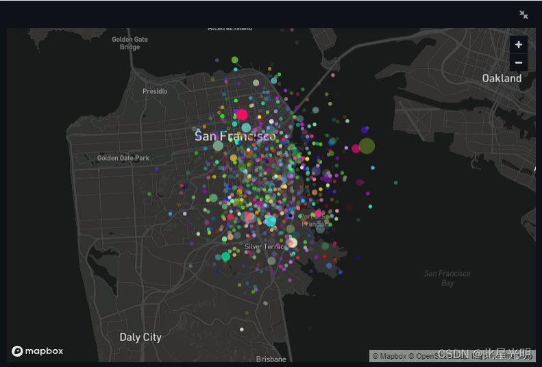
element.add_rows
将一个数据帧连接到当前数据帧的底部。
import streamlit as st
import pandas as pd
import numpy as np

df1 = pd.DataFrame(np.random.randn(50, 20), columns=("col %d" % i for i in range(20)))

my_table = st.table(df1)

df2 = pd.DataFrame(np.random.randn(50, 20), columns=("col %d" % i for i in range(20)))

my_table.add_rows(df2)
# Now the table shown in the Streamlit app contains the data for
# df1 followed by the data for df2.
您也可以对曲线图做同样的处理。例如,如果您想在折线图中添加更多数据:
# Assuming df1 and df2 from the example above still exist...
my_chart = st.line_chart(df1)
my_chart.add_rows(df2)
# Now the chart shown in the Streamlit app contains the data for
# df1 followed by the data for df2.
对于数据集已命名的绘图,可以使用关键字参数传递数据,关键字就是名称:
# Assuming df1 and df2 from the example above still exist...
my_chart = st.line_chart(df1)
my_chart.add_rows(df2)
# Now the chart shown in the Streamlit app contains the data for
# df1 followed by the data for df2.
st.altair_chart
使用 Vega-Altair 库显示图表。
Vega-Altair 是基于 Vega 和 Vega-Lite 的 Python 声明式统计可视化库。
| Function signature[source] | |
|---|---|
| st.altair_chart(altair_chart, *, use_container_width=False, theme="streamlit", key=None, on_select="ignore", selection_mode=None) | |
| Returns | |
| (element or dict) | If on_select is "ignore" (default), this method returns an internal placeholder for the chart element that can be used with the .add_rows() method. Otherwise, this method returns a dictionary-like object that supports both key and attribute notation. The attributes are described by the VegaLiteState dictionary schema. |
| Parameters | |
| altair_chart (altair.Chart) | The Altair chart object to display. See Example Gallery — Vega-Altair 5.3.0 documentation for examples of graph descriptions. |
| use_container_width (bool) | Whether to override the figure's native width with the width of the parent container. If use_container_width is False (default), Streamlit sets the width of the chart to fit its contents according to the plotting library, up to the width of the parent container. If use_container_width is True, Streamlit sets the width of the figure to match the width of the parent container. |
| theme ("streamlit" or None) | The theme of the chart. If theme is "streamlit" (default), Streamlit uses its own design default. If theme is None, Streamlit falls back to the default behavior of the library. |
| key (str) | An optional string to use for giving this element a stable identity. If key is None (default), this element's identity will be determined based on the values of the other parameters. Additionally, if selections are activated and key is provided, Streamlit will register the key in Session State to store the selection state. The selection state is read-only. |
| on_select ("ignore", "rerun", or callable) | How the figure should respond to user selection events. This controls whether or not the figure behaves like an input widget. on_select can be one of the following:
To use selection events, the object passed to altair_chart must include selection paramters. To learn about defining interactions in Altair and how to declare selection-type parameters, see Interactive Charts in Altair's documentation. |
| selection_mode (str or Iterable of str) | The selection parameters Streamlit should use. If selection_mode is None (default), Streamlit will use all selection parameters defined in the chart's Altair spec. When Streamlit uses a selection parameter, selections from that parameter will trigger a rerun and be included in the selection state. When Streamlit does not use a selection parameter, selections from that parameter will not trigger a rerun and not be included in the selection state. Selection parameters are identified by their name property. |
代码
import streamlit as st
import pandas as pd
import numpy as np
import altair as alt

chart_data = pd.DataFrame(np.random.randn(20, 3), columns=["a", "b", "c"])

c = (
   alt.Chart(chart_data)
   .mark_circle()
   .encode(x="a", y="b", size="c", color="c", tooltip=["a", "b", "c"])
)

st.altair_chart(c, use_container_width=True)
这段代码使用了Streamlit库来创建一个交互式的数据可视化应用。首先导入了所需的库,包括streamlit、pandas、numpy和altair。然后创建了一个包含随机数据的DataFrame,并使用Altair库创建了一个散点图。散点图的x轴和y轴分别对应DataFrame中的"a"和"b"列,点的大小和颜色分别对应DataFrame中的"c"列,同时鼠标悬停在点上时会显示"a"、"b"和"c"的数值。最后使用streamlit的altair_chart函数将这个图表展示在应用中,并设置了use_container_width=True以自适应容器宽度。

Chart selections
VegaLiteState
流式版本
Vega-Lite 事件状态的模式。
事件状态存储在一个类似字典的对象中,该对象同时支持键和属性符号。事件状态不能通过会话状态进行编程更改或设置。
目前只支持选择事件。
代码
以下两个示例具有等效定义。每个示例的图表定义中都包含一个点和区间选择参数。点选择参数名为 "point_selection"(点选择)。区间或方框选择参数名为 "interval_selection"。
下面的示例使用的是 st.altair_chart:
import streamlit as st
import pandas as pd
import numpy as np
import altair as alt

if "data" not in st.session_state:
    st.session_state.data = pd.DataFrame(
        np.random.randn(20, 3), columns=["a", "b", "c"]
    )
df = st.session_state.data

point_selector = alt.selection_point("point_selection")
interval_selector = alt.selection_interval("interval_selection")
chart = (
    alt.Chart(df)
    .mark_circle()
    .encode(
        x="a",
        y="b",
        size="c",
        color="c",
        tooltip=["a", "b", "c"],
        fillOpacity=alt.condition(point_selector, alt.value(1), alt.value(0.3)),
    )
    .add_params(point_selector, interval_selector)
)

event = st.altair_chart(chart, key="alt_chart", on_select="rerun")

event
这段代码使用了Streamlit和Altair库来创建一个交互式数据可视化界面。首先,代码导入了所需的库:streamlit、pandas、numpy和altair。
接下来,代码检查了会话状态中是否存在名为"data"的数据。如果不存在,就创建一个包含20行3列随机数的DataFrame,并将其存储在会话状态中。然后,将数据存储在变量df中。
接着,代码创建了两个选择器:point_selector和interval_selector。point_selector用于选择单个数据点,而interval_selector用于选择数据区间。
然后,代码使用Altair库创建了一个散点图。散点图的x轴和y轴分别对应DataFrame中的"a"和"b"列,点的大小和颜色分别对应DataFrame中的"c"列。另外,还添加了tooltip来显示数据点的具体数值,并设置了点的透明度,根据选择器的状态来调整透明度。
最后,代码使用Streamlit的altair_chart函数将图表显示在界面上,并添加了on_select参数来指定当用户进行选择操作时触发重新运行。最后一行代码将事件显示在界面上。
下面的示例使用了 st.vega_lite_chart:
import streamlit as st
import pandas as pd
import numpy as np

if "data" not in st.session_state:
    st.session_state.data = pd.DataFrame(
        np.random.randn(20, 3), columns=["a", "b", "c"]
    )

spec = {
    "mark": {"type": "circle", "tooltip": True},
    "params": [
        {"name": "interval_selection", "select": "interval"},
        {"name": "point_selection", "select": "point"},
    ],
    "encoding": {
        "x": {"field": "a", "type": "quantitative"},
        "y": {"field": "b", "type": "quantitative"},
        "size": {"field": "c", "type": "quantitative"},
        "color": {"field": "c", "type": "quantitative"},
        "fillOpacity": {
            "condition": {"param": "point_selection", "value": 1},
            "value": 0.3,
        },
    },
}

event = st.vega_lite_chart(st.session_state.data, spec, key="vega_chart", on_select="rerun")

event
请尝试在这个交互式示例中选择点。单击点时,选择将显示在属性 "point_selection "下,这是点选择参数的名称。同样,当您进行区间选择时,它将显示在属性 "interval_selection "下。如果需要,您还可以为选择参数赋予其他名称。
如果在选择点时按住 Shift 键,现有的点选择将被保留。在进行其他选择时,不会保留区间选择。

element.add_rows
import streamlit as st
import pandas as pd
import numpy as np

df1 = pd.DataFrame(np.random.randn(50, 20), columns=("col %d" % i for i in range(20)))

my_table = st.table(df1)

df2 = pd.DataFrame(np.random.randn(50, 20), columns=("col %d" % i for i in range(20)))

my_table.add_rows(df2)
# Now the table shown in the Streamlit app contains the data for
# df1 followed by the data for df2.
您也可以对曲线图做同样的处理。例如,如果您想在折线图中添加更多数据:
# Assuming df1 and df2 from the example above still exist...
my_chart = st.line_chart(df1)
my_chart.add_rows(df2)
# Now the chart shown in the Streamlit app contains the data for
# df1 followed by the data for df2.
对于数据集已命名的绘图,可以使用关键字参数传递数据,关键字就是名称:
my_chart = st.vega_lite_chart({
    'mark': 'line',
    'encoding': {'x': 'a', 'y': 'b'},
    'datasets': {
      'some_fancy_name': df1,  # <-- named dataset
     },
    'data': {'name': 'some_fancy_name'},
}),
my_chart.add_rows(some_fancy_name=df2)  # <-- name used as keyword
设计
Altair 图表默认使用 Streamlit 主题显示。该主题时尚、用户友好,并采用了 Streamlit 的调色板。这样做的额外好处是,图表可以更好地与应用程序的其他设计融为一体。
从 Streamlit 1.16.0 开始,Streamlit 主题可通过 theme="streamlit" 关键字参数使用。要禁用它并使用 Altair 的本地主题,请使用 theme=None 代替。
让我们来看一个使用 Streamlit 主题和 Altair 原生主题的图表示例:
代码
import altair as alt
from vega_datasets import data

source = data.cars()

chart = alt.Chart(source).mark_circle().encode(
    x='Horsepower',
    y='Miles_per_Gallon',
    color='Origin',
).interactive()

tab1, tab2 = st.tabs(["Streamlit theme (default)", "Altair native theme"])

with tab1:
    # Use the Streamlit theme.
    # This is the default. So you can also omit the theme argument.
    st.altair_chart(chart, theme="streamlit", use_container_width=True)
with tab2:
    # Use the native Altair theme.
    st.altair_chart(chart, theme=None, use_container_width=True)
点击下面互动应用程序中的标签,查看启用和禁用 Streamlit 主题的图表。


如果您想知道自己的自定义配置是否仍会被考虑在内,不用担心!您仍然可以更改图表配置。换句话说,虽然我们现在默认启用了 Streamlit 主题,但你可以用自定义颜色或字体覆盖它。例如,如果你想让图表线变成绿色而不是默认的红色,你就可以这么做!
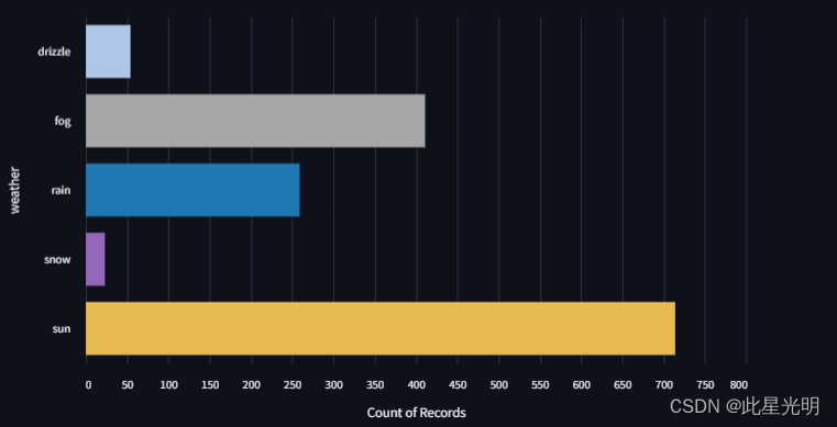
下面是一个 Altair 图表的示例,其中手动传递了颜色并得到了反映:
import altair as alt
import streamlit as st
from vega_datasets import data

source = data.seattle_weather()

scale = alt.Scale(
    domain=["sun", "fog", "drizzle", "rain", "snow"],
    range=["#e7ba52", "#a7a7a7", "#aec7e8", "#1f77b4", "#9467bd"],
)
color = alt.Color("weather:N", scale=scale)

# We create two selections:
# - a brush that is active on the top panel
# - a multi-click that is active on the bottom panel
brush = alt.selection_interval(encodings=["x"])
click = alt.selection_multi(encodings=["color"])

# Top panel is scatter plot of temperature vs time
points = (
    alt.Chart()
    .mark_point()
    .encode(
        alt.X("monthdate(date):T", title="Date"),
        alt.Y(
            "temp_max:Q",
            title="Maximum Daily Temperature (C)",
            scale=alt.Scale(domain=[-5, 40]),
        ),
        color=alt.condition(brush, color, alt.value("lightgray")),
        size=alt.Size("precipitation:Q", scale=alt.Scale(range=[5, 200])),
    )
    .properties(width=550, height=300)
    .add_selection(brush)
    .transform_filter(click)
)

# Bottom panel is a bar chart of weather type
bars = (
    alt.Chart()
    .mark_bar()
    .encode(
        x="count()",
        y="weather:N",
        color=alt.condition(click, color, alt.value("lightgray")),
    )
    .transform_filter(brush)
    .properties(
        width=550,
    )
    .add_selection(click)
)

chart = alt.vconcat(points, bars, data=source, title="Seattle Weather: 2012-2015")

tab1, tab2 = st.tabs(["Streamlit theme (default)", "Altair native theme"])

with tab1:
    st.altair_chart(chart, theme="streamlit", use_container_width=True)
with tab2:
    st.altair_chart(chart, theme=None, use_container_width=True)
请注意,即使启用了 Streamlit 主题,自定义颜色仍然反映在图表中 👇 。

柱状图