目录
1. MaterialApp
1.1 组件定义
1.2 主要功能和属性
1.3 示例
2. 脚手架 Scaffold
2.1 定义
2.2 Scaffold 的属性
2.3 示例
PS: 对于 Scaffold 和 MaterialApp
3. 线性布局 Column Row
3.1 Row
3.2 Column
4. 盒模型 Box Model
4.1 定义
4.2 示例
5. 容器 Container
5.1 定义
5.2 示例
6. 弹性布局 Flex
6.1 Flex
6.2 Expanded
6.3 留白 Spacer
7. 层叠布局 Stack
7.1 Stack
7.2 Positioned
7.3 示例
8. 流式布局 Wrap
8.1 定义
8.2 示例
9. 对齐定位 Align
9.1 Align
9.2 Alignment
9.3 FractionalOffset
9.4 Center
博主wx:yuanlai45_csdn 博主qq:2777137742
后期会创建粉丝群,为同学们提供分享交流平台以及提供官方发送的福利奖品~
1. MaterialApp
1.1 组件定义
Material 风格的程序的构建,当然相对应的是 ios 风格是 CupertinoApp
MaterialApp class - material library - Dart API
CupertinoApp class - cupertino library - Dart API
MaterialApp 是整个应用的根组件,它提供了应用的基础配置和框架。它承担了设定应用主题、路由以及其他全局配置的责任。
1.2 主要功能和属性
- title: 应用的标题,通常在任务管理器中显示
- theme: 应用的全局主题,定义了颜色、字体等统一样式
- home: 应用启动时的默认页面或根页面
- routes: 定义命名路由,用于应用内导航
- navigatorKey: 全局唯一的
Navigator,用于导航管理 - locale: 用于指定应用语言和区域的
Locale - localizationsDelegates: 本地化的代理,用于支持多语言
- debugShowCheckedModeBanner: 控制是否显示调试模式横幅
const MaterialApp({
  Key key,
  // 导航键 , key的作用提高复用性能
  this.navigatorKey,
  // 主页
  this.home,
  // 路由
  this.routes = const <String, WidgetBuilder>{},
  // 初始命名路由
  this.initialRoute,
  // 路由构造
  this.onGenerateRoute,
  // 未知路由
  this.onUnknownRoute,
  // 导航观察器
  this.navigatorObservers = const <NavigatorObserver>[],
  // 建造者
  this.builder,
  // APP 标题
  this.title = '',
  // 生成标题
  this.onGenerateTitle,
  // APP 颜色
  this.color,
  // 样式定义
  this.theme,
  // 主机暗色模式
  this.darkTheme,
  // 样式模式
  this.themeMode = ThemeMode.system,
  // 多语言 本地化
  this.locale,
  // 多语言代理
  this.localizationsDelegates,
  // 多语言回调
  this.localeListResolutionCallback,
  this.localeResolutionCallback,
  // 支持的多国语言
  this.supportedLocales = const <Locale>[Locale('en', 'US')],
  // 调试显示材质网格
  this.debugShowMaterialGrid = false,
  // 显示性能叠加
  this.showPerformanceOverlay = false,
  // 检查缓存图片的情况
  this.checkerboardRasterCacheImages = false,
  // 检查不必要的setlayer
  this.checkerboardOffscreenLayers = false,
  // 显示语义调试器
  this.showSemanticsDebugger = false,
  // 显示debug标记 右上角
  this.debugShowCheckedModeBanner = true,
})
1.3 示例
代码
import 'package:flutter/material.dart';
void main() {
runApp(const MyApp());
}
class MyApp extends StatelessWidget {
const MyApp({Key? key}) : super(key: key);
@override
Widget build(BuildContext context) {
return MaterialApp(
// APP 标题
// ios 没有用、 android 进程名称 、 web 标题tab栏名称
title: 'Material App',
// APP 颜色
color: Colors.green,
// 样式
theme: ThemeData(
primarySwatch: Colors.yellow,
),
// 主机暗色模式
darkTheme: ThemeData(
primarySwatch: Colors.red,
),
// 显示debug标记 右上角
// debugShowCheckedModeBanner: false,
// 调试显示材质网格
// debugShowMaterialGrid: true,
// 显示性能叠加
// showPerformanceOverlay: true,
// 检查缓存图片的情况
// checkerboardRasterCacheImages: true,
// 检查不必要的setlayer
// checkerboardOffscreenLayers: true,
// 显示语义调试器
// showSemanticsDebugger: true,
// 首页
home: Scaffold(
appBar: AppBar(
title: const Text('Material App'),
),
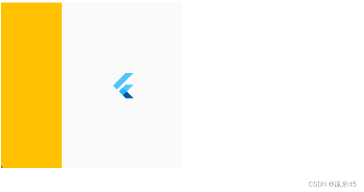
body: Center(
child: Column(
children: const [
Text("data"),
FlutterLogo(
size: 100,
),
],
),
),
),
);
}
}输出
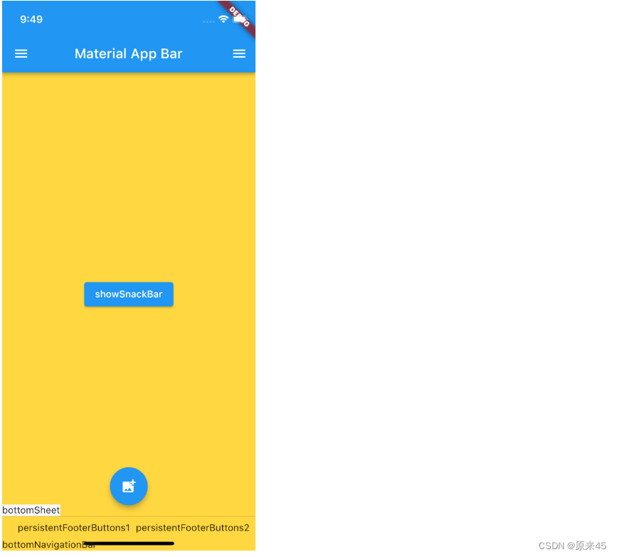
2. 脚手架 Scaffold
2.1 定义
Scaffold 是一个页面布局脚手架,实现了基本的 Material 布局,继承自 StatefulWidget,是有状态组件。我们知道大部分的应用页面都是含有标题栏,主体内容,底部导航菜单或者侧滑抽屉菜单等等构成,那么每次都重复写这些内容会大大降低开发效率,所以 Flutter 提供了 Material 风格的 Scaffold 页面布局脚手架,可以很快地搭建出这些元素部分
对应 ios 的是 CupertinoPageScaffold
Scaffold class - material library - Dart API
CupertinoPageScaffold class - cupertino library - Dart API
2.2 Scaffold 的属性
以下是 Scaffold 组件的一些常用属性:
- appBar:即顶栏,可以包含标题、导航按钮、动作按钮等
- body:应用的主体部分,显示页面的主要内容
- bottomNavigationBar:底部导航栏,用于页面间的切换
- floatingActionButton:浮动操作按钮,通常用于表示主要操作,如添加或编辑
- drawer:侧边栏菜单,用于导航到不同的页面或显示其他选项
- backgroundColor:背景颜色
- resizeToAvoidBottomInset:控制应用在有键盘弹出时是否调整布局以避免遮挡输入框
const Scaffold({
    Key key,
    // 菜单栏
    this.appBar,
    // 中间主体内容部分
    this.body,
    // 悬浮按钮
    this.floatingActionButton,
    // 悬浮按钮位置
    this.floatingActionButtonLocation,
    // 悬浮按钮动画
    this.floatingActionButtonAnimator,
    // 固定在下方显示的按钮
    this.persistentFooterButtons,
    // 左侧 侧滑抽屉菜单
    this.drawer,
    // 右侧 侧滑抽屉菜单
    this.endDrawer,
    // 底部菜单
    this.bottomNavigationBar,
    // 底部拉出菜单
    this.bottomSheet,
    // 背景色
    this.backgroundColor,
    // 自动适应底部padding
    this.resizeToAvoidBottomPadding,
    // 重新计算body布局空间大小,避免被遮挡
    this.resizeToAvoidBottomInset,
    // 是否显示到底部,默认为true将显示到顶部状态栏
    this.primary = true,
    this.drawerDragStartBehavior = DragStartBehavior.down,
  })
2.3 示例
代码
import 'package:flutter/gestures.dart';
import 'package:flutter/material.dart';

// class CupertinoPage extends StatelessWidget {
//   const CupertinoPage({Key? key}) : super(key: key);

//   @override
//   Widget build(BuildContext context) {
//     return const CupertinoPageScaffold(
//       navigationBar: CupertinoNavigationBar(
//         middle: Text('我是标题'),
//       ),
//       child: Center(
//         child: Text('我是内容'),
//       ),
//     );
//   }
// }

class ScaffoldPage extends StatelessWidget {
  const ScaffoldPage({Key? key}) : super(key: key);

  @override
  Widget build(BuildContext context) {
    return Scaffold(
      // 菜单栏
      appBar: AppBar(
        title: const Text('Material App Bar'),
      ),

      // 悬浮按钮
      // floatingActionButton: FloatingActionButton(
      //   onPressed: () {},
      //   child: const Icon(Icons.add_photo_alternate),
      // ),

      // 悬浮按钮位置
      // floatingActionButtonLocation: FloatingActionButtonLocation.centerFloat,

      // 固定在下方显示的按钮
      // persistentFooterButtons: const [
      //   Text('persistentFooterButtons1'),
      //   Text('persistentFooterButtons2'),
      // ],

      // 压缩顶部菜单空间
      // primary: true,

      // 左侧 侧滑抽屉菜单
      // drawer: const Drawer(
      //   child: Text('data'),
      // ),

      // 右侧 侧滑抽屉菜单
      // endDrawer: const Drawer(
      //   child: Text('data'),
      // ),

      // 检测手势行为方式,与drawer配合使用 down 方式有卡顿,可以 start 方式
      // drawerDragStartBehavior: DragStartBehavior.start,

      // 底部导航栏
      // bottomNavigationBar: const Text('bottomNavigationBar'),

      // 底部拉出菜单
      // bottomSheet: const Text('bottomSheet'),

      // 背景色
      // backgroundColor: Colors.amberAccent,

      // 自动适应底部padding
      // resizeToAvoidBottomInset: true,

      // 正文
      body: Builder(
        builder: (BuildContext context) {
          return Center(
            child: ElevatedButton(
              onPressed: () {
                // 脚手架管理
                // Scaffold.of(context).openDrawer();

                // 应用消息管理
                ScaffoldMessenger.of(context).showSnackBar(const SnackBar(
                  content: Text('Hello!'),
                ));
              },
              child: const Text('showSnackBar'),
            ),
          );
        },
      ),
    );
  }
}
输出
PS: 对于 Scaffold 和 MaterialApp
MaterialApp 是整个应用的根组件,它提供了应用的基础配置和框架。它承担了设定应用主题、路由以及其他全局配置的责任
Scaffold 是用来构建单个页面的布局框架。它提供了一个包含顶栏、底部导航栏、浮动按钮和主体内容的基本结构
3. 线性布局 Column Row
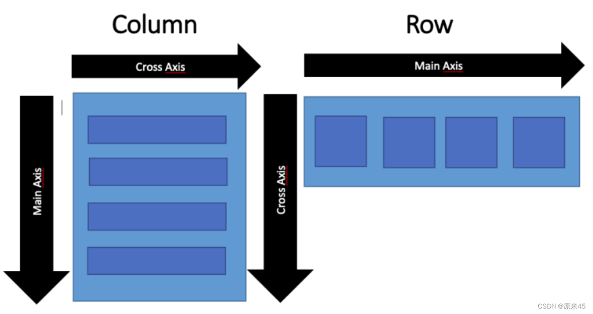
3.1 Row
Row 布局组件类似于 Android 中的 LinearLayout 线性布局,它用来做水平横向布局使用,里面的 children 子元素按照水平方向进行排列。
Row class - widgets library - Dart API
定义
Row({
    Key key,

  	// * 子元素集合
    List<Widget> children = const <Widget>[],

    // 主轴方向上的对齐方式(Row的主轴是横向轴)
    MainAxisAlignment mainAxisAlignment = MainAxisAlignment.start,
    // 在主轴方向(Row的主轴是横向轴)占有空间的值,默认是max
    MainAxisSize mainAxisSize = MainAxisSize.max,
    // 在交叉轴方向(Row是纵向轴)的对齐方式,Row的高度等于子元素中最高的子元素高度
    CrossAxisAlignment crossAxisAlignment = CrossAxisAlignment.center,

 		// 水平方向子元素的排列方向:从左到右排列还是反向
    TextDirection textDirection,
    // 表示纵轴(垂直)的对齐排列方向,默认是VerticalDirection.down,表示从上到下。这个参数一般用于Column组件里
    VerticalDirection verticalDirection = VerticalDirection.down,
    // 字符对齐基线方式
    TextBaseline textBaseline,

  })
MainAxisAlignment
主轴属性:主轴方向上的对齐方式,Row 是横向轴为主轴
enum MainAxisAlignment {
  // 按照主轴起点对齐,例如:按照靠近最左侧子元素对齐
  start,

  // 将子元素放置在主轴的末尾,按照末尾对齐
  end,

  // 子元素放置在主轴中心对齐
  center,

  // 将主轴方向上的空白区域均分,使得子元素之间的空白区域相等,首尾子元素都靠近首尾,没有间隙。有点类似于两端对齐
  spaceBetween,

  // 将主轴方向上的空白区域均分,使得子元素之间的空白区域相等,但是首尾子元素的空白区域为1/2
  spaceAround,

  // 将主轴方向上的空白区域均分,使得子元素之间的空白区域相等,包括首尾子元素
  spaceEvenly,
}
CrossAxisAlignment
交叉属性:在交叉轴方向的对齐方式,Row 是纵向轴。Row 的高度等于子元素中最高的子元素高度
enum CrossAxisAlignment {
  // 子元素在交叉轴上起点处展示
  start,

  // 子元素在交叉轴上末尾处展示
  end,

  // 子元素在交叉轴上居中展示
  center,

  // 让子元素填满交叉轴方向
  stretch,

  // 在交叉轴方向,使得子元素按照baseline对齐
  baseline,
}
MainAxisSize
在主轴方向子元素占有空间的方式,Row 的主轴是横向轴。默认是 max
enum MainAxisSize {
  // 根据传入的布局约束条件,最大化主轴方向占用可用空间,也就是尽可能充满可用宽度
  max,

  // 与max相反,是最小化占用主轴方向的可用空间
  min,
}
3.2 Column
Column 是纵向排列子元素
参数用法同上
Column class - widgets library - Dart API
代码
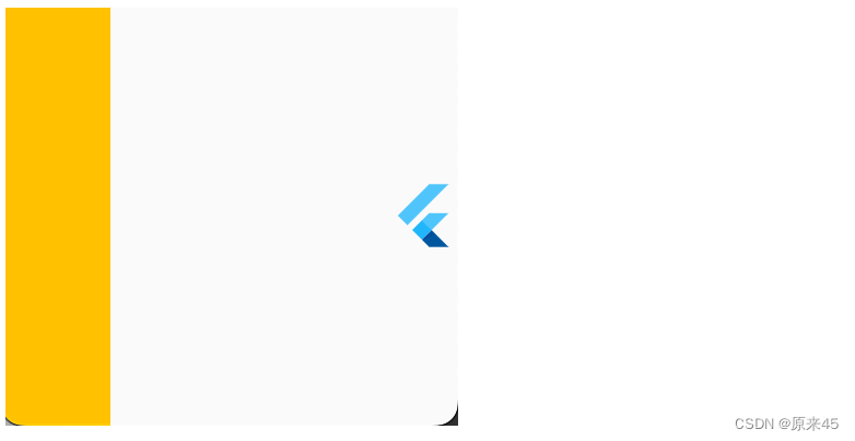
  @override
  Widget build(BuildContext context) {
    return Scaffold(
      body: Container(
        color: Colors.amber,
        child: Column(
          mainAxisAlignment: MainAxisAlignment.center,
          crossAxisAlignment: CrossAxisAlignment.center,
          // mainAxisSize: MainAxisSize.min,
          children: const [
            FlutterLogo(
              size: 24,
            ),
            FlutterLogo(
              size: 48,
            ),
            FlutterLogo(
              size: 128,
            ),
            FlutterLogo(
              size: 200,
            ),
          ],
        ),
      ),
    );
  }
输出
4. 盒模型 Box Model
Flutter 布局是混入了 RenderBox 特性,我们来了解下什么是盒模型
4.1 定义
盒子模型在 web 中是基础,所以本文参考了 mozilla w3schools
https://developer.mozilla.org/zh-CN/docs/Learn/CSS/Building_blocks/The_box_model
CSS Box Model
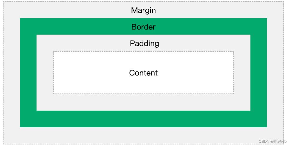
不同部分的说明:
- Margin(外边距) - 边框意外的距离。
- Border(边框) - 围绕在内边距和内容外的边框。
- Padding(内边距) - 边框内部到内容的距离。
- Content(内容) - 盒子的内容,显示文本和图像。
4.2 示例
代码
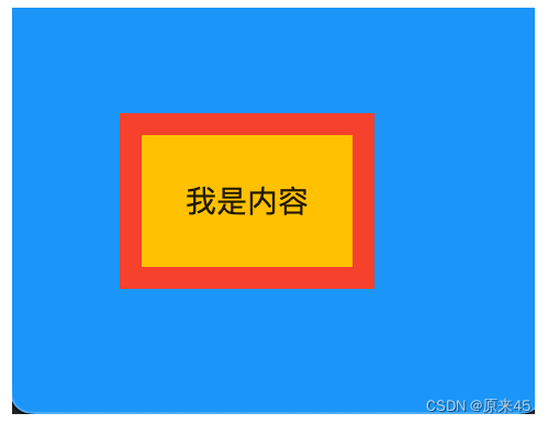
class BoxPage extends StatelessWidget {
  const BoxPage({Key? key}) : super(key: key);

  @override
  Widget build(BuildContext context) {
    return Scaffold(
      backgroundColor: Colors.blue,
      body: Container(
        // color: Colors.amber,

        // Margin(外边距)
        margin: const EdgeInsets.all(50),

        // Padding(内边距)
        padding: const EdgeInsets.all(20),

        // Content(内容)
        child: const Text("我是内容"),

        // 装饰样式
        decoration: BoxDecoration(
          // 背景色
          color: Colors.amber,

          // 边框
          border: Border.all(
            color: Colors.red,
            width: 10,
          ),
        ),
      ),
    );
  }
}
输出
5. 容器 Container
5.1 定义
Container 是一个组合类容器,它本身不对应具体的 RenderObject,它是 DecoratedBox、ConstrainedBox、Transform、Padding、Align 等组件组合的一个多功能容器,所以我们只需通过一个 Container 组件可以实现同时需要装饰、变换、限制的场景
Container class - widgets library - Dart API
下面是 Container 的定义:
Container({
    Key key,
    // 容器子Widget对齐方式
    this.alignment,
    // 容器内部padding
    this.padding,
    // 背景色
    Color color,
    // 背景装饰
    Decoration decoration,
    // 前景装饰
    this.foregroundDecoration,
    // 容器的宽度
    double width,
    // 容器的高度
    double height,
    // 容器大小的限制条件
    BoxConstraints constraints,
    // 容器外部margin
    this.margin,
    // 变换,如旋转
    this.transform,
    // 容器内子Widget
    this.child,
  })
BoxDecoration 装饰
const BoxDecoration({
  // 背景色
  this.color,
  // 背景图片
  this.image,
  // 边框样式
  this.border,
  // 边框圆角
  this.borderRadius,
  // 阴影
  this.boxShadow,
  // 渐变
  this.gradient,
  // 背景混合模式
  this.backgroundBlendMode,
  // 形状
  this.shape = BoxShape.rectangle,
})
5.2 示例
代码
import 'package:flutter/material.dart';

const img1 =
    "https://ducafecat.tech/2021/12/09/blog/2021-jetbrains-fleet-vs-vscode/2021-12-09-10-30-00.png";

class MyPage extends StatelessWidget {
  const MyPage({Key? key}) : super(key: key);

  @override
  Widget build(BuildContext context) {
    return Scaffold(
      body: Container(
        // 约束父容器
        constraints: const BoxConstraints.expand(
          height: 300.0,
        ),

        // 外边距
        margin: const EdgeInsets.all(20.0),

        // 内边距
        padding: const EdgeInsets.all(30.0),

        // 背景色
        // color: Colors.teal.shade700,

        // 子Widget居中
        alignment: Alignment.centerLeft,

        // 子Widget元素
        child: Text(
          'Hello World',
          style: TextStyle(
            fontSize: 34,
            fontWeight: FontWeight.bold,
            color: Colors.white,
          ),
        ),

        // 背景装饰
        decoration: const BoxDecoration(
          // 背景色
          color: Colors.blueAccent,
          // 圆角
          borderRadius: BorderRadius.all(
            Radius.circular(20.0),
          ),
          // 渐变
          // gradient: RadialGradient(
          //   colors: [Colors.red, Colors.orange],
          //   center: Alignment.topLeft,
          //   radius: .98,
          // ),
          // 阴影
          boxShadow: [
            BoxShadow(
              blurRadius: 2,
              offset: Offset(0, 2),
              color: Colors.blue,
            ),
          ],
          // 背景图
          image: DecorationImage(
            image: NetworkImage(img1),
            fit: BoxFit.cover,
          ),
          // 背景混合模式
          backgroundBlendMode: BlendMode.color,
          // 形状
          // shape: BoxShape.circle,
        ),

        // 前景装饰
        // foregroundDecoration: BoxDecoration(
        //   image: DecorationImage(
        //     image: AssetImage('assets/flutter.png'),
        //   ),
        // ),

        // Container旋转
        // transform: Matrix4.rotationZ(0.1),
      ),
    );
  }
}

void main() {
  runApp(MaterialApp(
    home: const MyPage(),
    theme: ThemeData(
      primarySwatch: Colors.blue,
    ),
  ));
}
6. 弹性布局 Flex
弹性布局允许子组件按照一定比例来分配父容器空间。
Flex class - widgets library - Dart API
6.1 Flex
我们可以发现 Column Row 组件都是继承与 Flex,功能非常强大,通常我们直接用 Column Row 即可
flutter/lib/src/widgets/basic.dart
/// * [Row], for a horizontal equivalent.

/// * [Flex], if you don't know in advance if you want a horizontal or vertical

/// arrangement.

/// * [Expanded], to indicate children that should take all the remaining room.

/// * [Flexible], to indicate children that should share the remaining room but

/// that may size smaller (leaving some remaining room unused).

/// * [SingleChildScrollView], whose documentation discusses some ways to

/// use a [Column] inside a scrolling container.

/// * [Spacer], a widget that takes up space proportional to its flex value.

/// * The [catalog of layout widgets](https://flutter.dev/widgets/layout/).

class Column extends Flex {

...
6.2 Expanded
Expanded 只能放在 Flex、Column、Row 中使用
把包裹的元素撑开
代码
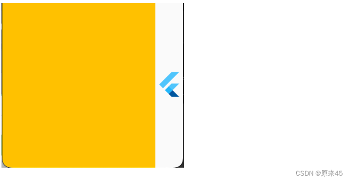
class FlexPage extends StatelessWidget {
  const FlexPage({Key? key}) : super(key: key);

  @override
  Widget build(BuildContext context) {
    return Scaffold(
      body: Row(
        children: [
          Expanded(
            child: Container(
              color: Colors.amber,
            ),
          ),
          const FlutterLogo(
            size: 32,
          ),
        ],
      ),
    );
  }
}
输出
Flex 属性调整比例
代码
  children: [
    Expanded(
      flex: 1,
      child: Container(
        color: Colors.amber,
      ),
    ),
    const Expanded(
      flex: 2,
      child: FlutterLogo(
        size: 32,
      ),
    ),
  ],
输出
6.3 留白 Spacer
留白撑开,很适合用在标题按钮的场景中
代码
  children: [
    Container(
      width: 50,
      color: Colors.amber,
    ),
    const Spacer(),
    const FlutterLogo(
      size: 32,
    ),
  ],
输出
7. 层叠布局 Stack
7.1 Stack
Stack 允许子组件堆叠
Stack class - widgets library - Dart API
定义
Stack({

	Key key,

	// 对齐方式,默认是左上角(topStart)
	this.alignment = AlignmentDirectional.topStart,

	// 对齐方向
	this.textDirection,

	// 定义如何设置无定位子元素尺寸,默认为loose
	this.fit = StackFit.loose,

  // 对超出 Stack 显示空间的部分如何剪裁
  this.clipBehavior = Clip.hardEdge,

	// 子元素
	List<Widget> children = const <Widget>[],

})
7.2 Positioned
根据 Stack 的四个角来确定子组件的位置
定义
const Positioned({

	Key key,

	this.left, // 上下左右位置
	this.top,
	this.right,
	this.bottom,

	this.width, // 宽高
	this.height,

	@required Widget child,

})
7.3 示例
代码
import 'package:flutter/material.dart';
class StackPage extends StatelessWidget {
const StackPage({Key? key}) : super(key: key);
@override
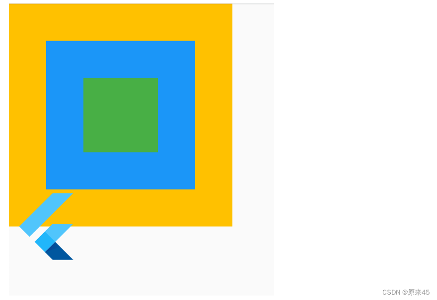
Widget build(BuildContext context) {
return Scaffold(
body: SizedBox(
width: 300,
height: 300,
child: Stack(
// 居中对齐
alignment: Alignment.center,
// 子元素溢出, none 不裁剪
clipBehavior: Clip.none,
// 子元素层叠放
children: [
// 三个色块
Container(
width: 300,
height: 300,
color: Colors.amber,
),
Container(
width: 200,
height: 200,
color: Colors.blue,
),
Container(
width: 100,
height: 100,
color: Colors.green,
),
// 绝对定位
const Positioned(
left: 0,
bottom: -50,
child: FlutterLogo(size: 100),
),
],
),
),
);
}
}输出
8. 流式布局 Wrap
用 Row 的时候可以发现子元素不会自动换行,这时候就需要 Wrap 了。
Wrap class - widgets library - Dart API
8.1 定义
Wrap({
  this.direction = Axis.horizontal,
  // 主轴方向的对齐方式
  this.alignment = WrapAlignment.start,
  // 主轴方向子widget的间距
  this.spacing = 0.0,
  // 纵轴方向的对齐方式
  this.runAlignment = WrapAlignment.start,
  // 纵轴方向的间距
  this.runSpacing = 0.0,
  // 交叉轴对齐方式
  this.crossAxisAlignment = WrapCrossAlignment.start,
  this.textDirection,
  this.verticalDirection = VerticalDirection.down,
  List<Widget> children = const <Widget>[],
})
8.2 示例
代码
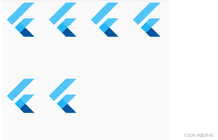
import 'package:flutter/material.dart';

class WrapPage extends StatelessWidget {
  const WrapPage({Key? key}) : super(key: key);

  @override
  Widget build(BuildContext context) {
    return Scaffold(
      body: Wrap(
        // 主轴方向子widget的间距
        spacing: 10,
        // 纵轴方向的间距
        runSpacing: 100,
        // 主轴方向的对齐方式
        alignment: WrapAlignment.start,
        children: const [
          FlutterLogo(size: 100),
          FlutterLogo(size: 100),
          FlutterLogo(size: 100),
          FlutterLogo(size: 100),
          FlutterLogo(size: 100),
          FlutterLogo(size: 100),
        ],
      ),
    );
  }
}
输出
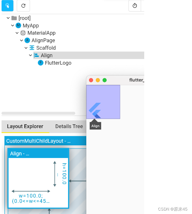
9. 对齐定位 Align
调整子元素在父元素的位置
Align class - widgets library - Dart API
9.1 Align
定义
Align({
  Key key,

  // 需要一个AlignmentGeometry类型的值
  // AlignmentGeometry 是一个抽象类,
  // 它有两个常用的子类:Alignment和 FractionalOffset
  this.alignment = Alignment.center,

  // 两个缩放因子
  // 会分别乘以子元素的宽、高,最终的结果就是 Align 组件的宽高
  this.widthFactor,
  this.heightFactor,
  Widget child,
})
代码
import 'package:flutter/material.dart';

class AlignPage extends StatelessWidget {
  const AlignPage({Key? key}) : super(key: key);

  @override
  Widget build(BuildContext context) {
    return const Scaffold(
      body: Align(
        widthFactor: 2,
        heightFactor: 2,
        alignment: Alignment.bottomLeft,
        child: FlutterLogo(
          size: 50,
        ),
      ),
    );
  }
}
输出
可以发现,Align 的高宽=子元素高宽*高宽因子factor,如果 null 采用父元素高度约束
9.2 Alignment
Alignment 是从 Align 的中心点出发
定义
/// The top left corner.
static const Alignment topLeft = Alignment(-1.0, -1.0);
/// The center point along the top edge.
static const Alignment topCenter = Alignment(0.0, -1.0);
/// The top right corner.
static const Alignment topRight = Alignment(1.0, -1.0);
/// The center point along the left edge.
static const Alignment centerLeft = Alignment(-1.0, 0.0);
/// The center point, both horizontally and vertically.
static const Alignment center = Alignment(0.0, 0.0);
/// The center point along the right edge.
static const Alignment centerRight = Alignment(1.0, 0.0);
/// The bottom left corner.
static const Alignment bottomLeft = Alignment(-1.0, 1.0);
/// The center point along the bottom edge.
static const Alignment bottomCenter = Alignment(0.0, 1.0);
/// The bottom right corner.
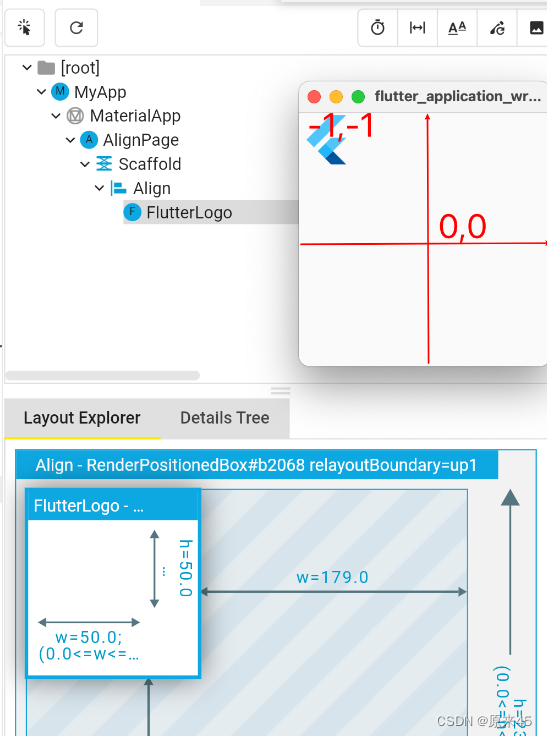
static const Alignment bottomRight = Alignment(1.0, 1.0);Alignment(-1.0, -1.0) 标识从中心点出发,左上角
代码
...
    return const Scaffold(
      body: Align(
        alignment: Alignment(-1, -1),
        child: FlutterLogo(
          size: 50,
        ),
      ),
    );
输出
Alignment.topLeft == Alignment(-1, -1) ,用哪种方式都可以
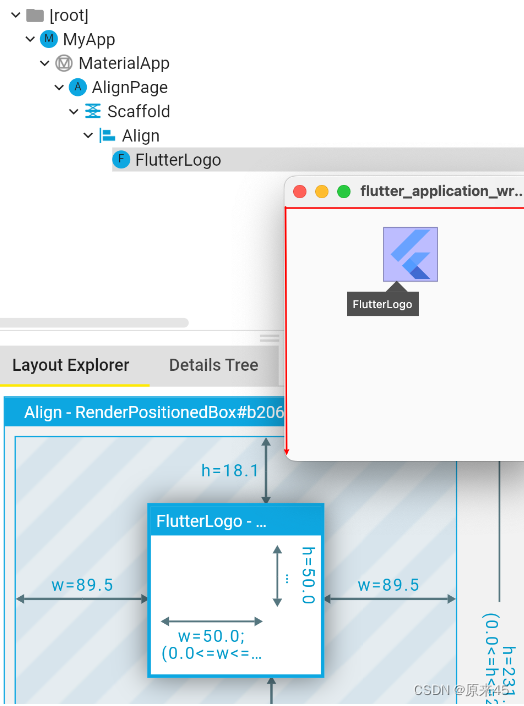
9.3 FractionalOffset
这种方式是固定从左上角出发
代码
...
  @override
  Widget build(BuildContext context) {
    return const Scaffold(
      body: Align(
        alignment: FractionalOffset(0.5, 0.1),
        child: FlutterLogo(
          size: 50,
        ),
      ),
    );
  }
用 FractionalOffset 对象,输入 0~1 的比例值
输出
9.4 Center
Center 是集成了 Align 对象,默认 alignment=Alignment.center
Center 定义, 少了一个 alignment 参数
class Center extends Align {
  /// Creates a widget that centers its child.
  const Center({ Key? key, double? widthFactor, double? heightFactor, Widget? child })
    : super(key: key, widthFactor: widthFactor, heightFactor: heightFactor, child: child);
}
然后 Align 定义, 默认了 this.alignment = Alignment.center,
class Align extends SingleChildRenderObjectWidget {
  /// Creates an alignment widget.
  ///
  /// The alignment defaults to [Alignment.center].
  const Align({
    Key? key,
    this.alignment = Alignment.center,
    this.widthFactor,
    this.heightFactor,
    Widget? child,
  }) : assert(alignment != null),
       assert(widthFactor == null || widthFactor >= 0.0),
       assert(heightFactor == null || heightFactor >= 0.0),
       super(key: key, child: child);
代码
...
  @override
  Widget build(BuildContext context) {
    return const Scaffold(
      body: Center(
        child: FlutterLogo(
          size: 50,
        ),
      ),
    );
  }
输出
创作不易,希望读者三连支持 💖
赠人玫瑰,手有余香 💖

![[office] 快速删除excel中的空行和列的方法 #其他#学习方法#经验分享](https://img-blog.csdnimg.cn/img_convert/241331a4e8f73c4893b01570bed77535.jpeg)
![[数据集][目标检测]盲道检测数据集VOC+YOLO格式2173张1类别](https://img-blog.csdnimg.cn/direct/dd05ea22da294ac8ab783094defe5cef.png)