写在前面
业务场景x轴的文字太多,会出现遮挡问题,想到文字倾斜展示,页面不美观,于是想到使用滚动条优化趋势图。
<template>
<div id="storeDown" style="height: 400px;width:100%"/>
</template>
<script>
// 引入 ECharts 主模块
// var echarts = require('echarts/lib/echarts')
// 引入柱状图
import { round } from 'echarts/src/util/number'
require('echarts/lib/chart/bar')
// 引入折线图
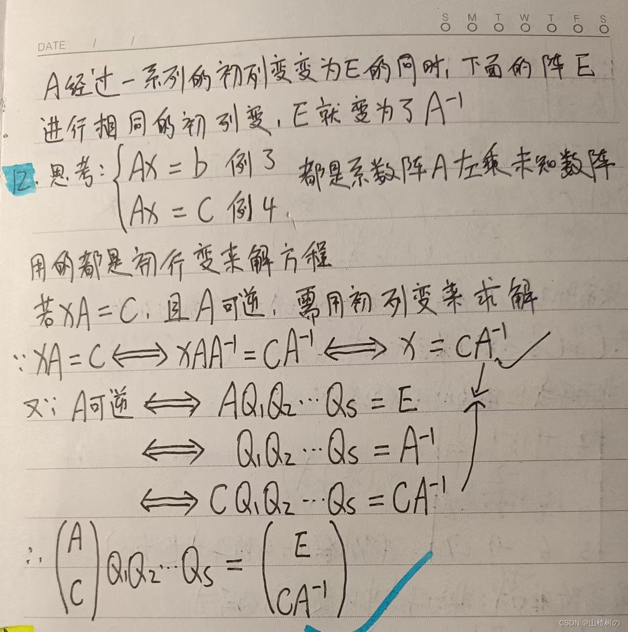
require('echarts/lib/chart/line')
// 引入提示框和标题组件
require('echarts/lib/component/tooltip')
// require('echarts/lib/component/title');
require('echarts/lib/component/toolbox')
require('echarts/lib/component/legend')
export default {
name: 'StoreGoDownEcharts',
props: {
itemList: {
type: Array,
default: () => []
},
type: {
type: String,
default: () => ''
},
th: {
type: String,
default: () => ''
}
},
data() {
return {
}
},
watch: {
itemList: {
handler(newData, oldData) {
if (this.itemList.length > 0) {
this.myCharts5()
}
}
}
},
mounted() {
this.loadata()
},
methods: {
loadata() {
this.myCharts5()
},
myCharts5() {
const that = this
// const that = this
var x_data = that.itemList.map((item) => {
return item.store_name
})
var serve = []
var serve2 = []
console.log(that.th)
var cycle = this.th === '同比' ? '同期' : '上周'
if (this.type === '销售额') {
serve = that.itemList.map((item) => {
return { value: round(item.sales / 10000, 2), Name: this.type, th_name: this.th, th: this.th === '同比' ? item.sales_tongbi : item.sales_huanbi }
})
serve2 = that.itemList.map((item) => {
return this.th === '同比' ? round(item.l_sales / 10000, 2) : round(item.l_week_tongqi_sales / 10000, 2)
})
} else if (this.type === '毛利额') {
serve = that.itemList.map((item) => {
return { value: round(item.gross / 10000, 2), Name: this.type, th_name: this.th, th: this.th === '同比' ? item.gross_tongbi : item.gross_huanbi }
})
serve2 = that.itemList.map((item) => {
return this.th === '同比' ? round(item.l_gross / 10000, 2) : round(item.l_week_tongqi_gross / 10000, 2)
})
}
var barwidthData = ''
if (serve.length < 4 && serve2.length < 4) {
barwidthData = '10%'
}
var myChart = this.$echarts.init(document.getElementById('storeDown'))
// that.myReize(myChart)
var option = {
tooltip: {
trigger: 'axis',
axisPointer: {
type: 'shadow'
},
formatter: function(params) {
var store_name = params[0].name
var type_0 = params[1].data.Name
var th_name = params[1].data.th_name
var cycle = params[0].seriesName
var value = ''
var value2 = ''
var value3 = ''
if (params[1].value) {
value = params[1].value + '万元'
} else {
value = ''
}
if (params[0].value) {
value2 = params[0].value + '万元'
} else {
value2 = ''
}
if (params[1].data.th) {
value3 = Math.abs(params[1].data.th) + '%'
} else {
value3 = ''
}
var htmlStr = ''
htmlStr = '<span style="font-size: 20px;font-weight: bold;color: #FEFEFE;line-height: 20px;">' + store_name + '</span>' +
'<br>' + '<span style="font-size: 16px;color: #FEFEFE;line-height: 22px;font-weight: bold; border-left:1px solid red "> ' + type_0 + '</span>' +
'<br>' + '<el-row style="display: flex;width: 200px"><el-col style="display: inline-block;width: 50%;">' + cycle + ':' + value2 + '</el-col>' + '<el-col style="display: inline-block;width: 50%;text-align: center">' + th_name + '<i class="el-icon-caret-bottom"></i></el-col></el-row>' +
'<el-row style="display: flex;width: 200px"><span style="display: inline-block;width: 50%;">当日:' + value + '</span>' +
'<span style="display: inline-block;width: 50%;text-align: center"> ' + value3 + '</span></el-row>'
return htmlStr
}
},
xAxis: {
type: 'category',
data: x_data,
triggerEvent: true,
axisLabel: {
interval: 0,
rotate: -30,
formatter: function(value) {
if (value.length > 8) {
value = value.substring(0, 7) + '..'
return value
} else {
return value
}
}
}
},
yAxis: {
type: 'value',
name: this.type + '(万元)'
},
legend: { data: [cycle, '当日'], top: '5px', right: '80px' },
dataZoom: [
{
type: 'slider',
show: true,
start: 0,
end: 40,
handleSize: 8,
yAxisIndex: null,
width: '80%',
height: '2%',
bottom: '1',
showDetail: false
},
{
type: 'inside',
start: 0,
end: 100
}
],
series: [
{
name: cycle,
data: serve2,
barWidth: barwidthData,
type: 'bar',
itemStyle: {
color: '#42B983'
}
},
{
name: '当日',
data: serve,
barWidth: barwidthData,
type: 'bar',
itemStyle: {
color: '#CEF7D4'
}
}
]
}
myChart.setOption(option)
window.addEventListener('resize', () => {
myChart.resize()
})
that.extension(myChart)
myChart.on('click', function(data) {
// 添加点击事件
})
},
extension(chart) {
// 注意这里,是以X轴显示内容过长为例,如果是y轴的话,需要把params.componentType == 'xAxis'改为yAxis
// 判断是否创建过div框,如果创建过就不再创建了
// 该div用来盛放文本显示内容的,方便对其悬浮位置进行处理
var elementDiv = document.getElementById('extension')
if (!elementDiv) {
var div = document.createElement('div')
div.setAttribute('id', 'extension')
div.style.display = 'block'
document.querySelector('html').appendChild(div)
}
chart.on('mouseover', function(params) {
if (params.componentType == 'xAxis') {
var elementDiv = document.querySelector('#extension')
// 设置悬浮文本的位置以及样式
var elementStyle =
'position: absolute;z-index: 99999;color: #fff;font-size: 12px;padding: 5px;display: inline;border-radius: 4px;background-color: #303133;box-shadow: rgba(0, 0, 0, 0.3) 2px 2px 8px'
elementDiv.style.cssText = elementStyle
elementDiv.innerHTML = params.value
document.querySelector('html').onmousemove = function(event) {
var elementDiv = document.querySelector('#extension')
var xx = event.pageX - 10
var yy = event.pageY + 15
console.log('22', xx)
elementDiv.style.top = yy + 'px'
elementDiv.style.left = xx + 'px'
}
}
})
chart.on('mouseout', function(params) {
// 注意这里,我是以X轴显示内容过长为例,如果是y轴的话,需要改为yAxis
if (params.componentType == 'xAxis') {
var elementDiv = document.querySelector('#extension')
elementDiv.style.cssText = 'display:none'
}
})
}
}
}
</script>
<style scoped>
</style>
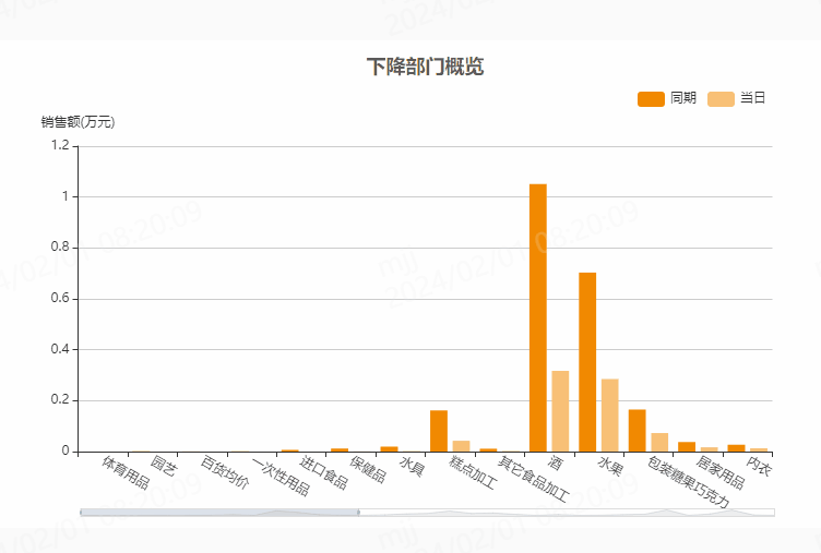
dataZoom 组件 用于区域缩放

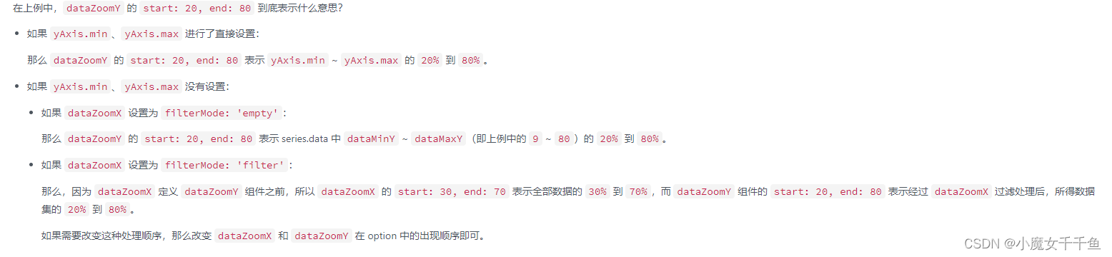
参考文章:dataZoom 区域缩放组件
🚀写在最后
希望我的分享能够帮助到更多的人,如果觉得我的分享有帮助的话,请大家一键三连支持一下哦~
❤️原创不易,期待你的关注与支持~
点赞👍+收藏⭐️+评论✍️
😊之后我会继续更新前端学习小知识,关注我不迷路~