🚀 个人主页 极客小俊
✍🏻 作者简介:web开发者、设计师、技术分享博主
🐋 希望大家多多支持一下, 我们一起学习和进步!😄
🏅 如果文章对你有帮助的话,欢迎评论 💬点赞👍🏻 收藏 📂加关注

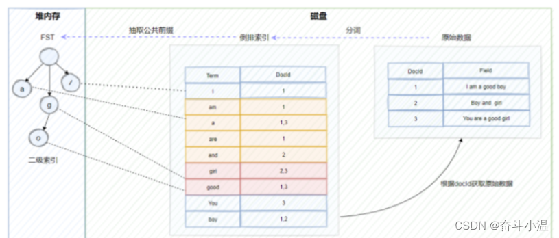
概述
我们以前在定位属性当中学习过relative、absolute、fixed、static这几种定位,但是后来的CSS3中出现了一种新的定位方式叫sticky, 它的中文意思是粘性的意思, 所以我们称之为粘性定位
那么什么叫粘性定位呢,它又有什么用处呢?
不用着急 哈哈哈 我们先来看一个案例你就明白了!
如图

从上图案例中我们可以看到 导航菜单在滚动条啦到一定位置的时候,就自动吸附在了某个位置上!
虽然这个吸附粘性效果我们是可以通过javascript脚本去实现,但是现在我们有了CSS3中的sticky定位就可以很方便的去实现这个效果!
所以我们的粘性定位(sticky) 也就是基于用户的滚动条位置来定位元素的定位的,这就是所谓的粘性!
粘性定位的定义
首先既然是定位,那么肯定也是依靠元素本身对吧, 那么粘性定位的元素主要依赖于用户的滚动, 这里的滚动通常都是指的滚动条!
sticky就像是relative与fixed的结合体一样, 也就是说当一个元素设置了sticky定位之后,会根据表现为在跨越特定阈值前为相对定位,之后为固定定位, 而这个特定阈值指的是 top、right、bottom、left之一
简单点说我们给一个元素设置的sticky定位,那么必须指定一个top, right, bottom 或 left 这4个阈值其中一个才可以使粘性定位生效, 否则就跟相对定位一样, 没什么效果可言!
案例
我们来看一个案例,假设我们随便来一点文字信息,把它们装到一个容器里面,
然后里面再添加一个div给它设置粘性定位看看效果
代码如下
<style type="text/css">
    #info{
        width: 100px;
        height: 30px;
        line-height: 30px;
        color: white;
        background-color: green;
        border: 2px solid black;
        padding: 5px;
        margin: 100px auto;
        font-weight: bold;
        text-align: center;
    }
    .box1 {
        width: 500px;
        height: 700px;
        background: yellow;
        margin: 100px auto;
        overflow-y: scroll;
    }

    .box1>.box2{
        background-color: blue;
        width: auto;
        height: 50px;
        /*开始进行粘性定位,黏住元素, 在指定的top和left位置 黏住元素*/
        position: sticky;
        top: 50px;
        left:0px;
    }
</style>


<div class="box1" id="box1">
    <div class="box2" id="box2"></div>
    A positioned element is an element whose computed position value is either relative, absolute, fixed, or sticky. (In
    other words, it's anythi
    ng except static.)
    A relatively positioned element is an element whose computed position value is relative. The top and bottom
    properties specify the vertical
    offset from its normal position; the left and right properties specify the horizontal offset.
    An absolutely positioned element is an element whose computed position value is absolute or fixed. The top, right,
    bottom, and left properti
    es specify offsets from the edges of the element's containing block. (The containing block is the ancestor relative
    to which the element is positi
    oned.) If the element has margins, they are added to the offset. The element establishes a new block formatting
    context (BFC) for its contents.
    A stickily positioned element is an element whose computed position value is sticky. It's treated as relatively
    positioned until its contai
    ning block crosses a specified threshold (such as setting top to value other than auto) within its flow root (or the
    container it scrolls within),
    at which point it is treated as "stuck" until meeting the opposite edge of its containing block.
    Most of the time, absolutely positioned elements that have height and width set to auto are sized so as to fit their
    contents. However, n
    on-replaced, absolutely positioned elements can be made to fill the available vertical space by specifying both top
    and bottom and leaving height
    unspecified (that is, auto). They can likewise be made to fill the available horizontal space by specifying both
    left and right and leaving width as auto.

    Except for the case just described (of absolutely positioned elements filling the available space):

    If both top and bottom are specified (technically, not auto), top wins.
    If both left and right are specified, left wins when direction is ltr (English, horizontal Japanese, etc.) and right
    wins when direction is rtl (Persian, Arabic, Hebrew, etc.).
    Accessibility concerns
    Ensure that elements positioned with an absolute or fixed value do not obscure other content when the page is zoomed
    to increase text size.

    MDN Understanding WCAG, Guideline 1.4 explanations
    Visual Presentation: Understanding SC 1.4.8 | Understanding WCAG 2.0
    Performance & Accessibility
    Scrolling elements containing fixed or sticky content can cause performance and accessibility issues. As a user
    scrolls, the browser must repaint the st
    icky or fixed content in a new location. Depending on the content needing to be repainted, the browser performance,
    and the device's process
    ing speed, the browser may not be able to manage repaints at 60 fps, causing accessibility concerns for people with
    sensitivities and jank for everyone.
    One solution is to add will-change: transform to the positioned elements to render the element in its own layer,
    improving repaint speed and therefor
    e improving performance and accessibility.

</div>
效果如下

分析
上图的代码中,我们可以看到,给元素box2定义了sticky定位同时指定了一个top:50px,意思就是直接把元素固定到了距离顶部50px的位置,相当于设置了fixed定位一样!
所以其实意思很简单:给元素一开始开始进行设置sticky粘性定位,然后再指定的top或者left等位置,黏住元素!
其实这样看,我们还不好看出区别,我们可以把代码修改一下,并且用javascript来监测一下效果!
html代码
<div id="info">没有开始吸附</div>
<div class="box1" id="box1">
    <div class="box2" id="box2"></div>
    A positioned element is an element whose computed position value is either relative, absolute, fixed, or sticky. (In
    other words, it's anythi
    ng except static.)
    A relatively positioned element is an element whose computed position value is relative. The top and bottom
    properties specify the vertical
    offset from its normal position; the left and right properties specify the horizontal offset.
    An absolutely positioned element is an element whose computed position value is absolute or fixed. The top, right,
    bottom, and left properti
    es specify offsets from the edges of the element's containing block. (The containing block is the ancestor relative
    to which the element is positi
    oned.) If the element has margins, they are added to the offset. The element establishes a new block formatting
    context (BFC) for its contents.
    A stickily positioned element is an element whose computed position value is sticky. It's treated as relatively
    positioned until its contai
    ning block crosses a specified threshold (such as setting top to value other than auto) within its flow root (or the
    container it scrolls within),
    at which point it is treated as "stuck" until meeting the opposite edge of its containing block.
    Most of the time, absolutely positioned elements that have height and width set to auto are sized so as to fit their
    contents. However, n
    on-replaced, absolutely positioned elements can be made to fill the available vertical space by specifying both top
    and bottom and leaving height
    unspecified (that is, auto). They can likewise be made to fill the available horizontal space by specifying both
    left and right and leaving width as auto.

    Except for the case just described (of absolutely positioned elements filling the available space):

    If both top and bottom are specified (technically, not auto), top wins.
    If both left and right are specified, left wins when direction is ltr (English, horizontal Japanese, etc.) and right
    wins when direction is rtl (Persian, Arabic, Hebrew, etc.).
    Accessibility concerns
    Ensure that elements positioned with an absolute or fixed value do not obscure other content when the page is zoomed
    to increase text size.

    MDN Understanding WCAG, Guideline 1.4 explanations
    Visual Presentation: Understanding SC 1.4.8 | Understanding WCAG 2.0
    Performance & Accessibility
    Scrolling elements containing fixed or sticky content can cause performance and accessibility issues. As a user
    scrolls, the browser must repaint the st
    icky or fixed content in a new location. Depending on the content needing to be repainted, the browser performance,
    and the device's process
    ing speed, the browser may not be able to manage repaints at 60 fps, causing accessibility concerns for people with
    sensitivities and jank for everyone.
    One solution is to add will-change: transform to the positioned elements to render the element in its own layer,
    improving repaint speed and therefor
    e improving performance and accessibility.
</div>
css代码
<style type="text/css">


    #info{
        width: 100px;
        height: 30px;
        line-height: 30px;
        color: white;
        background-color: green;
        border: 2px solid black;
        padding: 5px;
        margin: 100px auto;
        font-weight: bold;
        text-align: center;
    }
    .box1 {
        width: 500px;
        height: 700px;
        background: yellow;
        margin: 100px auto;
        overflow-y: scroll;
    }

    .box1>.box2{
        background-color: blue;
        width: auto;
        height: 50px;
        /*当它有一定的距离*/
        margin-top: 100px;
        /*开始进行粘性定位,在指定的top和left位置 黏住元素*/
        position: sticky;
        top: 0px;
        left:0px;
    }
</style>
js代码
<script>
    window.onload=function (){

        var info=document.getElementById("info");
        var box1=document.getElementById("box1");
        var box2=document.getElementById("box2");

        box1.onscroll=function (){
            console.log(box1.scrollTop);
            //获取当前元素滚动条到顶部的Top值
            if(box1.scrollTop>=100){
                box2.style.backgroundColor="red";
                info.innerHTML="开始吸附";
                info.style.background="red";
            }else{
                box2.style.backgroundColor="blue";
                info.innerHTML="没有开始吸附";
                info.style.background="green";
            }
        }

    }

</script>
效果如下
分析
这里我们加了一个margin-top 让大家方便看吸附效果
但是如果你指定了top值 那么其实就要相应的减掉margin-top值,从而计算得到正确的粘性触发阈值!

Sticky与Fixed的区别
很多人搞不清楚这两个之间的区别,其实也很简单
fixed定位是相对于整个浏览器视窗进行固定定位和吸附的!
Sticky定位是相对于父元素进行粘性定位和吸附的!
你如果不相信,我们可以来修改一下CSS代码看看
举个栗子
.box1>.box2{
    background-color: blue;
    width: 500px; /*给一个宽度*/
    height: 50px;
    /*当它有一定的距离*/
    margin-top: 100px;
    /*开始进行粘性定位,在指定的top和left位置 黏住元素*/
    position: fixed; /*设置固定定位*/
    top: 0px;
    left:0px;
}
如图

Sticky定位的兼容性
Sticky定位的兼容性目前 比较早的低版本浏览器可能是不支持Sticky定位
我们里可以使用Edge浏览器来模拟一下ie11的内核看看有没有效果!
如图

从上图看js代码是没问题的,但很显然Sticky定位是不兼容的
最后
所以使用这个粘性定位属性也是需要看具体情况来决定, 如果你不考虑兼容性,只是考虑最新浏览器的渲染,那么基本上没什么问题,如果你要兼容老一点的浏览器,那么可能还需要借助js的帮助才可以!


"👍点赞" "✍️评论" "收藏❤️"
欢迎一起交流学习❤️❤️💛💛💚💚

好玩 好用 好看的干货教程可以
点击下方关注❤️
微信公众号❤️
说不定有意料之外的收获哦..🤗嘿嘿嘿、嘻嘻嘻🤗!
🌽🍓🍎🍍🍉🍇