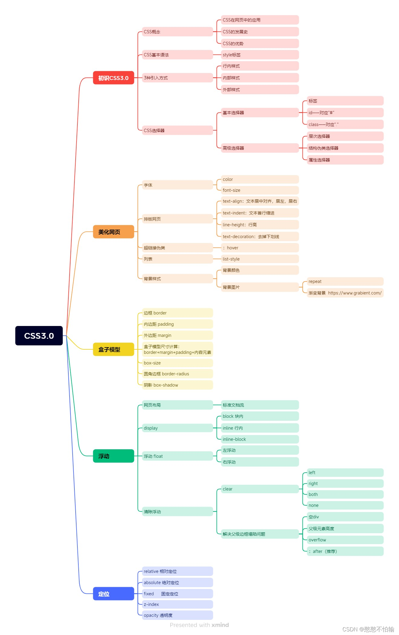
CSS学习
1.认识CSS
1.1什么是CSS
CSS:Cascading Style Sheet——层叠级联样式表
CSS:表现(美化网页)
字体;颜色;边距;高度;宽度;背景图片;网页定位;网页浮动...
1.2CSS发展史
-
CSS1.0:只包含字体颜色
-
CSS2.0:DIV(块)+CSS,提出了HTML与CSS结构分离的思想,网页变得简单
-
CSS2.1:加入了浮动和定位
-
CSS3.0:加入了圆角边框,阴影,动画...
1.3快速入门
-
规范:<style>可以编写CSS的代码,每一个声明,最好使用分号结尾
-
语法:
选择器{
声明1;
声明2;
声明3;
}
1.4CSS的优势
-
内容和表现分离
-
网页结构表现统一,可以实现复用
-
样式丰富
-
建议使用独立于HTML的CSS文件
1.5CSS三种导入方式
-
内部样式
-
外部样式
-
行内样式
<!DOCTYPE html>
<html lang="en">
<head>
<meta charset="UTF-8">
<title>Title</title>
<!--内部样式-->
<style>
h1{
color:green;
}
</style>
<!--外部样式-->
<link rel="stylesheet" href="CSS/style.css">
</head>
<body>
<!--优先级:就近原则(谁离元素近谁有效)-->
<h1 style="color:red">sxc</h1>
</body>
</html>
/*外部样式*/
 h1{
     color:yellow;
 }
2.选择器
作用:选择页面上的某一个或者某一类元素
2.1基本选择器(重点)
2.1.1 标签选择器
标签选择器,会选择到页面上所有这个标签的元素
<!DOCTYPE html>
<html lang="en">
<head>
<meta charset="UTF-8">
<title>Title</title>
<style>
/*标签选择器,会选择到页面上所有这个标签的元素*/
h1{
color:red;
}
p{
font-size:80px;
}
</style>
</head>
<body>
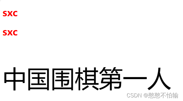
<h1>sxc</h1>
<h1>sxc</h1>
<p>中国围棋第一人</p>
</body>
</html>
结果如下:
2.1.2 类选择器
类选择器的格式 .class的名称{} 优点:可以多个标签归类,同一个class可以复用
<!DOCTYPE html>
<html lang="en">
<head>
<meta charset="UTF-8">
<title>Title</title>
</head>
<style>
/* 类选择器的格式 .class的名称{}
优点:可以多个标签归类,同一个class可以复用
*/
.hanhan{
color:red;
}
.sunshen{
color:yellow;
}
.sxc{
color:green;
}
</style>
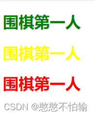
<body>
<h1 class="sxc">围棋第一人</h1>
<h1 class="sunshen">围棋第一人</h1>
<h1 class="hanhan">围棋第一人</h1>
</body>
</html>
结果如下图所示:
2.1.3 id选择器
id选择器:id必须全局唯一! 语法:#id名称{}
<!DOCTYPE html>
<html lang="en">
<head>
<meta charset="UTF-8">
<title>Title</title>
<style>
/* id选择器:id必须全局唯一!
#id名称{}
*/
#sunshen{
color:red;
}
</style>
</head>
<body>
<h1 id="sunshen">sxc</h1>
</body>
</html>
2.1.4三种选择器的优先级
id选择器>类选择器>标签选择器
2.2层次选择器
2.2.1后代选择器
后代选择器:在某个元素的后面
/*后代迭代器*/
       body p{
            background: green;
            }
2.2.2子选择器
子选择器:一代
 /*子选择器*/
        body>p{
            background: red;
        }
2.2.3相邻兄弟选择器
相邻兄弟选择器:只有一个,相邻(向下)
/*相邻兄弟选择器*/
        .active+p{
            background: yellow;
        }
2.2.4通用选择器
通用选择器:当前选中元素的向下所有兄弟元素
/*通用选择器*/
        .active~p{
            background: yellow;
        }
2.3结构伪类选择器
/*ul的第一个元素*/
ul li:first-child{
background: red;
}
/*ul的最后一个元素*/
ul li:last-child{
background: green;
}
/*选中p1:定位到父元素,选择当前的第一个元素
选择当前p元素的父级元素,选中父级元素的第一个,并且是当前元素才生效,按顺序选择
*/
p:nth-child(1){
background: yellow;
}
/*选中父元素下的p元素的第一个*/
p:nth-of-type(1){
background: red;
}
2.4属性选择器(常用+重点)
语法:属性名=属性值(正则)
-
=:绝对等于
-
*=:包含这个元素
-
^=:以这个开头
-
$=:以这个结尾
<!DOCTYPE html>
<html lang="en">
<head>
<meta charset="UTF-8">
<title>Title</title>
</head>
<body>
<style>
.demo a{
float: left;
display: block;
height: 50px;
width: 50px;
border-radius: 10px;
background: #2700ff;
text-align: center;
color: gainsboro;
text-decoration: none;
margin-right: 5px;
font: bold 20px/50px Arial;
}
/*a[id]{
background: yellow;
}*/
/*a[id=first]{
background: yellow;
}*/
/*a[class*=links]{
background: yellow;
}*/
/*a[href^=http]{
background: yellow;
}*/
a[href$=pdf]{
background: yellow;
}
</style>
<p class="demo">
<a href="http://www.baidu.com" class="links item first" id="first">1</a>
<a href="" class="links item active" target="_blank" title="test">2</a>
<a href="images/123.html" class="links item">3</a>
<a href="images/123.png" class="links item">4</a>
<a href="images/123.jpg" class="links item">5</a>
<a href="abc" class="links item">6</a>
<a href="/a.pdf" class="links item">7</a>
<a href="/abc.pdf" class="links item">8</a>
<a href="abc.doc" class="links item">9</a>
<a href="abcd.doc" class="links item last">10</a>
</p>
</body>
</html>
结果如下:

3.美化网页元素
3.1为什么要美化网页
-
有效的传递页面信息
-
美化网页,页面漂亮,才能吸引用户
-
凸显页面的主题
-
提高用户的体验
3.2字体样式
-
font-family:字体
-
font-size:字体大小
-
font-weight:字体粗细
-
color:字体颜色
<!DOCTYPE html>
<html lang="en">
<head>
<meta charset="UTF-8">
<title>Title</title>
<!--
font-family:字体
font-size:字体大小
font-weight:字体粗细
color:字体颜色
-->
<style>
body h1{
font-family:楷体;
color:red;
}
h1{
font-size: 50px;
}
.p1{
font-weight: bold;
}
</style>
</head>
<body>
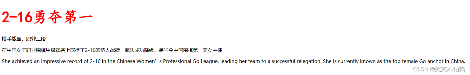
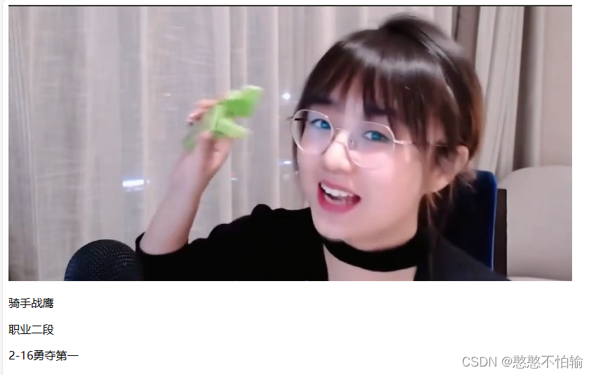
<h1>2-16勇夺第一</h1>
<p class="p1">
棋手战鹰,职业二段
</p>
<p>
在中国女子职业围棋甲级联赛上取得了2-16的骄人战绩,率队成功降级,是当今中国围棋第一美女主播
</p>
<p>
She achieved an impressive record of 2-16 in the Chinese Women’s Professional Go League, leading her team to a successful relegation. She is currently known as the top female Go anchor in China.
</p>
</body>
</html>
结果如下图所示:
3.3文本样式
3.3.1颜色
RGB:0-F RGBA A:0~1
3.3.2文本的对齐方式
text-align: center;居中
3.3.3首行缩进
text-indent: 2em;首行缩进两个字符
3.3.4行高
height line-height 行高与块的高度一致,就可以上下居中
3.3.5装饰
text-decoration:underline下划线
3.3.6文本图片水平对齐
img,span{ vertical-align: middle; }
<!DOCTYPE html>
<html lang="en">
<head>
<meta charset="UTF-8">
<title>Title</title>
<!--
1.颜色:
RGB:0-F
RGBA A:0~1
2.文本对齐方式:
text-align: center;居中
3.首行缩进:
text-indent: 2em;首行缩进两个字符
4.height
line-height
行高与块的高度一致,就可以上下居中
-->
<style>
h1{
color:rgba(0,255,255,0.8);
text-align: center;
}
.p1{
text-indent: 2em;
}
.p2{
text-indent: 2em;
}
.p3{
text-indent: 2em;
background: cornsilk;
height: 30px;
line-height: 30px;
}
img,span{
vertical-align: middle;
}
</style>
</head>
<body>
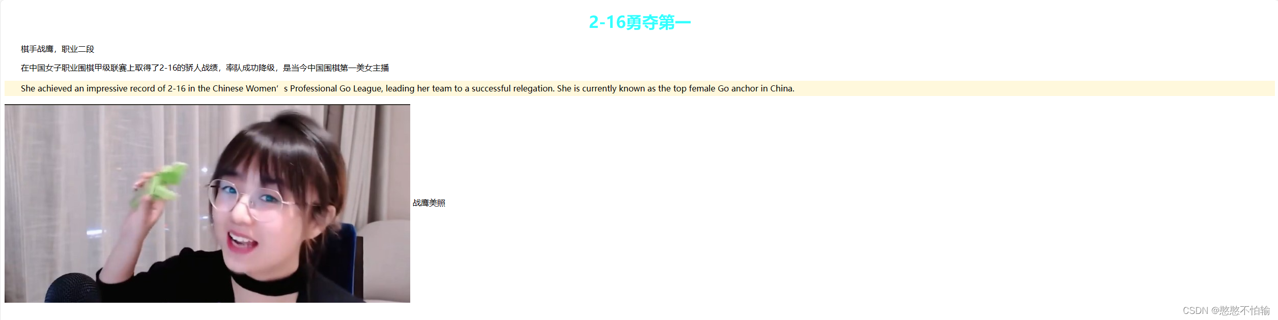
<h1>2-16勇夺第一</h1>
<p class="p1">
棋手战鹰,职业二段
</p>
<p class="p2">
在中国女子职业围棋甲级联赛上取得了2-16的骄人战绩,率队成功降级,是当今中国围棋第一美女主播
</p>
<p class="p3">
She achieved an impressive record of 2-16 in the Chinese Women’s Professional Go League, leading her team to a successful relegation. She is currently known as the top female Go anchor in China.
</p>
<p>
<img src="images/3.jpg" alt="">
战鹰美照
</p>
</body>
</html>
结果如下图所示
3.4超链接伪装
<!DOCTYPE html>
<html lang="en">
<head>
<meta charset="UTF-8">
<title>Title</title>
<style>
/*默认的颜色*/
a{
text-decoration: none;
color: black;
}
/*鼠标悬浮的颜色*/
a:hover{
color:orange;
}
/*鼠标按住未释放的状态*/
a:active{
color: aqua;
}
</style>
</head>
<body>
<a href="#">
<img src="images/3.jpg" alt="">
</a>
<p>
<a href="#">骑手战鹰</a>
</p>
<p>
<a href="">职业二段</a>
</p>
<p>
2-16勇夺第一
</p>
</body>
</html>
结果如下图所示:
3.5文本阴影
/*text-shadow;阴影颜色,水平偏移,垂直偏移,阴影半径*/
    #price{
      text-shadow: aquamarine 10px 10px 2px;
    }
3.6列表
#nav{
width: 300px;
background: bisque;
}
.title{
font-size: 18px;
font-weight: bold;
text-indent:1em;
line-height: 35px;
background: red;
}
ul{
background: bisque;
}
ul li{
height: 30px;
list-style: none;
text-indent:1em;
}
a{
text-decoration: none;
font-size: 14px;
color: #000;
}
a:hover{
color: orange;
text-decoration: underline;
}
3.7背景图片应用及渐变
<!DOCTYPE html>
<html lang="en">
<head>
<meta charset="UTF-8">
<title>Title</title>
<style>
div{
width:1000px;
height: 700px;
border: 1px solid red;
background-image: url("images/3.jpg");
}
.div1{
background-repeat: repeat-x;
}
.div1{
background-repeat: repeat-y;
}
.div1{
background-repeat: no-repeat;
}
</style>
</head>
<body>
<div class="div1"></div>
<div class="div2"></div>
<div class="div3"></div>
</body>
</html>
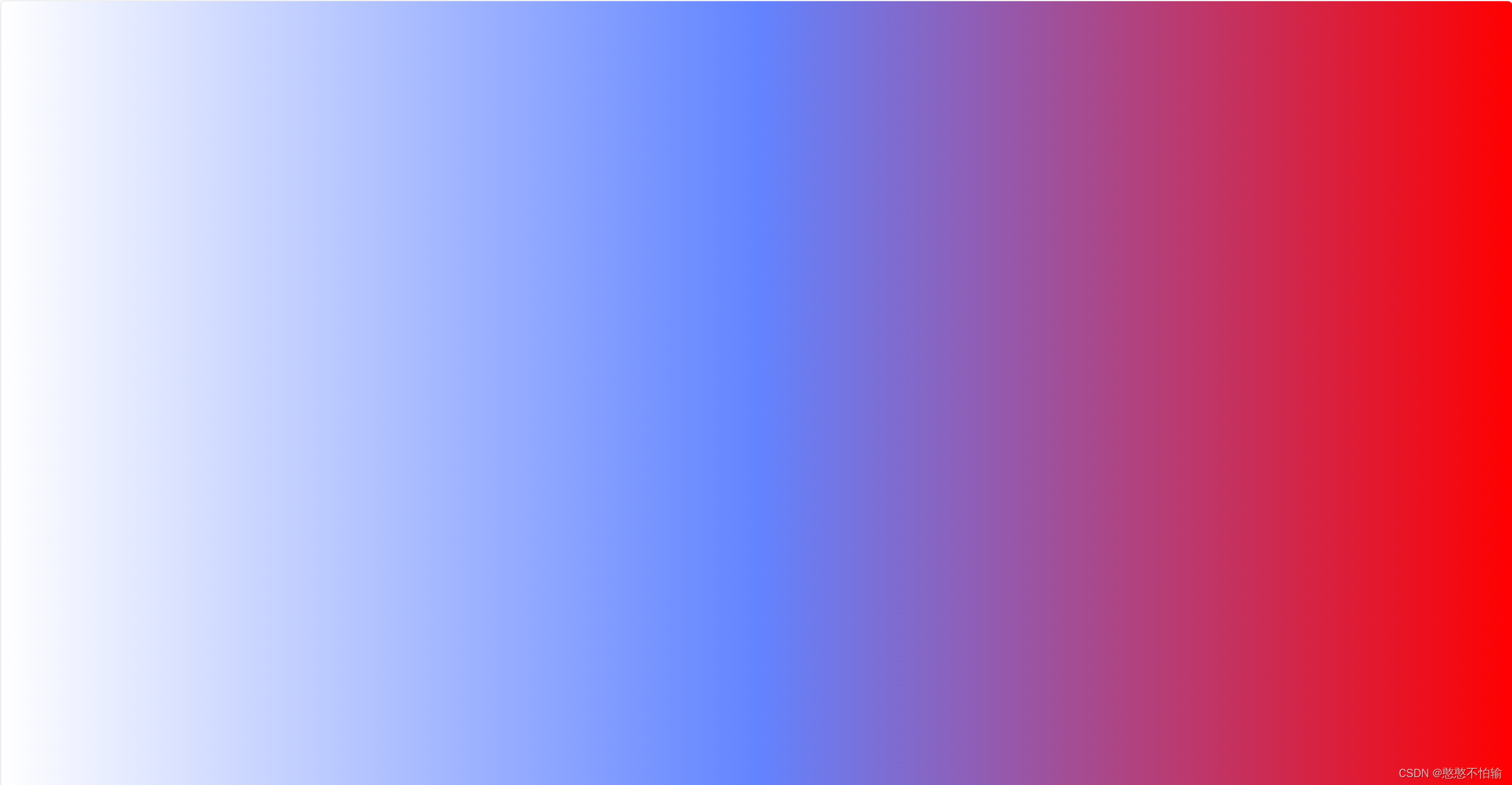
3.8渐变
<!DOCTYPE html>
<html lang="en">
<head>
<meta charset="UTF-8">
<title>Title</title>
<style>
body{
background-color: #FFFFFF;
background-image: linear-gradient(115deg, #FFFFFF 0%, #6284FF 50%, #FF0000 100%)
}
</style>
</head>
<body>
</body>
</html>
结果如下图所示:
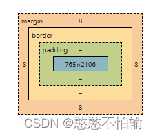
4.盒子模型
4.1什么是盒子模型
4.2边框
-
边框的粗细
-
边框的样式
-
边框的颜色
<!DOCTYPE html>
<html lang="en">
<head>
<meta charset="UTF-8">
<title>Title</title>
<style>
body{
margin: 0;
padding: 0;
text-decoration: none;
}
/*border:粗细;样式;颜色*/
#box{
width: 300px;
border: 1px solid red;
}
h2{
font-size: 16px;
background-color:aqua;
line-height: 30px;
}
form{
background: aqua;
}
div:nth-of-type(1) input{
border: 3px solid black;
}
</style>
</head>
<body>
<div id="box">
<h2>会员登录</h2>
<form action="#">
<div>
<span>用户名:</span>
<input type="text">
</div>
<div>
<span>密码:</span>
<input type="text">
</div>
<div>
<span>邮箱:</span>
<input type="text">
</div>
</form>
</div>
</body>
</html>
4.3内外边距
margin+border+padding+内容宽度
盒子的计算方式:元素到底有多大
h2{
font-size: 16px;
background-color:aqua;
line-height: 30px;
margin: 0 2px 3px 5px;
}
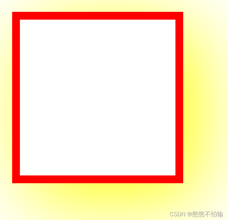
4.4圆角边框
下面给出一个最简单的圆角边框的案例:
<!DOCTYPE html>
<html lang="en">
<head>
<meta charset="UTF-8">
<title>Title</title>
<style>
div{
width: 100px;
height: 100px;
border: 5px solid red;
border-radius:30px ;
}
</style>
</head>
<body>
<div></div>
</body>
</html>
结果如下图所示:

4.5盒子阴影
下面给出一个最简单的盒子阴影的案例:
<!DOCTYPE html>
<html lang="en">
<head>
<meta charset="UTF-8">
<title>Title</title>
<style>
div{
width: 100px;
height: 100px;
border: 5px solid red;
box-shadow:10px 10px 100px yellow;
}
</style>
</head>
<body>
<div></div>
</body>
</html>
结果如下图所示:
5.浮动
5.1 display
<style>
    div{
    width: 100px;
    height: 100px;
    border: 1px solid red;
    display: none;
    }
    span{
        width: 100px;
        height: 100px;
        border: 1px solid red;
        display: inline-block;
        }
</style>
5.2 float
.layer01 {
border: 1px #F00 dashed;
display: inline-block;
float: right;
}
5.3父级边框塌陷问题
clear
/*
claer:right;右侧不允许有浮动元素
claer:left;左侧不允许有浮动元素
claer:both;两侧侧不允许有浮动元素
claer:none;
*/
解决方案:
-
增加父级元素的高度
#father { border: 1px #000 solid; height: 800px; } -
增加一个空的div标签,清除浮动
<div class="clear"></div>
.clear{
clear: both;
margin: 0;
padding: 0;
}
-
overflow
在父级元素中增加一个 overflow:hidden;
-
父类添加一个伪类:after(推荐)
#father:after{
    content: '';
    display: block;
    clear: both;
}
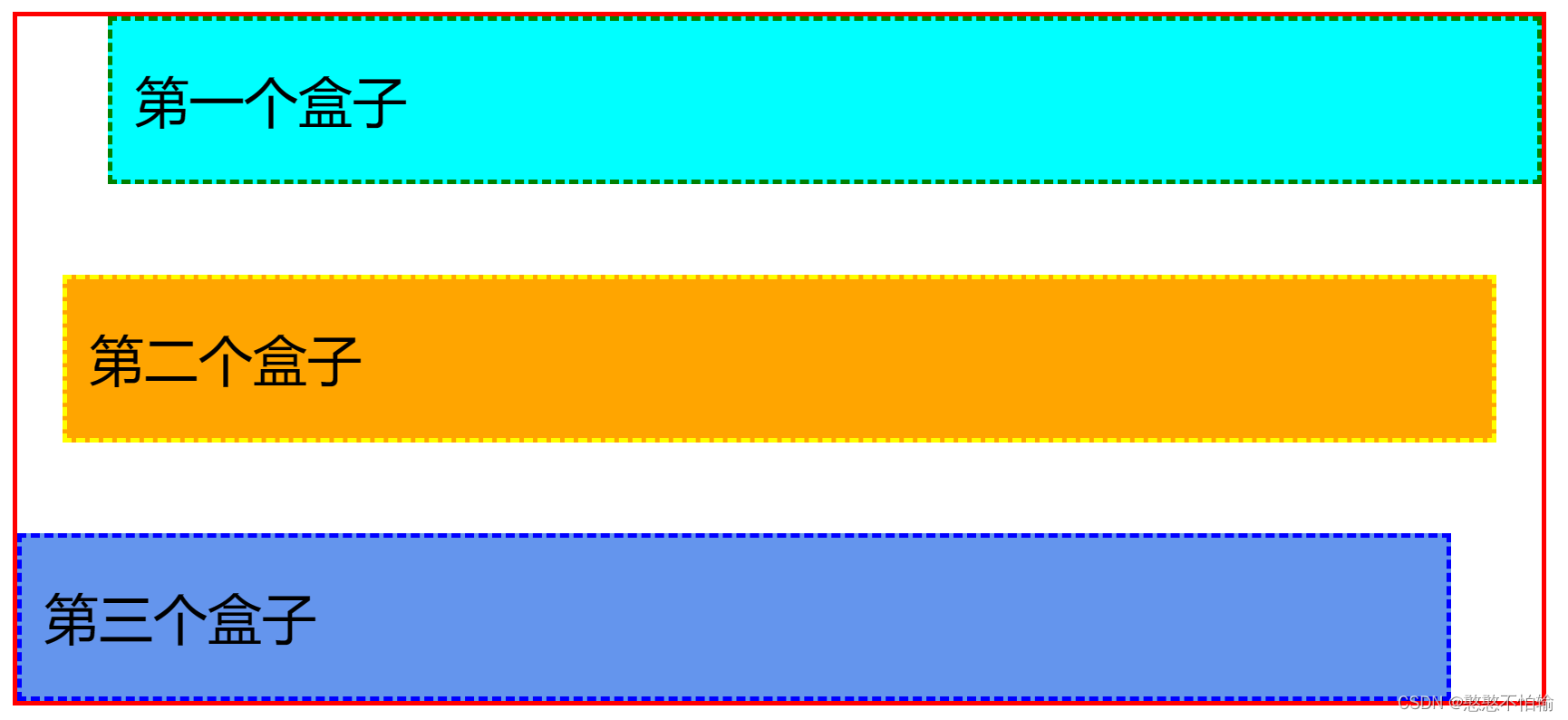
6.定位
6.1相对定位
加入下面这语句——position: relative;
相对于原来的位置,进行指定的偏移
top: -10px;
bottom: -10px;
left: 10px;
right: 10px;
完整代码如下:
<!DOCTYPE html>
<html lang="en">
<head>
<meta charset="UTF-8">
<title>Title</title>
<style>
div{
margin: 10px;
padding: 5px;
font-size: 12px;
line-height: 25px;
}
#father{
border: 1px solid red;
padding: 0;
}
#first{
background-color: aqua;
border: 1px dashed green;
position: relative;
top: -10px;
left: 10px;
}
#second{
background-color: orange;
border: 1px dashed yellow;
}
#third{
background-color: cornflowerblue;
border: 1px dashed blue;
position: relative;
bottom: -10px;
right: 10px;
}
</style>
</head>
<body>
<div id="father">
<div id="first">第一个盒子</div>
<div id="second">第二个盒子</div>
<div id="third">第三个盒子</div>
</div>
</body>
</html>
结果如下图所示:
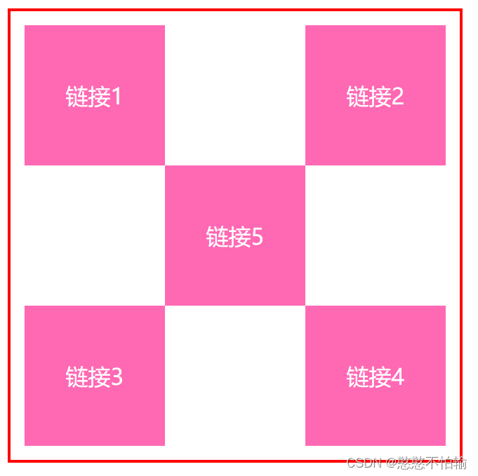
6.2方块定位练习
<!DOCTYPE html>
<html lang="en">
<head>
<meta charset="UTF-8">
<title>Title</title>
<style>
#box{
width: 300px;
height: 300px;
padding: 10px;
border: 2px solid red;
}
a{
width: 100px;
height: 100px;
text-decoration: none;
background-color: hotpink;
line-height:100px ;
text-align: center;
color: #FFFFFF;
display: block;
}
a:hover{
background: #6284FF;
}
.a2,.a4{
position: relative;
left: 200px;
top: -100px;
}
.a5{
position: relative;
left: 100px;
top: -300px;
}
</style>
</head>
<body>
<div id="box">
<a class="a1" href="#">链接1</a>
<a class="a2" href="#">链接2</a>
<a class="a3" href="#">链接3</a>
<a class="a4" href="#">链接4</a>
<a class="a5" href="#">链接5</a>
</div>
</body>
</html>
结果如下图所示:
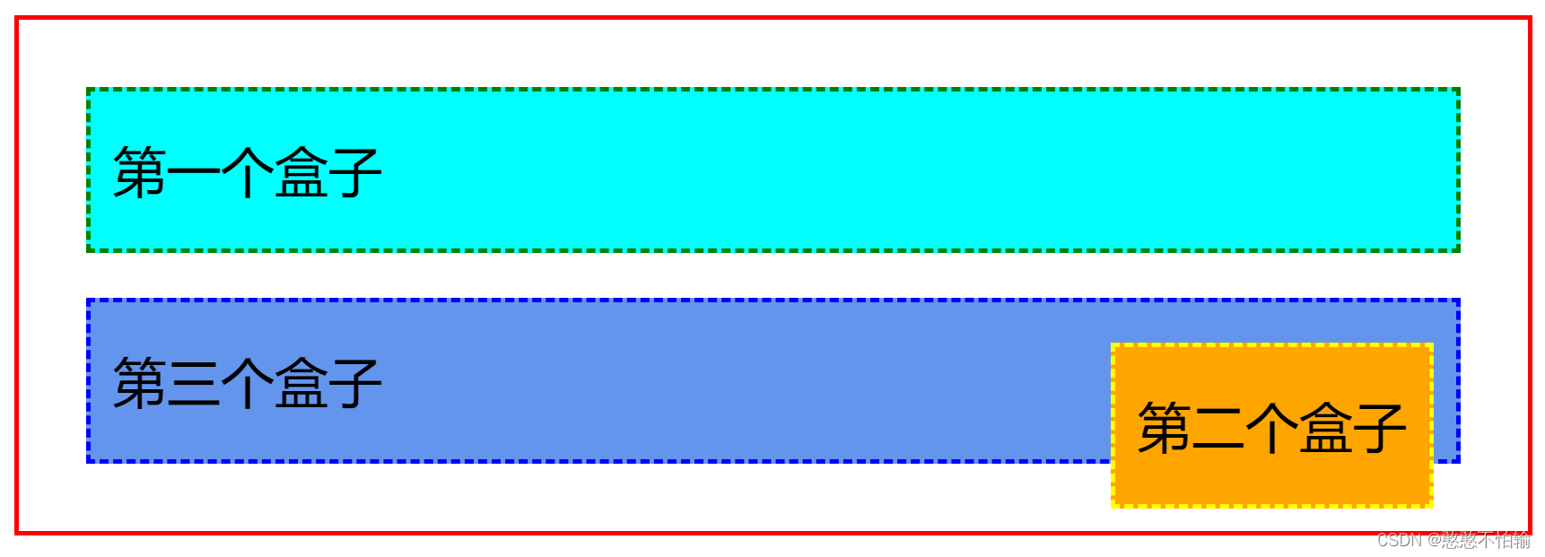
6.3绝对定位
-
没有父级元素的前提下,相对于浏览器定位
-
假设父级元素存在定位,通常会相对父级元素进行偏移
-
在父级元素范围内移动
<!DOCTYPE html> <html lang="en"> <head> <meta charset="UTF-8"> <title>Title</title> <style> div{ margin: 10px; padding: 5px; font-size: 12px; line-height: 25px; } #father{ border: 1px solid red; } #first{ background-color: aqua; border: 1px dashed green; } #second{ background-color: orange; border: 1px dashed yellow; position: absolute; right: 30px; } #third{ background-color: cornflowerblue; border: 1px dashed blue; } </style> </head> <body> <div id="father"> <div id="first">第一个盒子</div> <div id="second">第二个盒子</div> <div id="third">第三个盒子</div> </div> </body> </html>结果如下图所示:
6.4固定定位
<!DOCTYPE html>
<html lang="en">
<head>
<meta charset="UTF-8">
<title>Title</title>
<style>
body{
height: 300px;
}
div:nth-of-type(1){
width: 100px;
height: 100px;
background: yellow;
position: fixed;
right: 0;
bottom: 0;
}
</style>
</head>
<body>
<div>div1</div>
</body>
</html>
结果如下图所示:
无论浏览器页面如何滑动,其位置不变

6.5 z-index
z-index:默认为0,最高为999
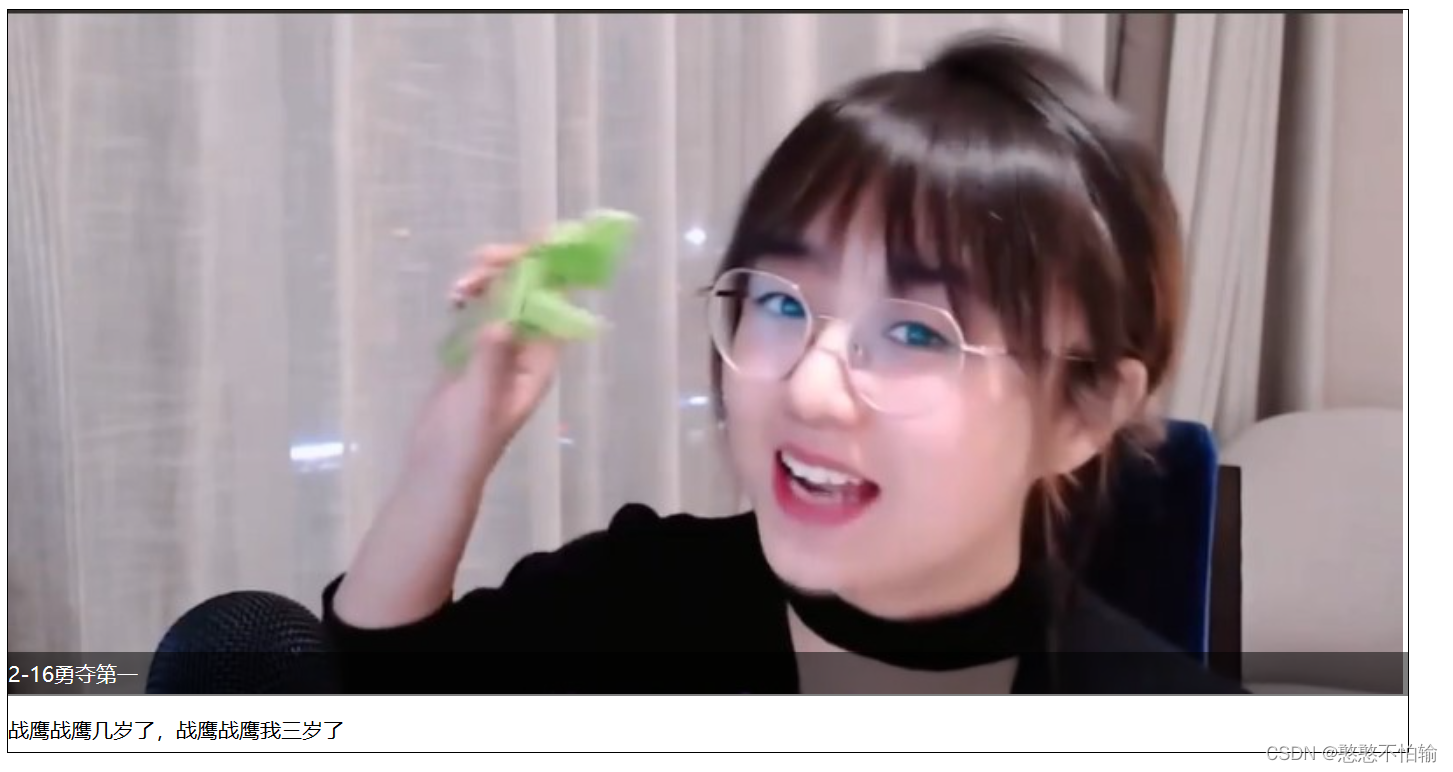
<!DOCTYPE html> <html lang="en"> <head> <meta charset="UTF-8"> <title>Title</title> <link rel="stylesheet" href="css/style.css"> </head> <body> <div id="content"> <ul> <li><img src="images/3.jpg" alt=""></li> <li class="tipText">2-16勇夺第一</li> <li class="tipBG"></li> <li>战鹰战鹰几岁了,战鹰战鹰我三岁了</li> </ul> </div> </body> </html>
#content{
    width: 800px;
    padding: 0;
    margin: 0;
    overflow: hidden;
    font-size: 12px;
    line-height: 25px;
    border: 1px #000 solid;
}
ul,li{
    padding: 0;
    margin: 0;
    list-style: none;
}
#content ul{
    position: relative;
}
.tipBG,.tipText{
    position: absolute;
    width: 800px;
    top: 367px;
    height: 25px;
}
.tipText{
    color: #FFFFFF;
    z-index: 999;
}
.tipBG{
    background: #000;
    opacity:0.5;
}
结果如下图所示:
7.CSS3.0总结