Bootstrap v3
Bootstrap v3 是一个流行的前端框架,它提供了一系列的模板、组件和工具,可以帮助开发者快速地构建响应式的网站和应用程序。
以下是 Bootstrap v3 的一些常见应用:
-
响应式布局:Bootstrap v3 提供了一个易于使用的网格系统,可以让开发者轻松地构建响应式网站。网格系统使用行和列来创建网页布局,可以适应不同的屏幕尺寸,从而在不同的设备上获得更好的用户体验。
-
样式化的组件:Bootstrap v3 提供了一系列的样式化组件,如按钮、表单、导航栏等,开发者可以直接使用这些组件来快速构建网站和应用程序。
-
JavaScript 插件:Bootstrap v3 还提供了一些常用的 JavaScript 插件,如轮播、模态框、下拉菜单等,可以帮助开发者实现更丰富的交互效果和功能。
-
自定义主题:Bootstrap v3 提供了一个易于定制的主题系统,开发者可以按照自己的需求定制特定颜色、字体等样式,从而创造出独特的设计风格。
总的来说,Bootstrap v3 是一个非常实用的前端框架,可以大大提高开发者的工作效率,同时还能帮助开发者创建出现代化、响应式、易于维护的网站和应用程序。
布局容器
Bootstrap 需要为页面内容和栅格系统包裹一个 .container 容器。我们提供了两个作此用处的类。注意,由于 padding 等属性的原因,这两种 容器类不能互相嵌套。
.container 类用于固定宽度并支持响应式布局的容器。
<div class="container">
  ...
</div>
.container-fluid 类用于 100% 宽度,占据全部视口(viewport)的容器。
<div class="container-fluid">
  ...
</div>
<!DOCTYPE html>
<html lang="en">
<head>
<meta charset="UTF-8">
<title>Title</title>
<script src="https://cdn.bootcdn.net/ajax/libs/jquery/3.7.1/jquery.min.js"></script>
<link rel="stylesheet" href="bootstrap-3.4.1-dist/css/bootstrap.min.css">
<script src="bootstrap-3.4.1-dist/js/bootstrap.min.js"></script>
<style>
.c1 {
height: 100px;
border: 2px solid black;
}
</style>
</head>
<body>
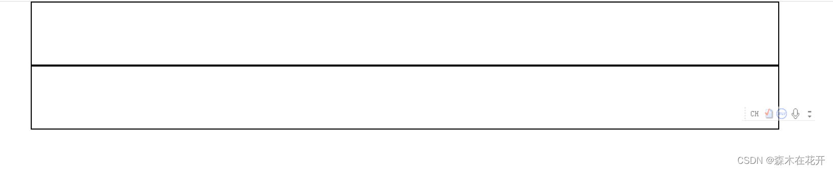
<div class="c1 container">
</div>
<div class="c1 container-fluid">
</div>
</body>
</html>效果
栅格系统
Bootstrap 提供了一套响应式、移动设备优先的流式栅格系统,随着屏幕或视口(viewport)尺寸的增加,系统会自动分为最多12列。它包含了易于使用的预定义类,还有强大的mixin 用于生成更具语义的布局。
简介
栅格系统用于通过一系列的行(row)与列(column)的组合来创建页面布局,你的内容就可以放入这些创建好的布局中。下面就介绍一下 Bootstrap 栅格系统的工作原理:
- “行(row)”必须包含在
.container(固定宽度)或.container-fluid(100% 宽度)中,以便为其赋予合适的排列(aligment)和内补(padding)。 - 通过“行(row)”在水平方向创建一组“列(column)”。
- 你的内容应当放置于“列(column)”内,并且,只有“列(column)”可以作为行(row)”的直接子元素。
- 类似
.row和.col-xs-4这种预定义的类,可以用来快速创建栅格布局。Bootstrap 源码中定义的 mixin 也可以用来创建语义化的布局。 - 通过为“列(column)”设置
padding属性,从而创建列与列之间的间隔(gutter)。通过为.row元素设置负值margin从而抵消掉为.container元素设置的padding,也就间接为“行(row)”所包含的“列(column)”抵消掉了padding。 - 负值的 margin就是下面的示例为什么是向外突出的原因。在栅格列中的内容排成一行。
- 栅格系统中的列是通过指定1到12的值来表示其跨越的范围。例如,三个等宽的列可以使用三个
.col-xs-4来创建。 - 如果一“行(row)”中包含了的“列(column)”大于 12,多余的“列(column)”所在的元素将被作为一个整体另起一行排列。
- 栅格类适用于与屏幕宽度大于或等于分界点大小的设备 , 并且针对小屏幕设备覆盖栅格类。 因此,在元素上应用任何
.col-md-*栅格类适用于与屏幕宽度大于或等于分界点大小的设备 , 并且针对小屏幕设备覆盖栅格类。 因此,在元素上应用任何.col-lg-*不存在, 也影响大屏幕设备。
实例:从堆叠到水平排列
使用单一的一组 .col-md-* 栅格类,就可以创建一个基本的栅格系统,在手机和平板设备上一开始是堆叠在一起的(超小屏幕到小屏幕这一范围),在桌面(中等)屏幕设备上变为水平排列。所有“列(column)必须放在 ” .row 内。

<!DOCTYPE html>
<html lang="en">
<head>
    <meta charset="UTF-8">
    <title>Title</title>
     <script src="https://cdn.bootcdn.net/ajax/libs/jquery/3.7.1/jquery.min.js"></script>
    <link rel="stylesheet" href="bootstrap-3.4.1-dist/css/bootstrap.min.css">
    <script src="bootstrap-3.4.1-dist/js/bootstrap.min.js"></script>

    <style>
        .c1 {
            height:100px;
            border:2px solid black;
        }


    </style>


</head>
<body>
<!--实例:从堆叠到水平排列-->
<div class="container">
    <div class="row">
        <div class="c1 col-md-1">00</div>
        <div class="c1 col-md-1">00</div>
        <div class="c1 col-md-1">00</div>
        <div class="c1 col-md-1">00</div>
        <div class="c1 col-md-1">00</div>
        <div class="c1 col-md-1">00</div>
        <div class="c1 col-md-1">00</div>
        <div class="c1 col-md-1">00</div>
        <div class="c1 col-md-1">00</div>
        <div class="c1 col-md-1">00</div>
        <div class="c1 col-md-1">00</div>
        <div class="c1 col-md-1">00</div>


    </div>

</div>

<div class="container-fluid">
    <div class="row">
        <div class="col-md-2 c1">1</div>
        <div class="col-md-7 c1">2</div>
        <div class="col-md-3 c1">3</div>

    </div>

</div>

<div class="container-fluid">
    <div class="row">
        <div class="col-md-9 c1">
            <div class="row">
                <div class="col-md-3 c1">
                    <div class="row">
                        <div class="col-md-6 c1">4</div>
                        <div class="col-md-6 c1">5</div>
                    </div>
                </div>
                <div class="col-md-3 c1">6</div>
                <div class="col-md-3 c1">7</div>
                <div class="col-md-3 c1">8</div>
            </div>
        </div>
        <div class="col-md-3 c1">9</div>
    </div>
</div>


</body>
</html>
效果

排版
标题
HTML 中的所有标题标签,<h1> 到 <h6> 均可使用。另外,还提供了 .h1 到 .h6 类,为的是给内联(inline)属性的文本赋予标题的样式。
| h1. Bootstrap heading | Semibold 36px |
| h2. Bootstrap heading | Semibold 30px |
| h3. Bootstrap heading | Semibold 24px |
<h1>h1. Bootstrap heading</h1>
<h2>h2. Bootstrap heading</h2>
<h3>h3. Bootstrap heading</h3>
<h4>h4. Bootstrap heading</h4>
<h5>h5. Bootstrap heading</h5>
<h6>h6. Bootstrap heading</h6>
在标题内还可以包含 <small> 标签或赋予 .small 类的元素,可以用来标记副标题。
| h1. Bootstrap heading Secondary text |
| h2. Bootstrap heading Secondary text |
| h3. Bootstrap heading Secondary text |
Copy
<h1>h1. Bootstrap heading <small>Secondary text</small></h1>
<h2>h2. Bootstrap heading <small>Secondary text</small></h2>
<h3>h3. Bootstrap heading <small>Secondary text</small></h3>
<h4>h4. Bootstrap heading <small>Secondary text</small></h4>
<h5>h5. Bootstrap heading <small>Secondary text</small></h5>
<h6>h6. Bootstrap heading <small>Secondary text</small></h6>
中心内容
通过添加 .lead 类可以让段落突出显示。
Vivamus sagittis lacus vel augue laoreet rutrum faucibus dolor auctor. Duis mollis, est non commodo luctus.
<p class="lead">...</p>内联文本元素
Marked text
You can use the mark tag to <mark>highlight</mark> text.被删除的文本
对于被删除的文本使用 <del> 标签。
<del>This line of text is meant to be treated as deleted text.</del>无用文本
对于没用的文本使用 <s> 标签。
This line of text is meant to be treated as no longer accurate.
<s>This line of text is meant to be treated as no longer accurate.</s>插入文本
额外插入的文本使用 <ins> 标签。
This line of text is meant to be treated as an addition to the document.
<ins>This line of text is meant to be treated as an addition to the document.</ins>带下划线的文本
为文本添加下划线,使用 <u> 标签。
This line of text will render as underlined
<u>This line of text will render as underlined</u>利用 HTML 自带的表示强调意味的标签来为文本增添少量样式。
小号文本
对于不需要强调的inline或block类型的文本,使用 <small> 标签包裹,其内的文本将被设置为父容器字体大小的 85%。标题元素中嵌套的 <small> 元素被设置不同的 font-size 。
你还可以为行内元素赋予 .small 类以代替任何 <small> 元素。
This line of text is meant to be treated as fine print.
<small>This line of text is meant to be treated as fine print.</small>强调着重
通过增加 font-weight 值强调一段文本。
The following snippet of text is rendered as bold text.
<strong>rendered as bold text</strong>斜体书写
用斜体强调一段文本。
The following snippet of text is rendered as italicized text.
<em>rendered as italicized text</em>Alternate elements
在 HTML5 中可以放心使用 <b> 和 <i> 标签。<b> 用于高亮单词或短语,不带有任何着重的意味;而 <i> 标签主要用于发言、技术词汇等。
对齐
通过文本对齐类,可以简单方便的将文字重新对齐。
Left aligned text.
Center aligned text.
Right aligned text.
Justified text.
No wrap text.
<p class="text-left">Left aligned text.</p>
<p class="text-center">Center aligned text.</p>
<p class="text-right">Right aligned text.</p>
<p class="text-justify">Justified text.</p>
<p class="text-nowrap">No wrap text.</p>
改变大小写
通过这几个类可以改变文本的大小写。
lowercased text.
UPPERCASED TEXT.
Capitalized Text.
<p class="text-lowercase">Lowercased text.</p>
<p class="text-uppercase">Uppercased text.</p>
<p class="text-capitalize">Capitalized text.</p>
地址格式
让联系信息以最接近日常使用的格式呈现。在每行结尾添加 <br> 可以保留需要的样式。
Twitter, Inc.
1355 Market Street, Suite 900
San Francisco, CA 94103
P: (123) 456-7890Full Name
first.last@example.com
<address>
  <strong>Twitter, Inc.</strong><br>
  1355 Market Street, Suite 900<br>
  San Francisco, CA 94103<br>
  <abbr title="Phone">P:</abbr> (123) 456-7890
</address>

<address>
  <strong>Full Name</strong><br>
  <a href="mailto:#">first.last@example.com</a>
</address>
引用来源
在你的文档中引用其他来源的内容。
默认样式的引用
将任何 HTML 元素包裹在 <blockquote> 中即可表现为引用样式。对于直接引用,我们建议用 <p> 标签。
Lorem ipsum dolor sit amet, consectetur adipiscing elit. Integer posuere erat a ante.
<blockquote>
  <p>Lorem ipsum dolor sit amet, consectetur adipiscing elit. Integer posuere erat a ante.</p>
</blockquote>
实现代码
<!DOCTYPE html>
<html lang="en">
<head>
<meta charset="UTF-8">
<title>Title</title>
<script src="https://cdn.bootcdn.net/ajax/libs/jquery/3.7.1/jquery.min.js"></script>
<link rel="stylesheet" href="bootstrap-3.4.1-dist/css/bootstrap.min.css">
<script src="bootstrap-3.4.1-dist/js/bootstrap.min.js"></script>
</head>
<body>
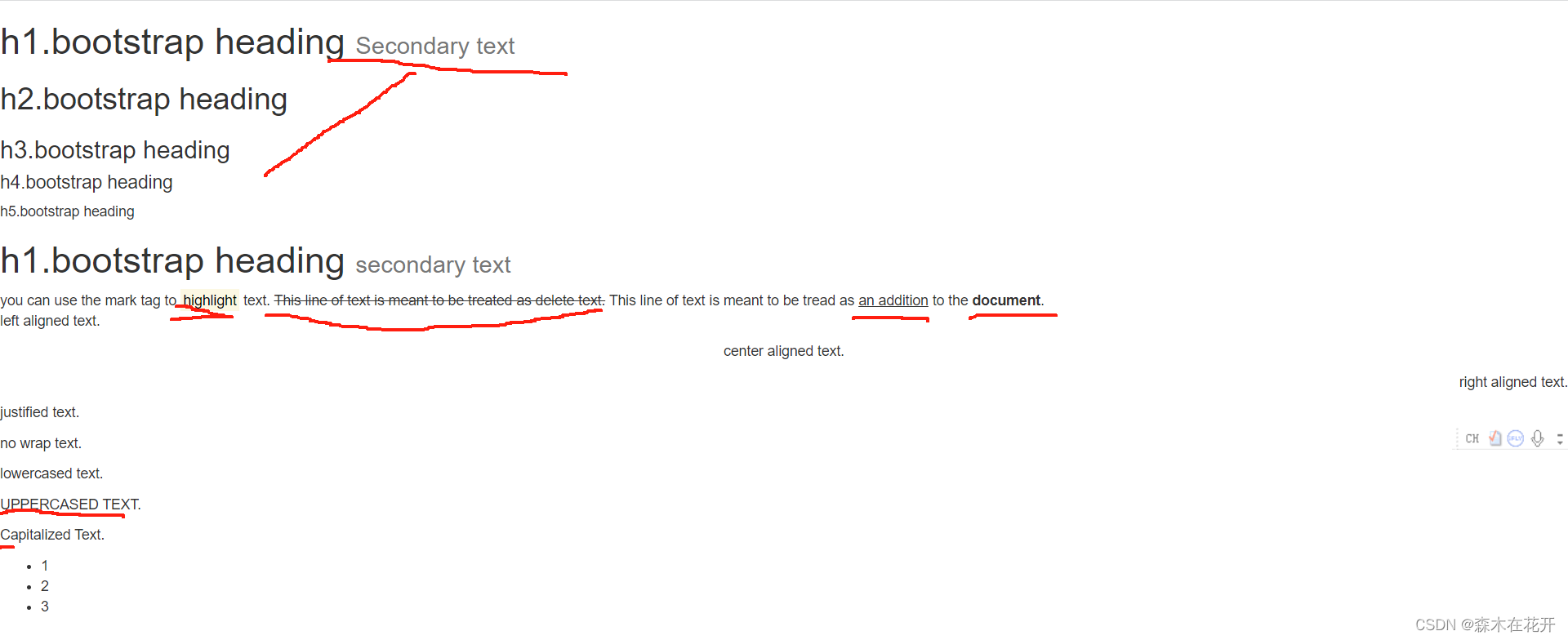
<h1>h1.bootstrap heading <small>Secondary text</small></h1>
<h2>h2.bootstrap heading</h2>
<h3>h3.bootstrap heading</h3>
<h4>h4.bootstrap heading</h4>
<h5>h5.bootstrap heading</h5>
<h1>h1.bootstrap heading <small>secondary text</small></h1>
you can use the mark tag to <mark>highlight</mark> text.
<del> This line of text is meant to be treated as delete text.</del>
This line of text is meant to be tread as <ins>an addition</ins> to the <strong>document</strong>.
<p class="text-left">left aligned text.</p>
<p class="text-center">center aligned text.</p>
<p class="text-right">right aligned text.</p>
<p class="text-justify">justified text.</p>
<p class="text-nowrap">no wrap text.</p>
<p class="text-lowercase">Lowercased text.</p>
<p class="text-uppercase">Uppercased text.</p>
<p class="text-capitalize">Capitalized text.</p>
<ul class="list-inlne">
<li>1</li>
<li>2</li>
<li>3</li>
</ul>
</body>
</html>代码效果
表格
基本实例
为任意 <table> 标签添加 .table 类可以为其赋予基本的样式 — 少量的内补(padding)和水平方向的分隔线。这种方式看起来很多余!?但是我们觉得,表格元素使用的很广泛,如果我们为其赋予默认样式可能会影响例如日历和日期选择之类的插件,所以我们选择将此样式独立出来。
| # | First Name | Last Name | Username |
|---|---|---|---|
| 1 | Mark | Otto | @mdo |
| 2 | Jacob | Thornton | @fat |
| 3 | Larry | the Bird |
Copy
<table class="table">
  ...
</table>
条纹状表格
通过 .table-striped 类可以给 <tbody> 之内的每一行增加斑马条纹样式。
跨浏览器兼容性
条纹状表格是依赖 :nth-child CSS 选择器实现的,而这一功能不被 Internet Explorer 8 支持。
| # | First Name | Last Name | Username |
|---|---|---|---|
| 1 | Mark | Otto | @mdo |
| 2 | Jacob | Thornton | @fat |
| 3 | Larry | the Bird |
Copy
<table class="table table-striped">
  ...
</table>
带边框的表格
添加 .table-bordered 类为表格和其中的每个单元格增加边框。
| # | First Name | Last Name | Username |
|---|---|---|---|
| 1 | Mark | Otto | @mdo |
| 2 | Jacob | Thornton | @fat |
| 3 | Larry | the Bird |
Copy
<table class="table table-bordered">
  ...
</table>
鼠标悬停
通过添加 .table-hover 类可以让 <tbody> 中的每一行对鼠标悬停状态作出响应。
| # | First Name | Last Name | Username |
|---|---|---|---|
| 1 | Mark | Otto | @mdo |
| 2 | Jacob | Thornton | @fat |
| 3 | Larry | the Bird |
Copy
<table class="table table-hover">
  ...
</table>
紧缩表格
通过添加 .table-condensed 类可以让表格更加紧凑,单元格中的内补(padding)均会减半。
| # | First Name | Last Name | Username |
|---|---|---|---|
| 1 | Mark | Otto | @mdo |
| 2 | Jacob | Thornton | @fat |
| 3 | Larry the Bird | ||
Copy
<table class="table table-condensed">
  ...
</table>
状态类
通过这些状态类可以为行或单元格设置颜色。
| Class | 描述 |
|---|---|
.active | 鼠标悬停在行或单元格上时所设置的颜色 |
.success | 标识成功或积极的动作 |
.info | 标识普通的提示信息或动作 |
.warning | 标识警告或需要用户注意 |
.danger | 标识危险或潜在的带来负面影响的动作 |
| # | Column heading | Column heading | Column heading |
|---|---|---|---|
| 1 | Column content | Column content | Column content |
| 2 | Column content | Column content | Column content |
| 3 | Column content | Column content | Column content |
| 4 | Column content | Column content | Column content |
| 5 | Column content | Column content | Column content |
| 6 | Column content | Column content | Column content |
| 7 | Column content | Column content | Column content |
| 8 | Column content | Column content | Column content |
| 9 | Column content | Column content | Column content |
<!-- On rows -->
<tr class="active">...</tr>
<tr class="success">...</tr>
<tr class="warning">...</tr>
<tr class="danger">...</tr>
<tr class="info">...</tr>

<!-- On cells (`td` or `th`) -->
<tr>
  <td class="active">...</td>
  <td class="success">...</td>
  <td class="warning">...</td>
  <td class="danger">...</td>
  <td class="info">...</td>
</tr>
代码实现
表格

<!DOCTYPE html>
<html lang="en">
<head>
    <meta charset="UTF-8">
    <title>Title</title>
    <script src="https://cdn.bootcdn.net/ajax/libs/jquery/3.7.1/jquery.min.js"></script>
    <link rel="stylesheet" href="bootstrap-3.4.1-dist/css/bootstrap.min.css">
    <script src="bootstrap-3.4.1-dist/js/bootstrap.min.js"></script>
</head>
<body>
<div class="container">
    <div class="row">
        <table class="table  table-striped table-bordered table-hover table-condensed">
            <thead>
            <tr>
                <th>ID</th>
                <th>NAME</th>
                <th>AGE</th>
                <th>GENDER</th>
            </tr>
            </thead>
            <tbody>
                <tr class="active">
                    <td>1</td>
                    <td>2</td>
                    <td>3</td>
                    <td>4</td>
                </tr>
                <tr class="success">
                    <td>1</td>
                    <td>2</td>
                    <td>3</td>
                    <td>4</td>
                </tr>
                <tr class="info">
                    <td>1</td>
                    <td>2</td>
                    <td>3</td>
                    <td>4</td>
                </tr>
                <tr class="danger">
                    <td>1</td>
                    <td>2</td>
                    <td>3</td>
                    <td>4</td>
                </tr>
                <tr class="warning">
                    <td>1</td>
                    <td>2</td>
                    <td>3</td>
                    <td>4</td>
                </tr>
            </tbody>
        </table>
    </div>
</div>
</body>
</html>
代码效果

表单
基本实例
单独的表单控件会被自动赋予一些全局样式。所有设置了 .form-control 类的 <input>、<textarea> 和 <select> 元素都将被默认设置宽度属性为 width: 100%;。 将 label 元素和前面提到的控件包裹在 .form-group 中可以获得最好的排列。
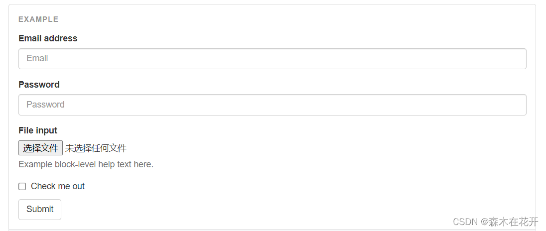
<form>

  <div class="form-group">
    <label for="exampleInputEmail1">Email address</label>
    <input type="email" class="form-control" id="exampleInputEmail1" placeholder="Email">
  </div>

  <div class="form-group">
    <label for="exampleInputPassword1">Password</label>
    <input type="password" class="form-control" id="exampleInputPassword1" placeholder="Password">
  </div>

  <div class="form-group">
    <label for="exampleInputFile">File input</label>
    <input type="file" id="exampleInputFile">
    <p class="help-block">Example block-level help text here.</p>
  </div>

  <div class="checkbox">

    <label>
      <input type="checkbox"> Check me out
    </label>
  </div>

  <button type="submit" class="btn btn-default">Submit</button>

</form>
水平排列的表单
通过为表单添加 .form-horizontal 类,并联合使用 Bootstrap 预置的栅格类,可以将 label 标签和控件组水平并排布局。这样做将改变 .form-group 的行为,使其表现为栅格系统中的行(row),因此就无需再额外添加 .row 了。
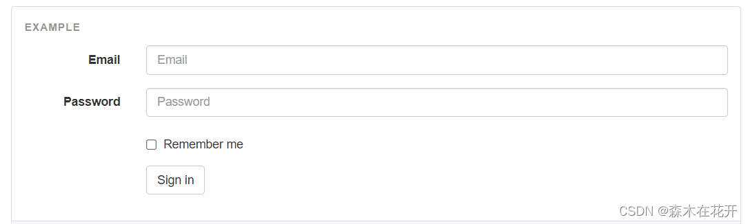
<form class="form-horizontal">

  <div class="form-group">

    <label for="inputEmail3" class="col-sm-2 control-label">Email</label>

    <div class="col-sm-10">
      <input type="email" class="form-control" id="inputEmail3" placeholder="Email">
    </div>
  </div>

  <div class="form-group">
    <label for="inputPassword3" class="col-sm-2 control-label">Password</label>
    <div class="col-sm-10">
      <input type="password" class="form-control" id="inputPassword3" placeholder="Password">
    </div>
  </div>

  <div class="form-group">
    <div class="col-sm-offset-2 col-sm-10">
      <div class="checkbox">
        <label>
          <input type="checkbox"> Remember me
        </label>
      </div>
    </div>
  </div>

  <div class="form-group">
    <div class="col-sm-offset-2 col-sm-10">
      <button type="submit" class="btn btn-default">Sign in</button>
    </div>
  </div>

</form>
多选和单选框
多选框(checkbox)用于选择列表中的一个或多个选项,而单选框(radio)用于从多个选项中只选择一个。
Disabled checkboxes and radios are supported, but to provide a "not-allowed" cursor on hover of the parent
<label>, you'll need to add the.disabledclass to the parent.radio,.radio-inline,.checkbox, or.checkbox-inline.
默认外观(堆叠在一起)

<div class="checkbox">
<label>
<input type="checkbox" value="">
Option one is this and that—be sure to include why it's great
</label>
</div>
<div class="checkbox disabled">
<label>
<input type="checkbox" value="" disabled>
Option two is disabled
</label>
</div>
<div class="radio">
<label>
<input type="radio" name="optionsRadios" id="optionsRadios1" value="option1" checked>
Option one is this and that—be sure to include why it's great
</label>
</div>
<div class="radio">
<label>
<input type="radio" name="optionsRadios" id="optionsRadios2" value="option2">
Option two can be something else and selecting it will deselect option one
</label>
</div>
<div class="radio disabled">
<label>
<input type="radio" name="optionsRadios" id="optionsRadios3" value="option3" disabled>
Option three is disabled
</label>
</div>内联单选和多选框
通过将 .checkbox-inline 或 .radio-inline 类应用到一系列的多选框(checkbox)或单选框(radio)控件上,可以使这些控件排列在一行。
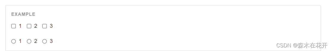
<label class="checkbox-inline">
  <input type="checkbox" id="inlineCheckbox1" value="option1"> 1
</label>
<label class="checkbox-inline">
  <input type="checkbox" id="inlineCheckbox2" value="option2"> 2
</label>
<label class="checkbox-inline">
  <input type="checkbox" id="inlineCheckbox3" value="option3"> 3
</label>

<label class="radio-inline">
  <input type="radio" name="inlineRadioOptions" id="inlineRadio1" value="option1"> 1
</label>
<label class="radio-inline">
  <input type="radio" name="inlineRadioOptions" id="inlineRadio2" value="option2"> 2
</label>
<label class="radio-inline">
  <input type="radio" name="inlineRadioOptions" id="inlineRadio3" value="option3"> 3
</label>
静态控件
如果需要在表单中将一行纯文本和 label 元素放置于同一行,为 <p> 元素添加 .form-control-static 类即可。
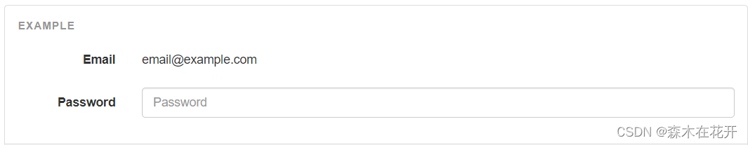
<form class="form-horizontal">
  <div class="form-group">
    <label class="col-sm-2 control-label">Email</label>
    <div class="col-sm-10">
      <p class="form-control-static">email@example.com</p>
    </div>
  </div>
  <div class="form-group">
    <label for="inputPassword" class="col-sm-2 control-label">Password</label>
    <div class="col-sm-10">
      <input type="password" class="form-control" id="inputPassword" placeholder="Password">
    </div>
  </div>
</form> 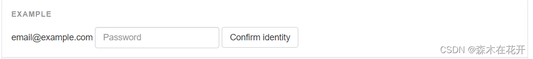
<form class="form-inline">
  <div class="form-group">
    <label class="sr-only">Email</label>
    <p class="form-control-static">email@example.com</p>
  </div>
  <div class="form-group">
    <label for="inputPassword2" class="sr-only">Password</label>
    <input type="password" class="form-control" id="inputPassword2" placeholder="Password">
  </div>
  <button type="submit" class="btn btn-default">Confirm identity</button>
</form>
其他的功能请查阅开发文档
https://v3.bootcss.com/css/#buttons