“ 六棵圣诞树,满足她圣诞愿望 ”
距离25号圣诞节只有几天了,程序员有属于程序员的浪漫,这不来了~
如果一颗圣诞树不够,那就送她六棵,祝她圣诞快乐~
直接上效果图——
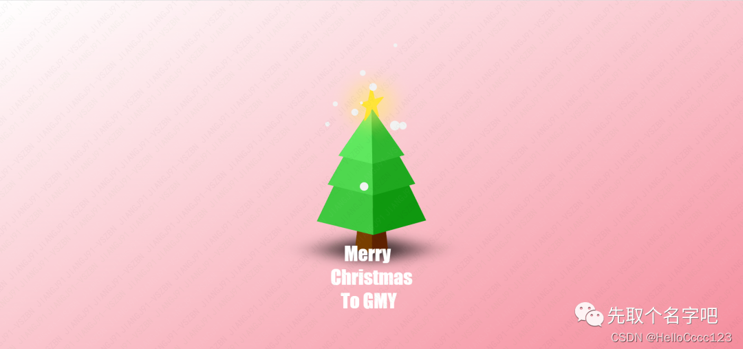
01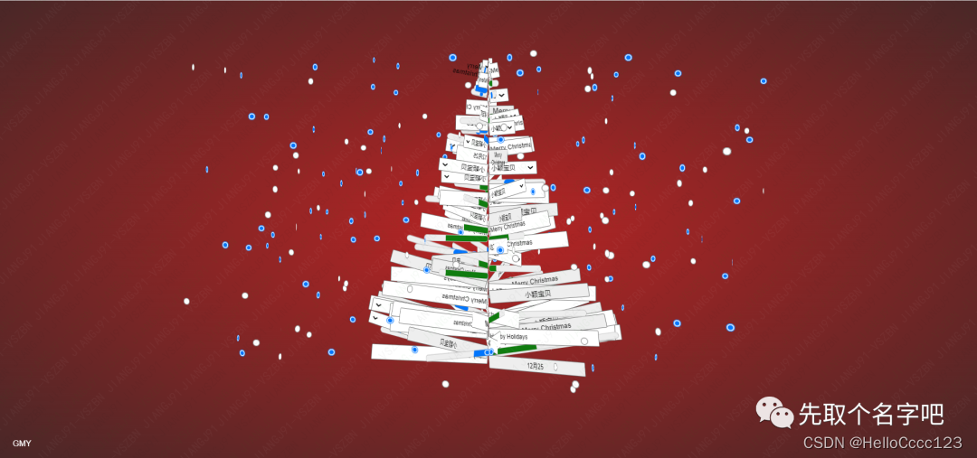
02
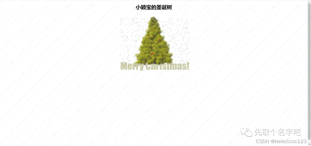
03
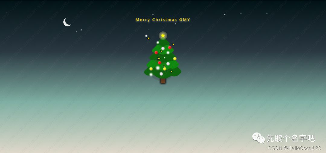
04
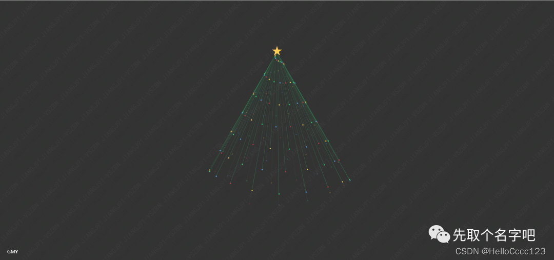
05
06
代码如下:
第1~4圣诞树,公众号「先取个名字吧」回复圣诞树,即可获取代码
六棵圣诞树都是完美适配手机,手机上即可打开。
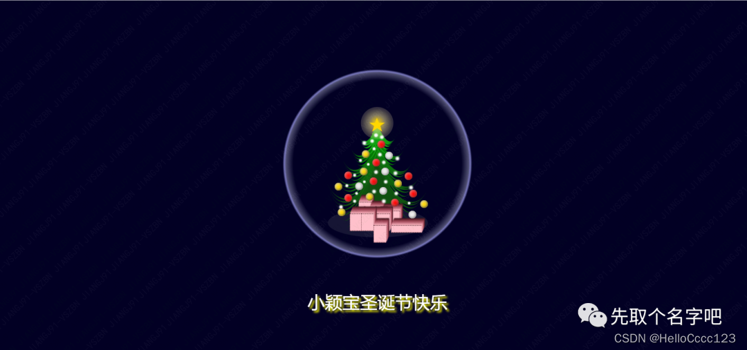
第五棵圣诞树如下:
<!DOCTYPE html>
<html>

<head>
    <meta http-equiv="content-type" content="text/html; charset=utf-8">
    <meta name="viewport" content="width=device-width,initial-scale=1,maximum-scale=1,user-scalable=no">

    <title>小颖宝第五颗木马诞树</title>
    <link rel="stylesheet" href="../css/76.css">
    <style>
        /* 引用网络字体(Kanit) */
        @import url("http://fonts.googleapis.com/css?family=Kanit");

        * {
            /* 初始化 */
            margin: 0;
            padding: 0;
        }

        body {
            background-color: #333;
        }

        /* 顶部星星 */
        .star {
            width: 36px;
            height: 36px;
            /* 绝对定位 计算位置 */
            position: absolute;
            left: calc(50% - 18px);
            top: calc(20vh - 22px);
            z-index: 2;
            background: #ffce54;
            /* 裁切成五角星 */
            clip-path: polygon(50% 0%, 61% 35%, 98% 35%, 68% 57%, 79% 91%, 50% 70%, 21% 91%, 32% 57%, 2% 35%, 39% 35%);
            /* 动画过渡 */
            transition: 0.3s;
        }

        /* Merry Christmas文字 */
        .star::before {
            /* 默认没文字 */
            content: "";
            /* 绝对定位 */
            position: absolute;
            top: 55vh;
            width: 100%;
            text-align: center;
            color: #555;
            font-size: 6vw;
            font-family: "Kanit";
            font-weight: 900;
            /* 不让文字换行 */
            white-space: nowrap;
            /* 字体发光效果 */
            text-shadow: 0 0 10px #fff,
            0 0 20px #fff,
            0 0 40px #fff,
            0 0 80px #fff,
            0 0 120px #fff,
            0 0 160px #fff;
        }

        /* 鼠标移入星星,星星变成图片 */
        .star:hover {
            background: url("../images/op1/1.jpg") no-repeat;
            /* 保持原有尺寸比例,裁切长边 */
            background-size: cover;
            background-position: center;
            width: 50vw;
            height: 50vh;
            border-radius: 20px;
            /* 取消裁切五角星 */
            clip-path: none;
            /* 计算left,让其居中 */
            left: calc(50% - 25vw);
        }

        /* 鼠标移入,设置文本 */
        .star:hover::before {
            content: "Merry Christmas";
        }

        ul {
            padding: 0;
        }

        ul li {
            list-style: none;
        }

        .tree li {
            position: absolute;
            top: 20vh;
            right: 50%;
            width: 1px;
            /* 通过var函数调用自定义属性--h,设置每一条线的高度 */
            height: var(--h);
            /* 线条背景颜色,透明往浅绿色渐变 */
            background: linear-gradient(transparent, rgba(46, 204, 113, 0.35));
            /* 设置旋转元素的基点位置 */
            transform-origin: 50% 0;
            /* 执行动画:动画名 时长 加速后减速 无限次播放 */
            animation: swing 4s ease-in-out infinite;
            /* 通过var函数调用自定义属性--d,设置每一条线的动画延迟时间 */
            animation-delay: var(--d);
        }

        /* 彩色小圆点 */
        .tree li::before {
            content: "";
            position: absolute;
            left: -1px;
            bottom: 1px;
            width: 4px;
            height: 4px;
            border-radius: 50%;
        }

        /* 下标是4的倍数的所有小圆点 */
        .tree li:nth-child(4n)::before {
            background-color: #D8334A;
        }

        /* 下标是4的倍数加1的所有小圆点 */
        .tree li:nth-child(4n+1)::before {
            background-color: #FFCE54;
        }

        /* 下标是4的倍数加2的所有小圆点 */
        .tree li:nth-child(4n+2)::before {
            background-color: #2ECC71;
        }

        /* 下标是4的倍数加3的所有小圆点 */
        .tree li:nth-child(4n+3)::before {
            background-color: #5D9CEC;
        }

        /* 定义动画 */
        @keyframes swing {
            0%, 100% {
                transform: rotateZ(-30deg);
            }
            5%, 45% {
                opacity: 0.25;
            }
            50%, 100%, 0% {
                opacity: 1;
            }
            50% {
                transform: rotateZ(30deg);
            }
        }

        .project-title {
            position: absolute;
            left: 25px;
            bottom: 20px;

            font-size: 16px;
            color: #fff;
        }
</style>
</head>

<body>

<audio autoplay="autopaly" loop="loop" id="audios">
    <source src="music/2.mp3" type="audio/mp3"/>
</audio>


<script>
    // 这里使用了微信自带的WeixinJSBridgeReady事件
    document.addEventListener('WeixinJSBridgeReady', function () {
        document.getElementById('audios').play()
    })

    // 将以下代码添加到js入口函数内即可
    document.addEventListener('touchstart', function () {
        document.getElementById('audios').play()
    })

    // 将以下代码添加到js入口函数内即可
    document.addEventListener('click', function () {
        document.getElementById('audios').play()
    })
</script>

<div class="star"></div>
<ul class="tree" id="tree"></ul>
<script>
    function createTree() {
        for (let i = 0; i < 128; i++) {
            let li = document.createElement('li');
            li.style.cssText = '--h:calc(60vh / 128 * ' + i + ');--d:calc(-28s / 128 * ' + i + ');';
            document.getElementById('tree').appendChild(li);
        }
    }

    window.addEventListener('load', () => {
        createTree();
    })
</script>

</body>

</html>

![[1184]FinalShell下载安装](https://img-blog.csdnimg.cn/img_convert/5b614fbee799ec7b96c377b0d771ab8e.png)