qml相关知识1
- QtQuick.Controls 哪个版本支持TreeModel 和 TreeItem
- qt5.12开始,TreeItem 类被删除,无法使用
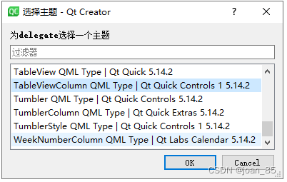
- delegate 什么时候可以用
- Qt5.15中没有 import QtQuick.Controls 1吗,哪个版本有control1
- qml如何两种版本的controls混用(QML之在QtQuick.Controls 2项目中使用QtQuick.Controls模块中的控件)
- QML Row: Cannot specify left, right, horizontalCenter, fill or centerIn anchors for items inside Row
- qml 虚线边框绘制
- 关闭文件系统视图
- 消息提示框
- Popup
- Dialog相关
- 如何给下边框设置阴影效果
- Qt Design Studio 4.2.0怎么引入Calendar组件,并使用Calendar
- 引入QtQuick.Controls.Styles 2.15,显示module not found
- achors.rightMargin失效
- label
- 下拉框
- .ui.qml不支持function
- 鼠标响应事件
- Menu介绍
- 自定义菜单组件(官方文档)
- 菜单组件Menu应用
- 点击事件出现Dialog弹框
- 弹框中modal属性
- pointSize和pixelSize区别
- 表格自定义内容中,delegate类型:
- Rectangle隐藏下边框
- 表格只显示下边框
- QML 布局详解
- Rectangle
- button
- Button自定义
- 树形结构
- 边的阴影怎么实现
- TextInput的使用方法
- TextInput禁止输入模式
- TextInput文字居中方式
- Text文字右对齐
- Text文字居中方式
- anchors.fill和anchors.centerIn区别
- 自定义组件
- 自定义属性
- Item
- anchors详解
- 什么时候用Item什么时候用Rectangle?什么时候用Row什么时候用RowLayout?
- lable用法
- Column
- Qt中font.pointSize和font.pixelSize的区别
- Qt中fileMode
- 隐藏虚拟键盘
- qt design studioA开发工具中, 新建的.ui.qml中引入ColumnLayout后,无法启动【Run Project】
- 用Column布局可以正常运行,但是加上以下四句,运行失效
- 报错:module "QtQuick.Layouts" version 5.15 is not installed
- qt design studio中用ColumnLayout失效,用Column正常显示【没法用ColumnLayout,RowLayout】
- qt design studio的2D预览和运行不一致的问题,2D预览可能不准确
- 报错:Parameter "mouse" is not declared. Injection of parameters into signal handlers is deprecated. Use JavaScript functions with formal parameters instead.
- 报错:QML Row: Cannot specify left, right, horizontalCenter, fill or centerIn anchors for items inside Row. Row will not function.
- 报错:QML Column: Cannot specify top, bottom, verticalCenter, fill or centerIn anchors for items inside Column. Column will not function.
- 自己写的登录页面的例子
QtQuick.Controls 哪个版本支持TreeModel 和 TreeItem
在QtQuick.Controls模块中并没有直接提供TreeModel和TreeItem。TreeModel和TreeItem是基于Qt的Models模块自定义的模型和项,用于在QML中创建树状结构的数据。
若想在QML中使用TreeModel和TreeItem,你需要自己实现这些模型和项,然后将其在QtQuick.Controls中使用。这并不依赖于QtQuick.Controls模块的特定版本,而是依赖于你自己的实现代码。
你可以参考Qt的Models模块文档,自己实现TreeModel和TreeItem。在应用中,可以将这些自定义的模型与QtQuick.Controls的相关组件(如TreeView、TreeViewItem)结合使用,来展示树状结构的数据。
qt5.12开始,TreeItem 类被删除,无法使用
从 Qt 5.12 开始,TreeView 组件的 API 发生了重大变化,TreeItem 类被删除,并使用命令式的 TreeView 模型进行代替。
delegate 什么时候可以用
在 QtQuick.Controls 中,delegate 是一个可用的属性,可以在不同的版本中使用。根据 Qt 官方文档的最新记录,在 Qt 5.12 或更高版本中的 QtQuick.Controls 中,都可以使用 delegate 属性。
需要注意的是,delegate 是针对一些特定的控件(如 ListView、ComboBox 等)的属性,用于自定义每个项的外观。不是所有的控件都具有 delegate 属性。
如果你在使用 QtQuick.Controls 1.4 版本,可以尝试检查你所使用的控件是否具有 delegate 属性,并按照该版本的文档进行使用。
搜【帮助-》索引-》输入delegate查看】
treeview组件中没有此属性
Qt5.15中没有 import QtQuick.Controls 1吗,哪个版本有control1
在 Qt 5.15 中,QtQuick.Controls 模块的版本仅从 2 开始可用,并没有 QtQuick.Controls 1 的导入语句。
只有从 Qt 5.0 到 Qt 5.14,才提供了 QtQuick.Controls 1 模块。
QtQuick.Controls 2 是自从 Qt 5.7 版本引入的。
所以像TreeView,Calendar的使用一般用controls1,即Qt5.14
【之前不懂这个,自定义日历和表格总是出现确实某个模块的报错,来来回回卸载安装了无数次,希望这次别让我失望!!!!】
qml如何两种版本的controls混用(QML之在QtQuick.Controls 2项目中使用QtQuick.Controls模块中的控件)
参考:https://blog.csdn.net/zbw1185/article/details/81058486
两种方法
1、类型重命名
正确的做法是将使用到的QtQuick.Controls模块进行类型重命名,然后再调用其中的控件。
import QtQuick 2.9
import QtQuick.Window 2.2
import QtQuick.Controls 1.4 as Controls14
import QtQuick.Controls.Styles 1.4 as Styles14
import QtQuick.Controls 2.2

Window {
    visible: true
    width: 640
    height: 480
    title: qsTr("Hello World")

    //qml1
    Controls14.Button {
        x: 100
        y: 200
        text: "A button"
        style: Styles14.ButtonStyle {
            background: Rectangle {
                implicitWidth: 100
                implicitHeight: 25
                border.width: control.activeFocus ? 2 : 1
                border.color: "#888"
                radius: 4
                gradient: Gradient {
                     GradientStop { position: 0 ; color: control.pressed ? "#ccc" : "#eee" }
                     GradientStop { position: 1 ; color: control.pressed ? "#aaa" : "#ccc" }
                 }
            }
        }
    }

    //qml2
    Button{
        x: 300
        y: 200
        text: "B button"
    }
}
2、将控件封装成组件
MyButton.qml
import QtQuick 2.0
import QtQuick.Controls 1.4
import QtQuick.Controls.Styles 1.4

Button {
    x: 100
    y: 200
    text: "A button"
    style: ButtonStyle {
        background: Rectangle {
            implicitWidth: 100
            implicitHeight: 25
            border.width: control.activeFocus ? 2 : 1
            border.color: "#888"
            radius: 4
            gradient: Gradient {
                GradientStop { position: 0 ; color: control.pressed ? "#ccc" : "#eee" }
                GradientStop { position: 1 ; color: control.pressed ? "#aaa" : "#ccc" }
            }
        }
    }
}
直接调用
import QtQuick 2.9
import QtQuick.Window 2.2
import QtQuick.Controls 2.2

Window {
    visible: true
    width: 640
    height: 480
    title: qsTr("Hello World")
    //qml1
    MyButton{
        onClicked:
        {
            console.log("aaaa")
        }
    }

    //qml2
    Button{
        x: 300
        y: 200
        text: "B button"
    }
}
QML Row: Cannot specify left, right, horizontalCenter, fill or centerIn anchors for items inside Row
Row中子元素按照控件属性由左向右分布,通过spacing控制子元素间距,因此通过anchor.left和anchor.right控制Row中子元素的水平位置会发生冲突,但仍然可以通过anchor.top和anchor.bottom控制子元素的垂直分布。如果希望用anchor进行定位,就用Item替换Row。
原文链接:https://blog.csdn.net/weixin_43692244/article/details/103686333
qml 虚线边框绘制

调整参数实现设计要求的效果
Rectangle{
   width: 400
   height: 100
   anchors.centerIn: parent
   Column{
       width:1
       height:parent.height
       spacing: 5
       clip: true
       anchors.left: parent.left
       Repeater{
           anchors.fill: parent
           model: parent.height/10
           delegate:Rectangle{
               width: 1
               height: 10
               color: "black"
           }
       }
   }
   Column{
       width:1
       height:parent.height
       spacing: 5
       clip: true
       anchors.right: parent.right
       Repeater{
           anchors.fill: parent
           model: parent.height/10
           delegate:Rectangle{
               width:1
               height: 10
               color: "black"
           }
       }
   }
   Row{
       width: parent.width
       height: 1
       spacing: 5
       clip: true
       anchors.top: parent.top
       Repeater{
           anchors.fill: parent
           model: parent.width/10
           delegate:Rectangle{
               width: 10
               height: 1
               color: "black"
           }
       }
   }
   Row{
       width: parent.width
       height: 1
       spacing: 5
       clip: true
       anchors.bottom: parent.bottom
       Repeater{
           anchors.fill: parent
           model: parent.width/10
           delegate:Rectangle{
               width: 10
               height: 1
               color: "black"
           }
       }
   }
}
参考:https://blog.csdn.net/zs1123/article/details/124948191
关闭文件系统视图
消息提示框
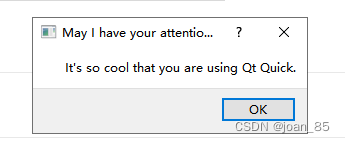
MessageDialog {
    id: dialog
    title: "May I have your attention please"
    text: "It's so cool that you are using Qt Quick."
  onAccepted: {
       console.log("And of course you could only agree.")
       Qt.quit()
 }
  Component.onCompleted: visible = true
}
Popup
closePolicy : enumeration :此属性决定弹出窗口关闭的情况
Popup.NoAutoClose: Popup 只会在手动指示时关闭。
Popup.CloseOnPressOutside:当鼠标在其外部按下时, Popup 将关闭。
Popup.CloseOnPressOutsideParent:当鼠标在其父级之外按下时, Popup 将关闭。
Popup.CloseOnReleaseOutside:当鼠标离开 Popup 时, Popup 将关闭。
Popup.CloseOnReleaseOutsideParent:当鼠标在其父级之外释放时, Popup 将关闭。
Popup.CloseOnEscape:当 Popup 具有活动焦点时按下退出键, Popup 将关闭。
modal : bool:确定弹出窗口是否是模态的
dim : bool:显示弹出窗口是否使背景变暗
Overlay:弹出窗口覆盖
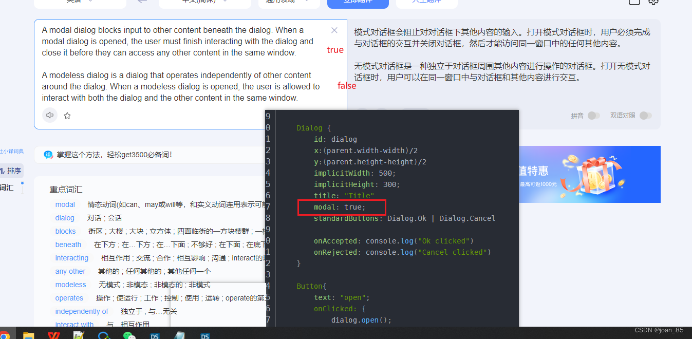
Dialog相关
属性基本与Pupup一致
1.去掉默认的边框
解决:加入background属性,里面为空也可
    Dialog {
        id: wanGatewayApply
        width: 259//控制整个弹窗的大小
        height: 160
        x: (bodyRect.width - width) / 2 // 水平居中
        y: (bodyRect.height - height) / 2 -100// 垂直居中
        modal: true
        // title: "Title" //标题
        // standardButtons: Dialog.Ok | Dialog.Cancel  //按钮

        background: Rectangle{
//         implicitWidth: 100
//         implicitHeight: 100
//         anchors.centerIn: parent
//         border.color: "#fff"
        }
        onAccepted: console.log("Ok clicked")
        onRejected: console.log("Cancel clicked")


        Rectangle{
            anchors.fill: parent
            color: "#fff"
        }
    }
如何给下边框设置阴影效果
gpt搜索的
import QtQuick 2.15
import QtGraphicalEffects 1.15

Rectangle {
    width: 200
    height: 40
    color: "#FFFFFF"

    Rectangle {
        width: parent.width
        height: 1
        color: "gray"

        DropShadow {
            anchors.bottom: parent.bottom
            color: "#000000"
            radius: 5
            samples: 10
            horizontalOffset: 0
            verticalOffset: 0
        }
    }
}
实践:
import QtQuick 2.15
//import QtQuick.Controls 2.15
import QtGraphicalEffects 1.15//边框效果一般用这个
//************************************************ 顶部区域
Rectangle {
    id: headerBox
    color: "#fff"
    width: parent.width
    height: 60
    Image {
        id: mLogo
        x: 55
        width: 139
        height: 60
        source: "images/mLogo.png"
    }
}
// 顶部-外部阴影-----于要操作的组件同级
DropShadow {
    anchors.fill: headerBox
    horizontalOffset: 0
    verticalOffset: 3
    radius: 8.0
    samples: 16
    color: "#DCDCDC"
    source: headerBox
}
Qt Design Studio 4.2.0怎么引入Calendar组件,并使用Calendar
要在 Qt Design Studio 4.2.0 中引入 Calendar 组件并使用它,你需要按照以下步骤进行操作:

步骤 1:创建新项目
1.打开 Qt Design Studio。
2.在“选择模板”对话框中,选择适合你需求的项目模板,并创建一个新项目。

步骤 2:导入 Calendar 组件
1.在项目资源管理器中,右键单击 Imports 文件夹,选择 "Add Existing File"(添加现有文件)。
2.在文件选择对话框中,导航到你的 Qt 安装目录中的 qml/QtQuick/Controls.2 文件夹。
3.选择 Calendar.qml(如果有 CalendarStyle.qml,也选择它)文件并导入到项目中。

步骤 3:使用 Calendar 组件
1.在 MainWindow.qml 或你希望使用 Calendar 的 QML 文件中,添加以下 import 语句:
import QtQuick.Controls 2.15
2.在该文件中,使用以下代码来创建和使用 Calendar 组件:
Rectangle {
    width: 400
    height: 300
    Calendar {
        id: calendar
        anchors.centerIn: parent
    }
}

现在,你已经成功在 Qt Design Studio 4.2.0 中引入并使用了 Calendar 组件。你可以根据需要自定义和配置 Calendar 组件的属性和行为。

如果你需要更复杂的操作,例如处理日期选择事件或更改样式,请参考官方的 Qt Quick Controls 2 文档和示例,以获取更多关于 Calendar 组件的使用信息。
引入QtQuick.Controls.Styles 2.15,显示module not found
import QtQuick 2.15
import QtQuick.Controls 2.15
import WinIFDesigner 1.0
import Qt5Compat.GraphicalEffects
import Qt.labs.qmlmodels 1.0
import QtQuick.Layouts 1.11

//import QtQuick.Controls 1.6
//import QtQuick.Controls.Styles 1.4
import QtQuick.Controls.Styles 2.15
Qt Design Studio 4.2.0 并没有引入 QtQuick.Controls.Styles 模块。QtQuick.Controls.Styles 是一个用于自定义 Qt Quick Controls 2 外观的模块,但它不是 Qt Design Studio 的一部分。
查询结果:
achors.rightMargin失效
1.Rectangle,Image 结合,Image 距离右侧设置距离
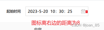
解决:
anchors.right: parent.right
anchors.rightMargin: 8
同时使用
Rectangle{
    width: 212
    height: 32
    anchors.verticalCenter: parent.verticalCenter
    border.color: "#D9D9D9"

    TextInput {
        id: textInput
        x:8
        anchors.verticalCenter: parent.verticalCenter
        verticalAlignment: Text.AlignVCenter
        text: qsTr("2023-5-20  10:30:25")
        font.pointSize: 10
    }
    Image {
        id: startDate
        source: "./images/date"
        anchors.verticalCenter: parent.verticalCenter
        anchors.right: parent.right
        anchors.rightMargin: 8
    }
}
2.Rectangle,Text 结合,text距离右侧设置距离

Rectangle{
   id: apnName
   width: 76
   height: 32
   border.color: "#333"
   Text {
       text: qsTr("APN")
       anchors.fill: parent
       verticalAlignment: Text.AlignVCenter
       horizontalAlignment:Text.AlignRight
       anchors.rightMargin: 20
       color: "#333"
       font.family: "PingFang SC"
       font.pointSize: 10
   }
}
label

 Label {
     text: "Hello world"
     font.pixelSize: 22
     font.italic: true
 }
下拉框
可参考:
https://blog.csdn.net/tanxuan231/article/details/124990398
https://www.5axxw.com/questions/content/3xqy76
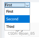
 ComboBox {
     textRole: "key"
     model: ListModel {
         ListElement { key: "First"; value: 123 }
         ListElement { key: "Second"; value: 456 }
         ListElement { key: "Third"; value: 789 }
     }
 }
自定义下拉框

 import QtQuick
 import QtQuick.Controls

 ComboBox {
     id: control
     model: ["First", "Second", "Third"]

     delegate: ItemDelegate {
         width: control.width
         contentItem: Text {
             text: control.textRole
                 ? (Array.isArray(control.model) ? modelData[control.textRole] : model[control.textRole])
                 : modelData
             color: "#21be2b"
             font: control.font
             elide: Text.ElideRight
             verticalAlignment: Text.AlignVCenter
         }
         highlighted: control.highlightedIndex === index
     }

     indicator: Canvas {
         id: canvas
         x: control.width - width - control.rightPadding
         y: control.topPadding + (control.availableHeight - height) / 2
         width: 12
         height: 8
         contextType: "2d"

         Connections {
             target: control
             function onPressedChanged() { canvas.requestPaint(); }
         }

         onPaint: {
             context.reset();
             context.moveTo(0, 0);
             context.lineTo(width, 0);
             context.lineTo(width / 2, height);
             context.closePath();
             context.fillStyle = control.pressed ? "#17a81a" : "#21be2b";
             context.fill();
         }
     }

     contentItem: Text {
         leftPadding: 0
         rightPadding: control.indicator.width + control.spacing

         text: control.displayText
         font: control.font
         color: control.pressed ? "#17a81a" : "#21be2b"
         verticalAlignment: Text.AlignVCenter
         elide: Text.ElideRight
     }

     background: Rectangle {
         implicitWidth: 120
         implicitHeight: 40
         border.color: control.pressed ? "#17a81a" : "#21be2b"
         border.width: control.visualFocus ? 2 : 1
         radius: 2
     }

     popup: Popup {
         y: control.height - 1
         width: control.width
         implicitHeight: contentItem.implicitHeight
         padding: 1

         contentItem: ListView {
             clip: true
             implicitHeight: contentHeight
             model: control.popup.visible ? control.delegateModel : null
             currentIndex: control.highlightedIndex

             ScrollIndicator.vertical: ScrollIndicator { }
         }

         background: Rectangle {
             border.color: "#21be2b"
             radius: 2
         }
     }
 }
.ui.qml不支持function
鼠标响应事件
例子:
MouseArea {
      anchors.fill: parent
      acceptedButtons: Qt.LeftButton | Qt.RightButton
      onClicked: function(mouse){
          if (mouse.button === Qt.RightButton)
              contextMenu.popup()
      }
      onPressAndHold: function(mouse){
          if (mouse.source === Qt.MouseEventNotSynthesized)
              contextMenu.popup()
      }

      Menu {
          id: contextMenu
          MenuItem { text: "Cut" }
          MenuItem { text: "Copy" }
          MenuItem { text: "Paste" }
      }
  }
参考:https://blog.csdn.net/qq_41895747/article/details/104597293
Menu介绍
参考:https://blog.csdn.net/hw5230/article/details/131191517
自定义菜单组件(官方文档)
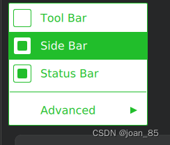
 import QtQuick
 import QtQuick.Controls

 Menu {
     id: menu

     Action { text: qsTr("Tool Bar"); checkable: true }
     Action { text: qsTr("Side Bar"); checkable: true; checked: true }
     Action { text: qsTr("Status Bar"); checkable: true; checked: true }

     MenuSeparator {
         contentItem: Rectangle {
             implicitWidth: 200
             implicitHeight: 1
             color: "#21be2b"
         }
     }

     Menu {
         title: qsTr("Advanced")
         // ...
     }

     topPadding: 2
     bottomPadding: 2

     delegate: MenuItem {
         id: menuItem
         implicitWidth: 200
         implicitHeight: 40

         arrow: Canvas {
             x: parent.width - width
             implicitWidth: 40
             implicitHeight: 40
             visible: menuItem.subMenu
             onPaint: {
                 var ctx = getContext("2d")
                 ctx.fillStyle = menuItem.highlighted ? "#ffffff" : "#21be2b"
                 ctx.moveTo(15, 15)
                 ctx.lineTo(width - 15, height / 2)
                 ctx.lineTo(15, height - 15)
                 ctx.closePath()
                 ctx.fill()
             }
         }

         indicator: Item {
             implicitWidth: 40
             implicitHeight: 40
             Rectangle {
                 width: 26
                 height: 26
                 anchors.centerIn: parent
                 visible: menuItem.checkable
                 border.color: "#21be2b"
                 radius: 3
                 Rectangle {
                     width: 14
                     height: 14
                     anchors.centerIn: parent
                     visible: menuItem.checked
                     color: "#21be2b"
                     radius: 2
                 }
             }
         }

         contentItem: Text {
             leftPadding: menuItem.indicator.width
             rightPadding: menuItem.arrow.width
             text: menuItem.text
             font: menuItem.font
             opacity: enabled ? 1.0 : 0.3
             color: menuItem.highlighted ? "#ffffff" : "#21be2b"
             horizontalAlignment: Text.AlignLeft
             verticalAlignment: Text.AlignVCenter
             elide: Text.ElideRight
         }

         background: Rectangle {
             implicitWidth: 200
             implicitHeight: 40
             opacity: enabled ? 1 : 0.3
             color: menuItem.highlighted ? "#21be2b" : "transparent"
         }
     }

     background: Rectangle {
         implicitWidth: 200
         implicitHeight: 40
         color: "#ffffff"
         border.color: "#21be2b"
         radius: 2
     }
 }
菜单组件Menu应用
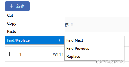
MouseArea{
   id:moouseId
   anchors.fill: parent
   onClicked: {
     dialog.open();
   }
}


Menu {
   id: dialog
   y: moouseId.height
   Action { text: "Cut" }
   Action { text: "Copy" }
   Action { text: "Paste" }
   MenuSeparator { }
   Menu {
       title: "Find/Replace"
       Action { text: "Find Next" }
       Action { text: "Find Previous" }
       Action { text: "Replace" }
   }
}
或者用MenuItem
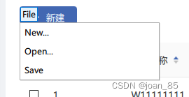
Button {
    id: fileButton
    text: "File"
    onClicked: menu.open()

    Menu {
        id: menu
        y: fileButton.height

        MenuItem {
            text: "New..."
        }
        MenuItem {
            text: "Open..."
        }
        MenuItem {
            text: "Save"
        }
    }
}
点击事件出现Dialog弹框
但自带的边框去不掉(暂没解决)
Rectangle {
  id: addRect
  width: 82
  height: 32
  border.color: "#4267B2"
  color: "#4267B2"
  radius: 4
  Image {
      id: addImg
      source: "images/addWhite.png"
      width: 13
      height: 13
      x: 15
      anchors.verticalCenter: parent.verticalCenter
  }
  Text {
      id: addText
      text: qsTr("新建")
      x: 38
      font.pointSize: 10
      color: "#fff"
      anchors.verticalCenter: parent.verticalCenter
  }
  //点击
  MouseArea{
      anchors.fill: parent
      onClicked: {
        dialog.open();
      }
  }
  //弹窗内容
  Dialog {
         id: dialog
         x:0
         y:34
//  implicitWidth: 185;
//  implicitHeight: 326;
         width: 185;
         height: 326;
         modal: true;
//  standardButtons: Dialog.Ok | Dialog.Cancel
//  onAccepted: console.log("Ok clicked")
//  onRejected: console.log("Cancel clicked")
         /* 内容样式 */
         Rectangle{
             id:dialogCon
             anchors.fill: parent
             color: "#fff"
             Column {
                 spacing: 15
                 Text {
                     id: iconText
                     font.pointSize: 10
                     font.family:  "iconfont"
                     text: "11111"
                     color: "#333"
                 }
                 Text {
                     id: iconText2
                     font.pointSize: 10
                     font.family:  "iconfont"
                     text: "2222"
                     color: "#333"
                 }
             }
         }
     }
}
弹框中modal属性
pointSize和pixelSize区别
font.pointSize: 14
font.pixelSize: 14
通过设置PointSize的字体来说,字体大小是随着屏幕大小以及分辨率自适应的,无须处理字体的缩放;
通过设置PixelSize的字体来说,所占分辨率大小固定,在相同尺寸上更高分辨率的屏幕上,由于其单位长度内的像素点数更多,即像素密度更大,字体会看起来小一些.
要处理这种情况,一种办法就是所有字体都用PointSize来表示大小,但对于已经采用PixelSize的字体来说,就要对其进行控制缩放。
通过qss来实现:
PointSize:    font-size:16pt;
PixelSize:     font-size:16px;
一直被字体自适应这个问题困扰,尤其是使用pixelSize单位字体,在不同的分辨率电脑上会显示不一样的效果,有的大,有的中等,有的贼小,这是因为使用pixelSize会导致字体给固定住,多大就是大多,不会自己变化,遇到分辨率高的就变小,低的就贼大,刚好和设计原型差不多的,就看着很漂亮。
而使用pointSize虽然会自己放大缩小,但是和设计稿的字体差距很大,而且也会存在相应问题,而我更倾向于使用pixelSize,既然它固定了,我可以根据比例自己放大缩小即可,所以本文重点就要解决的就是如何获取放大缩小的比例,使像素字体无论再什么设备上都能看起来是中等好看的!
思路
要想获取到字体的缩放因子,就得知道宽高的原始像素对比现设备的原始像素,分别得到不同的宽高比例值,获取最小值,这就是缩放比例因子,然后乘以当前的字体大小,就可以等比缩放字体了,当然还可以增加一个缩放基础因子,初始化为1,这个需要人为的调整,有的可能1不太好看,需要调整到1.1就会更佳,下面给出具体的获取代码
horizontalRatio = 变化的U
参考:https://it.cha138.com/ios/show-6287196.html
表格自定义内容中,delegate类型:
delegate: CheckBox
delegate: SpinBox
delegate: TextField
delegate: DelegateChooser
{
   DelegateChoice
   {
       column: 0
       delegate: CheckBox
       {
           implicitWidth: header.width*0.1
           implicitHeight:40
           checked: model.display
           onToggled: model.display = checked
       }
   }
   DelegateChoice
   {
       column: 1
       delegate: SpinBox
       {
           implicitWidth: 140
           implicitHeight:40
           value: model.display
           onValueModified: model.display = value
       }
   }
   DelegateChoice
   {
       delegate: TextField
       {
           text: model.display
           selectByMouse: true
           implicitWidth: 140
           implicitHeight:40
           onAccepted: model.display = text
       }
   }
}
三四五列没设置column,默认一样
Rectangle隐藏下边框
Rectangle{
     width: parent.width
     height: 32
     color: "#F5F5F5"
     border.color: "#D9D9D9"
    // border.width: 1
     //隐藏下边框
     Rectangle{
         width: parent.width
         height: 1
         color: "#F5F5F5"
         anchors.bottom: parent.bottom
     }
 }
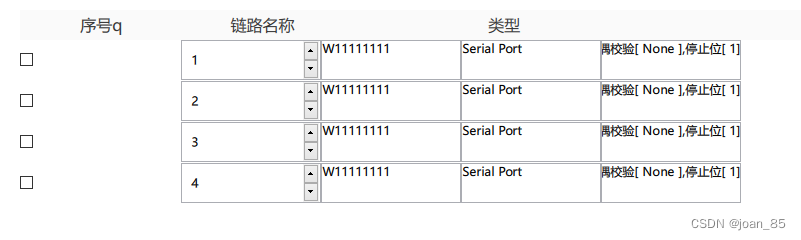
表格只显示下边框
delegate: DelegateChooser
{
   DelegateChoice
   {
       column: 0
       delegate: Rectangle
       {
           id:checkBoxRect
           implicitWidth: header.width*0.03
           implicitHeight:50
           border.width: 1
           border.color:"#E8E8E8"
           color:"#fff"
//         CheckBox{
//               anchors.centerIn: parent
//               checked: model.display
//               onToggled: model.display = checked
//         }

//加这一层覆盖掉checkBoxRect内容
           Rectangle{
             anchors{
                 fill: checkBoxRect
                 bottomMargin: checkBoxRect.border.width
             }
             color: "#fff"
             CheckBox{
               anchors.centerIn: parent
               checked: model.display
               onToggled: model.display = checked
             }
           }

       }


   }

   DelegateChoice{}
    ...
    ...
    ...
   }
QML 布局详解
在QML中布局分为以下几种:绝对坐标、锚布局、定位器、布局管理器。
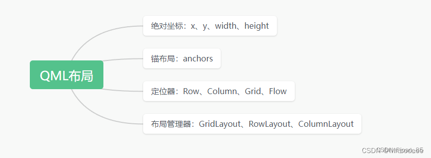
1.设置x、y、width、height能够定位一个组件的位置,这种方法扩展性太差。
    Button{
        width: 50
        height: 50
        x: 10
        y:10
        background: Rectangle{
            color:"red"
        }
    }
2.锚布局
3.定位器
Row和Column差不多
4.Flow:流式布局
示例:Flow项自动将子Text项并排放置,当超出父控件边界时会自动换行。
5.Grid:网格布局
可以控制绘制几行几列。
参考:https://blog.csdn.net/wzz953200463/article/details/129718412
Rectangle
圆角属性:radius
放发缩小:scale
改变元素的原点位置:transformOrigin: “TopLeft”
移动:transform: Translate { y: -40 }//上移
Rectangle底部颜色和宽度:
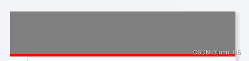
Rectangle {
    id: rect
    anchors.fill: parent
    border.width: 5//底边宽度
    color: "gray"
    border.color: "red"//底边颜色
}
Rectangle {
    anchors {
        fill: rect
        bottomMargin: rect.border.width
    }
    color: "gray"
}
button
background属性
 Button{
        id:b1
        width: 50
        height: 50
        anchors.centerIn: parent    //在Window的中心
        background: Rectangle{
            color:"red"
        }
    }
Button自定义
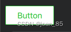
 import QtQuick
 import QtQuick.Controls

 Button {
     id: control
     text: qsTr("Button")

     contentItem: Text {
         text: control.text
         font: control.font
         opacity: enabled ? 1.0 : 0.3
         color: control.down ? "#17a81a" : "#21be2b"
         horizontalAlignment: Text.AlignHCenter
         verticalAlignment: Text.AlignVCenter
         elide: Text.ElideRight
     }

     background: Rectangle {
         implicitWidth: 100
         implicitHeight: 40
         opacity: enabled ? 1 : 0.3
         border.color: control.down ? "#17a81a" : "#21be2b"
         border.width: 1
         radius: 2
     }
 }
树形结构
可参考下,help中的查询文档
TreeView {
	id: myTree
	anchors.fill: parent
	headerVisible: false
	backgroundVisible : false   //隐藏背景
	style: treeViewStyle
	model: root.treeModel
	selection: sel

	TableViewColumn {
	width: myTree.width
	title: "Name"
	role: "name"
	}

	itemDelegate: Item {
		Image {
		id: nodeTextImage
		anchors.verticalCenter: parent.verticalCenter
		source: ""
		}
		Text {
			id: nameText
			anchors.left: nodeTextImage.right
			anchors.leftMargin: 5
			anchors.verticalCenter: parent.verticalCenter
			color: "white"
			elide: styleData.elideMode
			text: styleData.value
			font.pointSize: 16
		}
		Drag.active:itemMouse.drag.active
		Drag.dragType: Drag.Automatic;      //选择自动开始拖动
		Drag.supportedActions: Qt.CopyAction;   //选择复制数据到DropArea
		Drag.onDragFinished: {              //拖拽结束

		}

	MouseArea {
		id: itemMouse
		anchors.fill: parent
		hoverEnabled: true
		drag.target: nameText

		property bool isExpand: true    //点击展开树节点
		onClicked: {
			sel.setCurrentIndex(styleData.index, 0x0010)    //点击Item,设置选中当前节点
			if (isExpand) {
			    emit: myTree.expand(styleData.index)
			    isExpand = false;
			    mControl.updateNodeName(styleData.index)
			}
			else {
			    emit: myTree.collapse(styleData.index)
			    isExpand = true;
边的阴影怎么实现
切记:DropShadow要放在需要阴影模块的同级,否者样式错乱

import Qt5Compat.GraphicalEffects
Rectangle {
   id: headerBox
   color: "#ffffff"
   width: parent.width
   height: 60
}
//外部阴影
DropShadow {
   anchors.fill: headerBox
   horizontalOffset: 7
   verticalOffset: 3
   radius: 8.0
   samples: 16
   color: "#b9b9b9"
   source: headerBox
}

 // 顶部-内部阴影
InnerShadow {
      anchors.fill: headerBox
      cached: true
      horizontalOffset: 0
      verticalOffset: -3
      radius: 16
      samples: 32
      color: "#666"
      smooth: true
      source: headerBox
  }
参考:
https://blog.csdn.net/luoyayun361/article/details/65428939
https://blog.csdn.net/Marrrrrco/article/details/125204965
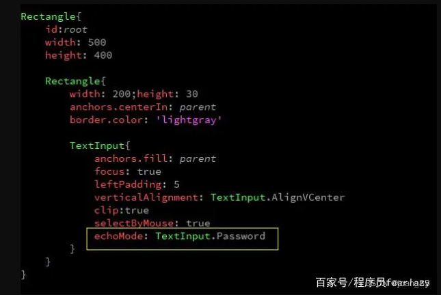
TextInput的使用方法
参考:https://baijiahao.baidu.com/s?id=1707087196065011808&wfr=spider&for=pc
https://blog.csdn.net/hahaha113461/article/details/129723861
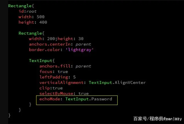
TextInput禁止输入模式
readOnly: true
TextInput文字居中方式
https://baijiahao.baidu.com/s?id=1707087196065011808&wfr=spider&for=pc
TextInput{
    anchors.fill: parent
    //anchors.leftMargin: 8
    text: "192.168.222"
    font.pointSize: 10
    font.family: "PingFang SC"
    verticalAlignment: Qt.AlignCenter  //或者用verticalAlignment: TextInput.AlignVCenter
    //horizontalAlignment: Qt.AlignHCenter//或者用verticalAlignment: TextInput.AlignHCenter
}
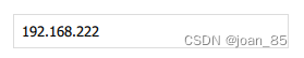
TextInput{
    anchors.fill: parent
    anchors.leftMargin: 8
    text: "192.168.222"
    font.pointSize: 10
    font.family: "PingFang SC"
    verticalAlignment: Qt.AlignCenter  //或者用verticalAlignment: TextInput.AlignVCenter
    //horizontalAlignment: Qt.AlignHCenter//或者用verticalAlignment: TextInput.AlignHCenter
}
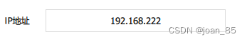
Text文字右对齐

Rectangle{
    id: ipName
    width: 60
    height: 32
    border.color: "blue"
    Text {
        text: qsTr("IP地址")
        anchors.fill: parent
        verticalAlignment: Text.AlignVCenter
        horizontalAlignment:Text.AlignRight
        //anchors.rightMargin: 4
	}
}
Text文字居中方式
(1)创建一个rectangle,让text在rectangle中居中。
Window {
    width: 400
    height: 400
    title: qsTr("Hello World")
    visible: true
    Rectangle{
        anchors.centerIn: parent
        width: parent.width/2
        height: parent.height/2
        color:"yellow"
        Text {
            id: name
            anchors.centerIn: parent
            text: qsTr("text")
            font.pixelSize: 30
        }
    }
}
(2)只创建一个text,设置对其方式。
Window {
    width: 400
    height: 400
    title: qsTr("Hello World")
    visible: true
    Text {
        width: parent.width
        height: parent.height
        id: name
        text: qsTr("text")
        font.pixelSize: 30
        horizontalAlignment: Text.AlignHCenter//(1)
        verticalAlignment: Text.AlignVCenter//(2)
    }
}
参考:https://blog.csdn.net/ipfpm/article/details/88687398
anchors.fill和anchors.centerIn区别
anchors.centerIn:parent,是将子控件放在父控件的正中心,子控件的宽高是自己设置的;anchors.fill:parent, 是在子控件的大小设置与父控件大小一样,特别是mouseArea中经常使用anchors.fill:parent,这是为了指定鼠标事件接受的范围。如果是两个矩形控件,颜色不同,那么子控件会完全覆盖父控件,全是子控件的颜色显示。
还有一点,就是parent是指父类,直接相关的父类。anchors.fill指定的父类是必须是直接的父类,如果不是,会报错的。
参考:https://blog.csdn.net/lichen18848950451/article/details/79185611
自定义组件
新建一个自定义文件,文件名为:Button.qml
import QtQuick 2.0
Rectangle {
    id: root

    property alias text: label.text
    signal clicked

    width: 116; height: 26
    color: "lightsteelblue"
    border.color: "slategrey"

    Text {
        id: label
        anchors.centerIn: parent
        text: "Start"
    }
    MouseArea {
        anchors.fill: parent
        onClicked: {
            root.clicked()
        }
    }
}
下面我们需要修改 main.qml 来使用这个组件:
import QtQuick 2.0

Rectangle {
    width: 360
    height: 360
    Button {
        id: button
        x: 12; y: 12
        text: "Start"
        onClicked: {
            status.text = "Button clicked!"
        }
    }

    Text {
        id: status
        x: 12; y: 76
        width: 116; height: 26
        text: "waiting ..."
        horizontalAlignment: Text.AlignHCenter
    }
}
在 main.qml 中,我们直接使用了Button这个组件,就像 QML 其它元素一样。由于 Button.qml 与 main.qml 位于同一目录下,所以不需要额外的操作。但是,如果我们将 Button.qml 放在不同目录,比如构成如下的目录结果:
app
 |- QML
 |   |- main.qml
 |- components
     |- Button.qml
那么,我们就需要在 main.qml 的import部分增加一行import …/components才能够找到Button组件。
有时候,选择一个组件的根元素很重要。比如我们的Button组件。我们使用Rectangle作为其根元素。Rectangle元素可以设置背景色等。但是,有时候我们并不允许用户设置背景色。所以,我们可以选择使用Item元素作为根。事实上,Item元素作为根元素会更常见一些。
参考:https://www.bookstack.cn/read/qt-study-road-2/15edfd7a031f980e.md
自定义属性
// 自定义属性
property int times: 24
// 属性别名
property alias anotherTimes: times
//声明一个默认属性
default property var defaultText
参考:https://www.bookstack.cn/read/qt-study-road-2/ffdc17d45ca95b72.md
Item
Item是QML中最基本的元素,所有其他元素都继承自它。它代表了一个可视化的对象,可以在界面上显示出来。
Item的属性包括位置、大小、旋转角度、缩放比例等。还可以设置颜色、透明度、边框等外观属性。此外,Item还可以响应用户输入事件,例如鼠标点击、键盘按键等。
在QML中,通常使用Item作为容器来组织其他元素,例如Rectangle、Text等。可以将多个Item嵌套在一起,形成复杂的界面布局。
下面是一个简单的例子,展示了如何使用Item创建一个红色矩形:
import QtQuick 2.0
Item {
width: 100
height: 100
color: "red"
}
参考:https://blog.csdn.net/m0_60259116/article/details/130270827
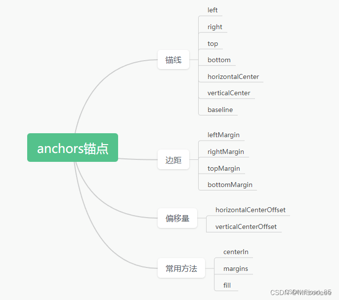
anchors详解
https://baijiahao.baidu.com/s?id=1706546262009663031&wfr=spider&for=pc
https://zhuanlan.zhihu.com/p/477876610?utm_id=0
什么时候用Item什么时候用Rectangle?什么时候用Row什么时候用RowLayout?
什么时候用Item,就是你要做一个组件,这个组件是一个复合的组件,组件有部分是有显示项。这种情况下,就用Item。如果你的元素是作为一个整体,以后不需要变动和更改,那么就用Rectangle。
什么时候用Row布局,当布局里面的所有元素的尺寸宽高都明确的时候,用Row布局,你可以精确细化到每个元素的宽高。
RowLayout布局,自带了一个自适应的布局方式,比如填充满,然后比如元素的比例。如果一个行中只有部分元素的尺寸是已知的,那么可以考虑用此布局。
参考:https://www.cnblogs.com/xianqingzh/p/4569176.html
lable用法
import QtQuick 2.12
import QtQuick.Window 2.12
import QtQuick.Controls 2.5

Window {
    visible: true
    width: 640
    height: 480
    title: qsTr("Hello World")

    Label
    {
        x:100
        y:100
        width: 100
        height: 50

        text: qsTr("我是标签")  //可被翻译
        color: "red"  //设置Label字体颜色
        font.pixelSize: 22 //字体大小
        font.italic: true  //斜体

        //字体对其方式
        horizontalAlignment:Text.AlignHCente
        verticalAlignment:Text.AlignVCenter

        //设置背景颜色
        background: Rectangle{
            color: "gray"
        }
    }
}
Column
Column可以将它的子元素排列成一列
1.使用:
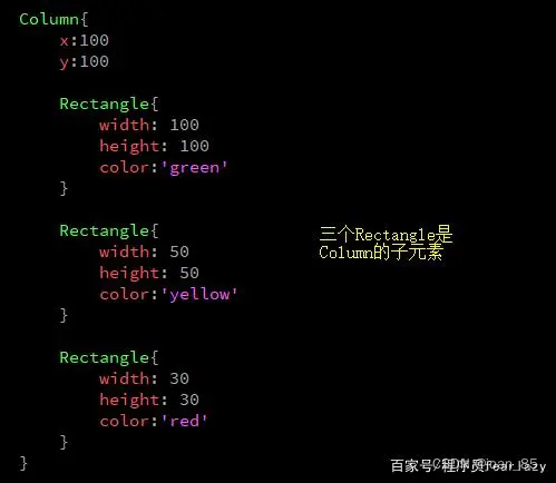
2.使用spacing设置Column内部元素之间的间隔。
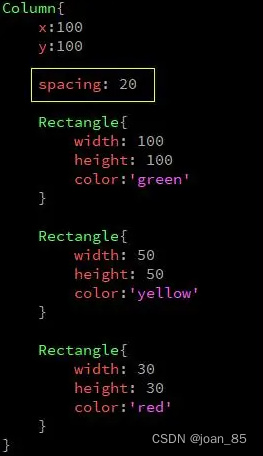
3.设置Column子元素四周的空白使用leftPadding、topPadding、rightPadding和bottomPadding。
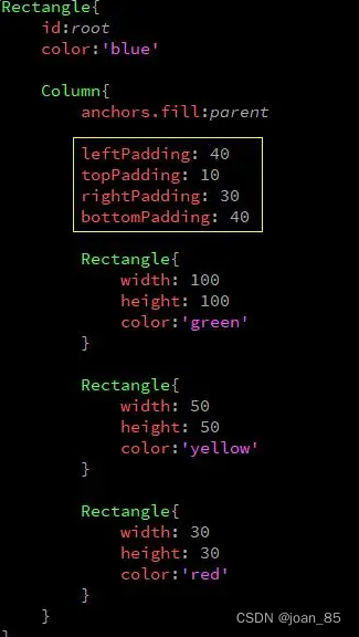
4.除了以上属性,Column元素还有三个属性的值是Transition(过渡),这三个属性是populate、add、和move。
它们分别用来设置Column子元素创建时、添加时和移动时的过渡效果(添加动画)。
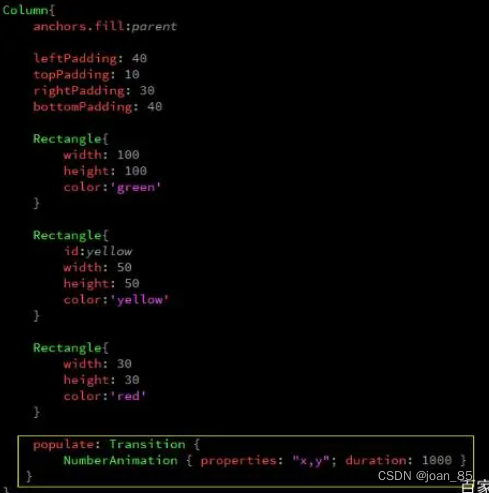
参考:https://baijiahao.baidu.com/s?id=1706627580638269232&wfr=spider&for=pc
Qt中font.pointSize和font.pixelSize的区别
pixel size 是所占的像素大小 这样有一个缺点 有些显示器的分辨率(dpi)比较大 那么单位长度中的像素点就比较多 这样一个字所占的长度就会比较少
point size 则规定了实际中我们肉眼看到的字体的大小 他和pixel无关的,他和显示器无关 不管在什么样上的显示器上 规定大小是多少就是多少。
注意:
1、当font.pointSize和font.pixelSize同时指定时,font.pixelSize生效。
2、在移动平台,建议使用font.pointSize。
因为像Android智能手机,屏幕尺寸和像素多种多样,使用font.pointSize可以更好的适应屏幕,在不同屏幕上看起来大小比较正常。而使用pixelSize,可能会导致有的手机上看不见,有些手机上特别大的情况。
参考:https://blog.csdn.net/bzs2510568513/article/details/120056541
Qt中fileMode
背景图片设置:
Image {
    id: imageBg
    fillMode: Image.PreserveAspectFit
    source: "images/loginBg.png"
    width: parent.width
    height: parent.height
}
Image.Stretch:图片拉伸自适应;(默认的)
Image.PreserveAspectFit:按比例缩放,不裁剪
Image.PreserveAspectCrop:均匀缩放,必要时裁剪
Image.Tile:像贴瓷砖一样
Image.TileVertically:水平拉伸,垂直平铺
Image.TileHorizontally:垂直拉伸,水平平铺
Image.Pad:原始图像不做处理
参考:https://blog.csdn.net/qq78442761/article/details/89891547
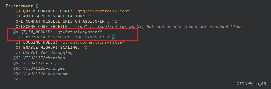
隐藏虚拟键盘
在WinIFDesigner.qmlproject文件中,注释下面两行代码即可
qt design studioA开发工具中, 新建的.ui.qml中引入ColumnLayout后,无法启动【Run Project】
加入下面一句代码后,可以显示,无法启动,暂未知原因
import QtQuick.Layouts 5.15
代码如下:
import QtQuick 2.15
import QtQuick.Controls 2.15
import WinIFDesigner 1.0
import QtQuick.Layouts 5.15//可以显示,无法启动

Rectangle {
    width: Constants.width
    height: Constants.height
    color: '#F0F2F5'

    ColumnLayout {
        id: columnLayout
        //        anchors.fill: parent
        width: parent.width
        height: parent.height
        spacing: 0
        Rectangle {
            id: rectangle
            width: parent.width
            height: 60
            color: "#ffffff"
        }
    }
}
用Column布局可以正常运行,但是加上以下四句,运行失效
//anchors.top: 60//有以下四行,不能运行,注释后正常
//anchors.bottom: 0
//anchors.right: 0
//anchors.left: 0
import QtQuick 2.15
import QtQuick.Controls 2.15
import WinIFDesigner 1.0
Rectangle {
    width: Constants.width
    height: Constants.height
    color: '#F0F2F5'

    Column {
        id: column
        anchors.fill: parent
        Rectangle {
            id: rectangle
            width: parent.width
            height: 60
            color: "#ffffff"
        }
        Rectangle {
            id: rectangle2
            width: parent.width
            height: parent.height - 60
            //anchors.top: 60//有以下四行,不能运行,注释后正常
            //anchors.bottom: 0
            //anchors.right: 0
            //anchors.left: 0
        }
    }
}
报错:module “QtQuick.Layouts” version 5.15 is not installed
拖拽组件默认是:import QtQuick.Layouts 5.15
将版本改为1.11即可
//import QtQuick.Layouts 5.15
import QtQuick.Layouts 1.11
参考官方文档:https://doc.qt.io/qt-5/qtquicklayouts-overview.html
qt design studio中用ColumnLayout失效,用Column正常显示【没法用ColumnLayout,RowLayout】
引入版本问题:import QtQuick.Layouts 1.11 可以正常显示
qt design studio的2D预览和运行不一致的问题,2D预览可能不准确
报错:Parameter “mouse” is not declared. Injection of parameters into signal handlers is deprecated. Use JavaScript functions with formal parameters instead.
原因:自Qt6开始,QML中使用信号处理函数参数时,需要显式捕获参数,写法如下
原来:
onClicked:{
    if (mouse.button === Qt.RightButton)
        contextMenu.popup()
}
改为:
onClicked: function(mouse){
    if (mouse.button === Qt.RightButton)
        contextMenu.popup()
}
报错:QML Row: Cannot specify left, right, horizontalCenter, fill or centerIn anchors for items inside Row. Row will not function.
Row 有次报错,可用Item代替!!!
Row中子元素按照控件属性由左向右分布,通过spacing控制子元素间距,因此通过anchor.left和anchor.right控制Row中子元素的水平位置会发生冲突,但仍然可以通过anchor.top和anchor.bottom控制子元素的垂直分布。如果希望用anchor进行定位,就用Item替换Row。
参考:https://blog.csdn.net/weixin_43692244/article/details/103686333
报错:QML Column: Cannot specify top, bottom, verticalCenter, fill or centerIn anchors for items inside Column. Column will not function.
Column正在尝试将MouseArea锚定到Image和Text旁边,但MouseArea指定其锚点来填充其父级。 这两件事是矛盾的,因此你得到错误的原因。
如果将MouseArea移出Column并进入SmileyDelegate的基本Item,您可能会发现它的效果与预期的一样。
Column is trying to anchor your MouseArea to next to the Image and the Text, but the MouseArea specifies its anchor to fill its parent. Those two things are contradictory, and hence why you get the error.
You’ll probably find it works as you expect if you move the MouseArea out of Column and into the base Item for SmileyDelegate.
参考:https://m.656463.com/wenda/cwQMLlwfwColumnndxzdtopbottomver_283
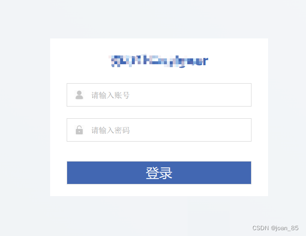
自己写的登录页面的例子
用column排列,子元素为Rectangle可以布局,但是间隔只能设置一样的,暂时找不到解决方案
所以本例子中没有用column,用的父元素为Rectangle 。
/*
This is a UI file (.ui.qml) that is intended to be edited in Qt Design Studio only.
It is supposed to be strictly declarative and only uses a subset of QML. If you edit
this file manually, you might introduce QML code that is not supported by Qt Design Studio.
Check out https://doc.qt.io/qtcreator/creator-quick-ui-forms.html for details on .ui.qml files.
*/
import QtQuick 2.15
import QtQuick.Controls 2.15
import WinIFDesigner 1.0
import Qt5Compat.GraphicalEffects

Rectangle {
    id: rectangleBox
    width: Constants.width
    height: Constants.height

    color: Constants.backgroundColor

    //    背景图片
    Image {
        id: imageBg
        fillMode: Image.PreserveAspectFit
        source: "images/loginBg.png"
        width: parent.width
        height: parent.height
    }

    //    登录页面
    Rectangle {
        id: loginRectBox
        width: 448
        height: 324
        anchors.horizontalCenter: parent.horizontalCenter
        anchors.verticalCenter: parent.verticalCenter
        color: "#ffffff"

        Item {
            id: loginTitle
            height: 90
            width: parent.width

            Text {
                id: loginTitleText
                anchors.horizontalCenter: parent.horizontalCenter
                anchors.verticalCenter: parent.verticalCenter
                text: qsTr("WinIFDesigner")
                font.bold: true
                font.pointSize: 20
                color: '#4267B2'
                font.family: 'PingFang SC'
            }
        }

        Rectangle {
            id: loginCont
            x: 0
            y: 92
            width: parent.width
            height: parent.height - 92

            //  账号
            Rectangle {
                id: userCont
                width: 380
                height: 48
                anchors.horizontalCenter: parent.horizontalCenter
                border.color: '#D9D9D9'
                clip: true //clip是从Item那里继承下来的,让绘制限定在它自己的矩形范围内。 失效!!!
                Image {
                    id: userNameImg
                    x: 16
                    source: "images/userNum.png"
                    width: 20
                    height: 20
                    anchors.verticalCenter: parent.verticalCenter
                }

                Text {
                    id: userTextPlaceholder
                    //  visible: !(userInput.activeFocus || userInput.length > 0)
                    visible: !(userInput.length > 0)
                    anchors.fill: parent
                    verticalAlignment: Text.AlignVCenter
                    leftPadding: 50
                    text: qsTr("请输入账号")
                    font.family: 'PingFang SC'
                    font.pixelSize: 16
                    color: "#999999"
                }
                TextInput {
                    id: userInput
                    anchors.fill: parent
                    leftPadding: 50
                    verticalAlignment: TextInput.AlignVCenter //文字显示位置
                    //                    text: "admin"
                    font.pointSize: 16
                    focus: true
                    selectByMouse: true //鼠标可选中 -复制,剪切
                    //                    echoMode: TextInput.Password //密码形式  TextInput.Normal:显示文本;TextInput.Password:密码;TextInput.NoEcho(啥也不显示);TextInput.PasswordEchoOnEdit(编辑时显示文本)
                }
            }
            //  密码
            Rectangle {
                id: pswCont
                width: 380
                height: 48
                y: 72
                anchors.horizontalCenter: parent.horizontalCenter
                border.color: '#D9D9D9'
                clip: true //clip是从Item那里继承下来的,让绘制限定在它自己的矩形范围内。 失效!!!
                Image {
                    id: pswImg
                    x: 16
                    source: "images/userPsw.png"
                    width: 20
                    height: 20
                    anchors.verticalCenter: parent.verticalCenter
                }

                Text {
                    id: pswTextPlaceholder
                    visible: !(pswTextInput.length > 0)
                    anchors.fill: parent
                    verticalAlignment: Text.AlignVCenter
                    leftPadding: 50
                    text: qsTr("请输入密码")
                    font.family: 'PingFang SC'
                    font.pixelSize: 16
                    color: "#999999"
                }
                TextInput {
                    id: pswTextInput
                    anchors.fill: parent
                    leftPadding: 50
                    verticalAlignment: TextInput.AlignVCenter //文字显示位置
                    //                    text: "123456"
                    font.pointSize: 16
                    focus: true
                    selectByMouse: true //鼠标可选中 -复制,剪切
                    echoMode: TextInput.Password //密码形式  TextInput.Normal:显示文本;TextInput.Password:密码;TextInput.NoEcho(啥也不显示);TextInput.PasswordEchoOnEdit(编辑时显示文本)
                }
            }
            Rectangle {
                id: loginBtnCont
                width: 380
                height: 48
                anchors.horizontalCenter: parent.horizontalCenter
                border.color: '#D9D9D9'
                y: 160
                color: '#4267B2'

                Text {
                    id: loginBtnText
                    text: qsTr("登录")
                    font.pointSize: 20
                    anchors.horizontalCenter: parent.horizontalCenter
                    anchors.verticalCenter: parent.verticalCenter
                    color: '#fff'
                }
            }
        }
    }

    //  边框阴影
    DropShadow {
        anchors.fill: rectangle1
        horizontalOffset: 7
        verticalOffset: 3
        radius: 8.0
        samples: 16
        color: "#80000000"
        source: rectangle1
    }
}


