前端CSS文字阴影text-shadow记录
一、文字阴影
<!DOCTYPE html>
<html lang="en">
<head>
<meta charset="UTF-8">
<meta name="viewport" content="width=device-width, initial-scale=1.0">
<title>Document</title>
<style>
body {
display: flex;
justify-content: center;
align-items: center;
height: 100vh;
}
.text {
font-size: 60px;
font-weight: bold;
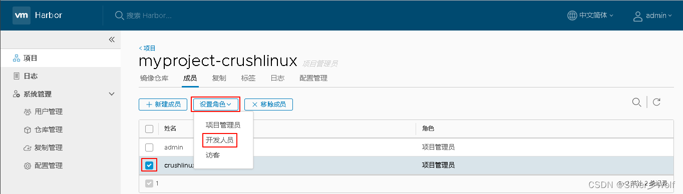
text-shadow: 4px 4px 10px #222222;
}
</style>
</head>
<body>
<div class="text">
Hello world
</div>
</body>
</html>
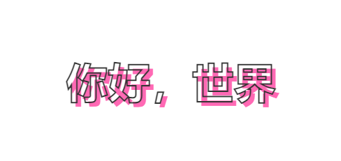
效果:
下面代码只放CSS部分
二、文字模糊
        .text {
            font-size: 60px;
            font-weight: bold;
            text-shadow: 0 0 6px #000;
            color: transparent;
        }
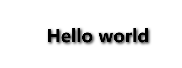
设置文字阴影后,文字颜色设置透明,即可设置文字模糊

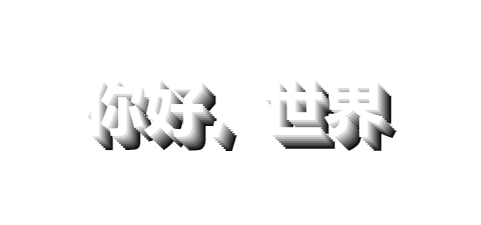
三、像素风格的文字
		.text {
            font-size: 60px;
            font-weight: bold;
            text-shadow: 2px 2px 0px #ddd,
                4px 4px 0px #bbb,
                6px 6px 0px #999,
                8px 8px 0px #777,
                10px 10px 0px #555,
                12px 12px 0px #333,
                14px 14px 0px #111;
            color: #fff;
        }
四、3D文字
        .text {
            font-size: 60px;
            font-weight: bold;
            text-shadow: 2px 2px 2px #ddd,
                4px 4px 2px #bbb,
                6px 6px 2px #999,
                8px 8px 2px #777,
                10px 10px 2px #555,
                12px 12px 2px #333,
                14px 14px 2px #111;
            color: #fff;

        }
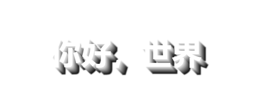
与像素风格不同之处在与阴影模糊效果增加了(0px->2px)
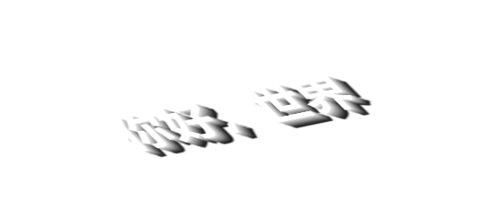
可以把阴影放入伪类,字体会更有空间感,如下:
        .text {
            font-size: 60px;
            font-weight: bold;
            text-shadow: 2px 2px 2px #ddd,
                4px 4px 2px #bbb,
                6px 6px 2px #999,
                8px 8px 2px #777,
                10px 10px 2px #555,
                12px 12px 2px #333,
                14px 14px 2px #111;
            color: #fff;
            transform: skew(40deg) rotate(-10deg) rotateX(50deg);

        }
五、彩虹拖尾
		.text {
            font-size: 60px;
            font-weight: bold;
            text-shadow: 2px 2px 2px #ff0000,
                4px 4px 2px #ff7f00,
                6px 6px 2px #ffff00,
                8px 8px 2px #00ff00,
                10px 10px 2px #00ffff,
                12px 12px 2px #0000ff,
                14px 14px 2px #8b00ff;
            color: #fff;
            /* transform: skew(40deg) rotate(-10deg) rotateX(50deg); */

        }
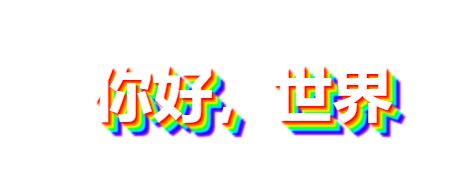
修改阴影的颜色就行了
六、空心文字
        .text {
            font-size: 60px;
            font-weight: bold;
            color: transparent;
            -webkit-text-stroke-width: 2px;
            -webkit-text-stroke-color: #333;
            /* text-shadow: 6px 6px hotpink; */

		}
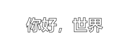
两步:一是文字透明,二是文字描边
继续给文字阴影,就是解开上面注释起来的代码,得到下面效果