目录
1-数据大屏解决方案vw和vh
2-数据大屏解决方案scale
3-数据大屏原型需求图
4-数据大屏顶部搭建
4.1-顶部原型需求
4.2-顶部模块父组件的结构和逻辑
4.3-顶部模块子组件结构和逻辑
5-数据大屏游客统计
5.1-原型需求图分析
5.2-结构样式逻辑开发
1-数据大屏解决方案vw和vh
比如我们的显示器分辨率为1920*1080,1920=100vw,1080=100vh;如果我们的原型尺寸是100*100;我们需要计算尺寸换算成对应的vw和vh;每次需要动态计算,而且缺点是div盒子的文案和文字不能对应动态扩大和缩放。所以在实际项目中,我们一般采用下面的scale方案。
比如div的尺寸是宽100*高100;换算成对应的是: 100/1920*100vw=5.208vw;100/1080*100=9.259vh;
      * {
            margin: 0;
            padding: 0;
        }

        .box {
            width:100vw;
            height:100vh;
            background: orange;
        }
        .top{
            width: 5.2vw;
            height: 9.26vh;
            background: red;
            margin-left: 2.6vw;
        }

        .bottom{
            width: 5.2vw;
            height: 9.26vh;
            background: skyblue;
            margin-left: 2.6vw;
            margin-top:9.26vh;
        }
2-数据大屏解决方案scale
scale解决方案的优点是:我们只需要确定屏幕尺寸,然后按照这个比例缩放就好。实际项目中一般采用scale这种缩放的解决方案。
结构核心代码如下:
<head>
    <style>
        * {
            margin: 0;
            padding: 0;
        }

        .container {
            width: 100vw;
            height: 100vh;
            background: url(./bg.png) no-repeat;
            background-size: cover;
        }

        .box {
            position: fixed;
            width: 1920px;
            height: 1080px;
            background: red;
            transform-origin: left top;
            left: 50%;
            top: 50%;
        }

        .top {
            width: 100px;
            height: 100px;
            background: hotpink;
            margin-left: 50px;
        }

        .bottom {
            width: 100px;
            height: 100px;
            background: skyblue;
            margin-left: 50px;
            margin-top: 100px;
        }
    </style>
</head>

<body>
    <div class="container">
        <!-- 数据展示的区域 -->
        <div class="box">
            <div class="top">这是top区域</div>
            <div class="bottom">这是bottom区域</div>
        </div>
    </div>
</body>
js逻辑的核心计算方法:
    //控制数据大屏放大与缩小
    let box = document.querySelector('.box');
    box.style.transform = `scale(${getScale()}) translate(-50%,-50%)`
    //计算缩放的比例
    function getScale(w = 1920, h = 1080) {
        const ww = window.innerWidth / w;
        const wh = window.innerHeight / h;
        return ww < wh ? ww : wh;
    }

    window.onresize = () => {
        box.style.transform = `scale(${getScale()}) translate(-50%,-50%)`
    }
3-数据大屏原型需求图

4-数据大屏顶部搭建
4.1-顶部原型需求
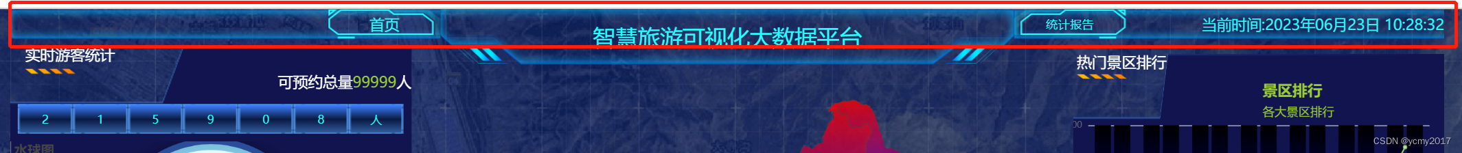
数据大屏总体分为上下两部分;其中上部(顶部),顶部可以分为三部分,左中右三部分。我们先来分析和实现顶部的功能。 左中右三个盒子,先用三个div包起来,左边可以在div里面使用一个span,里面有个首页,点击要去到首页,需要绑定一个点击事件。中间就是一个div,显示文字,不过我们需要编写对应的样式。右边有个统计报告文案,目前没有任何事件,然后还需要显示当前时间,而且要定时刷新,组件销毁的时候,我们需要清除定时器。
4.2-顶部模块父组件的结构和逻辑
父组件在加载的时候,需要对适配大屏做出逻辑处理。进行相关的缩放操作。
文件父组件:src\views\screen\index.vue的代码结构实现:
文件父组件:src\views\screen\index.vue在挂载的时候,需要处理缩放相关逻辑:
import { ref, onMounted } from "vue";
//引入顶部的子组件
import Top from './components/top/index.vue';
//获取数据大屏展示内容盒子的DOM元素
let screen = ref();
onMounted(() => {
    screen.value.style.transform = `scale(${getScale()}) translate(-50%,-50%)`
});
//定义大屏缩放比例
function getScale(w = 1920, h = 1080) {
    const ww = window.innerWidth / w;
    const wh = window.innerHeight / h;
    return ww < wh ? ww : wh;
}
//监听视口变化
window.onresize = () => {
    screen.value.style.transform = `scale(${getScale()}) translate(-50%,-50%)`
}
文件父组件:src\views\screen\index.vue中相关的样式代码:
.container {
    width: 100vw;
    height: 100vh;
    background: url(./images/bg.png) no-repeat;
    background-size: cover;

    .screen {
        position: fixed;
        width: 1920px;
        height: 1080px;
        left: 50%;
        top: 50%;
        transform-origin: left top;

        .top {
            width: 100%;
            height: 40px;
        }

    }
}
4.3-顶部模块子组件结构和逻辑
首先,组件加载的时候,我们需要加载一个定时器,定时去获取时间。点击首页的时候,我们还要跳转首页,需要使用到useRouter方法获取到$router。
顶部组件文件:src\views\screen\components\top\index.vue的页面结构如下:

顶部组件文件src\views\screen\components\top\index.vue;我们需要处理的相关业务逻辑核心代码如下:
<script setup lang="ts">
//@ts-ignore
import moment from 'moment';
//点击首页按钮回到首页
import { useRouter } from 'vue-router';
import { ref, onMounted, onBeforeUnmount } from 'vue';
//获取路由器对象
let $router = useRouter();

//存储当前时间
let time = ref(moment().format('YYYY年MM月DD日 HH:mm:ss'));
let timer = ref(0);
//按钮的点击回调
const goHome = () => {
    $router.push('/home')
}
//组件挂载完毕更新当前的事件
onMounted(() => {
    timer.value = setInterval(() => {
        time.value = moment().format('YYYY年MM月DD日 HH:mm:ss');
    }, 1000);
});

onBeforeUnmount(() => {
    clearInterval(timer.value);
})
</script>

<script lang="ts">
export default {
  name: 'Top',
}
</script>顶部组件文件src\views\screen\components\top\index.vue;我们需要对页面进行相关的页面样式代码如下【在实际项目中,按照自己的原型图进行变更,这里没有做很精细的布局和优化】:
<style scoped lang="scss">
.top {
    width: 100%;
    height: 40px;
    display: flex;

    .left {
        flex: 1.5;
        background: url(../../images/dataScreen-header-left-bg.png) no-repeat;
        background-size: cover;

        .lbtn {
            width: 150px;
            height: 40px;
            float: right;
            background: url(../../images/dataScreen-header-btn-bg-l.png) no-repeat;
            background-size: 100% 100%;
            text-align: center;
            line-height: 40px;
            color: #29fcff;
            font-size: 20px;
        }
    }

    .center {
        flex: 2;

        .title {
            width: 100%;
            height: 74px;
            background: url(../../images/dataScreen-header-center-bg.png) no-repeat;
            background-size: 100% 100%;
            text-align: center;
            line-height: 74px;
            color: #29fcff;
            font-size: 30px;
        }
    }

    .right {
        flex: 1.5;
        background: url(../../images/dataScreen-header-left-bg.png) no-repeat;
        background-size: cover;
        display: flex;
        justify-content: space-between;
        align-items: center;

        .rbtn {
            width: 150px;
            height: 40px;
            background: url(../../images/dataScreen-header-btn-bg-r.png) no-repeat;
            background-size: 100% 100%;
            text-align: center;
            line-height: 40px;
            color: #29fcff;
        }

        .time {
            color: #29fcff;
            font-size: 20px;
        }


    }
}
</style>
5-数据大屏游客统计
5.1-原型需求图分析
目前数据大屏的数据全部是静态数据,在实际项目中大家可以根据自己的项目实际,向服务端获取相关的动态数据进行数据展示和渲染就好。
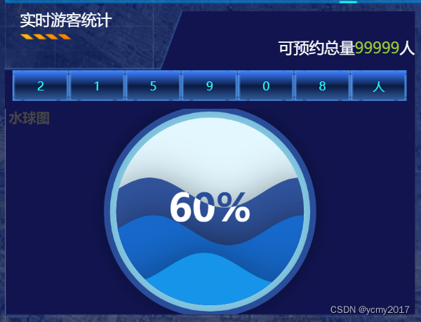
页面结构分三部分,上面的顶部需要展示实时游客统计和可预约的数量,中间部分需要展示目前的游客数量,下面部分需要用到echarts的扩展组件水球图echarts-liquidfill组件。

5.2-结构样式逻辑开发
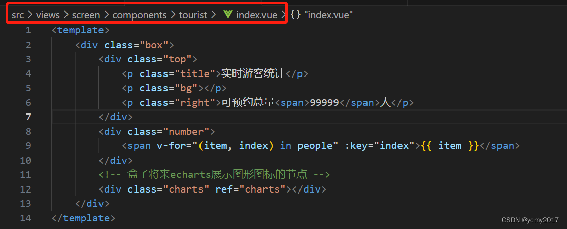
组件src\views\screen\components\tourist\index.vue的页面结构如下图:
组件src\views\screen\components\tourist\index.vue的核心处理逻辑:
<script setup lang="ts">
import 'echarts-liquidfill'
import * as echarts from 'echarts';
import { ref, onMounted } from 'vue';
let people = ref('215908人');

//水球图拓展插件

//获取节点
let charts = ref();
onMounted(() => {
    //获取echarts类的实例
    let mycharts = echarts.init(charts.value);
    //设置实例的配置项
    mycharts.setOption({
        //标题组件
        title: {
            text: '水球图'
        },
        //x|y轴组件
        xAxis: {},
        yAxis: {},
        //系列:决定你展示什么样的图形图标
        series: {
            type: 'liquidFill',//系列
            data: [0.6, 0.4, 0.2],//展示的数据
            waveAnimation: true,//动画
            animationDuration: 3,
            animationDurationUpdate: 0,
            radius: '100%',//半径
            outline: {//外层边框颜色设置
                show: true,
                borderDistance: 8,
                itemStyle: {
                    color: 'skyblue',
                    borderColor: '#294D99',
                    borderWidth: 8,
                    shadowBlur: 20,
                    shadowColor: 'rgba(0, 0, 0, 0.25)'
                }
            },
        },
        //布局组件
        grid: {
            left: 0,
            right: 0,
            top: 0,
            bottom: 0
        }

    })
})
</script>组件src\views\screen\components\tourist\index.vue的样式核心代码:
.box {
    background: url(../../images/dataScreen-main-lb.png) no-repeat;
    background-size: 100% 100%;
    margin-top: 10px;

    .top {
        margin-left: 20px;

        .title {
            color: white;
            font-size: 20px;

        }

        .bg {
            width: 68px;
            height: 7px;
            background: url(../../images/dataScreen-title.png) no-repeat;
            background-size: 100% 100%;
            margin-top: 10px;
        }

        .right {
            float: right;
            color: white;
            font-size: 20px;

            span {
                color: yellowgreen;
            }
        }
    }

    .number {
        padding: 10px;
        margin-top: 30px;
        display: flex;


        span {
            flex: 1;
            height: 40px;
            text-align: center;
            line-height: 40px;
            background: url(../../images/total.png) no-repeat;
            background-size: 100% 100%;
            color: #29fcff;
        }
    }

    .charts {
        width: 100%;
        height: 270px;
    }
}


![[JVM]再聊 CMS 收集器](https://img-blog.csdnimg.cn/a4fe8c81a83745e8bf7d9c1cf60639d9.png)