总目录
文章目录
- 总目录
- 一、什么是用户控件和自定义控件
- 1 用户控件和自定义控件
- 2 相关知识点
- 2 用户控件和自定义控件的适用场景
- 二、用户控件的使用
- 1.通过依赖属性和路由事件封装用户控件的案例
- 2.通过依赖属性+命令依赖属性封装用户控件的案例
- 3.只对外提供属性不对外提供操作的用户控件封装案例
- 三、自定义控件的使用
- 1. 创建普通类继承现有控件进行扩展 - 圆角的Button
- 2. 创建自定义控件
- 3.相关知识点
- 结语
一、什么是用户控件和自定义控件
1 用户控件和自定义控件
在WPF中,用户控件(UserControl)和自定义控件(CustomControl)都是对UI控件的一种封装方式,目的都是实现封装后控件的重用。
只不过各自封装的实现方式和使用的场景上存在差异。
| 不同点 | UserControl | CustomControl |
|---|---|---|
| 是否为复合控件 | 注重控件的复合,可以将多个控件组合成一个复合控件 | 不是复合控件,而是通过继承已有控件,对控件的功能和外观进行扩展 |
| 控件代码 组成部分 | 用户控件由XAML代码和后台代码组成且两者紧密绑定 | 自定义控件由控件的类对象代码(后台代码) 以及Generic.xaml中的样式模板代码组成 |
| 是否可模板重写 | 不支持在外部对控件进行模板重写和样式的更改 | 支持在外部对控件的进行模板重写和样式的修改 |
| 继承关系 | 继承自UserControl | 继承自Control |
| 编写过程 | 可以在编辑器中实时查看控件效果,更直观 | 不可实时查看控件效果,不直观 |
2 相关知识点
在定义用户控件和自定义控件的过程中,会涉及到以下知识点:
- 当封装的控件,需要对外提供属性 以供设置的时候,我们需要通过 定义依赖属性或者附加属性来实现
- 当封装的控件,需要对外提供路由事件的时候,我们需要通过定义自定义路由事件来实现
- 当封装的控件,如果觉得路由事件不好用,希望直接对外提供命令的时候,我们需要通过依赖属性定义一个或多个对外的命令属性来实现
2 用户控件和自定义控件的适用场景
当我们写一个控件的时候,考虑到该控件在当前项目的其他界面会重复使用,或者在后续其他的项目中还会得到复用的时候,我们就可以将该控件封装成一个 自定义的用户控件,或者直接封装成自定义控件。
- 如果希望封装的控件外观可以通过ControlTemplate 进行更改的时候,使用CustomControl
- 如果希望控件的样式可以更改的时候,也可使用CustomControl
- 反之,当我们界面元素较多,需要多个控件进行复合才可组成的时候,可以采用UserControl
二、用户控件的使用
用户控件的封装无非以下三种形式,会分别通过三个案例说明:
- 需要对外提供属性和事件(复合控件内没有可以使用Command的控件)
- 只需对外提供属性,属性除了正常的依赖属性外,还需包含ICommand 类型或其派生的依赖属性
- 只对外提供属性值的设置,所有操作的业务逻辑全部封装到控件内部
这三种形式的封装,有各自的适用场景。
1.通过依赖属性和路由事件封装用户控件的案例
1.1 先创建用户控件,然后在控件内定义依赖属性和路由事件
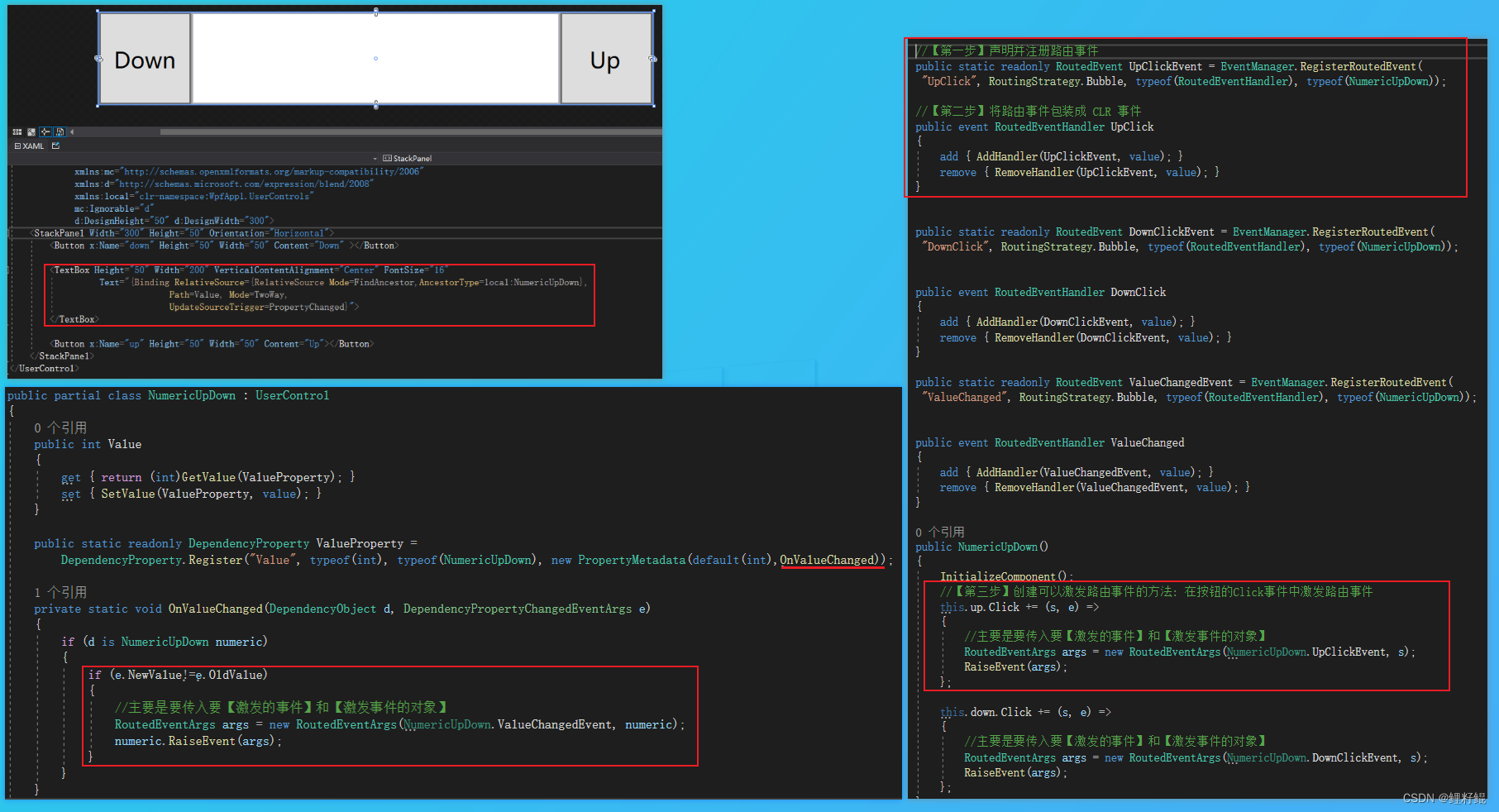
- 步骤1 :创建用户控件,然后在控件的后台代码中,根据需要对外提供的属性定义依赖属性
        public int Value
        {
            get { return (int)GetValue(ValueProperty); }
            set { SetValue(ValueProperty, value); }
        }

        public static readonly DependencyProperty ValueProperty =
            DependencyProperty.Register("Value", typeof(int), typeof(NumericUpDown), new PropertyMetadata(default(int),OnValueChanged));

        private static void OnValueChanged(DependencyObject d, DependencyPropertyChangedEventArgs e)
        {
            if (d is NumericUpDown numeric)
            {
                if (e.NewValue!=e.OldValue)
                {
                    //主要是要传入要【激发的事件】和【激发事件的对象】
                    RoutedEventArgs args = new RoutedEventArgs(NumericUpDown.ValueChangedEvent, numeric);
                    numeric.RaiseEvent(args);
                }
            }
        }
- 步骤2:根据需求定义需要对外提供的路由事件
        //【第一步】声明并注册路由事件
        public static readonly RoutedEvent UpClickEvent = EventManager.RegisterRoutedEvent(
         "UpClick", RoutingStrategy.Bubble, typeof(RoutedEventHandler), typeof(NumericUpDown));

        //【第二步】将路由事件包装成 CLR 事件
        public event RoutedEventHandler UpClick
        {
            add { AddHandler(UpClickEvent, value); }
            remove { RemoveHandler(UpClickEvent, value); }
        }


        public NumericUpDown()
        {
            InitializeComponent();
            //【第三步】将合理的业务中激发定义的路由事件
            // 如该场景下适合在 名为up的Button的Click事件中激发路由事件,这样就可以将自定义的路由事件与按钮的Click事件绑定在一起
            this.up.Click += (s, e) =>
            {
                //主要是要传入要【激发的事件】和【激发事件的对象】
                RoutedEventArgs args = new RoutedEventArgs(NumericUpDown.UpClickEvent, s);
                RaiseEvent(args);
            };
        }
- 步骤3:在用户控件xaml中绑定 定义的依赖属性,通过RelativeSource的方式实现:
<TextBox Height="50" Width="200"
         Text="{Binding RelativeSource={RelativeSource Mode=FindAncestor,AncestorType=local:NumericUpDown},
                        Path=Value, Mode=TwoWay,
                        UpdateSourceTrigger=PropertyChanged}">
</TextBox>
1.2 再者在引用用户控件的地方,绑定相关的值和命令
- 步骤1:引用用户控件,将用户控件对外提供的属性 绑定ViewModel中的属性
- 步骤2:然后根据需要依次将事件转为命令予以绑定
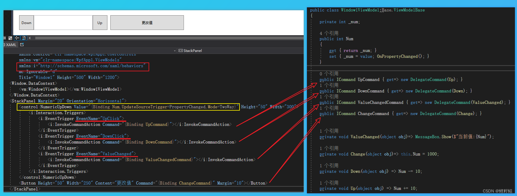
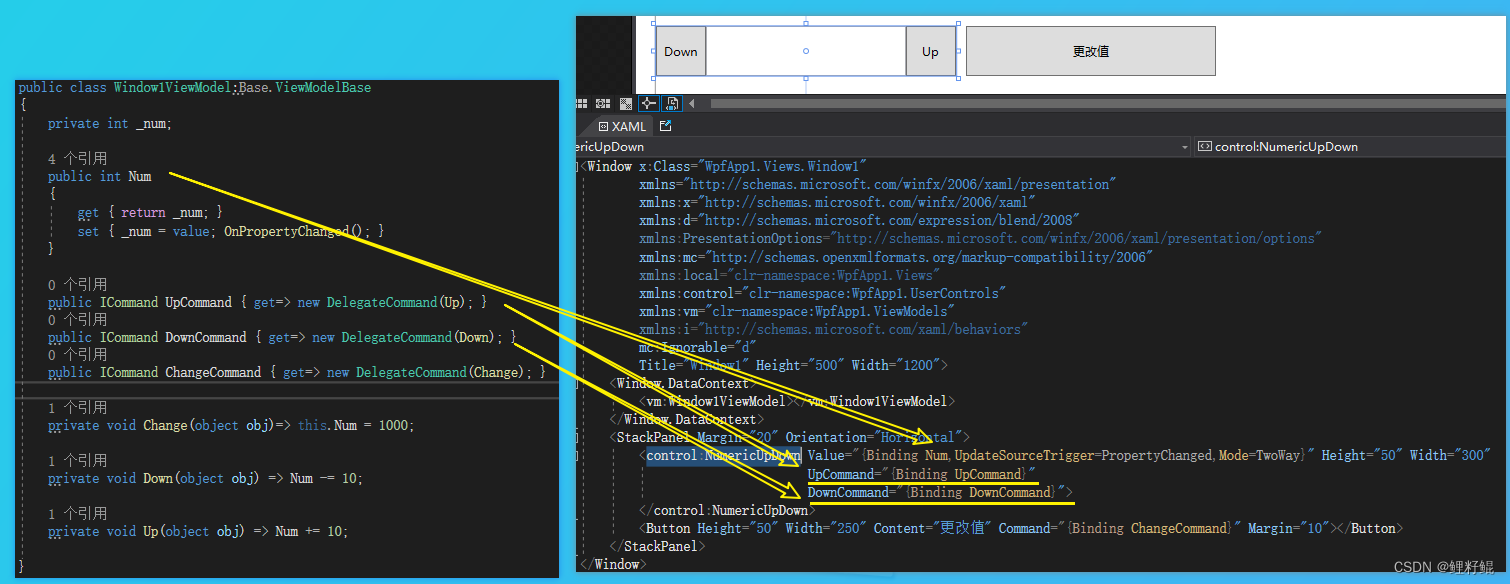
<Window x:Class="WpfApp1.Views.Window1"
xmlns="http://schemas.microsoft.com/winfx/2006/xaml/presentation"
xmlns:x="http://schemas.microsoft.com/winfx/2006/xaml"
xmlns:d="http://schemas.microsoft.com/expression/blend/2008"
xmlns:PresentationOptions="http://schemas.microsoft.com/winfx/2006/xaml/presentation/options"
xmlns:mc="http://schemas.openxmlformats.org/markup-compatibility/2006"
xmlns:local="clr-namespace:WpfApp1.Views"
xmlns:control="clr-namespace:WpfApp1.UserControls"
xmlns:vm="clr-namespace:WpfApp1.ViewModels"
xmlns:i="http://schemas.microsoft.com/xaml/behaviors"
mc:Ignorable="d"
Title="Window1" Height="500" Width="1200">
<Window.DataContext>
<vm:Window1ViewModel></vm:Window1ViewModel>
</Window.DataContext>
<StackPanel Margin="20" Orientation="Horizontal">
<control:NumericUpDown Value="{Binding Num,UpdateSourceTrigger=PropertyChanged,Mode=TwoWay}" Height="50" Width="300">
<i:Interaction.Triggers>
<i:EventTrigger EventName="UpClick">
<i:InvokeCommandAction Command="{Binding UpCommand}"></i:InvokeCommandAction>
</i:EventTrigger>
<i:EventTrigger EventName="DownClick">
<i:InvokeCommandAction Command="{Binding DownCommand}"></i:InvokeCommandAction>
</i:EventTrigger>
<i:EventTrigger EventName="ValueChanged">
<i:InvokeCommandAction Command="{Binding ValueChangedCommand}"></i:InvokeCommandAction>
</i:EventTrigger>
</i:Interaction.Triggers>
</control:NumericUpDown>
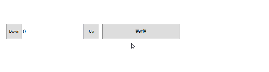
<Button Height="50" Width="250" Content="更改值" Command="{Binding ChangeCommand}" Margin="10"></Button>
</StackPanel>
</Window>
2.通过依赖属性+命令依赖属性封装用户控件的案例
相对上面的封装方式,这种封装方式,可以在使用上给人感觉更方便,因为我们使用Command 不必像事件那样,还需要多一步转命令的操作。
1.1 再者在引用用户控件的地方,绑定相关的值和命令
- 步骤1:将需要对外提供的属性和操作(命令)都定义成了依赖属性
    public partial class NumericUpDown : UserControl
    {
        public int Value
        {
            get { return (int)GetValue(ValueProperty); }
            set { SetValue(ValueProperty, value); }
        }

        public static readonly DependencyProperty ValueProperty =
            DependencyProperty.Register("Value", typeof(int), typeof(NumericUpDown), new PropertyMetadata(default(int)));

        public ICommand UpCommand
        {
            get { return (ICommand)GetValue(UpCommandProperty); }
            set { SetValue(UpCommandProperty, value); }
        }

        public static readonly DependencyProperty UpCommandProperty =
            DependencyProperty.Register("UpCommand", typeof(ICommand), typeof(NumericUpDown), new PropertyMetadata( default(ICommand)));

        public ICommand DownCommand
        {
            get { return (ICommand)GetValue(DownCommandProperty); }
            set { SetValue(DownCommandProperty, value); }
        }

        public static readonly DependencyProperty DownCommandProperty =
            DependencyProperty.Register("DownCommand", typeof(ICommand), typeof(NumericUpDown), new PropertyMetadata(default(ICommand)));

        public NumericUpDown()
        {
            InitializeComponent();
        }
    }
如果命令,需要传参,只需将命令参数也定义一个依赖属性即可,如下所示:
//命令参数
 public object CommandParemeter
 {
     get { return (object)GetValue(CommandParemeterProperty); }
     set { SetValue(CommandParemeterProperty, value); }
 }
 public static readonly DependencyProperty CommandParemeterProperty =
     DependencyProperty.Register("CommandParemeter", typeof(object), typeof(NumericUpDown), new PropertyMetadata(default(object)));
- 步骤2:在用户控件的xaml中予以绑定
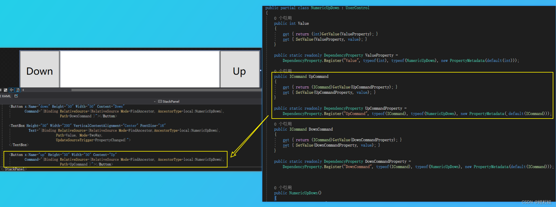
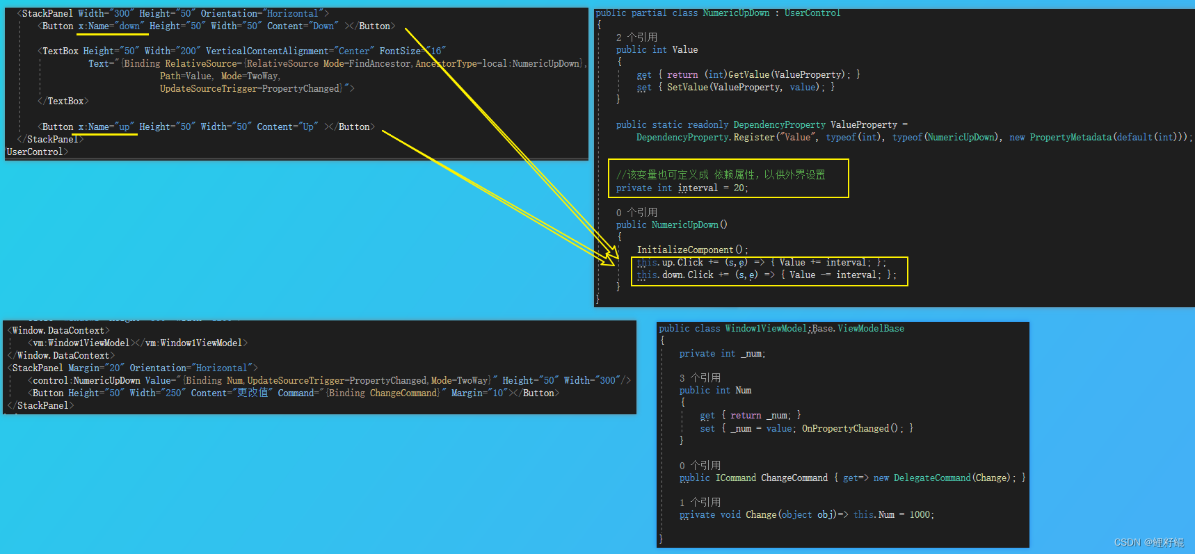
    <StackPanel Width="300" Height="50" Orientation="Horizontal">
        <Button x:Name="down" Height="50" Width="50" Content="Down"
                Command="{Binding RelativeSource={RelativeSource Mode=FindAncestor, AncestorType=local:NumericUpDown},
                                  Path=DownCommand }"></Button>

        <TextBox Height="50" Width="200" VerticalContentAlignment="Center" FontSize="16"
                  Text="{Binding RelativeSource={RelativeSource Mode=FindAncestor,AncestorType=local:NumericUpDown},
                                Path=Value, Mode=TwoWay,
                                UpdateSourceTrigger=PropertyChanged}">
        </TextBox>

        <Button x:Name="up" Height="50" Width="50" Content="Up"
                Command="{Binding RelativeSource={RelativeSource Mode=FindAncestor, AncestorType=local:NumericUpDown},
                                  Path=UpCommand }"></Button>
    </StackPanel>
1.2 再者在引用用户控件的地方,绑定相关的值和命令
    <StackPanel Margin="20" Orientation="Horizontal">
        <control:NumericUpDown Value="{Binding Num,UpdateSourceTrigger=PropertyChanged,Mode=TwoWay}" Height="50" Width="300"
                               UpCommand="{Binding UpCommand}"
                               DownCommand="{Binding DownCommand}">
        </control:NumericUpDown>
        <Button Height="50" Width="250" Content="更改值" Command="{Binding ChangeCommand}" Margin="10"></Button>
    </StackPanel>
3.只对外提供属性不对外提供操作的用户控件封装案例
三、自定义控件的使用
1. 创建普通类继承现有控件进行扩展 - 圆角的Button
- 新建一个MyCornerButton类,继承自Button,定义一个ButtonCornerRadius依赖属性
    public class MyCornerButton: Button
    {
        public CornerRadius ButtonCornerRadius
        {
            get { return (CornerRadius)GetValue(ButtonCornerRadiusProperty); }
            set { SetValue(ButtonCornerRadiusProperty, value); }
        }

        public static readonly DependencyProperty ButtonCornerRadiusProperty =
            DependencyProperty.Register("ButtonCornerRadius", typeof(CornerRadius), typeof(MyCornerButton), new PropertyMetadata(default(CornerRadius)));
    }
- 在MyCornerButton控件的样式模板中绑定自定义的依赖属性
        <!--此处省略很多样式代码,主要需要注意:
        	1、自定义控件通过TargetType 指定该样式的控件目标类型为自定义控件类
            2、在模板中 将自定义的ButtonCornerRadius依赖属性,绑定到Border的CornerRadius 上
          -->
        <Style x:Key="MyCornerButtonStyle1" TargetType="{x:Type controls:MyCornerButton}">
            <Setter Property="Template">
                <Setter.Value>
                    <ControlTemplate TargetType="{x:Type controls:MyCornerButton}">
                        <Border x:Name="border" BorderBrush="{TemplateBinding BorderBrush}"
                        		CornerRadius="{TemplateBinding ButtonCornerRadius}"
                        		BorderThickness="{TemplateBinding BorderThickness}"
                        		Background="{TemplateBinding Background}" SnapsToDevicePixels="True">
                            <ContentPresenter x:Name="contentPresenter" ContentTemplate="{TemplateBinding ContentTemplate}" Content="{TemplateBinding Content}" ContentStringFormat="{TemplateBinding ContentStringFormat}" Focusable="False" HorizontalAlignment="{TemplateBinding HorizontalContentAlignment}" Margin="{TemplateBinding Padding}" RecognizesAccessKey="True" SnapsToDevicePixels="{TemplateBinding SnapsToDevicePixels}" VerticalAlignment="{TemplateBinding VerticalContentAlignment}"/>
                        </Border>
                        <ControlTemplate.Triggers>
                            <Trigger Property="IsMouseOver" Value="True">
                                <Setter Property="Background" TargetName="border" Value="#FFBEE6FD"/>
                                <Setter Property="BorderBrush" TargetName="border" Value="#FF3C7FB1"/>
                            </Trigger>

                        </ControlTemplate.Triggers>
                    </ControlTemplate>
                </Setter.Value>
            </Setter>
        </Style>
通过以上简单的两个步骤,我们就可以自定义一个简单好用的圆角按钮。
另外需额外补充一句:上面的圆角是通过在控件类内部定义依赖属性实现,当然我们也可以通过在一个公共的类中将圆角属性定义成附加属性,然后通过在样式中绑定附加属性来实现;如果我们很多地方都会使用到这个圆角属性,我们可以考虑将其放在公共的辅助类中,定义成附加属性。
2. 创建自定义控件
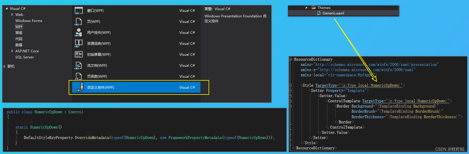
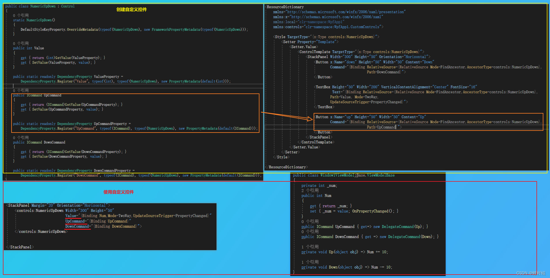
当我们通过新建项 创建 自定义控件NumericUpDown的时候,会生成以下内容:
- NumericUpDown控件的类,主要负责控件的业务逻辑
- 自动生成Themes 文件夹,以及下属的Generic.xaml 文件,在Generic.xaml编写控件对应的样式模板代码,负责控件的外观展示
在NumericUpDown控件类中会自动生成以下代码:
        static NumericUpDown()
        {
            DefaultStyleKeyProperty.OverrideMetadata(typeof(NumericUpDown), new FrameworkPropertyMetadata(typeof(NumericUpDown)));
        }
该代码是设置控件的默认样式,如果没有该代码,则无法展示在Generic.xaml中编写的控件默认样式。
另外我们是可以在该类中定义对外提供的依赖属性和事件/命令等以及编写控件相关的业务逻辑。
在Generic.xaml中编写的控件默认样式,该xaml文件中的样式,是不需要设置Key的,默认样式会通过TargetType去匹配。
具体案例如下:
3.相关知识点
-
当我们在Generic.xaml中编写的控件默认样式时,对模板内相关控件指定了名称,那么当我们通过右键菜单自动生成模板副本的时候,生成的样式中就会和默认样式中的结构以及控件名称一致,如上案例中,在默认样式中,定义了一个up 的Button,那么重写该控件模板的时候,模板内就会自动生成一个名为up的Button。
-
若要指定控件所需的 FrameworkElement 对象,可使用 TemplatePartAttribute,它指定预期元素的名称和类型。
-
若要指定控件的可能状态,可使用 TemplateVisualStateAttribute,它指定状态的名称及其所属的 VisualStateGroup。 将 TemplatePartAttribute 和 TemplateVisualStateAttribute 放置在控件的类定义中。
以下示例为 NumericUpDown 控件指定 FrameworkElement 对象和状态。
[TemplatePart(Name = "UpButtonElement", Type = typeof(RepeatButton))]
[TemplatePart(Name = "DownButtonElement", Type = typeof(RepeatButton))]
[TemplateVisualState(Name = "Positive", GroupName = "ValueStates")]
[TemplateVisualState(Name = "Negative", GroupName = "ValueStates")]
[TemplateVisualState(Name = "Focused", GroupName = "FocusedStates")]
[TemplateVisualState(Name = "Unfocused", GroupName = "FocusedStates")]
public class NumericUpDown : Control
{
    public static readonly DependencyProperty BackgroundProperty;
    public static readonly DependencyProperty BorderBrushProperty;
    public static readonly DependencyProperty BorderThicknessProperty;
    public static readonly DependencyProperty FontFamilyProperty;
    public static readonly DependencyProperty FontSizeProperty;
    public static readonly DependencyProperty FontStretchProperty;
    public static readonly DependencyProperty FontStyleProperty;
    public static readonly DependencyProperty FontWeightProperty;
    public static readonly DependencyProperty ForegroundProperty;
    public static readonly DependencyProperty HorizontalContentAlignmentProperty;
    public static readonly DependencyProperty PaddingProperty;
    public static readonly DependencyProperty TextAlignmentProperty;
    public static readonly DependencyProperty TextDecorationsProperty;
    public static readonly DependencyProperty TextWrappingProperty;
    public static readonly DependencyProperty VerticalContentAlignmentProperty;

    public Brush Background { get; set; }
    public Brush BorderBrush { get; set; }
    public Thickness BorderThickness { get; set; }
    public FontFamily FontFamily { get; set; }
    public double FontSize { get; set; }
    public FontStretch FontStretch { get; set; }
    public FontStyle FontStyle { get; set; }
    public FontWeight FontWeight { get; set; }
    public Brush Foreground { get; set; }
    public HorizontalAlignment HorizontalContentAlignment { get; set; }
    public Thickness Padding { get; set; }
    public TextAlignment TextAlignment { get; set; }
    public TextDecorationCollection TextDecorations { get; set; }
    public TextWrapping TextWrapping { get; set; }
    public VerticalAlignment VerticalContentAlignment { get; set; }
}
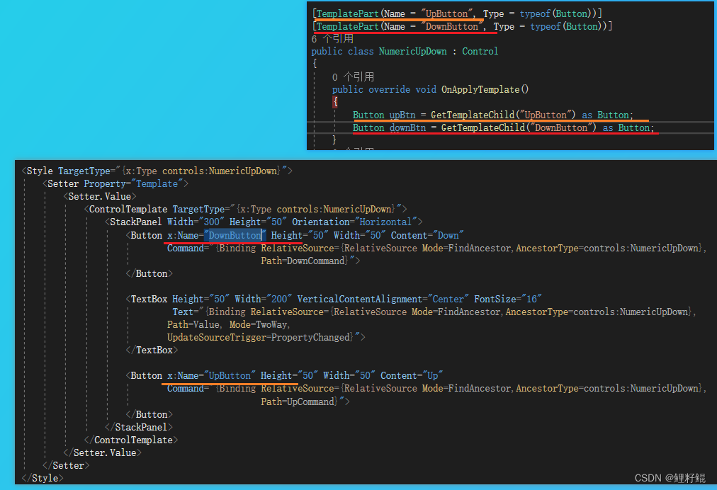
- 通常我们控件模板内的名称,尽量与TemplatePart特性中的名称保持一致,可减少一些不必要的麻烦。
MSDN上的完成应用案例如下:
    <Style TargetType="{x:Type local:NumericUpDown}">
        <Setter Property="Template">
            <Setter.Value>
                <ControlTemplate TargetType="local:NumericUpDown">
                    <Grid  Margin="3"  Background="{TemplateBinding Background}">
                        <VisualStateManager.VisualStateGroups>
                            <VisualStateGroup Name="ValueStates">

                                <VisualState Name="Negative">
                                    <Storyboard>
                                        <ColorAnimation To="Red" Storyboard.TargetName="TextBlock"  Storyboard.TargetProperty="(Foreground).(Color)"/>
                                    </Storyboard>
                                </VisualState>

                                <VisualState Name="Positive"/>
                            </VisualStateGroup>

                            <VisualStateGroup Name="FocusStates">
                                <VisualState Name="Focused">
                                    <Storyboard>
                                        <ObjectAnimationUsingKeyFrames Storyboard.TargetName="FocusVisual"  Storyboard.TargetProperty="Visibility" Duration="0">
                                            <DiscreteObjectKeyFrame KeyTime="0">
                                                <DiscreteObjectKeyFrame.Value>
                                                    <Visibility>Visible</Visibility>
                                                </DiscreteObjectKeyFrame.Value>
                                            </DiscreteObjectKeyFrame>
                                        </ObjectAnimationUsingKeyFrames>
                                    </Storyboard>
                                </VisualState>
                                <VisualState Name="Unfocused"/>
                            </VisualStateGroup>

                        </VisualStateManager.VisualStateGroups>

                        <Grid>
                            <Grid.RowDefinitions>
                                <RowDefinition/>
                                <RowDefinition/>
                            </Grid.RowDefinitions>
                            <Grid.ColumnDefinitions>
                                <ColumnDefinition/>
                                <ColumnDefinition/>
                            </Grid.ColumnDefinitions>

                            <Border BorderThickness="1" BorderBrush="Gray"   Margin="7,2,2,2" Grid.RowSpan="2"  Background="#E0FFFFFF"
                                    VerticalAlignment="Center"   HorizontalAlignment="Stretch">

                                <TextBlock Name="TextBlock"  Width="60" TextAlignment="Right" Padding="5"
                                           Text="{Binding RelativeSource={RelativeSource FindAncestor,
                                           AncestorType={x:Type local:NumericUpDown}},
                                           Path=Value}"/>
                            </Border>

                            <RepeatButton Name="UpButton" Content="Up" Margin="2,5,5,0" Grid.Column="1" Grid.Row="0"/>
                            <RepeatButton Name="DownButton" Content="Down" Margin="2,0,5,5"  Grid.Column="1" Grid.Row="1"/>

                            <Rectangle Name="FocusVisual" Grid.ColumnSpan="2" Grid.RowSpan="2"  Stroke="Black" StrokeThickness="1" Visibility="Collapsed"/>
                        </Grid>

                    </Grid>
                </ControlTemplate>
            </Setter.Value>
        </Setter>
    </Style>
在ControlTemplate中通过VisualStateManager 管理,该控件在不同的状态下的样式,例如获得焦点,失去焦点等不同状态,也可以通过触发器去实现VisualStateManager 提供视觉管理功能
以下示例演示 NumericUpDown 的逻辑。
using System.Windows;
using System.Windows.Controls;
using System.Windows.Controls.Primitives;
using System.Windows.Input;
using System.Windows.Media;

namespace VSMCustomControl
{
    [TemplatePart(Name = "UpButtonElement", Type = typeof(RepeatButton))]
    [TemplatePart(Name = "DownButtonElement", Type = typeof(RepeatButton))]
    [TemplateVisualState(Name = "Positive", GroupName = "ValueStates")]
    [TemplateVisualState(Name = "Negative", GroupName = "ValueStates")]
    [TemplateVisualState(Name = "Focused", GroupName = "FocusedStates")]
    [TemplateVisualState(Name = "Unfocused", GroupName = "FocusedStates")]
    public class NumericUpDown : Control
    {
        public NumericUpDown()
        {
            DefaultStyleKey = typeof(NumericUpDown);
            this.IsTabStop = true;
        }

        public static readonly DependencyProperty ValueProperty =
            DependencyProperty.Register("Value", typeof(int), typeof(NumericUpDown),
                new PropertyMetadata(new PropertyChangedCallback(ValueChangedCallback)));

        public int Value
        {
            get { return (int)GetValue(ValueProperty); }
			set { SetValue(ValueProperty, value); }
        }

        private static void ValueChangedCallback(DependencyObject obj,DependencyPropertyChangedEventArgs args)
        {
            NumericUpDown ctl = (NumericUpDown)obj;
            int newValue = (int)args.NewValue;

            ctl.UpdateStates(true);
            ctl.OnValueChanged(new ValueChangedEventArgs(NumericUpDown.ValueChangedEvent,newValue));
        }

        public static readonly RoutedEvent ValueChangedEvent =EventManager.RegisterRoutedEvent("ValueChanged", RoutingStrategy.Direct,typeof(ValueChangedEventHandler), typeof(NumericUpDown));

        public event ValueChangedEventHandler ValueChanged
        {
            add { AddHandler(ValueChangedEvent, value); }
            remove { RemoveHandler(ValueChangedEvent, value); }
        }

        protected virtual void OnValueChanged(ValueChangedEventArgs e)
        {
            // Raise the ValueChanged event so applications can be alerted
            // when Value changes.
            RaiseEvent(e);
        }

        private void UpdateStates(bool useTransitions)
        {
            if (Value >= 0)
            {
                VisualStateManager.GoToState(this, "Positive", useTransitions);
            }
            else
            {
                VisualStateManager.GoToState(this, "Negative", useTransitions);
            }

            if (IsFocused)
            {
                VisualStateManager.GoToState(this, "Focused", useTransitions);
            }
            else
            {
                VisualStateManager.GoToState(this, "Unfocused", useTransitions);
            }
        }

        public override void OnApplyTemplate()
        {
            UpButtonElement = GetTemplateChild("UpButton") as RepeatButton;
            DownButtonElement = GetTemplateChild("DownButton") as RepeatButton;
            //TextElement = GetTemplateChild("TextBlock") as TextBlock;

            UpdateStates(false);
        }

        private RepeatButton downButtonElement;

        private RepeatButton DownButtonElement
        {
            get
            {
                return downButtonElement;
            }

            set
            {
                if (downButtonElement != null)
                {
                    downButtonElement.Click -=
                        new RoutedEventHandler(downButtonElement_Click);
                }
                downButtonElement = value;

                if (downButtonElement != null)
                {
                    downButtonElement.Click +=
                        new RoutedEventHandler(downButtonElement_Click);
                }
            }
        }

        void downButtonElement_Click(object sender, RoutedEventArgs e)
        {
            Value--;
        }

        private RepeatButton upButtonElement;

        private RepeatButton UpButtonElement
        {
            get
            {
                return upButtonElement;
            }

            set
            {
                if (upButtonElement != null)
                {
                    upButtonElement.Click -=
                        new RoutedEventHandler(upButtonElement_Click);
                }
                upButtonElement = value;

                if (upButtonElement != null)
                {
                    upButtonElement.Click +=
                        new RoutedEventHandler(upButtonElement_Click);
                }
            }
        }

        void upButtonElement_Click(object sender, RoutedEventArgs e)
        {
            Value++;
        }

        protected override void OnMouseLeftButtonDown(MouseButtonEventArgs e)
        {
            base.OnMouseLeftButtonDown(e);
            Focus();
        }


        protected override void OnGotFocus(RoutedEventArgs e)
        {
            base.OnGotFocus(e);
            UpdateStates(true);
        }

        protected override void OnLostFocus(RoutedEventArgs e)
        {
            base.OnLostFocus(e);
            UpdateStates(true);
        }
    }

    public delegate void ValueChangedEventHandler(object sender, ValueChangedEventArgs e);

    public class ValueChangedEventArgs : RoutedEventArgs
    {
        private int _value;

        public ValueChangedEventArgs(RoutedEvent id, int num)
        {
            _value = num;
            RoutedEvent = id;
        }

        public int Value
        {
            get { return _value; }
        }
    }
}
通过该案例主要理解三个东西:
- 1 TemplateVisualState 和VisualStateManager 这部分是 管理视觉效果的,用于设置在不同状态下控件的样式
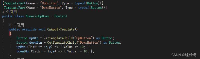
- 2 TemplatePart 和 GetTemplateChild方法的使用,通过TemplatePart 预定义控件的组成部分相关信息,通过GetTemplateChild获取指定名称的预定义组件
- 3 OnApplyTemplate ,每当应用程序代码或内部进程调用FrameworkElement.ApplyTemplate(),都将调用此方法,一般在静态构造函数执行完成后,就会调用该方法,我们可以在该方法中使用GetTemplateChild获取指定名称的预定义组件,给该组件附加一些事件或者业务逻辑。如下图所示:
结语
以上就是本文的内容,希望以上内容可以帮助到您,如文中有不对之处,还请批评指正。
参考资料:
控件自定义
讲解WPF中用户控件和自定义控件的使用


![Ctfshow [单身杯]](https://img-blog.csdnimg.cn/0966a2109b324c5bad8344e244b612b4.png#pic_center)