Element Plus 图标使用方式整理
以下是 Element Plus 图标的所有使用方式,包含完整代码示例和总结表格:
1. 按需引入图标组件
-
适用场景:仅需少量图标时,按需导入减少打包体积
-
示例代码:
<template> <div> <!-- 直接使用导入的图标组件 --> <Edit class="icon" /> <Delete @click="handleClick" /> </div> </template> <script setup> import { Edit, Delete } from '@element-plus/icons-vue'; const handleClick = () => { console.log('图标被点击'); }; </script> <style> .icon { font-size: 24px; cursor: pointer; } </style> -
注释说明:
- 通过
@element-plus/icons-vue按需导入图标组件 - 在
<script setup>中导入并直接在模板中使用 - 支持绑定点击事件等原生属性
- 通过
2. 全局注册所有图标
- 适用场景:项目需频繁使用大量图标时
- 示例代码:
// main.js
import { createApp } from 'vue';
import App from './App.vue';
import * as ElementPlusIconsVue from '@element-plus/icons-vue';
import ElementPlus from 'element-plus';

const app = createApp(App);
app.use(ElementPlus);

// 全局注册所有图标
for (const [key, component] of Object.entries(ElementPlusIconsVue)) {
  app.component(key, component);
}

app.mount('#app');
  <!-- 组件中直接使用 -->
  <template>
    <Search class="global-icon" />
    <InfoFilled />
  </template>
- 注意事项:
- 会引入所有图标,可能增加打包体积
- 需在入口文件全局注册
3. 动态绑定图标(通过变量)
- 适用场景:需要动态切换图标时
- 示例代码:
<template>
  <component :is="currentIcon" class="dynamic-icon" />
  <button @click="toggleIcon">切换图标</button>
</template>

<script setup>
import { ref } from 'vue';
import { Edit, Check } from '@element-plus/icons-vue';

const currentIcon = ref(Edit);

const toggleIcon = () => {
  currentIcon.value = currentIcon.value === Edit ? Check : Edit;
};
</script>
4. 自定义图标
- 适用场景:需使用项目专属图标时
- 示例代码:
<!-- 自定义图标组件 CustomIcon.vue -->
<template>
  <svg class="custom-icon" viewBox="0 0 1024 1024">
    <!-- 自定义路径 -->
    <path d="M512 1024c-282.2 0-512-229.8-512-512s229.8-512 512-512 512 229.8 512 512-229.8 512-512 512z"/>
  </svg>
</template>

<!-- 使用自定义图标 -->
<template>
  <CustomIcon class="custom-style" />
</template>

<script setup>
import CustomIcon from './CustomIcon.vue';
</script>
5. 组合图标(Element Plus 2.3+)
- 适用场景:需要组合多个图标时
- 示例代码:
<template>
  <el-icon class="combined-icon">
    <Edit />
    <Check />
  </el-icon>
</template>

<style>
.combined-icon .el-icon__inner {
  margin-right: 8px;
}
</style>
使用方式总结表格
| 方式 | 适用场景 | 代码示例 | 注意事项 |
|---|---|---|---|
| 按需引入 | 少量图标需求 | import { Edit } from '@element-plus/icons-vue'; | 需逐个导入,适合小项目 |
| 全局注册 | 大量图标需求 | 入口文件循环注册所有图标组件 | 可能增加打包体积 |
| 动态绑定 | 需要动态切换图标 | <component :is="currentIcon" /> | 需通过变量控制图标类型 |
| 自定义图标 | 需要专属图标 | 自定义 SVG 组件并导入 | 需自行设计图标路径 |
| 组合图标 | 需要多个图标组合 | <el-icon><Edit /><Check /></el-icon> | 需手动设置间距/样式 |
关键点补充
- 图标样式控制:通过 CSS 直接修改
font-size、color、cursor等属性 - 图标列表:所有图标名称可通过
@element-plus/icons-vue查看 - 版本兼容:Element Plus 2.x+ 推荐使用 SVG 图标,旧版字体图标已弃用
如果需要进一步优化或扩展某个用法,可以随时提出!
扩展
在按钮上加图标和直接使用图标
完整代码例子
<script setup lang="ts">
import { ref } from 'vue'
defineProps<{ msg: string }>()
const count = ref(0)
</script>
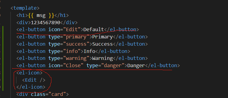
<template>
<h1>{{ msg }}</h1>
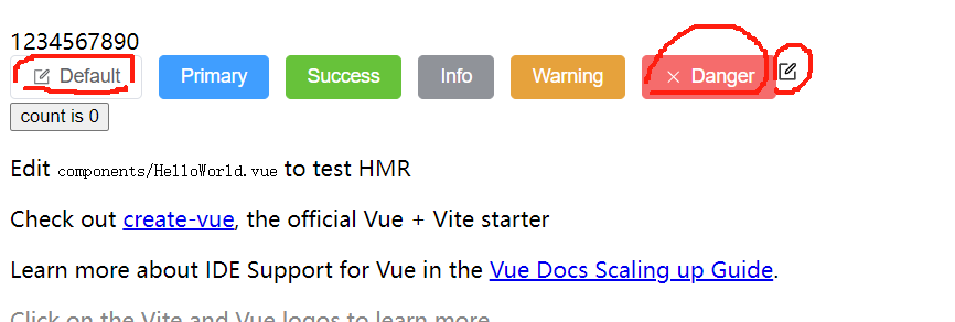
<div>1234567890</div>
<el-button icon="Edit">Default</el-button>
<el-button type="primary">Primary</el-button>
<el-button type="success">Success</el-button>
<el-button type="info">Info</el-button>
<el-button type="warning">Warning</el-button>
<el-button icon="Close" type="danger">Danger</el-button>
<el-icon>
<Edit />
</el-icon>
<div class="card">
<button type="button" @click="count++">count is {{ count }}</button>
<p>
Edit
<code>components/HelloWorld.vue</code> to test HMR
</p>
</div>
<p>
Check out
<a href="https://vuejs.org/guide/quick-start.html#local" target="_blank">create-vue</a>, the official Vue + Vite
starter
</p>
<p>
Learn more about IDE Support for Vue in the
<a href="https://vuejs.org/guide/scaling-up/tooling.html#ide-support" target="_blank">Vue Docs Scaling up Guide</a>.
</p>
<p class="read-the-docs">Click on the Vite and Vue logos to learn more</p>
</template>
<style scoped>
.read-the-docs {
color: #888;
}
</style>