个人开发的塔罗牌占卜小程序:【问问塔罗牌】 快来瞧瞧吧!

一、核心实现原理
我们通过三步实现这个效果:
-
逐字渲染:通过 JavaScript 定时添加字符
-
透明度动画:CSS 实现淡入效果
-
光标动画:伪元素 + CSS 动画模拟输入状态
二、完整代码实现
HTML 结构
<div class="chat-container">
  <div class="response-box">
    <p class="typing-effect"></p>
  </div>
</div>
CSS 样式
.typing-effect {
  font-size: 1.2rem;
  line-height: 1.5;
  min-height: 2em;
  position: relative;
}

/* 渐显动画 */
@keyframes fadeIn {
  from { opacity: 0; }
  to { opacity: 1; }
}

/* 光标动画 */
.typing-effect::after {
  content: "|";
  animation: blink 1s infinite;
  opacity: 0.7;
}

@keyframes blink {
  0%, 100% { opacity: 0; }
  50% { opacity: 1; }
}
JavaScript 逻辑
function simulateTyping(targetElement, text, speed = 50) {
let index = 0;
targetElement.innerHTML = '';
function addCharacter() {
if (index < text.length) {
// 创建单个字符的span
const charSpan = document.createElement('span');
charSpan.textContent = text[index];
charSpan.style.animation = 'fadeIn 0.3s ease-in';
targetElement.appendChild(charSpan);
index++;
// 滚动保持可见
targetElement.parentElement.scrollTop = targetElement.parentElement.scrollHeight;
setTimeout(addCharacter, speed);
} else {
// 完成后移除光标
targetElement.style.setProperty('--cursor-visibility', 'hidden');
}
}
addCharacter();
}
// 使用示例
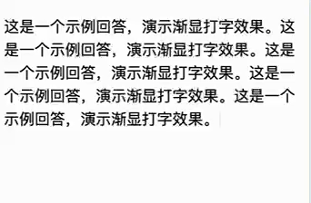
const responseBox = document.querySelector('.typing-effect');
simulateTyping(responseBox, '这是一个示例回答,演示渐显打字效果。'.repeat(5));三、关键代码解析
1. 逐字渲染逻辑
-
使用
setTimeout递归实现可控速率的逐字添加 -
每个字符包裹在独立的
span中以便单独控制动画 -
动态计算滚动位置保持内容可见
2. 动画系统
-
渐显动画:通过
fadeIn关键帧实现 0.3 秒淡入 -
光标效果:利用伪元素的
blink动画模拟输入状态 -
性能优化:使用 CSS 硬件加速(
translateZ(0)可选择性添加)
3. 扩展参数
// 可配置参数示例
simulateTyping(element, text, {
  speed: 30,        // 字间间隔(ms)
  fadeDuration: 500, // 淡入时长
  cursorColor: '#00ff88', // 光标颜色
  onComplete: () => console.log('完成') // 回调函数
});
四、效果优化技巧
-
节流处理:对于长文本使用
requestAnimationFrame -
加载状态:添加初始闪烁光标提示
-
响应式设计:通过媒体查询适配移动端
-
音效增强:添加打字音效(需用户交互后触发)
// 添加音效示例
const typeSound = new Audio('typewriter.wav');
function playTypeSound() {
  typeSound.currentTime = 0;
  typeSound.play();
}

// 在 addCharacter 中调用
if (index % 2 === 0) playTypeSound();
五、实际应用场景
-
聊天机器人界面
-
代码演示平台
-
交互式故事叙述
-
教学软件的逐步提示
-
游戏对话系统
六、延伸扩展思路
-
动画曲线:尝试
cubic-bezier(0.4, 0, 0.2, 1)获得更自然的效果 -
富文本支持:通过标记语法实现重点词特殊动画
-
错误模拟:添加随机退格效果
-
多语言适配:支持从右到左的书写方向
/* RTL 支持 */
[dir="rtl"] .typing-effect {
  unicode-bidi: bidi-override;
  direction: rtl;
}