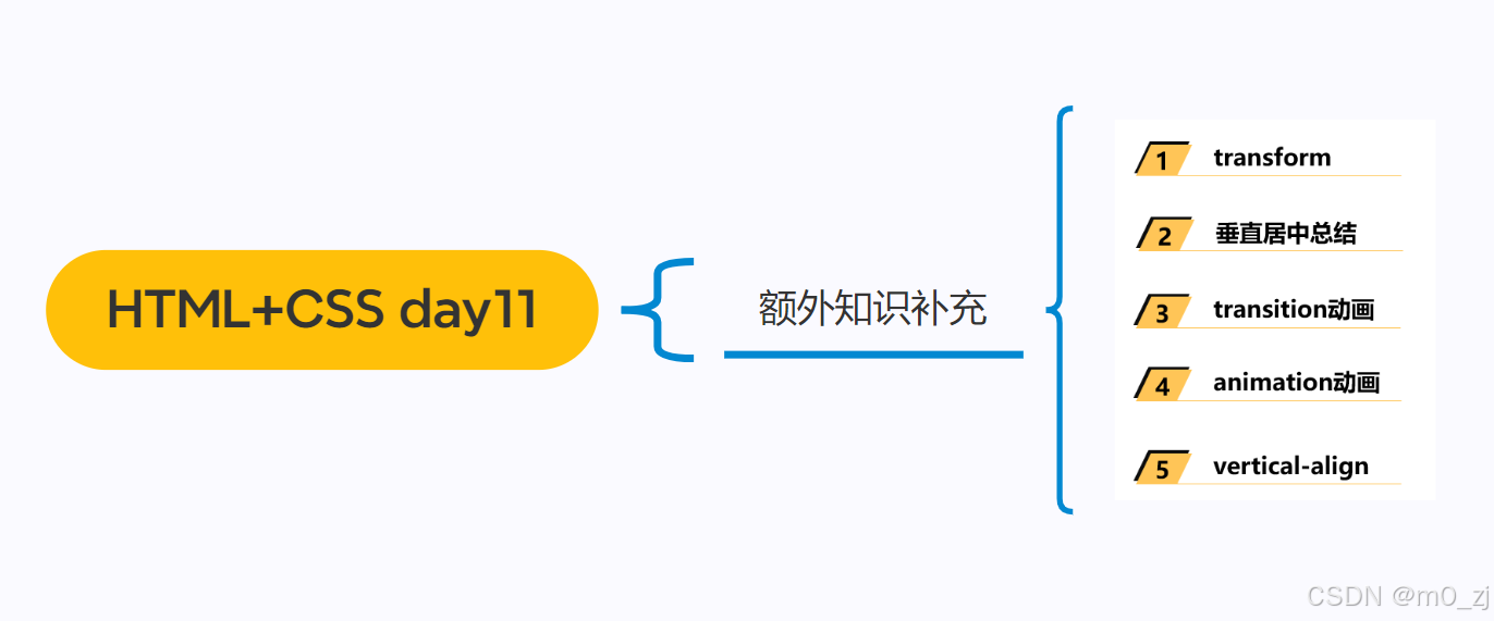
1 transform
CSS属性 - transform

transform的用法
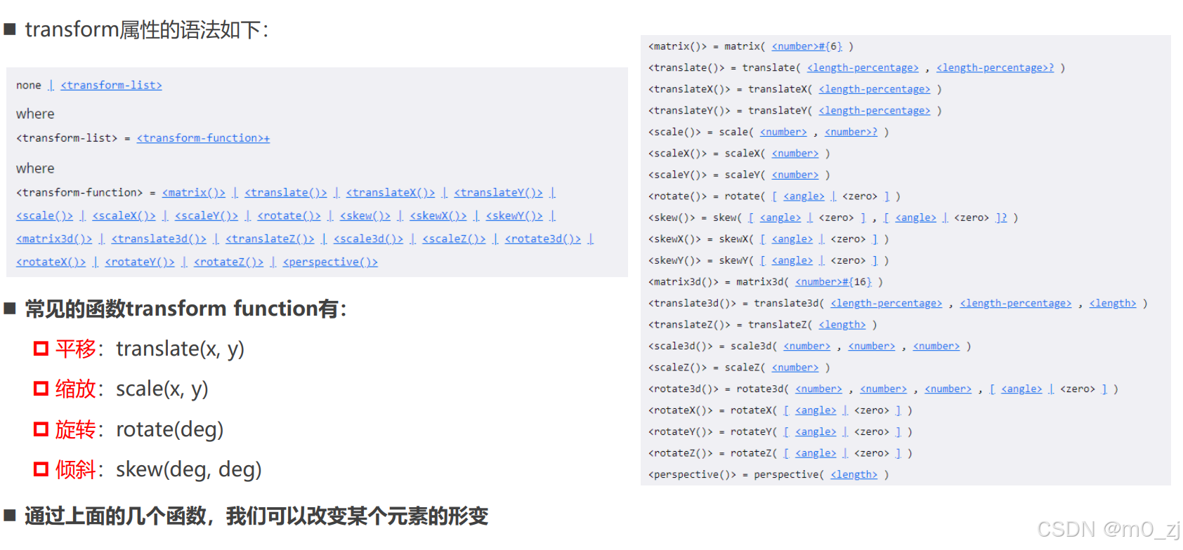
+表示一个或者多个
不用记住全部的函数,只用掌握这四个常用的函数即可
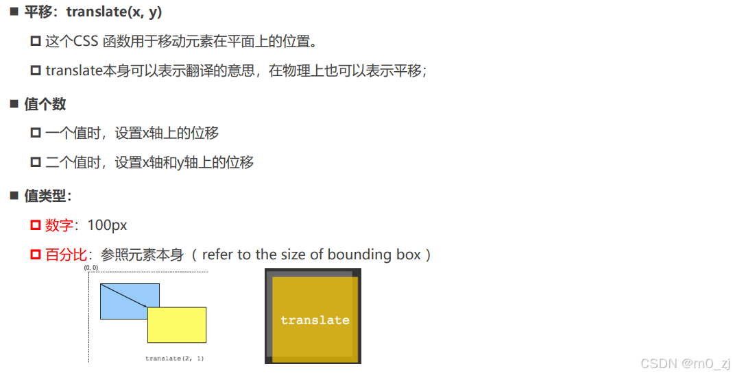
位移 - translate
<!DOCTYPE html>
<html lang="en">
<head>
  <meta charset="UTF-8">
  <meta http-equiv="X-UA-Compatible" content="IE=edge">
  <meta name="viewport" content="width=device-width, initial-scale=1.0">
  <title>Document</title>
  <style>
    .container {
      display: inline-block;
      border: 5px solid #f00;
    }

    .container .box {
      width: 200px;
      height: 200px;
      background-color: orange;

      transform: translate(100px, 100px);
    }
  </style>
</head>
<body>

  <div class="container">
    <div class="box"></div>
  </div>

</body>
</html>
translate百分比
<!DOCTYPE html>
<html lang="en">
<head>
  <meta charset="UTF-8">
  <meta http-equiv="X-UA-Compatible" content="IE=edge">
  <meta name="viewport" content="width=device-width, initial-scale=1.0">
  <title>Document</title>
  <style>
    .container {
      display: inline-block;
      border: 5px solid #f00;
    }

    .container .box {
      width: 200px;
      height: 100px;
      background-color: orange;

      /* 百分比: 你的百分比是相对于谁? */
      /* 不同地方的百分比相对参照物是不一样 */

      /* traslate的百分比是相对于自身的 */
      /* 如果设置的x位移: 那么参考的是自身的宽度 */
      /* 如果设置的y位移: 那么参考的是自身的高度 */
      transform: translate(100%, 100%);

      /* transform: translate(x, y); */
      /* transform: translateX();
      transform: translateY(); */
    }
  </style>
</head>
<body>

  <div class="container">
    <div class="box"></div>
  </div>

</body>
</html>


translate的补充
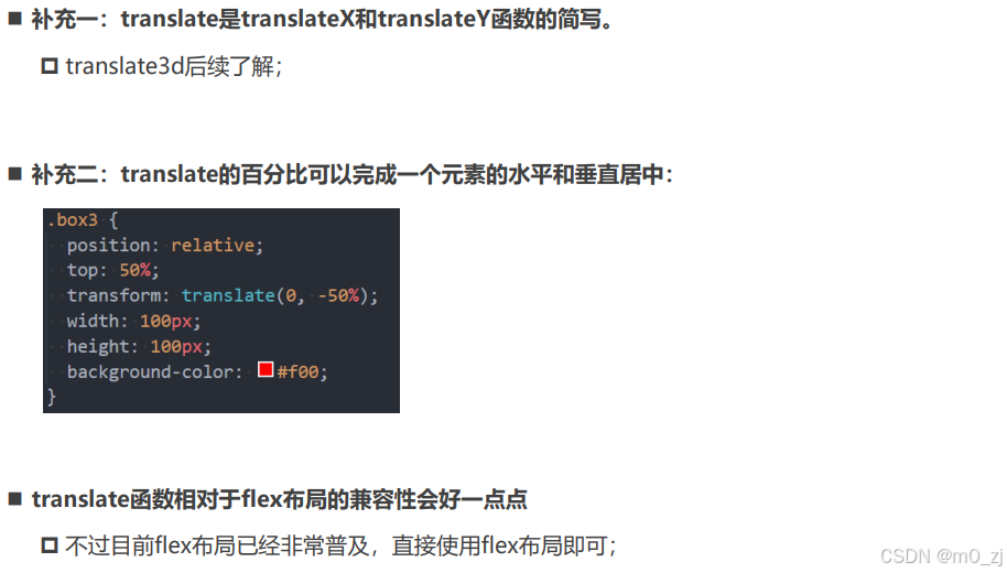
<!DOCTYPE html>
<html lang="en">
<head>
  <meta charset="UTF-8">
  <meta http-equiv="X-UA-Compatible" content="IE=edge">
  <meta name="viewport" content="width=device-width, initial-scale=1.0">
  <title>Document</title>
  <style>
    .container {
      /* position: relative; */
      /* display: flex;
      align-items: center; */

      height: 300px;
      background-color: orange;
    }

    .box1 {
      position: absolute;
      width: 100px;
      /* height: 100px; */
      top: 0;
      bottom: 0;
      margin: auto 0;
      background-color: #f00;
    }

    .box2 {
      background-color: #f00;
    }

    .box3 {
      display: inline-block;
      height: 100px;
      background-color: #f00;

      /* 两件事情:
          1.让元素向下位移父元素的50%
          2.让元素向上位移自身的50%
      */
      /* margin-top的百分比是相对于包含块(父元素)的宽度 */
      /* margin-top: 50%; */
      position: relative;
      top: 50%;
      transform: translate(0, -50%);
    }
  </style>
</head>
<body>

  <!--
    水平居中:
      1.行内级元素:
        * 设置父元素的text-align: center
      2.块级元素:
        * 设置当前块级元素(宽度) margin: 0 auto;
      3.绝对定位
        * 元素有宽度情况下, left0/right0/margin: 0 auto;
      4.flex
        * justify-content: center
   -->

  <!--
    垂直居中:
      1.绝对定位
        * 元素有高度情况下, top0/bottom0/margin: auto 0;
  -->
  <!--
    1.垂直居中: 绝对定位
    弊端:
      1> 必须使用定位(脱离标准流)
      2> 必须给元素设置高度
   -->
  <!-- <div class="container">
    <div class="box1">coderwhy</div>
  </div> -->

  <!--
    2.垂直居中: flex布局(直接使用flex)
    弊端:
      1> 当前flex局部中所有的元素都会被垂直居中
      2> 相对来说, 兼容性差一点点(基本可以忽略)
   -->
   <!-- <div class="container">
     <div class="box2">flex布局的居中</div>
     aaaa
   </div> -->

   <!--
    3.垂直居中: top/translate(个人推荐, 不好理解)
  -->
  <div class="container">
    <div class="box3">coderwhy</div>
    aaaaa
  </div>

</body>
</html>
补充:水平居中和垂直居中
水平居中:
1.行内级元素:
* 设置父元素的text-align: center
2.块级元素:
* 设置当前块级元素(宽度) margin: 0 auto;
3.绝对定位
* 元素有宽度情况下, left0/right0/margin: 0 auto;
4.flex
* justify-content: center
垂直居中:
1.绝对定位
元素有高度情况下, top0/bottom0/margin: auto 0;
    .container {
      position: relative;
      height: 300px;
      background-color: orange;
    }

    .box1 {
      position: absolute;
      width: 100px;
      height: 100px;
      top: 0;
      bottom: 0;
      margin: auto 0;
      background-color: red;

    }
1.垂直居中: 绝对定位
弊端:
1> 必须使用定位(脱离标准流)
2> 必须给元素设置高度
2.垂直居中: flex布局(直接使用flex)
弊端:
1> 当前flex局部中所有的元素都会被垂直居中
2> 相对来说, 兼容性差一点点(基本可以忽略)
.container {
      display: flex;
      align-items: center;

      height: 300px;
      background-color: orange;
    }
.box2 {
      background-color: #f00;
    }
3.垂直居中: top/translate(个人推荐, 不好理解)
    .container {
      height: 300px;
      background-color: orange;
    }

    .box3 {
      display: inline-block;
      height: 100px;
      background-color: #f00;

      /* 两件事情:
          1.让元素向下位移父元素的50%
          2.让元素向上位移自身的50%
      */
      /* margin-top的百分比是相对于包含块(父元素)的宽度 */
      /* margin-top: 50%; */
      position: relative;
      top: 50%;
      transform: translate(0, -50%);
    }
缩放 - scale
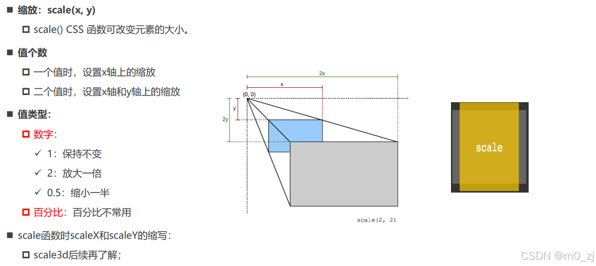
<!DOCTYPE html>
<html lang="en">
<head>
  <meta charset="UTF-8">
  <meta http-equiv="X-UA-Compatible" content="IE=edge">
  <meta name="viewport" content="width=device-width, initial-scale=1.0">
  <title>Document</title>
  <style>
    body {
      text-align: center;
      padding-top: 200px;
    }

    .container {
      display: inline-block;
      border: 20px solid #f00;
    }

    .box {
      border: 20px solid #0f0;
      width: 200px;
      height: 200px;
      background-color: orange;

      /* 形变 */
      transform: scale(60%, 60%);
    }

    .box1 {
      border: 20px solid #0f0;
      width: 200px;
      height: 200px;
      background-color: purple;

      /* 形变 */
      /* 0~1 对元素进行缩小 */
      /* 大于1 对元素进行放大 */
      /* transform: scale(1.2, 1.2); */
    }

    .box1:hover {
      transform: scale(1.1, 1.1);
    }
  </style>
</head>
<body>

  <div class="container">
    <div class="box"></div>
  </div>

  <div class="container">
    <div class="box1"></div>
  </div>

</body>
</html>
旋转 - rotate
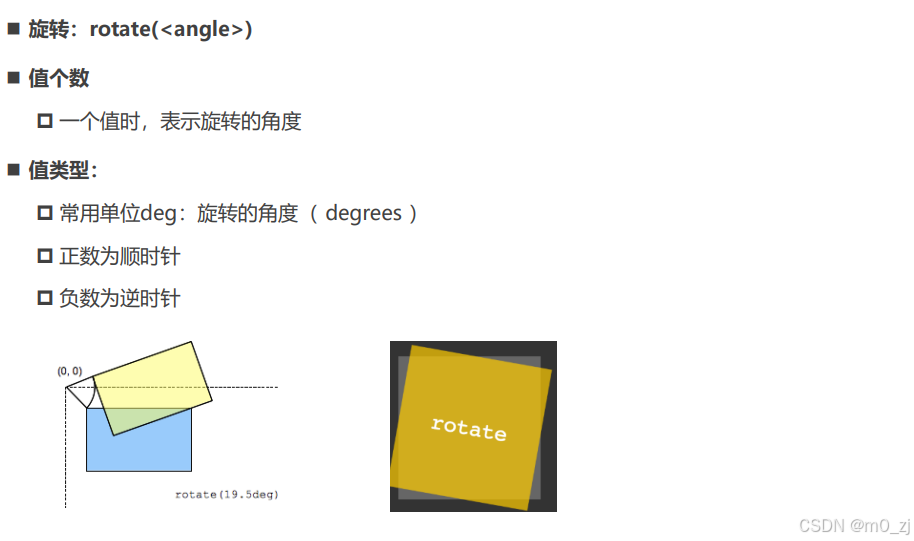
<!DOCTYPE html>
<html lang="en">
<head>
  <meta charset="UTF-8">
  <meta http-equiv="X-UA-Compatible" content="IE=edge">
  <meta name="viewport" content="width=device-width, initial-scale=1.0">
  <title>Document</title>
  <style>
    body {
      text-align: center;
      padding-top: 200px;
    }

    .container {
      display: inline-block;
      border: 10px solid #f00;
    }

    .box {
      width: 200px;
      height: 100px;
      background-color: orange;
    }

    .box:hover {
      transform: rotate(-45deg);
    }
  </style>
</head>
<body>

  <div class="container">
    <div class="box"></div>
  </div>

</body>
</html>
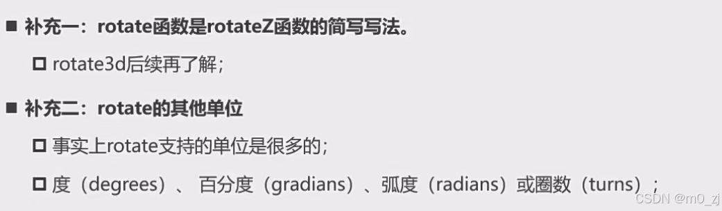
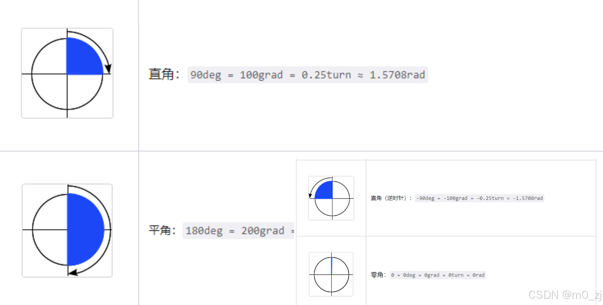
rotate补充
transform-origin
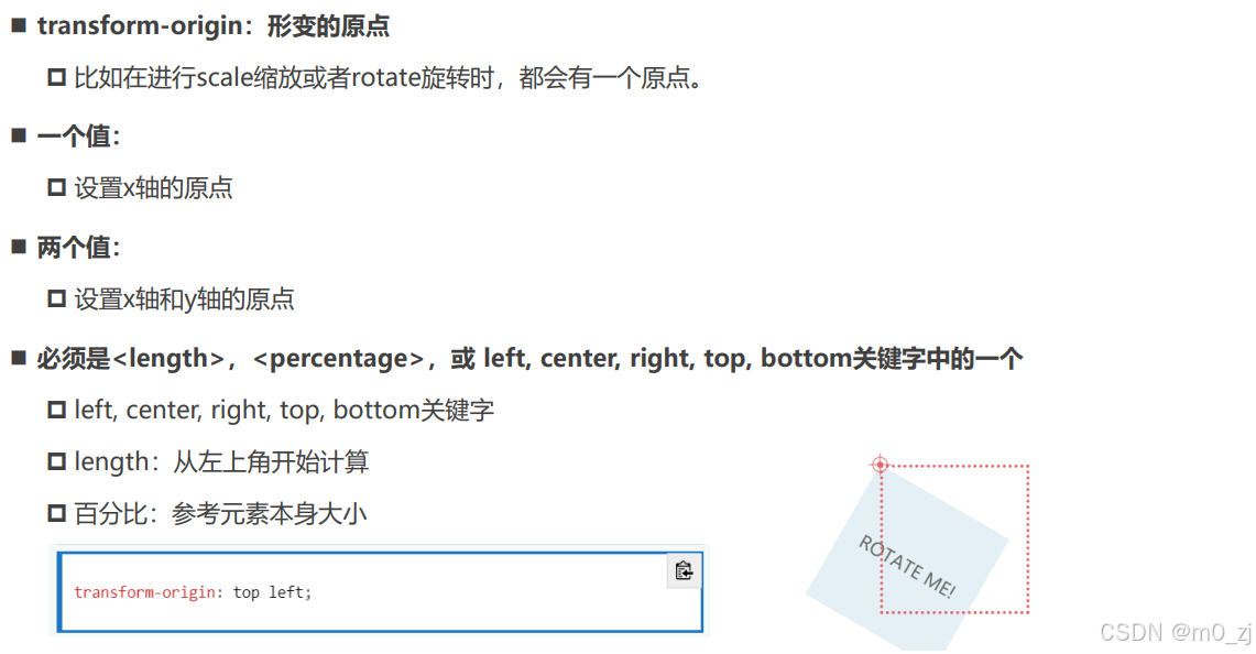
<!DOCTYPE html>
<html lang="en">
<head>
  <meta charset="UTF-8">
  <meta http-equiv="X-UA-Compatible" content="IE=edge">
  <meta name="viewport" content="width=device-width, initial-scale=1.0">
  <title>Document</title>
  <style>
    body {
      text-align: center;
      padding-top: 200px;
    }

    .container {
      display: inline-block;
      border: 10px solid #f00;
    }

    .box {
      width: 200px;
      height: 100px;
      background-color: orange;

      /* 修改当前元素的形变的原点位置 */
      /* transform-origin: center top; */
      /* transform-origin: 20px 20px; */
      transform-origin: 10% 10%;
    }

    .box:hover {
      transform: rotate(45deg) scale(0.5);
    }
  </style>
</head>
<body>

  <div class="container">
    <div class="box"></div>
  </div>

</body>
</html>
倾斜 - skew(理解)
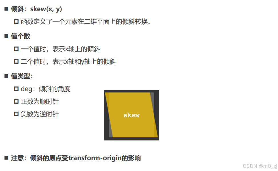
<!DOCTYPE html>
<html lang="en">
<head>
  <meta charset="UTF-8">
  <meta http-equiv="X-UA-Compatible" content="IE=edge">
  <meta name="viewport" content="width=device-width, initial-scale=1.0">
  <title>Document</title>
  <style>
    .box {
      font-style: italic;
      width: 200px;
      height: 100px;
      background-color: orange;
    }

    .box:hover {
      transform: skew(10deg, 10deg);
    }
  </style>
</head>
<body>

  <div class="box">我是div元素</div>

</body>
</html>
transform设置多个值
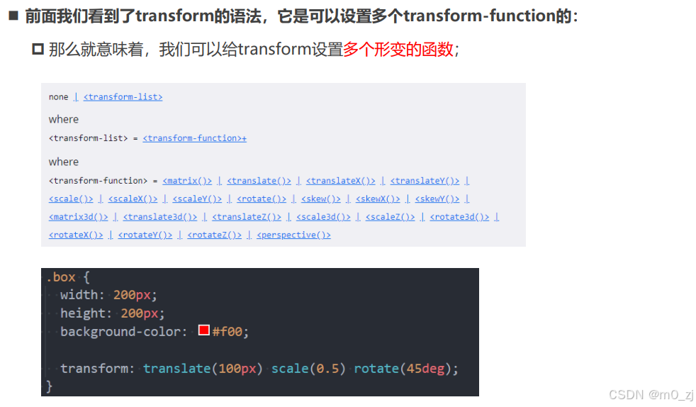
<!DOCTYPE html>
<html lang="en">
<head>
  <meta charset="UTF-8">
  <meta http-equiv="X-UA-Compatible" content="IE=edge">
  <meta name="viewport" content="width=device-width, initial-scale=1.0">
  <title>Document</title>
  <style>
    .box {
      width: 200px;
      height: 100px;
      background-color: orange;
    }

    .box:hover {
      /* transform: translateX(50px);
      transform: scale(1.2);
      transform: rotate(45deg); */

      /*
        <transform-function>+
          +: 一个或者多个, 并且多个之间以空格分隔
          transform: scale() translate();

        <box-shadow>#
          #: 一个或者多个, 多个之间以, 分隔
          box-shadow: 1px 1px 1px 1px #f00,
      */
      transform: translate(50px) scale(1.2) rotate(45deg);
    }
  </style>
</head>
<body>

  <div class="box"></div>

</body>
</html>
2 垂直居中总结
(见上补充知识)
3 transition动画
认识transition动画
哪些CSS属性可以做动画呢?
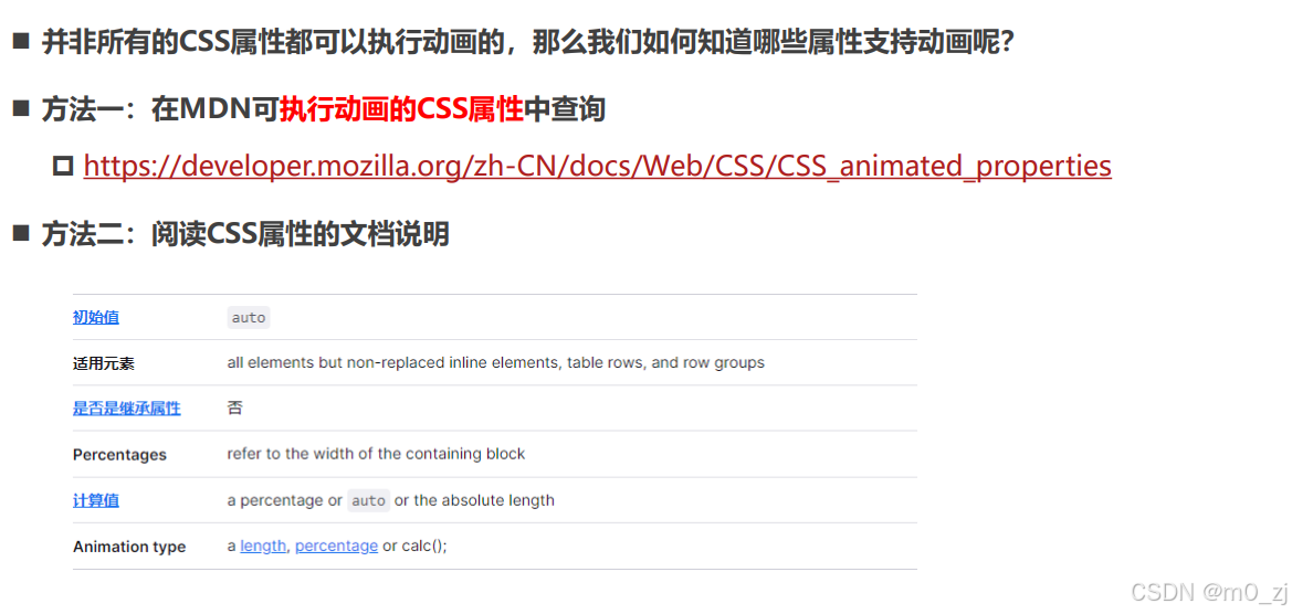
过渡动画 - transition

<!DOCTYPE html>
<html lang="en">
<head>
  <meta charset="UTF-8">
  <meta http-equiv="X-UA-Compatible" content="IE=edge">
  <meta name="viewport" content="width=device-width, initial-scale=1.0">
  <title>Document</title>
  <style>
    .container {
      background-color: #f00;
    }

    .box {
      position: relative;
      left: 0;

      width: 200px;
      height: 100px;
      background-color: orange;

      /* 告知浏览器 box 在进行一些CSS属性变化的时候有一个过渡效果 */
      /* transition-property: transform, left; */
      /* transition-property: all;
      transition-duration: 1s;
      transition-timing-function: ease-in;
      transition-delay: 1s; */

      /* 简写属性 */
      transition: all 1s ease-in 1s;
    }

    .container:hover .box {
      left: 100px;
      transform: translate(100px);
      width: 500px;
    }
  </style>
</head>
<body>

  <div class="container">
    <div class="box"></div>
  </div>

</body>
</html>
几个英语词汇的区分(理解)
举例 transform:translate(10px,10px)
transition适用于给各种属性做动画的,可以给width/color/transform等属性做动画
补充:宽度的变化方向
<!DOCTYPE html>
<html lang="en">
<head>
  <meta charset="UTF-8">
  <meta http-equiv="X-UA-Compatible" content="IE=edge">
  <meta name="viewport" content="width=device-width, initial-scale=1.0">
  <title>Document</title>
  <style>
    .box {
      position: fixed;
      right: 0;
      width: 400px;
      height: 100px;
      background-color: orange;
    }
  </style>
</head>
<body>

  <div class="box"></div>

</body>
</html>
4 animation动画
认识CSS Animation
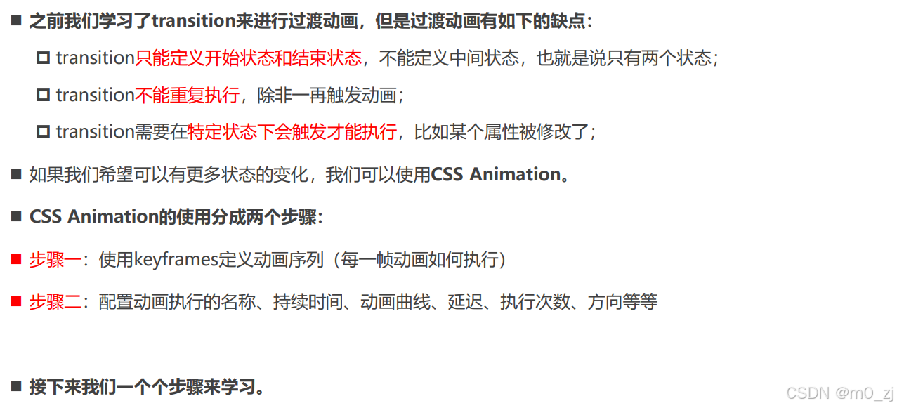
@keyframes规则
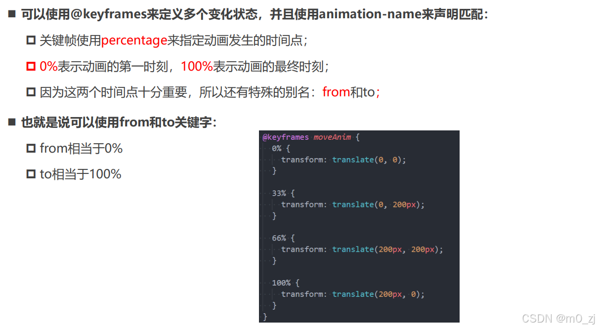
<!DOCTYPE html>
<html lang="en">
<head>
  <meta charset="UTF-8">
  <meta http-equiv="X-UA-Compatible" content="IE=edge">
  <meta name="viewport" content="width=device-width, initial-scale=1.0">
  <title>Document</title>
  <style>
    .box {
      width: 200px;
      height: 100px;
      background-color: orange;

      /* box要执行moveAnim的动画 */
      animation-name: moveAnim;
      animation-duration: 3s;
      animation-timing-function: ease-in-out;

      /* 其他属性: */
      /* 动画执行的次数 */
      /* animation-delay: 2s; */
      /* animation-iteration-count: 2; */
      /* animation-direction: reverse; */
      /* 元素停留在动画的哪一个位置 */
      /* animation-fill-mode: forwards; */

      /* js动态修改 */
      /* animation-play-state: paused; */
      animation: moveAnim 3s linear 1s 2 normal forwards, ;
    }

    @keyframes moveAnim {
      0% {
        transform: translate(0, 0) scale(0.5, 0.5);
      }

      33% {
        transform: translate(0, 200px) scale(1.2, 1.2);
      }

      66% {
        transform: translate(400px, 200px) scale(1, 1);
      }

      100% {
        transform: translate(400px, 0) scale(0.5, 0.5);
      }
    }

  </style>
</head>
<body>

  <div class="box">

  </div>

</body>
</html>
animation属性

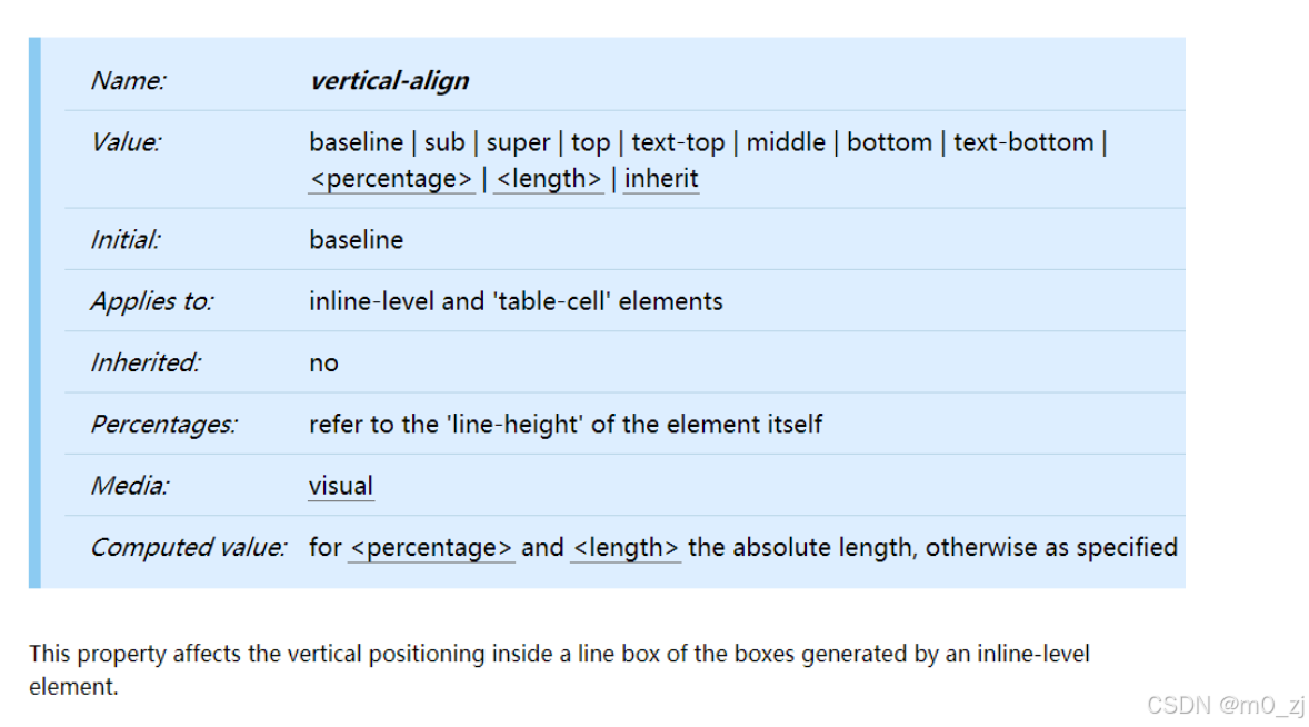
5 vertical-align
CSS属性 - vertical-align
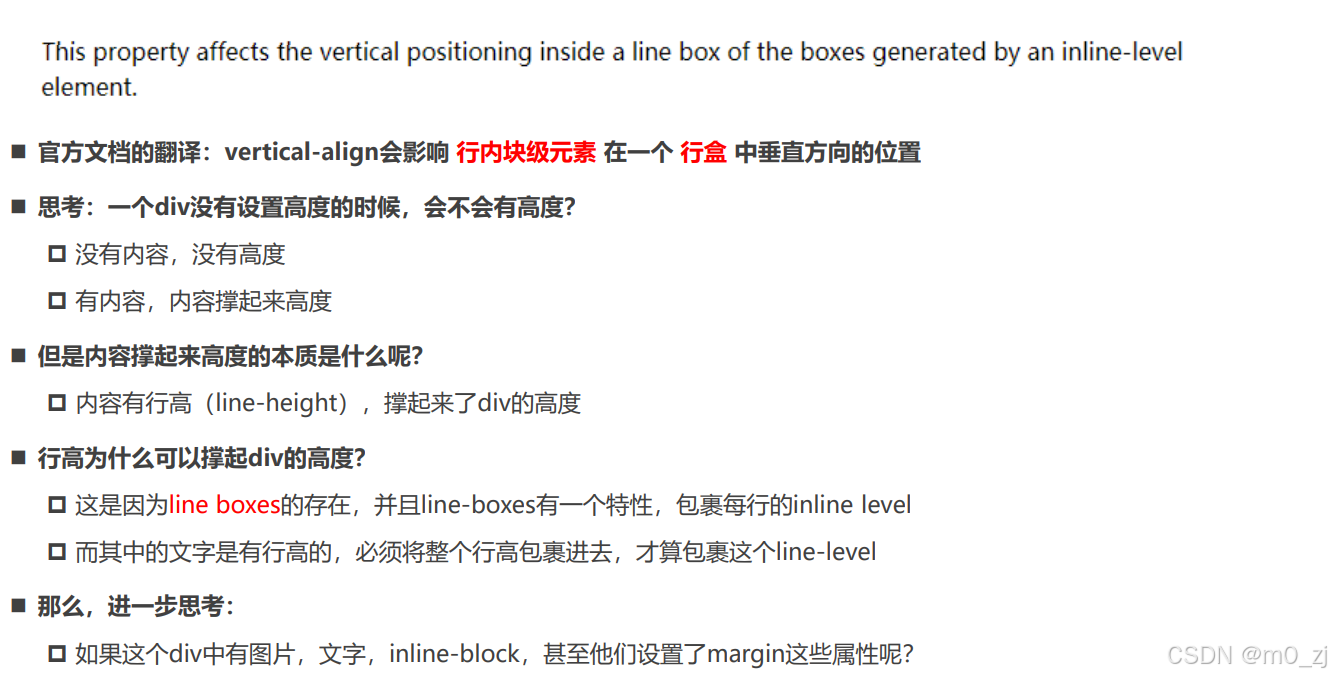
行盒(inline-box),我们可以把每一行的文本,看成在一个行盒里。
其作用为:将当前行里面所有的内容包裹在一起。
<!DOCTYPE html>
<html lang="en">
<head>
  <meta charset="UTF-8">
  <meta http-equiv="X-UA-Compatible" content="IE=edge">
  <meta name="viewport" content="width=device-width, initial-scale=1.0">
  <title>Document</title>
  <style>
    /* 当前box有没有高度: 会有高度 */
    /* 为什么有高度: 由内容的撑起来 */
    /* 本质: 内容的行高撑起来 */
    .box {
      background-color: orange;
    }

    .small {
      display: inline-block;
      width: 100px;
      height: 100px;
      background-color: #f00;
    }
  </style>
</head>
<body>

  <div class="box">
    我是div元素 <span class="small"></span>
    虽然说,现在想吃什么用什么海外产品,都能代购,但是自己去购买,感觉还是不同。
    一个人在路上,心情也会不同,路上的行程,可以听书看书,到达后,疯狂的游玩。书的种类很多,旅行的书本真的不少,常常看到人们去各地游玩,自己心中也跟着想去。有时间,可以试着一个人去旅行,那是一种享受一种幸福。女人不必限制于单身生活,才会各地旅行,婚后的女性,有时间,也可以一个人去旅行,那是一种不同的感受,有些人也可以带小孩老公一起去旅行。独自游玩是一种幸福,家庭一起去旅行,也是一种幸福。单身的女性,可以一个人独游。婚后的女性,也可以一个人独游。当然,婚后若是自己一个人不方便,那就全家人旅行。
  </div>

</body>
</html>
【我们可以理解为,div里面有行盒,是为了包裹里面每行的文本内容】
2.行盒中的多种行内元素:
<!DOCTYPE html>
<html lang="en">
<head>
  <meta charset="UTF-8">
  <meta http-equiv="X-UA-Compatible" content="IE=edge">
  <meta name="viewport" content="width=device-width, initial-scale=1.0">
  <title>Document</title>
  <style>
    .box {
      background-color: orange;
    }

    .box img {
      width: 200px;
    }

    .box .small {
      display: inline-block;
      width: 100px;
      height: 200px;
      background-color: #f00;
    }
  </style>
</head>
<body>

  <div class="box">
    我是普通的文本, 323fdafdafxxxx322
    <img src="../images/kobe01.jpg" alt="">
    <span class="small"></span>
  </div>

</body>
</html>
3。行盒内包裹多个内容如何对齐
<!DOCTYPE html>
<html lang="en">
<head>
  <meta charset="UTF-8">
  <meta http-equiv="X-UA-Compatible" content="IE=edge">
  <meta name="viewport" content="width=device-width, initial-scale=1.0">
  <title>Document</title>
  <style>
    .box {
      background-color: orange;
    }

    .box img {
      width: 200px;
    }

    .box .small {
      display: inline-block;
      width: 100px;
      height: 200px;
      background-color: #f00;
    }
  </style>
</head>
<body>

  <div class="box">
    我是普通的文本, 323fdafdafxqgxxx322
    <img src="../images/kobe01.jpg" alt="">
    <span class="small"></span>
  </div>

</body>
</html>
行盒里的东西如何对齐?里面有文字,图片。。。如何对齐?


深入理解vertical-align – line boxes
深入理解vertical-align – 不同情况分析

vertical-align的baseline
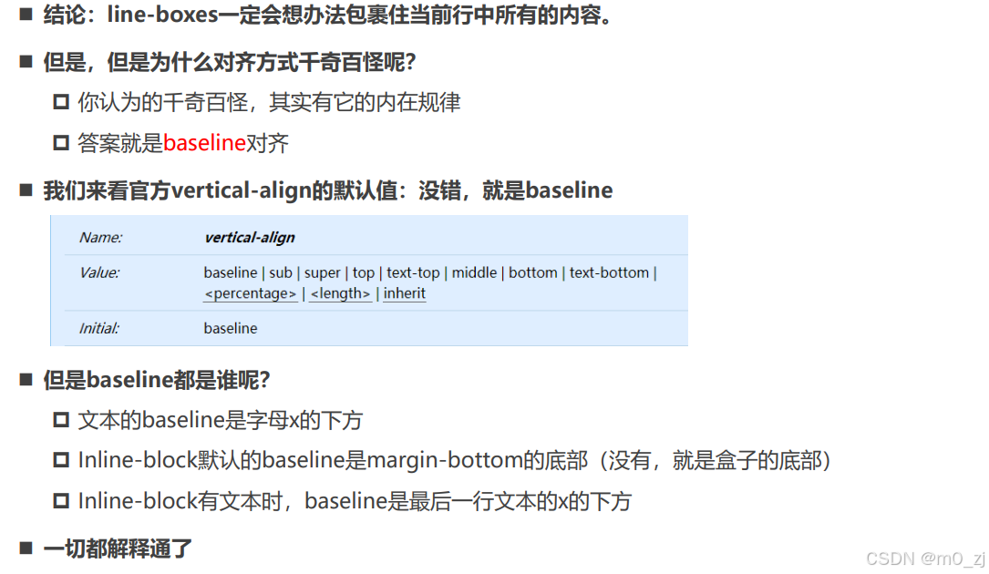
vertical-align的其他值
练习
一. 完成所有的代码练习
见vscode
二. 说出常见的CSS Transform形变有哪些
transform属性允许对某一个元素进行某些形变, 包括旋转,缩放,倾斜或平移等。transform对于行内级非替换元素(如a,span)是无效的。
-
translate(x, y) :平移,用于移动元素在平面上的位置
-
scale(x, y) :缩放,可改变元素的大小。
-
rotate(deg) :旋转,表示旋转的角度 。
-
skew(deg, deg) :倾斜,定义了一个元素在二维平面上的倾斜转换
三. 说出CSS Transition和Animation动画的区别
-
transition:
-
只能定义两个状态:开始状态和结束状态,不能定义中间状态
-
不能重复执行动画,除非一再触发动画
-
需要在特定状态触发后才能执行,比如某属性修改了
-
-
animation:
-
可以用@keyframes定义动画序列(每一帧如何执行)
-
通过设置animation-iteration-count来规定动画执行的次数
-
不需要触发特定状态即可执行
-
-
animation动画比transition多了animation-iteration-count, animation-direction, animation-fill-mode 和 animation-play-state属性
四. 理解vertical-align的作用以及应用场景
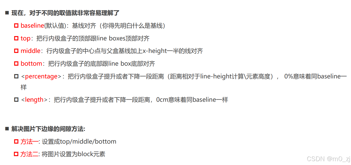
vertical-align影响行内级元素在一个行盒中垂直方向的位置,默认值为baseline对齐/
-
baseline(默认值):基线对齐
-
top:把行内级盒子的顶部跟line boxes顶部对齐
-
middle:行内级盒子的中心点与父盒基线加上x-height一半的线对齐
-
bottom:把行内级盒子的底部跟line box底部对齐
不同应用情景分析:
-
只有文字时:行盒包裹内容,文字的bottom-line和行盒底部对齐
-
有图片和文字时:图片的底部和文字的baseline对齐
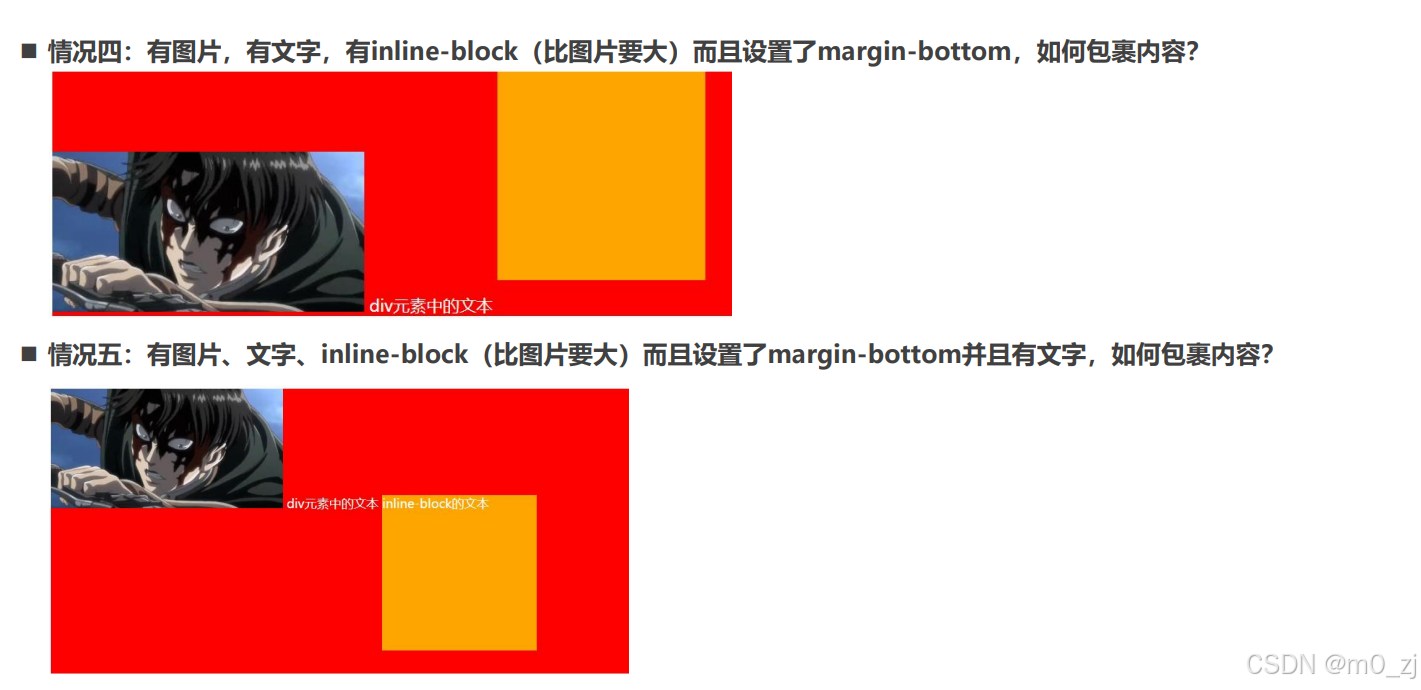
-
有图片,有文字,有inline-block(比图片要大 : 图片的底部,行内块底部和文字的baseline对齐
-
有图片,有文字,有inline-block(比图片要大)而且设置了margin-bottom: 图片的底部,行内块margin-bottom底部和文字的baseline对齐
-
有图片、文字、 inline-block(比图片要大)而且设置了margin-bottom并且有文字 :文字的baseline和图片的底部,行内块内最后一行文字的baseline对齐
五. 完成小米布局中的动画效果
见vscode
六. 自己找一个包含动画的网页案例(比如考拉页面)
见vscode
总结
一. transform
1.1. transform作用以及语法
1.2. translate(x, y)
1.3. translate的百分比(总结垂直居中的方案)
-
利用百分比做垂直居中
1.4. scale(x, y)
1.5. rotate
-
deg
-
正值: 顺时针
-
负值: 逆时针
-
-
rad
1.6. transform-origin
-
修改形变的坐标原点
1.7. skew倾斜
-
deg
1.8. transform设置多个值
二. transition
2.1. 理解过渡动画
-
哪些是可执行动画的属性
2.2. 过渡常见属性
-
transition-property
-
transition-duration
-
transition-timing-function
-
transition-delay
2.3. 总结几个单词的作用
transform
translate
transition
三. animation
3.1. transition弊端和animation介绍
3.2. animation的使用过程
-
@keyframes定义每一帧的属性
-
animation属性
-
animation-name
-
animation-duration
-
animation-timing-function
-
animation-delay
-
animation-iteration-count
-
animation-direction 方向
-
animation-fill-mode
-
animation-play-state: js用
-


![88.[4]攻防世界 web php_rce](https://i-blog.csdnimg.cn/direct/746849efe285440195a72b9397913ac2.png)


