前言
在 WPF 中,控件种类丰富且功能非常完善。一个显著的优点是 WPF 提供了强大的自定义能力和灵活的用户界面表现,能够满足各种复杂的应用需求。其中,ControlTemplate 和 DataTemplate 是两个非常重要的概念,分别用于自定义控件的外观和定义数据的展示方式。
控件模板(ControlTemplate)
ControlTemplate 主要用于自定义控件的外观,而不改变控件的行为。由于WPF默认控件的样式不是特别美观,ControlTemplate 它允许自定义控件的视觉元素,例如按钮的外观、文本框的边框等等,而不需要改变控件的内部逻辑或数据。ControlTemplate 也是一个 XAML 模板。
基本语法
<ControlTemplate x:Key="CustomerTemplate" TargetType="{x:Type 控件类型}">

</ControlTemplate>
ControlTemplate有两个重要的属性,VisualTree另一个是Triggers。
- VisualTree,定义模板的视觉树结构,其实我们就是使用这个属性来描述控件的外观的。
- Triggers,触发器列表,里面包含一些触发器Trigger,我们可以定制这个触发器列表来使控件对外界的刺激发生反应,比如鼠标经过时文本变成粗体等。
下面我就基于比较常用的Button来演示一下,如何自定义Button样式。
<Window x:Class="WpfApp1.ControlTemplateWindow"
        xmlns="http://schemas.microsoft.com/winfx/2006/xaml/presentation"
        xmlns:x="http://schemas.microsoft.com/winfx/2006/xaml"
        xmlns:d="http://schemas.microsoft.com/expression/blend/2008"
        xmlns:mc="http://schemas.openxmlformats.org/markup-compatibility/2006"
        xmlns:local="clr-namespace:WpfApp1"
        mc:Ignorable="d"
        Title="ControlTemplateWindow" Height="450" Width="800">

    <Window.Resources>
    </Window.Resources>

    <Grid>

        <Grid.RowDefinitions>
            <RowDefinition Height="40"/>
        </Grid.RowDefinitions>

        <Grid.ColumnDefinitions>
            <ColumnDefinition Width="100"/>
            <ColumnDefinition Width="100"/>
            <ColumnDefinition Width="100"/>
            <ColumnDefinition Width="100"/>
            <ColumnDefinition Width="100"/>
            <ColumnDefinition Width="100"/>
            <ColumnDefinition Width="100"/>
        </Grid.ColumnDefinitions>

        <Button Grid.Column="0" Grid.Row="0" Content="默认按钮" Margin="0 10 0 0"></Button>

        <Button Grid.Column="2" Grid.Row="0" Content="自定义按钮1" Foreground="White" FontSize="12" FontWeight="Bold" Margin="0 10 0 0" Cursor="Hand">
            <Button.Style>
                <Style TargetType="Button">
                    <Setter Property="Background" Value="#409eff"/>
                    <Setter Property="BorderBrush" Value="White"/>
                </Style>
            </Button.Style>
            <Button.Template>
                <ControlTemplate TargetType="Button">
                    <Border Background="{TemplateBinding Background}" BorderBrush="{TemplateBinding BorderBrush}" CornerRadius="7">
                        <Grid>
                            <!--Rectangle是用于绘制矩形,Fill填充颜色,RadiusX/Y 是绘制矩形的CornerRadius,Opacity透明度 -->
                            <Rectangle Name="CustomerOverlay" Fill="White" Opacity="0" RadiusX="7" RadiusY="7" />
                            <Rectangle Name="CustomerPressed" Fill="Black" Opacity="0" RadiusX="7" RadiusY="7" />
                            <!-- 按钮的内容 -->
                            <ContentPresenter HorizontalAlignment="Center" VerticalAlignment="Center"/>
                        </Grid>
                    </Border>
                    <!-- 触发器 -->
                    <ControlTemplate.Triggers>
                        <!-- 点击按钮时触发 -->
                        <Trigger Property="IsPressed" Value="True">
                            <Setter TargetName="CustomerPressed" Property="Opacity" Value="0.3"/>
                        </Trigger>
                        <!-- 鼠标移动到按钮时触发 -->
                        <Trigger Property="Button.IsMouseOver" Value="True">
                            <Setter TargetName="CustomerOverlay" Property="Opacity" Value="0.2"/>
                        </Trigger>
                    </ControlTemplate.Triggers>
                </ControlTemplate>
            </Button.Template>
        </Button>

    </Grid>
</Window>
代码看着有点多,其实很简单,复制到自己本地,就可以运行,大家可以试一下。
简单解释下代码:
- ControlTemplate:我们定义了一个简单的ControlTemplate,该模板的目标类型是Button。
- Grid:定义一个布局(类似HTML的div),该布局中就是具体的自定义样式的内容。里面我加了两个图层,一个是在鼠标悬停时展示,另一个是鼠标点击按钮时展示。我在Grid外面还包了一个Border边框。
- ContentPresenter:这是一个占位符,用来显示按钮的内容。它确保我们可以在按钮中显示文本或其他控件。
- TemplateBinding:用于将模板中控件的某个属性绑定到其父控件的某个属性。在此示例中,BorderBrush绑定到按钮的BorderBrush、Background属性。
- Triggers:触发器,具体每个控件的触发器会不同,大家可以参考微软官网中WPF具体每个控件模板。
需要注意的是,ControlTemplate中的内容一般放到Window.Resources中。
具体执行效果如下所示:
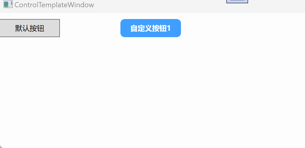
当鼠标悬停在按钮上时,按钮会显示一个高亮图层;点击按钮后,会展示一个新的图层效果。这是基于element-plus按钮组件的样式用WPF实现的,下面我把element-plus上比较常用的按钮组件,用WPF实现看看效果。
<Window x:Class="WpfApp1.ControlTemplateWindow"
        xmlns="http://schemas.microsoft.com/winfx/2006/xaml/presentation"
        xmlns:x="http://schemas.microsoft.com/winfx/2006/xaml"
        xmlns:d="http://schemas.microsoft.com/expression/blend/2008"
        xmlns:mc="http://schemas.openxmlformats.org/markup-compatibility/2006"
        xmlns:local="clr-namespace:WpfApp1"
        mc:Ignorable="d"
        Title="ControlTemplateWindow" Height="450" Width="800">

    <Window.Resources>
        <ControlTemplate x:Key="CustomButtonTemplate" TargetType="Button">
            <Border Background="{TemplateBinding Background}" BorderBrush="{TemplateBinding BorderBrush}" CornerRadius="7">
                <Grid>
                    <!-- Rectangle用于绘制矩形,Fill填充颜色,RadiusX/Y绘制矩形的CornerRadius,Opacity透明度 -->
                    <Rectangle Name="CustomerOverlay" Fill="White" Opacity="0" RadiusX="7" RadiusY="7" />
                    <Rectangle Name="CustomerPressed" Fill="Black" Opacity="0" RadiusX="7" RadiusY="7" />
                    <!-- 按钮的内容 -->
                    <ContentPresenter HorizontalAlignment="Center" VerticalAlignment="Center"/>
                </Grid>
            </Border>
            <!-- 触发器 -->
            <ControlTemplate.Triggers>
                <!-- 点击按钮时触发 -->
                <Trigger Property="IsPressed" Value="True">
                    <Setter TargetName="CustomerPressed" Property="Opacity" Value="0.3"/>
                </Trigger>
                <!-- 鼠标移动到按钮时触发 -->
                <Trigger Property="Button.IsMouseOver" Value="True">
                    <Setter TargetName="CustomerOverlay" Property="Opacity" Value="0.2"/>
                </Trigger>
            </ControlTemplate.Triggers>
        </ControlTemplate>

        <ControlTemplate  x:Key="CustomIconButtonTemplate" TargetType="Button">
            <Grid>
                <Ellipse Fill="{TemplateBinding Background}" Width="{TemplateBinding Width}" Height="{TemplateBinding Height}"/>
                <Image Source="/images/收藏.png" Width="18" />

                <Ellipse Name="CustomerOverlay" Fill="White" Opacity="0" Width="{TemplateBinding Width}" Height="{TemplateBinding Height}"/>
                <Ellipse Name="CustomerPressed" Fill="Black" Opacity="0" Width="{TemplateBinding Width}" Height="{TemplateBinding Height}"/>
            </Grid>
            <!-- 触发器 -->
            <ControlTemplate.Triggers>
                <!-- 点击按钮时触发 -->
                <Trigger Property="IsPressed" Value="True">
                    <Setter TargetName="CustomerPressed" Property="Opacity" Value="0.3"/>
                </Trigger>
                <!-- 鼠标移动到按钮时触发 -->
                <Trigger Property="Button.IsMouseOver" Value="True">
                    <Setter TargetName="CustomerOverlay" Property="Opacity" Value="0.2"/>
                </Trigger>
            </ControlTemplate.Triggers>
        </ControlTemplate>

        <ControlTemplate x:Key="CustomImageButtonTemplate" TargetType="Button">
            <Border Background="{TemplateBinding Background}" BorderBrush="{TemplateBinding BorderBrush}" CornerRadius="7">
                <Grid>
                    <Rectangle Name="CustomerOverlay" Fill="White" Opacity="0" RadiusX="7" RadiusY="7" />
                    <Rectangle Name="CustomerPressed" Fill="Black" Opacity="0" RadiusX="7" RadiusY="7" />
                    <!-- 按钮的内容 -->
                    <WrapPanel HorizontalAlignment="Center" VerticalAlignment="Center">
                        <ContentPresenter Content="下载" VerticalAlignment="Center" Margin="0 0 8 0"/>
                        <Image Source="/images/下载.png" Width="15" />
                    </WrapPanel>
                </Grid>
            </Border>
            <!-- 触发器 -->
            <ControlTemplate.Triggers>
                <!-- 点击按钮时触发 -->
                <Trigger Property="IsPressed" Value="True">
                    <Setter TargetName="CustomerPressed" Property="Opacity" Value="0.3"/>
                </Trigger>
                <!-- 鼠标移动到按钮时触发 -->
                <Trigger Property="Button.IsMouseOver" Value="True">
                    <Setter TargetName="CustomerOverlay" Property="Opacity" Value="0.2"/>
                </Trigger>
            </ControlTemplate.Triggers>
        </ControlTemplate>
    </Window.Resources>

    <Grid>

        <Grid.RowDefinitions>
            <RowDefinition Height="40"/>
        </Grid.RowDefinitions>

        <Grid.ColumnDefinitions>
            <ColumnDefinition Width="100"/>
            <ColumnDefinition Width="100"/>
            <ColumnDefinition Width="100"/>
            <ColumnDefinition Width="100"/>
            <ColumnDefinition Width="100"/>
            <ColumnDefinition Width="100"/>
            <ColumnDefinition Width="100"/>
        </Grid.ColumnDefinitions>

        <Button Grid.Column="0" Grid.Row="0" Content="默认按钮" Margin="0 10 0 0"></Button>

        <Button Grid.Column="2" Grid.Row="0"
                Content="自定义按钮1"
                Foreground="White"
                FontSize="12"
                FontWeight="Bold"
                Background ="#409eff"
                BorderBrush="White"
                Margin="0 10 0 0"
                Cursor="Hand"
                Template="{StaticResource CustomButtonTemplate}">
        </Button>

        <Button Grid.Column="4" Grid.Row="0"
                Margin="0 10 0 0"
                Background="#e6a23c"
                Width="30"
                Height="30"
                Cursor="Hand"
                Template="{StaticResource CustomIconButtonTemplate}">
        </Button>

        <Button Grid.Column="6" Grid.Row="0"
                Margin="0 10 0 0"
                Foreground="White"
                Background="#409eff"
                BorderBrush="White"
                Cursor="Hand"
                Template="{StaticResource CustomImageButtonTemplate}">
        </Button>

    </Grid>
</Window>
具体效果如下所示:
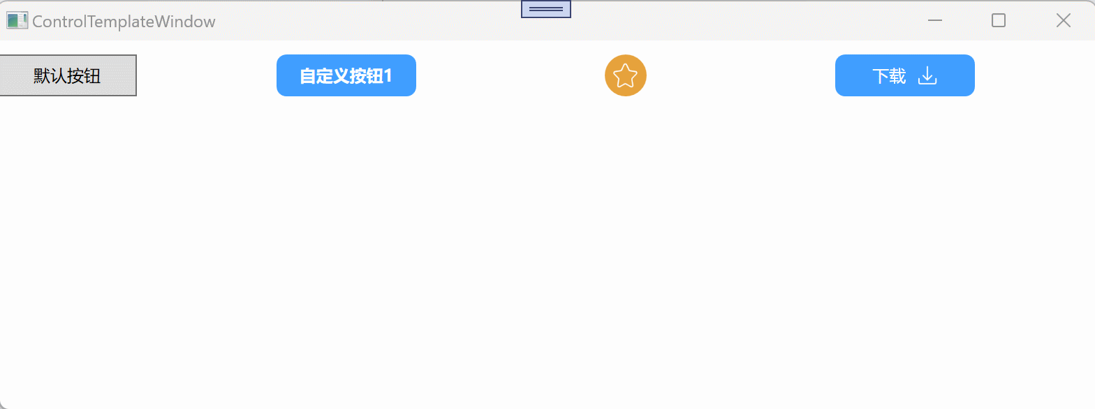
还有更多炫酷的自定义样式,比如添加一个动画效果,但是这种样式,对于我目前刚刚学习WPF来说不太需要,等后面需要用到再了解。
数据模板(DataTemplate)
ControlTemplate 主要用于自定义控件的外观,它改变控件的整体结构和样式,通常用于修改控件的框架(例如按钮的样式)。而当控件内部需要显示与数据相关的内容时,就需要使用 DataTemplate。DataTemplate 定义了数据对象的外观,控制了数据项的可视化方式,特别是在使用像 ItemsControl、ListBox 或 DataGrid 等控件时,DataTemplate 会决定如何呈现绑定的数据项。
基本语法
<DataTemplate x:Key="CustomerDataTemplate">

</DataTemplate>
DataTemplate重要属性:
- VisualTree,定义每个数据项的样式。
- Triggers,触发器当绑定的数据满足某个条件时,可以去设置一些控件的属性值,这个与ControlTemplate中的Triggers还不一样。
下面我将以ListBox为例,自定义ListBox的样式
前端页面代码:
<Window x:Class="WpfApp1.DataTemplateWindow"
        xmlns="http://schemas.microsoft.com/winfx/2006/xaml/presentation"
        xmlns:x="http://schemas.microsoft.com/winfx/2006/xaml"
        xmlns:d="http://schemas.microsoft.com/expression/blend/2008"
        xmlns:mc="http://schemas.openxmlformats.org/markup-compatibility/2006"
        xmlns:local="clr-namespace:WpfApp1"
        mc:Ignorable="d"
        Title="DataTemplateWindow" Height="450" Width="800">

    <Window.Resources>

    </Window.Resources>

    <Grid>

        <Grid.RowDefinitions>
            <RowDefinition />
            <RowDefinition/>
        </Grid.RowDefinitions>

        <ListBox Grid.Row="0"
                 x:Name="DefaultListBox"
                 HorizontalContentAlignment="Stretch"
                 >
        </ListBox>

        <ListBox Grid.Row="1" x:Name="CustomerListBox" HorizontalContentAlignment="Stretch">
            <ListBox.ItemContainerStyle>
                <Style TargetType="ListBoxItem">
                    <Setter Property="Margin" Value="0 10 0 0"/>
                    <!-- 去掉背景 -->
                    <Setter Property="Background" Value="Transparent"/>
                    <Setter Property="BorderBrush" Value="Transparent"/>
                    <Setter Property="BorderThickness" Value="0"/>

                </Style>
            </ListBox.ItemContainerStyle>
            <!-- ListBox中的内容排列方向 -->
            <ListBox.ItemsPanel>
                <ItemsPanelTemplate>
                    <WrapPanel Orientation="Horizontal"/>
                </ItemsPanelTemplate>
            </ListBox.ItemsPanel>
            <ListBox.ItemTemplate>
                <DataTemplate>
                    <WrapPanel Orientation="Horizontal"  >
                        <Border  Background="{Binding TagColor}" CornerRadius="3" Width="70" Height="25" >
                            <TextBlock
                                   Text="{Binding TagName}"
                                   Width="70"
                                   Height="25"
                                   TextAlignment="Center"
                                   Foreground="White"
                                   Padding="0 5 0 0"
                                   />
                        </Border>
                        <Image Source="/images/删除.png" x:Name="ShowImg" Width="15" Margin="-18 0 0 0" Visibility="Hidden"  Cursor="Hand" />

                    </WrapPanel>

                    <DataTemplate.Triggers>
                        <DataTrigger Binding="{Binding TagDelete}" Value="True">
                            <Setter TargetName="ShowImg" Property="Visibility" Value="Visible"/>
                        </DataTrigger>
                    </DataTemplate.Triggers>

                </DataTemplate>
            </ListBox.ItemTemplate>
        </ListBox>


    </Grid>
</Window>
后台代码:
using System;
using System.Collections.Generic;
using System.Linq;
using System.Text;
using System.Threading.Tasks;
using System.Windows;
using System.Windows.Controls;
using System.Windows.Data;
using System.Windows.Documents;
using System.Windows.Input;
using System.Windows.Media;
using System.Windows.Media.Imaging;
using System.Windows.Shapes;

namespace WpfApp1
{
    /// <summary>
    /// DataTemplateWindow.xaml 的交互逻辑
    /// </summary>
    public partial class DataTemplateWindow : Window
    {
        public DataTemplateWindow()
        {
            InitializeComponent();

            var tagList = new List<TagInfo>()
            {
                new TagInfo()
                {
                    TagName = "Tag 1",
                    TagColor = "#409eff"
                },
                new TagInfo()
                {
                    TagName = "Tag 2",
                    TagColor = "#67c23a",
                    TagDelete = true
                },
                new TagInfo()
                {
                    TagName = "Tag 3",
                    TagColor = "#909399"
                },
            };

            DefaultListBox.ItemsSource = tagList;
            CustomerListBox.ItemsSource = tagList;
        }
    }

    public class TagInfo
    {
        public string TagName { get; set; }
        public string TagColor { get; set; }
        public bool TagDelete { get; set; } = false;
        public override string ToString()
        {
            return TagName;  // 使用 TagName 作为默认显示内容
        }
    }
}
执行效果:
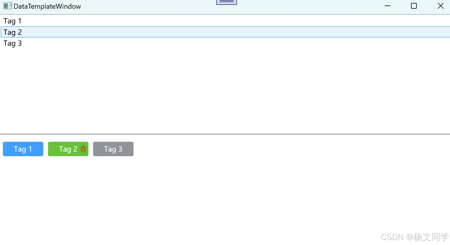
代码也很简单,稍微解释一下:
- ItemContainerStyle,设置每个数据项的样式。
- ItemsPanel,设置数据集的排列方向。
- ItemTemplate,设置每个数据项的具体自定义样式,里面就有DataTemplate。
需要注意的是,上面说的ItemContainerStyle、ItemsPanel、ItemTemplate这并不是每个数据集的控件都支持,具体还需要看官网每个控件支持的是哪些。
DataTemplate中的内容一般也是放到Window.Resources中。
<Window x:Class="WpfApp1.DataTemplateWindow"
        xmlns="http://schemas.microsoft.com/winfx/2006/xaml/presentation"
        xmlns:x="http://schemas.microsoft.com/winfx/2006/xaml"
        xmlns:d="http://schemas.microsoft.com/expression/blend/2008"
        xmlns:mc="http://schemas.openxmlformats.org/markup-compatibility/2006"
        xmlns:local="clr-namespace:WpfApp1"
        mc:Ignorable="d"
        Title="DataTemplateWindow" Height="450" Width="800">

    <Window.Resources>
        <Style x:Key="CustomListBoxItemStyle" TargetType="ListBoxItem">
            <Setter Property="Margin" Value="0 10 0 0"/>
            <Setter Property="Background" Value="Transparent"/>
            <Setter Property="BorderBrush" Value="Transparent"/>
            <Setter Property="BorderThickness" Value="0"/>
        </Style>

        <!-- ItemTemplate -->
        <DataTemplate x:Key="CustomItemTemplate">
            <WrapPanel Orientation="Horizontal">
                <Border Background="{Binding TagColor}" CornerRadius="3" Width="70" Height="25">
                    <TextBlock Text="{Binding TagName}" Width="70" Height="25" TextAlignment="Center"
                               Foreground="White" Padding="0 5 0 0"/>
                </Border>
                <Image Source="/images/删除.png" x:Name="ShowImg" Width="15" Margin="-18 0 0 0"
                       Visibility="Hidden" Cursor="Hand"/>
            </WrapPanel>
            <DataTemplate.Triggers>
                <DataTrigger Binding="{Binding TagDelete}" Value="True">
                    <Setter TargetName="ShowImg" Property="Visibility" Value="Visible"/>
                </DataTrigger>
            </DataTemplate.Triggers>
        </DataTemplate>
    </Window.Resources>

    <Grid>

        <Grid.RowDefinitions>
            <RowDefinition />
            <RowDefinition/>
        </Grid.RowDefinitions>

        <ListBox Grid.Row="0"
                 x:Name="DefaultListBox"
                 HorizontalContentAlignment="Stretch"
                 >
        </ListBox>

        <ListBox Grid.Row="1" x:Name="CustomerListBox" HorizontalContentAlignment="Stretch"
                 ItemContainerStyle="{StaticResource CustomListBoxItemStyle}"
                 ItemTemplate="{StaticResource CustomItemTemplate}">
            <ListBox.ItemsPanel>
                <ItemsPanelTemplate>
                    <WrapPanel Orientation="Horizontal"/>
                </ItemsPanelTemplate>
            </ListBox.ItemsPanel>
        </ListBox>


    </Grid>
</Window>
总结
在 WPF 中,ControlTemplate和DataTemplate 是非常强大且重要的功能,它们分别用于自定义控件的外观和数据展示的方式。只有在用到某些控件需要自定义样式的时候,再具体了解,因为每个控件自定义模板是不一样的,本篇文章只是根据Button和ListBox简单实现这两个控件的自定义样式。如果有不同的需求,大家具体可以看下微软的模板库,里面有每个控件模板涉及需要修改的点。
后面我会用每个控件都实现自定义样,包括下拉控件、分页控件、时间控件等等,实现效果以经常使用的场景为主。
控件样式和模板 - WPF .NET Framework | Microsoft Learn


![[Deep Learning] Anaconda+CUDA+CuDNN+Pytorch(GPU)环境配置-2025](https://i-blog.csdnimg.cn/direct/55fa37ad880a4beab115d3389f3a94cb.png)


