参数 说明 类型 默认值 必传 animated 是否展示动画效果 boolean true false button 是否使用按钮占位图 boolean | SkeletonButtonProps false false avatar 是否显示头像占位图 boolean | SkeletonAvatarProps false false input 是否使用输入框占位图 boolean | SkeletonInputProps false false image 是否使用图像占位图 boolean false false title 是否显示标题占位图 boolean | SkeletonTitleProps true false paragraph 是否显示段落占位图 boolean | SkeletonParagraphProps true false loading 为 true 时,显示占位图,反之则直接展示子组件 boolean true false
名称 说明 类型 必传 shape 指定按钮的形状 ‘default’ | ‘round’ | ‘circle’ false size 设置按钮的大小 ‘default’ | ‘small’ | ‘large’ false block 将按钮宽度调整为其父宽度的选项 boolean false
名称 说明 类型 必传 shape 指定头像的形状 ‘circle’ | ‘square’ false size 设置头像占位图的大小 number | ‘default’ | ‘small’ | ‘large’ false
名称 说明 类型 必传 size 设置输入框的大小 ‘default’ | ‘small’ | ‘large’ false
名称 说明 类型 必传 width 设置标题占位图的宽度 number | string false
名称 说明 类型 必传 rows 设置段落占位图的行数 number | string false width 设置段落占位图的宽度,若为数组时则为对应的每行宽度,反之则是最后一行的宽度 number | string | Array<number|string> false
< script setup lang= "ts" >
import { computed } from 'vue'
interface SkeletonButtonProps {
shape? : 'default' | 'round' | 'circle'
size? : 'default' | 'small' | 'large'
block? : boolean
}
interface SkeletonAvatarProps {
shape? : 'circle' | 'square'
size? : number | 'default' | 'small' | 'large'
}
interface SkeletonInputProps {
size: 'default' | 'small' | 'large'
}
interface SkeletonTitleProps {
width? : number | string
}
interface SkeletonParagraphProps {
rows? : number | string
width? : number | string | Array < number | string >
}
interface Props {
animated? : boolean
button? : boolean | SkeletonButtonProps
avatar? : boolean | SkeletonAvatarProps
input? : boolean | SkeletonInputProps
image? : boolean
title? : boolean | SkeletonTitleProps
paragraph? : boolean | SkeletonParagraphProps
loading? : boolean
}
const props = withDefaults ( defineProps < Props> ( ) , {
animated: true ,
button: false ,
image: false ,
avatar: false ,
input: false ,
title: true ,
paragraph: true ,
loading: true
} )
const buttonSize = computed ( ( ) => {
if ( typeof props. button === 'object' ) {
if ( props. button. size === 'large' ) {
return 40
}
if ( props. button. size === 'small' ) {
return 24
}
return 32
}
} )
const titleTop = computed ( ( ) => {
if ( typeof props. avatar === 'boolean' ) {
return 8
} else {
if ( typeof props. avatar. size === 'number' ) {
return ( props. avatar. size - 16 ) / 2
} else {
const topMap = {
default : 8 ,
small: 4 ,
large: 12
}
return topMap[ props. avatar. size || 'default' ]
}
}
} )
const titleWidth = computed ( ( ) => {
if ( typeof props. title === 'boolean' ) {
return '38%'
} else {
if ( typeof props. title. width === 'number' ) {
return props. title. width + 'px'
}
return props. title. width || '38%'
}
} )
const paragraphRows = computed ( ( ) => {
if ( typeof props. paragraph === 'boolean' ) {
return 3
}
return props. paragraph. rows
} )
const paragraphWidth = computed ( ( ) => {
if ( typeof props. paragraph === 'boolean' ) {
return Array ( paragraphRows. value)
} else {
if ( Array . isArray ( props. paragraph. width) ) {
return props. paragraph. width. map ( ( width: number | string ) => {
if ( typeof width === 'number' ) {
return width + 'px'
} else {
return width
}
} )
} else if ( typeof props. paragraph. width === 'number' ) {
return Array ( paragraphRows. value) . fill ( props. paragraph. width + 'px' )
} else {
return Array ( paragraphRows. value) . fill ( props. paragraph. width)
}
}
} )
< / script>
< template>
< div
v- if = "loading"
: class = "['m-skeleton', {'m-skeleton-avatar': avatar, 'm-skeleton-animated': animated}]"
: style= "`--button-size: ${buttonSize}px; --title-top: ${titleTop}px;`" >
< span
v- if = "button"
: class = "[
'u-skeleton-button' ,
{
'u-button-round' : typeof button !== 'boolean' && button. shape === 'round' ,
'u-button-circle' : typeof button !== 'boolean' && button. shape === 'circle' ,
'u-button-sm' : typeof button !== 'boolean' && button. size === 'small' ,
'u-button-lg' : typeof button !== 'boolean' && button. size === 'large' ,
'u-button-block' : typeof button !== 'boolean' && button. shape !== 'circle' && button. block,
}
] "> < / span>
< span
: class = "[
'u-skeleton-input' ,
{
'u-input-sm' : typeof input !== 'boolean' && input. size === 'small' ,
'u-input-lg' : typeof input !== 'boolean' && input. size === 'large' ,
}
] " v-if=" input"> < / span>
< div class = "m-skeleton-image" v- if = "image" >
< svg viewBox= "0 0 1098 1024" xmlns= "http://www.w3.org/2000/svg" class = "m-skeleton-image-svg" >
< path class = "u-skeleton-image-path" d= "M365.714286 329.142857q0 45.714286-32.036571 77.677714t-77.677714 32.036571-77.677714-32.036571-32.036571-77.677714 32.036571-77.677714 77.677714-32.036571 77.677714 32.036571 32.036571 77.677714zM950.857143 548.571429l0 256-804.571429 0 0-109.714286 182.857143-182.857143 91.428571 91.428571 292.571429-292.571429zM1005.714286 146.285714l-914.285714 0q-7.460571 0-12.873143 5.412571t-5.412571 12.873143l0 694.857143q0 7.460571 5.412571 12.873143t12.873143 5.412571l914.285714 0q7.460571 0 12.873143-5.412571t5.412571-12.873143l0-694.857143q0-7.460571-5.412571-12.873143t-12.873143-5.412571zM1097.142857 164.571429l0 694.857143q0 37.741714-26.843429 64.585143t-64.585143 26.843429l-914.285714 0q-37.741714 0-64.585143-26.843429t-26.843429-64.585143l0-694.857143q0-37.741714 26.843429-64.585143t64.585143-26.843429l914.285714 0q37.741714 0 64.585143 26.843429t26.843429 64.585143z" > < / path>
< / svg>
< / div>
< div class = "m-skeleton-header" v- if = "avatar" >
< span
: class = "[
'u-skeleton-avatar' ,
{
'u-avatar-sm' : typeof avatar !== 'boolean' && avatar. size === 'small' ,
'u-avatar-lg' : typeof avatar !== 'boolean' && avatar. size === 'large' ,
'u-avatar-square' : typeof avatar !== 'boolean' && avatar. shape === 'square' ,
}
] "> < / span>
< / div>
< template v- if = "!button && !image && !input" >
< div class = "m-skeleton-content" >
< h3 class = "u-skeleton-title" : style= "{ width: titleWidth }" > < / h3>
< ul class = "u-skeleton-paragraph" >
< li v- for = "n in paragraphRows" : key= "n" : style= "`width: ${paragraphWidth[(n as number) - 1]};`" > < / li>
< / ul>
< / div>
< / template>
< / div>
< slot v- else > < / slot>
< / template>
< style lang= "less" scoped>
. m- skeleton {
display: table;
width: 100 % ;
. u- skeleton- button {
display: inline- block;
vertical- align: top;
background: rgba ( 0 , 0 , 0 , .06 ) ;
border- radius: 4px;
width: 64px;
min- width: 64px;
height: 32px;
line- height: 32px;
}
. u- button- sm {
width: 48px;
min- width: 48px;
height: 24px;
line- height: 24px;
}
. u- button- lg {
width: 80px;
min- width: 80px;
height: 40px;
line- height: 40px;
}
. u- button- round {
border- radius: var ( -- button- size) ;
}
. u- button- circle {
width: var ( -- button- size) ;
min- width: var ( -- button- size) ;
border- radius: 50 % ;
}
. u- button- block {
width: 100 % ;
}
. u- skeleton- input {
display: inline- block;
vertical- align: top;
background: rgba ( 0 , 0 , 0 , 0.06 ) ;
border- radius: 4px;
width: 160px;
min- width: 160px;
height: 32px;
line- height: 32px;
}
. u- input- sm {
width: 120px;
min- width: 120px;
height: 24px;
line- height: 24px;
}
. u- input- lg {
width: 200px;
min- width: 200px;
height: 40px;
line- height: 40px;
}
. m- skeleton- image {
display: flex;
align- items: center;
justify- content: center;
vertical- align: top;
background: rgba ( 0 , 0 , 0 , .06 ) ;
border- radius: 4px;
width: 96px;
height: 96px;
line- height: 96px;
. m- skeleton- image- svg {
width: 48px;
height: 48px;
line- height: 48px;
max- width: 192px;
max- height: 192px;
. u- skeleton- image- path {
fill: #bfbfbf;
}
}
}
. m- skeleton- header {
display: table- cell;
padding- right: 16px;
vertical- align: top;
. u- skeleton- avatar {
display: inline- block;
vertical- align: top;
background: rgba ( 0 , 0 , 0 , .06 ) ;
width: 32px;
height: 32px;
line- height: 32px;
border- radius: 50 % ;
}
. u- avatar- sm {
width: 24px;
height: 24px;
line- height: 24px;
}
. u- avatar- lg {
width: 40px;
height: 40px;
line- height: 40px;
}
. u- avatar- square {
border- radius: 6px;
}
}
. m- skeleton- content {
display: table- cell;
width: 100 % ;
vertical- align: top;
. u- skeleton- title {
margin: 0 ;
height: 16px;
background: rgba ( 0 , 0 , 0 , .06 ) ;
border- radius: 4px;
}
. u- skeleton- paragraph {
margin- top: 24px;
padding: 0 ;
li {
height: 16px;
list- style: none;
background: rgba ( 0 , 0 , 0 , .06 ) ;
border- radius: 4px;
& : not ( : first- child) {
margin- top: 16px;
}
& : last- child {
width: 61 % ;
}
}
}
}
}
. m- skeleton- avatar {
. m- skeleton- content {
. u- skeleton- title {
margin- top: var ( -- title- top) ;
}
. u- skeleton- paragraph {
margin- top: 28px;
}
}
}
. m- skeleton- animated {
. u- skeleton- button,
. u- skeleton- input,
. m- skeleton- image,
. m- skeleton- header . u- skeleton- avatar,
. m- skeleton- content . u- skeleton- title,
. m- skeleton- content . u- skeleton- paragraph li {
position: relative;
z- index: 0 ;
overflow: hidden;
background: transparent;
& : : after {
position: absolute;
top: 0 ;
left: - 150 % ;
bottom: 0 ;
right: - 150 % ;
background: linear- gradient ( 90deg, rgba ( 0 , 0 , 0 , .06 ) 25 % , rgba ( 0 , 0 , 0 , .15 ) 37 % , rgba ( 0 , 0 , 0 , .06 ) 63 % ) ;
animation- name: skeleton- loading;
animation- duration: 1 . 4s;
animation- timing- function : ease;
animation- iteration- count: infinite;
content: "" ;
}
@ keyframes - loading {
0 % {
transform: translateX ( - 37.5 % ) ;
}
100 % {
transform: translateX ( 37.5 % ) ;
}
}
}
}
< / style>
< script setup lang= "ts" >
import Skeleton from './Skeleton.vue'
import { ref } from 'vue'
const loading = ref < boolean > ( false )
const showSkeleton = ( ) => {
loading. value = true
setTimeout ( ( ) => {
loading. value = false
} , 2000 )
}
const animated = ref ( false )
const block = ref ( false )
const size = ref ( 'default' )
const buttonShape = ref ( 'default' )
const avatarShape = ref ( 'circle' )
const sizeOptions = ref ( [
{
label: 'Default' ,
value: 'default'
} ,
{
label: 'Large' ,
value: 'large'
} ,
{
label: 'Small' ,
value: 'small'
}
] )
const buttonShapeOptions = ref ( [
{
label: 'Default' ,
value: 'default'
} ,
{
label: 'Round' ,
value: 'round'
} ,
{
label: 'Circle' ,
value: 'circle'
}
] )
const avatarShapeOptions = ref ( [
{
label: 'Square' ,
value: 'square'
} ,
{
label: 'Circle' ,
value: 'circle'
}
] )
< / script>
< template>
< div>
< h1> { { $route. name } } { { $route. meta. title } } < / h1>
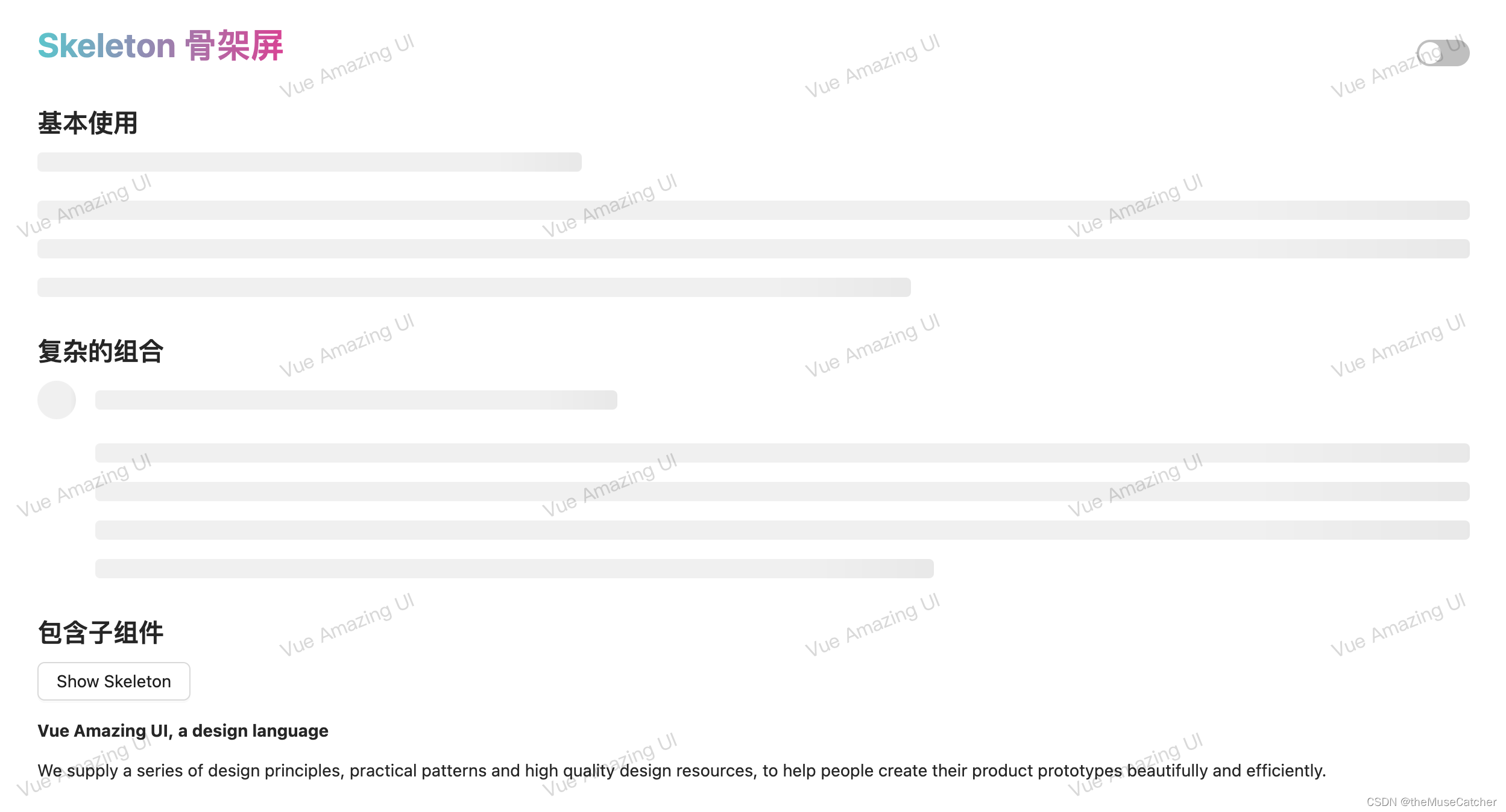
< h2 class = "mt30 mb10" > 基本使用< / h2>
< Skeleton / >
< h2 class = "mt30 mb10" > 复杂的组合< / h2>
< Skeleton avatar : paragraph= "{ rows: 4 }" / >
< h2 class = "mt30 mb10" > 包含子组件< / h2>
< Button : loading= "loading" @ click = "showSkeleton" > Show Skeleton< / Button>
< br/ >
< br/ >
< Skeleton : loading= "loading" >
< div>
< h4> Vue Amazing UI , a design language< / h4>
< br/ >
< p>
We supply a series of design principles, practical patterns and high quality design
resources, to help people create their product prototypes beautifully and efficiently.
< / p>
< / div>
< / Skeleton>
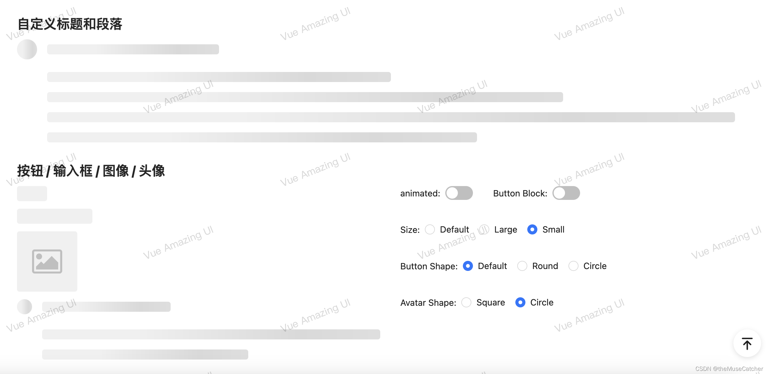
< h2 class = "mt30 mb10" > 自定义标题和段落< / h2>
< Skeleton avatar : title= "{ width: '24%' }" : paragraph= "{ rows: 4, width: ['48%', '72%', '96%', '60%'] }" / >
< h2 class = "mt30 mb10" > 按钮 / 输入框 / 图像 / 头像< / h2>
< Flex : gap= "32" >
< Flex vertical : gap= "12" width= "50%" >
< Skeleton : animated= "animated" : button= "{ shape: buttonShape, size: size, block: block}" / >
< Skeleton style= "width: 200px" : animated= "animated" : input= "{ size: size }" / >
< Skeleton : animated= "animated" image / >
< Skeleton : avatar= "{ shape: avatarShape, size: size }" : paragraph= "{ rows: 2 }" / >
< / Flex>
< Flex vertical : gap= "36" width= "50%" >
< Space : size= "32" >
< Space align= "center" >
animated: < Switch v- model: checked= "animated" / >
< / Space>
< Space align= "center" >
Button Block: < Switch v- model: checked= "block" / >
< / Space>
< / Space>
< Space align= "center" >
Size: < Radio : options= "sizeOptions" v- model: value= "size" / >
< / Space>
< Space align= "center" >
Button Shape: < Radio : options= "buttonShapeOptions" v- model: value= "buttonShape" / >
< / Space>
< Space align= "center" >
Avatar Shape: < Radio : options= "avatarShapeOptions" v- model: value= "avatarShape" / >
< / Space>
< / Flex>
< / Flex>
< / div>
< / template>