本文介绍了CSS样式、选择器、伪类、像素、颜色、字体、边框、列表、表格属性、背景、盒子、布局与浮动
1.样式
1.1 行内样式
<h1 style="color: aqua;font-size: large;">123</h1>1.2 内部样式
  <style>
        h1{
            color: red;
            font: 100;
        }
    </style>
1.3 外部样式
        <!-- rel:引入的文档与当前文档的联系 -->
        <link rel="stylesheet" href="./style.css">
</head>
1.4 样式优先级
行内样式>内部样式>外部样式
1.5 样式继承
如果本身设置了a样式,那么就用a样式;
如果本身没有设置了b样式,祖先设置了b样式,那么会优先继承离得近的祖先的b样式
能继承的css属性:除vertical-align的文本属性,比如color,text-align,font-size,text-indent,line-height,height...
2 选择器
2.1 选择器分类
/* 选择器样式后来者居上(css文件的后者) */
/* 1.通配选择器 */
*{
    font: 300;
}
/* 2.元素选择器 */
h1{
    background-color: aqua;
    font: 100;
}
/* 3.类选择器 */
.speak
{
    background-color: blueviolet;
    font: 100;
}
/* 4.交集选择器1 */
/*在speak类里面的p元素 */
p.speak{
    background-color: rgb(185, 26, 26);
}
/* 交集选择器2 */
.speak.sp{
    background-color: antiquewhite;
}
/* 5.id选择器 */
#id{
    background-color: rgb(227, 22, 145);
}
/* 6.并集选择器 */
#id1,
.lei1,
h2
{
    background-color: rgb(243, 148, 6);
}
/* 7.后代选择器,儿子孙子重孙子都是后代,选类名为ol的元素后代类名为li2的li标签 */
ol li.li2{
    background-color: rgb(16, 244, 46);
}
/* 8.子代选择器 */
.ul>li>h3{
    background-color: rgb(245, 8, 209);
}
/* 9.相邻兄弟选择器 */
div+p{
    background-color: rgb(157, 239, 15);
}
/* 通用兄弟选择器 */
div~h3{
    background-color: rgb(4, 238, 109);
}
/* 10.属性选择器:具有title属性的元素 */
[title]{
    color: aqua;
}
[title="title1"]{
    color:rgb(226, 241, 11);
}
/* 以a为开头的 */
[title^="a"]{
    color: blueviolet;
}
/* 以u为结尾的 */
[title$="u"]{
    color: rgb(10, 174, 250);
}
/* 包括g的title */
[title*="g"]{
    color: rgb(243, 14, 174);
}
/* 11.伪类选择器,对元素特殊状态的描述 */
/* 顺序不能乱,link、visited是a标签独有,hover、active所有标签共有 */
        a:link{
                color:aqua;
            }
        /* 选中访问过的a元素 */
        a:visited{
        color:rgb(246, 143, 8);
        }
            /* 鼠标悬停 */
        a:hover{
        color:rgb(246, 8, 12)
        }
        /* 激活的状态,鼠标点下去没点上来 */
        a:active{
        color:rgb(8, 246, 44)
        }
        span:hover{
        color:rgb(246, 8, 12)
        }
        /* 激活的状态 */
        span:active{
        color:rgb(8, 246, 44)
        }
        /* 获取焦点,只有往里面输入东西的元素可以使用 */
        input:focus,select:focus{
                color: aqua;
                background-color: brown;
        }
 /* 12.伪元素选择器  */
        /* 选中div身上第一个文字 */
        div::first-letter{
                color: yellowgreen;
                font-size: 40px;
        }
        /* 选中div第一行 */
        div::first-line{
                background-color: aqua;
        }
        /* 选中的是div中被鼠标选择的文字 */
        div::selection{
                background-color: yellow;
                color: blue;
        }
        /* 选中的是input中提示的文字 */
        input::placeholder{
                color: red;
        }
        /* 选中p元素最开始的位置,随后创建一个子元素 */
        p::before{
                content: "¥";
                color: red;
        }
        p::after{
                content:".00"
        }
2.2 选择器优先级
选择器同类型,后来者居上
从前往后比较权重,谁靠前的数大,优先级就高


并集选择器权重为1
3 伪类
3.1 结构伪类
<head>
        <style>
                /* 选中div后代p元素是第一个孩子的,first-child:所有的儿子中第一个儿子 */
                div p:first-child{
                        color:aqua
                }
        </style>
</head>
<body>
        <div>
                <span>1111</span>
                <span>
                        <p>12222</p>
                </span>
                <p>13333</p>
        </div>
</body>
<head>
        <style>
    /* 选中div第一个孩子的p元素,first-of-type:同类型儿子中第一个儿子,p的父亲是谁无所谓,只要是第一个孩子 */
                div p:first-of-type{
                        color:aqua
                }

        </style>
</head>
<body>
        <div>
                <span>1111</span>
                <span>
                        <p>12222</p>
                </span>
                <p>13333</p>
                <p>13333</p>
        </div>
</body>
 /* 所有的儿子中最后一个儿子 */
        div>p:last-child{
                color: aqua;
        }
        /* 如果()里为n,则是所有的儿子,2n选中偶数,n从0开始,选中前五个:-n+5*/
        div>p:nth-child(0){
                color: blueviolet;
        }
        /* 从下往上数第几个 */
        div>p:nth-last-child(2){
                color: antiquewhite;
        }
 div>p:nth-of-type(3){
                color: rgb(13, 234, 65);
        }
        /* 没有兄弟的span元素 */
        div>span:only-child{
                color: rgb(6, 156, 236);
        }
                /* 同类型里面没有兄弟的span元素 */
        div>span:only-of-type{
                color: rgb(253, 12, 173);
        }
        /* html{}==:root{} ,选中的是根元素*/
        html{
                background-color: rgb(244, 159, 11);
        }
        div:empty{
                width: 200px;
                height: 300px;
                background-color: rgb(21, 242, 9);
        }
3.2 否定伪类
<head>
        <style>
                /* div后代中不是第一个孩子的p元素,不管爹是谁;(first-child)表示爹必须是div */
                div p:not(:first-child)
                {
                        color: red;
                }
        </style>
</head>
<body>
        <div>
                <span>1111</span>
                <span>
                        <p>12222</p>
                </span>
                <p>13333</p>
                <p>13333</p>
        </div>
</body>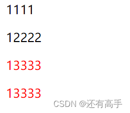
3.3 UI伪类
<head>
        <style>
        /* 对于input:focus也可以让获取焦点变大,但是恢复不了 */
        input:checked{
                width: 200px;
                height: 300px;
        }
        input:disabled{
                background-color: rgb(61, 135, 199);
        }
        input:enabled{
                background-color: aqua;
        }
        </style>
</head>
<body>
        <input type="checkbox">复选框
        <input type="radio">单选框
        <input type="button">按钮
        <input type="text">
        <input type="text" disabled>
</body>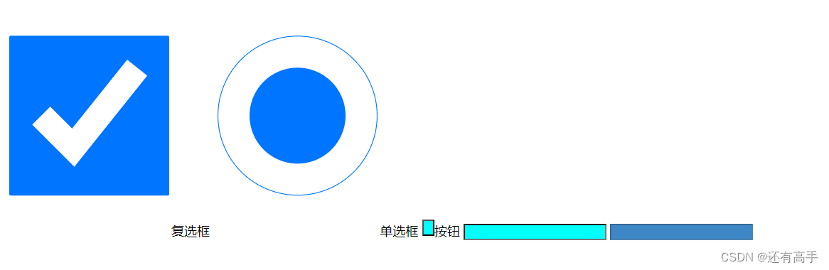
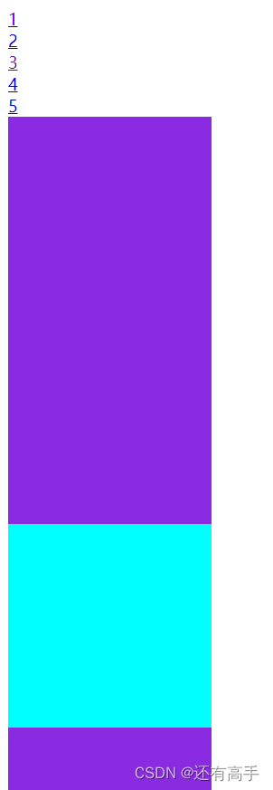
3.4 目标伪类
<head>
        <style>
        div:target{
                background-color: aqua;
        }
        div{
                width: 200px;
                height: 200px;
                background-color: blueviolet;
        }
        </style>
</head>
<body>
        <a href="#1">1</a><br>
        <a href="#2">2</a><br>
        <a href="#3">3</a><br>
        <a href="#4">4</a><br>
        <a href="#5">5</a><br>
        <div id="1"></div>
        <div id="2"></div>
        <div id="3"></div>
        <div id="4"></div>
        <div id="5"></div>
</body>
点击3:
3.5 语言伪类
        <style>
        div:lang(zh){
                color: red;
        }
        :lang(en){
                color: aqua;
        }
        p:lang(){
                color: blue;
        }
        </style>
</head>
<body>
        <div lang="zh">我是中文</div>
        <div>English</div>
        <p>我是中文</p>
</body>
4 像素
代码可以用cm,mm定义长度宽度,但是不够精细
电脑屏幕就是一个个像素组成的,但像素是一个相对单位,没有固定长度
px太精细太小不能看,所以有缩放
5 颜色
<head>
        <style>
        div{
                color: aqua;
        }
        h1{
                color: #00ff00;
        }
        h2{
                /* 简写形式,十六进制,f表示ff,e表示透明度 */
                color:#0f0e;
        }
        h3{
                color: rgb(200, 0, 0);
        }
        h4{
                color: rgb(0, 100%, 80%);
        }
        h5{
                /* 0.5表示透明度 */
                color: rgba(100,100,100,0.5);
        }
        </style>
</head>
<body>
        <div>1</div>
        <h1>3</h1>
        <h2>4</h2>
        <h3>5</h3>
        <h4>6</h4>
        <h5>7</h5>
</body>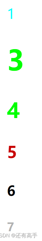
6 字体
chrome默认最小接受文字大小:12px,默认16px
衬线字体:像毛笔写出来的
6.1 实现文字垂直居中
行高=像素、数字(参考自身font-size倍数)、百分比(参考自身font-size百分比)
/* 实现文字垂直居中 */
                height: 200px;
                line-height: 200px;
6.2 vertical-align
用于图片、行内元素等
默认基线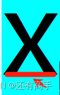
<head>
        <style>
        div{
             background-color: aqua;
             font-size: 200px;
        }
        img{
                vertical-align:baseline
        }

        </style>
</head>
<body>
        <div>
               x<img src="./image/favicon.ico">
        </div>
</body>
 img{
                vertical-align:bottom
        }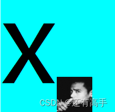
img{
                /* 与x的中心点对齐 */
                vertical-align:middle
        }
img{
                /* 低于基线 */
                vertical-align:sub
        }
6.3 text-align
<head>
        <style>
        .d1{
             text-align: left;
        }
        .d2{
                text-align:center;
        }
        .d3{
                text-align:right;
        }
        </style>
</head>
<body>
        <div class="d1">我是11</div>
        <div class="d2">我是21</div>
        <div class="d3">我是31</div>
</body>
6.4 单位
长度单位em:相对于当前元素的font-size的倍数,当前元素找不到font-size找父元素的,父元素没有再往上找,否则用默认
rem:相对于根元素(html)的font-size的倍数
width: 50%;50%是父元素width的px的50%
6.5 font属性
.div1{
        font-size: 40px;
        /* 电脑设置应该有该字体 */
        /* 最好用英文 */
        font-family: "微软雅黑";
        /* italic字体变斜 */
        font-style: italic;
        /* 控制字体粗细 */
        font-weight: 100;
      }
      .div2{
        /* 字体复合属性 */
        /* 字体族必须最后一位,字体大小必须倒数第二位 */
        font: bold 30px "楷体",sans-serif;
      }
         /* 所有元素字体都20px */
         body{
        font: 100px;
        /* 从前到后,找到能用的为止 */
        /* sans-serif非衬线字体,serif衬线字体 */
        font-family: "宋体","微软雅黑",sans-serif;
        /* 字母间距 */
        letter-spacing: 10px;
      }
      .div4{
        font-size: 10px;
        /* 乱写默认微软雅黑 */
        font-family: "宋体213123213";
        /* 单词间距,通过空格判断 */
        word-spacing:20px;
      }
      .div5{
        /* overline上划线,dotted虚线 */
        text-decoration: overline dotted red;
      }
      .div6{
        /* underline下划线,wavy波浪线 */
        text-decoration: underline wavy green;
      }
      .div7{
        /* underline下划线,wavy波浪线 */
        text-decoration: line-through;
        font-size: 40px;
        /* 向后空两位,文本缩进 */
        text-indent:80px;
7 边框
span{
                /* solid实线 */
                border: 2px green solid;
        }
8 列表
        <style>
        ul{
                 /* 列表符号
                list-style-type: decimal;
                /* 列表符号位置 */
                /* list-style-position: inside; */
                /* 自定义列表符号 */
                /* list-style-image: url("123.gif"); */
                /* 复合属性 */
                list-style:circle inside url("./image/favicon.ico")
        }
        li{
                background-color: aqua;
        }
        </style>
</head>
<body>
        <ul>
                <li>我是1</li>
                <li>我是2</li>
                <li>我是3</li>
        </ul>
</body>
9 表格独有属性
9.1 border-spacing
<head>
        <style>
       table{
        /* 单元格间距 */
        border-spacing: 10px;
       }
        </style>
</head>
<body>
        <!-- cellspacing="30" -->
        <table border="1" >
                <caption>学生信息</caption>
                <thead>
                    <tr>
                        <th>姓名</th>
                        <th>性别</th>
                        <th>年龄</th>
                        <th>成绩</th>
                    </tr>
                </thead>
                <tbody>
                    <tr>
                        <td>1</td>
                        <td>2</td>
                        <td>3</td>
                        <td>4</td>
                    </tr>
                </tbody>
                <tfoot>
                    <tr>
                        <td>1tfoot</td>
                        <td>2tfoot</td>
                        <td>3tfoot</td>
                        <td>4tfoot</td>
                    </tr>
                </tfoot>
            </table>
            <hr>
</body>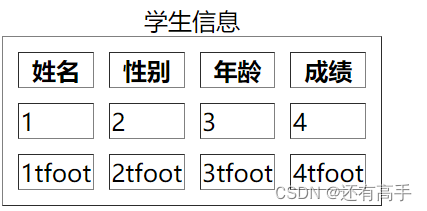
9.2 table-layout
table{
        /* auto根据内容分配单元格大小;fixed固定大小,需要加宽度限定,不然等同auto */
        table-layout: fixed;
        width: 500px;
} 
9.3 border-collapse
        <style>
       table{
        width:500px;
        border:4px solid red
       }
       th,td{
        border: 2px solid orange;
       }
</style> 
table{}添加:
/* 合并相邻单元格的边框 */
border-collapse:collapse; 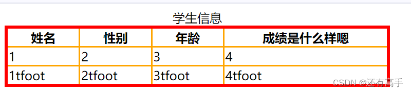
9.4 其他属性
/* 隐藏没有内容的单元格 */
        empty-cells: hide;
        /* 标题放下面 */
        caption-side: bottom;
10 背景
<head>
        <style>
       div{
        width: 400px;
        height: 400px;
        /* background-color: aqua; */
        /* 大的图片展示一部分,小的重复且铺满 */
        /* background-image: url('./image/favicon.ico');
        background-repeat: no-repeat; */
        /* background-position: left bottom; */
        /* background-position: center;相当于background-position: center center; */
        /* background-position: left;相当于background-position: left center; */
        /* 以图片左上角为基点,div左上角为原点,移动y轴100px,移动x轴200px */
        /* background-position: 100px 200px; */
        /* 移动x轴100px,y轴处于center */
        /* background-position: 100px; */
        background:url('./image/favicon.ico') no-repeat 100px aqua;
       }
        </style>
</head>
<body>
      <div></div>
</body>
11 鼠标
 div{
        /* 进入div盒子,鼠标形式变动 */
        cursor: all-scroll;
       }
12 盒子
12.1 margin,padding,border,content
<head>
        <style>
       div{
        width: 400px;
        height: 400px;
        background-color: aqua;
        /* margin:-100px:此时width、height变为300px */
        /* margin合并:上兄弟margin-bottom与下兄弟margin-top合并一起 */
        /* padding内边距 */
        /* padding-left: 20px;
        padding-top: 10px;
        padding-top: 10px;
        padding-bottom: 20px; */
        /* padding复合属性,border、margin同理 */
        /*padding:10px: 10px上下左右 */
        /*padding:10px 20px: 10px上下,20px左右 */
        /*padding:10px 20px 30px: 10px上,20px左右,30px下 */
        /*padding:10px 20px 30px 40px: 10px上,20px右,30px下 40px左 */
       }
        </style>
</head>
<body>
      <div></div>
</body>
12.2 margin塌陷
<head>
        <style>
          .outer{
                width: 400px;
                height: 400px;
                background-color: rgb(121, 70, 148);
                /* 解决margin塌陷1  */
                /* border: 1px solid ; */
                /* 解决margin塌陷2  */
                /* padding: 10px; */
                /* 解决margin塌陷3  */
                /* overflow: hidden; */

        }
        .in1{
                width: 100px;
                height: 100px;
                background-color: aqua;
                /* margin塌陷:子元素的margin被父元素抢走 */
                margin-top: 20px;
        }

        </style>
</head>
<body>
        <div>213</div>
        <div class="outer">
                <div class="in1"></div>
        </div>
        <div>213</div>
</body>
margin塌陷效果:

12.3 处理内容溢出
                overflow: hidden;
超出的给隐藏

                overflow: scroll;
滚动条


                overflow: auto;

                overflow: visible;
13 布局
13.1 实现效果1
实现效果:

代码:
<head>
        <style>
          .outer{
                width: 400px;
                height: 400px;
                background-color:gray;
                overflow: hidden;

        }
        .in1{
                width: 100px;
                height: 100px;
                background-color: rgb(234, 215, 10);
                /* 盒子左右居中 */
                margin:0 auto;
                /* 文本左右居中 */
                text-align: center;
                /* 文本上下居中 */
                line-height: 100px;
                /* 盒子上下居中 */
                margin-top:150px;
        }

        </style>
</head>
<body>
        <div class="outer">
                <div class="in1">inner</div>
        </div>
</body>
13.2 实现效果2

代码:
        <style>
          .outer{
                width: 400px;
                height: 400px;
                background-color:gray;
                text-align: center;
                /* 如果行内元素、行内块元素也想居中,可以当成文字处理 */
                line-height: 400px;
                margin:0 auto;
                overflow: hidden;
                 /* 图片受父元素文字影响大,文字越大图片越跑偏 */
                font-size:0

        }
        span{
                font-size: 20px;
                background-color: aqua;
                /* 图片位置与x中间位置对齐 */
                /* 上一个布局调盒子上下是margin-top */
                vertical-align: middle;
        }
        img{
                /* 图片位置与x中间位置对齐 */
                vertical-align: middle;
        }

        </style>
</head>
<body>
        <div class="outer">
                <span>inner</span><img src="./image/favicon.ico">
        </div>
</body>
13.3 幽灵空白
效果代码:
<head>
        <style>
          .outer{
                width: 400px;
                background-color:rgb(243, 9, 9);
        }
        </style>
</head>
<body>
        <div class="outer">
                <img src="./image/favicon.ico">xg
        </div>
</body>
解决办法:
/* 解决办法1 */
        img{
                vertical-align: bottom;
        }
/* 解决办法2,条件:div内只有一张图片,没有其他内容 */
img{
display: block;
}<head>
<style>
.outer{
width: 400px;
background-color:rgb(46, 185, 173);
font-size: 0;
}
/* 解决办法3:单独设置字体大小 */
span
{
font-size: 20px;
}
</style>
</head>
<body>
<div class="outer">
<img src="./image/favicon.ico"><span>xg</span>
</div>
</body>14 浮动
浮动:文字环绕文字,文字环绕图片
14.1 浮动给特点
1.脱离文档流。文档流即默认效果
2.宽高内容撑开且可设置
3.不会margin合并与塌陷
4.若标签内只有浮动元素则父元素高度塌陷

5.对后面的兄弟有影响
in1、in2、in3:float: left;
<div class="outer">
             <div class="in1">1</div>
             <div class="in2">2</div>
             <div class="in3">3</div>
             <div class="in4">4</div>

<div class="outer">
            <div class="in4">4</div>
             <div class="in1">1</div>
             <div class="in2">2</div>
             <div class="in3">3</div>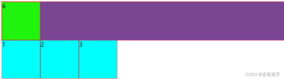
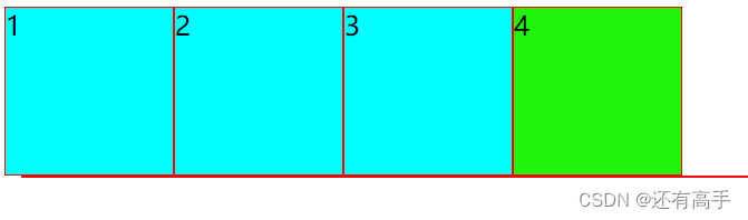
14.2 清除浮动
方法一:给父元素指定高度
方法二:给父元素设置浮动
方法三:父元素设置overflow:hidden
效果:
方法四:
<head>
        <style>
          .outer::after{
                background-color: rgb(121, 70, 148);
                margin: 10px;
                border: 1px solid red;
                width: 400px;
        }
        .in1,.in2,.in3{
                width: 100px;
                height: 100px;
                float: left;
                border: 1px solid red;
                background-color: aqua;
        }
        .in4{
                width: 100px;
                height: 100px;
                border: 1px solid red;
                background-color: rgb(32, 243, 13);
                /* 清除左浮动产生的影响 */
                /* clear: left; */
                /* 清除4之前所有浮动产生的影响 */
                /* 想在最后加clear:both;不能是行内元素 */
                clear:both;
        }
        </style>
</head>
<body>
        <div class="outer">
                <div class="in1">1</div>
                <div class="in2">2</div>
                <div class="in3">3</div>
                <div class="in4">4</div>
</body>
注意:
1 in4不和in1,2,3同一行
2 如果in4是行内、行内块元素,直接当文本处理
3 如果in4是浮动,且in4{clear:both;},所以用clear:both不能是浮动的
 方法五:
方法五:
.outer::after{
                content:'';
  /* 默认是行内元素 */
                display: block;
                clear: both;
        }
in1,2,3,4都浮动的状态下
但是,in4不浮动时: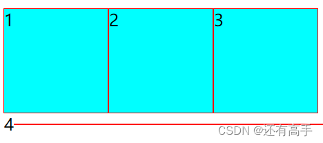
14.3 浮动练习
需求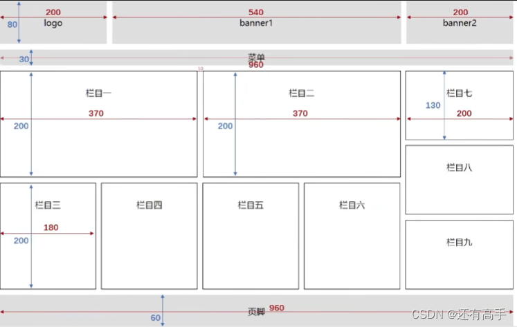
代码:
<!DOCTYPE html>
<html lang="en">
<head>
<style>
*{
margin: 0;
padding:0;
}
.leftfix{
float: left;
}
.rightfix{
float: right;
}
.clearfix::after{
content:"";
display: block;
clear: both;
}
.container{
width: 960px;
height: 80px;
margin: 0 auto;
text-align: center ;
}
.logo,.banner2{
width: 200px;
height: 80px;
}
.banner1{
width: 540px;
height: 80px;
margin:0 10px;
}
.logo,.banner2,.banner1{
background-color: gray;
line-height: 80px;
}
.menu{
width: 960px;
height: 30px;
background-color: gray;
line-height: 30px;
text-align: center;
margin-top:10px
}
.column1,.column2{
/* 边框也占了w和h,所以都-2 */
width: 368px;
height: 198px;
text-align: center;
line-height: 198px;
border:1px solid black;
margin-right:10px;
}
.column3,.column4,.column5,.column6{
width: 178px;
height: 198px;
border: 1px solid black;
text-align: center;
line-height: 198px;
margin-right:10px;
}
.content{
margin-top: 10px;
}
.leftbottom{
margin-top: 10px;
}
.column7,.column8,.column9{
width: 198px;
height: 128px;
text-align: center;
line-height: 128px;
border:1px solid black;
}
.column8{
margin: 10px 0;
}
.footer{
height: 60px;
background-color: gray;
text-align: center;
line-height: 60px;
margin-top:10px;
}
</style>
</head>
<body>
<div class="container">
<!-- 头部区 -->
<div class="header clearfix">
<div class="logo leftfix">logo</div>
<div class="banner1 leftfix">banner1</div>
<div class="banner2 leftfix">banner2</div>
</div>
<!-- 菜单区 -->
<div class="menu">菜单</div>
<!-- 内容区 -->
<div class="content clearfix">
<div class="left leftfix">
<div class="lefttop clearfix">
<div class="column1 leftfix">栏目1</div>
<div class="column2 leftfix">栏目2</div>
</div>
<div class="leftbottom clearfix">
<div class="column3 leftfix">栏目3</div>
<div class="column4 leftfix">栏目4</div>
<div class="column5 leftfix">栏目5</div>
<div class="column6 leftfix">栏目6</div>
</div>
</div>
<div class="right leftfix">
<div class="column7">栏目7</div>
<div class="column8">栏目8</div>
<div class="column9">栏目9</div>
</div>
</div>
<!-- 页脚 -->
<div class="footer">页脚</div>
</div>
</body>
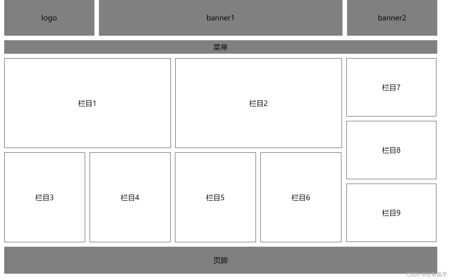
</html> 效果:
注意:
1结构要清晰,注释要写上
2width,height需要考虑padding,border
3左浮,清浮动单独成{}