 IconThemeData? iconTheme, // 设置icon的颜色 Appbar中的icon无效
IconThemeData primaryIconTheme, // 与primaryColor形成对比的图标主题
 IconThemeData accentIconTheme, // 与accentColor形成对比的图标主题。
TextTheme? primaryTextTheme, //与primary color形成对比的文本主题
TextTheme? textTheme, // 文本的颜色与卡片和画布的颜色形成对比。
Typography typography, // 用于配置TextTheme、primaryTextTheme和accentTextTheme的颜色和几何TextTheme值。
 ActionIconThemeData? actionIconTheme, //它用[ActionIconTheme.of]或整个[Theme]的[ThemeData.ActionIconTheme]覆盖[BackButton]、[CloseButton]、[DrawerButton和[EndDrawerButton的默认图标。
AppBarTheme appBarTheme, // 用于自定义Appbar的颜色、高度、亮度、iconTheme和textTheme的主题。
BadgeThemeData? badgeTheme,  //用于定义Badge小部件主题
MaterialBannerThemeData? bannerTheme,   //定义[MaterialBanner] 主题  Defines the visual properties of [MaterialBanner] widgets.
    BottomAppBarTheme? bottomAppBarTheme, //BottomAppBar主题   Defines default property values for descendant [BottomAppBar] widgets.
    BottomNavigationBarThemeData? bottomNavigationBarTheme,//BottomNavigationBar主题  Defines default property values for descendant [BottomNavigationBar] widgets.
    BottomSheetThemeData? bottomSheetTheme,
    //Defines default property values for [BottomSheet]'s [Material].
    ButtonBarThemeData? buttonBarTheme,  // Defines the visual properties of [ButtonBar] widgets.

    ButtonThemeData? buttonTheme, //计划在将来的版本中弃用此类。
    请改用以下一个或多个按钮和相关主题:[TextButton], [TextButtonTheme], [TextButtonThemeData],  [ElevatedButton],
    [ElevatedButtonTheme], [ElevatedButtonThemeData],[OutlinedButton], [OutlinedButtonTheme], [OutlinedButtonThemeData]

    CardTheme? cardTheme, // Defines default property values for descendant [Card] widgets.
    定义子代[Card]小部件的默认属性值。

    CheckboxThemeData? checkboxTheme, // Defines default property values for descendant [Checkbox] widget
    定义子代[Checkbox]小部件的默认属性值

    ChipThemeData? chipTheme,  //Use this class to configure a [ChipTheme] widget, or to set the  [ThemeData.chipTheme] for a [Theme] widget.
    用于chip类组件的样式
    ///  * [Chip], a chip that displays information and can be deleted.
///  * [InputChip], a chip that represents a complex piece of information, such
///    as an entity (person, place, or thing) or conversational text, in a
///    compact form.
///  * [ChoiceChip], allows a single selection from a set of options. Choice
///    chips contain related descriptive text or categories.
///  * [FilterChip], uses tags or descriptive words as a way to filter content.
///  * [ActionChip], represents an action related to primary content.
///  * [CircleAvatar], which shows images or initials of entities.
///  * [Wrap], A widget that displays its children in multiple horizontal or
///    vertical runs.
///  * [ChipTheme] widget, which can override the chip theme of its
///    children.
///  * [Theme] widget, which performs a similar function to [ChipTheme],
///    but for overall themes.
///  * [ThemeData], which has a default [ChipThemeData].


    DataTableThemeData? dataTableTheme, // Defines default property values for descendant [DataTable] widgets
定义子代[DataTable]小部件的默认属性值

    DatePickerThemeData? datePickerTheme, // Overrides the default values of visual properties for descendant [DatePickerDialog] widgets.
覆盖子代[DatePickerDialog]小部件的视觉属性的默认值。

    DialogTheme? dialogTheme, // Defines a theme for [Dialog] widgets.

    DividerThemeData? dividerTheme, // Defines the visual properties of [Divider], [VerticalDivider], dividers between [ListTile]s, and dividers between rows in [DataTable]s. 定义[Divider]、[VerticalDivider]、[ListTile]之间的分隔符以及[DataTable]中行之间的分隔器的视觉属性。


    DrawerThemeData? drawerTheme, // Defines default property values for descendant [Drawer] widgets.


    DropdownMenuThemeData? dropdownMenuTheme, // Overrides the default values of visual properties for descendant [DropdownMenu] widgets.


    ElevatedButtonThemeData? elevatedButtonTheme, // A [ButtonStyle] that overrides the default appearance of [ElevatedButton]s when it's used with [ElevatedButtonTheme] or with the overall [Theme]'s [ThemeData.elevatedButtonTheme].
一个[ButtonStyle],当它与[ElectedButtonTheme]或整个[Theme]的[ThemeData.electedButton Theme]一起使用时,它会覆盖[ElectedButton]的默认外观。

    ExpansionTileThemeData? expansionTileTheme, // Used with [ExpansionTileTheme] to define default property values for descendant [ExpansionTile] widgets.
/与[ExpansionTileTheme]一起使用,为后代[ExpansionTile]小部件定义默认属性值。

    FilledButtonThemeData? filledButtonTheme, //  A [ButtonStyle] that overrides the default appearance of	[FilledButton]s when it's used with [FilledButtonTheme] or with the overall [Theme]'s [ThemeData.filledButtonTheme]. // Defines default property values for descendant [FloatingActionButton] widgets.

    FloatingActionButtonThemeData? floatingActionButtonTheme, //  A [ButtonStyle] that overrides the default appearance of [IconButton]s when it's used with the [IconButton], the [IconButtonTheme] or the overall [Theme]'s [ThemeData.iconButtonTheme].

    IconButtonThemeData? iconButtonTheme, // A [ButtonStyle] that overrides the default appearance of [IconButton]s when it's used with the [IconButton], the [IconButtonTheme] or the overall [Theme]'s [ThemeData.iconButtonTheme].

    ListTileThemeData? listTileTheme, // Used with [ListTileTheme] to define default property values for descendant [ListTile] widgets, as well as classes that build [ListTile]s, like [CheckboxListTile], [RadioListTile], and [SwitchListTile].

    MenuBarThemeData? menuBarTheme, //  A data class that [MenuBarTheme] uses to define the visual properties of [MenuBar] widgets.

    MenuButtonThemeData? menuButtonTheme, // A [ButtonStyle] theme that overrides the default appearance of [SubmenuButton]s and [MenuItemButton]s when it's used with a [MenuButtonTheme] or with the overall [Theme]'s [ThemeData.menuTheme].

    MenuThemeData? menuTheme, //  Defines the configuration of the submenus created by the [SubmenuButton], [MenuBar], or [MenuAnchor] widgets.

    NavigationBarThemeData? navigationBarTheme, // Defines default property values for descendant [NavigationBar] widgets.

    NavigationDrawerThemeData? navigationDrawerTheme, //  Defines default property values for descendant [NavigationDrawer] widgets.

    NavigationRailThemeData? navigationRailTheme, // Defines default property values for descendant [NavigationRail] widgets.

    OutlinedButtonThemeData? outlinedButtonTheme, //  A [ButtonStyle] that overrides the default appearance of [OutlinedButton]s when it's used with [OutlinedButtonTheme] or with the  overall [Theme]'s [ThemeData.outlinedButtonTheme].

    PopupMenuThemeData? popupMenuTheme, // Defines the visual properties of the routes used to display popup menus as well as [PopupMenuItem] and [PopupMenuDivider] widgets.

    ProgressIndicatorThemeData? progressIndicatorTheme, // Defines the visual properties of [ProgressIndicator] widgets.

    RadioThemeData? radioTheme, // Defines default property values for descendant [Radio] widgets.

    SearchBarThemeData? searchBarTheme, // Defines default property values for descendant [SearchBar] widgets.

    SearchViewThemeData? searchViewTheme, // Defines the configuration of the search views created by the [SearchAnchor] widget.

    SegmentedButtonThemeData? segmentedButtonTheme, // Overrides the default values of visual properties for descendant [SegmentedButton] widgets.

    SliderThemeData? sliderTheme,//Use this class to configure a [SliderTheme] widget, or to set the [ThemeData.sliderTheme] for a [Theme] widget.

    SnackBarThemeData? snackBarTheme,//Customizes default property values for [SnackBar] widgets.

    SwitchThemeData? switchTheme,//Defines default property values for descendant [Switch] widgets.

    TabBarTheme? tabBarTheme,//Defines a theme for [TabBar] widgets.

    TextButtonThemeData? textButtonTheme,//  A [ButtonStyle] that overrides the default appearance of  [TextButton]s when it's used with [TextButtonTheme] or with the overall [Theme]'s [ThemeData.textButtonTheme].
    一个[ButtonStyle],当它与[TextButtonTheme]或整体[Theme]的[ThemeData.TextButtonTheme]一起使用时,它覆盖[TextButton]的默认外观。

    TextSelectionThemeData? textSelectionTheme,// Defines the visual properties needed for text selection in [TextField] and [SelectableText] widgets.

    TimePickerThemeData? timePickerTheme,//Defines the visual properties of the widget displayed with [showTimePicker].

    ToggleButtonsThemeData? toggleButtonsTheme,//Defines the color and border properties of [ToggleButtons] widgets.

    TooltipThemeData? tooltipTheme,// Defines the visual properties of [Tooltip] widgets.
    定义[Tooltip]小部件的视觉属性。
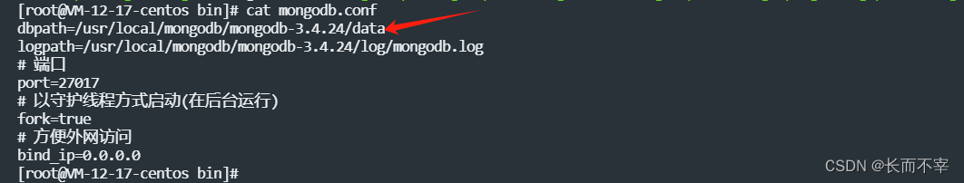
先展示报错信息 网上一大推说是关闭不正确导致的,然后给出的解决方法是
./mongod -f mongodb.conf --repair吊用没有,还是报错:
about to fork child process, waiting until server is ready for connections.
forked process: 302226
ERROR: child process failed, exited…