文章目录
- 0. 代码数据下载
- 1. 背景描述
- 2. 探索性数据分析
- 2.1 数据集分布
- 2.2 特征的相关性
- 2.3 散点图可视化
- 3. 特征工程和分类编程
- 4. 实施机器学习模型
- 3.1 随机森林分类器
- a. 通过随机森林进行特征排名
- b. 可视化树形图
- 3.2 梯度增强分类器
- a. 基于梯度增强模型的特征排序
- 3.3 结论
0. 代码数据下载
关注公众号:『AI学习星球』
回复:IBM员工流失率预测 即可获取数据下载。
算法学习、4对1辅导、论文辅导或核心期刊可以通过公众号或➕v:codebiubiu滴滴我

1. 背景描述
保持员工满意和满意的问题是一个长期存在且历史悠久的挑战。如果您投入了大量时间和金钱,员工仍然离开,那么这意味着您将不得不花费更多的时间和金钱来雇佣其他人。因此,在本比赛中,看看我们是否可以通过IBM数据集来预测员工的流失程度。
- 探索性数据分析:在本节中,我们通过查看特征分布,一个特征与另一个特征的相关性以及创建一些Seaborn和Plotly可视化来探索数据集。
- 特征工程和分类编码:执行一些特征工程以及将所有分类特征编码为虚拟变量
- 实现机器学习模型:我们实现随机森林和梯度提升模型,然后我们从这些模型中查看特征重要性
2. 探索性数据分析
数据处理的包准备
import numpy as np # linear algebra
import pandas as pd # data processing, CSV file I/O (e.g. pd.read_csv)
import seaborn as sns
import matplotlib.pyplot as plt
%matplotlib inline

# Import statements required for Plotly
import plotly.offline as py
py.init_notebook_mode(connected=True)
import plotly.graph_objs as go
import plotly.tools as tls


from sklearn.ensemble import RandomForestClassifier, GradientBoostingClassifier
from sklearn.linear_model import LogisticRegression
from sklearn.metrics import (accuracy_score, log_loss, classification_report)
from imblearn.over_sampling import SMOTE
import xgboost

# Import and suppress warnings
import warnings
warnings.filterwarnings('ignore')
让我们将数据集加载到数据框对象中,并快速查看前几行
attrition = pd.read_csv('WA_Fn-UseC_-HR-Employee-Attrition.csv')
attrition.head()
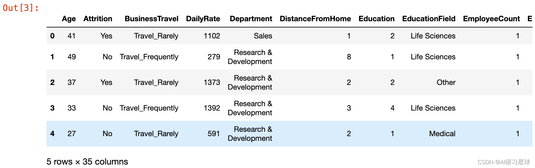
从数据集中可以看出,我们可以定义模型的训练的目标是“损失率”。
此外,数据集中包含了连续变量和分类变量。 对于分类变量,我们将在后一章中处理它们。 本节将专注于数据探索,作为第一步,让我们快速进行一些简单的数据完整性检查,以查看数据中是否存在空值或无限值。
数据质量检查
要查找任何空值,我们可以按如下方式调用isnull。
# Looking for NaN
display(attrition.isnull().any())
2.1 数据集分布
通常,探索数据的前几个步骤之一就是大致了解这些特征如何分布。
为此,我将从Seaborn绘图库中调用熟悉的 kdeplot 函数,这将生成如下的双变量图:
# Plotting the KDEplots
f, axes = plt.subplots(3, 3, figsize=(10, 8),
                       sharex=False, sharey=False)

# Defining our colormap scheme
s = np.linspace(0, 3, 10)
cmap = sns.cubehelix_palette(start=0.0, light=1, as_cmap=True)

# Generate and plot
x = attrition['Age'].values
y = attrition['TotalWorkingYears'].values
sns.kdeplot(x, y, cmap=cmap, shade=True, cut=5, ax=axes[0,0])
axes[0,0].set( title = 'Age against Total working years')

cmap = sns.cubehelix_palette(start=0.333333333333, light=1, as_cmap=True)
# Generate and plot
x = attrition['Age'].values
y = attrition['DailyRate'].values
sns.kdeplot(x, y, cmap=cmap, shade=True, ax=axes[0,1])
axes[0,1].set( title = 'Age against Daily Rate')

cmap = sns.cubehelix_palette(start=0.666666666667, light=1, as_cmap=True)
# Generate and plot
x = attrition['YearsInCurrentRole'].values
y = attrition['Age'].values
sns.kdeplot(x, y, cmap=cmap, shade=True, ax=axes[0,2])
axes[0,2].set( title = 'Years in role against Age')

cmap = sns.cubehelix_palette(start=1.0, light=1, as_cmap=True)
# Generate and plot
x = attrition['DailyRate'].values
y = attrition['DistanceFromHome'].values
sns.kdeplot(x, y, cmap=cmap, shade=True,  ax=axes[1,0])
axes[1,0].set( title = 'Daily Rate against DistancefromHome')

cmap = sns.cubehelix_palette(start=1.333333333333, light=1, as_cmap=True)
# Generate and plot
x = attrition['DailyRate'].values
y = attrition['JobSatisfaction'].values
sns.kdeplot(x, y, cmap=cmap, shade=True,  ax=axes[1,1])
axes[1,1].set( title = 'Daily Rate against Job satisfaction')

cmap = sns.cubehelix_palette(start=1.666666666667, light=1, as_cmap=True)
# Generate and plot
x = attrition['YearsAtCompany'].values
y = attrition['JobSatisfaction'].values
sns.kdeplot(x, y, cmap=cmap, shade=True,  ax=axes[1,2])
axes[1,2].set( title = 'Daily Rate against distance')

cmap = sns.cubehelix_palette(start=2.0, light=1, as_cmap=True)
# Generate and plot
x = attrition['YearsAtCompany'].values
y = attrition['DailyRate'].values
sns.kdeplot(x, y, cmap=cmap, shade=True,  ax=axes[2,0])
axes[2,0].set( title = 'Years at company against Daily Rate')

cmap = sns.cubehelix_palette(start=2.333333333333, light=1, as_cmap=True)
# Generate and plot
x = attrition['RelationshipSatisfaction'].values
y = attrition['YearsWithCurrManager'].values
sns.kdeplot(x, y, cmap=cmap, shade=True,  ax=axes[2,1])
axes[2,1].set( title = 'Relationship Satisfaction vs years with manager')

cmap = sns.cubehelix_palette(start=2.666666666667, light=1, as_cmap=True)
# Generate and plot
x = attrition['WorkLifeBalance'].values
y = attrition['JobSatisfaction'].values
sns.kdeplot(x, y, cmap=cmap, shade=True,  ax=axes[2,2])
axes[2,2].set( title = 'WorklifeBalance against Satisfaction')

f.tight_layout()

# Define a dictionary for the target mapping
target_map = {'Yes':1, 'No':0}
# Use the pandas apply method to numerically encode our attrition target variable
attrition["Attrition_numerical"] = attrition["Attrition"].apply(lambda x: target_map[x])
2.2 特征的相关性
通过绘制相关矩阵,我们可以非常清楚地了解这些特征是如何相互关联的。 对于Pandas数据集,我们可以方便地使用调用corr ,它默认在该数据集中提供成对的Pearson Correlation值。
在这个相关图中,将使用Plotly库通过Heatmap函数生成交互式Pearson相关矩阵,如下所示:
# creating a list of only numerical values
numerical = [u'Age', u'DailyRate', u'DistanceFromHome',
             u'Education', u'EmployeeNumber', u'EnvironmentSatisfaction',
             u'HourlyRate', u'JobInvolvement', u'JobLevel', u'JobSatisfaction',
             u'MonthlyIncome', u'MonthlyRate', u'NumCompaniesWorked',
             u'PercentSalaryHike', u'PerformanceRating', u'RelationshipSatisfaction',
             u'StockOptionLevel', u'TotalWorkingYears',
             u'TrainingTimesLastYear', u'WorkLifeBalance', u'YearsAtCompany',
             u'YearsInCurrentRole', u'YearsSinceLastPromotion',u'YearsWithCurrManager']
data = [
    go.Heatmap(
        z= attrition[numerical].astype(float).corr().values, # Generating the Pearson correlation
        x=attrition[numerical].columns.values,
        y=attrition[numerical].columns.values,
        colorscale='Viridis',
        reversescale = False,
#         text = True ,
        opacity = 1.0

    )
]


layout = go.Layout(
    title='Pearson Correlation of numerical features',
    xaxis = dict(ticks='', nticks=36),
    yaxis = dict(ticks='' ),
    width = 900, height = 700,

)


fig = go.Figure(data=data, layout=layout)
py.iplot(fig, filename='labelled-heatmap')
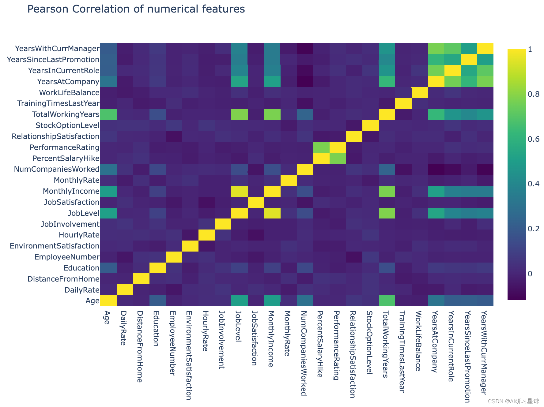
从相关图中,我们可以看到很多列之间的相关性很差。
通常,在建立预测模型时,如果特征之间的相关性较弱,我们不需要处理冗余特征。 如果变量之间的相关性较强,则可以应用诸如主成分分析(PCA)等方法来降低特征空间的维度。
2.3 散点图可视化
现在让我们创建一些Seaborn散点图并将Attrition设置为目标变量,以了解各种特征如何影响员工流失。
# Refining our list of numerical variables
numerical = [u'Age', u'DailyRate',  u'JobSatisfaction',
       u'MonthlyIncome', u'PerformanceRating',
        u'WorkLifeBalance', u'YearsAtCompany', u'Attrition_numerical']

#g = sns.pairplot(attrition[numerical], hue='Attrition_numerical', palette='seismic', diag_kind = 'kde',diag_kws=dict(shade=True))
#g.set(xticklabels=[])
3. 特征工程和分类编程
在对数据集进行了简要的探索之后,现在让我们继续进行特征工程的任务,并对数据集中的分类变量进行数字编码。 简而言之,特征工程就是在现有的特征基础上创建新的特征。
首先,我们将通过使用dtype方法将数值变量与分类变量分开,如下所示:
# Drop the Attrition_numerical column from attrition dataset first - Don't want to include that
attrition = attrition.drop(['Attrition_numerical'], axis=1)

# Empty list to store columns with categorical data
categorical = []
for col, value in attrition.iteritems():
    if value.dtype == 'object':
        categorical.append(col)

# Store the numerical columns in a list numerical
numerical = attrition.columns.difference(categorical)
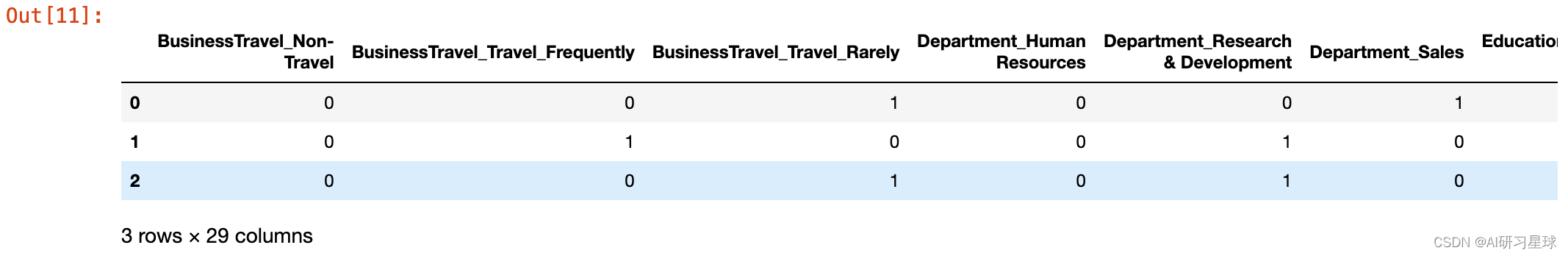
确定了哪些特征包含分类数据后,我们可以设置数字编码数据。
为此,我将使用Pandas中的 get_dummies 方法,该方法根据分类变量创建编码的虚拟变量。
# Store the categorical data in a dataframe called attrition_cat
attrition_cat = attrition[categorical]
attrition_cat = attrition_cat.drop(['Attrition'], axis=1) # Dropping the target column
应用 get_dummies 方法,我们看到只需应用一行Python代码就可以方便地编码分类值。
attrition_cat = pd.get_dummies(attrition_cat)
attrition_cat.head(3)
为数字数据创造新特征
# Store the numerical features to a dataframe attrition_num
attrition_num = attrition[numerical]
编码了我们的分类变量,并创建了一些新特征,我们现在可以继续将两个数据集合并成一个最终集中,我们将使用它来训练和测试我们的模型。
# Concat the two dataframes together columnwise
attrition_final = pd.concat([attrition_num, attrition_cat], axis=1)
目标变量
目标由列 Attrition 给出,其中包含分类变量因此需要数字编码。
我们通过创建一个字典项来对数字进行编码,其中映射的格式为 1:Yes 和 0:No
# Define a dictionary for the target mapping
target_map = {'Yes':1, 'No':0}
# Use the pandas apply method to numerically encode our attrition target variable
target = attrition["Attrition"].apply(lambda x: target_map[x])
target.head(3)

然而,仅通过快速检查目标变量中“Yes”和“No”的数量计数就告诉我们目标中存在相当大的偏差,
如图所示
data = [go.Bar(
            x=attrition["Attrition"].value_counts().index.values,
            y= attrition["Attrition"].value_counts().values
    )]

py.iplot(data, filename='basic-bar')
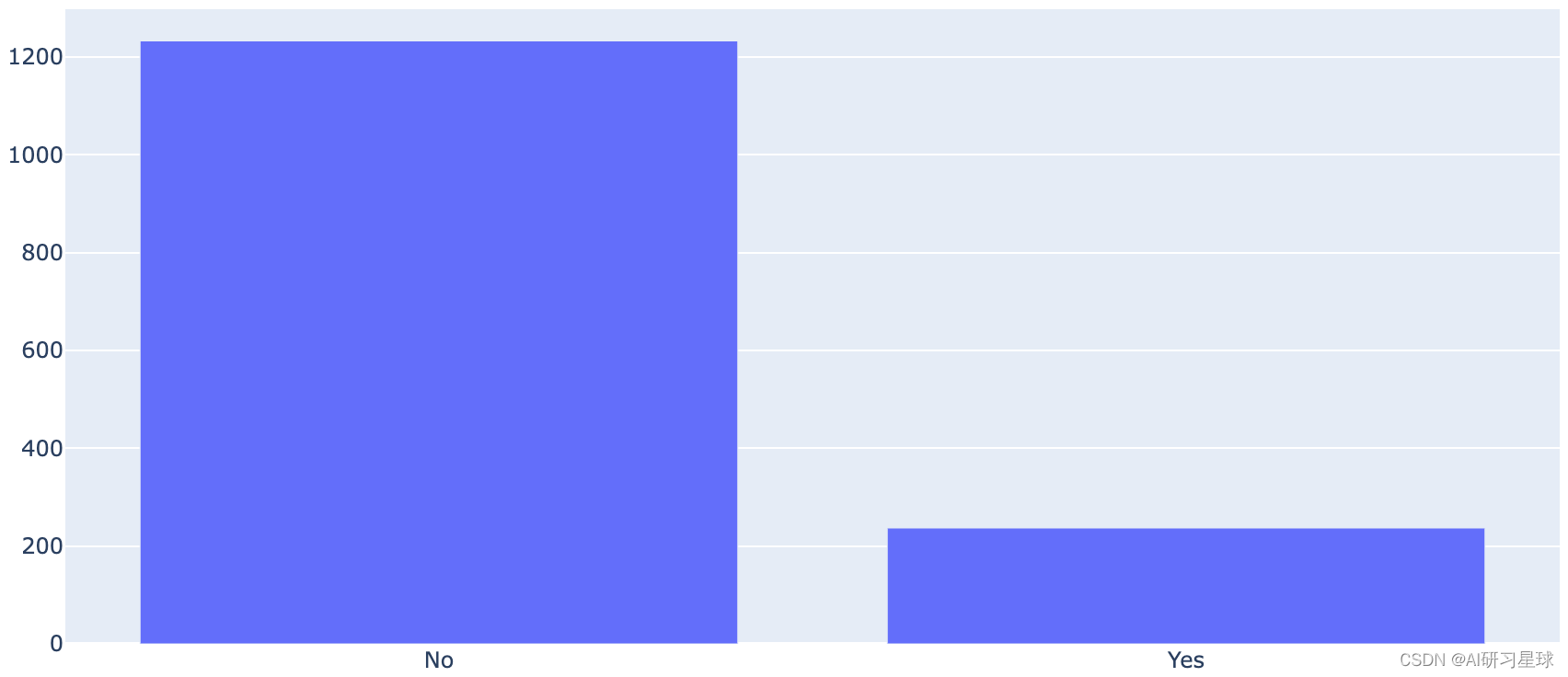
因此,目标变量存在很大的不平衡。
已经提出了许多统计技术来处理数据的不平衡(过采样或欠采样)。
我将使用称为SMOTE的过采样技术来处理这种不平衡。
4. 实施机器学习模型
在完成了一些探索性数据分析和简单的特征工程以及确保所有分类值都已编码之后,我们现在准备着手构建我们的模型。
正如在本笔记的介绍中所提到的,我们的目标是评估和对比少数不同学习模型的表现。
将数据拆分为训练和测试集
但在我们开始训练模型之前,我们必须将我们的数据集划分为训练集和测试集。 要分割我们的数据,我们将使用sklearn
# Import the train_test_split method
from sklearn.model_selection import train_test_split
from sklearn.model_selection import StratifiedShuffleSplit

# Split data into train and test sets as well as for validation and testing
train, test, target_train, target_val = train_test_split(attrition_final,
                                                         target,
                                                         train_size= 0.80,
                                                         random_state=0);
#train, test, target_train, target_val = StratifiedShuffleSplit(attrition_final, target, random_state=0);
由于目标偏斜导致过度采样的SMOTE
既然我们已经注意到目标变量中值的严重不平衡,那么让我们通过imblearn Python处理这个偏斜值来实现SMOTE方法。
oversampler=SMOTE(random_state=0)
smote_train, smote_target = oversampler.fit_sample(train,target_train)
3.1 随机森林分类器
Breiman于2001年首次引入的随机森林方法可归入集成模型的范畴。随机森林的构建块是无处不在的决策树。 作为独立模型的决策树通常被认为是“弱学习器”,因为其预测性能相对较差。 然而,随机森林收集决策树的一组(或整体),并使用它们的组合预测能力来获得相对强大的预测性能 - “强学习器”。
使用“弱学习器”集合来创建“强学习器”的原则支持了机器学习中经常遇到的集合方法的基础。
初始化随机森林参数
我们将利用Scikit-learn库构建随机森林模型。
为此,我们必须首先定义我们将提供给随机森林分类器的参数集,如下所示
seed = 0   # We set our random seed to zero for reproducibility
# Random Forest parameters
rf_params = {
    'n_jobs': -1,
    'n_estimators': 1000,
#     'warm_start': True,
    'max_features': 0.3,
    'max_depth': 4,
    'min_samples_leaf': 2,
    'max_features' : 'sqrt',
    'random_state' : seed,
    'verbose': 0
}
定义了我们的参数后,我们可以使用scikit-learn的 RandomForestClassifier 初始化随机森林对象,并通过添加双星号符号来解压参数,如下所示
rf = RandomForestClassifier(**rf_params)
准备我们的随机森林模型后的下一步是使用我们的训练集开始构建森林并将其拟合到我们的流失率目标变量。
我们通过简单地使用fit 调用来实现如下操作
rf.fit(smote_train, smote_target)
print("Fitting of Random Forest finished")
Fitting of Random Forest finished
根据我们的目标变量将我们的森林与我们的参数拟合到训练集中,我们现在有了一个学习模型 rf ,我们可以用它来预测。
要使用我们的随机森林预测我们的测试数据,我们可以使用sklearn的.predict方法如下
rf_predictions = rf.predict(test)
print("Predictions finished")
Predictions finished
评分模型
print("Accuracy score: {}".format(accuracy_score(target_val, rf_predictions)))
print("="*80)
print(classification_report(target_val, rf_predictions))
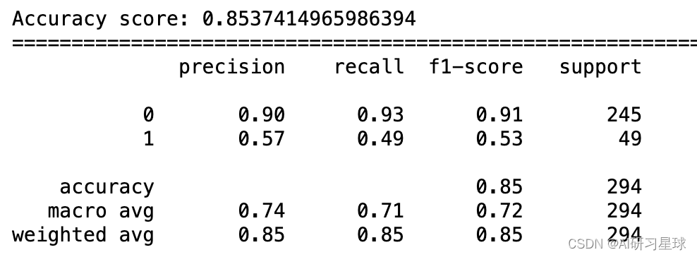
模型的准确性
如所观察到的,我们的随机森林为其预测返回了大约88%的准确度,乍一看这似乎是一个表现相当不错的模型。 然而,当我们考虑我们的目标变量偏差时,其中yes和no的分布分别为84%和26%,因此我们的模型仅比随机猜测稍微好一些。
如分类报告输出中所示,平均精确度和召回率将提供更多信息
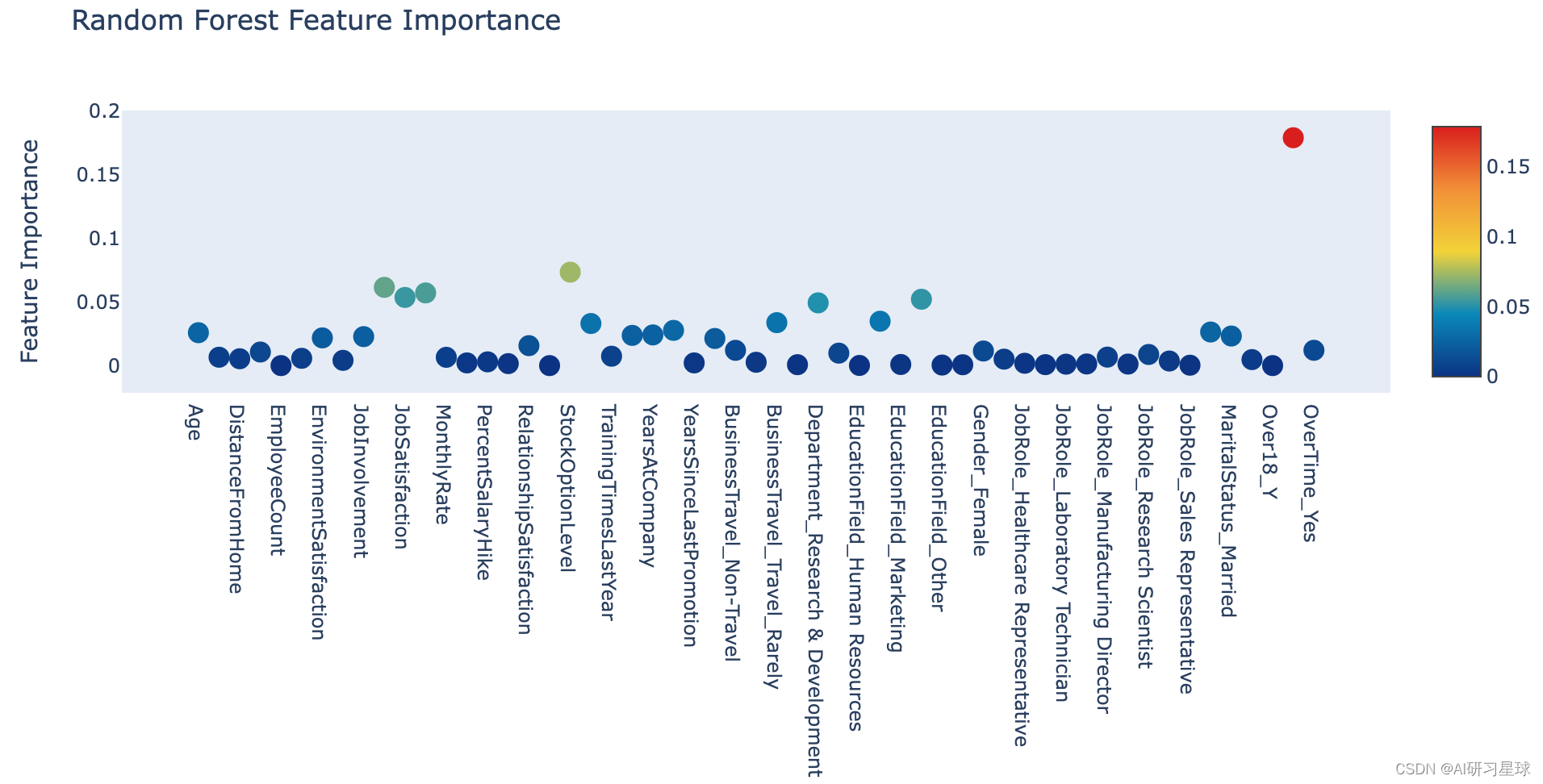
a. 通过随机森林进行特征排名
下面显示的是各种要素重要性的交互式绘图。
# Scatter plot
trace = go.Scatter(
    y = rf.feature_importances_,
    x = attrition_final.columns.values,
    mode='markers',
    marker=dict(
        sizemode = 'diameter',
        sizeref = 1,
        size = 13,
        #size= rf.feature_importances_,
        #color = np.random.randn(500), #set color equal to a variable
        color = rf.feature_importances_,
        colorscale='Portland',
        showscale=True
    ),
    text = attrition_final.columns.values
)
data = [trace]

layout= go.Layout(
    autosize= True,
    title= 'Random Forest Feature Importance',
    hovermode= 'closest',
     xaxis= dict(
         ticklen= 5,
         showgrid=False,
        zeroline=False,
        showline=False
     ),
    yaxis=dict(
        title= 'Feature Importance',
        showgrid=False,
        zeroline=False,
        ticklen= 5,
        gridwidth= 2
    ),
    showlegend= False
)
fig = go.Figure(data=data, layout=layout)
py.iplot(fig,filename='scatter2010')
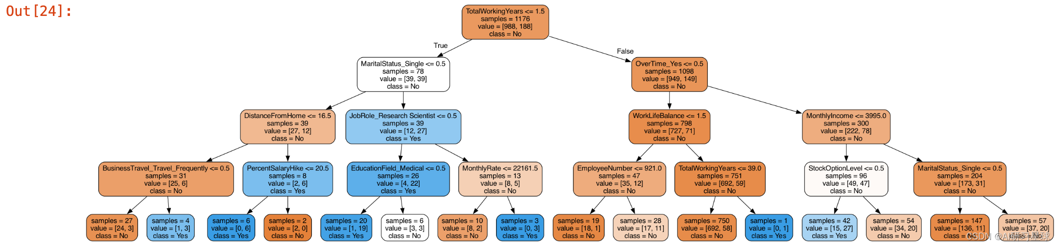
b. 可视化树形图
from sklearn import tree
from IPython.display import Image as PImage
from subprocess import check_call
from PIL import Image, ImageDraw, ImageFont
import re

decision_tree = tree.DecisionTreeClassifier(max_depth = 4)
decision_tree.fit(train, target_train)

# Predicting results for test dataset
y_pred = decision_tree.predict(test)

# Export our trained model as a .dot file
with open("tree1.dot", 'w') as f:
     f = tree.export_graphviz(decision_tree,
                              out_file=f,
                              max_depth = 4,
                              impurity = False,
                              feature_names = attrition_final.columns.values,
                              class_names = ['No', 'Yes'],
                              rounded = True,
                              filled= True )

#Convert .dot to .png to allow display in web notebook
check_call(['dot','-Tpng','tree1.dot','-o','tree1.png'])

# Annotating chart with PIL
img = Image.open("tree1.png")
draw = ImageDraw.Draw(img)
img.save('sample-out.png')
PImage("sample-out.png", height=2000, width=1900)
3.2 梯度增强分类器
梯度增强也是一种集成技术,就像随机森林一样,弱学习器的组合汇集在一起形成一个相对强大的学习器。
该技术涉及定义您想要最小化的某种函数(损失函数)以及最小化此函数的方法/算法。因此,顾名思义,用于最小化损失函数的算法是梯度下降方法,该方法添加决策树,其在指向减少我们的损失函数(向下梯度)的方向上“指向”。
要在Sklearn中设置梯度增强分类器很简单,它只涉及少量代码行。我们再次首先设置分类器的参数
初始化梯度提升参数
通常,在设置基于树的或梯度增强模型时,有一些关键参数。这些将始终是估算器的数量,模型训练的最大深度,以及每片叶子的最小样本数
# Gradient Boosting Parameters
gb_params ={
    'n_estimators': 1500,
    'max_features': 0.9,
    'learning_rate' : 0.25,
    'max_depth': 4,
    'min_samples_leaf': 2,
    'subsample': 1,
    'max_features' : 'sqrt',
    'random_state' : seed,
    'verbose': 0
}
定义了我们的参数后,我们现在可以分别在我们的训练和测试集上应用通常的拟合和预测方法
gb = GradientBoostingClassifier(**gb_params)
# Fit the model to our SMOTEd train and target
gb.fit(smote_train, smote_target)
# Get our predictions
gb_predictions = gb.predict(test)
print("Predictions have finished")
Predictions have finished
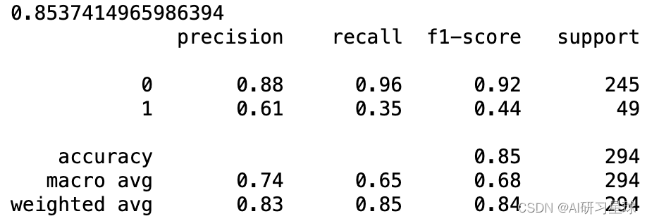
print(accuracy_score(target_val, gb_predictions))
print(classification_report(target_val, gb_predictions))
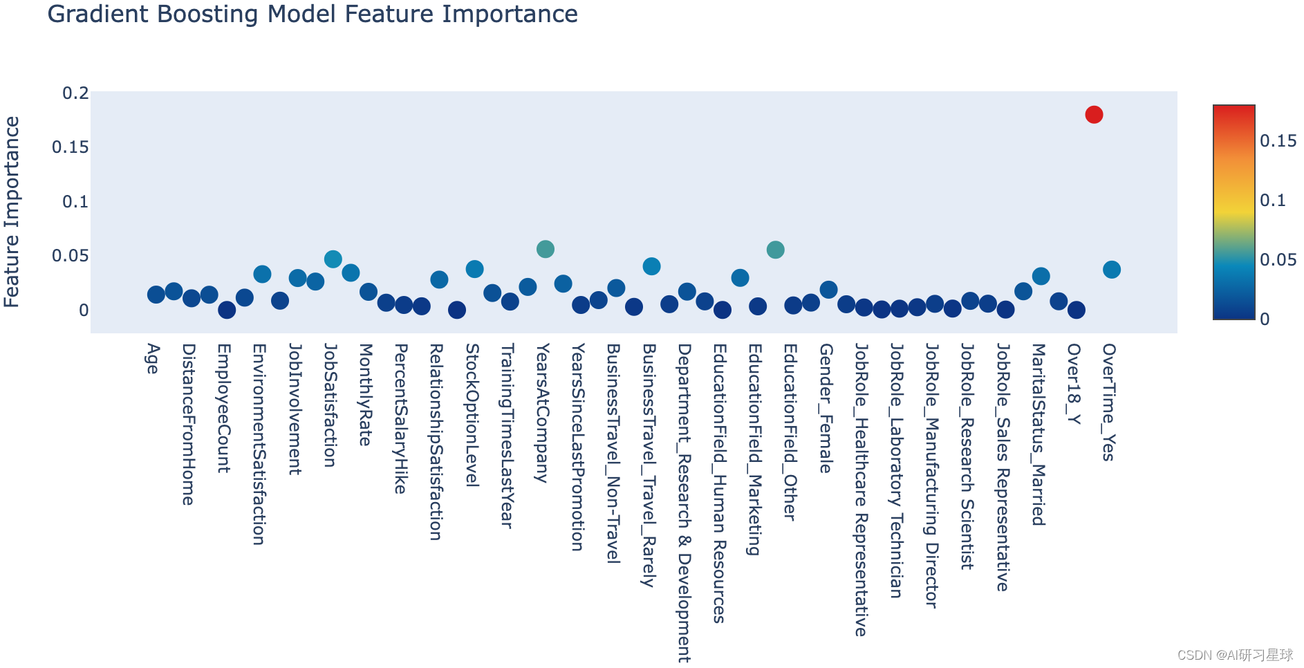
a. 基于梯度增强模型的特征排序
与随机森林非常相似,我们可以调用梯度增强模型的feature_importances_属性并将其转储到交互式Plotly图表中
# Scatter plot
trace = go.Scatter(
    y = gb.feature_importances_,
    x = attrition_final.columns.values,
    mode='markers',
    marker=dict(
        sizemode = 'diameter',
        sizeref = 1,
        size = 13,
        #size= rf.feature_importances_,
        #color = np.random.randn(500), #set color equal to a variable
        color = gb.feature_importances_,
        colorscale='Portland',
        showscale=True
    ),
    text = attrition_final.columns.values
)
data = [trace]

layout= go.Layout(
    autosize= True,
    title= 'Gradient Boosting Model Feature Importance',
    hovermode= 'closest',
     xaxis= dict(
         ticklen= 5,
         showgrid=False,
        zeroline=False,
        showline=False
     ),
    yaxis=dict(
        title= 'Feature Importance',
        showgrid=False,
        zeroline=False,
        ticklen= 5,
        gridwidth= 2
    ),
    showlegend= False
)
fig = go.Figure(data=data, layout=layout)
py.iplot(fig,filename='scatter')
3.3 结论
我们构建了一个非常简单的预测员工流失的管道模型,从一些基本的探索性数据分析到特征工程,以及以随机森林和梯度提升分类器的形式实现两个学习模型。甚至可以在预测中恢复89%的准确性。
话虽如此,还有很大的改进空间。 例如,可以根据数据设计更多功能。 此外,可以通过使用某种形式的混合或堆叠模型来挤出该管道模型的性能。
参考链接:https://www.kaggle.com/arthurtok/employee-attrition-via-ensemble-tree-based-methods
关注公众号:『AI学习星球』
回复:IBM员工流失率预测 即可获取数据下载。
算法学习、4对1辅导、论文辅导或核心期刊可以通过公众号或➕v:codebiubiu滴滴我