💂作者简介: THUNDER王,一名热爱财税和SAP ABAP编程以及热爱分享的博主。目前于江西师范大学会计学专业大二本科在读,同时任汉硕云(广东)科技有限公司ABAP开发顾问。在学习工作中,我通常使用偏后端的开发语言ABAP,SQL进行任务的完成,对SAP企业管理系统,SAP ABAP开发和数据库具有较深入的研究。
💅文章概要: 各位C站的小伙伴们,马上就要迎来我们一年一度的元旦和春节啦,值此之际,让我们一起来写一个响应式跨年倒计时吧!无论是电脑,手机还是平板都可以完美适配哦!
🤟每日一言: 保护好你的梦想,等到它开花结果的那天,它会让你俯视所有曾经看低你的人。
目录
- 前言
- 响应式布局介绍
- 响应式跨年倒计时效果演示
- PC端效果演示
- 手机端效果演示
- IPAD竖屏效果演示
- IPAD横屏效果演示
- 实现思路
- 背景的设置
- HTML+CSS源码
- 上浮泡泡效果实现
- HTML源码
- CSS源码
- 倒计时代码原理实现
- JAVASCRIPT源码
- 响应式布局设计
- CSS源码
- 完整源码
- 写在最后的话
前言
各位C站的小伙伴们,马上就要迎来我们一年一度的元旦和春节啦,值此之际,让我们一起来写一个响应式跨年倒计时吧!无论是电脑,手机还是平板都可以完美适配哦!
响应式布局介绍
响应式布局 是 Ethan Marcotte 在 2010年5月份 提出的一个概念,简而言之,就是 一个网站能够兼容多个终端 ——而不是为每个终端做一个特定的版本。这个概念是为解决移动互联网浏览而诞生的。
响应式布局可以为不同终端的用户提供更加舒适的界面和更好的用户体验 ,而且随着大屏幕移动设备的普及,用“大势所趋”来形容也不为过。随着越来越多的设计师采用这个技术,我们不仅看到很多的创新,还看到了一些成形的模式。

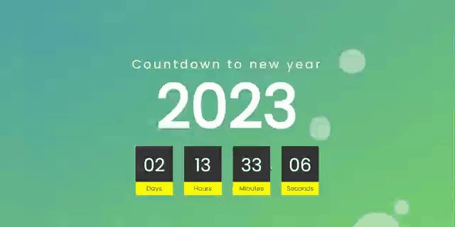
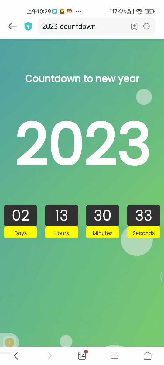
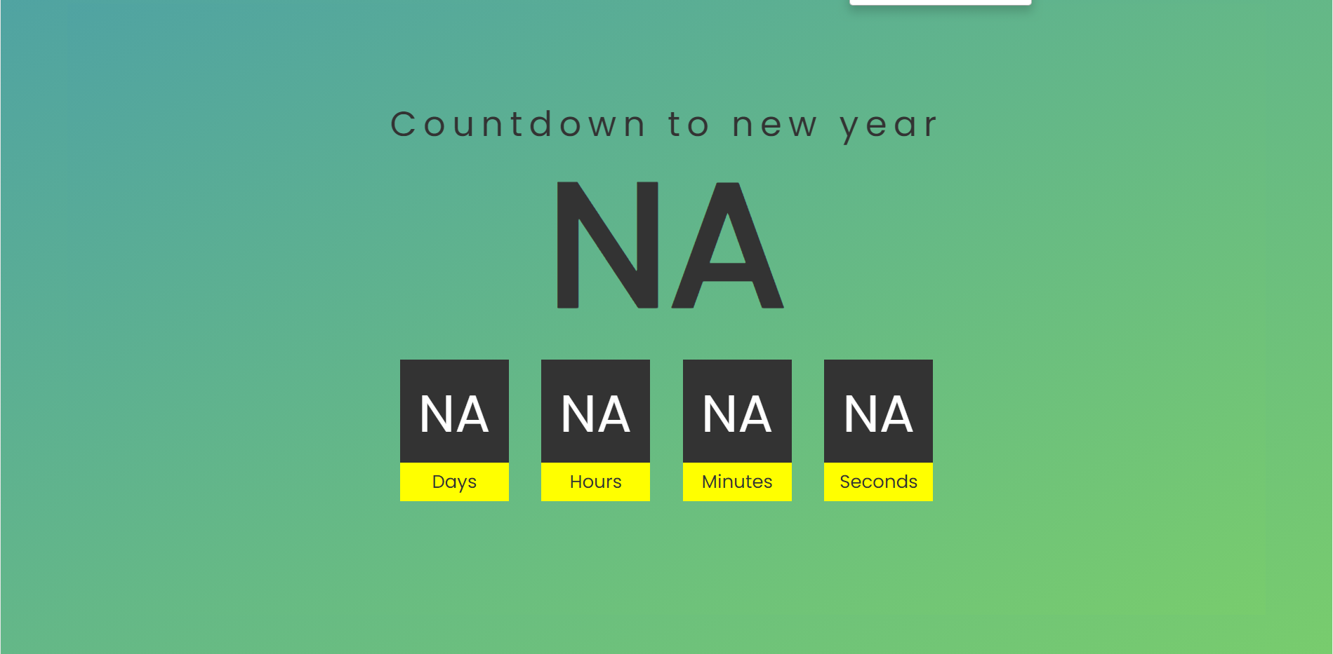
响应式跨年倒计时效果演示
下面展示四种情况下的效果演示,包括 PC端,手机端,IPAD竖屏和IPAD横屏
PC端效果演示
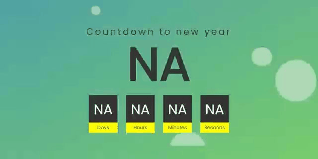
手机端效果演示
IPAD竖屏效果演示

IPAD横屏效果演示

实现思路
看完效果图后,各位小伙伴们肯定很想知道实现的思路,接下来我将分步骤逐一进行讲解,如果想要获取源码的小伙伴可以跳过该部分,直接前往最后的完整源码章节!,在分布讲解种我会将HTML,CSS,JAVASCRIPT三个部分全部放在同一个文件中,方便各位小伙伴们获取!
我将实现思路分成了如下四个部分,列举如下:
- 背景的设置
- 上浮泡泡效果实现
- 倒计时代码原理实现
- 响应式布局设计
背景的设置
通过使用HTML和CSS可以完成整个倒计时的背景设计,背景颜色采取了渐变色的设计,更具美感搭配上浮泡泡有一种置身绿色海洋的身临其境!
HTML+CSS源码
<!DOCTYPE html>
<html lang="en">
<head>
<meta charset="UTF-8">
<meta name="viewport" content="width=device-width, initial-scale=1.0">
<meta http-equiv="X-UA-Compatible" content="ie=edge">
<title>New Year Count Down</title>
<style>
@import url("https://fonts.googleapis.com/css?family=Poppins&display=swap");
* {
margin: 0;
padding: 0;
font-family: "Poppins", sans-serif;
}
@media screen and (min-width: 1025px) {
body {
background: linear-gradient(to bottom right, #50a3a2 0,#78cc6d 100%);
background-attachment: fixed;
background-blend-mode: hard-light;
}
.container {
width: 80%;
margin: 5% auto;
padding: 11% 5%;
background-attachment: fixed;
display: flex;
align-items: center;
justify-content: center;
flex-direction: column;
background: linear-gradient(to bottom right, #50a3a2 0,#78cc6d 100%);
}
.container h2 {
text-align: center;
font-size: 10em;
line-height: 0.7em;
color: #333;
margin-top: -80px;
}
.container h2 span {
display: block;
font-weight: 400;
letter-spacing: 6px;
font-size: 0.2em;
}
.countdouwn {
display: flex;
margin-top: 50px;
}
.countdouwn div {
position: relative;
width: 100px;
height: 100px;
line-height: 100px;
text-align: center;
background: #333333;
color: #ffffff;
margin: 0 15px;
font-size: 3em;
font-weight: 500;
}
.countdouwn div:before {
content: "";
position: absolute;
bottom: -30px;
left: 0;
width: 100%;
height: 35px;
background: #ff0;
color: #333;
font-size: 0.35em;
line-height: 35px;
font-weight: 300;
}
.countdouwn #day:before {
content: "Days";
}
.countdouwn #hour:before {
content: "Hours";
}
.countdouwn #minute:before {
content: "Minutes";
}
.countdouwn #second:before {
content: "Seconds";
}
}
</style>
</head>
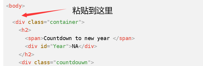
<body>
<div class="container">
<h2>
<span>Countdown to new year </span>
<div id="Year">NA</div>
</h2>
<div class="countdouwn">
<div id="day">NA</div>
<div id="hour">NA</div>
<div id="minute">NA</div>
<div id="second">NA</div>
</div>
</div>
</body>
</html>
上浮泡泡效果实现
采取HTML+CSS样式设计可以设计出泡泡的样式,最后在CSS中使用@keyframes rise 可以实现泡泡的上浮
HTML源码
复制如下源码粘贴到<body>标签的下方
<div class="bubble-container">
	<div class="bubble bubble-1"></div>
	<div class="bubble bubble-2"></div>
	<div class="bubble bubble-3"></div>
	<div class="bubble bubble-4"></div>
	<div class="bubble bubble-5"></div>
	<div class="bubble bubble-6"></div>
	<div class="bubble bubble-7"></div>
	<div class="bubble bubble-8"></div>
</div>
CSS源码
复制如下源码粘贴到<style></style>标签之间
.bubble-container{
     position: absolute;
     width: 100%;
     height: 100%;
     z-index: 0;
     overflow: hidden;
     top:0;
     left:0;
}

.bubble-container .bubble{
     position: absolute;
     bottom: -10rem;
     width:  4rem;
     height: 4rem;
     background-color: #f1f1f1;
     border-radius: 50%;
     opacity: .5;
     animation: rise 10s infinite ease-in;
}

.bubble-container .bubble-1 {
     width: 4rem;
     height: 4rem;
     left: 10%;
     animation: 8s;
}

.bubble-container .bubble-2 {
     width: 2rem;
     height: 2rem;
     left: 20%;
     animation-duration: 5s;
     animation-delay: 1s;
}

.bubble-container .bubble-3 {
     width: 5rem;
     height: 5rem;
     left: 35%;
     animation-duration: 7s;
     animation-delay: 2s;
}

.bubble-container .bubble-4 {
     width: 8rem;
     height: 8rem;
     left: 50%;
     animation-duration: 11s;
     animation-delay: 0s;
}

.bubble-container .bubble-5 {
     width: 3.5rem;
     height: 3,5rem;
     left: 55%;
     animation-duration: 6s;
     animation-delay: 1s;
}

.bubble-container .bubble-6 {
     width: 4.5rem;
     height: 4,5rem;
     left: 65%;
     animation-duration: 8s;
     animation-delay: 3s;
}

.bubble-container .bubble-7 {
     width: 9rem;
     height: 9rem;
     left: 75%;
     animation-duration: 12s;
     animation-delay: 2s;
}

.bubble-container .bubble-8{
     width: 2.5rem;
     height: 2.5rem;
     left: 80%;
     animation-duration: 6s;
     animation-delay: 2s;
}


@keyframes rise {
     0% {
         bottom: -10rem;
         transform: translateX(0);
     }
     50% {
         transform: translate(10rem);
     }
     100%{
         bottom: 1080px;
         transform: translateX(-20rem);
     }
}
倒计时代码原理实现
使用JAVASCRIPT嵌入到<script></script>标签之中,可以实现倒计时的效果,利用了计数器的原理获取下一年的时间和距离2023年剩余的时间
JAVASCRIPT源码
复制如下源码粘贴到<script></script>标签之间
    // 自动为下一年
    function newYear() {
      var Y = new Date().getFullYear() + 1
      var newDay = Y + '/1/1 00:00:00'
      var countDate = new Date(newDay);
      var now = new Date().getTime()
      gap = countDate - now;
      var second = 1000
      var minute = second * 60
      var hour = minute * 60
      var day = hour * 24

      var d = Math.floor(gap / day)
      var h = Math.floor((gap % day) / hour)
      var m = Math.floor((gap % hour) / minute)
      var s = Math.floor((gap % minute) / second)

      // 此处可删除
      d = addZero(d)
      h = addZero(h)
      m = addZero(m)
      s = addZero(s)
      // func end

      // 显示的年
      document.getElementById('Year').innerText = Y

      // 倒计时
      document.getElementById('day').innerText = d
      document.getElementById('hour').innerText = h
      document.getElementById('minute').innerText = m
      document.getElementById('second').innerText = s
    }

    // 数字小于10前面就加0
    function addZero(num) {
      return num < 10 ? '0' + num : num
    }

    setInterval(() => {
      newYear()
    }, 1000)
响应式布局设计
通过不同的媒介类型和条件定义样式表规则。媒介查询让CSS可以更精确作用于不同的媒介类型和同一媒介的不同条件。媒介查询的大部分媒介特性都接受min和max用于表达”大于或等于”和”小于或等于”。如:width会有min-width和max-width媒介查询可以被用在CSS中的@media和@import规则上,也可以被用在HTML和XML中。通过这个标签属性,我们可以很方便的在不同的设备下实现丰富的界面,特别是移动设备,将会运用更加的广泛。
CSS源码
复制如下源码粘贴到<style></style>标签之间,便可实现多分辨率下的完美显示!
@media screen and (max-width:1024px){
  *{
    margin: 0;
    padding: 0;
  }
  html{
    background: rgb(0,21,32);
  }
  .container{
    width: 100%;
    margin: 20% 0;
    padding: 0%;
    background: rgb(0,21,32);
  }
  .container div{
    margin: 0;
    color: #fff;
    line-height: normal;
  }
  .container h2 span{
    color: #fff;
    display: block;
    text-align: center;
    font-size: 1em;
  }
  .container h2:first-child div{
    font-size: 6em;
    text-align: center;
    margin: 10% 0;
  }

  .countdouwn{
    display: flex;
    justify-content: space-around;
    margin: 0;
  }
  .countdouwn div{
    width: 20%;
    height: 13vw;
    margin: 0 10px;
    line-height: 13vw;
    font-size: 2.3em;
    position: relative;
    text-align: center;
    background: #333333;
    color: #ffffff;
    font-weight: 500;
  }
  .countdouwn div:before{
    content:'';
    position: absolute;
    bottom: -30px;
    left: 0;
    width: 100%;
    height: 30px;
    background: #aaa;
    color: #333;
    font-size: .35em;
    line-height: 35px;
    font-weight: 300;
  }
  .countdouwn #day:before{
    content: 'Days';
  }

  .countdouwn #hour:before{
    content: 'Hours';
  }

  .countdouwn #minute:before{
    content: 'Minutes';
  }

  .countdouwn #second:before{
    content: 'Seconds';
  }
}
完整源码
各位小伙伴只需要复制以下所有源码然后新建一个html文件将源码复制进去,然后就可以直接运行了!
<!DOCTYPE html>
<html lang="en">

<head>
  <meta charset="UTF-8">
  <meta name="viewport" content="width=device-width, initial-scale=1.0">
  <meta http-equiv="X-UA-Compatible" content="ie=edge">
  <title>2023 countdown</title>
  <link rel="shortcut icon" type="image/jpg" href="NY.png"/>
  <link href="https://w.wallhaven.cc/full/3z/wallhaven-3z32j3.jpg" mce_href="favicon.ico" rel="icon" type="image/x-icon"/>
  <style>
      @import url("https://fonts.googleapis.com/css?family=Poppins&display=swap");
* {
  margin: 0;
  padding: 0;
  font-family: "Poppins", sans-serif;
}
@media screen and (min-width: 1025px) {
  body {
   background: linear-gradient(to bottom right, #50a3a2 0,#78cc6d 100%);
    background-attachment: fixed;
    background-blend-mode: hard-light;
  }

  .container {
    width: 80%;
    margin: 5% auto;
    padding: 11% 5%;
    background-attachment: fixed;
    display: flex;
    align-items: center;
    justify-content: center;
    flex-direction: column;
    background: linear-gradient(to bottom right, #50a3a2 0,#78cc6d 100%);
  }

  .container h2 {
    text-align: center;
    font-size: 10em;
    line-height: 0.7em;
    color: #fff;
    margin-top: -80px;
  }

  .container h2 span {
    display: block;
    font-weight: 400;
    letter-spacing: 6px;
    font-size: 0.2em;
  }

  .countdouwn {
    display: flex;
    margin-top: 50px;
  }

  .countdouwn div {
    position: relative;
    width: 100px;
    height: 100px;
    line-height: 100px;
    text-align: center;
    background: #333333;
    color: #ffffff;
    margin: 0 15px;
    font-size: 3em;
    font-weight: 500;
  }

  .countdouwn div:before {
    content: "";
    position: absolute;
    bottom: -30px;
    left: 0;
    width: 100%;
    height: 35px;
    background: #ff0;
    color: #333;
    font-size: 0.35em;
    line-height: 35px;
    font-weight: 300;
  }

  .countdouwn #day:before {
    content: "Days";
  }

  .countdouwn #hour:before {
    content: "Hours";
  }

  .countdouwn #minute:before {
    content: "Minutes";
  }

  .countdouwn #second:before {
    content: "Seconds";
  }
}

.bubble-container{
     position: absolute;
     width: 100%;
     height: 100%;
     z-index: 0;
     overflow: hidden;
     top:0;
     left:0;
}

.bubble-container .bubble{
     position: absolute;
     bottom: -10rem;
     width:  4rem;
     height: 4rem;
     background-color: #f1f1f1;
     border-radius: 50%;
     opacity: .5;
     animation: rise 10s infinite ease-in;
}

.bubble-container .bubble-1 {
     width: 4rem;
     height: 4rem;
     left: 10%;
     animation: 8s;
}

.bubble-container .bubble-2 {
     width: 2rem;
     height: 2rem;
     left: 20%;
     animation-duration: 5s;
     animation-delay: 1s;
}

.bubble-container .bubble-3 {
     width: 5rem;
     height: 5rem;
     left: 35%;
     animation-duration: 7s;
     animation-delay: 2s;
}

.bubble-container .bubble-4 {
     width: 8rem;
     height: 8rem;
     left: 50%;
     animation-duration: 11s;
     animation-delay: 0s;
}

.bubble-container .bubble-5 {
     width: 3.5rem;
     height: 3,5rem;
     left: 55%;
     animation-duration: 6s;
     animation-delay: 1s;
}

.bubble-container .bubble-6 {
     width: 4.5rem;
     height: 4,5rem;
     left: 65%;
     animation-duration: 8s;
     animation-delay: 3s;
}

.bubble-container .bubble-7 {
     width: 9rem;
     height: 9rem;
     left: 75%;
     animation-duration: 12s;
     animation-delay: 2s;
}

.bubble-container .bubble-8{
     width: 2.5rem;
     height: 2.5rem;
     left: 80%;
     animation-duration: 6s;
     animation-delay: 2s;
}


@keyframes rise {
     0% {
         bottom: -10rem;
         transform: translateX(0);
     }
     50% {
         transform: translate(10rem);
     }
     100%{
         bottom: 1080px;
         transform: translateX(-20rem);
     }
}

@media screen and (max-width:1024px){
  *{
    margin: 0;
    padding: 0;
  }
  body {
   background: linear-gradient(to bottom right, #50a3a2 0,#78cc6d 100%);
    background-attachment: fixed;
    background-blend-mode: hard-light;
  }
  .container{
    width: 100%;
    margin: 20% 0;
    padding: 0%;
   background: linear-gradient(to bottom right, #50a3a2 0,#78cc6d 100%);
  }
  .container div{
    margin: 0;
    color: #fff;
    line-height: normal;
  }
  .container h2 span{
    color:#fff;
    display: block;
    text-align: center;
    font-size: 1em;
  }
  .container h2:first-child div{
    font-size: 6em;
    text-align: center;
    margin: 10% 0;
  }

  .countdouwn{
    display: flex;
    justify-content: space-around;
    margin: 0;
     border-radius: 15px;
  }
  .countdouwn div{
    width: 20%;
    height: 13vw;
    margin: 0 10px;
    line-height: 13vw;
    font-size: 2.3em;
    position: relative;
    text-align: center;
    background: #333333;
    color: #ffffff;
    font-weight: 500;
    border-radius: 5px;
  }
  .countdouwn div:before{
    content:'';
    position: absolute;
    bottom: -30px;
    left: 0;
    width: 100%;
    height: 30px;
    background:  #ff0;
    color: #333;
    font-size: .35em;
    line-height: 35px;
    font-weight: 300;
     border-radius: 5px;
  }
  .countdouwn #day:before{
    content: 'Days';
     border-radius: 5px;
  }

  .countdouwn #hour:before{
    content: 'Hours';
  }

  .countdouwn #minute:before{
    content: 'Minutes';
  }

  .countdouwn #second:before{
    content: 'Seconds';
  }
}


  </style>
</head>

<body>
<div class="bubble-container">
	<div class="bubble bubble-1"></div>
	<div class="bubble bubble-2"></div>
	<div class="bubble bubble-3"></div>
	<div class="bubble bubble-4"></div>
	<div class="bubble bubble-5"></div>
	<div class="bubble bubble-6"></div>
	<div class="bubble bubble-7"></div>
	<div class="bubble bubble-8"></div>
</div>

  <div class="container">
    <h2>
      <span>Countdown to new year </span>
      <div id="Year">NA</div>
    </h2>
    <div class="countdouwn">
      <div id="day">NA</div>
      <div id="hour">NA</div>
      <div id="minute">NA</div>
      <div id="second">NA</div>
    </div>
  </div>
  <script>
    // 自动为下一年
    function newYear() {
      var Y = new Date().getFullYear() + 1
      var newDay = Y + '/1/1 00:00:00'
      var countDate = new Date(newDay);
      var now = new Date().getTime()
      gap = countDate - now;
      var second = 1000
      var minute = second * 60
      var hour = minute * 60
      var day = hour * 24

      var d = Math.floor(gap / day)
      var h = Math.floor((gap % day) / hour)
      var m = Math.floor((gap % hour) / minute)
      var s = Math.floor((gap % minute) / second)

      // 此处可删除
      d = addZero(d)
      h = addZero(h)
      m = addZero(m)
      s = addZero(s)
      // func end

      // 显示的年
      document.getElementById('Year').innerText = Y

      // 倒计时
      document.getElementById('day').innerText = d
      document.getElementById('hour').innerText = h
      document.getElementById('minute').innerText = m
      document.getElementById('second').innerText = s
    }

    // 数字小于10前面就加0
    function addZero(num) {
      return num < 10 ? '0' + num : num
    }

    setInterval(() => {
      newYear()
    }, 1000)
  </script>
</body>

</html>
写在最后的话
本文花费大量时间介绍了如何创建一个响应式布局的跨年倒计时代码,希望能帮助到各位小伙伴,码文不易,还望各位大佬们多多支持哦,你们的支持是我最大的动力!

✨ 原创不易,还希望各位大佬支持一下 \textcolor{blue}{原创不易,还希望各位大佬支持一下} 原创不易,还希望各位大佬支持一下
👍 点赞,你的认可是我创作的动力! \textcolor{9c81c1}{点赞,你的认可是我创作的动力!} 点赞,你的认可是我创作的动力!
⭐️ 收藏,你的青睐是我努力的方向! \textcolor{ed7976}{收藏,你的青睐是我努力的方向!} 收藏,你的青睐是我努力的方向!
✏️ 评论,你的意见是我进步的财富! \textcolor{98c091}{评论,你的意见是我进步的财富!} 评论,你的意见是我进步的财富!


