介绍鸿蒙高频知识点,持续更新中
一、鸿蒙代码结构
├──entry/src/main/ets        // 代码区
│  ├──common
│  │  └──Constant.ets        // 常量类
│  ├──entryability
│  │  └──EntryAbility.ts     // 程序入口类
│  ├──pages
│  │  ├──MainPage.ets        // 主页入口文件
│  │  └──WebPage.ets         // 抽奖页入口文件
│  └──viewmodel
│     └──NavigatorModel.ets  // 导航model
├──entry/src/main/resources
│  ├──base
│  │  ├──element             // 尺寸、颜色、文字等资源文件存放位置
│  │  ├──media               // 媒体资源存放位置
│  │  └──profile             // 页面配置文件存放位置
│  ├──en_US                  // 国际化英文
│  ├──rawfile                // 本地html代码存放位置
│  └──zh_CN                  // 国际化中文
└──HttpServerOfWeb           // 服务端代码
二、配置文件
1、module.json5
用于配置UIAbility页面模块信息。
位置:/entry/src/main/module.json5
{
  "module": {
    "name": "entry",//当前Module的名称
    "type": "entry",//Module的类型(entry:应用的主模块, feature:应用的动态特性模块)
    "description": "$string:module_desc",
    "mainElement": "EntryAbility",//标识当前Module的入口UIAbility名称或者ExtensionAbility名称。
    "deviceTypes": [//运行设备
      "phone",
      "tablet"
    ],
    "deliveryWithInstall": true,//标识当前Module是否在用户主动安装的时候安装,表示该Module对应的HAP是否跟随应用一起安装。
    "installationFree": false,//是否支持免安装特性
    "pages": "$profile:main_pages",//页面配置文件json
    "abilities": [//UIAbility的配置信息
      {
        "name": "EntryAbility",//当前UIAbility组件的名称,该名称在整个应用要唯一
        "srcEntry": "./ets/entryability/EntryAbility.ts",//入口UIAbility的路径
        "description": "$string:EntryAbility_desc",
        "icon": "$media:icon",//app图标
        "label": "$string:EntryAbility_label",//app
        "startWindowIcon": "$media:icon",//当前UIAbility组件启动页面图标(暂时没发现有啥用,与上面保持一致即可)
        "startWindowBackground": "$color:start_window_background",
        "exported": true,//当前UIAbility组件是否可以被其他应用调用
        "skills": [//能够接收的Want的特征集
          {
            "entities": [
              "entity.system.home"
            ],
            "actions": [
              "action.system.home"
            ]
          }
        ]
      }
    ]
  }
}
2、main_pages.json
页面列表json,对应上面module.json5的pages字段。
位置:/entry/src/main/resources/base/profile/main_pages.json
{
  "src": [
    "pages/SecondPage",
    "pages/SimpleVideoPlay",
    "pages/Index"
  ]
}
3、build-profile.json5
定制HAP多目标构建产物。
位置:entry/build-profile.json5
{
  "apiType": 'stageMode',
  "buildOption": {
  },
  "targets": [
    {
      "name": "default",
      "runtimeOS": "HarmonyOS"
    },
    {
      "name": "ohosTest",
    }
  ]
}
例如,以ArkTS Stage模型为例,定义一个免费版和付费版,示例如下。参考资料
{
  "apiType": 'stageMode',
  "buildOption": {
  },
  "targets": [
    {
      "name": "default"  //默认target名称default,未定义deviceType,默认支持config.json或module.json5中定义的设备类型
    },
    {
      "name": "free", //免费版target名称
      "config": {
        "deviceType": [  //定义free支持的设备类型为Tablet
          "tablet"
        ]
      }
    },
    {
      "name": "pay",//付费版target名称
      "config": {
        "deviceType": [  //定义pay支持的设备类型为Tablet
          "tablet"
        ]
      }
    }
  ]
}
4、oh-package.json5
描述项目基础信息
位置:entry/oh-package.json5
{
  "name": "entry",
  "version": "1.0.0",
  "description": "Please describe the basic information.",
  "main": "",
  "author": "",
  "license": "",
  "dependencies": {}
}
三、组件
1、Image
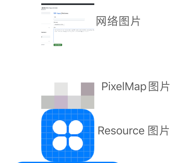
- 网络图片
需要在module.json5 文件中添加网络访问权限
"module": {
  "requestPermissions": [
    {"name": "ohos.permission.INTERNET"}
  ]
}
Image('https://gitcode.net/liuxingyuzaixian/csdn_img/-/raw/main/pictures/2023/11/17_10_51_42_image-20230518181509168.png')
  .width(78)
  .height(78)
  .objectFit(ImageFit.Cover)//设置缩放类型
- PixelMap 图片
代码生成的色块图片,需要创建PixelMap对象
@State myPixelmap?: PixelMap = null

onPageShow() {
  // 创建PixelMap图片
  const color = new ArrayBuffer(56);
  let opts = { editable: true, pixelFormat: 3, size: { height: 4, width: 6 } }
  image.createPixelMap(color, opts, (err, pixelmap) => {
    if (pixelmap != undefined) {
      this.myPixelmap = pixelmap;
    }
  })
}

// 使用
if (this.myPixelmap != null)
  Image(this.myPixelmap).width(78).height(78)
- Resource 图片
需要将图片添加到下面目录:/resources/base/media
// 使用
Image($r('app.media.icon')).width(78).height(78)
2、Text
Text($r('app.string.module_desc'))
  .fontSize(50)
  .fontWeight(FontWeight.Bold)
  .fontColor(0xFF0000)
  .maxLines(1)
  .textOverflow({ overflow: TextOverflow.Ellipsis })//单行...
  .decoration({ type: TextDecorationType.Underline, color: Color.Black })//文本装饰线
1、数字默认单位: vp
2、vp :屏幕密度相关像素
3、sp:文本推荐
3、TextInput
单行文本输入
TextInput({ placeholder: "账号" })
  .maxLength(11)
  .type(InputType.Number)
  .onChange((value: string) => {

  })
4、Button
Button("登录", { type: ButtonType.Capsule })
  .onClick(() => {

  })
5、Column、Row
用法语 flutter 一样,仅仅多了space参数方便添加间距
Column({ space: 10 }) {
  Text("asdf")
  Text("asdf")
}.alignItems(HorizontalAlign.Start)
6、List
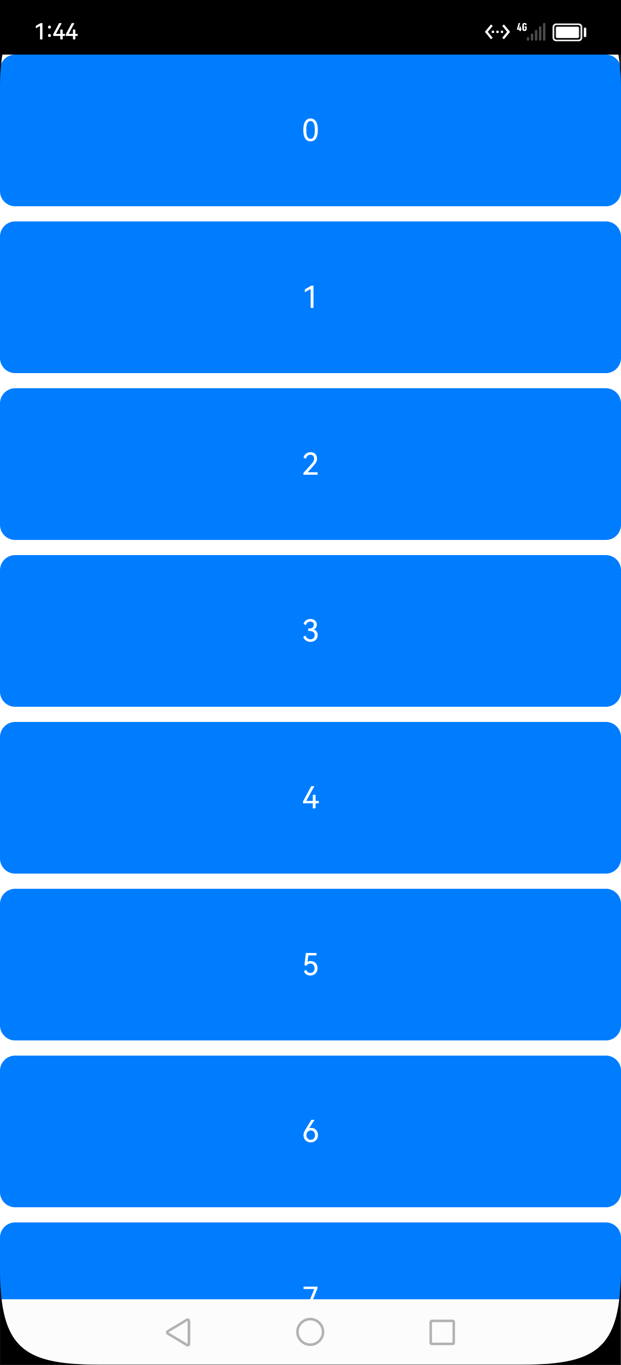
如果长度超过容器高度,就会滚动
private arr: number[] = [0, 1, 2, 3, 4, 5, 6, 7, 8, 9]

List({ space: 10 }) {
  ForEach(this.arr, (item: number) => {
    ListItem() {
      Text(`${item}`)
        .width('100%')
        .height(100)
        .fontSize(20)
        .fontColor(Color.White)
        .textAlign(TextAlign.Center)
        .borderRadius(10)
        .backgroundColor(0x007DFF)
    }
  }, item => item)
}
.height('100%')
7、Grid
构建如下不可滚动网格示例
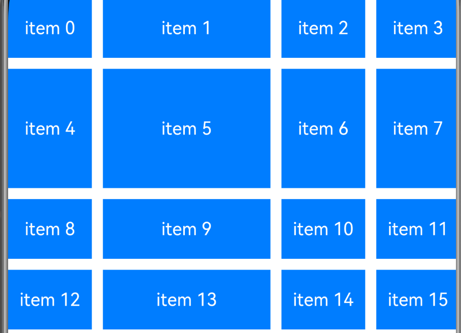
Grid() {
  ForEach(this.arr, (item: string) => {
    GridItem() {
      Text(item)
        .fontSize(16)
        .fontColor(Color.White)
        .backgroundColor(0x007DFF)
        .width('100%')
        .height('100%')
        .textAlign(TextAlign.Center)
    }
  }, item => item)
}
.columnsTemplate('1fr 2fr 1fr 1fr') // 设置当前网格布局列的数量。
.rowsTemplate('1fr 2fr 1fr 1fr') // 设置当前网格布局行的数量。
.columnsGap(10) // 设置列与列的间距。
.rowsGap(10) // 设置行与行的间距。
.height(300)
如果需要垂直方向滚动,则关闭掉rowsTemplate即可,如下:
Grid() {
  ForEach(this.arr, (item: string) => {
    GridItem() {
      Text(item)
        .fontSize(16)
        .fontColor(Color.White)
        .backgroundColor(0x007DFF)
        .width(50)
        .height(50)
        .textAlign(TextAlign.Center)
    }
  }, item => item)
}
.direction(Direction.Ltr)
.columnsTemplate('1fr 2fr 1fr 1fr') // 设置当前网格布局列的数量。
// .rowsTemplate('1fr 2fr 1fr 1fr') // 设置当前网格布局行的数量。
.columnsGap(10) // 设置列与列的间距。
.rowsGap(10) // 设置行与行的间距。
.height(300)
.onScrollIndex((first: number) => {
  console.info('first:' + first)
})
8、Tabs
使用系统自带的样式:不带图片
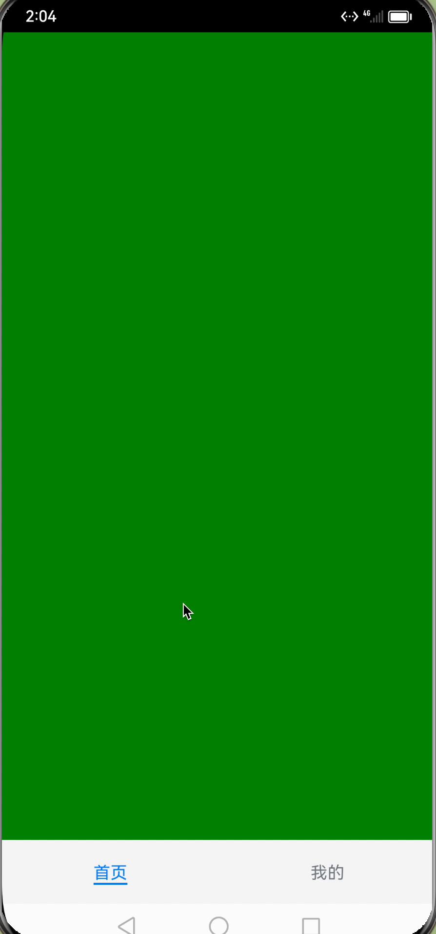
private controller: TabsController = new TabsController()

Column() {
  Tabs({ barPosition: BarPosition.End, controller: this.controller }) {
    TabContent() {
      Column().width('100%').height('100%').backgroundColor(Color.Green)
    }
    .tabBar('首页')

    TabContent() {
      Column().width('100%').height('100%').backgroundColor(Color.Blue)
    }
    .tabBar('我的')
  }
  .barMode(BarMode.Fixed)//页签比较多的时候,可以设置滑动页签Scrollable
  .barWidth('100%') // 设置TabBar宽度
  .barHeight(60) // 设置TabBar高度
  .width('100%') // 设置Tabs组件宽度
  .height('100%') // 设置Tabs组件高度
  .backgroundColor(0xF5F5F5) // 设置Tabs组件背景颜色
  .vertical(false)//注意:这个表示底部的 tab 排列方向(与页面与 tab 的排列方向刚好相反)
}
.width('100%')
.height('100%')
自定义样式:带图片。tabBar组件支持@Builder装饰器修饰的函数
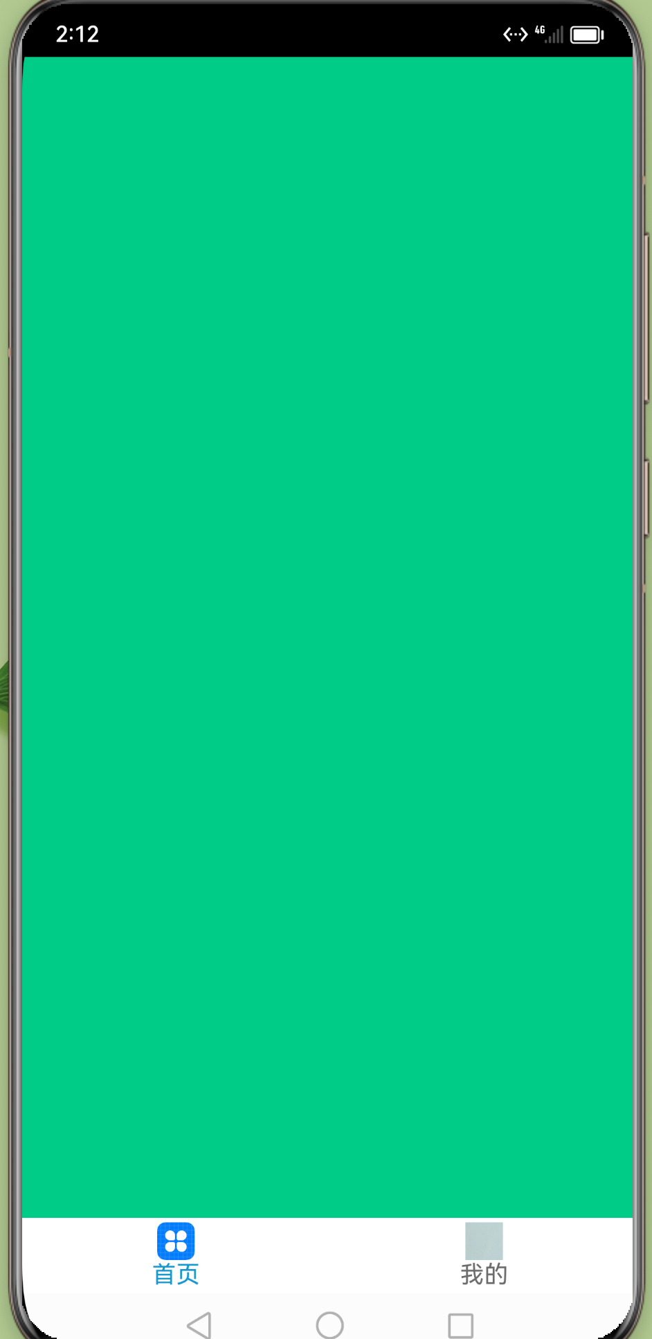
struct Index {
  @State currentIndex: number = 0;
  private tabsController: TabsController = new TabsController();

  @Builder TabBuilder(title: string, targetIndex: number, selectedImg: Resource, normalImg: Resource) {
    Column() {
      Image(this.currentIndex === targetIndex ? selectedImg : normalImg)
        .size({ width: 25, height: 25 })
      Text(title)
        .fontColor(this.currentIndex === targetIndex ? '#1698CE' : '#6B6B6B')
    }
    .width('100%')
    .height(50)
    .justifyContent(FlexAlign.Center)
    .onClick(() => {
      this.currentIndex = targetIndex;
      this.tabsController.changeIndex(this.currentIndex);
    })
  }

  build() {
    Tabs({ barPosition: BarPosition.End, controller: this.tabsController }) {
      TabContent() {
        Column().width('100%').height('100%').backgroundColor('#00CB87')
      }
      .tabBar(this.TabBuilder('首页', 0, $r('app.media.icon'), $r('app.media.test')))

      TabContent() {
        Column().width('100%').height('100%').backgroundColor('#007DFF')
      }
      .c(this.TabBuilder('我的', 1, $r('app.media.icon'), $r('app.media.test')))
    }
    .barWidth('100%')
    .barHeight(50)
    .onChange((index: number) => {
      this.currentIndex = index;
    })
  }
}
9、Swiper
Swiper() {
  Image($r('app.media.video_list0'))
    .borderRadius(12).objectFit(ImageFit.Contain)
  Image($r('app.media.video_list0'))
    .borderRadius(12).objectFit(ImageFit.Contain)
  Image($r('app.media.video_list0'))
    .borderRadius(12).objectFit(ImageFit.Contain)
}
.autoPlay(true)
10、Slider进度条
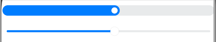
@State slidingProgress: number = 0;

// 样式 1
Slider({
  value: this.slidingProgress,
  style: SliderStyle.InSet,
})
  .onChange((value: number, mode: SliderChangeMode) => {
    this.slidingProgress = Math.floor(value);
  })
// 样式 2
Slider({
  value: this.slidingProgress,
  style: SliderStyle.OutSet,
})
  .onChange((value: number, mode: SliderChangeMode) => {
    this.slidingProgress = Math.floor(value);
  })
11、Video
1、加载本地
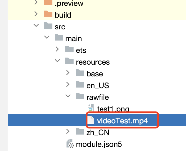
需要先在rawfile中添加videoTest.mp4文件
Video({
  src: $rawfile('videoTest.mp4'),
  previewUri: $r('app.media.icon'),
})
效果图如下

2、加载网络视频
src换成网络视频即可,并且添加网络权限。
需要注意的是:
1、目前我使用鸿蒙模拟器对网络视频的加载体验并不好
2、网络加载器点击播放的时候需要一段下载时间,最好加上loading
Video({
  src: "http://clips.vorwaerts-gmbh.de/big_buck_bunny.mp4",
  previewUri: $r('app.media.icon'),
})
  .objectFit(ImageFit.Contain)
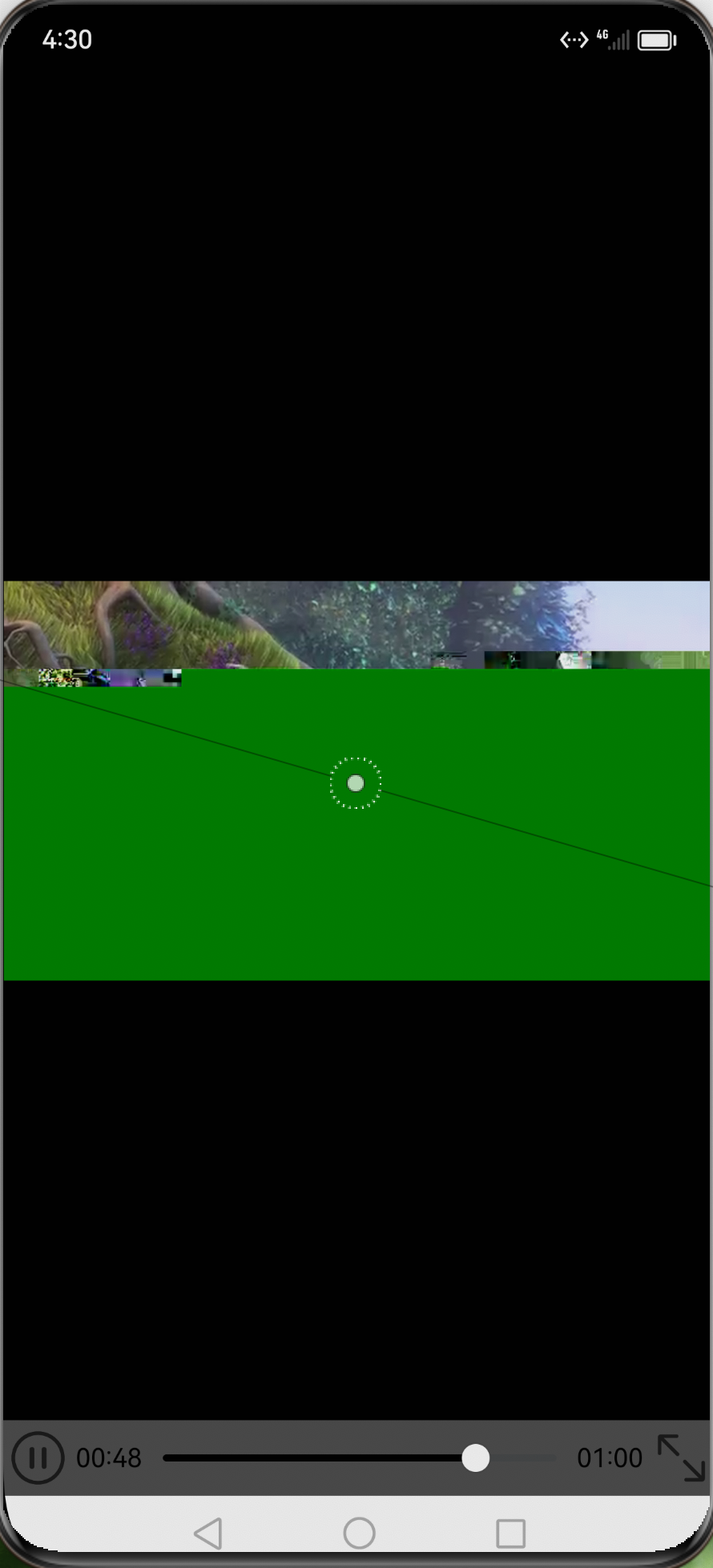
3、自定义Video

Button("dianji").onClick(()=>{
  router.pushUrl({
    url: 'pages/SimpleVideoPlay',
    params: { source: $rawfile('videoTest.mp4') }//添加视频资源
  });
})
自定义Video页面SimpleVideoPlay.ets
需要额外不上这些icon
ic_back.png
ic_pause.png
ic_play.png
ic_public_play.png
import router from '@ohos.router';
import { VideoPlayer } from './VideoPlayer';

/**
 * 自定义Video页面
 */
@Entry
@Component
struct Play {
  private source: string = (router.getParams() as Record<string, Object>).source as string;
  private startIconResource: Resource = $r('app.media.ic_public_play');
  private backIconResource: Resource = $r('app.media.ic_back');
  @Provide isPlay: boolean = false;
  @Provide isOpacity: boolean = false;
  controller: VideoController = new VideoController();
  @Provide isLoading: boolean = false;
  @Provide progressVal: number = 0;
  @Provide flag: boolean = false;

  aboutToAppear() {
    this.source;
  }

  onPageHide() {
    this.controller.pause();
  }

  build() {
    Column() {
      Row() {
        Image(this.backIconResource)
          .width(24)
          .height(24)
          .margin({ left: 24 })
          .onClick(() => {
            router.back();
          })
        Text('返回')
          .fontColor(Color.White)
          .fontSize(24)
          .fontWeight(500)
          .margin({ left: 12 })
      }
      .width('100%')
      .margin({
        left: 12,
        top: 12
      })
      .justifyContent(FlexAlign.Start)

      Stack() {
        if (!this.isPlay && !this.isLoading) {
          Image(this.startIconResource)
            .width(50)
            .height(50)
            .zIndex(2)
        }
        if (this.isLoading) {
          Progress({
            value: 0,
            total: 100,
            type: ProgressType.ScaleRing
          })
            .color(Color.Grey)
            .value(this.progressVal)
            .width(80)
            .style({
              strokeWidth: 15,
              scaleCount: 15,
              scaleWidth: 5
            })
            .zIndex(1)
        }
        VideoPlayer({
          source: this.source,
          controller: this.controller
        })
          .zIndex(0)
      }
    }
    .height('100%')
    .backgroundColor(Color.Black)
  }
}
滑块VideoPlaySlider.ets
/**
 * video slider component
 */
@Component
export struct VideoSlider {
  @Consume isOpacity: boolean;
  private controller: VideoController = new VideoController();
  @Consume currentStringTime: string;
  @Consume currentTime: number;
  @Consume durationTime: number;
  @Consume durationStringTime: string;
  @Consume isPlay: boolean;
  @Consume flag: boolean;
  @Consume isLoading: boolean;
  @Consume progressVal: number;

  build() {
    Row({ space: 12 }) {
      Image(this.isPlay ? $r('app.media.ic_pause') : $r('app.media.ic_play'))
        .width(24)
        .height(24)
        .margin({ left: 12 })
        .onClick(() => {
          this.iconOnclick();
        })
      Text(this.currentStringTime)
        .fontSize(16)
        .fontColor(Color.White)
        .margin({ left: 12 })
      Slider({
        value: this.currentTime,
        min: 0,
        max: this.durationTime,
        step: 1,
        style: SliderStyle.OutSet
      })
        .blockColor("#FFFFFF")
        .width('46.7%')
        .trackColor(Color.Gray)
        .selectedColor("#FFFFFF")
        .showSteps(true)
        .showTips(true)
        .trackThickness(this.isOpacity ? 2 : 4)
        .onChange((value: number, mode: SliderChangeMode) => {
          this.sliderOnchange(value, mode);
        })
      Text(this.durationStringTime)
        .fontSize(16)
        .margin({ right: 12 })
        .fontColor(Color.White)
    }
    .opacity(this.isOpacity ? Number.parseFloat('0.2') : 1)
    .width('100%')
    .alignItems(VerticalAlign.Center)
    .justifyContent(FlexAlign.Center)
  }

  /**
   * icon onclick callback
   */
  iconOnclick() {
    if (this.isPlay === true) {
      this.controller.pause()
      this.isPlay = false;
      this.isOpacity = false;
      return;
    }
    if (this.flag === true) {
      this.controller.start();
      this.isPlay = true;
      this.isOpacity = true;
    } else {
      this.isLoading = true;
      // The video loading is not complete. The loading action is displayed.
      let intervalLoading = setInterval(() => {
        if (this.progressVal >= 100) {
          this.progressVal = 0;
        } else {
          this.progressVal += 10;
        }
      }, 100)
      // The scheduled task determines whether the video loading is complete.
      let intervalFlag = setInterval(() => {
        if (this.flag === true) {
          this.controller.start();
          this.isPlay = true;
          this.isOpacity = true;
          this.isLoading = false;
          clearInterval(intervalFlag);
          clearInterval(intervalLoading);
        }
      }, 100);
    }
  }

  /**
   * video slider component onchange callback
   */
  sliderOnchange(value: number, mode: SliderChangeMode) {
    this.currentTime = Number.parseInt(value.toString());
    this.controller.setCurrentTime(Number.parseInt(value.toString()), SeekMode.Accurate);
    if (mode === SliderChangeMode.Begin || mode === SliderChangeMode.Moving) {
      this.isOpacity = false;
    }
    if (mode === SliderChangeMode.End) {
      this.isOpacity = true;
    }
  }
}
Video组件封装VideoPlayer.ets
import prompt from '@ohos.promptAction';
import { VideoSlider } from './VideoPlaySlider';
export function changeSliderTime(value: number): string {
  let second: number = value % 60;
  let min: number = Number.parseInt((value / 60).toString());
  let head = min < 10 ? `${'0'}${min}` : min;
  let end = second < 10 ? `${'0'}${second}` : second;
  let nowTime = `${head}${':'}${end}`;
  return nowTime;
}

/**
 * video controller component
 */
@Component
export struct VideoPlayer {
  private source: string | Resource = '';
  private controller: VideoController = new VideoController();
  private previewUris: Resource = $r('app.media.icon');
  @Provide currentTime: number = 0;
  @Provide durationTime: number = 0;
  @Provide durationStringTime: string = '00:00';
  @Provide currentStringTime: string = '00:00';
  @Consume isPlay: boolean;
  @Consume isOpacity: boolean;
  @Consume flag: boolean;
  @Consume isLoading: boolean;
  @Consume progressVal: number;

  build() {
    Column() {
      Video({
        src: this.source,
        previewUri: this.previewUris,
        controller: this.controller
      })
        .width('100%')
        .height('88%')
        .controls(false)
        .autoPlay(false)
        .objectFit(ImageFit.Contain)
        .loop(false)
        .onUpdate((event) => {
          if (event) {
            this.currentTime = event.time;
            this.currentStringTime = changeSliderTime(this.currentTime);
          }
        })
        .onPrepared((event) => {
          this.prepared(event?.duration);
        })
        .onFinish(() => {
          this.finish();
        })
        .onError(() => {
          prompt.showToast({
            duration: 5000,
            message: '请检查网络'
          });
        })
      VideoSlider({ controller: this.controller })
    }
  }

  /**
   * video component prepared callback
   */
  prepared(duration: number) {
    this.durationTime = duration;
    let second: number = duration % 60;
    let min: number = Number.parseInt((duration / 60).toString());
    let head = min < 10 ? `${'0'}${min}` : min;
    let end = second < 10 ? `${'0'}${second}` : second;
    this.durationStringTime = `${head}${':'}${end}`;
    this.flag = true;
  }

  /**
   * video component finish callback
   */
  finish() {
    this.isPlay = false;
    this.isOpacity = false;
  }
}
12、Web
1、Web组件使用
struct Index {
  controller: WebController = new WebController();

  build() {
    Column() {
      // 加载网页
      Web({ src: 'https://developer.harmonyos.com/', controller: this.controller })
      // 加载本地html
      // Web({ src: $rawfile('index.html'), controller: this.controller })
    }
  }
}
2、Web与js交互
下面示例中:
1、打开App,html回调confirm方法
2、点击按钮,app调用html的test方法
鸿蒙页面使用如下
struct Index {
  controller: WebController = new WebController();

  build() {
    Column() {
      // 鸿蒙调用html的方法
      Button("鸿蒙按钮").onClick(() => {
        this.controller.runJavaScript({
          script: 'test()',
          callback: (result: string) => {
            prompt.showToast({
              duration: 5000,
              message: result
            });
          } });
      })
      Web({ src: $rawfile('index.html'), controller: this.controller })
        .javaScriptAccess(true)
        // 鸿蒙对外方法
        .onConfirm((event) => {
          AlertDialog.show({
            title: 'title',
            message: event.message,
            confirm: {
              value: 'onAlert',
              action: () => {
                event.result.handleConfirm();
              }
            },
            cancel: () => {
              event.result.handleCancel();
            }
          })
          return true;
        })
        // 输出js的日志
        .onConsole((event) => {
          console.log('getMessage:' + event.message.getMessage());
          console.log('getMessageLevel:' + event.message.getMessageLevel());
          return false;
        })
    }
  }
}
html使用如下
<!DOCTYPE html>
<html>
<meta charset="utf-8">
<body>
</body>
<script type="text/javascript">
  <!--js回调鸿蒙的方法-->
  confirm("confirm message from html")
  <!--js对外方法-->
  function test() {
      return "This value is from index.html"
  }

</script>
</html>
四、鸿蒙api
1、UIAbility启动模式
UIAbility当前支持singleton(单实例模式)、multiton(多实例模式)和specified(指定实例模式)3种启动模式
- singleton(单实例模式)
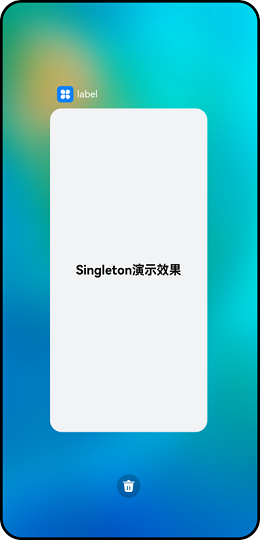
如果应用进程中该类型的UIAbility实例已经存在,则复用系统中的UIAbility实例.
在module.json5配置文件中的"launchType"字段配置为"singleton"即可。
{
  "module": {
    // ...
    "abilities": [
      {
        "launchType": "singleton",
        // ...
      }
    ]
  }
}
- standard(标准实例模式)
每次调用startAbility()方法时,都会在应用进程中创建一个新的该类型UIAbility实例。即在最近任务列表中可以看到有多个该类型的UIAbility实例。
"launchType": "standard",
- specified(指定实例模式)
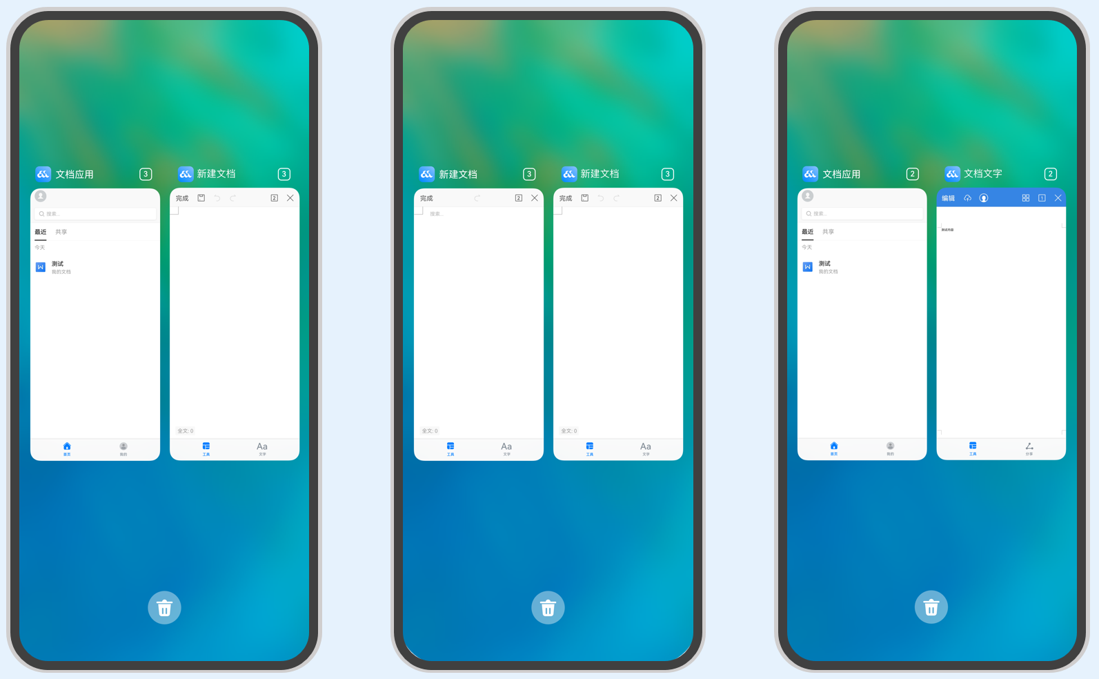
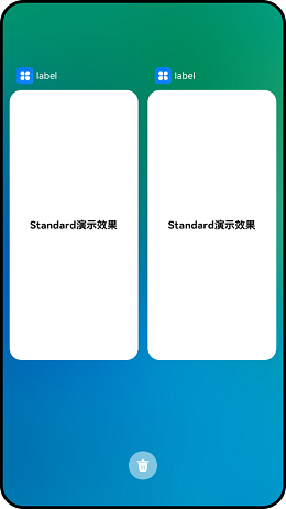
针对一些特殊场景使用(例如文档应用中每次新建文档希望都能新建一个文档实例,重复打开一个已保存的文档希望打开的都是同一个文档实例)
"launchType": "specified",
2、UIAbility组件生命周期
UIAbility的生命周期包括Create、Foreground、Background、Destroy四个状态
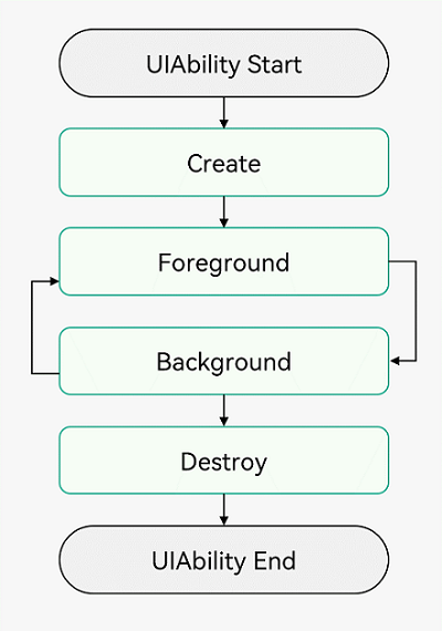
需要注意的是:UIAbility没有WindowStageCreate、WindowStageDestroy,这两个是WindowStage的生命周期。
UIAbility实例创建完成之后,在进入Foreground之前,系统会创建一个WindowStage。WindowStage创建完成后会进入onWindowStageCreate()回调,可以在该回调中设置UI界面加载、设置WindowStage的事件订阅。

3、toast
import prompt from '@ohos.promptAction';

Button("点击toast").onClick(() => {
  prompt.showToast({
    duration: 5000,
    message: '点击toast'
  });
})
4、Preferences存储
注意:初始化需要await,并且需要context参数,建议在EntryAbility的onCreate方法中
await sharePreferenceUtil.init(this.context);
import dataPreferences from '@ohos.data.preferences';

const KEY_APP_FONT_SIZE = 'appFontSize';
/**
 * SP工具类
 */
export class SharePreferenceUtil {
  preferences: dataPreferences.Preferences;

  // 初始化(注意:初始化是异步方法,需要await)
  async init(context: Context) {
    this.preferences = await dataPreferences.getPreferences(context, 'myPreferences');
  }

  // 存储
  saveDefaultFontSize(fontSize: number) {
    this.preferences.has(KEY_APP_FONT_SIZE).then(async (isExist: boolean) => {
      if (!isExist) {
        await this.preferences.put(KEY_APP_FONT_SIZE, fontSize);
        this.preferences.flush();
      }
    }).catch((err: Error) => {
    });
  }

  // 更新
  async saveChangeFontSize(fontSize: number) {
    await this.preferences.put(KEY_APP_FONT_SIZE, fontSize);
    this.preferences.flush();
  }

  // 获取
  async getChangeFontSize() {
    let fontSize: number = 0;
    fontSize = await this.preferences.get(KEY_APP_FONT_SIZE, fontSize) as number;
    return fontSize;
  }

  // 删除
  async deleteChangeFontSize() {
    let deleteValue = this.preferences.delete(KEY_APP_FONT_SIZE);
    deleteValue.then(() => {
    }).catch((err: Error) => {
    });
  }
}

const sharePreferenceUtil = new SharePreferenceUtil();

export default sharePreferenceUtil;
五、状态管理与数据同步
1、组件状态管理装饰器和@Builder装饰器:
组件状态管理装饰器用来管理组件中的状态,它们分别是:@State、@Prop、@Link。
- @State装饰的变量是组件内部的状态数据,当这些状态数据被修改时,将会调用所在组件的build方法进行UI刷新。
- @Prop与@State有相同的语义,但初始化方式不同。@Prop装饰的变量必须使用其父组件提供的@State变量进行初始化,允许组件内部修改@Prop变量,但更改不会通知给父组件,即@Prop属于单向数据绑定。
- @Link装饰的变量可以和父组件的@State变量建立双向数据绑定,需要注意的是:@Link变量不能在组件内部进行初始化。
- @Builder装饰的方法用于定义组件的声明式UI描述,在一个自定义组件内快速生成多个布局内容。
组件内的状态管理:@State
从父组件单向同步状态:@Prop
与父组件双向同步状态:@Link
监听状态变化:@Watch
跨组件层级双向同步状态:@Provide和@Consume
1、父页面同步数据给子页面:@Prop
2、子页面同步数据给父页面:@Link
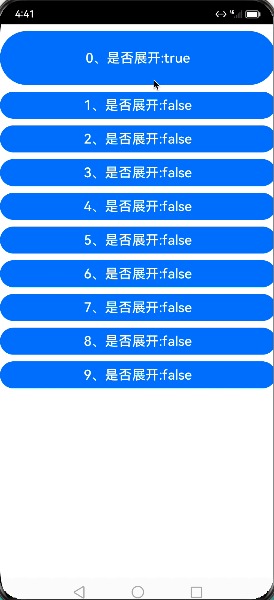
下面示例中
1、父组件把clickIndex通过 Props 传递给子页面
2、点击子组件后,通过 Link 把修改后的clickIndex值传递给页面
3、其余子组件 Watch 了clickIndex,并同时修改组件中的isExpanded值
页面
Index.ets
import TestItem from './TestItem';

@Entry
@Component
struct Index {
  private arr: number[] = [0, 1, 2, 3, 4, 5, 6, 7, 8, 9]
  @State clickIndex: number = -1;

  build() {
    Column() {
      ForEach(this.arr, (item: number, index: number) => {
        TestItem({
          index: this.arr[index], //@Prop传递给子组件数据
          clickIndex: $clickIndex, //@Link双向绑定数据
        })
      }, item => item)
    }
    .width('100%')
    .height('100%')
  }
}
组件
TestItem.ets
@Component
export default struct TestItem {
  @Prop index: number; //当前 item 序号
  @State isExpanded: boolean = false; //当前是否展开
  // @Link修饰是为了同步数据到父组件,@Watch是为了监听回调给onClickIndexChanged
  @Link @Watch('onClickIndexChanged') clickIndex: number; //点击的序号

  onClickIndexChanged() {
    this.isExpanded = this.clickIndex == this.index;
  }

  build() {
    Button(this.index + '、是否展开:' + this.isExpanded)
      .width('100%')
      .height(this.isExpanded ? 80 : 40)
      .fontSize(20)
      .fontColor(Color.White)
      .borderRadius(10)
      .backgroundColor(0x007DFF)
      .margin({ top: 10 })
      .onClick(() => {
        this.clickIndex = this.index;
      })
  }
}
2、子组件callback 回调父页面
子组件声明callback 方法
// 组件
@Component
export default struct TestItem {
  callback?: (index: number) => void;

  build() {
    Button('子组件')
      .width('100%')
      .height(40)
      .fontSize(20)
      .fontColor(Color.White)
      .borderRadius(10)
      .backgroundColor(0x007DFF)
      .onClick(() => {
        // this.clickIndex = this.index;
        if (this.callback !== undefined) {
          this.callback(123)
        }
      })
  }
}
父页面传入callback方法
TestItem({
  callback: (index:number): void => {
    console.warn("index:",index)
  }
})
六、弹窗
1、警告弹窗AlertDialog

AlertDialog.show(
  {
    title: '删除联系人', // 标题
    message: '是否需要删除所选联系人?', // 内容
    autoCancel: false, // 点击遮障层时,是否关闭弹窗。
    alignment: DialogAlignment.Bottom, // 弹窗在竖直方向的对齐方式
    offset: { dx: 0, dy: -20 }, // 弹窗相对alignment位置的偏移量
    primaryButton: {
      value: '取消',
      action: () => {
      }
    },
    secondaryButton: {
      value: '删除',
      fontColor: '#D94838',
      action: () => {
      }
    },
    cancel: () => { // 点击遮障层关闭dialog时的回调
    }
  }
)
2、文本选择弹窗TextPickerDialog
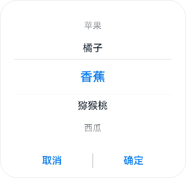
@State select: number = 2;
private fruits: string[] = ['苹果', '橘子', '香蕉', '猕猴桃', '西瓜'];

TextPickerDialog.show({
  range: this.fruits, // 设置文本选择器的选择范围
  selected: this.select, // 设置初始选中项的索引值。
  onAccept: (value: TextPickerResult) => { // 点击弹窗中的“确定”按钮时触发该回调。
    // 设置select为按下确定按钮时候的选中项index,这样当弹窗再次弹出时显示选中的是上一次确定的选项
    this.select = value.index;
    console.info("TextPickerDialog:onAccept()" + JSON.stringify(value));
  },
  onCancel: () => { // 点击弹窗中的“取消”按钮时触发该回调。
    console.info("TextPickerDialog:onCancel()");
  },
  onChange: (value: TextPickerResult) => { // 滑动弹窗中的选择器使当前选中项改变时触发该回调。
    console.info("TextPickerDialog:onChange()" + JSON.stringify(value));
  }
})
3、日期滑动选择弹窗DatePickerDialog
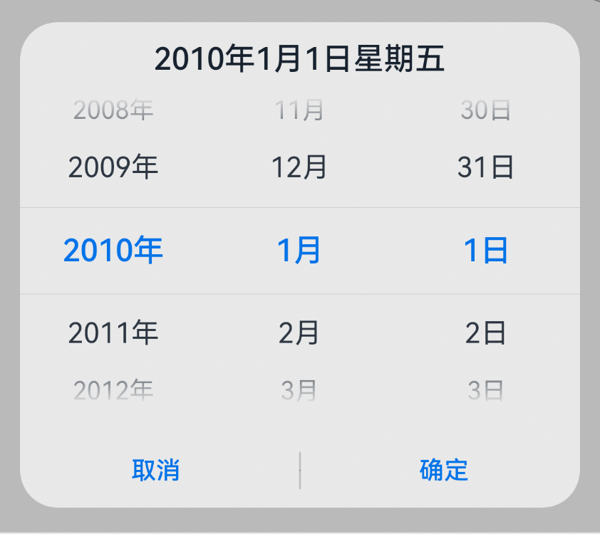
selectedDate: Date = new Date("2010-1-1")

DatePickerDialog.show({
  start: new Date("1900-1-1"), // 设置选择器的起始日期
  end: new Date("2023-12-31"), // 设置选择器的结束日期
  selected: this.selectedDate, // 设置当前选中的日期
  lunar: false,
  onAccept: (value: DatePickerResult) => { // 点击弹窗中的“确定”按钮时触发该回调
    // 通过Date的setFullYear方法设置按下确定按钮时的日期,这样当弹窗再次弹出时显示选中的是上一次确定的日期
    this.selectedDate.setFullYear(value.year, value.month, value.day)
    console.info("DatePickerDialog:onAccept()" + JSON.stringify(value))
  },
  onCancel: () => { // 点击弹窗中的“取消”按钮时触发该回调
    console.info("DatePickerDialog:onCancel()")
  },
  onChange: (value: DatePickerResult) => { // 滑动弹窗中的滑动选择器使当前选中项改变时触发该回调
    console.info("DatePickerDialog:onChange()" + JSON.stringify(value))
  }
})
4、自定义弹窗
通过装饰器@CustomDialog定义的组件来实现,然后结合CustomDialogController来控制自定义弹窗的显示和隐藏。
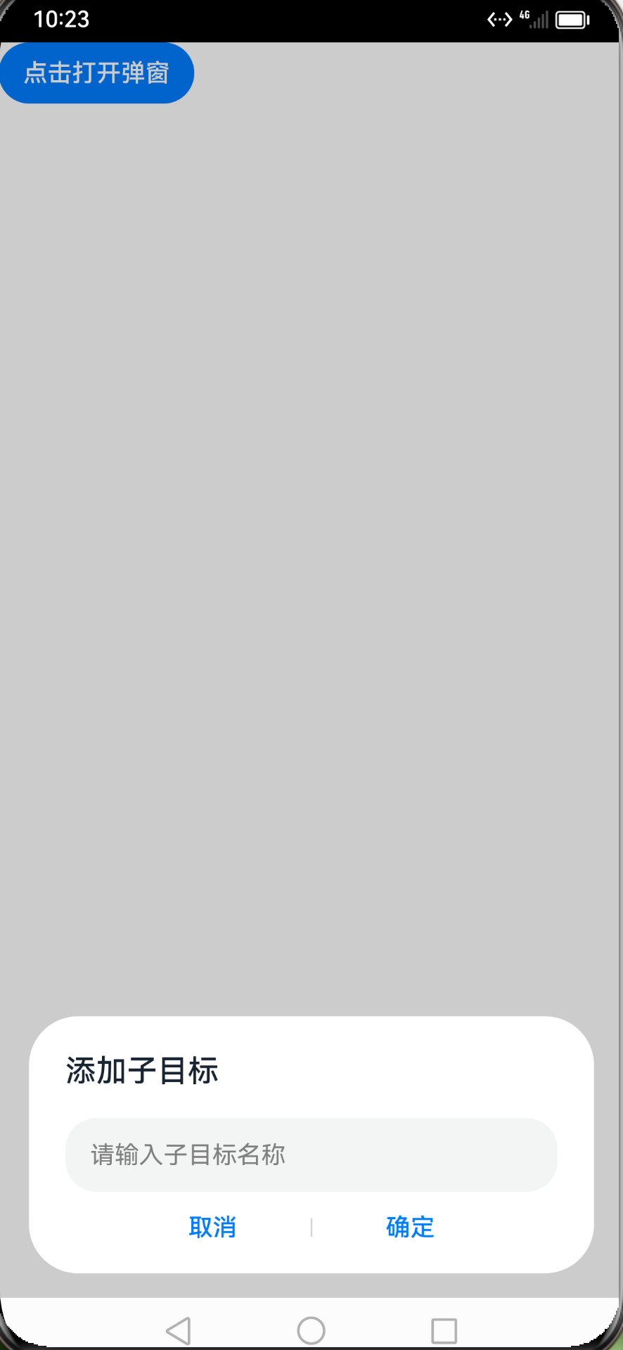
弹窗组件AddTargetDialog.ets绘制
@CustomDialog
export default struct AddTargetDialog {
  @State subtaskName: string = '';
  private controller?: CustomDialogController;
  onClickOk?: (value: string) => void;

  build() {
    Column() {
      Text('添加子目标')
        .width('100%')
        .fontSize('20fp')
        .fontWeight(500)
        .fontColor('#182431')
        .textAlign(TextAlign.Start)
      TextInput({ placeholder: '请输入子目标名称'})
        .placeholderColor(Color.Grey)
        .placeholderFont({ size: '16fp'})
        .caretColor(Color.Blue)
        .backgroundColor('#0D182431')
        .width('100%')
        .height('40%')
        .margin({ top: '6%' })
        .fontSize('16fp')
        .fontColor("#182431")
        .onChange((value: string) => {
          this.subtaskName = value;
        })
      Blank()
      Row() {
        Button('取消')
          .dialogButtonStyle()
          .onClick(() => {
            this.controller?.close();
          })
        Divider()
          .vertical(true)
        Button('确定')
          .dialogButtonStyle()
          .onClick(() => {
            if (this.onClickOk !== undefined) {
              this.onClickOk(this.subtaskName);
            }
          })
      }
      .width('70%')
      .height('10%')
      .justifyContent(FlexAlign.SpaceBetween)
    }
    .padding('24vp')
    .height('168vp')
    .width('90.3%')
    .borderRadius(32)
    .backgroundColor(Color.White)
  }
}

/**
 * Custom button style.
 */
@Extend(Button) function dialogButtonStyle() {
  .fontSize('16fp')
  .height('32vp')
  .width('96vp')
  .backgroundColor(Color.White)
  .fontColor('#007DFF')
}
页面使用
@Entry
@Component
struct Index {
  dialogController: CustomDialogController = new CustomDialogController({
    builder: AddTargetDialog({
      onClickOk: (value: string): void => {
        console.warn("value:",value)
        this.dialogController.close();// 关闭
      }
    }),
    alignment: DialogAlignment.Bottom,
    offset: {
      dx: 0,
      dy: '-16vp'
    },
    customStyle: true,
    autoCancel: false
  });

  build() {
    Button("点击打开弹窗").onClick(()=>{
      this.dialogController.open()// 打开
    })
  }
}
七、动画
添加animation属性就好,由State驱动。

struct Index {
  @State iconWidth: number = 30;

  onPageShow() {
    this.iconWidth = 90;
  }

  build() {
    Column() {
      Image($r('app.media.icon'))
        .width(this.iconWidth)
        .margin(10)
        .objectFit(ImageFit.Contain)
        .animation({
          duration: 2000,
          tempo: 3.0, //动画的播放速度
          delay: 0,
          curve: Curve.Linear,
          playMode: PlayMode.Normal,
          iterations: -1, //播放次数,默认一次,设置为-1时表示无限次播放。
        })
    }
  }
}
八、网络请求
注意:多个请求可以使用同一个httpRequest对象,httpRequest对象不能复用,因为它支持request、destroy、on和off方法,例如取消网络请求httpRequest.destroy();
import http from '@ohos.net.http';

let httpRequest = http.createHttp();
let promise = httpRequest.request(
  "http://www.baidu.com",
  {
    // 请求方式
    method: http.RequestMethod.POST,
    // 请求的额外数据。
    extraData: {
      "param1": "value1",
      "param2": "value2",
    },
    // 可选,默认为60s
    connectTimeout: 60000,
    // 可选,默认为60s
    readTimeout: 60000,
    // 开发者根据自身业务需要添加header字段
    header: {
      'Content-Type': 'application/json'
    }
  });
promise.then((data) => {
  if (data.responseCode === http.ResponseCode.OK) {
    console.info('Result:' + data.result);
    console.info('code:' + data.responseCode);
  }
}).catch((err) => {
  console.info('error:' + JSON.stringify(err));
});
九、路由
在如下目录下注册页面
/entry/src/main/resources/base/profile/main_pages.json
跳转代码
import router from '@ohos.router';

router.pushUrl({
  url: 'pages/SecondPage',
  params: {
    src: 'Index页面传来的数据',
  }
}, router.RouterMode.Single)
鸿蒙参考资料
鸿蒙第一课视频,对应代码Codelabs
完整版的功能demo
官方文档
HarmonyOS点石成金
鸿蒙系统系列教程6-鸿蒙系统项目结构解析
鸿蒙开发者学习笔记