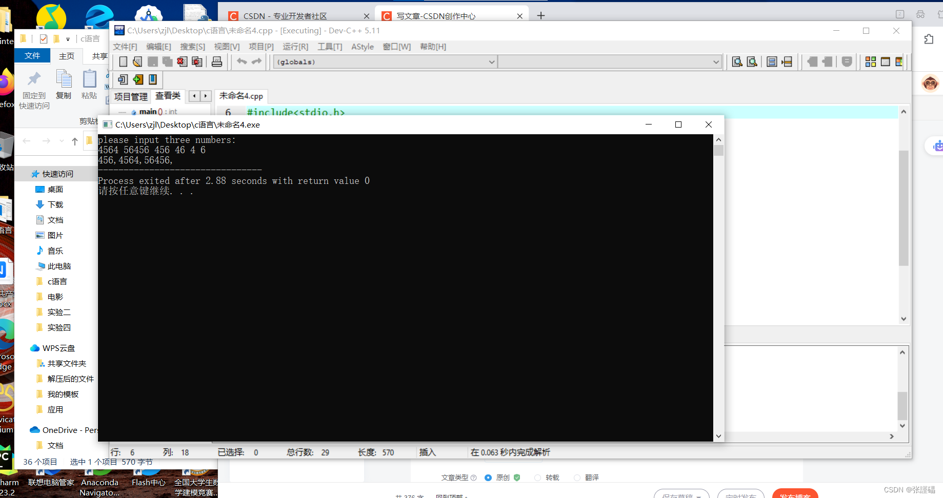
一:需求
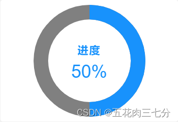
小程序中要展示进度,要求类似示例图,用圆环形式展示进度,那这该如何实现呢?这一篇文章主要讲的就是这样一个功能。

二:实现
实现的大致流程是把圆环进度条封装成一个组件,然后在需要使用此组件的页面引入。
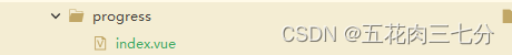
1:progress实现代码
<template>
<view class="progress_box">
<canvas class="progress_bg" canvas-id="cpbg"
:style="{width:progress_width+'px',height:progress_height+'px'}"></canvas>
<canvas class="progress_bar" canvas-id="cpbar"
:style="{width:progress_width+'px',height:progress_height+'px'}"></canvas>
<view class="result">
<view style="font-size: 44rpx;font-weight: 650;letter-spacing: 4rpx;">进度</view>
<view class="percentage">{{value+'%'}}</view>
</view>
</view>
</template>
<script>
export default {
props: {
value: {
type: Number,
default: 0,
required: true
},
progress_time: {
type: Number,
default: 1500
},
progress_width: {
type: Number,
default: 250
},
progress_height: {
type: Number,
default: 250
},
border_width: {
type: Number,
default: 30
},
bg_color: {
type: String,
default: 'gray'
},
start_color: {
type: String,
default: '#0091FF'
},
end_color: {
type: String,
default: '#0091FF'
},
},
data() {
return {
percent: 0, // 保存进度值的变化前后值,用于比较用
}
},
mounted() {
this.drawProgressbg();
this.drawCircle(this.value);
},
methods: {
// 背景
drawProgressbg: function() {
// 自定义组件实例 this ,表示在这个自定义组件下查找拥有 canvas-id 的 <canvas/>
let ctx = uni.createCanvasContext('cpbg', this);
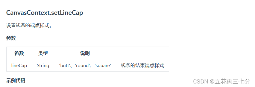
ctx.setLineWidth(this.border_width);
ctx.setStrokeStyle(this.bg_color);
ctx.setLineCap('round');
ctx.beginPath();
ctx.arc(125, 125, 100, 0 * Math.PI, 2 * Math.PI, false);
ctx.stroke();
ctx.draw();
},
// 画圆(递归调用)
drawCircle: function(step) {
if (step === 0) return;
let time = Math.floor(this.progress_time / 100)
let ctx = uni.createCanvasContext('cpbar', this);
let gradient = ctx.createLinearGradient(28, 55, 192, 55);
gradient.addColorStop('0', this.start_color);
gradient.addColorStop('1.0', this.end_color);
ctx.setLineWidth(this.border_width);
ctx.setStrokeStyle(gradient);
ctx.setLineCap('butt');
ctx.beginPath();
step = 0.02 * step-0.5;
ctx.arc(125, 125, 100, -0.5 * Math.PI, step * Math.PI, false);
ctx.stroke();
ctx.draw();
if (this.value > this.percent) {
this.percent++
setTimeout(() => {
this.drawCircle(this.percent)
},
time)
}
}
}
};
</script>
<style>
.progress_box {
position: relative;
width: 100%;
height: 100%;
display: flex;
align-items: center;
justify-content: center;
text-align: center;
}
.progress_bg {
position: absolute;
}
.result{
position: absolute;
top: 35%;
width: 50%;
color: #0091FF;
}
.percentage{
font-size: 75rpx;
color: #0091FF;
margin-top: 20rpx;
}
</style>2:使用progress
<template>
	<view class="main">
        <view>
            <progress:value="value"></progress>
           </view>
	</view>
</template>

<script>
import Progress from '@/components/progress/index.vue'
export default {
	components: {Progress},
	data() {
		return {
			value:'50',
		};
	},
	onLoad() {
		this.init()
	},
	// onShow() {
	// 	this.init()
	// },
	methods: {
    }
};
</script>

<style lang="scss" scoped>

</style>
3:说明
三:效果


![[③ADRV902x]: Digital Filter Configuration(接收端)](https://img-blog.csdnimg.cn/5b6487b3fcc440b7a53108ee4ef0497e.png)