样式一:
import numpy as np
import matplotlib.pyplot as plt
# 设置字体
plt.rcParams['font.sans-serif'] = ['Times New Roman']
# Define data and error values
precision_data = [0.349209635, 0.270397704, 0.297925, 0.4826985, 0.4273875,0.304880102,0.27524925 ,0.555276857 ,0.670770153]
precision_errors = [0.042316368, 0.067922638, 0.051424869, 0.064362478,0.061984597 ,0.058466114 ,0.053526879 ,0.082872212, 0.059994839]
recall_data = [0.56398724, 0.61202551, 0.34742925, 0.71364175,0.2836455 ,0.92711199 , 0.8159265,0.345950587 ,0.751530867 ]
recall_errors = [0.031384024, 0.193760725, 0.04395216, 0.133768497 , 0.070772195, 0.018860383, 0.131817215,0.157283313 ,0.133413839]
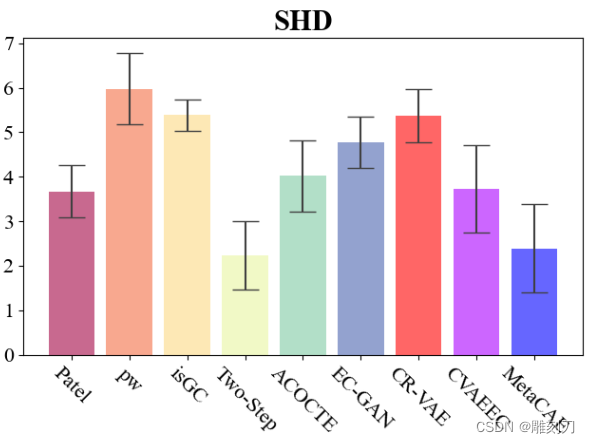
shd_data = [3.674479167, 5.974489796, 5.3825, 2.2325 ,4.02 ,4.775510204 , 5.3625 , 3.724642857,2.390306122]
shd_errors = [0.596049484, 0.800855585, 0.344497564, 0.769484985 ,0.806615504 ,0.568924124 , 0.59870694,0.976687968 ,0.99402855]
F1_data = [0.419679948, 0.384364541, 0.31320825, 0.5667935 , 0.33320625, 0.445818622 , 0.39836825, 0.380561112, 0.697417092]
F1_errors = [0.037000734, 0.105593087, 0.042420443, 0.08536647,0.064445529 , 0.03587304,0.038227198 , 0.080015292 ,0.085268364]
# plt.figure(dpi=100)
plt.figure(figsize=(5,5),dpi=100)
# Define x-axis labels %pwLiNGAM
labels = ['Patel', 'pw', 'isGC', 'Two-Step','ACOCTE','EC-GAN','CR-VAE','CVAEEC','MetaCAE']
# Define colors for each bar
# colors = ['#1f77b4', '#aec7e8', '#ff7f0e', '#2ca02c',"#98df8a",'#00ffff','#ff0000','#aa00ff','#0000ff']
colors = ['#A40545', '#F46F44', '#FDD985', '#E9F5A1',"#7FCBA4",'#4B65AF','#ff0000','#aa00ff','#0000ff']
# Create bar chart with error bars and differentiated colors
fig, ax = plt.subplots()
ax.bar(labels, shd_data, yerr=shd_errors, align='center', alpha=0.6, ecolor='#404040', capsize=10, color=colors)
# Add labels and title
# ax.set_ylabel('Outcome')
ax.set_title('SHD',fontdict={'family' : 'Times New Roman', 'size' : 22,'weight':'bold'})
# ax.set_xticklabels(labels,rotation=-45)
for tick in ax.get_xticklabels():
tick.set_rotation(-45)
# tick.set_ha('right')
plt.xticks(fontproperties = 'Times New Roman', size = 16)
plt.yticks(fontproperties = 'Times New Roman', size = 16)
# plt.tight_layout(pad=0.05)
plt.subplots_adjust(left=0.18, bottom=0.18)
# Show plot
plt.savefig("shd.png")
plt.show()
样式二:
# -*- coding: utf-8 -*-
import numpy as np
import matplotlib.pyplot as plt
from matplotlib import rcParams
rcParams['font.family'] = 'Times New Roman'
# 数据
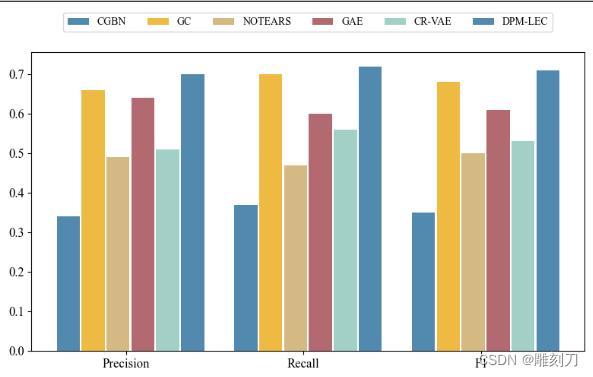
labels = ['Precision', 'Recall', 'F1']
cgbn_values = [0.34, 0.37, 0.35]
gc_values = [0.66, 0.70, 0.68]
notears_values = [0.49, 0.47, 0.50]
gae_values = [0.64, 0.60, 0.61]
CRVAE_values=[0.51, 0.56, 0.53]
dpmlec_values = [0.70, 0.72, 0.71]
x = np.arange(len(labels)) # 柱状图的 x 坐标位置
width = 0.13 # 柱子的宽度
fig, ax = plt.subplots(figsize=(8,5))
rects1 = ax.bar(x - width/2, cgbn_values, width, label='CGBN', color='#528AAF')
rects2 = ax.bar(x + width/2+0.01, gc_values, width, label='GC', color='#EFBA42')
rects3 = ax.bar(x + 3*width/2+0.02, notears_values, width, label='NOTEARS', color='#D4BA82')
rects4 = ax.bar(x + 5*width/2+0.03, gae_values, width, label='GAE', color='#B26A70')
rects5 = ax.bar(x + 7*width/2+0.04, CRVAE_values, width, label='CR-VAE', color='#A2CFC6')
rects5 = ax.bar(x + 9*width/2+0.05, dpmlec_values, width, label='DPM-LEC', color='#528AAF')
# 设置坐标轴标签和标题
# 设置 x 轴刻度标签的字体大小
ax.set_xticks(x+ width*2)
# ax.set_xticklabels(labels, fontsize=12)
# ax.set_xticks(x + width/2)
ax.set_xticklabels(labels, fontsize=12)
# 设置 y 轴刻度标签的字体大小
ax.tick_params(axis='y', labelsize=12)
# 移除柱子上的数字
def autolabel(rects):
pass
# 添加图例
ax.legend(loc='upper center', bbox_to_anchor=(0.5, 1.15), ncol=6)
plt.savefig('bar_chart.pdf', format='pdf', bbox_inches='tight', dpi=300)
# 显示图形
plt.show()