常见的CSS布局方法
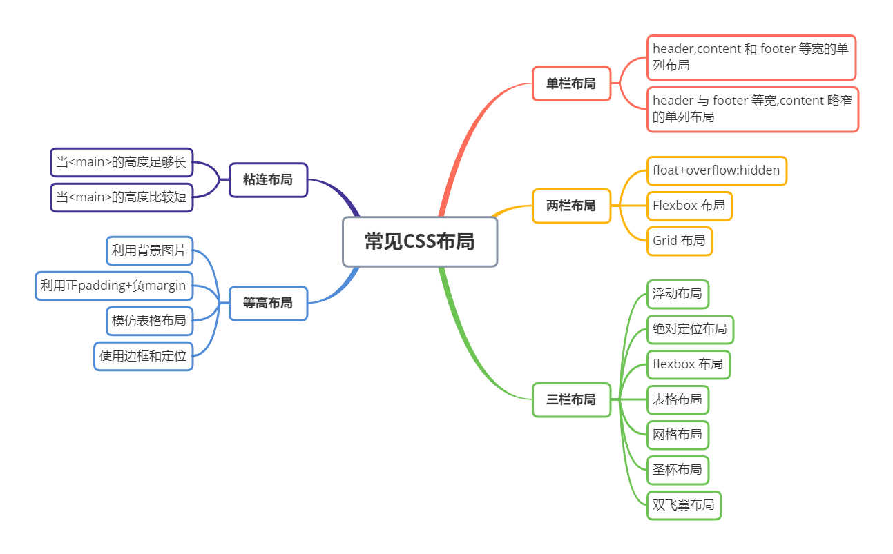
「1. 单栏布局」
常见的单列布局有两种:
- header,content 和 footer 等宽的单列布局
- header 与 footer 等宽,content 略窄的单列布局
header,content 和 footer 等宽的单列布局
先通过对 header,content,footer 统一设置 width:1000px;或者 max-width:1000px(这两者的区别是当屏幕小于 1000px 时,前者会出现滚动条,后者则不会,显示出实际宽度);然后设置 margin:auto 实现居中即可得到。
<div class="header"></div>
<div class="content"></div>
<div class="footer"></div>
.header{
    margin:0 auto;
    max-width: 960px;
    height:100px;
}
.content{
    margin: 0 auto;
    max-width: 960px;
    height: 400px;
}
.footer{
    margin: 0 auto;
    max-width: