注:本文内容分享转载自 HarmonyOS Developer 官网文档
一. CSS 语法参考
CSS 是描述 HML 页面结构的样式语言。所有组件均存在系统默认样式,也可在页面 CSS 样式文件中对组件、页面自定义不同的样式。请参考通用样式了解兼容 JS 的类 Web 开发范式支持的组件样式。
尺寸单位
● 逻辑像素 px(文档中以<length>表示):
○ 默认屏幕具有的逻辑宽度为 720px(配置见配置文件中的 window 小节),实际显示时会将页面布局缩放至屏幕实际宽度,如 100px 在实际宽度为 1440 物理像素的屏幕上,实际渲染为 200 物理像素(从 720px 向 1440 物理像素,所有尺寸放大 2 倍)。
○ 额外配置 autoDesignWidth 为 true 时(配置见配置文件中的 window 小节),逻辑像素 px 将按照屏幕密度进行缩放,如 100px 在屏幕密度为 3 的设备上,实际渲染为 300 物理像素。应用需要适配多种设备时,建议采用此方法。
● 百分比(文档中以<percentage>表示):表示该组件占父组件尺寸的百分比,如组件的 width 设置为 50%,代表其宽度为父组件的 50%。
样式导入
为了模块化管理和代码复用,CSS 样式文件支持 @import 语句,导入 css 文件。
声明样式
每个页面目录下存在一个与布局 hml 文件同名的 css 文件,用来描述该 hml 页面中组件的样式,决定组件应该如何显示。
1. 内部样式,支持使用 style、class 属性来控制组件的样式。例如:
<!-- index.hml --><div class="container"><text style="color: red">Hello World</text></div>
/* index.css */.container {justify-content: center;}
2. 文件导入,合并外部样式文件。例如,在 common 目录中定义样式文件 style.css,并在 index.css 文件首行中进行导入:
/* style.css */.title {font-size: 50px;}
/* index.css */@import '../../common/style.css';.container {justify-content: center;}
选择器
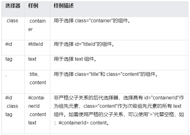
css 选择器用于选择需要添加样式的元素,支持的选择器如下表所示:
示例:
<!-- 页面布局xxx.hml --><div id="containerId" class="container"><text id="titleId" class="title">标题</text><div class="content"><text id="contentId">内容</text></div></div>
/* 页面样式xxx.css *//* 对所有div组件设置样式 */div {flex-direction: column;}/* 对class="title"的组件设置样式 */.title {font-size: 30px;}/* 对id="contentId"的组件设置样式 */#contentId {font-size: 20px;}/* 对所有class="title"以及class="content"的组件都设置padding为5px */.title, .content {padding: 5px;}/* 对class="container"的组件下的所有text设置样式 */.container text {color: #007dff;}/* 对class="container"的组件下的直接后代text设置样式 */.container > text {color: #fa2a2d;}
以上样式运行效果如下:
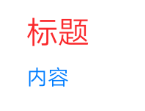
其中“.container text”将“标题”和“内容”设置为蓝色,而“.container > text”直接后代选择器将“标题”设置为红色。2 者优先级相同,但直接后代选择器声明顺序靠后,将前者样式覆盖(优先级计算见选择器优先级)。
选择器优先级
选择器的优先级计算规则与 w3c 规则保持一致(只支持:内联样式,id,class,tag,后代和直接后代),其中内联样式为在元素 style 属性中声明的样式。
当多条选择器声明匹配到同一元素时,各类选择器优先级由高到低顺序为:内联样式 > id > class > tag。
伪类
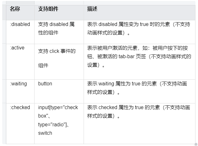
css 伪类是选择器中的关键字,用于指定要选择元素的特殊状态。例如,:disabled 状态可以用来设置元素的 disabled 属性变为 true 时的样式。
除了单个伪类之外,还支持伪类的组合,例如,:focus:checked 状态可以用来设置元素的 focus 属性和 checked 属性同时为 true 时的样式。支持的单个伪类如下表所示,按照优先级降序排列:
伪类示例如下,设置按钮的:active 伪类可以控制被用户按下时的样式:
<!-- index.hml --><div class="container"><input type="button" class="button" value="Button"></input></div>
/* index.css */.button:active {background-color: #888888;/*按钮被激活时,背景颜色变为#888888 */}
说明
针对弹窗类组件及其子元素不支持伪类效果,包括 popup、dialog、menu、option、picker
样式预编译
预编译提供了利用特有语法生成 css 的程序,可以提供变量、运算等功能,令开发者更便捷地定义组件样式,目前支持 less、sass 和 scss 的预编译。使用样式预编译时,需要将原 css 文件后缀改为 less、sass 或 scss,如 index.css 改为 index.less、index.sass 或 index.scss。
● 当前文件使用样式预编译,例如将原 index.css 改为 index.less:
/* index.less *//* 定义变量 */@colorBackground: #000000;.container {background-color: @colorBackground; /* 使用当前less文件中定义的变量 */}
● 引用预编译文件,例如 common 中存在 style.scss 文件,将原 index.css 改为 index.scss,并引入 style.scss:
/* style.scss *//* 定义变量 */$colorBackground: #000000;
在 index.scss 中引用:
/* index.scss *//* 引入外部scss文件 */@import '../../common/style.scss';.container {background-color: $colorBackground; /* 使用style.scss中定义的变量 */}
说明
引用的预编译文件建议放在 common 目录进行管理。
CSS 样式继承 6+
css 样式继承提供了子节点继承父节点样式的能力,继承下来的样式在多选择器样式匹配的场景下,优先级排最低,当前支持以下样式的继承:
● font-family
● font-weight
● font-size
● font-style
● text-align
● line-height
● letter-spacing
● color
● visibility
二. CSS 动画
1.属性样式动画
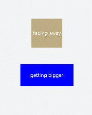
在关键帧(Keyframes)中动态设置父组件的 width 和 height,实现组件变大缩小。子组件设置 scale 属性使父子组件同时缩放,再设置 opacity 实现父子组件的显示与隐藏。
<!-- xxx.hml --><div class="container"><div class="fade"><text>fading away</text></div><div class="bigger"><text>getting bigger</text></div></div>
/* xxx.css */.container {background-color:#F1F3F5;display: flex;justify-content: center;align-items: center;flex-direction: column;width: 100%;height: 100%;}.fade {width: 30%;height: 200px;left: 35%;top: 25%;position: absolute;animation: 2s change infinite friction;}.bigger {width: 20%;height: 100px;background-color: blue;animation: 2s change1 infinite linear-out-slow-in;}text {width: 100%;height: 100%;text-align: center;color: white;font-size: 35px;animation: 2s change2 infinite linear-out-slow-in;}/* 颜色变化 */@keyframes change{from {background-color: #f76160;opacity: 1;}to {background-color: #09ba07;opacity: 0;}}/* 父组件大小变化 */@keyframes change1 {0% {width: 20%;height: 100px;}100% {width: 80%;height: 200px;}}/* 子组件文字缩放 */@keyframes change2 {0% {transform: scale(0);}100% {transform: scale(1.5);}}
说明
● animation 取值不区分先后,duration (动画执行时间)/ delay (动画延迟执行时间)按照出现的先后顺序解析。
● 必须设置 animation-duration 样式,否则时长为 0 则不会有动画效果。当设置 animation-fill-mode 属性为 forwards 时,组件直接展示最后一帧的样式。
2. transform 样式动画
设置 transform 属性对组件进行旋转、缩放、移动和倾斜。
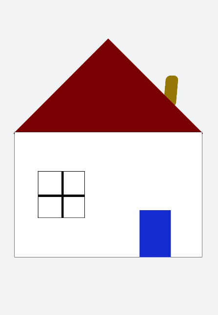
设置静态动画
创建一个正方形并旋转 90°变成菱形,并用下方的长方形把菱形下半部分遮盖形成屋顶,设置长方形 translate 属性值为(150px,-150px)确定坐标位置形成门,再使用 position 属性使横纵线跟随父组件(正方形)移动到指定坐标位置,接着设置 scale 属性使父子组件一起变大形成窗户大小,最后使用 skewX 属性使组件倾斜后设置坐标 translate(200px,-710px)得到烟囱。
<!-- xxx.hml --><div class="container"><div class="top"></div><div class="content"></div><div class="door"></div><!-- 窗户 --><div class="window"><div class="horizontal"></div><div class="vertical"></div></div><div class="chimney"></div></div>
/* xxx.css */.container {width:100%;height:100%;background-color:#F1F3F5;align-items: center;flex-direction: column;}.top{z-index: -1;position: absolute;width: 428px;height: 428px;background-color: #860303;transform: rotate(45deg);margin-top: 284px;margin-left: 148px;}.content{margin-top: 500px;width: 600px;height: 400px;background-color: white;border: 1px solid black;}.door{width: 100px;height: 135px;background-color: #1033d9;transform: translate(150px,-137px);}.window{z-index: 1;position: relative;width: 100px;height: 100px;background-color: white;border: 1px solid black;transform: translate(-150px,-400px) scale(1.5);}/* 窗户的横轴 */.horizontal{position: absolute;top: 50%;width: 100px;height: 5px;background-color: black;}/* 窗户的纵轴 */.vertical{position: absolute;left: 50%;width: 5px;height: 100px;background-color: black;}.chimney{z-index: -2;width: 40px;height: 100px;border-radius: 15px;background-color: #9a7404;transform: translate(200px,-710px) skewX(-5deg);}
设置平移动画
小球下降动画,改变小球的 Y 轴坐标实现小球下落,在下一段是时间内减小 Y 轴坐标实现小球回弹,让每次回弹的高度逐次减小直至回弹高度为 0,就模拟出了小球下降的动画。
<!-- xxx.hml --><div class="container"><div class="circle"></div><div class="flower"></div></div>
/* xxx.css */.container {width:100%;height:100%;background-color:#F1F3F5;display: flex;justify-content: center;}.circle{width: 100px;height: 100px;border-radius: 50px;background-color: red;/* forwards停在动画的最后一帧 */animation: down 3s fast-out-linear-in forwards;}.flower{position: fixed;width: 80%;margin-left: 10%;height: 5px;background-color: black;top: 1000px;}@keyframes down {0%{transform: translate(0px,0px);}/* 下落 */15%{transform: translate(10px,900px);}/* 开始回弹 */25%{transform: translate(20px,500px);}/* 下落 */35%{transform: translate(30px,900px);}/* 回弹 */45%{transform: translate(40px,700px);}55%{transform: translate(50px,900px);}65%{transform: translate(60px,800px);}80%{transform: translate(70px,900px);}90%{transform: translate(80px,850px);}/* 停止 */100%{transform: translate(90px,900px);}}

设置旋转动画
设置不同的原点位置(transform-origin)改变元素所围绕的旋转中心。rotate3d 属性前三个参数值分别为 X 轴、Y 轴、Z 轴的旋转向量,第四个值为旋转角度,旋转向角度可为负值,负值则代表旋转方向为逆时针方向。
<!-- xxx.hml --><div class="container"><div class="rotate"><div class="rect rect1"></div><div class="rect rect2"></div><div class="rect rect3"></div></div><!-- 3d属性 --><div class="rotate3d"><div class="content"><div class="rect4"></div><div class="rect5"> </div></div><div class="mouse"></div></div></div>
/* xxx.css */.container {flex-direction: column;background-color:#F1F3F5;display: flex;align-items: center;justify-content: center;width: 100%;height: 100%;}.rect {width: 100px;height: 100px;animation: rotate 3s infinite;margin-left: 30px;}.rect1 {background-color: #f76160;}.rect2 {background-color: #60f76f;/* 改变原点位置*/transform-origin: 10% 10px;}.rect3 {background-color: #6081f7;/* 改变原点位置*/transform-origin: right bottom;}@keyframes rotate {from {transform: rotate(0deg)}to {transform: rotate(360deg);}}/* 3d示例样式 */.rotate3d {margin-top: 150px;flex-direction: column;background-color:#F1F3F5;display: flex;align-items: center;width: 80%;height: 600px;border-radius: 300px;border: 1px solid #ec0808;}.content {padding-top: 150px;display: flex;align-items: center;justify-content: center;}/* react4 react5 翻转形成眼睛 */.rect4 {width: 100px;height: 100px;animation: rotate3d1 1000ms infinite;background-color: darkmagenta;}.rect5 {width: 100px;height: 100px;animation: rotate3d1 1000ms infinite;margin-left: 100px;background-color: darkmagenta;}.mouse {margin-top: 150px;width: 200px;height: 100px;border-radius: 50px;border: 1px solid #e70303;animation: rotate3d2 1000ms infinite;}/* 眼睛的动效 */@keyframes rotate3d1 {0% {transform:rotate3d(0,0,0,0deg)}50% {transform:rotate3d(20,20,20,360deg);}100% {transform:rotate3d(0,0,0,0deg);}}/* 嘴的动效 */@keyframes rotate3d2 {0% {transform:rotate3d(0,0,0,0deg)}33% {transform:rotate3d(0,0,10,30deg);}66% {transform:rotate3d(0,0,10,-30deg);}100% {transform:rotate3d(0,0,0,0deg);}}
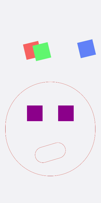
说明
transform-origin 变换对象的原点位置,如果仅设置一个值,另一个值为 50%,若设置两个值第一个值表示 X 轴的位置,第二个值表示 Y 轴的位置。
设置缩放动画
设置 scale 样式属性实现涟漪动画,先使用定位确定元素的位置,确定坐标后创建多个组件实现重合效果,再设置 opacity 属性改变组件不透明度实现组件隐藏与显示,同时设置 scale 值使组件可以一边放大一边隐藏,最后设置两个组件不同的动画执行时间,实现扩散的效果。
设置 sacle3d 中 X 轴、Y 轴、Z 轴的缩放参数实现动画。
<!-- xxx.hml --><div class="container"><div class="circle"><text>ripple</text></div><div class="ripple"></div><div class="ripple ripple2"></div><!-- 3d --><div class="content"><text>spring</text></div></div>
/* xxx.css */.container {flex-direction: column;background-color:#F1F3F5;width: 100%;position: relative;}.circle{margin-top: 400px;margin-left: 40%;width: 100px;height: 100px;border-radius: 50px;background-color: mediumpurple;z-index: 1; position: absolute;}.ripple{margin-top: 400px;margin-left: 40%;position: absolute; z-index: 0;width: 100px;height: 100px;border-radius: 50px;background-color: blueviolet;animation: ripple 5s infinite;}/* 设置不同的动画时间 */.ripple2{animation-duration: 2.5s;}@keyframes ripple{0%{transform: scale(1);opacity: 0.5;}50%{transform: scale(3);opacity: 0;}100%{transform: scale(1);opacity: 0.5;}}text{color: white;text-align: center;height: 100%;width: 100%;}.content {margin-top: 700px;margin-left: 33%;width: 200px;height: 100px;animation:rubberBand 1s infinite;background-color: darkmagenta;position: absolute;}@keyframes rubberBand {0% {transform: scale3d(1, 1, 1);}30% {transform: scale3d(1.25, 0.75, 1.1);}40% {transform: scale3d(0.75, 1.25, 1.2);}50% {transform: scale3d(1.15, 0.85, 1.3);}65% {transform: scale3d(.95, 1.05, 1.2);}75% {transform: scale3d(1.05, .95, 1.1);}100%{transform: scale3d(1, 1, 1);}}
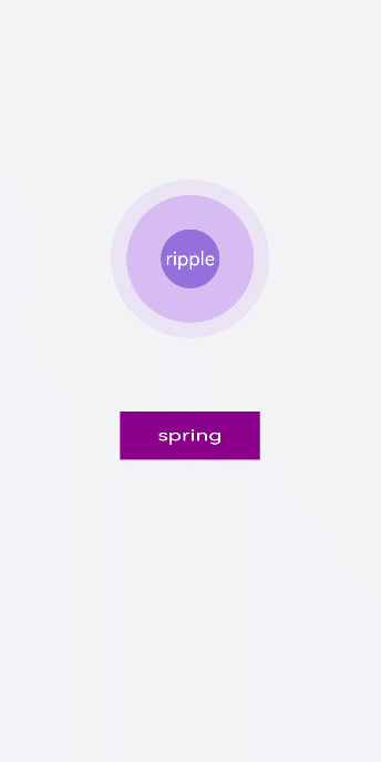
说明
设置 transform 属性值后,子元素会跟着父元素一起改变,若只改变父元素其他属性值时(如:height,width),子元素不会改变。
设置 matrix 属性
matrix 是一个入参为六个值的矩阵,6 个值分别代表:scaleX, skewY, skewX, scaleY, translateX, translateY。下面示例中设置 了 matrix 属性为 matrix(1,0,0,1,0,200)使组件移动和倾斜。
<!-- xxx.hml --><div class="container"><div class="rect"> </div></div>
/* xxx.css */.container{background-color:#F1F3F5;display: flex;justify-content: center;width: 100%;height: 100%;}.rect{width: 100px;height: 100px;background-color: red;animation: down 3s infinite forwards;}@keyframes down{0%{transform: matrix(1,0,0,1,0,0);}10%{transform: matrix(1,0,0,1,0,200);}60%{transform: matrix(2,1.5,1.5,2,0,700);}100%{transform: matrix(1,0,0,1,0,0);}}
整合 transform 属性
transform 可以设置多个值并且多个值可同时设置,下面案例中展示同时设置缩放(scale),平移(translate),旋转(rotate)属性时的动画效果。
<!-- xxx.hml --><div class="container"><div class="rect1"></div><div class="rect2"></div><div class="rect3"></div><div class="rect4"></div><div class="rect5"></div></div>
/* xxx.css */.container{width: 100%;height: 100%;flex-direction:column;background-color:#F1F3F5;padding:50px;}.rect1{width: 100px;height: 100px;background-color: red;animation: change1 3s infinite forwards;}.rect2{margin-top: 50px;width: 100px;height: 100px;background-color: darkblue;animation: change2 3s infinite forwards;}.rect3{margin-top: 50px;width: 100px;height: 100px;background-color: darkblue;animation: change3 3s infinite;}.rect4{align-self: center;margin-left: 50px;margin-top: 200px;width: 100px;height: 100px;background-color: darkmagenta;animation: change4 3s infinite;}.rect5{margin-top: 300px;width: 100px;height: 100px;background-color: cadetblue;animation: change5 3s infinite;}/* change1 change2 对比 */@keyframes change1{0%{transform: translate(0,0); transform: rotate(0deg)}100%{transform: translate(0,500px);transform: rotate(360deg)}}/* change2 change3 对比属性顺序不同的动画效果 */@keyframes change2{0%{transform:translate(0,0) rotate(0deg) ;}100%{transform: translate(300px,0) rotate(360deg);}}@keyframes change3{0%{transform:rotate(0deg) translate(0,0);}100%{transform:rotate(360deg) translate(300px,0);}}/* 属性值不对应的情况 */@keyframes change4{0%{transform: scale(0.5);}100%{transform:scale(2) rotate(45deg);}}/* 多属性的写法 */@keyframes change5{0%{transform:scale(0) translate(0,0) rotate(0);}100%{transform: scale(1.5) rotate(360deg) translate(200px,0);}}
说明
● 当设置多个 transform 时,后续的 transform 值会把前面的覆盖掉。若想同时使用多个动画样式可用复合写法,例:transform: scale(1) rotate(0) translate(0,0)。
● transform 进行复合写法时,变化样式内多个样式值顺序的不同会呈现不一样的动画效果。
● transform 属性设置的样式值要一一对应,若前后不对应,则该动画不生效。若设置多个样式值则只会呈现出已对应值的动画效果。