grid网格布局
网格布局是由一系列水平及垂直的线构成的一种布局模式,使用网格,我们能够将设计元素进行排列,帮助我们设计一系列具有固定位置以及宽度的元素的页面,使我们的网站页面更加统一。
它将网页划分成一个个网格,可以任意组合不同的网格,做出各种各样的布局。以前,只能通过复杂的 CSS 框架达到的效果,现在浏览器内置了。
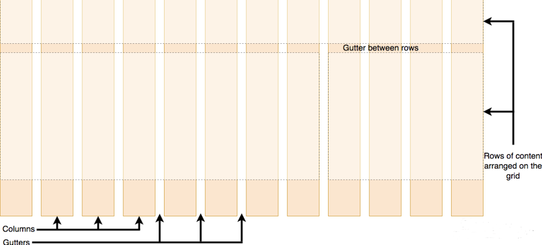
一个网格通常具有许多的「列(column)与行(row)」,以及行与行、列与列之间的间隙,这个间隙一般被称为「沟槽(gutter)」。
grid布局与flex布局的对比
Grid 布局与 Flex 布局有一定的相似性,都可以指定容器内部多个项目的位置。但是,它们也存在重大区别。
Flex 布局是轴线布局,只能指定"项目"针对轴线的位置,可以看作是一维布局。Grid 布局则是将容器划分成"行"和"列",产生单元格,然后指定"项目所在"的单元格,可以看作是二维布局。Grid 布局远比 Flex 布局强大。
基本概念
学习 Grid 布局之前,需要了解一些基本概念。
容器和项目
采用网格布局的区域,称为"容器"(container)。容器内部采用网格定位的子元素,称为"项目"(item)。
<div class="container">
  <div class="item"><p>1</p></div>
  <div class="item"><p>2</p></div>
  <div class="item"><p>3</p></div>
</div>
上面的最外层<div class="container">元素就是容器,内层的三个<div class="item">元素就是项目。
注意:项目只能是容器的顶层子元素,不包含项目的子元素,比如上面代码的<p>元素就不是项目。Grid 布局只对项目生效。
行与列
容器里面的水平区域称为"行"(row),垂直区域称为"列"(column)。
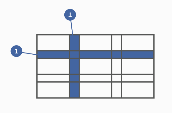
上图中,水平的深色区域就是"行",垂直的深色区域就是"列"。
单元格
行和列的交叉区域,称为"单元格"(cell)。
正常情况下,n行和m列会产生n x m个单元格。比如,3行3列会产生9个单元格。
网格线
划分网格的线,称为"网格线"(grid line)。水平网格线划分出行,垂直网格线划分出列。
正常情况下,n行有n + 1根水平网格线,m列有m + 1根垂直网格线,比如三行就有四根水平网格线。
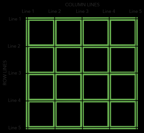
上图是一个 4 x 4 的网格,共有5根水平网格线和5根垂直网格线。
容器属性
Grid 布局的属性分成两类。一类定义在容器上面,称为容器属性;另一类定义在项目上面,称为项目属性。这部分先介绍容器属性。
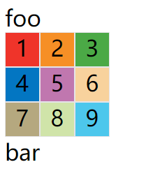
display 属性
display: grid指定一个容器采用网格布局。
div {
  display: grid;
}
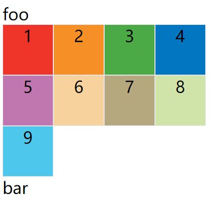
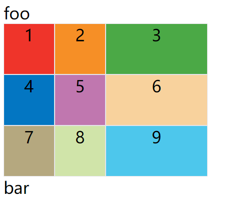
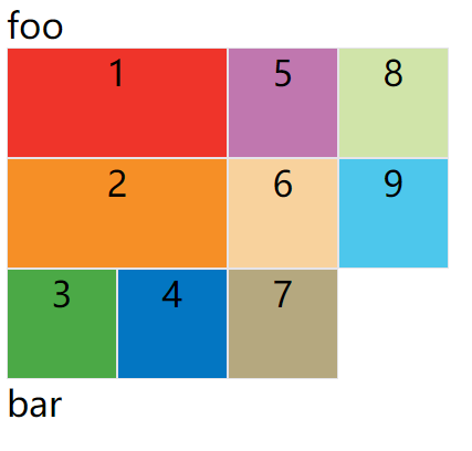
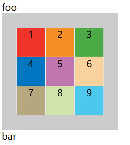
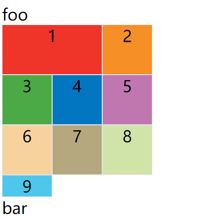
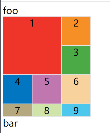
案例:
<style>
.container {
  display: grid;
  grid-template-columns: 50px 50px 50px;
  grid-template-rows: 50px 50px 50px;
}
.item {
  font-size: 2em;
  text-align: center;
  border: 1px solid #e5e4e9;
}
</style>
<span style="font-size: 2em;">foo</span>
<div class="container">
  <div class="item" style="background: #ef342a;">1</div>
  <div class="item" style="background: #f68f26;">2</div>
  <div class="item" style="background: #4ba946;">3</div>
  <div class="item" style="background: #0376c2;">4</div>
  <div class="item" style="background: #c077af;">5</div>
  <div class="item" style="background: #f8d29d;">6</div>
  <div class="item" style="background: #b5a87f;">7</div>
  <div class="item" style="background: #d0e4a9;">8</div>
  <div class="item" style="background: #4dc7ec;">9</div>
</div>
<span style="font-size: 2em;">bar</span>
效果图:
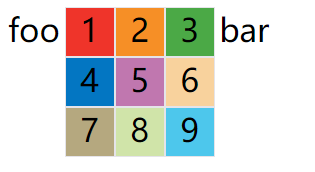
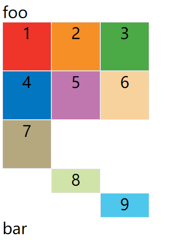
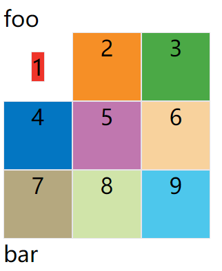
默认情况下,容器元素都是块级元素,但也可以设成行内元素。
div {
  display: inline-grid;
}
上面代码指定div是一个行内元素,该元素内部采用网格布局。
案例:
<style>
.container {
  display: inline-grid;
  grid-template-columns: 50px 50px 50px;
  grid-template-rows: 50px 50px 50px;
}
.item {
  font-size: 2em;
  text-align: center;
  border: 1px solid #e5e4e9;
}
</style>
<span style="font-size: 2em;">foo</span>
<div class="container">
  <div class="item" style="background: #ef342a;">1</div>
  <div class="item" style="background: #f68f26;">2</div>
  <div class="item" style="background: #4ba946;">3</div>
  <div class="item" style="background: #0376c2;">4</div>
  <div class="item" style="background: #c077af;">5</div>
  <div class="item" style="background: #f8d29d;">6</div>
  <div class="item" style="background: #b5a87f;">7</div>
  <div class="item" style="background: #d0e4a9;">8</div>
  <div class="item" style="background: #4dc7ec;">9</div>
</div>
<span style="font-size: 2em;">bar</span>
效果图:
注意:设为网格布局以后,容器子元素(项目)的
float、display: inline-block、display: table-cell、vertical-align和column-*等设置都将失效。
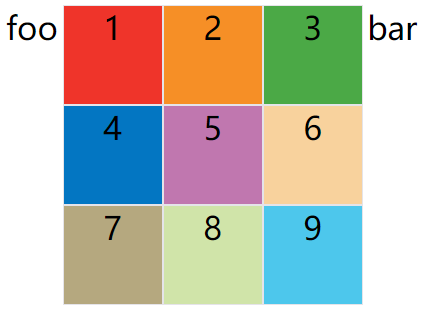
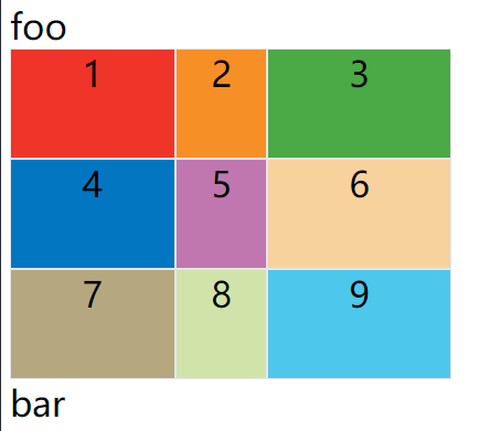
grid-template-columns 属性,grid-template-rows 属性
容器指定了网格布局以后,接着就要划分行和列。
grid-template-columns属性定义每一列的列宽;grid-template-rows属性定义每一行的行高;
.container {
  display: inline-grid;
  grid-template-columns: 100px 100px 100px;
  grid-template-rows: 100px 100px 100px;
}
上面代码指定了一个三行三列的网格,列宽和行高都是100px。
效果图:
除了使用绝对单位,也可以使用百分比。
.container {
  display: grid;
  grid-template-columns: 33.33% 33.33% 33.33%;
  grid-template-rows: 33.33% 33.33% 33.33%;
}
repeat()
有时候,重复写同样的值非常麻烦,尤其网格很多时。这时,可以使用repeat()函数,简化重复的值。上面的代码用repeat()改写如下。
.container {
  display: inline-grid;
  grid-template-columns: repeat(3, 33.33%);
  grid-template-rows: repeat(3, 33.33%);
}
repeat()接受两个参数:
- 第一个参数是重复的次数(上例是3)
- 第二个参数是所要重复的值。
repeat()重复某种模式也是可以的。
.container {
  display: grid;
  grid-template-columns: repeat(2, 100px 20px 80px);
}
上面代码定义了6列,第一列和第四列的宽度为100px,第二列和第五列为20px,第三列和第六列为80px。
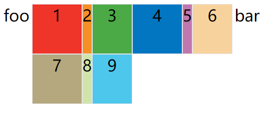
auto-fill 关键字
有时,单元格的大小是固定的,但是容器的大小不确定。如果希望每一行(或每一列)容纳尽可能多的单元格,这时可以使用auto-fill关键字表示自动填充。
.container {
  width: 400px;
  display: grid;
  grid-template-columns: repeat(auto-fill, 100px);
  grid-template-rows: 100px 100px 100px;
}
上面代码中,外部容器定义的宽度为400px,单我们每个项目定义的宽度是100px,然后使用auto-fill关键字,然后会自动填充,直到容器不能放置更多的列,即每行为显示400 / 100 = 4列元素,即效果如下:
fr 关键字
为了方便表示比例关系,网格布局提供了fr关键字(fraction 的缩写,意为"片段")。如果两列的宽度分别为1fr和2fr,就表示后者是前者的两倍。
.container {
  width: 400px;
  display: grid;
  grid-template-columns: 1fr 1fr 1fr;
  grid-template-rows: 100px 100px 100px;
}
上面代码表示三个相同宽度的列,并且自动沾满容器的宽度

fr可以与绝对长度的单位结合使用,这时会非常方便。
.container {
  width: 400px;
  display: grid;
  grid-template-columns: 150px 1fr 2fr;
  grid-template-rows: 100px 100px 100px;
}
上面代码表示,第一列的宽度为150像素,第二列的宽度是第三列的一半。
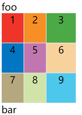
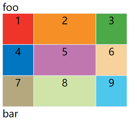
minmax()
minmax()函数产生一个长度范围,表示长度就在这个范围之中。它接受两个参数,分别为最小值和最大值。
.container {
  display: grid;
  grid-template-rows: 100px 100px 100px;
  /* 方式一 */
  width: 250px;
  grid-template-columns: 1fr 1fr minmax(100px, 1fr);

  /* 方式二 */
  width: 500px;
  grid-template-columns: 2fr 2fr minmax(100px, 1fr);
}
上面代码中,minmax(100px, 1fr)表示列宽不小于100px,不大于1fr。
方式一效果图:
方式二效果图:

auto 关键字
auto关键字表示由浏览器自己决定长度。
.container {
  display: grid;
  grid-template-rows: 100px 100px 100px;
  width: 400px;
  grid-template-columns: 100px auto 100px;
}
上面代码中,第二列的宽度,基本上等于该列单元格的最大宽度,除非单元格内容设置了min-width,且这个值大于最大宽度。
网格线的名称
grid-template-columns属性和grid-template-rows属性里面,还可以使用方括号,指定每一根网格线的名字,方便以后的引用。
.container {
  display: grid;
  width: 400px;
  grid-template-columns: [c1] 100px [c2] 100px [c3] auto [c4];
  grid-template-rows: [r1] 100px [r2] 100px [r3] 100px [r4];
}
上面代码指定网格布局为3行 x 3列,因此有4根垂直网格线和4根水平网格线。方括号里面依次是这八根线的名字。
网格布局允许同一根线有多个名字,比如[fifth-line row-5]。
布局实例
grid-template-columns属性对于网页布局非常有用。两栏式布局只需要一行代码。
.wrapper {
  display: grid;
  width: 400px;
  grid-template-columns: 70% 30%;
  grid-template-rows: 100px 100px 100px;
}
上面代码将左边栏设为70%,右边栏设为30%。

传统的十二网格布局,写起来也很容易。
grid-template-columns: repeat(12, 1fr);
grid-row-gap/grid-column-gap/grid-gap
grid-row-gap属性设置行与行的间隔(行间距),grid-column-gap属性设置列与列的间隔(列间距)。
.container {
  display: grid;
  width: 400px;
  grid-template-columns: repeat(3, auto);
  grid-template-rows: 100px 100px 100px;
  grid-row-gap: 20px;
  grid-column-gap: 20px;
}
上面代码中,grid-row-gap用于设置行间距,grid-column-gap用于设置列间距。

grid-gap属性是grid-column-gap和grid-row-gap的合并简写形式,语法如下:
grid-gap: <grid-row-gap> <grid-column-gap>;
因此,上面一段 CSS 代码等同于下面的代码。
.container {
  display: grid;
  width: 400px;
  grid-template-columns: repeat(3, auto);
  grid-template-rows: 100px 100px 100px;
  grid-gap: 20px 20px;
}
如果grid-gap省略了第二个值,浏览器认为第二个值等于第一个值。
grid-gap: 20px; // 等价于 grid-gap: 20px 20px;
根据最新标准,上面三个属性名的
grid-前缀已经删除,grid-column-gap和grid-row-gap写成column-gap和row-gap,grid-gap写成gap。
grid-template-areas 属性
网格布局允许指定"区域"(area),一个区域由单个或多个单元格组成。grid-template-areas属性用于定义区域。
.container {
  display: grid;
  width: 400px;
  grid-template-columns: repeat(3, auto);
  grid-template-rows: 100px 100px 100px;
  row-gap: 20px;
  column-gap: 20px;
  grid-template-areas: 'a b c'
                        'd e f'
                        'g h i';
}
上面代码先划分出9个单元格,然后将其定名为a到i的九个区域,分别对应这九个单元格。
多个单元格合并成一个区域的写法如下。
grid-template-areas: 'a a a'
                     'b b b'
                     'c c c';
上面代码将9个单元格分成a、b、c三个区域。
下面是一个布局实例。
grid-template-areas: "header header header"
                     "main main sidebar"
                     "footer footer footer";
上面代码中,顶部是页眉区域header,底部是页脚区域footer,中间部分则为main和sidebar。
如果某些区域不需要利用,则使用"点"(.)表示。
grid-template-areas: 'a . c'
                     'd . f'
                     'g . i';
上面代码中,中间一列为点,表示没有用到该单元格,或者该单元格不属于任何区域。
注意,区域的命名会影响到网格线。每个区域的起始网格线,会自动命名为
区域名-start,终止网格线自动命名为区域名-end。
比如,区域名为header,则起始位置的水平网格线和垂直网格线叫做header-start,终止位置的水平网格线和垂直网格线叫做header-end。
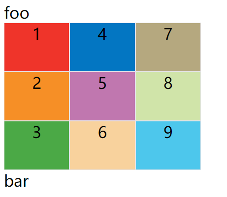
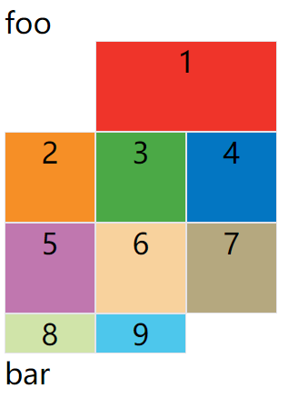
grid-auto-flow 属性
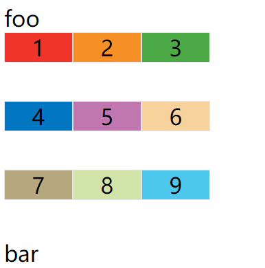
划分网格以后,容器的子元素会按照顺序,自动放置在每一个网格。默认的放置顺序是"先行后列",即先填满第一行,再开始放入第二行,即下图数字的顺序。

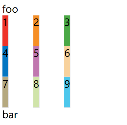
这个顺序由grid-auto-flow属性决定,默认值是row,即"先行后列"。也可以将它设成column,变成"先列后行"。
grid-auto-flow: column;
上面代码设置了column以后,放置顺序就变成了下图。
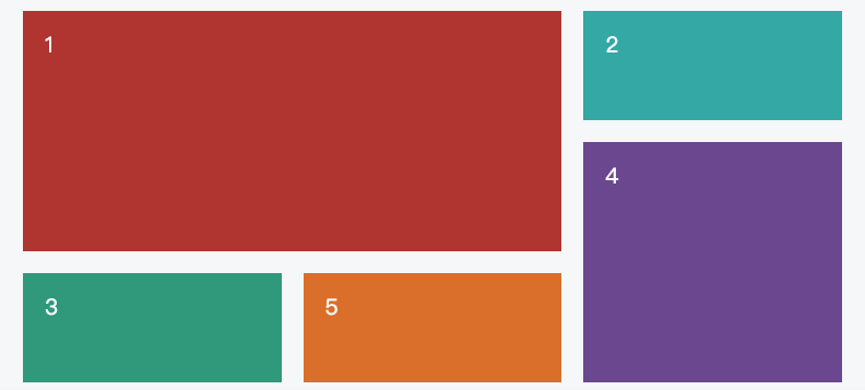
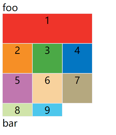
grid-auto-flow属性除了设置成row和column,还可以设成row dense和column dense。这两个值主要用于,某些项目指定位置以后,剩下的项目怎么自动放置。
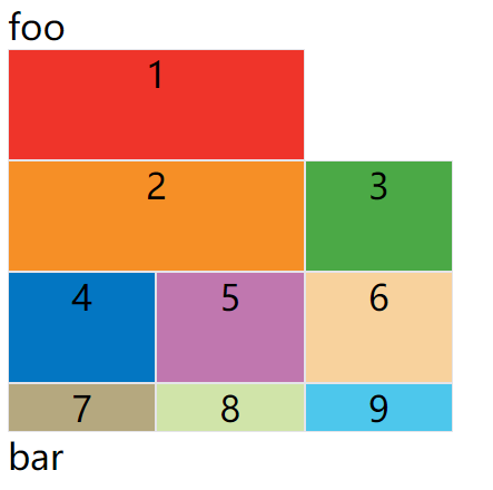
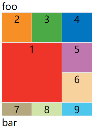
例子:让1号项目和2号项目各占据两个单元格,然后在默认的grid-auto-flow: row情况下,会产生下面这样的布局
<style>
  .container {
    display: grid;
    width: 400px;
    grid-template-columns: repeat(3, auto);
    grid-template-rows: 100px 100px 100px;
    grid-auto-flow: row;
  }
  .item {
    font-size: 2em;
    text-align: center;
    border: 1px solid #e5e4e9;
  }
</style>
<span style="font-size: 2em;">foo</span>
<div class="container">
  <div class="item" style="background: #ef342a;grid-column-start: 1;grid-column-end: 3;">1</div>
  <div class="item" style="background: #f68f26;grid-column-start: 1;grid-column-end: 3;">2</div>
  <div class="item" style="background: #4ba946;">3</div>
  <div class="item" style="background: #0376c2;">4</div>
  <div class="item" style="background: #c077af;">5</div>
  <div class="item" style="background: #f8d29d;">6</div>
  <div class="item" style="background: #b5a87f;">7</div>
  <div class="item" style="background: #d0e4a9;">8</div>
  <div class="item" style="background: #4dc7ec;">9</div>
</div>
<span style="font-size: 2em;">bar</span>
上图中,1号项目后面的位置是空的,这是因为3号项目默认跟着2号项目,所以会排在2号项目后面。
现在修改设置,设为row dense,表示"先行后列",并且尽可能紧密填满,尽量不出现空格。
.container {
  ...
  grid-auto-flow: row dense;
}
上面代码的效果如下:
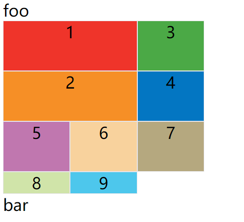
上图会先填满第一行,再填满第二行,所以3号项目就会紧跟在1号项目的后面。8号项目和9号项目就会排到第四行。
如果将设置改为column dense,表示"先列后行",并且尽量填满空格。
.container {
  ...
  grid-auto-flow: column dense;
}
上面代码的效果如下:
上图会先填满第一列,再填满第2列,所以3号项目在第一列,4号项目在第二列。8号项目和9号项目被挤到了第四列。
justify-items/align-items/place-items
justify-items属性设置单元格内容的水平位置(左中右),align-items属性设置单元格内容的垂直位置(上中下)。
.container {
  justify-items: start | end | center | stretch;
  align-items: start | end | center | stretch;
}
这两个属性的写法完全相同,都可以取下面这些值。
- start:对齐单元格的起始边缘。
- end:对齐单元格的结束边缘。
- center:单元格内部居中。
- stretch:拉伸,占满单元格的整个宽度(默认值)。
示例:justify-items: start;
<style>
  .container {
    display: grid;
    width: 400px;
    grid-template-columns: 100px 100px 100px;
    grid-template-rows: 100px 100px 100px;
    justify-items: start;
  }
  .item {
    font-size: 2em;
    text-align: center;
    border: 1px solid #e5e4e9;
  }
</style>
<span style="font-size: 2em;">foo</span>
<div class="container">
  <div class="item" style="background: #ef342a;">1</div>
  <div class="item" style="background: #f68f26;">2</div>
  <div class="item" style="background: #4ba946;">3</div>
  <div class="item" style="background: #0376c2;">4</div>
  <div class="item" style="background: #c077af;">5</div>
  <div class="item" style="background: #f8d29d;">6</div>
  <div class="item" style="background: #b5a87f;">7</div>
  <div class="item" style="background: #d0e4a9;">8</div>
  <div class="item" style="background: #4dc7ec;">9</div>
</div>
<span style="font-size: 2em;">bar</span>
上面代码表示,单元格的内容左对齐,效果如下图:
示例:align-items: start;
.container {
  ...
  align-items: start;
}
上面代码表示,单元格的内容头部对齐,效果如下图:
place-items属性是align-items属性和justify-items属性的合并简写形式。
place-items: <align-items> <justify-items>;
如果省略第二个值,则浏览器认为与第一个值相等。
例子:place-items: start end;
.container {
  ...
  place-items: start end;
}
上面代码表示,单元格内容的水平方向左对齐,垂直方向底部对齐
justify-content/align-content/place-content
justify-content属性是整个内容区域在容器里面的水平位置(左中右),align-content属性是整个内容区域的垂直位置(上中下)。
.container {
  justify-content: start | end | center | stretch | space-around | space-between | space-evenly;
  align-content: start | end | center | stretch | space-around | space-between | space-evenly;
}
这两个属性的写法完全相同,都可以取下面这些值。(下面的图都以justify-content属性为例,align-content属性的图完全一样,只是将水平方向改成垂直方向。)
- start - 对齐容器的起始边框。
- end - 对齐容器的结束边框。
- center - 容器内部居中。
- stretch - 项目大小没有指定时,拉伸占据整个网格容器。
- space-around - 每个项目两侧的间隔相等。所以,项目之间的间隔比项目与容器边框的间隔大一倍。
- space-between - 项目与项目的间隔相等,项目与容器边框之间没有间隔。
- space-evenly - 项目与项目的间隔相等,项目与容器边框之间也是同样长度的间隔。
示例:使其整个内容区域在容器里面水平垂直对齐
<style>
  .container {
    display: grid;
    width: 400px;
    height: 400px;
    background: #ccc;
    grid-template-columns: 100px 100px 100px;
    grid-template-rows: 100px 100px 100px;
    justify-content: center;
    align-content: center;
  }
  .item {
    font-size: 2em;
    text-align: center;
    border: 1px solid #e5e4e9;
  }
</style>
<span style="font-size: 2em;">foo</span>
<div class="container">
  <div class="item" style="background: #ef342a;">1</div>
  <div class="item" style="background: #f68f26;">2</div>
  <div class="item" style="background: #4ba946;">3</div>
  <div class="item" style="background: #0376c2;">4</div>
  <div class="item" style="background: #c077af;">5</div>
  <div class="item" style="background: #f8d29d;">6</div>
  <div class="item" style="background: #b5a87f;">7</div>
  <div class="item" style="background: #d0e4a9;">8</div>
  <div class="item" style="background: #4dc7ec;">9</div>
</div>
<span style="font-size: 2em;">bar</span>
上面代码中,justify-content: center;代表内容区域在整个容器里面水平居中对齐,align-content: center;代表内容区域在整个容器里面垂直居中对齐,效果如下图:
place-content属性是align-content属性和justify-content属性的合并简写形式。
place-content: <align-content> <justify-content>
如果省略第二个值,浏览器就会假定第二个值等于第一个值。
可以将上面例子中的justify-content: center;align-content: center;代码替换成下面这一句:
place-content: center center;
grid-auto-columns/grid-auto-rows
有时候,一些项目的指定位置,在现有网格的外部。比如网格只有3列,但是某一个项目指定在第5行。这时,浏览器会自动生成多余的网格,以便放置项目。
grid-auto-columns属性和grid-auto-rows属性用来设置,浏览器自动创建的多余网格的列宽和行高。它们的写法与grid-template-columns和grid-template-rows完全相同。如果不指定这两个属性,浏览器完全根据单元格内容的大小,决定新增网格的列宽和行高。
例子:划分好的网格是3行 x 3列,但是,8号项目指定在第4行,9号项目指定在第5行。
<style>
  .container {
    display: grid;
    grid-template-columns: 100px 100px 100px;
    grid-template-rows: 100px 100px 100px;
    grid-auto-rows: 50px;
  }
  .item {
    font-size: 2em;
    text-align: center;
    border: 1px solid #e5e4e9;
  }
</style>
<span style="font-size: 2em;">foo</span>
<div class="container">
  <div class="item" style="background: #ef342a;">1</div>
  <div class="item" style="background: #f68f26;">2</div>
  <div class="item" style="background: #4ba946;">3</div>
  <div class="item" style="background: #0376c2;">4</div>
  <div class="item" style="background: #c077af;">5</div>
  <div class="item" style="background: #f8d29d;">6</div>
  <div class="item" style="background: #b5a87f;">7</div>
  <div class="item" style="background: #d0e4a9;grid-row-start: 4;grid-column-start: 2;">8</div>
  <div class="item" style="background: #4dc7ec;grid-row-start: 5;grid-column-start: 3;">9</div>
</div>
<span style="font-size: 2em;">bar</span>
上面代码指定新增的行高统一为50px(原始的行高为100px)。
grid-template
grid-template属性是grid-template-columns、grid-template-rows和grid-template-areas这三个属性的合并简写形式。
grid属性是grid-template-rows、grid-template-columns、grid-template-areas、 grid-auto-rows、grid-auto-columns、grid-auto-flow这六个属性的合并简写形式。
从易读易写的角度考虑,还是建议不要合并属性。
项目属性
下面这些属性定义在项目上面。
grid-column-start/grid-column-end/grid-row-start/grid-row-end
项目的位置是可以指定的,具体方法就是指定项目的四个边框,分别定位在哪根网格线。
- grid-column-start属性:左边框所在的垂直网格线
- grid-column-end属性:右边框所在的垂直网格线
- grid-row-start属性:上边框所在的水平网格线
- grid-row-end属性:下边框所在的水平网格线
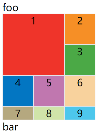
示例:1号项目的左边框是第二根垂直网格线,右边框是第四根垂直网格线
<style>
  .container {
    display: grid;
    grid-template-columns: 100px 100px 100px;
    grid-template-rows: 100px 100px 100px;
  }
  .item {
    font-size: 2em;
    text-align: center;
    border: 1px solid #e5e4e9;
  }
</style>
<span style="font-size: 2em;">foo</span>
<div class="container">
  <div class="item" style="background: #ef342a;grid-column-start: 2;grid-column-end: 4;">1</div>
  <div class="item" style="background: #f68f26;">2</div>
  <div class="item" style="background: #4ba946;">3</div>
  <div class="item" style="background: #0376c2;">4</div>
  <div class="item" style="background: #c077af;">5</div>
  <div class="item" style="background: #f8d29d;">6</div>
  <div class="item" style="background: #b5a87f;">7</div>
  <div class="item" style="background: #d0e4a9;">8</div>
  <div class="item" style="background: #4dc7ec;">9</div>
</div>
<span style="font-size: 2em;">bar</span>
效果如下:
上图中,只指定了1号项目的左右边框,没有指定上下边框,所以会采用默认位置,即上边框是第一根水平网格线,下边框是第二根水平网格线。
除了1号项目以外,其他项目都没有指定位置,由浏览器自动布局,这时它们的位置由容器的grid-auto-flow属性决定,这个属性的默认值是row,因此会"先行后列"进行排列。读者可以把这个属性的值分别改成column、row dense和column dense,看看其他项目的位置发生了怎样的变化。
例子:指定四个边框位置的效果
<style>
  .container {
    display: grid;
    grid-template-columns: 100px 100px 100px;
    grid-template-rows: 100px 100px 100px;
  }
  .item {
    font-size: 2em;
    text-align: center;
    border: 1px solid #e5e4e9;
  }
</style>
<span style="font-size: 2em;">foo</span>
<div class="container">
  <div class="item" style="background: #ef342a;grid-column-start: 1;grid-column-end: 3;grid-row-start: 2;grid-row-end: 4">1</div>
  <div class="item" style="background: #f68f26;">2</div>
  <div class="item" style="background: #4ba946;">3</div>
  <div class="item" style="background: #0376c2;">4</div>
  <div class="item" style="background: #c077af;">5</div>
  <div class="item" style="background: #f8d29d;">6</div>
  <div class="item" style="background: #b5a87f;">7</div>
  <div class="item" style="background: #d0e4a9;">8</div>
  <div class="item" style="background: #4dc7ec;">9</div>
</div>
<span style="font-size: 2em;">bar</span>
效果如下图:

这四个属性的值,除了指定为第几个网格线,还可以指定为网格线的名字。
grid-column-start: header-start;
grid-column-end: header-end;
上面代码中,左边框和右边框的位置,都指定为网格线的名字。
示例:左边框和右边框的位置,都指定为网格线的名字
<style>
  .container {
    width: 300px;
    display: grid;
    grid-template-columns: 100px 100px 100px;
    grid-template-rows: 100px 100px 100px;
    grid-template-areas: "header header header"
                     "main main sidebar"
                     "footer footer footer";
  }
  .item {
    font-size: 2em;
    text-align: center;
    border: 1px solid #e5e4e9;
  }
</style>
<span style="font-size: 2em;">foo</span>
<div class="container">
  <div class="item" style="background: #ef342a;grid-column-start: header-start;grid-column-end: header-end;">1</div>
  <div class="item" style="background: #f68f26;">2</div>
  <div class="item" style="background: #4ba946;">3</div>
  <div class="item" style="background: #0376c2;">4</div>
  <div class="item" style="background: #c077af;">5</div>
  <div class="item" style="background: #f8d29d;">6</div>
  <div class="item" style="background: #b5a87f;">7</div>
  <div class="item" style="background: #d0e4a9;">8</div>
  <div class="item" style="background: #4dc7ec;">9</div>
</div>
<span style="font-size: 2em;">bar</span>
效果如下图:
这四个属性的值还可以使用span关键字,表示"跨越",即左右边框(上下边框)之间跨越多少个网格。
grid-column-start: span 2;
示例:1号项目的左边框距离右边框跨越2个网格
<style>
  .container {
    display: grid;
    grid-template-columns: 100px 100px 100px;
    grid-template-rows: 100px 100px 100px;
  }
  .item {
    font-size: 2em;
    text-align: center;
    border: 1px solid #e5e4e9;
  }
</style>
<span style="font-size: 2em;">foo</span>
<div class="container">
  <div class="item" style="background: #ef342a;grid-column-start: span 2;">1</div>
  <div class="item" style="background: #f68f26;">2</div>
  <div class="item" style="background: #4ba946;">3</div>
  <div class="item" style="background: #0376c2;">4</div>
  <div class="item" style="background: #c077af;">5</div>
  <div class="item" style="background: #f8d29d;">6</div>
  <div class="item" style="background: #b5a87f;">7</div>
  <div class="item" style="background: #d0e4a9;">8</div>
  <div class="item" style="background: #4dc7ec;">9</div>
</div>
<span style="font-size: 2em;">bar</span>
效果如下图:
示例:grid-column-end: span 2;
<style>
  .container {
    width: 300px;
    display: grid;
    grid-template-columns: 100px 100px 100px;
    grid-template-rows: 100px 100px 100px;
  }
  .item {
    font-size: 2em;
    text-align: center;
    border: 1px solid #e5e4e9;
  }
</style>
<span style="font-size: 2em;">foo</span>
<div class="container">
  <div class="item" style="background: #ef342a;grid-column-start: 1;grid-column-end: span 2;grid-row-start: 2;grid-row-end: 4;">1</div>
  <div class="item" style="background: #f68f26;">2</div>
  <div class="item" style="background: #4ba946;">3</div>
  <div class="item" style="background: #0376c2;">4</div>
  <div class="item" style="background: #c077af;">5</div>
  <div class="item" style="background: #f8d29d;">6</div>
  <div class="item" style="background: #b5a87f;">7</div>
  <div class="item" style="background: #d0e4a9;">8</div>
  <div class="item" style="background: #4dc7ec;">9</div>
</div>
<span style="font-size: 2em;">bar</span>
效果如下图:
使用这四个属性,如果产生了项目的重叠,则使用z-index属性指定项目的重叠顺序。
grid-column 属性,grid-row 属性
grid-column属性是grid-column-start和grid-column-end的合并简写形式,grid-row属性是grid-row-start属性和grid-row-end的合并简写形式。
.item {
  grid-column: <start-line> / <end-line>;
  grid-row: <start-line> / <end-line>;
}
下面是一个例子。
.item-1 {
  grid-column: 1 / 3;
  grid-row: 1 / 2;
}
/* 等同于 */
.item-1 {
  grid-column-start: 1;
  grid-column-end: 3;
  grid-row-start: 1;
  grid-row-end: 2;
}
上面代码中,项目item-1占据第一行,从第一根列线到第三根列线。
这两个属性之中,也可以使用span关键字,表示跨越多少个网格。
.item-1 {
  background: #b03532;
  grid-column: 1 / 3;
  grid-row: 1 / 3;
}
/* 等同于 */
.item-1 {
  background: #b03532;
  grid-column: 1 / span 2;
  grid-row: 1 / span 2;
}
示例:项目item-1占据的区域,包括第一行 + 第二行、第一列 + 第二列。
<style>
  .container {
    width: 300px;
    display: grid;
    grid-template-columns: 100px 100px 100px;
    grid-template-rows: 100px 100px 100px;
  }
  .item {
    font-size: 2em;
    text-align: center;
    border: 1px solid #e5e4e9;
  }
</style>
<span style="font-size: 2em;">foo</span>
<div class="container">
  <div class="item" style="background: #ef342a;grid-column: 1 / 3;grid-row: 1 / 3;">1</div>
  <div class="item" style="background: #f68f26;">2</div>
  <div class="item" style="background: #4ba946;">3</div>
  <div class="item" style="background: #0376c2;">4</div>
  <div class="item" style="background: #c077af;">5</div>
  <div class="item" style="background: #f8d29d;">6</div>
  <div class="item" style="background: #b5a87f;">7</div>
  <div class="item" style="background: #d0e4a9;">8</div>
  <div class="item" style="background: #4dc7ec;">9</div>
</div>
<span style="font-size: 2em;">bar</span>
效果如下图:
斜杠以及后面的部分可以省略,默认跨越一个网格。
.item-1 {
  grid-column: 1;
  grid-row: 1;
}
上面代码中,项目item-1占据左上角第一个网格。
grid-area
grid-area属性指定项目放在哪一个区域。
.item-1 {
  grid-area: e;
}
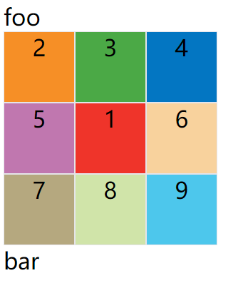
示例:1号项目位于e区域
<style>
  .container {
    width: 300px;
    display: grid;
    grid-template-columns: 100px 100px 100px;
    grid-template-rows: 100px 100px 100px;
    grid-template-areas: 'a b c'
                     'd e f'
                     'g h i';
  }
  .item {
    font-size: 2em;
    text-align: center;
    border: 1px solid #e5e4e9;
  }
</style>
<span style="font-size: 2em;">foo</span>
<div class="container">
  <div class="item" style="background: #ef342a;grid-area: e;">1</div>
  <div class="item" style="background: #f68f26;">2</div>
  <div class="item" style="background: #4ba946;">3</div>
  <div class="item" style="background: #0376c2;">4</div>
  <div class="item" style="background: #c077af;">5</div>
  <div class="item" style="background: #f8d29d;">6</div>
  <div class="item" style="background: #b5a87f;">7</div>
  <div class="item" style="background: #d0e4a9;">8</div>
  <div class="item" style="background: #4dc7ec;">9</div>
</div>
<span style="font-size: 2em;">bar</span>
效果如下图:
grid-area属性还可用作grid-row-start、grid-column-start、grid-row-end、grid-column-end的合并简写形式,直接指定项目的位置。
.item {
  grid-area: <row-start> / <column-start> / <row-end> / <column-end>;
}
示例:
<style>
  .container {
    width: 300px;
    display: grid;
    grid-template-columns: 100px 100px 100px;
    grid-template-rows: 100px 100px 100px;
  }
  .item {
    font-size: 2em;
    text-align: center;
    border: 1px solid #e5e4e9;
  }
</style>
<span style="font-size: 2em;">foo</span>
<div class="container">
  <div class="item" style="background: #ef342a;grid-area: 1 / 1 / 3 / 3;">1</div>
  <div class="item" style="background: #f68f26;">2</div>
  <div class="item" style="background: #4ba946;">3</div>
  <div class="item" style="background: #0376c2;">4</div>
  <div class="item" style="background: #c077af;">5</div>
  <div class="item" style="background: #f8d29d;">6</div>
  <div class="item" style="background: #b5a87f;">7</div>
  <div class="item" style="background: #d0e4a9;">8</div>
  <div class="item" style="background: #4dc7ec;">9</div>
</div>
<span style="font-size: 2em;">bar</span>
效果如下图:
justify-self/align-self/place-self
justify-self属性设置单元格内容的水平位置(左中右),跟justify-items属性的用法完全一致,但只作用于单个项目。
align-self属性设置单元格内容的垂直位置(上中下),跟align-items属性的用法完全一致,也是只作用于单个项目。
.item {
  justify-self: start | end | center | stretch;
  align-self: start | end | center | stretch;
}
这两个属性都可以取下面四个值。
- start:对齐单元格的起始边缘。
- end:对齐单元格的结束边缘。
- center:单元格内部居中。
- stretch:拉伸,占满单元格的整个宽度(默认值)。
例子:justify-self: center;align-self: center;
<style>
  .container {
    width: 300px;
    display: grid;
    grid-template-columns: 100px 100px 100px;
    grid-template-rows: 100px 100px 100px;
  }
  .item {
    font-size: 2em;
    text-align: center;
    border: 1px solid #e5e4e9;
  }
</style>
<span style="font-size: 2em;">foo</span>
<div class="container">
  <div class="item" style="background: #ef342a;justify-self: center;align-self: center;">1</div>
  <div class="item" style="background: #f68f26;">2</div>
  <div class="item" style="background: #4ba946;">3</div>
  <div class="item" style="background: #0376c2;">4</div>
  <div class="item" style="background: #c077af;">5</div>
  <div class="item" style="background: #f8d29d;">6</div>
  <div class="item" style="background: #b5a87f;">7</div>
  <div class="item" style="background: #d0e4a9;">8</div>
  <div class="item" style="background: #4dc7ec;">9</div>
</div>
<span style="font-size: 2em;">bar</span>
效果如下图:
place-self属性是align-self属性和justify-self属性的合并简写形式。
如果省略第二个值,place-self属性会认为这两个值相等。
place-self: <align-self> <justify-self>;
上面例子的代码可以改成如下:
place-self: center center;
结语
❤️ 🧡 💛大家喜欢我写的文章的话,欢迎大家点点关注、点赞、收藏和转载!!
欢迎关注公众号前端开心果 🔥我会持续更新前端相关的内容文章哦。


