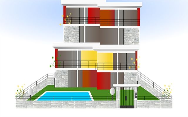
记住我们之前画的草图,根据我们的草图来构建初始的页面
<!DOCTYPE html>
<html lang="en">
<head>
<meta charset="UTF-8" />
<meta http-equiv="X-UA-Compatible" content="IE=edge" />
<meta name="viewport" content="width=device-width, initial-scale=1.0" />
<link rel="stylesheet" href="css/style.css" />
<title>Omnifood</title>
</head>
<body>
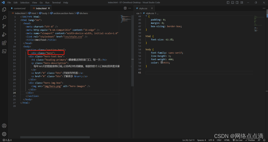
<section class="section-hero">
<div class="hero-text-box">
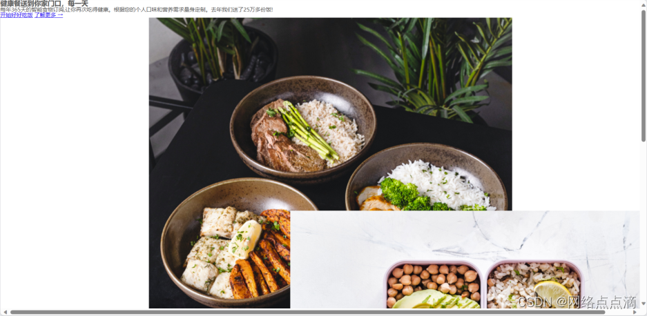
<h1 class="heading-primary">健康餐送到你家门口,每一天</h1>
<p class="hero-description">
每年365天的智能食物订阅,让你再次吃得健康。根据您的个人口味和营养需求量身定制。去年我们送了25万多份饭!
</p>
<a href="#" class="btn">开始好好吃饭</a>
<a href="#" class="btn">了解更多 →</a>
</div>
<div class="hero-img-box">
<img src="img/hero.png" alt="hero-images" />
</div>
</section>
</body>
</html>
根据上述代码的几个注意事项:
● 通常一个部分我们会有section元素,这符合语义化HTML的规则
● 主体页面的按钮,这次我们使用a元素去实现
● 通常我们把文字和图片单独放置一个class中,方便区分和CSS的编写
● →这个元素是指向右边的箭头,还有&darr;向下的箭头,以此类推
● 这里我们选择CSS grid布局,在外围添加一个布局的容器,记住不能使用seciton,因为section仅能作为表达模块和节,最好不要使用它来作为布局的容器;
● 首先我们先使用css grid来布两列的布局
.hero {
    display: grid;
    grid-template-columns: 1fr 1fr;

}
● 之后再设置图片的宽度
.hero-image {
    width: 100%;
}
● 接着就是用max-width来设置全部的宽度和居中了
.hero {
    max-width: 130rem;
    margin: 0 auto;
    display: grid;
    grid-template-columns: 1fr 1fr;
}

第一部分就到此结束了,下一节再继续!