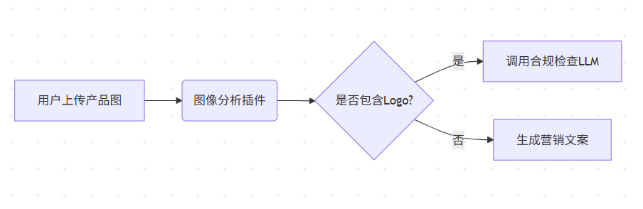
在网页开发中,有多种方式能让一个盒子实现水平垂直居中。下面为你介绍几种常见且快速的方法。
1. 使用 Flexbox 布局
Flexbox 是一种非常便捷的布局模型,能够轻松实现元素的水平和垂直居中。
html
<!DOCTYPE html>
<html lang="en">

<head>
    <meta charset="UTF-8">
    <meta name="viewport" content="width=device-width, initial-scale=1.0">
    <style>
        .parent {
            display: flex;
            justify-content: center;
            align-items: center;
            width: 300px;
            height: 300px;
            background-color: lightblue;
        }

        .child {
            width: 50px;
            height: 50px;
            background-color: lightcoral;
        }
    </style>
    <title>Flexbox 居中</title>
</head>

<body>
    <div class="parent">
        <div class="child"></div>
    </div>
</body>

</html>
在上述代码中,通过将父元素的 display 属性设置为 flex,使其成为一个弹性容器。justify-content: center 实现了子元素在水平方向上的居中,align-items: center 实现了子元素在垂直方向上的居中。
2. 使用绝对定位和负边距
此方法利用绝对定位和负边距来达成元素的水平垂直居中。
html
<!DOCTYPE html>
<html lang="en">

<head>
    <meta charset="UTF-8">
    <meta name="viewport" content="width=device-width, initial-scale=1.0">
    <style>
        .parent {
            position: relative;
            width: 300px;
            height: 300px;
            background-color: lightblue;
        }

        .child {
            position: absolute;
            top: 50%;
            left: 50%;
            width: 50px;
            height: 50px;
            margin-top: -25px;
            margin-left: -25px;
            background-color: lightcoral;
        }
    </style>
    <title>绝对定位和负边距居中</title>
</head>

<body>
    <div class="parent">
        <div class="child"></div>
    </div>
</body>

</html>
这里,父元素的 position 属性被设置为 relative,作为子元素绝对定位的参考。子元素通过 top: 50% 和 left: 50% 把左上角定位到父元素的中心,再利用负边距(值为自身宽度和高度的一半)将其向上和向左移动,从而实现水平垂直居中。不过,这种方法要求子元素的宽度和高度是固定的。
3. 使用绝对定位和 transform 属性
借助绝对定位和 transform 属性也能实现元素的水平垂直居中。
transform: translate(-50%, -50%); 意味着元素会在 X 轴和 Y 轴上分别向左和向上移动自身宽度和高度的 50%。
<!DOCTYPE html>
<html lang="en">

<head>
    <meta charset="UTF-8">
    <meta name="viewport" content="width=device-width, initial-scale=1.0">
    <style>
        .parent {
            position: relative;
            width: 300px;
            height: 300px;
            background-color: lightblue;
        }

        .child {
            position: absolute;
            top: 50%;
            left: 50%;
            transform: translate(-50%, -50%);
            width: 50px;
            height: 50px;
            background-color: lightcoral;
        }
    </style>
    <title>绝对定位和 transform 居中</title>
</head>

<body>
    <div class="parent">
        <div class="child"></div>
    </div>
</body>

</html>
父元素的 position 属性设为 relative,子元素通过 top: 50% 和 left: 50% 把左上角定位到父元素的中心,transform: translate(-50%, -50%) 则将子元素向上和向左移动自身宽度和高度的一半,实现水平垂直居中。这种方法不要求子元素的宽度和高度固定。
4. 使用 Grid 布局
Grid 布局是一种强大的二维布局模型,也能轻松实现元素的水平垂直居中。
html
<!DOCTYPE html>
<html lang="en">

<head>
    <meta charset="UTF-8">
    <meta name="viewport" content="width=device-width, initial-scale=1.0">
    <style>
        .parent {
            display: grid;
            place-items: center;
            width: 300px;
            height: 300px;
            background-color: lightblue;
        }

        .child {
            width: 50px;
            height: 50px;
            background-color: lightcoral;
        }
    </style>
    <title>Grid 居中</title>
</head>

<body>
    <div class="parent">
        <div class="child"></div>
    </div>
</body>

</html>
通过将父元素的 display 属性设置为 grid,使其成为一个网格容器。place-items: center 同时实现了子元素在水平和垂直方向上的居中。

![[Redis]1-高效的数据结构P2-Set](https://i-blog.csdnimg.cn/direct/023f6a4da5a048fdbaaf56a839fe7b9f.png)
![[渗透测试]渗透测试靶场docker搭建 — —全集](https://i-blog.csdnimg.cn/direct/f0d53ffa538f4d1fa5ec1e2b777a54b0.png)