下面是一个带有多种动态背景效果的现代化前端页面,包含粒子效果、渐变波浪和星空背景三种可选动态背景。直接上代码!!
<!DOCTYPE html>
<html lang="zh-CN">
<head>
<meta charset="UTF-8">
<meta name="viewport" content="width=device-width, initial-scale=1.0">
<title>动态背景效果展示</title>
<style>
* {
margin: 0;
padding: 0;
box-sizing: border-box;
}
body {
font-family: 'Arial', sans-serif;
color: white;
overflow: hidden;
height: 100vh;
background-color: #0a192f; /* 默认背景色 */
}
.background-selector {
position: fixed;
top: 20px;
right: 20px;
z-index: 100;
display: flex;
gap: 10px;
}
.bg-btn {
padding: 8px 15px;
background: rgba(255, 255, 255, 0.2);
border: 1px solid rgba(255, 255, 255, 0.3);
color: white;
border-radius: 20px;
cursor: pointer;
backdrop-filter: blur(5px);
transition: all 0.3s ease;
font-size: 14px;
}
.bg-btn:hover {
background: rgba(255, 255, 255, 0.3);
}
.bg-btn.active {
background: rgba(255, 255, 255, 0.4);
font-weight: bold;
}
.content {
position: relative;
z-index: 10;
height: 100vh;
display: flex;
flex-direction: column;
justify-content: center;
align-items: center;
text-align: center;
padding: 20px;
}
h1 {
font-size: 3rem;
margin-bottom: 20px;
text-shadow: 0 2px 10px rgba(0, 0, 0, 0.3);
}
p {
font-size: 1.2rem;
max-width: 600px;
margin-bottom: 30px;
line-height: 1.6;
text-shadow: 0 1px 3px rgba(0, 0, 0, 0.3);
}
/* 粒子背景容器 */
#particles-js {
position: fixed;
width: 100%;
height: 100%;
top: 0;
left: 0;
z-index: 0;
display: block;
}
/* 渐变波浪背景 */
.wave-container {
position: fixed;
width: 100%;
height: 100%;
top: 0;
left: 0;
z-index: 0;
display: none;
overflow: hidden;
}
.wave {
position: absolute;
bottom: 0;
left: 0;
width: 200%;
height: 100%;
background: linear-gradient(45deg, #ee7752, #e73c7e, #23a6d5, #23d5ab);
background-size: 400% 400%;
animation: gradient 15s ease infinite;
}
.wave::before,
.wave::after {
content: '';
position: absolute;
width: 300%;
height: 300%;
top: -50%;
left: 50%;
transform: translate(-50%, -75%);
}
.wave::before {
border-radius: 45%;
background: rgba(255, 255, 255, 0.1);
animation: wave 15s linear infinite;
}
.wave::after {
border-radius: 40%;
background: rgba(255, 255, 255, 0.05);
animation: wave 20s linear infinite;
}
/* 星空背景 */
.stars {
position: fixed;
width: 100%;
height: 100%;
top: 0;
left: 0;
z-index: 0;
display: none;
background-color: #000;
}
.star {
position: absolute;
background-color: white;
border-radius: 50%;
animation: twinkle var(--duration) infinite ease-in-out;
}
/* 动画效果 */
@keyframes gradient {
0% { background-position: 0% 50%; }
50% { background-position: 100% 50%; }
100% { background-position: 0% 50%; }
}
@keyframes wave {
0% { transform: translate(-50%, -75%) rotate(0deg); }
100% { transform: translate(-50%, -75%) rotate(360deg); }
}
@keyframes twinkle {
0%, 100% { opacity: 0.2; }
50% { opacity: 1; }
}
/* 移动设备适配 */
@media (max-width: 768px) {
h1 {
font-size: 2rem;
}
p {
font-size: 1rem;
padding: 0 15px;
}
.background-selector {
top: 10px;
right: 10px;
flex-direction: column;
align-items: flex-end;
}
.bg-btn {
padding: 6px 12px;
font-size: 12px;
}
}
</style>
</head>
<body>
<!-- 背景选择器 -->
<div class="background-selector">
<button class="bg-btn active" data-bg="particles">粒子效果</button>
<button class="bg-btn" data-bg="wave">渐变波浪</button>
<button class="bg-btn" data-bg="stars">星空背景</button>
</div>
<!-- 页面内容 -->
<div class="content">
<h1>动态背景效果展示</h1>
<p>这是一个展示不同动态背景效果的页面。点击右上角的按钮可以切换不同的背景风格。</p>
</div>
<!-- 粒子背景 -->
<div id="particles-js"></div>
<!-- 渐变波浪背景 -->
<div class="wave-container">
<div class="wave"></div>
</div>
<!-- 星空背景 -->
<div class="stars"></div>
<!-- 粒子效果库 -->
<script src="https://cdn.jsdelivr.net/particles.js/2.0.0/particles.min.js"></script>
<script>
// 背景切换功能
const bgButtons = document.querySelectorAll('.bg-btn');
const backgrounds = {
particles: document.getElementById('particles-js'),
wave: document.querySelector('.wave-container'),
stars: document.querySelector('.stars')
};
// 显示默认背景
backgrounds.particles.style.display = 'block';
// 初始化粒子效果
function initParticles() {
particlesJS('particles-js', {
particles: {
number: {
value: window.innerWidth < 768 ? 40 : 80, // 移动设备减少粒子数量
density: {
enable: true,
value_area: window.innerWidth < 768 ? 600 : 800
}
},
color: { value: "#ffffff" },
shape: { type: "circle" },
opacity: {
value: 0.5,
random: true,
anim: { enable: true, speed: 1, opacity_min: 0.1 }
},
size: {
value: 3,
random: true,
anim: { enable: true, speed: 2, size_min: 0.3 }
},
line_linked: {
enable: true,
distance: window.innerWidth < 768 ? 100 : 150,
color: "#ffffff",
opacity: 0.4,
width: 1
},
move: {
enable: true,
speed: window.innerWidth < 768 ? 1 : 2, // 移动设备降低速度
direction: "none",
random: true,
straight: false,
out_mode: "bounce",
bounce: true
}
},
interactivity: {
detect_on: "window",
events: {
onhover: {
enable: true,
mode: "repulse",
parallax: { enable: true, force: 30, smooth: 10 }
},
onclick: {
enable: true,
mode: "push",
push: { particles_nb: 4 }
},
resize: true
},
modes: {
repulse: {
distance: window.innerWidth < 768 ? 50 : 100,
duration: 0.4
},
push: { particles_nb: 4 }
}
},
retina_detect: true
});
}
// 创建星空
function createStars() {
const starsContainer = document.querySelector('.stars');
starsContainer.innerHTML = '';
const starCount = window.innerWidth < 768 ? 100 : 200; // 移动设备减少星星数量
for (let i = 0; i < starCount; i++) {
const star = document.createElement('div');
star.classList.add('star');
// 随机大小 (1-3px)
const size = Math.random() * 2 + 1;
star.style.width = `${size}px`;
star.style.height = `${size}px`;
// 随机位置
star.style.left = `${Math.random() * 100}%`;
star.style.top = `${Math.random() * 100}%`;
// 随机闪烁时间
star.style.setProperty('--duration', `${Math.random() * 5 + 3}s`);
starsContainer.appendChild(star);
}
}
// 初始化星空
createStars();
// 背景切换事件
bgButtons.forEach(button => {
button.addEventListener('click', () => {
// 更新按钮状态
bgButtons.forEach(btn => btn.classList.remove('active'));
button.classList.add('active');
// 隐藏所有背景
Object.values(backgrounds).forEach(bg => bg.style.display = 'none');
// 显示选中的背景
const selectedBg = button.getAttribute('data-bg');
backgrounds[selectedBg].style.display = 'block';
// 如果是星空背景,重新生成星星
if (selectedBg === 'stars') {
createStars();
}
// 如果是粒子背景,重新初始化
if (selectedBg === 'particles') {
// 先销毁现有粒子
if (window.pJSDom && window.pJSDom.length > 0) {
window.pJSDom[0].pJS.fn.vendors.destroy();
}
// 重新初始化
initParticles();
}
});
});
// 页面加载时初始化粒子
document.addEventListener('DOMContentLoaded', initParticles);
// 窗口大小改变时重新调整
window.addEventListener('resize', function() {
// 如果是粒子背景当前显示,则重新初始化
if (backgrounds.particles.style.display === 'block') {
if (window.pJSDom && window.pJSDom.length > 0) {
window.pJSDom[0].pJS.fn.vendors.destroy();
}
initParticles();
}
// 如果是星空背景当前显示,则重新生成星星
if (backgrounds.stars.style.display === 'block') {
createStars();
}
});
</script>
</body>
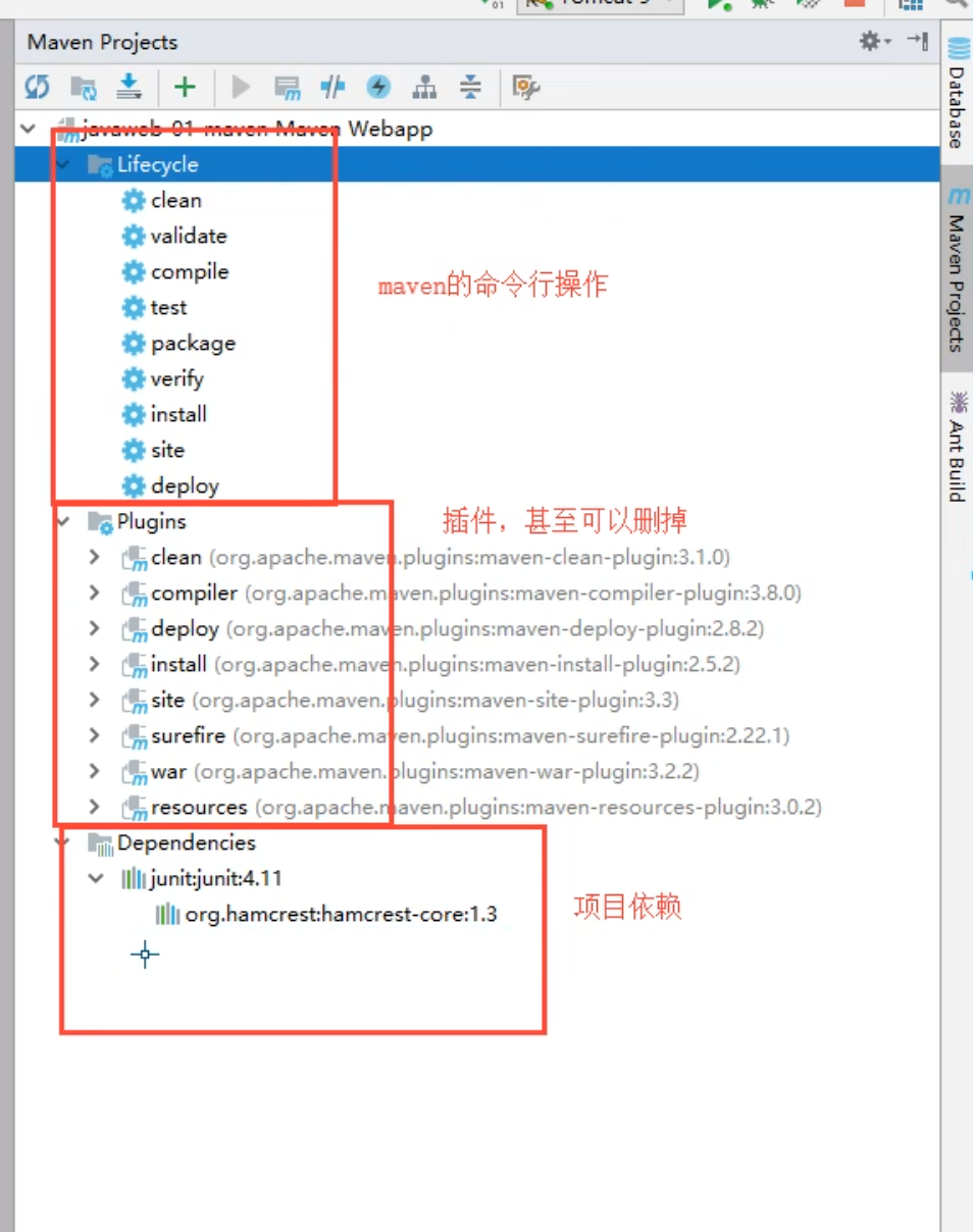
</html>页面特点
-
三种动态背景效果:
-
粒子效果:可交互的粒子网络,鼠标悬停会排斥粒子,点击会添加粒子
-
渐变波浪:彩色渐变背景加上动态波浪效果
-
星空背景:随机生成的闪烁星星
-
-
响应式设计:
-
适配各种屏幕尺寸
-
在移动设备上自动调整布局
-
-
用户交互:
-
可以随时切换不同的背景效果
-
粒子效果支持鼠标交互
-
-
视觉效果:
-
平滑的动画过渡
-
精美的色彩搭配
-
动态生成的随机元素
-
如何使用
-
将代码保存为HTML文件
-
在浏览器中打开即可看到效果
-
点击右上角的按钮可以切换不同的背景风格
-
可以自定义修改内容文字、颜色和动画参数
扩展建议
-
添加更多背景效果选项
-
实现背景效果的参数自定义
-
添加背景音乐配合视觉效果
-
保存用户选择的背景偏好到本地存储
这个页面可以直接使用,也可以作为基础集成到你的网站中,为网站增添动态视觉效果。


![[NOIP 2003 普及组] 栈 Java](https://i-blog.csdnimg.cn/direct/07c35fd8e1314b9593b56802d8d6f3ed.png)