目录
1. Popup组件介绍
2. 使用
上一章内容完成了音乐播放器程序的基本界面框架设计。本小节完成一个简单的功能。单击该播放器顶部菜单栏的“关于”按钮,弹出该程序的相关版本信息。我们将使用Qt Quick的Popup组件来实现。
1. Popup组件介绍
Qt 中的 Popup 组件用于在应用程序界面上临时弹出一个窗口,它常作为上下文菜单、提示框或信息展示区域使用。Popup 窗口通常依附于某个父控件,在特定事件(如鼠标点击、悬停)触发时显示,能提供额外的操作选项或信息,且不影响主窗口的布局。在用户与 Popup 交互完成或触发特定条件(如点击外部区域)时,它会自动隐藏。
2. 使用
修改LayoutHeaderView.qml文件,在ToolBar中添加Popup组件(紧跟RowLayout):
Popup{
id:aboutPop
topInset: 0
leftInset: -2
rightInset: 0
bottomInset: 0
parent: Overlay.overlay
x:(parent.width-width)/2
y:(parent.height-height)/2
width: 250
height: 230
background: Rectangle{
color:"#e9f4ff"
radius: 5
border.color: "#2273a7ab"
}
contentItem: ColumnLayout{
width: parent.width
height: parent.height
Layout.alignment: Qt.AlignHCenter
Image{
Layout.preferredHeight: 60
source: "qrc:/images/music"
Layout.fillWidth:true
fillMode: Image.PreserveAspectFit
}
Text {
text: qsTr("音乐播放器")
Layout.fillWidth: true
horizontalAlignment: Text.AlignHCenter
font.pixelSize: 16
color: "#8573a7ab"
font.family: window.mFONT_FAMILY
font.bold: true
}
Text {
text: qsTr("版本:V1.0")
Layout.fillWidth: true
horizontalAlignment: Text.AlignHCenter
font.pixelSize: 16
color: "#8573a7ab"
font.family: window.mFONT_FAMILY
font.bold: true
}
}
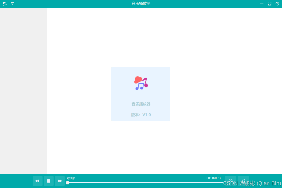
}上述代码使用 Qt Quick 的 Popup 组件创建了一个名为aboutPop的弹出窗口。设置了内外边距,使其位于覆盖层中心,尺寸为宽 250、高 230。背景是带圆角和边框的矩形,颜色为浅蓝。内容部分用 ColumnLayout 垂直排列元素,包含一个展示音乐图片的 Image 组件和两个 Text 组件,分别显示 “音乐播放器” 和 “版本:V1.0”,字体使用window.mFONT_FAMILY,颜色为淡蓝色,字号 16 且加粗。
然后修改RowLayout组件中的相关代码如下:
MusicToolButton{
            icon.source: "qrc:/images/music.png"
            toolTip: "关于"
            onClicked: {
                aboutPop.open()
            }
}上述代码在原来的基础上添加了onClicked事件。当按钮被点击时,执行aboutPop.open(),即打开之前定义的aboutPop弹出窗口,用于展示相关信息。
运行程序,单击顶部菜单栏“关于”按钮,最终效果如下图所示:
上一章:QT Quick(C++)跨平台应用程序项目实战教程 5 — 界面设计-CSDN博客
下一章: