上篇的截图中除了一个上下的箭头,还有一个圆形进度条,今天我们来讲讲这个如何进行实现
我们看这个图形的构造,其实很简单:一个圆形图形,以及一个文本来显示进度 所以我们用一个层叠布局
绘制一个带颜色的圆形,然后在放一个文本来显示进度即可。具体的实现看下面这个实现过程
实现步骤
-
定义组件结构:
- 使用
@Component装饰器定义CircleProgressView结构体。
- 使用
-
声明属性:
progress: 数字,当前进度值(0-100),默认为 0color: 字符串,进度条颜色,默认为 ‘#1989fa’layerColor: 字符串,背景圆环颜色,默认为 ‘#ebedf0’circleSize: 数字,圆形进度条的大小(宽度和高度),默认为 100strokeWidth: 数字,圆环的线条宽度,默认为 4clockwise: 布尔值,进度是否顺时针增加,默认为 true
其中 我们 @State 装饰器来设置 progress 状态。用 @Prop 装饰器定义其他可配置属性。
装饰器的作用是通过数据来驱动UI,当数据变更后UI上的值也将变化,关于鸿蒙中装饰器的使用详见鸿蒙官方文档
-
初始化绘图上下文:
- 创建
RenderingContextSettings和CanvasRenderingContext2D实例。
- 创建
-
实现绘制圆形的辅助方法:
drawCircle方法用于绘制圆形或圆弧。
-
实现
build方法:- 使用
Stack组件作为容器,居中对齐内容。 - 添加
Canvas组件并设置其宽度和高度。 - 在
onReady回调中绘制背景圆和进度圆弧。 - 添加
Text组件显示进度百分比。
- 使用
具体的代码实现如下:
@Component
export struct CircleProgressView {
  @State progress: number = 0
  @Prop color: string = '#1989fa'
  @Prop layerColor: string = '#ebedf0'
  @Prop circleSize: number = 100
  @Prop strokeWidth: number = 4
  @Prop clockwise: boolean = true
  private settings: RenderingContextSettings = new RenderingContextSettings(true)
  private context: CanvasRenderingContext2D = new CanvasRenderingContext2D(this.settings)

  build() {
    Stack({ alignContent: Alignment.Center }) {
      Canvas(this.context)
        .width(this.circleSize)
        .height(this.circleSize)
        .onReady(() => {
          let centerX = this.circleSize / 2
          let centerY = this.circleSize / 2
          let radius = (this.circleSize - this.strokeWidth) / 2

          // 绘制背景圆
          this.drawCircle(this.context, centerX, centerY, radius, this.layerColor, 0, 2 * Math.PI)

          // 计算进度角度
          let progressAngle = (this.progress / 100) * 2 * Math.PI
          let startAngle = -Math.PI / 2
          let endAngle = this.clockwise ? startAngle + progressAngle : startAngle - progressAngle

          // 绘制进度圆弧
          this.drawCircle(this.context, centerX, centerY, radius, this.color, startAngle, endAngle)
        })

      Text(`${this.progress}%`)
        .fontSize(16)
        .fontColor(this.color)
    }
    .width(this.circleSize)
    .height(this.circleSize)
  }

  private drawCircle(context: CanvasRenderingContext2D, centerX: number, centerY: number, radius: number, color: string,
    startAngle: number, endAngle: number) {
    context.beginPath()
    context.arc(centerX, centerY, radius, startAngle, endAngle)
    context.strokeStyle = color
    context.lineWidth = this.strokeWidth
    context.stroke()
  }
}
使用示例
@Entry
@Component
struct Index {
@State progress: number = 75
build() {
Column({ space: 20 }) {
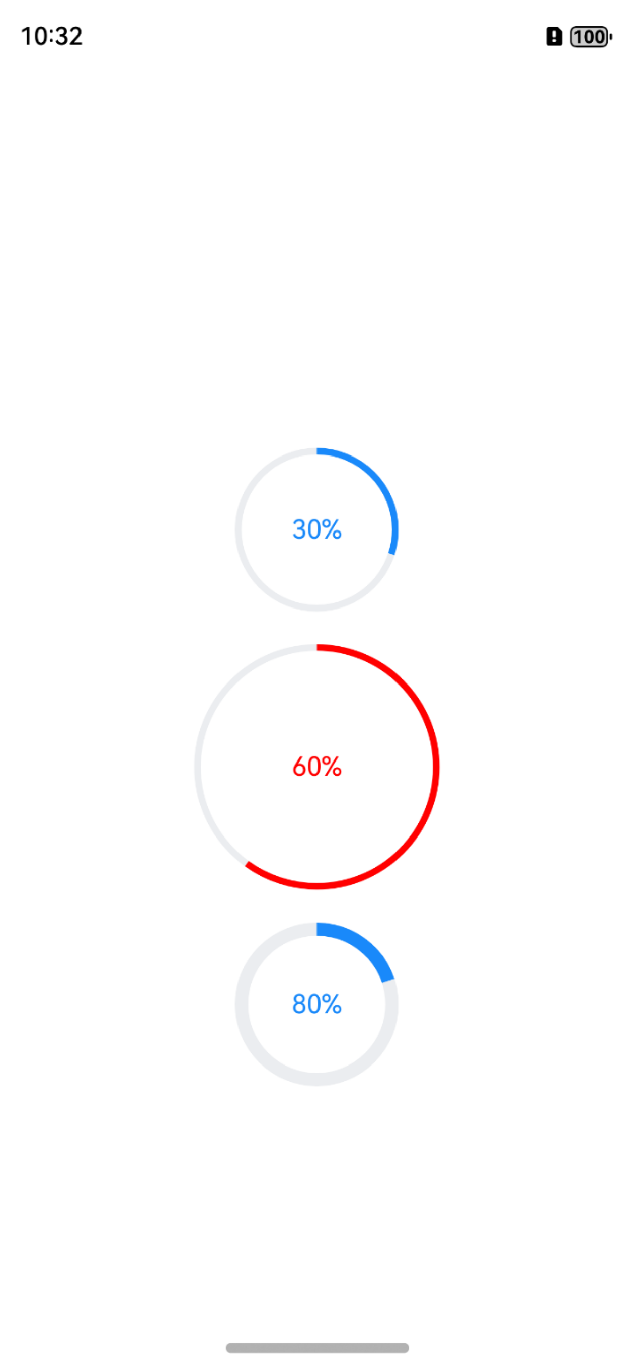
CircleProgressView({ progress: this.progress })
CircleProgressView({ progress: this.progress, color: '#ff0000', circleSize: 150 })
CircleProgressView({ progress: this.progress, clockwise: false, strokeWidth: 8 })
}
}
}
具体的效果如下:
注意事项
progress的值应该在 0 到 100 之间。- 确保传入的颜色值是有效的颜色字符串。
circleSize决定了整个组件的大小,包括进度条和中心的文本。strokeWidth不应该超过circleSize的一半,否则可能导致显示异常。- 可以根据需要扩展此组件,例如添加动画效果、自定义文本显示等。