st.checkbox
显示复选框部件。
| Function signature[source] | |
|---|---|
| st.checkbox(label, value=False, key=None, help=None, on_change=None, args=None, kwargs=None, *, disabled=False, label_visibility="visible") | |
| Returns | |
| (bool) | Whether or not the checkbox is checked. |
| Parameters | |
| label (str) | A short label explaining to the user what this checkbox is for. The label can optionally contain Markdown and supports the following elements: Bold, Italics, Strikethroughs, Inline Code, Emojis, and Links. This also supports:
Unsupported elements are unwrapped so only their children (text contents) render. Display unsupported elements as literal characters by backslash-escaping them. E.g. 1\. Not an ordered list. For accessibility reasons, you should never set an empty label (label="") but hide it with label_visibility if needed. In the future, we may disallow empty labels by raising an exception. |
| value (bool) | Preselect the checkbox when it first renders. This will be cast to bool internally. |
| key (str or int) | An optional string or integer to use as the unique key for the widget. If this is omitted, a key will be generated for the widget based on its content. Multiple widgets of the same type may not share the same key. |
| help (str) | An optional tooltip that gets displayed next to the checkbox. |
| on_change (callable) | An optional callback invoked when this checkbox's value changes. |
| args (tuple) | An optional tuple of args to pass to the callback. |
| kwargs (dict) | An optional dict of kwargs to pass to the callback. |
| disabled (bool) | An optional boolean, which disables the checkbox if set to True. The default is False. |
| label_visibility ("visible", "hidden", or "collapsed") | The visibility of the label. If "hidden", the label doesn't show but there is still empty space for it (equivalent to label=""). If "collapsed", both the label and the space are removed. Default is "visible". |
代码
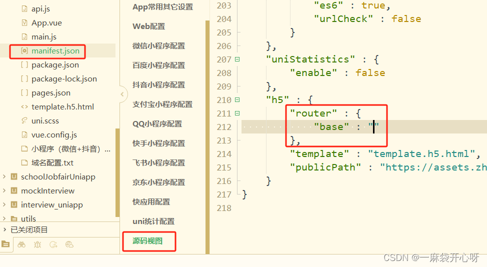
import streamlit as st

agree = st.checkbox("I agree")

if agree:
    st.write("Great!")
这段代码使用了Streamlit库来创建一个简单的交互式应用程序。首先,它导入了Streamlit库,并创建了一个名为agree的复选框,用于让用户选择是否同意某个条件。然后,它使用if语句来检查用户是否勾选了agree复选框,如果用户勾选了该复选框,就会在应用程序中显示文本"Great!"。
st.color_picker
显示颜色选择器部件。
| Function signature[source] | |
|---|---|
| st.color_picker(label, value=None, key=None, help=None, on_change=None, args=None, kwargs=None, *, disabled=False, label_visibility="visible") | |
| Returns | |
| (str) | The selected color as a hex string. |
| Parameters | |
| label (str) | A short label explaining to the user what this input is for. The label can optionally contain Markdown and supports the following elements: Bold, Italics, Strikethroughs, Inline Code, Emojis, and Links. This also supports:
Unsupported elements are unwrapped so only their children (text contents) render. Display unsupported elements as literal characters by backslash-escaping them. E.g. 1\. Not an ordered list. For accessibility reasons, you should never set an empty label (label="") but hide it with label_visibility if needed. In the future, we may disallow empty labels by raising an exception. |
| value (str) | The hex value of this widget when it first renders. If None, defaults to black. |
| key (str or int) | An optional string or integer to use as the unique key for the widget. If this is omitted, a key will be generated for the widget based on its content. Multiple widgets of the same type may not share the same key. |
| help (str) | An optional tooltip that gets displayed next to the color picker. |
| on_change (callable) | An optional callback invoked when this color_picker's value changes. |
| args (tuple) | An optional tuple of args to pass to the callback. |
| kwargs (dict) | An optional dict of kwargs to pass to the callback. |
| disabled (bool) | An optional boolean, which disables the color picker if set to True. The default is False. This argument can only be supplied by keyword. |
| label_visibility ("visible", "hidden", or "collapsed") | The visibility of the label. If "hidden", the label doesn't show but there is still empty space for it above the widget (equivalent to label=""). If "collapsed", both the label and the space are removed. Default is "visible". |
代码
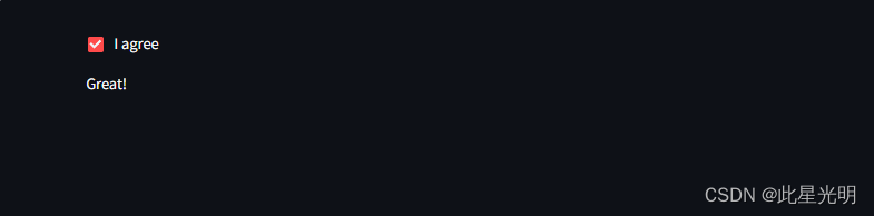
import streamlit as st

color = st.color_picker("Pick A Color", "#00f900")
st.write("The current color is", color)
这段代码使用了Streamlit库来创建一个简单的应用程序。首先,它导入了Streamlit库并将其重命名为st。然后,它使用st.color_picker函数创建了一个颜色选择器,用户可以在应用程序中选择颜色。函数的第一个参数是一个文本字符串,用作颜色选择器的标签,第二个参数是一个默认颜色值。接下来,代码使用st.write函数将当前选择的颜色显示在应用程序中。
st.multiselect
显示多选 widget。
多选窗口小部件一开始是空的。
| Function signature[source] | |
|---|---|
| st.multiselect(label, options, default=None, format_func=special_internal_function, key=None, help=None, on_change=None, args=None, kwargs=None, *, max_selections=None, placeholder="Choose an option", disabled=False, label_visibility="visible") | |
| Returns | |
| (list) | A list with the selected options |
| Parameters | |
| label (str) | A short label explaining to the user what this select widget is for. The label can optionally contain Markdown and supports the following elements: Bold, Italics, Strikethroughs, Inline Code, Emojis, and Links. This also supports:
Unsupported elements are unwrapped so only their children (text contents) render. Display unsupported elements as literal characters by backslash-escaping them. E.g. 1\. Not an ordered list. For accessibility reasons, you should never set an empty label (label="") but hide it with label_visibility if needed. In the future, we may disallow empty labels by raising an exception. |
| options (Iterable) | Labels for the select options in an Iterable. For example, this can be a list, numpy.ndarray, pandas.Series, pandas.DataFrame, or pandas.Index. For pandas.DataFrame, the first column is used. Each label will be cast to str internally by default. |
| default (Iterable of V, V, or None) | List of default values. Can also be a single value. |
| format_func (function) | Function to modify the display of selectbox options. It receives the raw option as an argument and should output the label to be shown for that option. This has no impact on the return value of the multiselect. |
| key (str or int) | An optional string or integer to use as the unique key for the widget. If this is omitted, a key will be generated for the widget based on its content. Multiple widgets of the same type may not share the same key. |
| help (str) | An optional tooltip that gets displayed next to the multiselect. |
| on_change (callable) | An optional callback invoked when this multiselect's value changes. |
| args (tuple) | An optional tuple of args to pass to the callback. |
| kwargs (dict) | An optional dict of kwargs to pass to the callback. |
| max_selections (int) | The max selections that can be selected at a time. |
| placeholder (str) | A string to display when no options are selected. Defaults to 'Choose an option'. |
| disabled (bool) | An optional boolean, which disables the multiselect widget if set to True. The default is False. This argument can only be supplied by keyword. |
| label_visibility ("visible", "hidden", or "collapsed") | The visibility of the label. If "hidden", the label doesn't show but there is still empty space for it above the widget (equivalent to label=""). If "collapsed", both the label and the space are removed. Default is "visible". |
代码
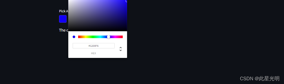
这段代码使用了Streamlit库来创建一个交互式应用程序。首先,使用`multiselect`函数创建了一个多选框,让用户从一个包含绿色、黄色、红色和蓝色的选项中选择自己喜欢的颜色。初始时,默认选中了黄色和红色两个选项。
接着,使用`write`函数将用户选择的颜色显示在应用程序中。当用户选择完颜色后,选中的颜色将会在屏幕上显示出来。
import streamlit as st

options = st.multiselect(
    "What are your favorite colors",
    ["Green", "Yellow", "Red", "Blue"],
    ["Yellow", "Red"])

st.write("You selected:", options)
st.radio
显示单选按钮 widget。
| Function signature[source] | |
|---|---|
| st.radio(label, options, index=0, format_func=special_internal_function, key=None, help=None, on_change=None, args=None, kwargs=None, *, disabled=False, horizontal=False, captions=None, label_visibility="visible") | |
| Returns | |
| (any) | The selected option or None if no option is selected. |
| Parameters | |
| label (str) | A short label explaining to the user what this radio group is for. The label can optionally contain Markdown and supports the following elements: Bold, Italics, Strikethroughs, Inline Code, Emojis, and Links. This also supports:
Unsupported elements are unwrapped so only their children (text contents) render. Display unsupported elements as literal characters by backslash-escaping them. E.g. 1\. Not an ordered list. For accessibility reasons, you should never set an empty label (label="") but hide it with label_visibility if needed. In the future, we may disallow empty labels by raising an exception. |
| options (Iterable) | Labels for the select options in an Iterable. For example, this can be a list, numpy.ndarray, pandas.Series, pandas.DataFrame, or pandas.Index. For pandas.DataFrame, the first column is used. Labels can include markdown as described in the label parameter and will be cast to str internally by default. |
| index (int or None) | The index of the preselected option on first render. If None, will initialize empty and return None until the user selects an option. Defaults to 0 (the first option). |
| format_func (function) | Function to modify the display of radio options. It receives the raw option as an argument and should output the label to be shown for that option. This has no impact on the return value of the radio. |
| key (str or int) | An optional string or integer to use as the unique key for the widget. If this is omitted, a key will be generated for the widget based on its content. Multiple widgets of the same type may not share the same key. |
| help (str) | An optional tooltip that gets displayed next to the radio. |
| on_change (callable) | An optional callback invoked when this radio's value changes. |
| args (tuple) | An optional tuple of args to pass to the callback. |
| kwargs (dict) | An optional dict of kwargs to pass to the callback. |
| disabled (bool) | An optional boolean, which disables the radio button if set to True. The default is False. |
| horizontal (bool) | An optional boolean, which orients the radio group horizontally. The default is false (vertical buttons). |
| captions (iterable of str or None) | A list of captions to show below each radio button. If None (default), no captions are shown. |
| label_visibility ("visible", "hidden", or "collapsed") | The visibility of the label. If "hidden", the label doesn't show but there is still empty space for it above the widget (equivalent to label=""). If "collapsed", both the label and the space are removed. Default is "visible". |
代码
import streamlit as st

genre = st.radio(
    "What's your favorite movie genre",
    [":rainbow[Comedy]", "***Drama***", "Documentary :movie_camera:"],
    captions = ["Laugh out loud.", "Get the popcorn.", "Never stop learning."])

if genre == ":rainbow[Comedy]":
    st.write("You selected comedy.")
else:
    st.write("You didn't select comedy.")
这段代码使用了Streamlit库来创建一个交互式应用程序。首先,它导入了Streamlit库。然后,它使用st.radio函数创建了一个单选框,让用户选择他们喜欢的电影类型。单选框有三个选项,分别是喜剧、戏剧和纪录片。每个选项都有一个标签,用于描述这种类型电影的特点。
接下来,代码检查用户选择的电影类型,并根据选择的结果显示不同的消息。如果用户选择了喜剧,那么会显示"您选择了喜剧。",否则会显示"您没有选择喜剧。"。

要初始化一个空的无线电部件,请使用 "无 "作为索引值:
import streamlit as st

genre = st.radio(
    "What's your favorite movie genre",
    [":rainbow[Comedy]", "***Drama***", "Documentary :movie_camera:"],
    index=None,
)

st.write("You selected:", genre)
这段代码使用了Streamlit库来创建一个简单的交互式应用程序。首先,它导入了Streamlit库。然后,它使用`st.radio`函数创建了一个单选按钮,用于让用户选择他们最喜欢的电影类型。单选按钮的标签是"What's your favorite movie genre",选项包括":rainbow[Comedy]"、"***Drama***"和"Documentary :movie_camera:"。最后,它使用`st.write`函数将用户选择的电影类型显示在屏幕上。

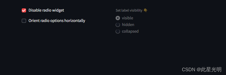
部件可以使用 label_visibility 参数自定义隐藏标签的方式。如果参数为 "hidden"(隐藏),则标签不会显示,但在部件上方仍有空位(相当于 label="")。如果为 "collapsed"(折叠),标签和空格都会被移除。默认为 "可见"。单选按钮也可以使用 disabled 参数禁用,并使用 horizontal 参数水平定向:
import streamlit as st

# 在会话状态中存储部件的初始值
if "visibility" not in st.session_state:
    st.session_state.visibility = "visible"
    st.session_state.disabled = False
    st.session_state.horizontal = False

col1, col2 = st.columns(2)

with col1:
    st.checkbox("Disable radio widget", key="disabled")
    st.checkbox("Orient radio options horizontally", key="horizontal")

with col2:
    st.radio(
        "Set label visibility 👇",
        ["visible", "hidden", "collapsed"],
        key="visibility",
        label_visibility=st.session_state.visibility,
        disabled=st.session_state.disabled,
        horizontal=st.session_state.horizontal,
    )

st.selectbox
| Function signature[source] | |
|---|---|
| st.selectbox(label, options, index=0, format_func=special_internal_function, key=None, help=None, on_change=None, args=None, kwargs=None, *, placeholder="Choose an option", disabled=False, label_visibility="visible") | |
| Returns | |
| (any) | The selected option or None if no option is selected. |
| Parameters | |
| label (str) | A short label explaining to the user what this select widget is for. The label can optionally contain Markdown and supports the following elements: Bold, Italics, Strikethroughs, Inline Code, Emojis, and Links. This also supports:
Unsupported elements are unwrapped so only their children (text contents) render. Display unsupported elements as literal characters by backslash-escaping them. E.g. 1\. Not an ordered list. For accessibility reasons, you should never set an empty label (label="") but hide it with label_visibility if needed. In the future, we may disallow empty labels by raising an exception. |
| options (Iterable) | Labels for the select options in an Iterable. For example, this can be a list, numpy.ndarray, pandas.Series, pandas.DataFrame, or pandas.Index. For pandas.DataFrame, the first column is used. Each label will be cast to str internally by default. |
| index (int) | The index of the preselected option on first render. If None, will initialize empty and return None until the user selects an option. Defaults to 0 (the first option). |
| format_func (function) | Function to modify the display of the labels. It receives the option as an argument and its output will be cast to str. |
| key (str or int) | An optional string or integer to use as the unique key for the widget. If this is omitted, a key will be generated for the widget based on its content. Multiple widgets of the same type may not share the same key. |
| help (str) | An optional tooltip that gets displayed next to the selectbox. |
| on_change (callable) | An optional callback invoked when this selectbox's value changes. |
| args (tuple) | An optional tuple of args to pass to the callback. |
| kwargs (dict) | An optional dict of kwargs to pass to the callback. |
| placeholder (str) | A string to display when no options are selected. Defaults to "Choose an option". |
| disabled (bool) | An optional boolean, which disables the selectbox if set to True. The default is False. |
| label_visibility ("visible", "hidden", or "collapsed") | The visibility of the label. If "hidden", the label doesn't show but there is still empty space for it above the widget (equivalent to label=""). If "collapsed", both the label and the space are removed. Default is "visible". |
代码
import streamlit as st

option = st.selectbox(
    "How would you like to be contacted?",
    ("Email", "Home phone", "Mobile phone"))

st.write("You selected:", option)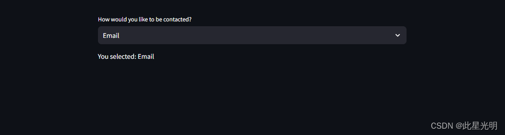
要初始化一个空的选择框,请使用 "无 "作为索引值:
import streamlit as st

option = st.selectbox(
   "How would you like to be contacted?",
   ("Email", "Home phone", "Mobile phone"),
   index=None,
   placeholder="Select contact method...",
)

st.write("You selected:", option)
这段代码使用了Streamlit库来创建一个交互式应用程序。首先,它创建了一个下拉框(selectbox),让用户选择他们希望如何被联系。下拉框中有三个选项:"Email"、"Home phone"和"Mobile phone"。用户可以在这三个选项中选择一个作为他们的联系方式。如果用户没有进行选择,下拉框会显示占位符"Select contact method..."。
然后,代码使用st.write函数来显示用户选择的联系方式。例如,如果用户选择了"Email",那么st.write函数会显示"You selected: Email"。这里index =none代表默认不指定任何选项,这里会有一个提示,让你选择相应的选项。
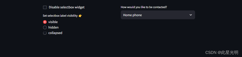
选择部件可以使用 label_visibility 参数自定义隐藏标签的方式。如果参数为 "hidden"(隐藏),则标签不显示,但在 widget 上方仍有空位(相当于 label="")。如果为 "collapsed"(折叠),标签和空格都会被移除。默认为 "可见"。也可以使用 disabled 参数禁用选择部件:
import streamlit as st

# Store the initial value of widgets in session state
if "visibility" not in st.session_state:
    st.session_state.visibility = "visible"
    st.session_state.disabled = False

col1, col2 = st.columns(2)

with col1:
    st.checkbox("Disable selectbox widget", key="disabled")
    st.radio(
        "Set selectbox label visibility 👉",
        key="visibility",
        options=["visible", "hidden", "collapsed"],
    )

with col2:
    option = st.selectbox(
        "How would you like to be contacted?",
        ("Email", "Home phone", "Mobile phone"),
        label_visibility=st.session_state.visibility,
        disabled=st.session_state.disabled,
    )
st.select_slider
显示滑块 widget,以便从列表中选择项目。
通过传递一个双元素元组或列表作为值,还可以显示一个范围滑块。
st.select_slider 和 st.slider 的区别在于,select_slider 可接受任何数据类型,并接受可迭代的选项集;而 st.slider 仅接受数字或日期/时间数据,并接受范围作为输入。
| Function signature[source] | |
|---|---|
| st.select_slider(label, options=(), value=None, format_func=special_internal_function, key=None, help=None, on_change=None, args=None, kwargs=None, *, disabled=False, label_visibility="visible") | |
| Returns | |
| (any value or tuple of any value) | The current value of the slider widget. The return type will match the data type of the value parameter. |
| Parameters | |
| label (str) | A short label explaining to the user what this slider is for. The label can optionally contain Markdown and supports the following elements: Bold, Italics, Strikethroughs, Inline Code, Emojis, and Links. This also supports:
Unsupported elements are unwrapped so only their children (text contents) render. Display unsupported elements as literal characters by backslash-escaping them. E.g. 1\. Not an ordered list. For accessibility reasons, you should never set an empty label (label="") but hide it with label_visibility if needed. In the future, we may disallow empty labels by raising an exception. |
| options (Iterable) | Labels for the select options in an Iterable. For example, this can be a list, numpy.ndarray, pandas.Series, pandas.DataFrame, or pandas.Index. For pandas.DataFrame, the first column is used. Each label will be cast to str internally by default. |
| value (a supported type or a tuple/list of supported types or None) | The value of the slider when it first renders. If a tuple/list of two values is passed here, then a range slider with those lower and upper bounds is rendered. For example, if set to (1, 10) the slider will have a selectable range between 1 and 10. Defaults to first option. |
| format_func (function) | Function to modify the display of the labels from the options. argument. It receives the option as an argument and its output will be cast to str. |
| key (str or int) | An optional string or integer to use as the unique key for the widget. If this is omitted, a key will be generated for the widget based on its content. Multiple widgets of the same type may not share the same key. |
| help (str) | An optional tooltip that gets displayed next to the select slider. |
| on_change (callable) | An optional callback invoked when this select_slider's value changes. |
| args (tuple) | An optional tuple of args to pass to the callback. |
| kwargs (dict) | An optional dict of kwargs to pass to the callback. |
| disabled (bool) | An optional boolean, which disables the select slider if set to True. The default is False. |
| label_visibility ("visible", "hidden", or "collapsed") | The visibility of the label. If "hidden", the label doesn't show but there is still empty space for it above the widget (equivalent to label=""). If "collapsed", both the label and the space are removed. Default is "visible". |
代码
import streamlit as st

color = st.select_slider(
    "Select a color of the rainbow",
    options=["red", "orange", "yellow", "green", "blue", "indigo", "violet"])
st.write("My favorite color is", color)
这段代码使用了Streamlit库来创建一个滑动条,让用户选择彩虹的颜色。用户可以从红、橙、黄、绿、蓝、靛、紫中选择一个颜色。然后代码会显示用户选择的颜色,并输出“我的最喜欢的颜色是”加上用户选择的颜色。下面是一个范围选择滑块的示例:
import streamlit as st

start_color, end_color = st.select_slider(
    "Select a range of color wavelength",
    options=["red", "orange", "yellow", "green", "blue", "indigo", "violet"],
    value=("red", "blue"))
st.write("You selected wavelengths between", start_color, "and", end_color)
这段代码使用了Streamlit库来创建一个交互式的滑块,让用户选择颜色的范围。用户可以通过拖动滑块来选择两个颜色之间的范围。代码中首先导入了Streamlit库,然后使用select_slider函数创建了一个滑块,让用户从红、橙、黄、绿、蓝、靛、紫这些选项中选择颜色的范围,默认选择了红色到蓝色的范围。最后,使用write函数将用户选择的颜色范围输出到界面上。

st.toggle
| Function signature[source] | |
|---|---|
| st.toggle(label, value=False, key=None, help=None, on_change=None, args=None, kwargs=None, *, disabled=False, label_visibility="visible") | |
| Returns | |
| (bool) | Whether or not the toggle is checked. |
| Parameters | |
| label (str) | A short label explaining to the user what this toggle is for. The label can optionally contain Markdown and supports the following elements: Bold, Italics, Strikethroughs, Inline Code, Emojis, and Links. This also supports:
Unsupported elements are unwrapped so only their children (text contents) render. Display unsupported elements as literal characters by backslash-escaping them. E.g. 1\. Not an ordered list. For accessibility reasons, you should never set an empty label (label="") but hide it with label_visibility if needed. In the future, we may disallow empty labels by raising an exception. |
| value (bool) | Preselect the toggle when it first renders. This will be cast to bool internally. |
| key (str or int) | An optional string or integer to use as the unique key for the widget. If this is omitted, a key will be generated for the widget based on its content. Multiple widgets of the same type may not share the same key. |
| help (str) | An optional tooltip that gets displayed next to the toggle. |
| on_change (callable) | An optional callback invoked when this toggle's value changes. |
| args (tuple) | An optional tuple of args to pass to the callback. |
| kwargs (dict) | An optional dict of kwargs to pass to the callback. |
| disabled (bool) | An optional boolean, which disables the toggle if set to True. The default is False. |
| label_visibility ("visible", "hidden", or "collapsed") | The visibility of the label. If "hidden", the label doesn't show but there is still empty space for it (equivalent to label=""). If "collapsed", both the label and the space are removed. Default is "visible". |
代码
import streamlit as st

on = st.toggle("Activate feature")

if on:
    st.write("Feature activated!")
这段代码使用了Streamlit库来创建一个简单的交互式应用程序。首先,它导入了Streamlit库并将其命名为st。然后,它创建了一个开关(toggle)组件,用于激活或关闭某个功能。用户可以通过单击开关来改变状态。接下来,代码使用if语句来检查开关的状态。如果开关被打开(on为True),则会显示一条消息“Feature activated!”。如果开关被关闭(on为False),则不会显示任何消息。