目录
12-Overflow
13-下拉菜单
14-提示框
14.1 显示位置(左右)
14.2 显示位置(上下)
14.3 添加箭头
14.4 淡入效果
15-图片
16-列表
17-表格
17.1 表格宽度和高度
17.2 文字对齐
17.3 表格颜色
18-计数器
19-导航栏
19.1 导航栏UI优化
19.2 社会实践
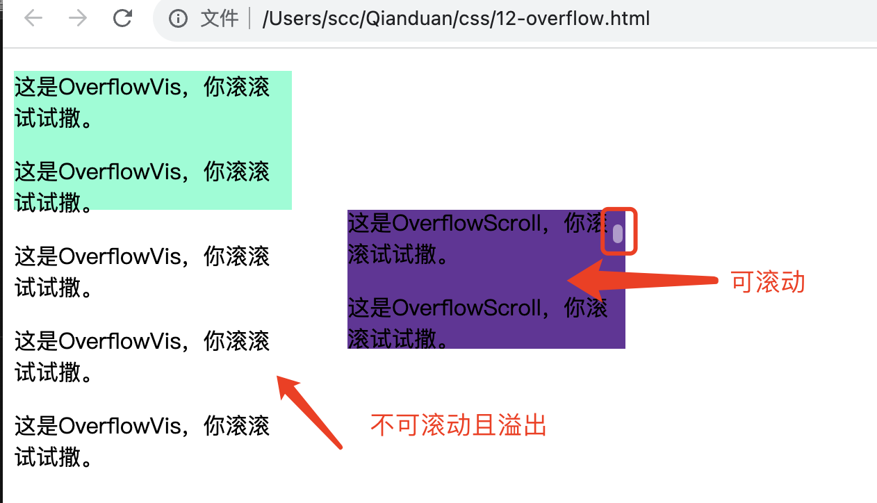
12-Overflow
overflow 属性用于控制内容溢出元素框时显示的方式。
注:overflow 属性只工作于 指定高度的块 元素上。注: 在 OS X Lion ( Mac 系统) 系统上,滚动条默认是隐藏的,使用的时候才会显示 (设置 "overflow:scroll" 也是一样的)。
<head>
    <style>
        #OverflowVis {
            width: 200px;
            height: 100px;
            background-color: aquamarine;
        }
        #OverflowScroll {
            width: 200px;
            height: 100px;
            margin-left: 240px;
            background-color: rebeccapurple;
            overflow: scroll;
        }
    </style>
</head>

<body>
    <div id="OverflowVis">
        <p>这是OverflowVis,你滚滚试试撒。</p>
        <p>这是OverflowVis,你滚滚试试撒。</p>
        .......
    </div>
    <div id="OverflowScroll">
        <p>这是OverflowScroll,你滚滚试试撒。</p>
        <p>这是OverflowScroll,你滚滚试试撒。</p>
        .......
    </div>
</body>
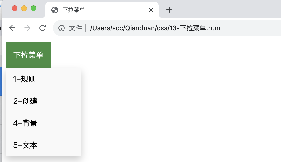
13-下拉菜单
创建一个鼠标移动上去后显示下拉菜单的效果。
<head>
    <style>
        /* 下拉按钮样式 */
        .dropbtn {
            background-color: #4CAF50;
            color: white;
            padding: 16px;
            font-size: 16px;
            border: none;
            cursor: pointer;
        }
        /* 容器 <div> - 需要定位下拉内容 */
        .dropdown {
            position: relative;
            display: inline-block;
        }
        /* 下拉内容 (默认隐藏) */
        .dropdown-content {
            display: none;
            position: absolute;
            background-color: #f9f9f9;
            min-width: 160px;
            box-shadow: 0px 8px 16px 0px rgba(0, 0, 0, 0.2);
        }
        /* 下拉菜单的链接 */
        .dropdown-content a {
            color: black;
            padding: 12px 16px;
            text-decoration: none;
            display: block;
        }
        /* 鼠标移上去后修改下拉菜单链接颜色 */
        .dropdown-content a:hover {
            background-color: #f1f1f1
        }
        /* 在鼠标移上去后显示下拉菜单 */
        .dropdown:hover .dropdown-content {
            display: block;
        }
        /* 当下拉内容显示后修改下拉按钮的背景颜色 */
        .dropdown:hover .dropbtn {
            background-color: #3e8e41;
        }
    </style>
</head>

<body>
    <div class="dropdown">
        <button class="dropbtn">下拉菜单</button>
        <div class="dropdown-content">
            <a href="1-规则.html">1-规则</a>
            <a href="2-创建.html">2-创建</a>
            <a href="4-背景.html">4-背景</a>
            <a href="5-文本.html">5-文本</a>
        </div>
    </div>
</body>
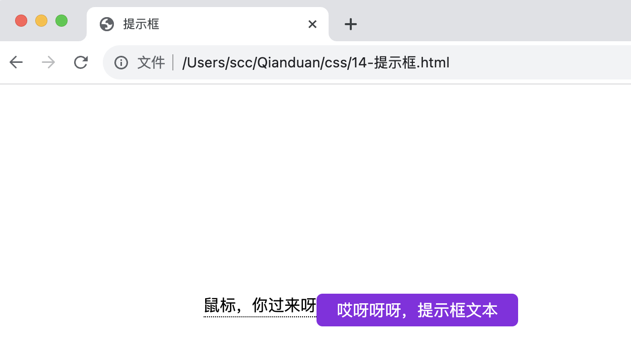
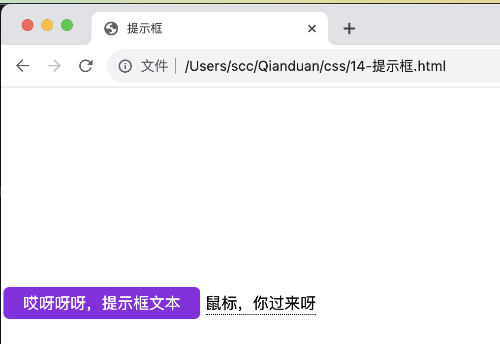
14-提示框
<head>
<style>
.tip{
position: relative;
display: inline-block;
border-bottom: 1px dotted black;
margin-top: 200px;
margin-left: 200px;
}
.tip .tiptext {
visibility: hidden;/* 隐藏 */
width: 200px;
background-color:blueviolet;
color: #fff;
text-align: center;
border-radius: 6px;
padding: 5px 0;
/* 11-定位 */
position: absolute;
z-index: 1;
}
.tip:hover .tiptext {
visibility: visible;/* 显示 */
}
</style>
</head>
<body>
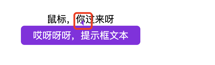
<div class="tip" >鼠标,你过来呀
<span class="tiptext">哎呀呀呀,提示框文本</span>
</div>
</body>
</html>
14.1 显示位置(左右)
        .tip .tiptext {
            padding: 5px 0;
            top: -5px;
            right: 105%;
        }
-
top:-5px 同于定位在容器元素的中间。使用数字 5 因为提示文本的顶部和底部的内边距(padding)是 5px。
-
右侧:left:105%;
-
左侧:right: 105%;
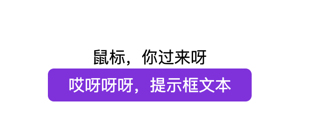
14.2 显示位置(上下)
        .tip .tiptext {
            top: 100%;
            left: 50%;
            margin-left: -100px;
        }
-
使用 margin-left 属性,并设置为 -100px。 这个数字计算来源是使用宽度的一半来居中对齐,即: width/2 (200/2 = 100)。
-
居中对齐:left: 50% 。
-
顶部:top: 100%;
-
底部:bottom: 100%;
14.3 添加箭头
        .tip .tiptext::after {
            content: "";
            position: absolute;
            bottom: 100%;
            left: 50%;
            margin-left: -5px;
            border-width: 5px;
            border-style: solid;
            border-color: transparent transparent blueviolet transparent;
        }
-
border-width 属性指定了箭头的大小
- border-color 用于将内容转换为箭头。
-
箭头向上:border-color: transparent transparent blueviolet(紫色) transparent;
-
箭头向左:border-color: blueviolet(紫色) transparent transparent transparent;
-
其他略
-
14.4 淡入效果
使用 CSS3 transition 属性及 opacity 属性来实现提示工具的淡入效果。
        .tip .tiptext {
            ......
            opacity: 0;
            transition: opacity 2s;

        }
        .tip:hover .tiptext {
            visibility: visible;/* 显示 */
            opacity: 1;

        }
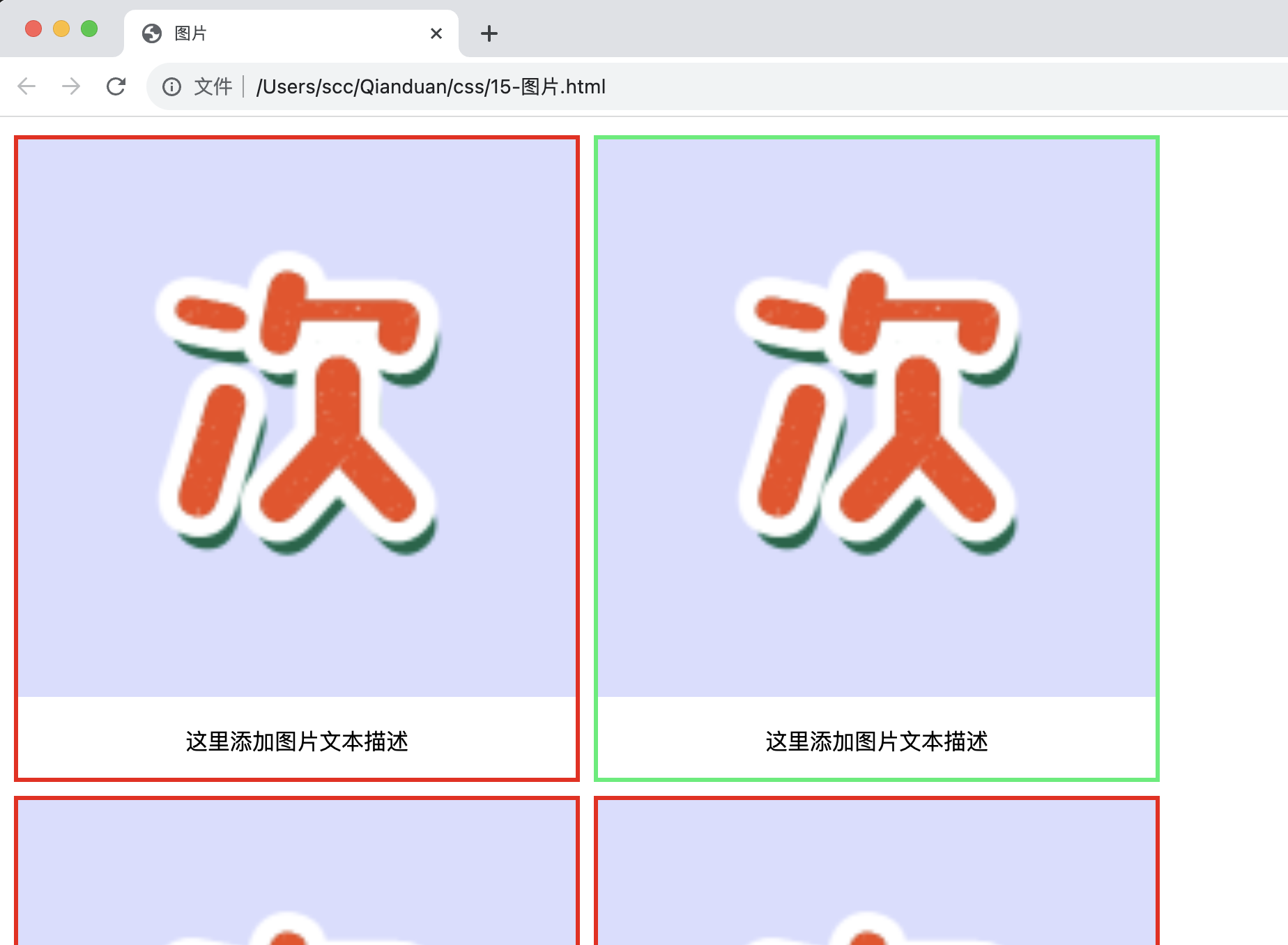
15-图片
<head>
    <style>
        div.img {
            margin: 5px;
            border: 3px solid #f40606;
            float: left;
            width: 400px;
        }

        div.img:hover {
            border: 3px solid #04ef6e;
        }

        div.img img {
            width: 100%;
            height: auto;
        }

        div.desc {
            padding: 15px;
            text-align: center;
        }
    </style>
</head>

<body>
    <div class="responsive">
        <div class="img">
            <a target="_blank"
                href="https://profile-avatar.csdnimg.cn/f9c3e04cbd4546c6be3442fdf4140b12_g984160547.jpg!1">
                <img src="https://profile-avatar.csdnimg.cn/f9c3e04cbd4546c6be3442fdf4140b12_g984160547.jpg!1"
                    alt="图片文本描述" width="300" height="200">
            </a>
            <div class="desc">这里添加图片文本描述</div>
        </div>
    </div>

    ....
</body>
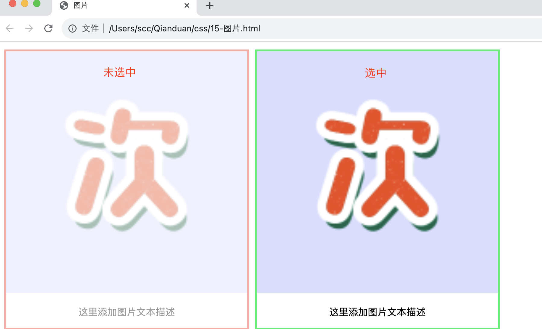
图像透明度
        div.img {
            opacity:0.4;

        }

        div.img:hover {
            opacity:1.0;
        }
opacity属性值从0.0 - 1.0。值越小,使得元素更加透明。
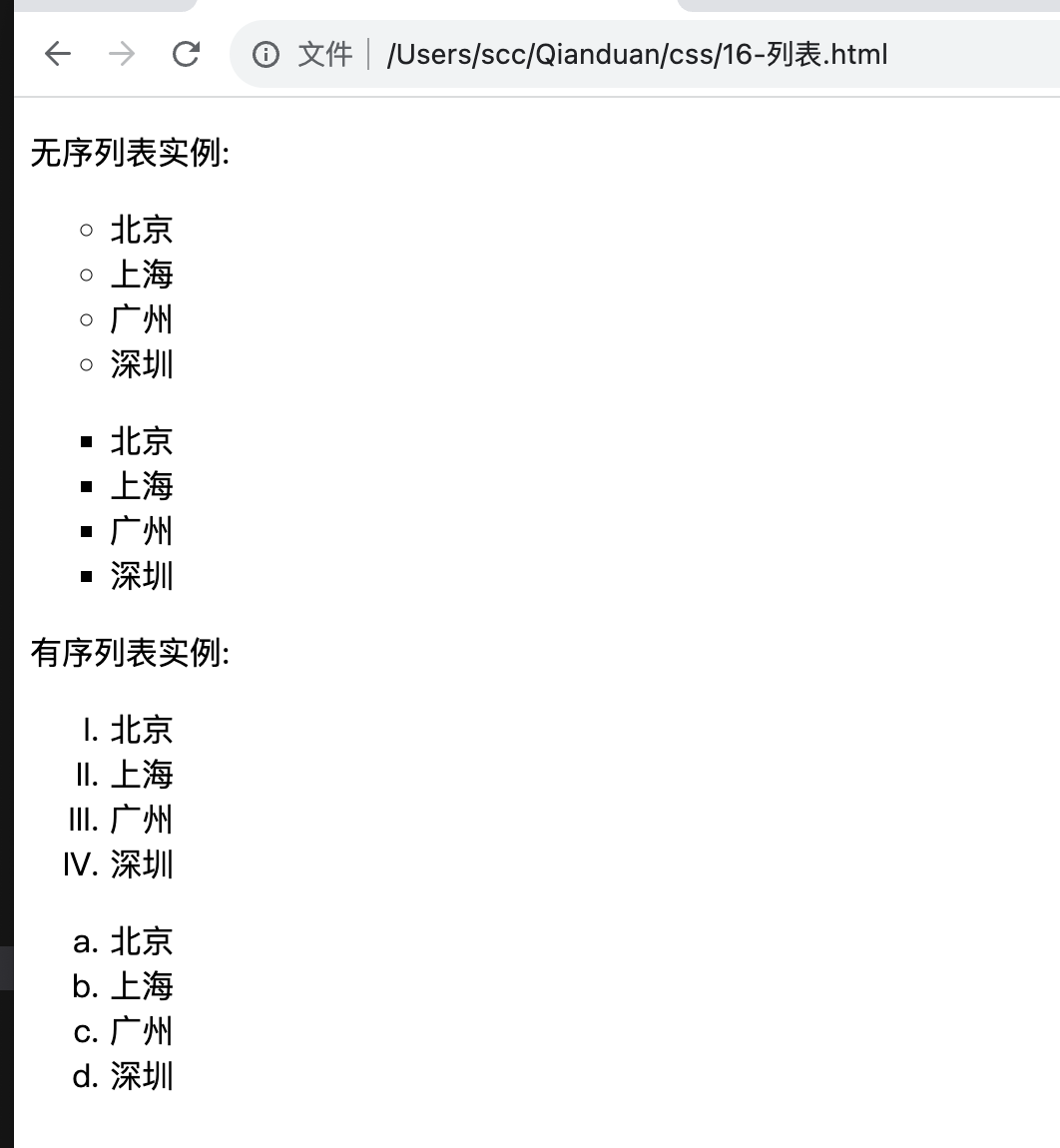
16-列表
在 HTML中,有两种类型的列表:
-
无序列表 ul - 列表项标记用特殊图形(如小黑点、小方框等)
-
有序列表 ol - 列表项的标记有数字或字母
使用 CSS,可以列出进一步的样式,并可用图像作列表项标记。
<head>
    <meta charset="utf-8">
    <title>列表</title>
    <style>
        ul.a {list-style-type:circle;}
        ul.b {list-style-type:square;}
        ol.c {list-style-type:upper-roman;}
        ol.d {list-style-type:lower-alpha;}
    </style>
</head>

<body>
    <p>无序列表实例:</p>

    <ul class="a">
      <li>北京</li>
      <li>上海</li>
      <li>广州</li>
      <li>深圳</li>
    </ul>

    <ul class="b">
        <li>北京</li>
        <li>上海</li>
        <li>广州</li>
        <li>深圳</li>
    </ul>

    <p>有序列表实例:</p>

    <ol class="c">
        <li>北京</li>
        <li>上海</li>
        <li>广州</li>
        <li>深圳</li>
    </ol>

    <ol class="d">
        <li>北京</li>
        <li>上海</li>
        <li>广州</li>
        <li>深圳</li>
    </ol>
</body>
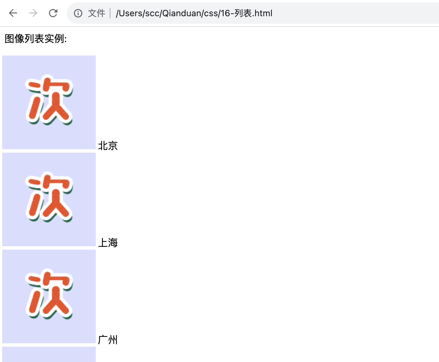
图像作列表项标记
      ul.e
      {
          list-style-image:url('src/bg.png');
          list-style-type: none;
          padding-left: 150px;
      }

      <p >图像列表实例:</p>
      <ul class="e">
          <li>北京</li>
          <li>上海</li>
          <li>广州</li>
          <li>深圳</li>
      </ul>
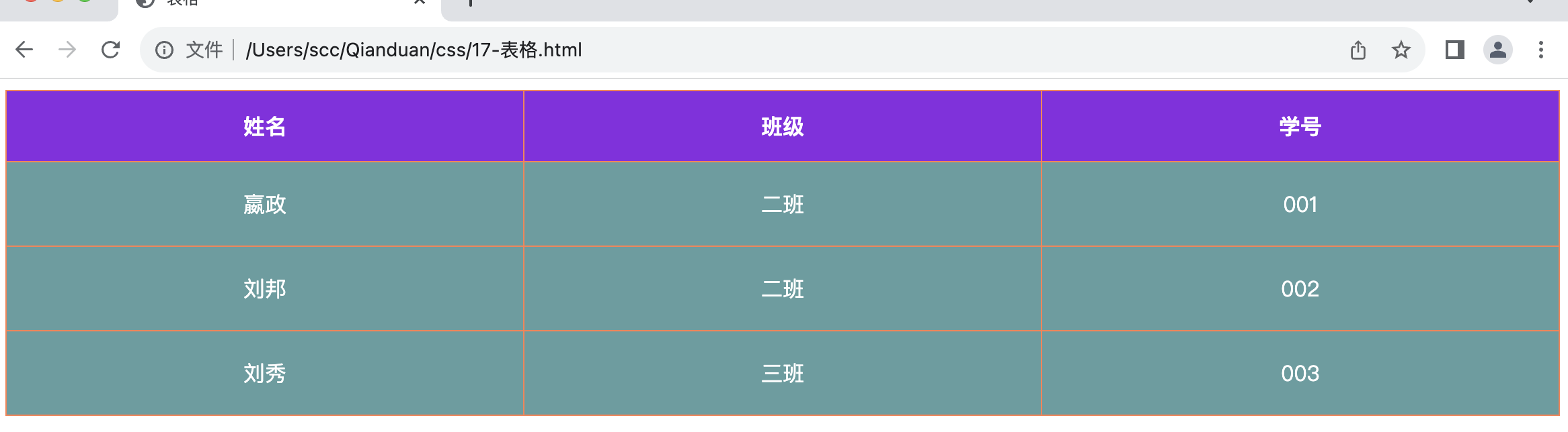
17-表格
-
border:th和th元素的边框(粗细 线条 颜色)。
-
border-collapse:边框是否被折叠成一个单一的边框或隔开:
<head>
    <meta charset="utf-8">
    <title>表格</title>
    <style>
        table {
            border-collapse: collapse;/* 折叠边框 */
        }

        table,th,td {
            border: 1px solid coral;
        }
    </style>
</head>

<body>
    <table>
        <tr>
            <th>姓名</th>
            <th>班级</th>
            <th>学号</th>
        </tr>
        <tr>
            <td>嬴政</td>
            <td>二班</td>
            <td>001</td>
        </tr>
        <tr>
            <td>刘邦</td>
            <td>二班</td>
            <td>002</td>
        </tr>
        <tr>
            <td>刘秀</td>
            <td>三班</td>
            <td>003</td>
        </tr>
    </table>
</body>
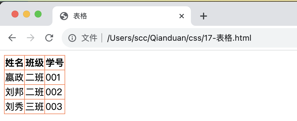
有点拥挤,有点丑,咱们再优化一下。
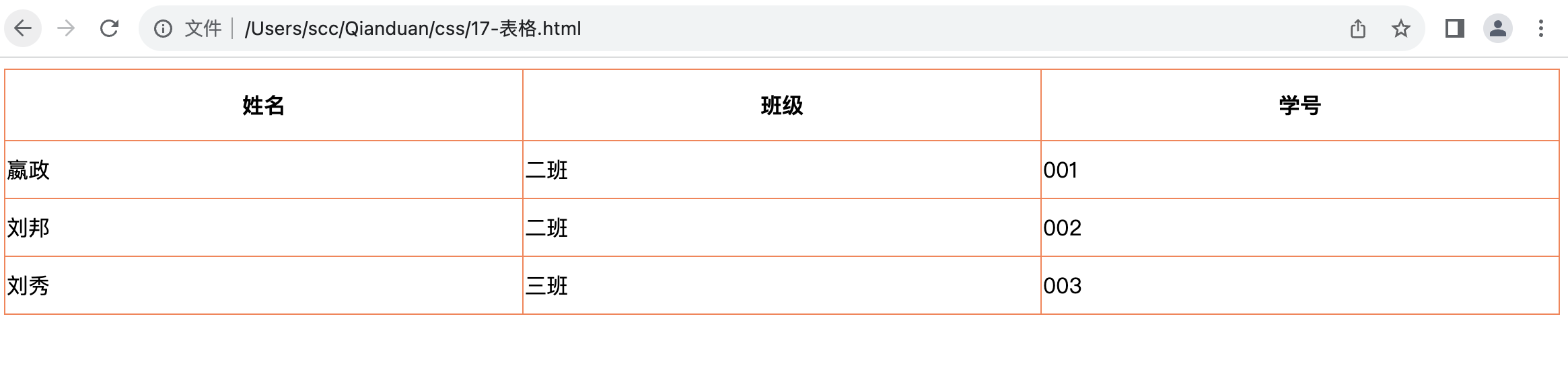
17.1 表格宽度和高度
        table {
            width:100%;
        }
        th{
            height:50px;
        }
        td{
            height: 40px;
        }
width和height属性定义表格的宽度和高度。
-
table width:100%; 按百分比设置表格宽度
-
th/td height:50px/40px; 指定单元格具体高度
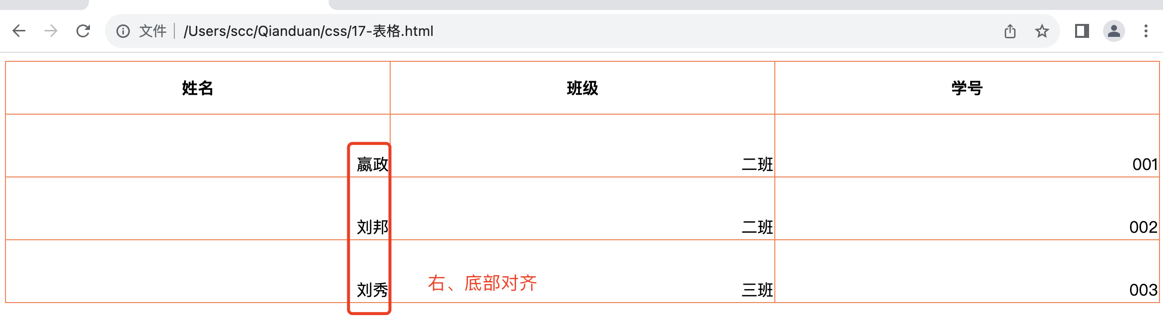
17.2 文字对齐
-
text-align属性设置水平对齐方式,向左,右,或中心。 -
vertical-align属性设置垂直对齐方式,顶部,底部或中间。
        td{
            height: 60px;
            text-align: right;
            vertical-align: bottom;
        }
17.3 表格颜色
        /* 表格线条颜色 */
        table,th,td {
            border: 1px solid coral;
        }
        ......
        th{
            height:50px;
            background-color: blueviolet; /* 表头背景色 */
            color: white;
        }
        td{
            height: 60px;
            text-align: center;
            background-color:cadetblue;/* 内容背景色 */
            color: white;
        }
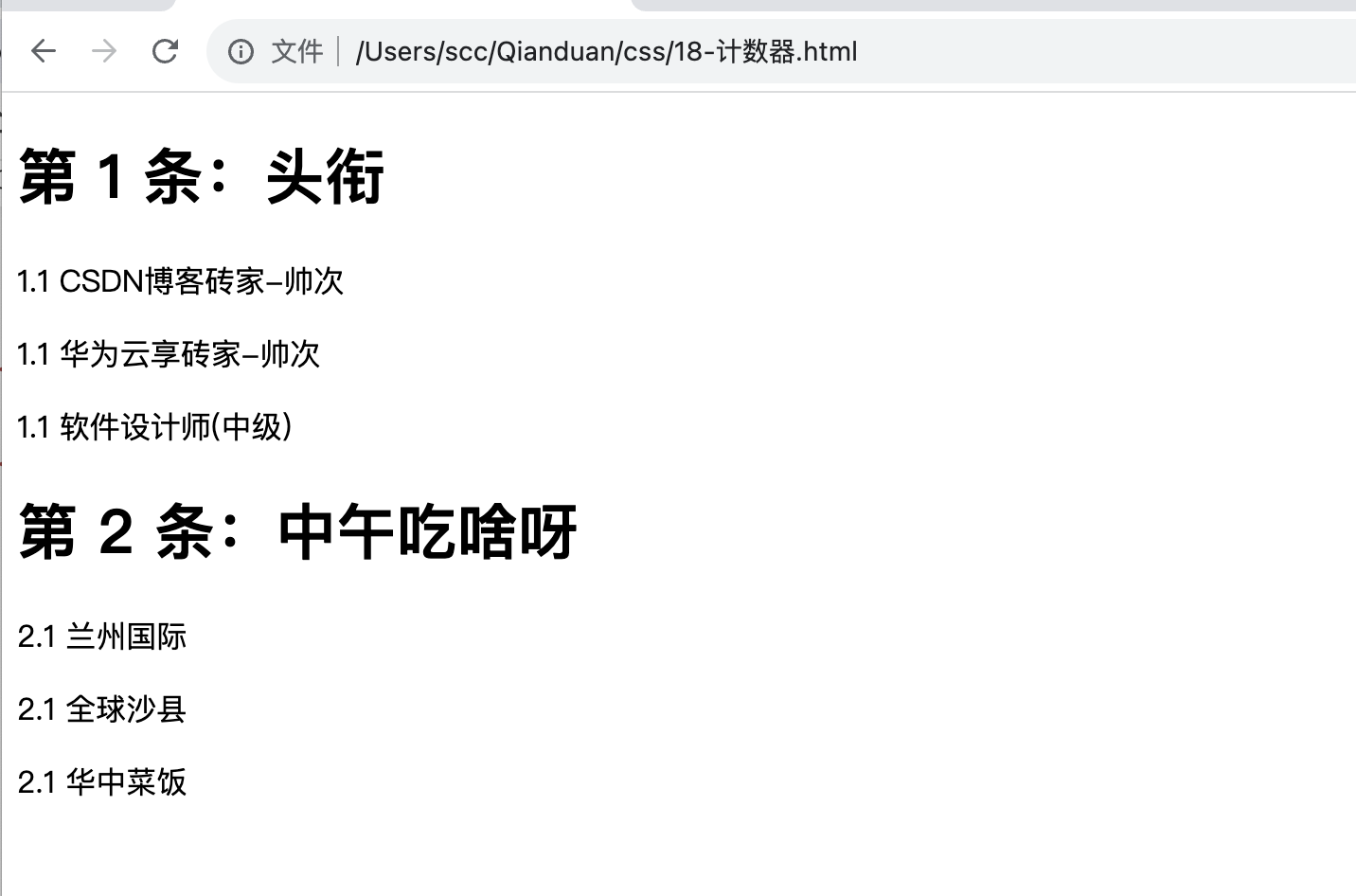
18-计数器
计数器通过一个变量来设置,根据规则递增变量。
CSS 计数器使用到以下几个属性:
-
counter-reset:创建或者重置计数器
-
counter-increment:递增变量
-
content:插入生成的内容
-
counter() 或 counters() 函数:将计数器的值添加到元素 要使用 CSS 计数器,得先用 counter-reset 创建:
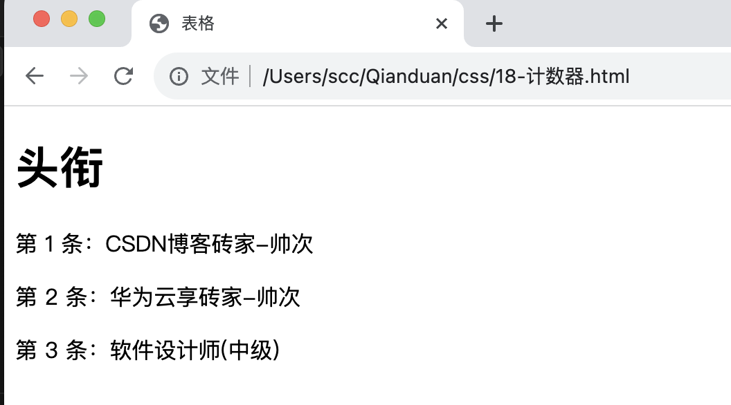
嵌套计数器,可用于注册协议/或结合列表使用。
    <style>
        body {
            counter-reset: section;
        }
        p {
             counter-reset: subsection;
        }
        h1::before {
            counter-increment: section;
            content: "第 " counter(section) " 条:";
        }
        p::before {
            counter-increment: subsection;
            content: "" counter(section) "." counter(subsection) " ";
        }
    </style>

    <h1>头衔</h1>
    <p>CSDN博客砖家-帅次</p>
    <p>华为云享砖家-帅次</p>
    <p>软件设计师(中级)</p>

    <h1>中午吃啥呀</h1>
    <p>兰州国际</p>
    <p>全球沙县</p>
    <p>华中菜饭</p>
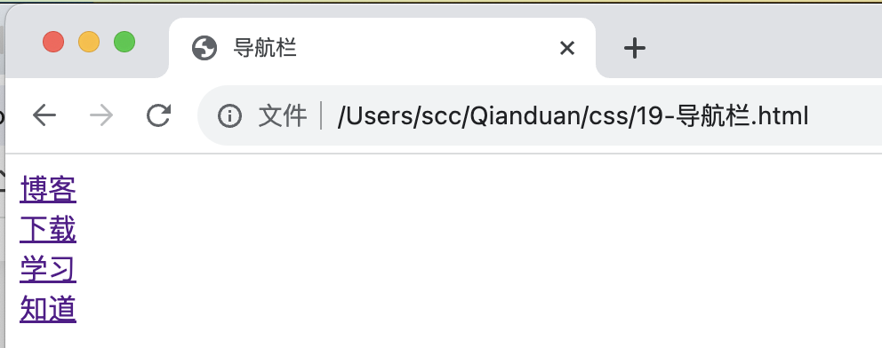
19-导航栏
导航栏,无处不在,还是需要熟练使用的。导航条基本上是一个链接列表。
    <ul>
        <li><a href="/Users/scc/Qianduan/css/1-规则.html">博客</a></li>
        <li><a href="/Users/scc/Qianduan/css/2-创建.html">下载</a></li>
        <li><a href="4-背景.html">学习</a></li>
        <li><a href="5-文本.html">知道</a></li>
    </ul>
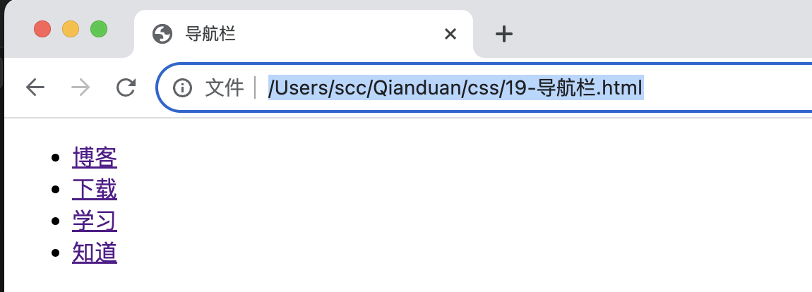
接下来我们删除边距和列表前小标志:
    <style>
        ul {
            list-style-type: none;
            margin: 0;
            padding: 0;
        }
    </style>
-
移除列表前小标志(
list-style-type:none)。一个导航栏并不需要列表标记。 -
移除浏览器的默认设置将边距和填充设置为
0。
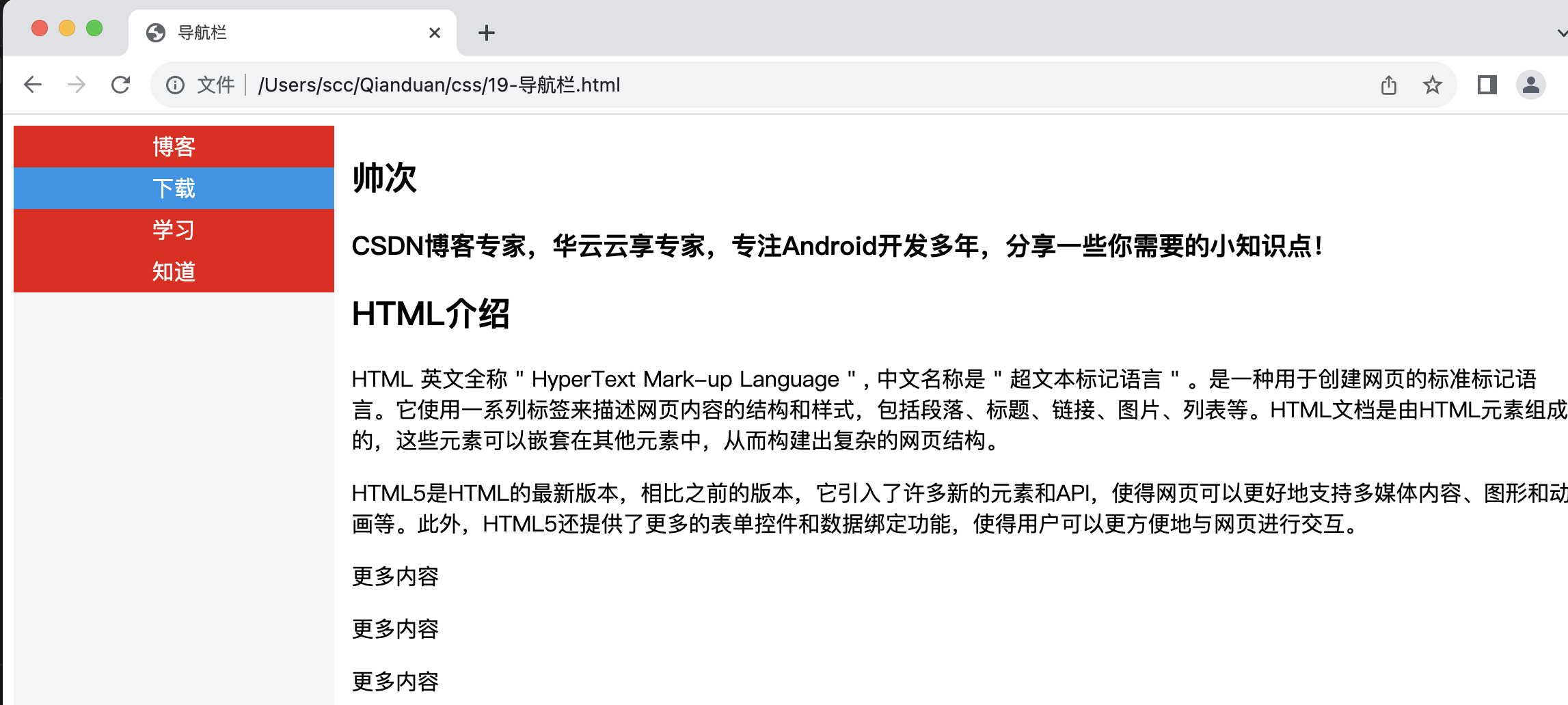
19.1 导航栏UI优化
-
a:link - 代表当一段文本为链接时的属性。
-
a:visited - 代表这段文本被点击之后的属性。
-
a:hover - 代表鼠标指针放在这个链接上时的属性。
-
a:active - 代表鼠标按下时一瞬间的属性。
        a:link,a:visited {
            display: block;
            color: #FFFFFF;
            background-color: #eb0b0b;
            width: 120px;
            text-align: center;
            padding: 4px;
            text-decoration: none;
            text-transform: uppercase;
        }

        a:hover,a:active {
            background-color: #0395e9;
        }

19.2 社会实践
        ul {
            list-style-type: none;
            margin: 0;
            padding: 0;
            width: 20%;
            background-color: #f5f5f5;
            position: fixed;
            height: 100%;
            overflow: auto;
        }

      <div style="margin-left:20%;padding:1px 16px;height:100%;">
        <h2>帅次</h2>
        <h3>CSDN博客专家,华云云享专家,专注Android开发多年,分享一些你需要的小知识点!</h3>
        <h2>HTML介绍</h2>
        <p>HTML 英文全称 " HyperText Mark-up Language " , 中文名称是 " 超文本标记语言 " 。是一种用于创建网页的标准标记语言。它使用一系列标签来描述网页内容的结构和样式,包括段落、标题、链接、图片、列表等。HTML文档是由HTML元素组成的,这些元素可以嵌套在其他元素中,从而构建出复杂的网页结构。</p>
        <p>HTML5是HTML的最新版本,相比之前的版本,它引入了许多新的元素和API,使得网页可以更好地支持多媒体内容、图形和动画等。此外,HTML5还提供了更多的表单控件和数据绑定功能,使得用户可以更方便地与网页进行交互。</p>
        <p>更多内容</p>
        ......
        <p>更多内容</p>
      </div>
-
width: 20%; - 宽度 20%。
-
height: 100%; - 高度全屏。
-
background-color: #f5f5f5; - 背景色
-
position: fixed; - 固定定位 元素的位置相对于浏览器窗口是固定位置。即使窗口是滚动的它也不会移动
叮,已入门。
相关推荐
HTML 入门手册(一)
HTML 入门手册(二)
CSS 入门手册(一)

![[c 语言] 大端,小端;网络序,主机序](https://img-blog.csdnimg.cn/direct/a3e06bdc463b404488797cec2ca0e5b4.png)