今天来讲讲Android开发中水都绕不开的东西----drawable。最常使用的莫过于通过XML所声明的Drawable作为View背景,通过代码创建的应用场景则较少。其有着使用简单,比自定义view的成本要低的特点。同时,非图片类型的drawable占用空间较小,对减小apk的体积有很大的帮助。
Drawable其实是个抽象类,每种Drawable都是其子类。其分类主要包括:
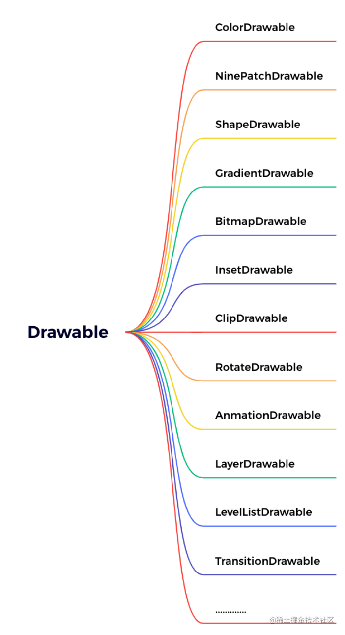
看着挺多,但其实按对应分类来了解,会发现很多都是一个类型,可举一反三。
ColorDrawable
最简单drawable,也是不怎么常用的,一般用于绘制一块单色区域。使用方式:
在xml的根结点中创建< color>,如下:
<?xml version="1.0" encoding="utf-8"?>
<color xmlns:android="http://schemas.android.com/apk/res/android"
    android:color="@color/white"/>
在代码中使用则是将要使用的色值作为参数传入其构造函数,示例表现则为:
ColorDrawable mColorDrawable = new ColorDrawable(0xff000000);
这里注意,传入的色值要写明透明度,如果省略透明度则默认代表透明。
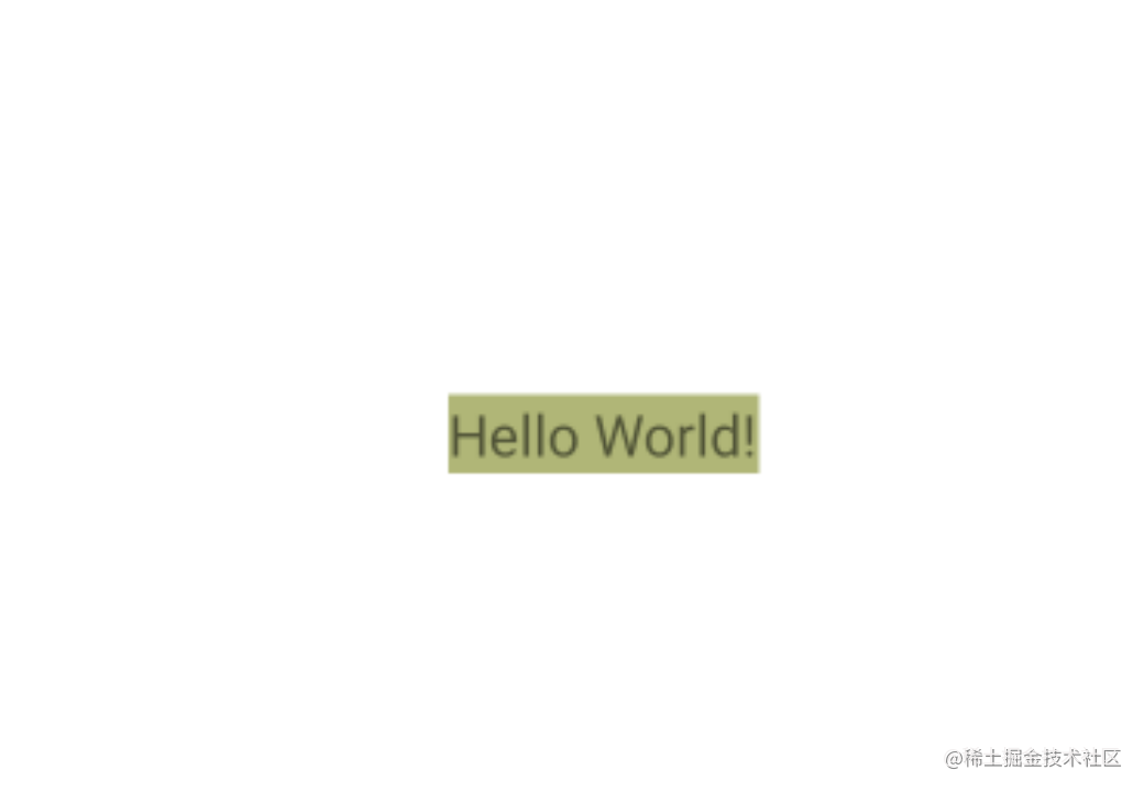
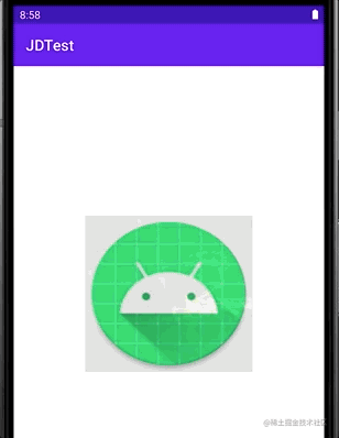
例如,我们在AS默认生成的最简单HelloWorld工程中去设置中间的TextView背景,代码如下:
    @Override
    protected void onCreate(Bundle savedInstanceState) {
	...
        TextView mTvNormal = findViewById(R.id.tv_normal);
        ColorDrawable mColorDrawable = new ColorDrawable(0x95798123);
        mTvNormal.setBackground(mColorDrawable);
}
其效果如下:
当然,这种在代码中使用的用法并不常见,一般都是res/value目录下的color.xml中声明对应色值:
<?xml version="1.0" encoding="utf-8"?>
<resources>
    <color name="teal_200">#FF03DAC5</color>
    <color name="teal_700">#FF018786</color>
    <color name="black">#FF000000</color>
    <color name="white">#FFFFFFFF</color>
</resources>
使用方法太简单,这里不赘述了。
NinePatchDrawable
.9图片,是android平台的一种特殊格式,文件扩展名为.9.png。因为安卓系统根据屏幕尺寸会自动缩放图片,但这种缩放效果可能并不友好,有时我们只想缩放图片的某部分,为了实现这种效果,NinePatchDrawable应运而生。可自动根据宽高进行缩放且不会失真。最常见某信某Q里聊天软件里的会自适应拉伸的条目背景,实际使用则可以通过引用图片或者通过xml描述的方法(注意:BitmapDrawable修改src加载的图片为.9图片也可以做到同样效果)。如:
<?xml version="1.0" encoding="utf-8"?>
<nine-patch
    xmlns:android="http://schemas.android.com/apk/res/android"
    android:src="@drawable/icon_pic"
    android:antialias="true"
    android:dither="true"
    android:filter="true"
    android:gravity="center"
    android:mipMap="false"
    android:tileMode="disabled"
    />
当然,也可以通过代码来创建NinePatchDrawable。但几乎没人这样做,建议直接使用.9图片。
以上xml中各属性参数含义如下:
· android:src :引用图片资源。
· android:antialias :抗锯齿,图片会显得平滑但清晰度降低
· android:dither :是否进行抖动处理(即高质量图片在显示质量较低的屏幕上是否以较好的显示效果出现)
· android:filter :是否过滤,在图片拉伸压缩变形的时候保持好的显示效果。
· android:gravity :控制图片在容器里的显示位置。
· android:mipMap :是否采用纹理映射,图片处理的技术。
· android:tileMode :是否开启平铺模式,参数设置:1、disable关闭不开启,是默认选项;2、mirror:水平和竖直方向上镜面效果;3、repeat:水平和竖直平铺;4、clamp:四周的像素会扩散到周围区域。
以上xml参数几乎适合所有Drawable。
BitmapDrawable
最简单的drawable之一,表示一张图片。在开发时我们可以直接使用资源图片,也可以通过BitmapDrawable的方式来设置其达到更多效果:
<?xml version="1.0" encoding="utf-8"?>
<bitmap
    xmlns:android="http://schemas.android.com/apk/res/android"
    android:src="@drawable/ic_launcher_round"
    android:antialias="true"
    android:dither="true"
    android:filter="true"
    android:gravity="center"
    android:mipMap="false"
    android:tileMode="disabled"
    />
其效果为:
ShapeDrawable
最常见的Drawable类,对应是xml中的< shape>。一般用于满足日开发中的各种圆角矩形、渐变等产品经理的奇思妙想,增强用户体验(滑稽脸)。在xml中,shape作为头标签,又有orners、gradient、padding、size、soild、stroke这些子标签。其各种标签又有不同属性控制,其属性和对应含义如下:
1、shape属性:
表示图形形状。对应值为:
·rectangle:矩形,默认的形状。
·oval:椭圆
·line:横线
·ring:圆环
2、corners:
是否圆角。标签属性如下:
radius:为四个角同时指定圆角大小,也可以单独为每个角指定圆角。
topLeftRadius: 单独为左上角指定圆角大小。
topRightRadius:单独为右上角指定圆角大小。
bottomLeftRadius:单独为左下角指定圆角大小。
bottomRightRadius:单独为右下角指定圆角大小。
3、gradient:
是否渐变,与solid互斥,只能二选一(很好理解,gradient表示颜色渐变效果,solid表示颜色填充满效果,当然不难即填充又渐变啦)。标签属性如下:
angle属性:渐变角度,默认为0,代表从左往右渐变,数值必须为45的倍数。
90:从下到上渐变;
180:自右向左渐变;
270: 从上到下渐变
startColor、endColor:开始/结束时的渐变色
centerColor:渐变效果的中间颜色
useLevel:一般为false,当drawable作为StateListDrawable使用时则为true
type:渐变类型,共三种类型:
linear(线性渐变);
radial(径向渐变);
sweep(扫面线渐变)。
gradientRadius :渐变半径,当type设置为radial 时才有效。
solid:内部颜色填充效果,与gradient互斥,对应属性只有一个:
Color:填充色。
stroke:图形描边(可以理解为图片里画的线),当shape指定形状为line或ring时,必须通过这个stroke来指定线宽和颜色,否则无效。其属性如下:
width:所描边线宽度
color:所描边线颜色
dashWidth :所描边线为虚线,代表虚线宽度(与dashGap合用生效)
dashGap:虚线线段之间的间隔距离。(与dashWidth合用生效)
size:表示shape的大小,当容器有自己宽高的时候,shape会自适应view的宽高,size不会生效。而容器如果是自适应(wrap_content),则size会生效。其属性也简单,仅为了声明宽高:
width:shape的宽
height:shape的高
ring的特殊属性:当shape指定形状为ring时,属性有以下5个(只有ring才有的属性):
·innerRadioRatio:半径占整个drawable宽度的比例
·innerRadius:即圆环内半径,和innerRadioRatio同时存在时以innerRadius为准。
·ticknessRatio:厚度占整个drawable宽度的比例
·tickness:圆环厚度,即为外半径减去内半径的大小,和ticknessRatio同时存在时以ticknessRadius为准。
·useLevel 一般为false。
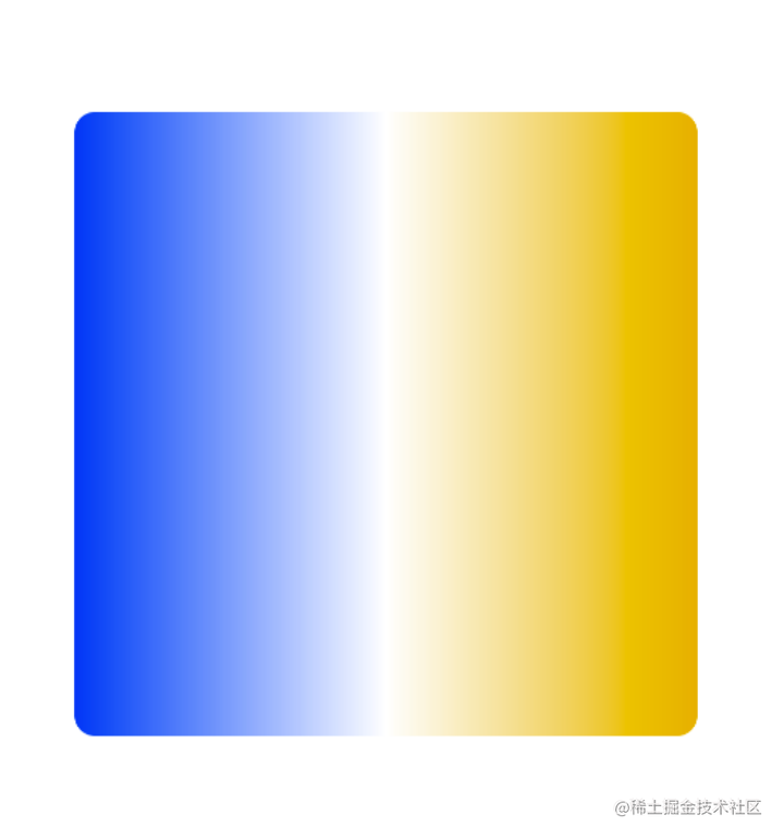
举个很简单的渐变例子,xml中代码如下:
<?xml version="1.0" encoding="utf-8"?>
<shape xmlns:android="http://schemas.android.com/apk/res/android">
    <gradient
        android:centerColor="#FFFFFF"
        android:startColor="#053FEC"
        android:endColor="#DFB109"/>
    <corners android:radius="10dp"/>
</shape>
则对应效果为圆角10dp的蓝黄渐变:
当然,shape可做成的效果原不仅仅是这一个渐变,可组合效果太多太多,这里就不赘述了。
ClipDrawable
通过设置一个Drawable的当前显示的比例来裁剪显示出另一张Drawable的类,可以通过调节这个比例来控制裁剪的宽高,以及裁剪内容占整个容器的比例。说大白话就是可以做到类似Progress进度条的效果,具体方法为setLevel(),设置值范围在[0,10000]之间,值越大裁剪内容越少显示内容越多,setLevel(10000)时,完全显示(可想而知,0就是完全不显示了)。
让我们开始一个简单例子,先在res/drawable下声明bg_drawable_clip.xml:
<?xml version="1.0" encoding="utf-8"?>
<clip xmlns:android="http://schemas.android.com/apk/res/android"
    android:drawable="@drawable/img_demo">
</clip>
然后对应activity布局则为:
<?xml version="1.0" encoding="utf-8"?>
<RelativeLayout xmlns:android="http://schemas.android.com/apk/res/android"
    xmlns:tools="http://schemas.android.com/tools"
    android:layout_width="match_parent"
    android:layout_height="match_parent"
    tools:context=".MainActivity">
    <ImageView
        android:id="@+id/iv_center"
        android:layout_alignParentTop="true"
        android:layout_width="match_parent"
        android:layout_height="333dp"
        android:background="@drawable/bg_drawable_clip"
        />
    <SeekBar
        android:id="@+id/seekbar"
        android:layout_below="@id/iv_center"
        android:layout_marginTop="20dp"
        android:layout_width="match_parent"
        android:layout_height="wrap_content" />
</RelativeLayout>
对应在Activity中关键代码则为:
ClipDrawable background = (ClipDrawable) mIvCenter.getBackground();
mSeekBar.setOnSeekBarChangeListener(new SeekBar.OnSeekBarChangeListener() {
    @Override
    public void onProgressChanged(SeekBar seekBar, int progress, boolean fromUser) {
        int level = seekBar.getMax();
        background.setLevel((int) (10000 * ((double)progress/(double)level)));
    }

    @Override
    public void onStartTrackingTouch(SeekBar seekBar) {

    }

    @Override
    public void onStopTrackingTouch(SeekBar seekBar) {

    }
});
可见其效果:
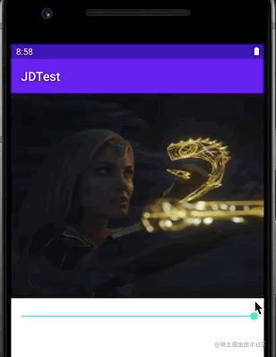
我们通过通过一个seekBar的进度来动态改变其setLevel中的值,最终让其显示不同的比例。当然也可以通过修改对应属性来调整他展开收缩的方向(竖直或者横向)。例如:
android:clipOrientation="vertical|horizontal"
由上面没有声明方向即是横向可以推断其默认方向为横向。竖向的例子这里就不赘述了。
RotateDrawable
看名字就能猜出来了,用于对Drawable的旋转。通过setLevel()来控制旋转程度,最大值为10000。其属性如下:
·android:fromDegrees:起始角度,对应最低的level值,默认为 0
·android:toDegrees:结束角度,对应最高的level值,默认为360
·android:pivotX:设置参照点的x坐标,取值为 0~1,默认是 50%,即 0.5
·android:pivotY:设置参照点的Y坐标,取值为 0~1,默认是 50%,即 0.5
·android:drawable:设置图片资源
·android:visible:是否可见
值得一提的是其角度计算方式坐标参考下图:
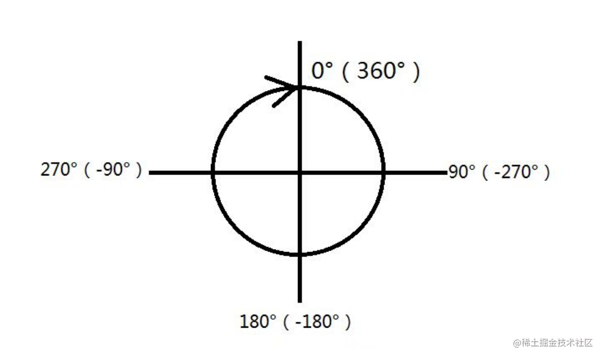
可能看到最大值10000会让部分人产生疑惑,明明只有360度,10000是什么效果,其实setLevel是个相对度数,setLevel(360)可以理解为旋转一圈,setLevel(720)则是旋转俩圈,以此类推。
此Drawable可用ClipDrawable中的实例验证,修改下对应标签名和设置方法就行了,过于简单这里就不赘述了。你可能会发现,这个RotateDrawable跟RotateAnimation极其类似,都是旋转动画,那么对应Android的动画,是不是还有一个对应动画的Drawable?有的,就是AnimationDrawable。
AnimationDrawable
类似于Android的帧动画,用于把一系列的Drawable按照设置的顺序一帧一帧的播放。
其根结点为< animation-list>。< animation-list>可以有一个或多个< item>,每个< item>可设置属性如下:
android:oneshot :设置是否循环播放,false 则为循环播放(是不是有点不一样)
android:duration :每帧的间隔时间
使用方法:
其xml设置格式如下:
<?xml version="1.0" encoding="utf-8"?>
<animation-list xmlns:android="http://schemas.android.com/apk/res/android"
    android:oneshot="false">
    <item
        android:drawable="@drawable/wave_1"
        android:duration="100" />
    <item
        android:drawable="@drawable/wave_2"
        android:duration="100" />
    <item
        android:drawable="@drawable/wave_3"
        android:duration="100" />
    <item
        android:drawable="@drawable/wave_4"
        android:duration="100" />
    <item
        android:drawable="@drawable/wave_5"
        android:duration="100" />
    <item
        android:drawable="@drawable/wave_6"
        android:duration="100" />
</animation-list>
在activity的布局文件中设置为ImageView的src,然后在Activity中通过ImageView.getDrawable()获取实例,然后start()即可播放动画。这里需要注意的是:在onCreate中直接调用,由于View还没初始化结束,是没有效果的。最好是postDelayed延迟播放。
由于其实例过于简单,这里不再赘述。
LayerDrawable
即图层叠加Drawable,可以说它是一个层次化显示的Drawable集合。通过显示多个Drawable的叠加、旋转、位移等组合显示出与单一Drawable不同的效果。LayerDrawable以 作为头节点。其子节点中属性如下:
android:drawable:引用的位图等资源,如果为空则必须有一个Drawable类型的子节点
android:left:这一个Drawable相对于容器的左边距,默认单位px
android:right:这一个Drawable相对于容器的右边距,默认单位px
android:top:这一个Drawable相对于容器的上边距,默认单位px
android:bottom:这一个Drawable相对于容器的下边距,默认单位px
android:id:赋予这一个drawable于 id,可用可不用。
在LayerDrawable中,每一个item表示一个Drawable,在效果上下面的Drawale覆盖上面的Drawable,item里面放的是各种Drawable。
例如,我们构建三层Drawable:
<?xml version="1.0" encoding="utf-8"?>
<layer-list xmlns:android="http://schemas.android.com/apk/res/android">

    <item>
        <shape>
            <solid android:color="@android:color/black"/>
        </shape>
    </item>
    <item
        android:bottom="10dp"
        android:left="10dp"
        android:right="10dp"
        android:top="10dp"
        >
        <shape>
            <solid android:color="@android:color/holo_red_dark"/>
            <stroke
                android:width="2dp"
                android:color="@android:color/holo_green_dark" />
            <corners android:radius="2dp"/>
        </shape>
    </item>
    <item
        android:bottom="10dp"
        android:left="10dp"
        android:right="10dp"
        android:top="10dp">
        <shape
            android:shape="oval">
            <solid android:color="@android:color/holo_blue_dark"/>
        </shape>
    </item>

</layer-list>
其Activity的布局为:
<?xml version="1.0" encoding="utf-8"?>
<RelativeLayout xmlns:android="http://schemas.android.com/apk/res/android"
    xmlns:tools="http://schemas.android.com/tools"
    android:layout_width="match_parent"
    android:layout_height="match_parent"
    tools:context=".MainActivity">
    <ImageView
        android:id="@+id/iv_center"
        android:layout_width="222dp"
        android:layout_height="222dp"
        android:layout_centerInParent="true"
        android:background="@drawable/bg_normol_drawable"/>
</RelativeLayout>
不难猜到其显示效果为:
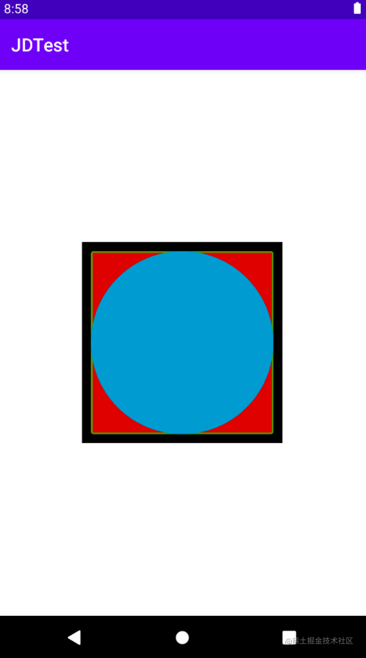
当然,LayerDrawable可实现效果远不止这么点,你可多试试其他效果。
TransitionDrawable
是LayerDrawable 的一个子类,LayerDrawable 有的属性它几乎都有,但TransitionDrawable 只做管理两层的 Drawable 并且提供了相应透明度变化的动画,可以控制一层 Drawable 过度到另一层 Drawable 的动画效果。其根结点为< transition> ,且只有两个 < item>,设置好之后调用 startTransition() 可启动两层间的切换动画(还有个reverseTransition()反过来播放)。
我们用LayerDrawable 例子的drawable做一点小改动。
<?xml version="1.0" encoding="utf-8"?>
<transition xmlns:android="http://schemas.android.com/apk/res/android">
    <item android:drawable="@drawable/ic_launcher_round"/>
    <item android:drawable="@drawable/img_demo"/>
</transition>
对应activity中布局文件则为:
<?xml version="1.0" encoding="utf-8"?>
<RelativeLayout xmlns:android="http://schemas.android.com/apk/res/android"
    xmlns:tools="http://schemas.android.com/tools"
    android:layout_width="match_parent"
    android:layout_height="match_parent"
    tools:context=".MainActivity">
    <ImageView
        android:id="@+id/iv_center"
        android:layout_width="222dp"
        android:layout_height="222dp"
        android:layout_centerInParent="true"
        android:src="@drawable/bg_normol_drawable"/>
</RelativeLayout>
Activity中对应代码则是:
ImageView mIvCenter = findViewById(R.id.iv_center);
TransitionDrawable drawable = (TransitionDrawable) mIvCenter.getDrawable();
drawable.startTransition(2000);
其效果为:
LevelListDrawable
LevelListDrawable 也可以用于管理一组 Drawable,可以为里面的 drawable 设置不同的 level,通过根据不同的 level 属性值在其绘制的时候,获取对应的 drawable 绘制到画布上,其根结点为< level-list>。其每个item属性如下:
android:drawable:引用的图片资源,如果为空则必须有一个 Drawable 类型的子节点
android:minLevel:对应的最小值
android:maxLevel :对应的最大值
在Activity中获取对应ImageView,通过setImageLevel()来设置不同drawable。其使用方式与LayerDrawable这些差别不大,这里不再赘述。
其余Drawable都有其特殊使用方式和特定场景,但按照分类,都能通过以上例子举一反三。


![[C/C++] -- CMake使用](https://img-blog.csdnimg.cn/direct/d1df6542ada7457c9b6acd6b1a24e671.png)