文章目录
- 前言
- UserControl简单使用
- 新建项目
- 直接新建项目
- 初始化UserControl
- Geometry:矢量图形
- 额外Icon导入
- 最优解决方案
- 按钮Button
- 切换按钮ToggleButton
- 默认按钮
- 图片可切换按钮
- 加载按钮
- 切换按钮
- 单选按钮和复选按钮没有太大特点,就不展开写了
- 总结
- DataGrid数据表格
- Growl消息提示
- 结论
前言
因为HandyControl 的功能非常的丰富,我打算完整的了解一下HandyControl 整个控件的基本使用,而且我的网易云WPF项目也打算用UserControl 进行重构
UserControl简单使用
WPF-UI HandyControl 简单介绍
HandyControl Visual Studio 插件
HandyControl Github地址
HandyControl 官方中文文档
HandyControl 实战Gitee仓库
新建项目
我们下载了HandyControl 插件之后,就可以使用HandyControl模板开始项目。
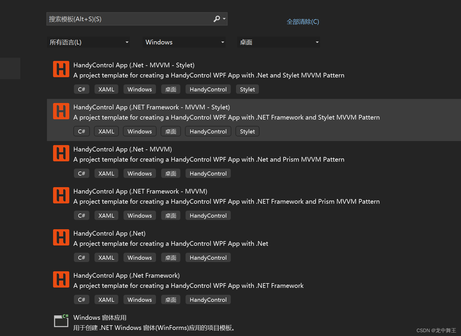
但是根据我的测试,第一这个HandyControl的.Net 版本都是.Net Core 5.0的。而且用起来还是不太舒服
直接新建项目
App.Xaml
<Application x:Class="WpfApp1.App"
             xmlns="http://schemas.microsoft.com/winfx/2006/xaml/presentation"
             xmlns:x="http://schemas.microsoft.com/winfx/2006/xaml"
             xmlns:local="clr-namespace:WpfApp1"
             xmlns:hc="https://handyorg.github.io/handycontrol"
             xmlns:icon="http://metro.mahapps.com/winfx/xaml/iconpacks"
             StartupUri="MainWindow.xaml">
    <Application.Resources>
        <ResourceDictionary>
            <ResourceDictionary.MergedDictionaries>
                <ResourceDictionary Source="pack://application:,,,/HandyControl;component/Themes/SkinDefault.xaml" />
                <ResourceDictionary Source="pack://application:,,,/HandyControl;component/Themes/Theme.xaml" />

            </ResourceDictionary.MergedDictionaries>
        </ResourceDictionary>
    </Application.Resources>
</Application>
初始化UserControl
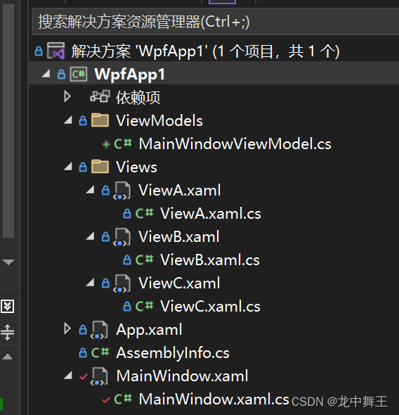
MainWindow
   <Grid>

       <TabControl  Style="{StaticResource TabControlInLine}"
                   x:Name="MyTable">
           <!--通过设置Collapsed来完全折叠TabItem-->
           <TabItem Header="A">
               <View:ViewA />
           </TabItem>
           <TabItem Header="B">
               <View:ViewB />

           </TabItem>

           <TabItem Header="C">
               <View:ViewC />

           </TabItem>
       </TabControl>
   </Grid>
接下来我会对HandyControl的特色控件进行实战。比如别的UI库没有实现的
Geometry:矢量图形
HandyControl对常用的矢量图形进行了封装
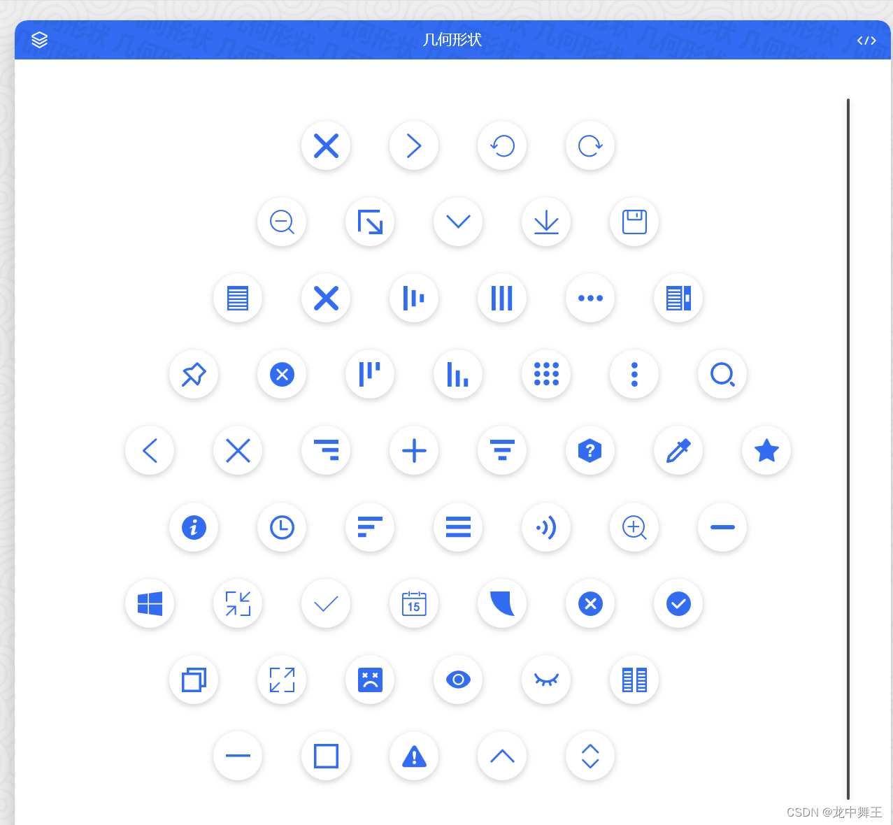
额外Icon导入
毕竟默认的Icon比较少,而且按照作者的意思,他不希望把HandyControl写的太臃肿。
How to convert a PackIconMarkup to a Geometry object? #256
这里用到了我们之前的矢量图
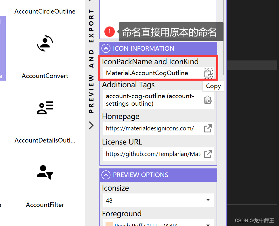
WPF Icon矢量库 MahApps.Metro.IconPacks
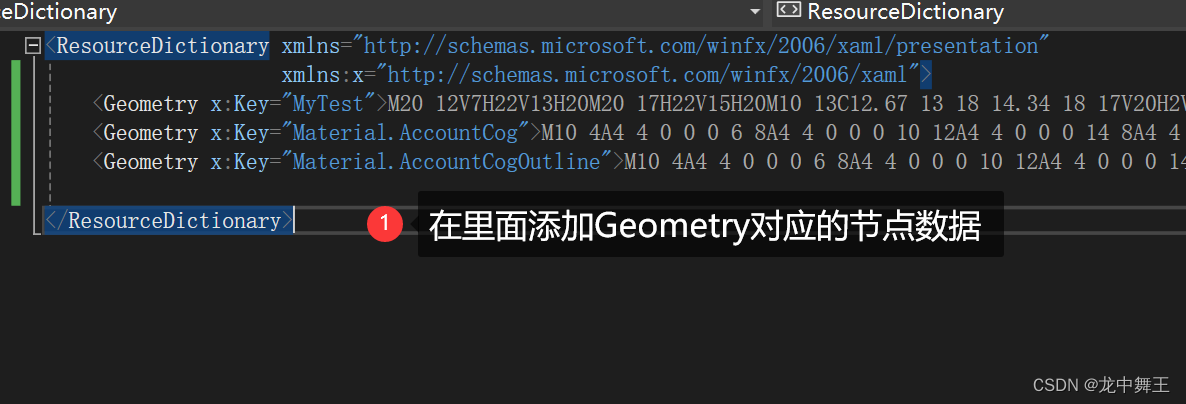
在Resource中添加
<Geometry x:Key="MyTest">矢量代码</Geometry>
然后在IconPacks Browser里面搜索对应的Data
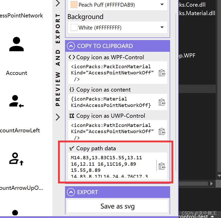
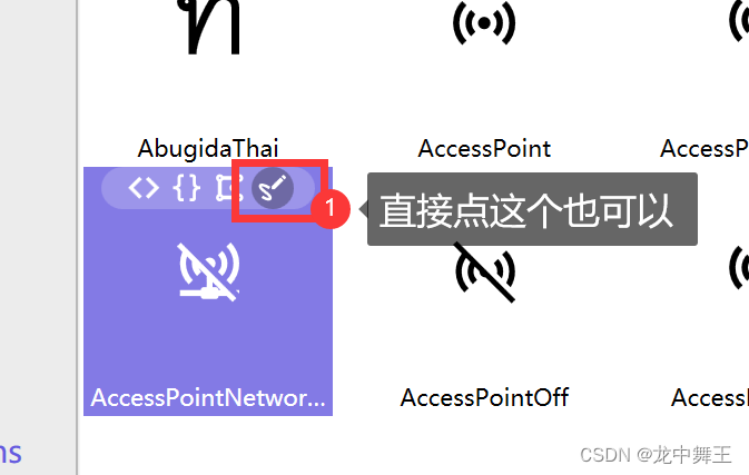
我暂时没找到更好的方法,去直接转换。应该是通过某种方法直接拿到里面全部的Geometry数据
<UserControl.Resources>
<!--定义数据,这个是直接拿到的矢量数据-->
<Geometry x:Key="MyTest">M20 12V7H22V13H20M20 17H22V15H20M10 13C12.67 13 18 14.34 18 17V20H2V17C2 14.34 7.33 13 10 13M10 4A4 4 0 0 1 14 8A4 4 0 0 1 10 12A4 4 0 0 1 6 8A4 4 0 0 1 10 4M10 14.9C7.03 14.9 3.9 16.36 3.9 17V18.1H16.1V17C16.1 16.36 12.97 14.9 10 14.9M10 5.9A2.1 2.1 0 0 0 7.9 8A2.1 2.1 0 0 0 10 10.1A2.1 2.1 0 0 0 12.1 8A2.1 2.1 0 0 0 10 5.9Z</Geometry>
</UserControl.Resources>
......其它代码
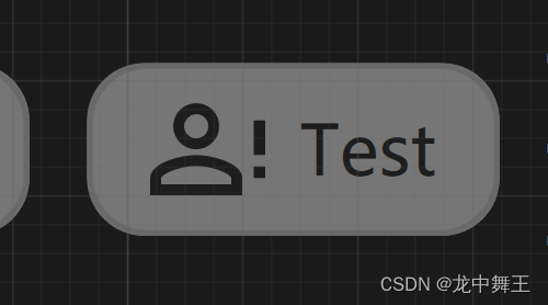
<Button IsEnabled="False"
Margin="5"
Content="Test"
hc:BorderElement.CornerRadius="10"
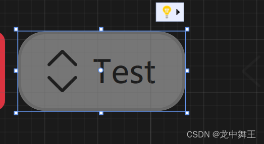
hc:IconElement.Geometry="{StaticResource MyTest}" />
效果
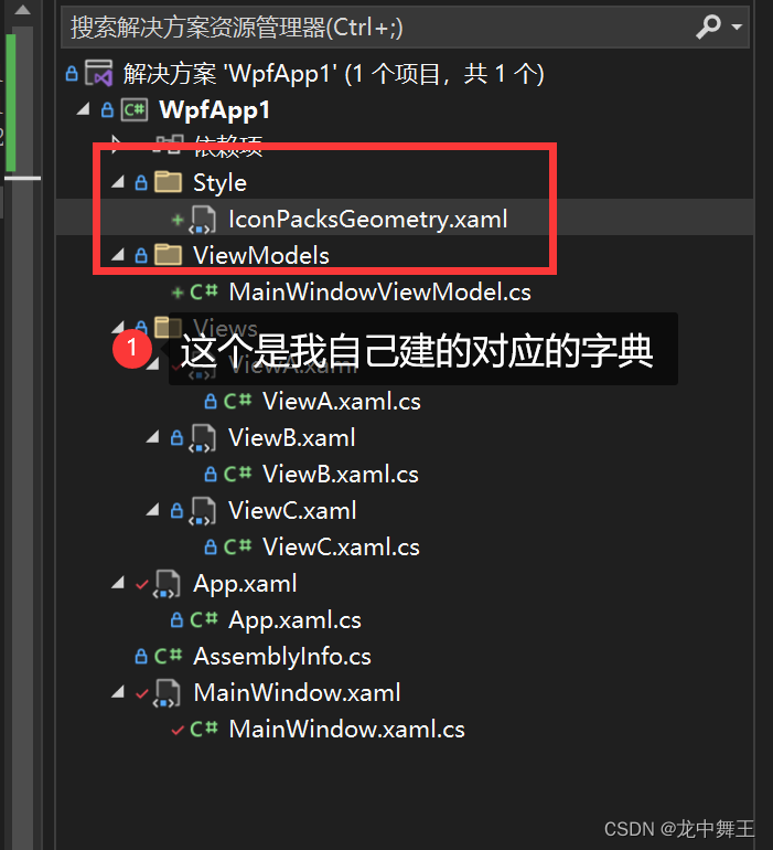
最优解决方案
自己新建一个字典:
<Application x:Class="WpfApp1.App"
             xmlns="http://schemas.microsoft.com/winfx/2006/xaml/presentation"
             xmlns:x="http://schemas.microsoft.com/winfx/2006/xaml"
             xmlns:local="clr-namespace:WpfApp1"
             xmlns:hc="https://handyorg.github.io/handycontrol"
             xmlns:icon="http://metro.mahapps.com/winfx/xaml/iconpacks"
             StartupUri="MainWindow.xaml">
    <Application.Resources>
        <ResourceDictionary>
            <ResourceDictionary.MergedDictionaries>
                <ResourceDictionary Source="pack://application:,,,/HandyControl;component/Themes/SkinDefault.xaml" />
                <ResourceDictionary Source="pack://application:,,,/HandyControl;component/Themes/Theme.xaml" />
                <!--这个是你自己的扩展Geometry字典-->
                <ResourceDictionary Source="/WpfApp1;component/Style/IconPacksGeometry.xaml" />
            </ResourceDictionary.MergedDictionaries>
        </ResourceDictionary>
    </Application.Resources>
</Application>
按钮Button
HandyControl 对Button进行了扩展,改造成了图标按钮。默认Icon在左,文本在右。而且添加了一些扩展属性,可以直接进行修改。
- hc:HandyControl
- IconElement:图标扩展
- Geometry:矢量图标
- Width:宽度
- Heigth:高度
- BorderElement:边框扩展
<Button IsEnabled="False"
                Margin="5"
                Content="Test"
                hc:BorderElement.CornerRadius="10"
                hc:IconElement.Geometry="{StaticResource UpDownGeometry}" />
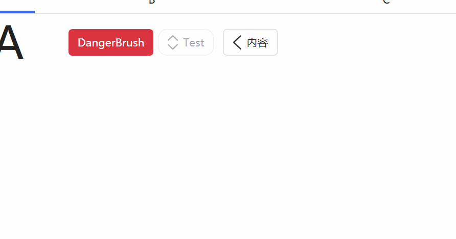
切换按钮ToggleButton
默认是没有带切换功能的,不太了解,如果你使用的是Default按钮,是不能进行切换的
默认按钮
        <ToggleButton Margin="5"
                      Content="内容"
                      Style="{StaticResource ToggleButtonDefault}"
                      hc:IconSwitchElement.Geometry="{StaticResource LeftGeometry}"
                      hc:IconSwitchElement.GeometrySelected="{StaticResource RightGeometry}" />
按钮点击无反应
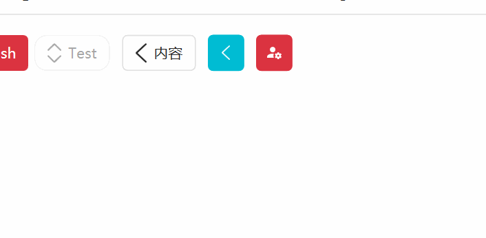
图片可切换按钮
如果使用可翻转按钮,Content就无效了,这个我不太理解为什么要无效。
这里的Geometry可以用我之前的直接导入法替换Icon
        <Geometry x:Key="Material.AccountCog">M10 4A4 4 0 0 0 6 8A4 4 0 0 0 10 12A4 4 0 0 0 14 8A4 4 0 0 0 10 4M17 12C16.87 12 16.76 12.09 16.74 12.21L16.55 13.53C16.25 13.66 15.96 13.82 15.7 14L14.46 13.5C14.35 13.5 14.22 13.5 14.15 13.63L13.15 15.36C13.09 15.47 13.11 15.6 13.21 15.68L14.27 16.5C14.25 16.67 14.24 16.83 14.24 17C14.24 17.17 14.25 17.33 14.27 17.5L13.21 18.32C13.12 18.4 13.09 18.53 13.15 18.64L14.15 20.37C14.21 20.5 14.34 20.5 14.46 20.5L15.7 20C15.96 20.18 16.24 20.35 16.55 20.47L16.74 21.79C16.76 21.91 16.86 22 17 22H19C19.11 22 19.22 21.91 19.24 21.79L19.43 20.47C19.73 20.34 20 20.18 20.27 20L21.5 20.5C21.63 20.5 21.76 20.5 21.83 20.37L22.83 18.64C22.89 18.53 22.86 18.4 22.77 18.32L21.7 17.5C21.72 17.33 21.74 17.17 21.74 17C21.74 16.83 21.73 16.67 21.7 16.5L22.76 15.68C22.85 15.6 22.88 15.47 22.82 15.36L21.82 13.63C21.76 13.5 21.63 13.5 21.5 13.5L20.27 14C20 13.82 19.73 13.65 19.42 13.53L19.23 12.21C19.22 12.09 19.11 12 19 12H17M10 14C5.58 14 2 15.79 2 18V20H11.68A7 7 0 0 1 11 17A7 7 0 0 1 11.64 14.09C11.11 14.03 10.56 14 10 14M18 15.5C18.83 15.5 19.5 16.17 19.5 17C19.5 17.83 18.83 18.5 18 18.5C17.16 18.5 16.5 17.83 16.5 17C16.5 16.17 17.17 15.5 18 15.5Z</Geometry>
        <Geometry x:Key="Material.AccountCogOutline">M10 4A4 4 0 0 0 6 8A4 4 0 0 0 10 12A4 4 0 0 0 14 8A4 4 0 0 0 10 4M10 6A2 2 0 0 1 12 8A2 2 0 0 1 10 10A2 2 0 0 1 8 8A2 2 0 0 1 10 6M17 12C16.84 12 16.76 12.08 16.76 12.24L16.5 13.5C16.28 13.68 15.96 13.84 15.72 14L14.44 13.5C14.36 13.5 14.2 13.5 14.12 13.6L13.16 15.36C13.08 15.44 13.08 15.6 13.24 15.68L14.28 16.5V17.5L13.24 18.32C13.16 18.4 13.08 18.56 13.16 18.64L14.12 20.4C14.2 20.5 14.36 20.5 14.44 20.5L15.72 20C15.96 20.16 16.28 20.32 16.5 20.5L16.76 21.76C16.76 21.92 16.84 22 17 22H19C19.08 22 19.24 21.92 19.24 21.76L19.4 20.5C19.72 20.32 20.04 20.16 20.28 20L21.5 20.5C21.64 20.5 21.8 20.5 21.8 20.4L22.84 18.64C22.92 18.56 22.84 18.4 22.76 18.32L21.72 17.5V16.5L22.76 15.68C22.84 15.6 22.92 15.44 22.84 15.36L21.8 13.6C21.8 13.5 21.64 13.5 21.5 13.5L20.28 14C20.04 13.84 19.72 13.68 19.4 13.5L19.24 12.24C19.24 12.08 19.08 12 19 12H17M10 13C7.33 13 2 14.33 2 17V20H11.67C11.39 19.41 11.19 18.77 11.09 18.1H3.9V17C3.9 16.36 7.03 14.9 10 14.9C10.43 14.9 10.87 14.94 11.3 15C11.5 14.36 11.77 13.76 12.12 13.21C11.34 13.08 10.6 13 10 13M18.04 15.5C18.84 15.5 19.5 16.16 19.5 17.04C19.5 17.84 18.84 18.5 18.04 18.5C17.16 18.5 16.5 17.84 16.5 17.04C16.5 16.16 17.16 15.5 18.04 15.5Z</Geometry>

......其它代码
 <ToggleButton Margin="5"
               Content="内容"
               Style="{StaticResource ToggleButtonIconInfo}"
               hc:IconSwitchElement.Geometry="{StaticResource LeftGeometry}"
               hc:IconSwitchElement.GeometrySelected="{StaticResource RightGeometry}" />

 <ToggleButton Margin="5"
               Content="内容"
               Style="{StaticResource ToggleButtonIconDanger}"
               hc:IconSwitchElement.Geometry="{StaticResource Material.AccountCog}"
               hc:IconSwitchElement.GeometrySelected="{StaticResource Material.AccountCogOutline}" />
加载按钮
添加LoadingStyle会将Icon的效果无效
        <ToggleButton Margin="5"
                      Content="内容"
                      Style="{StaticResource ToggleButtonLoadingInfo}"
                      hc:IconSwitchElement.Geometry="{StaticResource Material.AccountCog}"
                      hc:IconSwitchElement.GeometrySelected="{StaticResource Material.AccountCogOutline}" />
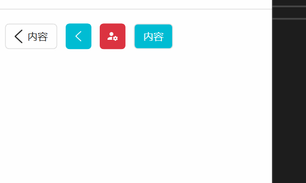
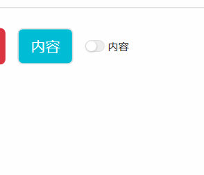
切换按钮
大小有点小,用的时候要放大点
        <ToggleButton Margin="5"
                      Content="内容"
                      FontSize="20"
                      Style="{StaticResource ToggleButtonSwitch}"
                      hc:IconSwitchElement.Geometry="{StaticResource Material.AccountCog}"
                      hc:IconSwitchElement.GeometrySelected="{StaticResource Material.AccountCogOutline}" />
单选按钮和复选按钮没有太大特点,就不展开写了
总结
HandyControl非常的好用,而且能进行自定义拓展,这里就不展开了。尤其是有了导入其它Icon的Geometry的能力之后,基本所有的图标都可以轻松拿下。
DataGrid数据表格
这里我们就用最简单的自动生成,看看效果
测试类
    public class TemplateDate
    {
        public string Name { get; set; }

        public int Age { get; set; }

        public long Phone { get; set; }

        public enum SexEnum { 男, 女, 保密 }

        public SexEnum Sex { get; set; }
    }
ViewModel绑定
    public class ViewBViewModel
    {
        public List<TemplateDate> TemplateDates { get; set; }
        public ViewBViewModel()
        {
            TemplateDates = new List<TemplateDate>() {
                new TemplateDate(){Name="小明",Age = 16,Phone = 13214324920,Sex = TemplateDate.SexEnum.男},
                new TemplateDate(){Name="小红",Age = 17,Phone = 38188949204,Sex = TemplateDate.SexEnum.女}
            };
        }
    }
View绑定
        <DataGrid CanUserAddRows="False"
                  hc:DataGridAttach.CanUnselectAllWithBlankArea="True"
                  ItemsSource="{Binding TemplateDates}"
                  SelectionMode="Extended"
                  SelectionUnit="Cell" />
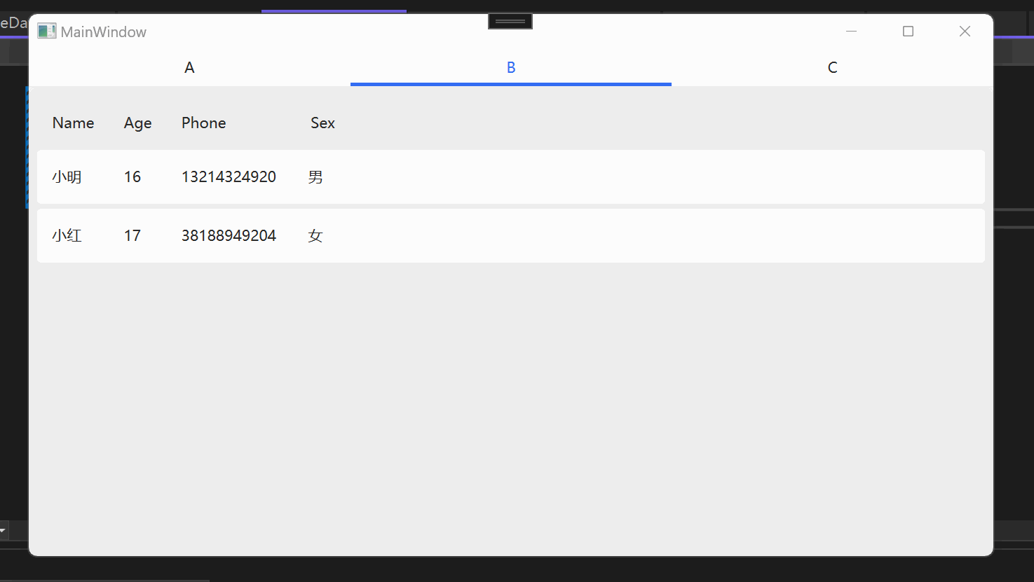
感觉UI效果还行
Growl消息提示
这个部分比较难,可以看看官方的文档
Growl 信息通知
如果想要设置提示的位置,可以手动添加如下控件。可以修改提示出现的位置。不过我个人建议不添加,因为默认的左上角就够用了。
<ScrollViewer VerticalScrollBarVisibility="Hidden"
              HorizontalAlignment="Right">
    <StackPanel hc:Growl.GrowlParent="True"
                VerticalAlignment="Top"
                Margin="0,10,10,10" />
</ScrollViewer>
按钮事件声明
using CommunityToolkit.Mvvm.ComponentModel;
using CommunityToolkit.Mvvm.Input;
using HandyControl.Controls;
using HandyControl.Data;
using System;
using System.Collections.Generic;
using System.Linq;
using System.Text;
using System.Threading.Tasks;

namespace WpfApp1.ViewModels
{
    public class ViewAViewModel:ObservableObject
    {
        public RelayCommand InfoBtn { get; set; }

        public RelayCommand SuccessBtn { get; set; }

        public RelayCommand WarningBtn { get; set; }

        public RelayCommand ErrorBtn { get; set; }

        public RelayCommand AskBtn { get; set; }

        public RelayCommand SeriousBtn { get; set; }

        public RelayCommand ClearBtn { get; set; }

        public RelayCommand InfoGlobalBtn { get; set; }

        public RelayCommand SuccessGlobalBtn { get; set; }

        public RelayCommand WarningGlobalBtn { get; set; }

        public RelayCommand ErrorGlobalBtn { get; set; }

        public RelayCommand AskGlobalBtn { get; set; }

        public RelayCommand SeriousGlobalBtn { get; set; }

        public RelayCommand ClearGlobalBtn { get; set; }

        public ViewAViewModel() {
            InfoBtn = new RelayCommand(() =>
            {
                Growl.Info("消息");
            });
            SuccessBtn = new RelayCommand(() => {
                Growl.Success("成功!");
            });

            WarningBtn = new RelayCommand(() => {
                Growl.Warning("警告");
            });
            ErrorBtn = new RelayCommand(() => {
                Growl.Error("错误");
            });

            AskBtn = new RelayCommand(() => {
                Growl.Ask("询问", isConfirmed =>
                {
                    Growl.Info($"询问结果[{isConfirmed}]");
                    return true;
                });

            });
            SeriousBtn = new RelayCommand(() => {
                Growl.Fatal("严重");
            });
            ClearBtn = new RelayCommand(() => {

                Growl.Clear();
            });


            InfoGlobalBtn = new RelayCommand(() =>
            {
                Growl.InfoGlobal("消息");
            });
            SuccessGlobalBtn = new RelayCommand(() => {
                Growl.SuccessGlobal("成功!");
            });

            WarningGlobalBtn = new RelayCommand(() => {
                Growl.WarningGlobal("警告");
            });
            ErrorGlobalBtn = new RelayCommand(() => {
                Growl.ErrorGlobal("错误");
            });

            AskGlobalBtn = new RelayCommand(() => {
                Growl.AskGlobal("询问", isConfirmed =>
                {
                    Growl.InfoGlobal($"询问结果[{isConfirmed}]");
                    return true;
                });

            });
            SeriousGlobalBtn = new RelayCommand(() => {
                Growl.FatalGlobal("严重");
            });
            ClearGlobalBtn = new RelayCommand(() => {

                Growl.ClearGlobal();
            });
        }
    }
}
按钮事件绑定
 <hc:Divider Content="窗体消息"
             Margin="0"
             FontSize="30" />
 <StackPanel Orientation="Horizontal">
     <StackPanel.Resources>
         <Style TargetType="Button"
                BasedOn="{StaticResource ButtonDefault}">
             <Setter Property="Margin"
                     Value="1" />
         </Style>
     </StackPanel.Resources>
     <Button Content="信息"
             Command="{Binding InfoBtn}" />
     <Button Content="成功"
             Command="{Binding SuccessBtn}" />
     <Button Content="警告"
             Command="{Binding WarningBtn}" />
     <Button Content="错误"
             Command="{Binding ErrorBtn}" />
     <Button Content="询问"
             Command="{Binding AskBtn}" />
     <Button Content="严重"
             Command="{Binding SeriousBtn}" />
     <Button Content="清空"
             Command="{Binding ClearBtn}" />
 </StackPanel>
 <hc:Divider Content="桌面消息"
             Margin="0"
             FontSize="30" />
 <StackPanel Orientation="Horizontal">
     <StackPanel.Resources>
         <Style TargetType="Button"
                BasedOn="{StaticResource ButtonDefault}">
             <Setter Property="Margin"
                     Value="1" />
         </Style>
     </StackPanel.Resources>
     <Button Content="信息"
             Command="{Binding InfoGlobalBtn}" />
     <Button Content="成功"
             Command="{Binding SuccessGlobalBtn}" />
     <Button Content="警告"
             Command="{Binding WarningGlobalBtn}" />
     <Button Content="错误"
             Command="{Binding ErrorGlobalBtn}" />
     <Button Content="询问"
             Command="{Binding AskGlobalBtn}" />
     <Button Content="严重"
             Command="{Binding SeriousGlobalBtn}" />
     <Button Content="清空"
             Command="{Binding ClearGlobalBtn}" />
 </StackPanel>
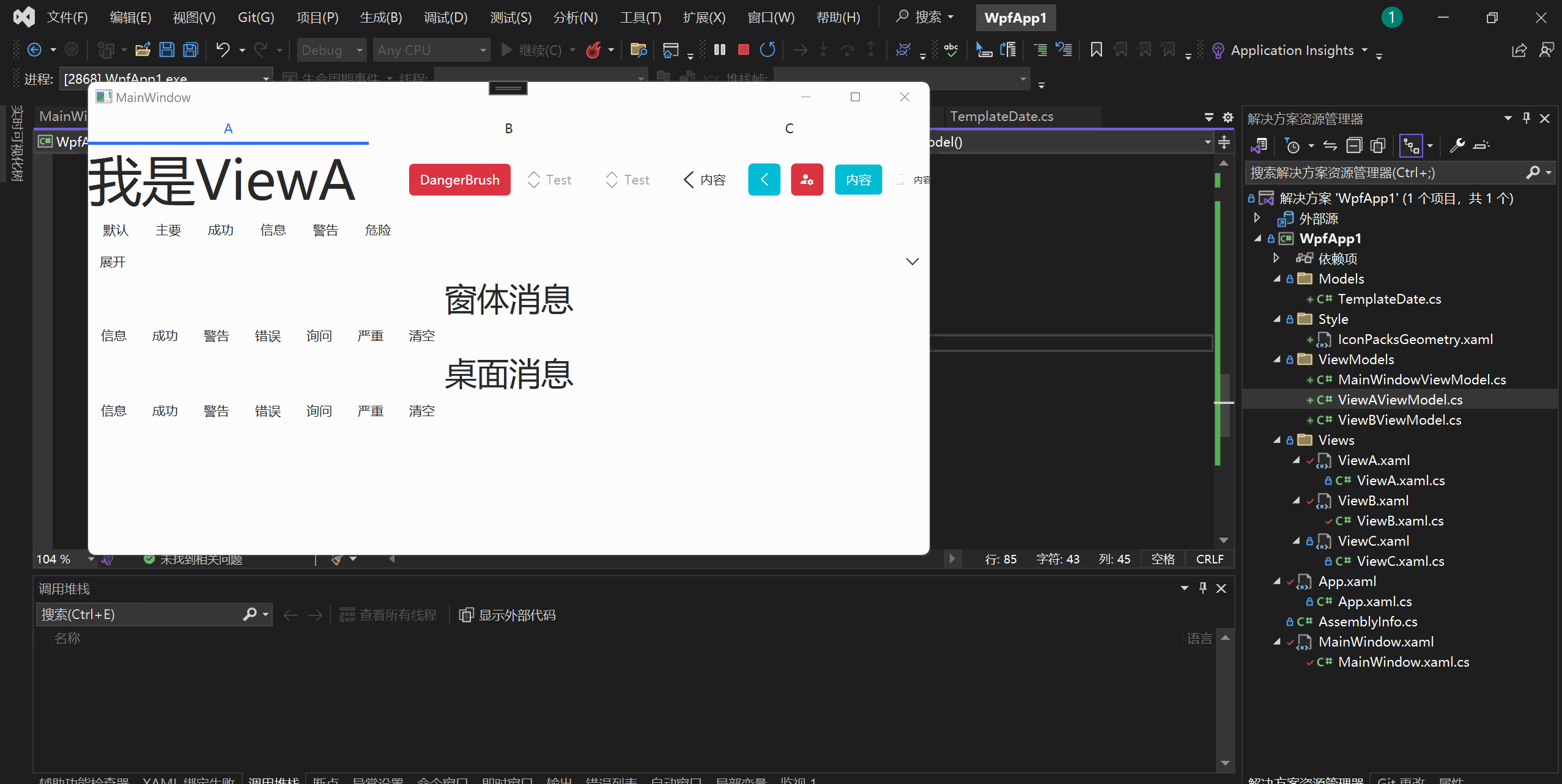
实现效果:
结论
这里简单使用了一下HandyControl的控件,其实还有很多别的控件,这里由于篇幅就不展开使用了。由于有额外的Icon数据手动添加,HandyControl基本已经完美了,搭配我之前的推荐的LiveCharts2,WPF基本的UI控件已经够用了。其实WPF也是很简单的,主要是国内的相关讨论比较少。我之前写过一个网易云的WPF版本,接下来会使用HandyControl进行重构。
WPF Live Charts2 自学笔记


