在WPF开发中,默认控件的样式常常无法满足实际的应用需求,我们通常都会采用引入第三方控件库的方式来美化UI,使得应用软件的设计风格更加统一。常用的WPF的UI控件库主要有以下几种,如:Modern UI for WPF,MaterialDesignInXamlToolkit,PanuonUI,Newbeecoder.UI,WPF UI ,AduSkin,Panuon.UI.Silver,HandyControl,MahApps.Metro,Kino.Toolkit.Wpf,Xceed Extended WPF Toolkit™,Kino.Toolkit.Wpf,PP.Wpf,Adonis-ui,CC.WPFTools,CookPopularControl ,PropertyTools,RRQMSkin,Layui-WPF,Arthas-WPFUI,fruit-vent-design,Fluent.Ribbon,DMSkin WPF,EASkins_WPF,Rubyer-WPF,WPFDevelopers.Minimal ,WPFDevelopers,DevExpress WPF UI Library,ReactiveUI,Telerik UI for WPF等等,面对如此之多的WPF 第三方UI控件库,可谓各有特色,不一而同,对于具有选择综合症的开发人员来说,真的很难抉择。在实际工作中,软件经过统一的UI设计以后,和具体的业务紧密相连,往往这些通用的UI框架很难百分之百的契合,这时候,就需要我们自己去实现自定义控件【Custom Control】来解决。本文以自定义窗口为例,简述如何通过自定义控件来扩展功能和样式,仅供学习分享使用,如有不足之处,还请指正。

自定义控件
自定义控件Custom Control,通过集成现有控件(如:Button , Window等)进行扩展,或者继承Control基类两种方式,和用户控件【User Control不太相同】,具体差异如下所示:
- 用户控件UserControl
- 注重复合控件的使用,也就是多个现有控件组成一个可复用的控件组
- XAML和后台代码组成,绑定紧密
- 不支持模板重写
- 继承自UserControl
- 自定义控件CustomControl
- 完全自己实现一个控件,如继承现有控件进行功能扩展,并添加新功能
- 后台代码和Generic.xaml进行组合
- 在使用时支持模板重写
- 继承自Control
本文所讲解的侧重点为自定义控件,所以用户控件不再过多阐述。
WPF实现自定义控件步骤
1. 创建控件库
首先在解决方案中,创建一个WPF类库项目【SmallSixUI.Templates】,作为控件库,后续所有自定义控件,都可以在此项目中开发。并创建Controls,Styles,Themes,Utils等文件夹,分别存放控件类,样式,主题,帮助类等内容,作为控件库的基础结构,如下所示:

2. 创建自定义控件
在Controls目录中,创建自定义窗口AiWindow,继承自Window类,即此类具有窗口的一切功能,并具有扩展出来的自定义功能。在此自定义窗口中,我们可以自定义窗口标题的字体颜色HeaderForeground,背景色HeaderBackground,是否显示标题IsShowHeader,标题高度HeaderHeight,窗口动画类型Type等内容,具体如下所示:
using System;
using System.Collections.Generic;
using System.ComponentModel;
using System.Linq;
using System.Text;
using System.Threading.Tasks;
using System.Windows.Automation.Text;
using System.Windows;
using SmallSixUI.Templates.Utils;
using System.Windows.Controls;
using System.Windows.Media;
using System.Windows.Shell;

namespace SmallSixUI.Templates.Controls
{
    [TemplatePart(Name = "PART_CloseWindowButton", Type = typeof(Button))]
    [TemplatePart(Name = "PART_MaxWindowButton", Type = typeof(Button))]
    [TemplatePart(Name = "PART_MinWindowButton", Type = typeof(Button))]
    public class AiWindow : Window
    {
        /// <summary>
        /// 关闭窗体
        /// </summary>
        private Button PART_CloseWindowButton = null;
        /// <summary>
        /// 窗体缩放
        /// </summary>
        private Button PART_MaxWindowButton = null;
        /// <summary>
        /// 最小化窗体
        /// </summary>
        private Button PART_MinWindowButton = null;

        /// <summary>
        /// 设置重写默认样式
        /// </summary>
        static AiWindow()
        {
            StyleProperty.OverrideMetadata(typeof(AiWindow), new FrameworkPropertyMetadata(AiResourceHelper.GetStyle(nameof(AiWindow) + "Style")));
        }


        /// <summary>
        /// 顶部内容
        /// </summary>
        [Bindable(true)]
        public object HeaderContent
        {
            get { return (object)GetValue(HeaderContentProperty); }
            set { SetValue(HeaderContentProperty, value); }
        }

        // Using a DependencyProperty as the backing store for HeaderContent.  This enables animation, styling, binding, etc...
        public static readonly DependencyProperty HeaderContentProperty =
            DependencyProperty.Register("HeaderContent", typeof(object), typeof(AiWindow));


        /// <summary>
        /// 头部标题栏文字颜色
        /// </summary>
        [Bindable(true)]
        public Brush HeaderForeground
        {
            get { return (Brush)GetValue(HeaderForegroundProperty); }
            set { SetValue(HeaderForegroundProperty, value); }
        }

        // Using a DependencyProperty as the backing store for HeaderForeground.  This enables animation, styling, binding, etc...
        public static readonly DependencyProperty HeaderForegroundProperty =
            DependencyProperty.Register("HeaderForeground", typeof(Brush), typeof(AiWindow), new PropertyMetadata(Brushes.White));


        /// <summary>
        /// 头部标题栏背景色
        /// </summary>
        [Bindable(true)]
        public Brush HeaderBackground
        {
            get { return (Brush)GetValue(HeaderBackgroundProperty); }
            set { SetValue(HeaderBackgroundProperty, value); }
        }

        // Using a DependencyProperty as the backing store for MyProperty.  This enables animation, styling, binding, etc...
        public static readonly DependencyProperty HeaderBackgroundProperty =
            DependencyProperty.Register("HeaderBackground", typeof(Brush), typeof(AiWindow));
        /// <summary>
        /// 是否显示头部标题栏
        /// </summary>
        [Bindable(true)]
        public bool IsShowHeader
        {
            get { return (bool)GetValue(IsShowHeaderProperty); }
            set { SetValue(IsShowHeaderProperty, value); }
        }

        // Using a DependencyProperty as the backing store for IsShowHeader.  This enables animation, styling, binding, etc...
        public static readonly DependencyProperty IsShowHeaderProperty =
            DependencyProperty.Register("IsShowHeader", typeof(bool), typeof(AiWindow), new PropertyMetadata(false));

        /// <summary>
        /// 动画类型
        /// </summary>
        [Bindable(true)]
        public AnimationType Type
        {
            get { return (AnimationType)GetValue(TypeProperty); }
            set { SetValue(TypeProperty, value); }
        }

        // Using a DependencyProperty as the backing store for Type.  This enables animation, styling, binding, etc...
        public static readonly DependencyProperty TypeProperty =
            DependencyProperty.Register("Type", typeof(AnimationType), typeof(AiWindow), new PropertyMetadata(AnimationType.Default));


        /// <summary>
        /// 头部高度
        /// </summary>
        public int HeaderHeight
        {
            get { return (int)GetValue(HeaderHeightProperty); }
            set { SetValue(HeaderHeightProperty, value); }
        }

        // Using a DependencyProperty as the backing store for HeaderHeight.  This enables animation, styling, binding, etc...
        public static readonly DependencyProperty HeaderHeightProperty =
            DependencyProperty.Register("HeaderHeight", typeof(int), typeof(AiWindow), new PropertyMetadata(50));


        public override void OnApplyTemplate()
        {
            base.OnApplyTemplate();
            PART_CloseWindowButton = GetTemplateChild("PART_CloseWindowButton") as Button;
            PART_MaxWindowButton = GetTemplateChild("PART_MaxWindowButton") as Button;
            PART_MinWindowButton = GetTemplateChild("PART_MinWindowButton") as Button;
            if (PART_MaxWindowButton != null && PART_MinWindowButton != null && PART_CloseWindowButton != null)
            {
                PART_MaxWindowButton.Click -= PART_MaxWindowButton_Click;
                PART_MinWindowButton.Click -= PART_MinWindowButton_Click;
                PART_CloseWindowButton.Click -= PART_CloseWindowButton_Click;
                PART_MaxWindowButton.Click += PART_MaxWindowButton_Click;
                PART_MinWindowButton.Click += PART_MinWindowButton_Click;
                PART_CloseWindowButton.Click += PART_CloseWindowButton_Click;
            }
        }

        private void PART_CloseWindowButton_Click(object sender, RoutedEventArgs e)
        {
            Close();
        }

        private void PART_MinWindowButton_Click(object sender, RoutedEventArgs e)
        {
            WindowState = WindowState.Minimized;
        }

        private void PART_MaxWindowButton_Click(object sender, RoutedEventArgs e)
        {
            if (WindowState == WindowState.Normal)
            {
                WindowState = WindowState.Maximized;
            }
            else
            {
                WindowState = WindowState.Normal;
            }
        }

        protected override void OnSourceInitialized(EventArgs e)
        {
            base.OnSourceInitialized(e);
            if (SizeToContent == SizeToContent.WidthAndHeight && WindowChrome.GetWindowChrome(this) != null)
            {
                InvalidateMeasure();
            }
        }
    }
}注意:在自定义控件中,设置窗口标题的属性要在样式中进行绑定,所以需要定义为依赖属性。在此控件中用到的通用的类,则存放在Utils中。
3. 创建自定义控件样式
在Styles文件夹中,创建样式资源文件【AiWindowStyle.xaml】,并将样式的TargentType指定为Cotrols中创建的自定义类AiWindow。然后修改控件的Template属性,为其定义新的的ControlTemplate,来改变控件的样式。如下所示:
<ResourceDictionary
xmlns="http://schemas.microsoft.com/winfx/2006/xaml/presentation"
xmlns:x="http://schemas.microsoft.com/winfx/2006/xaml"
xmlns:Ai="clr-namespace:SmallSixUI.Templates.Controls">
<WindowChrome
x:Key="LayWindowChromeStyle"
CaptionHeight="56"
CornerRadius="0"
GlassFrameThickness="1"
NonClientFrameEdges="None"
ResizeBorderThickness="4"
UseAeroCaptionButtons="False" />
<Style x:Key="AiWindowStyle" TargetType="Ai:AiWindow">
<Setter Property="Background" Value="White" />
<Setter Property="HeaderBackground" Value="#23262E" />
<Setter Property="WindowChrome.WindowChrome">
<Setter.Value>
<WindowChrome
CaptionHeight="50"
CornerRadius="0"
GlassFrameThickness="1"
NonClientFrameEdges="None"
ResizeBorderThickness="4"
UseAeroCaptionButtons="False" />
</Setter.Value>
</Setter>
<Setter Property="Template">
<Setter.Value>
<ControlTemplate TargetType="Ai:AiWindow">
<Border
Height="{TemplateBinding HeaderHeight}"
Background="{TemplateBinding Background}"
BorderBrush="{TemplateBinding BorderBrush}"
BorderThickness="{TemplateBinding BorderThickness}"
ClipToBounds="True">
<Border.Style>
<Style TargetType="Border">
<Style.Triggers>
<DataTrigger Binding="{Binding RelativeSource={RelativeSource AncestorType=Ai:AiWindow}, Path=WindowState}" Value="Maximized">
<Setter Property="Padding" Value="7" />
</DataTrigger>
</Style.Triggers>
</Style>
</Border.Style>
<Ai:AiTransition Style="{DynamicResource LayTransitionStyle}" Type="{TemplateBinding Type}">
<Grid>
<Grid.RowDefinitions>
<RowDefinition Height="auto" />
<RowDefinition />
</Grid.RowDefinitions>
<Grid
x:Name="PART_Header"
Background="{TemplateBinding HeaderBackground}">
<Grid.ColumnDefinitions>
<ColumnDefinition Width="auto" />
<ColumnDefinition Width="auto" />
<ColumnDefinition Width="*" />
<ColumnDefinition Width="auto" />
</Grid.ColumnDefinitions>
<Image
x:Name="Icon"
Width="32"
Height="32"
Margin="5"
Source="{TemplateBinding Icon}"
Stretch="Fill" />
<TextBlock
x:Name="HeaderText"
Grid.Column="1"
Margin="5,0"
FontSize="13"
VerticalAlignment="Center"
Foreground="{TemplateBinding HeaderForeground}"
Text="{TemplateBinding Title}" />
<ContentPresenter
Grid.Column="2"
ContentSource="HeaderContent"
WindowChrome.IsHitTestVisibleInChrome="true" />
<StackPanel Grid.Column="3" Orientation="Horizontal">
<StackPanel.Resources>
<ControlTemplate x:Key="WindowButtonTemplate" TargetType="Button">
<Grid x:Name="body" Background="Transparent">
<Border
Margin="3"
Background="Transparent"
WindowChrome.IsHitTestVisibleInChrome="True" />
<ContentPresenter HorizontalAlignment="{TemplateBinding HorizontalContentAlignment}" VerticalAlignment="{TemplateBinding VerticalContentAlignment}" />
</Grid>
<ControlTemplate.Triggers>
<Trigger Property="IsMouseOver" Value="True">
<Setter TargetName="body" Property="Background">
<Setter.Value>
<SolidColorBrush Opacity="0.1" Color="Black" />
</Setter.Value>
</Setter>
</Trigger>
</ControlTemplate.Triggers>
</ControlTemplate>
</StackPanel.Resources>
<Button
x:Name="PART_MinWindowButton"
Width="{Binding RelativeSource={RelativeSource Mode=Self}, Path=ActualHeight}"
Cursor="Hand"
Template="{DynamicResource WindowButtonTemplate}">
<Path
Width="15"
Height="2"
Data="M772.963422 533.491105l-528.06716 0c-12.38297 0-22.514491-10.131521-22.514491-22.514491l0 0c0-12.38297 10.131521-22.514491 22.514491-22.514491l528.06716 0c12.38297 0 22.514491 10.131521 22.514491 22.514491l0 0C795.477913 523.359584 785.346392 533.491105 772.963422 533.491105z"
Fill="{TemplateBinding HeaderForeground}"
IsHitTestVisible="false"
Stretch="Fill" />
</Button>
<Button
x:Name="PART_MaxWindowButton"
Width="{Binding RelativeSource={RelativeSource Mode=Self}, Path=ActualHeight}"
Cursor="Hand"
Template="{DynamicResource WindowButtonTemplate}">
<Path
x:Name="winCnangePath"
Width="15"
Height="15"
Data="M10.62,72a9.92,9.92,0,0,1-4-.86A11.15,11.15,0,0,1,.86,65.43,9.92,9.92,0,0,1,0,61.38V25A9.86,9.86,0,0,1,.86,21,11.32,11.32,0,0,1,3.18,17.6a11,11,0,0,1,3.38-2.32,9.68,9.68,0,0,1,4.06-.87H47a9.84,9.84,0,0,1,4.08.87A11,11,0,0,1,56.72,21,9.84,9.84,0,0,1,57.59,25V61.38a9.68,9.68,0,0,1-.87,4.06,11,11,0,0,1-2.32,3.38A11.32,11.32,0,0,1,51,71.14,9.86,9.86,0,0,1,47,72Zm36.17-7.21a3.39,3.39,0,0,0,1.39-.28,3.79,3.79,0,0,0,1.16-.77,3.47,3.47,0,0,0,1.07-2.53v-36a3.55,3.55,0,0,0-.28-1.41,3.51,3.51,0,0,0-.77-1.16,3.67,3.67,0,0,0-1.16-.77,3.55,3.55,0,0,0-1.41-.28h-36a3.45,3.45,0,0,0-1.39.28,3.59,3.59,0,0,0-1.14.79,3.79,3.79,0,0,0-.77,1.16,3.39,3.39,0,0,0-.28,1.39v36a3.45,3.45,0,0,0,.28,1.39A3.62,3.62,0,0,0,9.4,64.51a3.45,3.45,0,0,0,1.39.28Zm18-43.45a13.14,13.14,0,0,0-1.16-5.5,14.41,14.41,0,0,0-3.14-4.5,15,15,0,0,0-4.61-3,14.14,14.14,0,0,0-5.5-1.1H15A10.73,10.73,0,0,1,21.88.51,10.93,10.93,0,0,1,25.21,0H50.38a20.82,20.82,0,0,1,8.4,1.71A21.72,21.72,0,0,1,70.29,13.18,20.91,20.91,0,0,1,72,21.59v25.2a10.93,10.93,0,0,1-.51,3.33A10.71,10.71,0,0,1,70,53.05a10.84,10.84,0,0,1-2.28,2.36,10.66,10.66,0,0,1-3,1.58Z"
Fill="{TemplateBinding HeaderForeground}"
IsHitTestVisible="false"
Stretch="Fill" />
</Button>
<Button
x:Name="PART_CloseWindowButton"
Width="{Binding RelativeSource={RelativeSource Mode=Self}, Path=ActualHeight}"
Cursor="Hand"
Template="{DynamicResource WindowButtonTemplate}">
<Path
Width="15"
Height="15"
Data="M550.848 502.496l308.64-308.896a31.968 31.968 0 1 0-45.248-45.248l-308.608 308.896-308.64-308.928a31.968 31.968 0 1 0-45.248 45.248l308.64 308.896-308.64 308.896a31.968 31.968 0 1 0 45.248 45.248l308.64-308.896 308.608 308.896a31.968 31.968 0 1 0 45.248-45.248l-308.64-308.864z"
Fill="{TemplateBinding HeaderForeground}"
IsHitTestVisible="false"
Stretch="Fill" />
</Button>
</StackPanel>
</Grid>
<Grid Grid.Row="1" ClipToBounds="True">
<ContentPresenter />
</Grid>
</Grid>
</Ai:AiTransition>
</Border>
<ControlTemplate.Triggers>
<Trigger Property="WindowState" Value="Normal">
<Setter TargetName="winCnangePath" Property="Data" Value="M10.62,72a9.92,9.92,0,0,1-4-.86A11.15,11.15,0,0,1,.86,65.43,9.92,9.92,0,0,1,0,61.38V10.62a9.92,9.92,0,0,1,.86-4A11.15,11.15,0,0,1,6.57.86a9.92,9.92,0,0,1,4-.86H61.38a9.92,9.92,0,0,1,4.05.86,11.15,11.15,0,0,1,5.71,5.71,9.92,9.92,0,0,1,.86,4V61.38a9.92,9.92,0,0,1-.86,4.05,11.15,11.15,0,0,1-5.71,5.71,9.92,9.92,0,0,1-4.05.86Zm50.59-7.21a3.45,3.45,0,0,0,1.39-.28,3.62,3.62,0,0,0,1.91-1.91,3.45,3.45,0,0,0,.28-1.39V10.79a3.45,3.45,0,0,0-.28-1.39A3.62,3.62,0,0,0,62.6,7.49a3.45,3.45,0,0,0-1.39-.28H10.79a3.45,3.45,0,0,0-1.39.28A3.62,3.62,0,0,0,7.49,9.4a3.45,3.45,0,0,0-.28,1.39V61.21a3.45,3.45,0,0,0,.28,1.39A3.62,3.62,0,0,0,9.4,64.51a3.45,3.45,0,0,0,1.39.28Z" />
</Trigger>
<Trigger Property="IsShowHeader" Value="false">
<Setter TargetName="PART_Header" Property="Visibility" Value="Collapsed" />
</Trigger>
<Trigger Property="ResizeMode" Value="NoResize">
<Setter TargetName="PART_MaxWindowButton" Property="Visibility" Value="Collapsed" />
</Trigger>
<Trigger Property="Icon" Value="{x:Null}">
<Setter TargetName="Icon" Property="Visibility" Value="Collapsed" />
</Trigger>
<Trigger SourceName="HeaderText" Property="Text" Value="">
<Setter TargetName="HeaderText" Property="Visibility" Value="Collapsed" />
</Trigger>
<Trigger SourceName="HeaderText" Property="Text" Value="{x:Null}">
<Setter TargetName="HeaderText" Property="Visibility" Value="Collapsed" />
</Trigger>
</ControlTemplate.Triggers>
</ControlTemplate>
</Setter.Value>
</Setter>
</Style>
</ResourceDictionary>4. 创建默认主题
在Themes文件夹中,创建主题资源文件【Generic.xaml】,并在主题资源文件中,引用上述创建的样式资源,如下所示:
<ResourceDictionary xmlns="http://schemas.microsoft.com/winfx/2006/xaml/presentation"
                    xmlns:x="http://schemas.microsoft.com/winfx/2006/xaml">
    <ResourceDictionary.MergedDictionaries>
        <ResourceDictionary Source="pack://application:,,,/SmallSixUI.Templates;component/Styles/AiWindowStyle.xaml"></ResourceDictionary>
        <ResourceDictionary Source="pack://application:,,,/SmallSixUI.Templates;component/Styles/AiTransitionStyle.xaml"></ResourceDictionary>
    </ResourceDictionary.MergedDictionaries>
</ResourceDictionary>主题:主题资源文件,是为了整合一组资源样式,来形成一套主题。同一主题之内,风格统一;不同主题之间相互独立,风格迥异。
应用自定义控件库
1. 创建应用程序
在解决方案中,创建WPF应用程序【SmallSixUI.App】,并引用控件库【SmallSixUI.Templates】,如下所示:

2. 引入主题资源
在应用程序的启动类App.xaml中,引入主题资源文件,如下所示:
<Application x:Class="SmallSixUI.App.App"
             xmlns="http://schemas.microsoft.com/winfx/2006/xaml/presentation"
             xmlns:x="http://schemas.microsoft.com/winfx/2006/xaml"
             xmlns:local="clr-namespace:SmallSixUI.App"
             StartupUri="MainWindow.xaml">
    <Application.Resources>
        <ResourceDictionary>
            <ResourceDictionary.MergedDictionaries>
                <ResourceDictionary Source="pack://application:,,,/SmallSixUI.Templates;component/Themes/Generic.xaml"></ResourceDictionary>
            </ResourceDictionary.MergedDictionaries>
        </ResourceDictionary>
    </Application.Resources>
</Application>
3. 创建测试窗口
在应用程序中,创建测试窗口【SmallSixWindow.xaml】,添加控件库命名控件【Ai】,并修改窗口的继承类为【AiWindow】,然后设置窗口的背景色,logo,标题等,如下所示:
SmallSixWindow.xaml文件中,如下所示:
<Ai:AiWindow x:Class="SmallSixUI.App.SmallSixWindow"
        xmlns="http://schemas.microsoft.com/winfx/2006/xaml/presentation"
        xmlns:x="http://schemas.microsoft.com/winfx/2006/xaml"
        xmlns:d="http://schemas.microsoft.com/expression/blend/2008"
        xmlns:mc="http://schemas.openxmlformats.org/markup-compatibility/2006"
        xmlns:Ai="clr-namespace:SmallSixUI.Templates.Controls;assembly=SmallSixUI.Templates"
        xmlns:local="clr-namespace:SmallSixUI.App"
        mc:Ignorable="d"
        IsShowHeader="True"
        HeaderBackground="#446180"
        HeaderHeight="80"
        Icon="logo.png"
        Title="小六公子的UI设计窗口" Height="450" Width="800">
    <Grid>

    </Grid>
</Ai:AiWindow>
SmallSixWindow.xaml.cs中修改继承类,如下所示:
using SmallSixUI.Templates.Controls;
using System;
using System.Collections.Generic;
using System.Linq;
using System.Text;
using System.Threading.Tasks;
using System.Windows;
using System.Windows.Controls;
using System.Windows.Data;
using System.Windows.Documents;
using System.Windows.Input;
using System.Windows.Media;
using System.Windows.Media.Imaging;
using System.Windows.Shapes;
namespace SmallSixUI.App
{
/// <summary>
/// XWindow.xaml 的交互逻辑
/// </summary>
public partial class SmallSixWindow : AiWindow
{
public SmallSixWindow()
{
InitializeComponent();
}
}
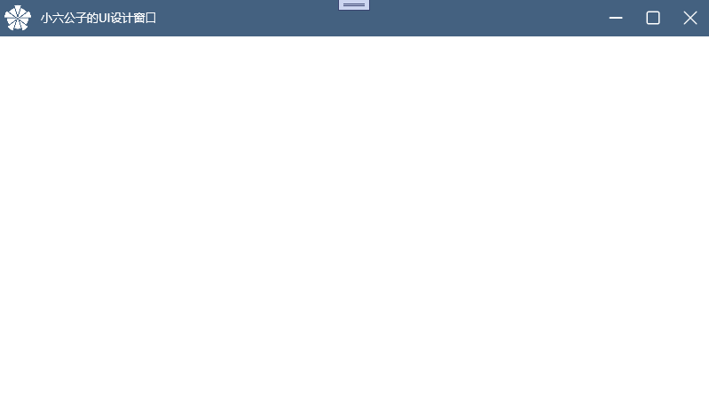
}运行程序
通过Visual Studio运行程序,如下所示:
普通默认窗口,如下所示:

自定义窗口
应用自定义样式的窗口,如下所示:
以上就是WPF自定义控件库之窗口的全部内容。希望可以抛砖引玉,一起学习,共同进步。