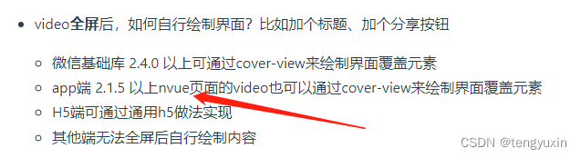
一、flex基础
设置在父容器上的属性:display:flex,align-items(交叉轴对齐方式),justify-content(主轴对齐方式),flex-wrap(换行)。
设置在子容器上的属性,通过 flex: 1,简写了 flex-grow、flex-shrink、flex-basis 三个属性。
详细教程:Flex布局语法教程
二、flex使用
需求:

- 一行只显示3个且高度固定
- 宽度随屏宽变化而一直保持三等份
- 总数不是3的倍数时, 居左展示
html:
<div class="father">
	<div class="child"></div>
	<div class="child"></div>
	<div class="child"></div>
	<div class="child"></div>
	<div class="child"></div>
	<div class="child"></div>
	<div class="child"></div>
	<div class="child"></div>
</div>
css:
.father{
	width: 100%;
	display: flex;
	flex-wrap: wrap;
	justify-content: flex-start;
}
.child{
	/* 方法一 */
	flex: 1;
	height: 50px;
	margin: 0 5px 5px 0;
	background-color: #999;
	width: calc((100% - 10px) / 3);// 这里的10px = (分布个数3-1)*间隙5px, 可以根据实际的分布个数和间隙区调整
	min-width: calc((100% - 10px) / 3);// 加入min-width、max-width后每个child的宽度就生效了
	max-width: calc((100% - 10px) / 3);

	/* 方法二 */
	/*
		height: 50px;
		margin: 0 5px 5px 0;
		box-sizing: border-box;
		background-color: #999;
		flex: 0 0 calc((100% - 10px) / 3);
	*/
}
.child:nth-child(3n){
	margin-right: 0;// 去除第3n个的margin-right
}
更多布局方法:Flex布局实例


![[每周一更]-(第61期):Rust入门策略(持续更新)](https://img-blog.csdnimg.cn/b58ef74f2335447296942335b335182d.jpeg#pic_center)